[Jim Dalrymple tried out Google Maps and is deciding to stick with Apple Maps](http://www.loopinsight.com/2012/12/13/im-sticking-with-apple-maps/):
>On the way, I ignored some directions to see how it would handle being re-routed.
>It did okay, but there was a long lag as it figured out where to take me next and instead of finding the best route from where I was, it kept trying to take me back to the original route.
That’s the best part about Apple Maps, in my use — both in the U.S. and Canada — Apple Maps almost instantly rerouted me, whereas most turn-by-turn mapping systems have a notable lag that can be the difference between a two minute or fifteen minute mistake.
I’m also (unsurprisingly) sticking with Apple Maps, but for different reasons:
1. The Google icon is hideous. It’d be great if it weren’t for the huge cutoff `G` and you know that cartoonish looking maps background.
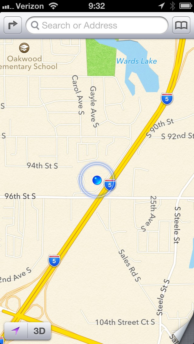
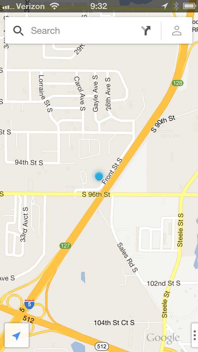
2. The maps look like cartoons. Look at Apple Maps and then Google, the difference to me is striking. Apple maps look like professional maps, whereas Google’s look like un-styled computer generations. I-5 in Washington is an eight lane freeway, which Google shows as one yellow stripe and Apple shows as two roads split directionally.
3. The Google UI is not an iOS UI — that’s crappy because this is an app to be used on iOS, Google should have stuck with iOS standards.
Having street view back is nice, I guess, but I never really missed it. Instead this is what matters to me: how the app looks. As you can see from the screenshots at the side, the Apple Maps just look better. That matters to me, moreover the non-standard iOS UI isn’t something I want to deal with when I use an app that I will likely be using when I need to get things done quickly (at a stop light perhaps).