Reader Nikolay Andreev emailed in this morning to shoot me a link to his post about organizing your iPhone homescreen — he also asked if I would share my tips. After taking a look at his post I thought I would share my thoughts on how to organize and arrange your homescreen icons for any iOS device.
Andreev’s method is to put every app in a folder — every one. [Hit this link](http://lantinian.blogspot.com/2011/03/my-iphone-homescreen-layout.html) to see how he does it. He likes the way it looks and I like that it keeps you to only one homescreen (for most non-app-crazy users). What I don’t like is how it works in practice and how it looks, to me it looks like walking into a room full of bins that house all your goods — I hate bins.
At least I hate *seeing* bins, I don’t mind them when they are neatly stored out of sight.
Anything that is on my homescreen is there because I want to get access to it and I really don’t want to have to open a folder to get to those icons. That is just too many taps and about 6 months ago I purged all folders from my homescreen for this very reason.
### My Homescreen Organization Method ###
I keep only three screens on my iPhone/iPad at all times. There is a very logical order to everything:
– **Screen 1** contains only the most used apps, never any folders.
– **Screen 2** contains a couple of apps that don’t fit on screen one and everything else in folders.
– **Screen 3** contains apps that I am testing or just downloaded (meaning I am unsure how long they will be on my device for).
– **iOS Dock** contains apps that I want to be able to access immediately, no matter which screen I am viewing.
I don’t stop there with the organization though, I also have a hierarchy for how and where the app is positioned on the screen.
### Positioning on iPhone ###
I break down my positioning by usage of the app (that is the most used apps go in the most optimum positions). I have determined that since I hold my iPhone with both my left and right hand equally (I am left handed and I use my iPhone more with my right hand). That means that the most premium positions are the four corners of the screen, then the next premium spots are the three icons that move vertically down the left and right sides (between the corner icons), then the two at the top and bottom in the middle positions. That leaves six icons in the middle that are of 4th priority. Here’s how this looks visually:
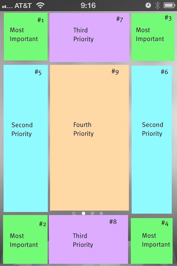
What you see here is the visual representation of how I view the app layout in some really hideous colors. I have further broken it down with numbers where I put the most important app in position #1 and then go down from there. The only exception is the dock apps — which are important, but they must also be apps that often need to be quickly accessed.
The end result of all this is a homescreen that looks like this:
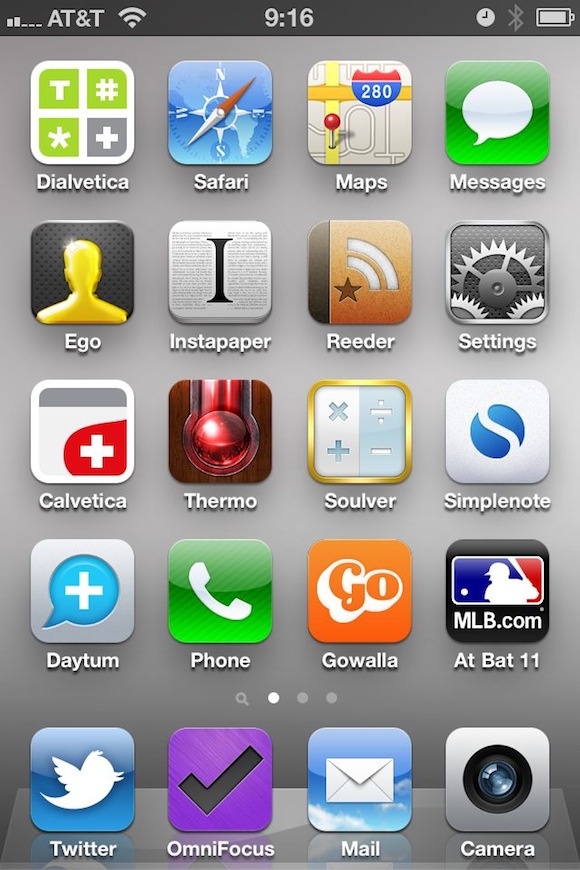
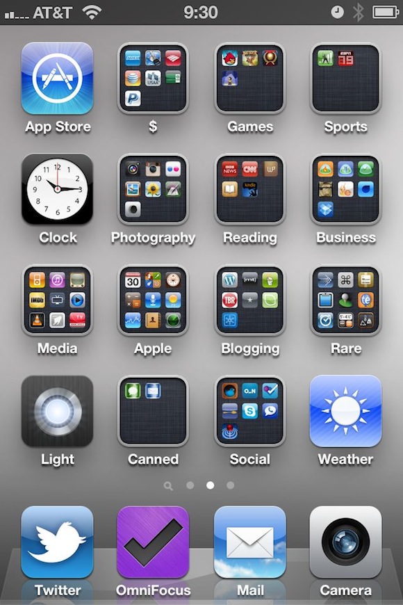
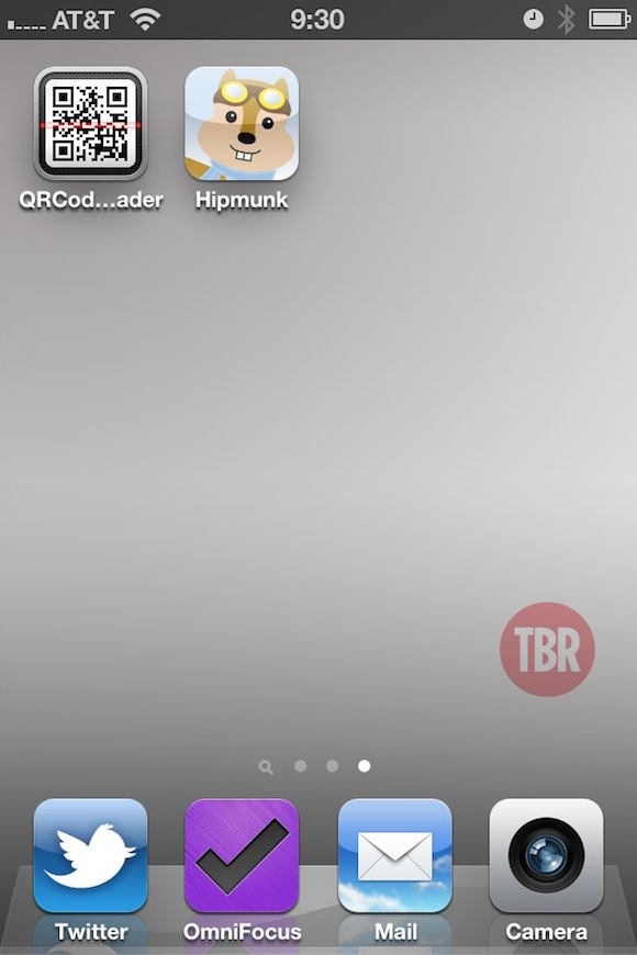
All of the dock items are items that I need to access frequently when I unlock my phone. Dialvetica and Messages are the next most frequently used apps and then follow the hierarchy on down. For the curious among you, here is the other two screens that I use — both follow the same general logic:
### Positioning on iPad ###
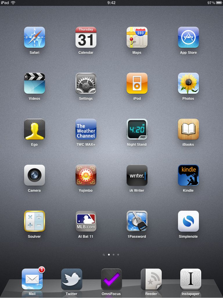
On the iPad I still follow the same general order as I do on the iPhone, but I make one huge change that makes all the difference to me. You see the iPad homescreen rotates, offering a new level of complexity to the entire arrangement. I arrange my homescreen based on how I am likely to use the device given the orientation it is in. That is, I read in portrait, not landscape view — so I make sure reading apps are in premium spots when held in portrait — likewise for writing apps in landscape. This of course is quite confusing and often leads to an odd layout, best just to show you what I mean. (You can click the images to see a larger version.)
Portrait:
[ ](https://f3a98a5aca88d28ed629-2f664c0697d743fb9a738111ab4002bd.ssl.cf1.rackcdn.com/ipad-homescreen-portrait.jpg)
What is most important here is that my ‘reading’ apps: iBooks, Kindle and Instapaper are all along the right edge — as I know I tend to read while holding with my left hand.
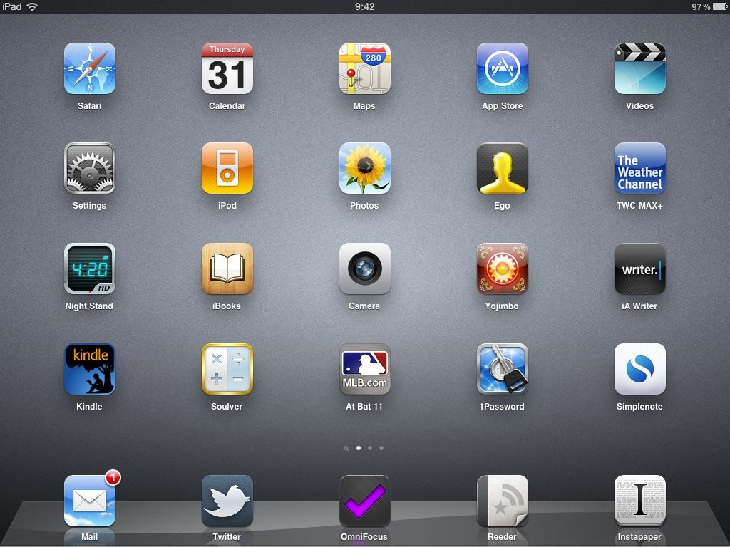
Landscape:
[ ](https://f3a98a5aca88d28ed629-2f664c0697d743fb9a738111ab4002bd.ssl.cf1.rackcdn.com/ipad-homescreen.jpg)
Here I move the writing apps (iA Writer and Simplenote) to the left edge as they are more frequently used in this orientation.
As before I am simply trying to get the most used apps to the edges, but because the screen rotates I decided to further prioritize based on how I use the device when holding in landscape or portrait.
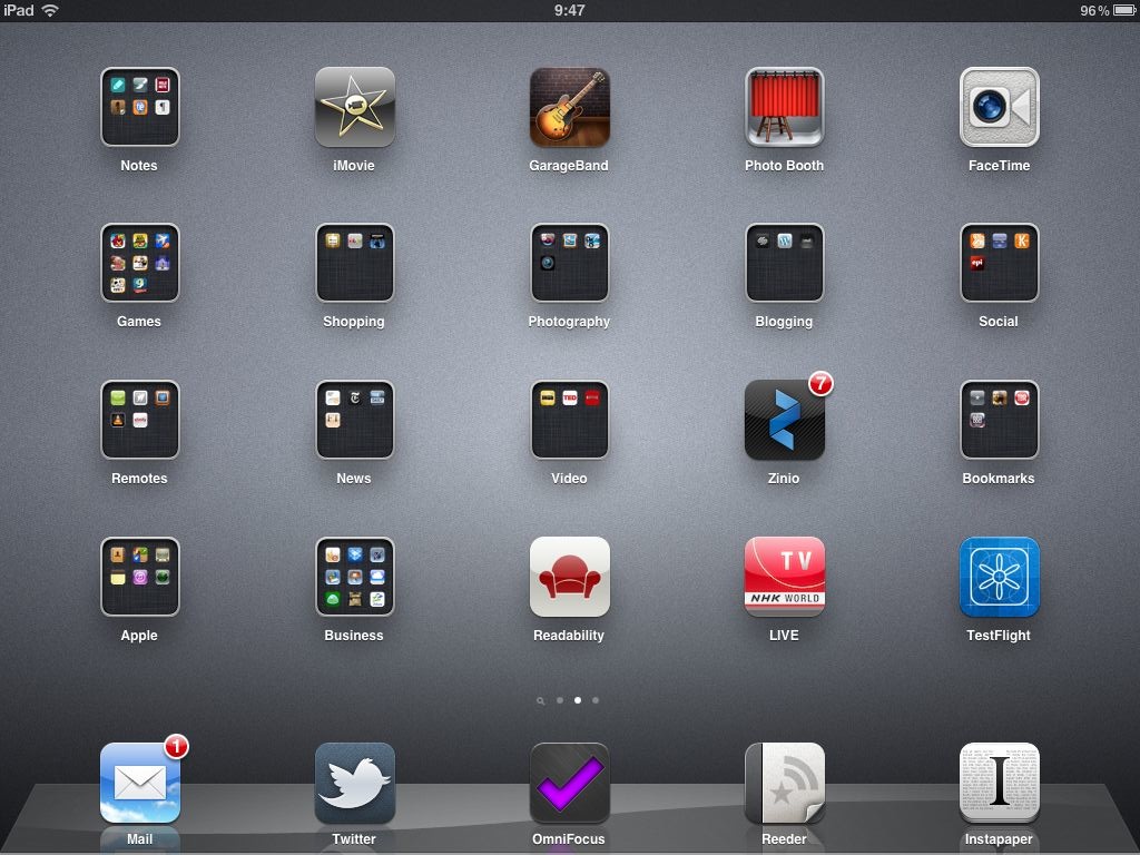
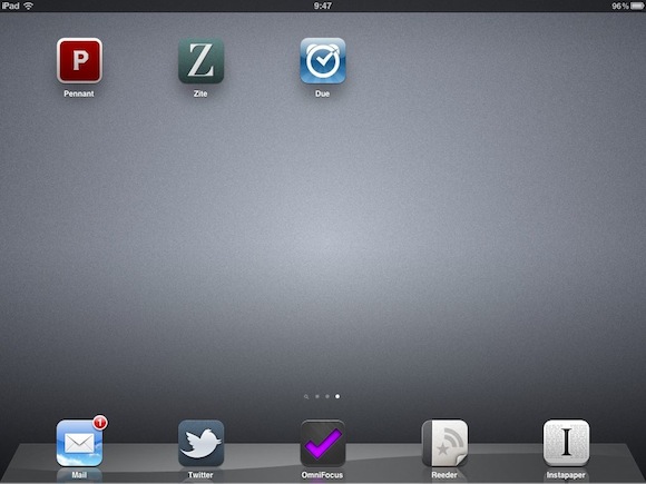
For the curious here are the other two pages I have on the iPad:
[ ](https://f3a98a5aca88d28ed629-2f664c0697d743fb9a738111ab4002bd.ssl.cf1.rackcdn.com/ipad-page-2.jpg)
[ ](https://f3a98a5aca88d28ed629-2f664c0697d743fb9a738111ab4002bd.ssl.cf1.rackcdn.com/ipad-page-3.jpg)
I hope this at least helps someone who is just as *nerdy* as I am.