I think it is only fair to start off this review by saying that I have never met a calendar (digital or otherwise) that I thought was perfect. When the iPhone came out I used the built-in Calendar.app until Calvetica came out. Then, not seeing anything but a design difference (more or less), I switched to Calvetica.
Between that point and the release of [Agenda](https://brooksreview.net/2011/06/agenda-review/) I switched back and forth between the built-in Calendar and [Calvetica](http://calvetica.com/). When Agenda came out, I quickly moved to it as my full time iOS calendar app — it was just simply better to use.
I won’t rehash all of [my complaints about calendars](https://brooksreview.net/2010/09/sucky-calendars/), but leave it at one main issue: don’t show me stuff that is from the past — my past. This is one area in which Agenda excels, and all others haven’t fare so well.
### Mobile Calendar Usage
I am not sure how most people use calendars on their phones, but I do know how I use mine and it breaks down into four routines:
1. Wake up in the morning and check the calendar for today’s events.
2. Input new events when I am not at my Mac throughout the day.
3. Be alerted to upcoming events.
4. Review the coming appointments for the next day before bed.
There is an odd couple of days in each month where I am looking at my calendar far off into some distant future to plan an event that will likely change before it happens — but that is the exception, not the rule.
### How Does Calvetica 4 Fare?
Calvetica still fails at hiding my past from me (well at least past events), but there are some very compelling things that make a good case for using Calvetica over Agenda.
### New Appointments
Calvetica has reworked how you create a new event in a calendar — it may be the fastest way to add a new event on the iPhone, yet not as fast as natural language input with something like Fantastical on the Mac. ((One thing that I am unsure about though is if given the smaller keyboard on iPhones, whether natural language input would be any good on iOS.)) When you want to create a new event, Calvetica presents you with this screen:
[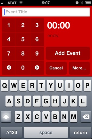 ](https://f3a98a5aca88d28ed629-2f664c0697d743fb9a738111ab4002bd.ssl.cf1.rackcdn.com/calvetica/new-event.jpg)
That’s very nice, enter the title and tap out the time and you are done. You can however tap that more button and you are brought to this screen:
[ ](https://f3a98a5aca88d28ed629-2f664c0697d743fb9a738111ab4002bd.ssl.cf1.rackcdn.com/calvetica/more.jpg)
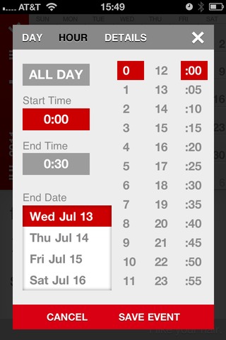
This screen is still pretty quick and straight forward (note that you can set the default duration and alarm times, thus some people will be able to avoid these screens all together). What annoys me most about this is that you are taken immediately to an expanded time screen, most of which can be controlled on the previous screen — the details screen is what I really want to get to. It looks like so:
[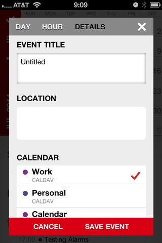 ](https://f3a98a5aca88d28ed629-2f664c0697d743fb9a738111ab4002bd.ssl.cf1.rackcdn.com/calvetica/details.jpg)
There are two reasons I need this screen:
1. I like to enter locations into my events.
2. I don’t keep all my events on the same calendar. ((Though I am rethinking this, I mean does it really matter if it is a work event or personal event? I still have to attend both…))
Overall and in my usage, the Calvetica interface is a touch faster to use than Calendar’s. If I could just get a faster way of adding in the location information I think it would be a pretty killer input method for me.
### Scheduling Appointments
As I mentioned above there are rare occasions where I need to schedule a future event with someone — this means constantly scanning my calendar on different days to see what is open and what works with other people. This is quite possibly the most annoying thing to do, but I still need to do it.
With the built in Calendar app this is best done by using the month view and tapping through the days to see what each day looks like. It’s not ideal, but it gets the job done. In Agenda I just used the never ending scrolling list of days to accomplish this — this works really well, right up and until the point that you need to jump to a specific day, at this point the system breaks down a bit.
In Calvetica though you can view this:
[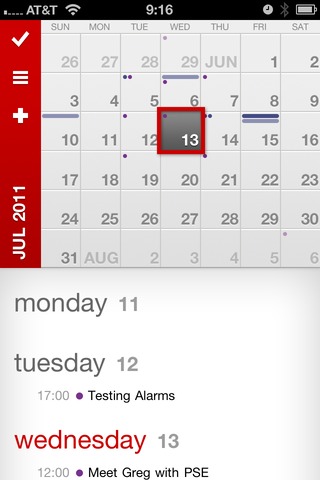 ](https://f3a98a5aca88d28ed629-2f664c0697d743fb9a738111ab4002bd.ssl.cf1.rackcdn.com/calvetica/week-view.jpg)
With the full month shown and a scrolling view of the week selected — well you get a pretty good idea of what you have going on. A quick tap on the month name and you can jump to any date that you want very quickly. All of this makes for a pretty ideal way to schedule and plan with others. (The color coded dots and bars along the top of each day in the month calendar also give you a nice heads up of a potential problem/conflict.)
### Tasks
One new addition in Calvetica 4 is the ability to schedule/manage/track tasks. I get the sense that this is a fairly basic offering. One nice thing is that there is a free cloud based backup for all your tasks, this makes the system a bit better — though syncing with a Mac app is still needed.
If tasks liked this synced back to something on a Mac I could really see someone like my wife using this and liking it. Very straight forward with little confusion.
There is also a nice UI change when you are viewing tasks versus events, very neat.
### Quick Reminders
One of the neatest features is the new quick reminders, this almost takes the place of apps like Due for me. Touch and hold on the plus symbol and you are presented with the following screen:
[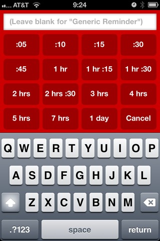 ](https://f3a98a5aca88d28ed629-2f664c0697d743fb9a738111ab4002bd.ssl.cf1.rackcdn.com/calvetica/quick-remind.jpg)
These reminders will appear on your calendars as appointments, which is why I really love them for fast event creation. Sometimes when my day gets busy there are things I know I need to do before X time, but that I can forget. I used to create a task in OmniFocus for these items, but quick reminders in Calvetica is much faster and better.
My most common reminder: go to bank, set due in 1 hour. I am forever forgetting to run to the bank. Quick reminders are great for this, love this feature.
### Day View
There is no ‘day view’ in the sense that all you see is the days events, Calvetica will always keep a partial display of the month calendar. This is not bad, but it also brings about one other problem that I have with the day view as it is implemented: it feels like ‘old Calvetica’ and not this new Calvetica.
I will admit though that this is the fastest way to delete appointments on my iPhone — man do I love deleting appointments.
### Agenda View
Not to be confused with the Agenda app, agenda view is a fairly common calendar view that shows the appointments only. Using agenda view on Calvetica essentially turns the app into a better looking version of the built-in Calendar app’s month view. It works the same way.
The one nice thing about Agenda view, is that unlike with week view you get to see the location of events — we should always ‘get’ to see this information if you ask me.
### Week View
One of the best and prettiest features of the last version of Calvetica was the week views. In portrait orientation you get a lovely looking week view (which is still around), spin to landscape and you get a more traditional week layout.
Gone is the landscape mode, which was a bummer for me until I realized that even — though I liked it — I never used it.
The current week view with the mixed in month Calendar not only offers the best looking view for the app, but it is also the most useful for me when checking out my day. I can see if the day is empty at a glance and what is coming up and when. It’s clean and simple, best viewed with the month view partially hidden.
### Alerts
Calvetica suffers the same fate as Agenda: system level alerts. When you have an alert go off before an event, the default Calendar is what you are taken to when you ‘slide to view’ the alert — this is both annoying and *not* Calvetica’s fault. Unless they wanted to run their own calendar databases, thus (as far as I understand) requiring you to re-input all your data.
This is a problem and one that iOS 5 does not solve, but hopefully someone figures out and soon.
### Gesture Support
An important part of using Calvetica is to make use of the gestures the app provides. The basics are swiping between calendar months, to the more advanced tap and hold to get additional features and pinch actions on the views to change the view type.
One thing about Calvetica that should be apparent is that each of the view modes (Day, Agenda, Week) have their usefulness, tapping the small button to switch between them means that you are likely to never switch view modes, or be annoyed when you want to switch. With pinching gestures you can quickly switch between the modes — making Calvetica infinitely better.
The app has a built in tutorial on gestures and I highly recommend you look through it before using the app.
#### Hiding the Month Calendar
One gesture is swiping up and down to show and hide the month calendar. Though the calendar doesn’t disappear (it shows the last two weeks, always), this is a very nice addition to the app. As much as I like this action, I have two major complaints about it:
1. When slide the month up and out of the way, the last digit in the year is cut off, so right now it reads: JUL 201. That seems very un-Calvetica like and I would love to see it automatically change the wording to perhaps: JUL ’11. Same amount of characters, nothing cut off.
2. Sorry, but why are you showing me the last two weeks in the calendar? Why *aren’t* you showing me the current week and next week — it’s doable and seems much more helpful. I like having the month calendar slid up and out of the way, but it would really be trick if it could still be helpful while it is tucked away — beyond just giving me more screen real estate.
### One More Complaint
If you have multiple calendars syncing with the same name (say you test a lot of stuff and you have duplicate calendars in both iCloud and, oh, MobileMe) this is a very confusing app to figure out which ones should be shown.
In fact the only app that handles this well is the built in app, since it shows what account each calendar is from. This is likely only an annoyance to people that keep multiple calendars, but it drove me crazy.
### Design
When [I wrote about Agenda](https://brooksreview.net/2011/06/agenda-review/), I had this to say about Calvetica:
>The problem with Calvetica is that I have always liked looking at Calvetica more than I have liked using it.
I never meant that as a bad thing, it’s just a *thing*. When the guys at Mysterious Trousers asked if I would take a look at the beta of version 4, they seemed pretty confident that they addressed that issue. I couldn’t agree more, what’s more impressive is that they made me like using Calvetica — while also making the app *much* better looking.
Overall Calvetica is better looking, however there is one screen that really bugs me:
This details screen pop-up doesn’t sit right with me. Looks almost Android-ish. For instance: why are some of the fields rounded off on the corners, while others remain square? It’s a small nitpick, but I am not a huge fan of the design on this screen, mostly because I think these guys *can* do better.
### Spit and Polish
There’s a few little things about Calvetica that are really nice little ‘extras’.
– When in week view there is a little bit of footer text that says things like: “I like your hair.” It’s a touch of personality and makes me smile every time I see it.
– You can change the color each calendar is displayed in. Yes, this *is* awesome.
– You can rearrange the order things are shown in the ‘details’ screen so that what you use/want is at the top.
– When in week view, the day’s date is show just to the right in a subtle gray — great touch that is both nice looking and very handy. This may seem trivial, but for some reason I really noticed how much I appreciated this.
– The app still opens incredibly fast.
### Agenda v. Calvetica
Honestly, I have a tough time deciding. The interfaces and logic behind each one is very different. If I had to choose I would say that Calvetica has a slight edge over Agenda right now for two reasons: design and event creation. As for the layout and display of your calendars, it’s Agenda all the way.
Calvetica 4 is in the App Store now and is a free upgrade for existing users, [go check it out](http://calvetica.com/).