When [Sparrow](http://sparrowmailapp.com/) came out I was pretty annoyed that it copied the look and feel of Tweetie so I consciously decided not to download it. This in addition to the fact that (like switching task apps) switching email apps is very disruptive to my workflow I decided not to try it at all. Lately though I have been seeing/reading/hearing from too many people that I respect whom have really taken to Sparrow.
I decided to give it a try.
I have been using it now for over a week and I think I have enough usage that I feel comfortable telling you my take as a hardcore Mail.app user.
It’s good, but it’s not better than Mail.app as an email app — yet I am switching to it. I can’t quite put my finger on it, it’s not the design of the app or the hideous icon — there is a lack of power in the app, yet I don’t miss the power.
I asked a couple of people that use the app why they like it better than Mail.app to see what I was missing, here’s what they told me.
[Chris Bowler](http://chrisbowler.com):
>Mail and Sparrow are close, but the integration of keyboard commands & more configurable interface make Sparrow the better choice.
Here’s what [Justin Blanton](http://hypertext.net/) had to say:
>It makes me hate email less. It’s prettier, simpler and just more fun to use. Also, for whatever reason, it makes me feel less guilty about firing off very short replies.
So while Chris seemed to have a “productive” reason for liking Sparrow, Justin has a more emotional response to the app — a response that I completely “get”.
When I use Sparrow I don’t feel like I am using a *real* email application, because it doesn’t look a feel like a *real* email application. It feels more akin to email on my iPad — robust, but not *the* tool. It’s an odd sensation that I am just now coming to terms with.
Chris is right in saying that there are a lot of little things in Sparrow that make it a very nice app — not the least of which is allowing ‘send and archive’ without having to invoke third party utilities. Sparrow just has a lot of common sense things in it, but it is sorely lacking in the bottom-posted email support…
I can’t say I have done my job as a reviewer unless I note some very really problems I have with this app, so here they are:
– **Bottom-posting**: You can’t do it automatically and I didn’t find a plugin or workaround on the net. What year is this? Instead I whipped up a Keyboard Maestro macro to bottom post emails replies for me — with the added benefit of it working better than my Mail.app hacks.
– **Multiple Email Accounts**: This still very much feels like an app designed for no more than two email accounts. The reason being: the avatars for each account. The sidebar is just bad. Where the pictures would be cute for users that only have a couple of email accounts — what picture am I to use for my business? What about this blog where I have three different email accounts? The avatar thing is just odd. (Yes I know about the extended sidebar, but it is hideous.)
– The icon is *really* bad.
– I wish I could turn off or change some of the colors the app uses, particularly the green. Not a fan of that shade of green.
As you can see my complaints about this app are pretty minor and that is because of the apps greatest strength: keeping you out of the app (which keeps me from noticing too much).
### Why I Like Sparrow
I mentioned this earlier but Sparrow really feels like using the simplicity of an iOS email app on your Mac. What’s good about that is it makes me feel (as Justin said) fine with shooting off shorter replies — the same feeling I have when using my iPhone or iPad to respond to emails — which in turn means I reply more promptly.
I don’t hate the Sparrow interface, but I doubt that it will ever truly feel like ’email’ to me — that’s a good thing. In Mail.app I was constantly checking folders, tweaking rules, and staring at emails. In Sparrow I usually only look at the combined inbox and then I search for everything else — Mail.app has a nice search engine in Lion, but so does Sparrow. The biggest difference is that Sparrow encourages the use of search and all but forces a user to forget about “filing” their email.
Thank you. Well done.
### Closing Arguments
Mail.app is a better email app: it’s more powerful, has more add-ons, is free, and you can hack on it more. Sparrow is a better app for replying to emails — it’s not an email app so much as it is a communication widget. Sparrow feels weak, but it isn’t weak. It feels gimmicky, but it *still* works.
If you go into Sparrow thinking that it’s just another email app then you are already predisposed to hating it. If you go into using Sparrow with the mindset that you hate email and want to spend as little time emailing as you can — well you just may be surprised, I was.
### Tips
Here’s how I am bottom posting:
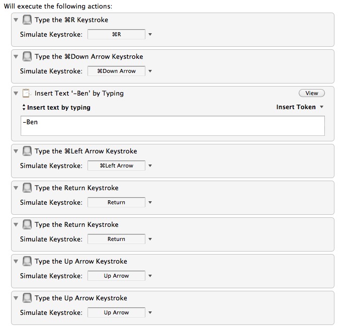
Basically I set this to trigger only in Sparrow when the `Command+R` keyboard shortcut is pressed.
And one tip to make things look better: turn off the sidebar and stick with the unified inbox with search to find ‘old’ emails.
### Still Missing
A Clip-o-tron for OmniFocus — this is really, really missing.