Instapaper has now gone [version 4](http://itunes.apple.com/us/app/instapaper/id288545208?mt=8) and Marco Arment has been kind enough to let me test out this new version. I can say that this new version is, without a doubt, fantastic.
Arment is fond of saying that Instapaper has the most generous update policy (every update has been free) and I would argue that the only software company more generous is Apple with iOS. But, why — why wouldn’t Arment charge for these fantastic updates? Let’s let him explain:
>There’s no good way to charge for updates in the App Store. Maybe Apple will add this functionality in the future, but they don’t seem to care so far. Maybe they’ll add it when they want upgrade pricing for the next version of Aperture or Final Cut Studio.
>But I’m not sure I’d charge regardless. I get a lot of goodwill from my customers by continually improving the product that they bought months or years ago, and that goodwill helps spread the word and drive new sales. I know I charge a “premium” compared to many other apps, but I want people to feel like Instapaper is a ridiculously good deal.
In my book Instapaper is certainly a “ridiculously good deal” and that may sum up Instapaper 4 perfectly.
### New Icon
Marco changed his now iconic icon for Instapaper and I risk being a hypocrite in saying this, but I *love* the new Instapaper icon.
I say I risk being a hypocrite because I have previously criticized apps that use page curls in their bottom corners, but with the overall design of Instapaper’s new icon — I think it works very well and truly doesn’t feel like a gimmick. What’s important about this new icon is that it represents what’s new about Instapaper.
The icon looks like a newspaper in the background, thanks to the large headlines and grid layout, but surprise… that’s actually how the new Instapaper looks — at least on the iPad.
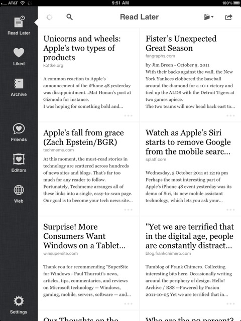
### The iPad Grid
Instapaper for the iPad has gone all grid on the home screen. Gone is the big list that looks like a blown up iPhone interface. It’s grid time, and then some.
[ ](https://f3a98a5aca88d28ed629-2f664c0697d743fb9a738111ab4002bd.ssl.cf1.rackcdn.com/ip-grid.jpg)
The grid not only looks beautiful, but is a more functional layout on the iPad. There is also a clever bit that tries to figure out who the author of the article is and print that below the headline, something which I find helpful when I see that a *certain* tech blog made it in my queue.
Among those nice touches is the still frame previews that the app will now grab for supported video sites — something infinitely helpful when you are trying to remember what the video is about.
I don’t save a ton of videos to Instapaper, but when I do, I need help in remembering what the video is about (beyond the headline) and these little still frames are perfect for this.
I also love the expanded text view that you get with the grid — something I find invaluable when you save links from Twitter (because the headlines get messed up).
Overall the Grid makes the statement that Instapaper on the iPad is more than just a larger version of Instapaper for the iPhone.
### Social
A while back Instapaper added a social element to the app that allowed you to ‘follow’ users to see their liked items. It was a very neat feature, but the implementation on iOS was never done in a way that I found useful.
In version 4, this changes.
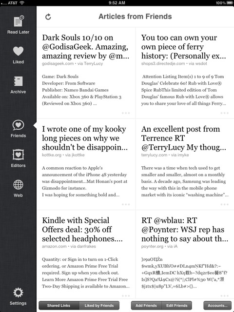
There is now a friends tab along the left edge that when selected will pull up a ‘shared links’ view. This view shows all the links that are being shared on a social network of your choice (Twitter, Facebook).
[ ](https://f3a98a5aca88d28ed629-2f664c0697d743fb9a738111ab4002bd.ssl.cf1.rackcdn.com/ip-friends.jpg)
You get the same grid view of the main screen, but this time you get to see all the links that are currently being shared. There is an option to switch to the ‘Liked by Friends’ view which gives you a portal into what the people you follow on Instapaper are ‘liking’. This is by far one of the best ways to discover new, great, reads.
I save this section of Instapaper for my dessert course, I love diving into it after I go through all the posts I added — just to peep on what other people I respect are reading. This is the digital equivalent of peeking into someone’s personal library. ((Even more so than seeing their Kindle library, because I am guessing this will give you a better insight into their interests.))
These features alone would be killer and really ups the sometimes challenging aspect on your iPad/iPhone of getting good content into Instapaper.
You almost don’t need to leave Instapaper anymore with these nice little additions.
[ ](https://f3a98a5aca88d28ed629-2f664c0697d743fb9a738111ab4002bd.ssl.cf1.rackcdn.com/ip-editor.jpg)
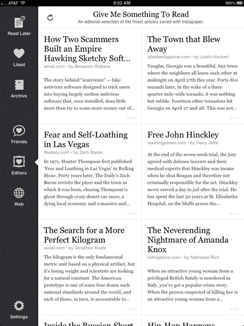
Additionally the revamped ‘Editors’ tab pulls in the current articles on the Instapaper “Give me Something To Read” curation of articles. A very nice touch for loading up on long-form reads before you hit the plane — also getting a better variety of articles that you may not otherwise discover.
Instapaper is the best cross-country-flight entertainment I have.
### Smaller Changes
There are a few smaller changes that, when added up, make the app massively better.
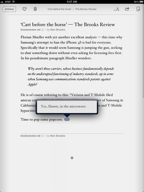
#### Footnotes Baby
Instapaper 4 adds support for copious Footnoters ((Like me.)) where the app will show a glyph with an `…` in it anytime a footnote appears. Tapping the icon results in a nice pop-up that shows the footnote.
[ ](https://f3a98a5aca88d28ed629-2f664c0697d743fb9a738111ab4002bd.ssl.cf1.rackcdn.com/ip-footnote.jpg)
This is perhaps the biggest change to the overall reading experience that version 4 introduces. Inline footnotes help keep you moving in the app instead of scrolling around to find the referenced footnote. It’s a great addition that was done seamlessly to the reading experience.
#### Wikipedia Support
It’s not often that I come across words that I need a definition of, but it is often that I come across things that I want to know more about — as in more reference information. For people like me, Instapaper has added a Wikipedia option to its dictionary.
[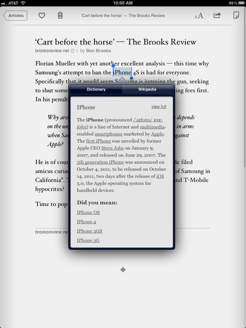 ](https://f3a98a5aca88d28ed629-2f664c0697d743fb9a738111ab4002bd.ssl.cf1.rackcdn.com/ip-wiki.jpg)
Now if you highlight some words and ask the app to define them you will get a popup that has an option to view the Wikipedia information on the selected text.
This is a very cool option.
I find in-app Wikipedia information especially useful for finding out more information about companies while I am reading the article, or information on particular people that I don’t know much about.
Come to think of it, this should actually be listed as a major feature.
### Search
You might notice that the search bar at the top of your queue has disappeared ((On the iPhone.)) , replaced now by a dedicated search section of the app. The reason being: this new search function doesn’t just search the articles on your device — it searches the full text of every article you have saved to Instapaper, including those in your archive.
It’s incredibly helpful, if like me, you often start telling someone about an article you read — only for them to ask that you send them the link. Instapaper saves me from having to spend hours on Google looking for the article because now I can just search the things that I have read all inside the place I read all my articles: Instapaper.
The search is very fast (given the thousands of articles that it has to search for me) even over 3G.
Most importantly search adds another revenue stream for Instapaper as it is only available via in-app purchase for the bargain price of $2.99 every three months. If you are already an Instapaper subscriber on the site then you will be granted access to this feature without needing to do the in-app-purchase.
Either way, it’s the same deal and it really is a deal.
### Raising the Bar
I am a huge Instapaper fanboy, and I don’t think I am incorrect in saying that with version 4.0 Marco Arment has significantly raised the bar in the ‘read later’ marketplace.
The app is faster, better looking, more comprehensive, and helps you get more content to read. This is a free upgrade, but I would have gladly paid for it.
### Miscellany
I had a chance to ask Arment about a few other Instapaper items, here’s that very short Q&A:
TBR: You didn’t add feature X to Instapaper 4, why not? When’s it coming?
MA: *There’s still lots of features I want to add, but I need to ship sometime.*
TBR: It seems like the iPad version received more attention this time around than the iPhone version, is the eye deceiving?
MA: *That’s correct. The iPad version had more room for improvement. Before 4.0, Instapaper on iPad felt like a scaled-up iPhone app. With 4.0, I’ve made the iPad app the premier way to use Instapaper, giving it an all-new navigation interface. Even in development, my priorities shifted: I’m now optimizing all new features for the iPad first and then figuring out how to port them to the iPhone.*
TBR: What new feature are you most proud of?
MA: *The iPad grid screen, by far. It was a lot of work, but completely worth every minute. I absolutely love using it.*
Same here, the grid is killer.
[Go get Instapaper 4](http://itunes.apple.com/us/app/instapaper/id288545208?mt=8) right now — you won’t regret it.