Along with Weather apps, I like to keep tabs on the current state of the art for calendar apps — I am still looking for that perfect app. Right now Agenda on the iPhone comes to [near perfection](https://brooksreview.net/2012/03/cal-redux/) for me and Fantastical/QuickCal suffice on my Mac.
Here again though I am faced with very little innovation in the iPad sector. This time around the problem seems to be the abundance of screen real estate and the love of skeuomorphic design.
Before we dive into the iPad calendar apps here are a couple of primers about what I am looking for in calendars:
1. [Calendar Apps Suck, Here Are My Suggestions](https://brooksreview.net/2010/09/sucky-calendars/) – in this post I talk about what I want out of a calendar app.
2. [Calendar Redux](https://brooksreview.net/2012/03/cal-redux/) – in this post I talk about why I like Agenda and how I oscillate between Fantastical and QuickCal.
### Back to the iPad
I think the biggest problem that iPad calendar developers face is with how people use the calendar on their iPad. I am going to make a very general assumption, but that assumption is that most iPad users own a smartphone and desktop/laptop computer of some type in addition to the iPad — something that I don’t think is too far off from reality.
The fact that users have multiple devices creates an interesting problem to solve on the iPad. By far the iPhone/smartphone is going to be much more readily available for checking appointments and entering new ones. The computer is also going to be far more heavily used than an iPad because people are more used to it — and because of the (generally speaking) larger screen nature of the computer, coupled with the fact that this is likely what people are sitting in front of while at work for 8 hours out of the day.
That leaves the iPad with an odd swatch of real estate to cover. The iPad needs to be both good at quickly looking up the days appointments and also great at long term planning and entering new events. In my opinion it’s almost an unfair situation for the iPad — so it’s not wonder to me that there aren’t any great calendar apps for it.
### Apple’s Offering
Apple’s built in calendar app is annoying at best and down right hideous most of the time. If you can get over the [little bits of torn paper](https://brooksreview.net/2011/04/mimics/) at the top, then you likely can’t get over the fact that it is just a rather useless port of iCal. My largest gripe here (besides the design) is that I can’t pinch to zoom at all to move from day to week to month views — or even to adjust how much of the screen the hour takes up.
Add to that the fact that the day view is a nightmare of wasted space and repetitive data, and well I can’t stand to use the app.
### The Incumbents
There has been only two calendar apps for my iPad that I thought were worth keeping around: [Agenda](http://getappsavvy.com/agenda/) and [Calvetica](http://mysterioustrousers.com/calvetica). Both are nice apps, but both don’t fill the void for me. Lacking in both utility and design.
#### Agenda
The app I love to use on my iPhone, seems to have lost its way in the port over to the iPad. My biggest gripe is that there is not one good viewport that accomplishes everything in a logical manner.
The week view is nice, but the layout is confusing. The day view has the signature scrolling list down the side, but wastes a ton of space showing just one days appointments. It’s a solid app, but it’s not a great app.
#### Calvetica
A slightly different approach than Agenda, Calvetica features a design that is more pleasing to my eye, but still feels like it is wasting too much space.
Is the best use of the screen to show a large scrolling month view? Not for me it isn’t. I do like the gestures for switching between day, agenda, and week views on the right — but I also find the app really sluggish at loading in the calendar data when scrolling through the months.
I’ve always had a soft spot for the design of Calvetica and think they have done a great job creating a quick entry system, but the fact remains that I mainly use a calendar for viewing appointments and in this case Calvetica doesn’t fit the bill for me.
### Interesting New Options
Again I dug through the App Store looking only at paid calendar apps. Of all the offerings just three caught my eye enough to download and try out because they were the only three that looked to be trying to do things a bit differently.
#### iCalendar
Not to be confused with iCal, [iCalendar](http://itunes.apple.com/app/icalendar/id492076105?mt=8) is an interesting option for one reason and one reason only: the design is a departure from the norm. iCalendar features very large type, and while that doesn’t work out too well for short appointments, it does make your data a bit more “glance-able”.
Honestly I just downloaded the app because the design caught my eye. Nothing about this app screams “new” or “different”, but if dark backgrounds are your thing, you may find the app nice (once they get a retina update out).
#### 12months
First a note about [12months](http://www.app.net/12months): no retina support here. It is a very unique app though. The entire years worth of calendar dates are listed out as little numbers. Tapping on any date shows the appointments for that date in a pop-up window. That’s it.
As far as I can tell there is no way to add an appointment, but it you can edit them. The app also only works in portrait orientation.
This is a niche app if I ever saw one. I’m not sure in what scenario this app would be useful, but I am sure it would be of interest to some. Personally I just find it odd.
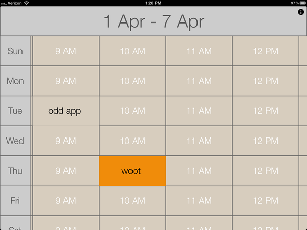
#### Calendar ABW
Let me first start by saying that [Calendar ABW](http://itunes.apple.com/us/app/calendar-abw/id478605600?mt=8) is the only app of the lot that doesn’t pull in your calendar data — a nugget I learned only after plopping down the $9.99 for it. The calendar data you enter is all sandboxed in the app — making it the hardest of all the apps mentioned here to start using. That said it is also the most interesting of the apps I tried.
Your entire day is broken into one hour segments, shown four at a time. Each day is one row. When you add an event you can either have it be 30 minutes or a full hour. That’s it.
This is quite interesting, and though it doesn’t work for me, I bet it would be great if you practiced time boxing. Here’s a screen shot so you can see what I mean:
[ ](http://c276381.r81.cf1.rackcdn.com/IMG_0057.PNG)
It seems to be to be built as an app you reference a lot, maybe for a conference schedule — as a day-to-day calendar app I don’t find it to be that great given that it doesn’t sync with my Agenda calendars.
### State of the App Store Summary Findings
At the end of all this searching I am left with two conclusions:
1. It must be incredibly difficult to build a calendar app for the iPad, because;
2. All current calendar apps for the iPad leave a lot to be desired.
For now, I’ll stick with alternating between Agenda and Calvetica.