[Craig Grannell writing about Tap! magazine](http://reverttosaved.com/2012/07/12/it-really-annoys-me-when-i-see-people-reviewing-ios-apps-badly/):
>People still bang on about magazines being rubbish on the iPad (something I wrote about in March) and, more recently, argue the iPad’s corner in terms of content creation. Bizarrely, Tap! almost never gets a mention, despite being a magazine designed specifically for the iPad and that’s actually put together on an iPad and in the iPad simulator on a Mac.
Grannell got me a free copy of Tap! back when they launched the app for the iPad (full disclosure and all) and he is right: Tap! is not like any other magazine you will find on the app store. I know I am among the lot that makes fun of iPad magazine apps. I make fun of them because for the most part they are a digital copy of what the magazine would normally print. Which is both boring and hostile towards the user (non-selectable text, huge files sizes, etc.). Tap! is different, but I have never been a huge fan of the kind of different that it is.
It’s great that Tap! is specifically made for the iPad, that truly is great, but the UI is very odd. Print magazines have always been about three things that readers care about:
1. The pictures.
2. The ads (a lot of people used to buy magazines to see the ads, mostly women’s magazines I am told).
3. The layouts.
Magazines are visually interesting and compelling to look at, but when you get right down to it, they are usually pretty terrible to read. And on the iPad we *want* to read, because the iPad offers other *more compelling* things to just look at and drool over. So to **me** a good iPad magazine app is one that is highly readable.
Does Tap! excel at this?
To answer that I am going to let you see some screenshots taken from the March 2012 issue, but first you should know that Tap! is mostly short form articles about a bunch great little apps, tips, tricks, tools, and gadgets.
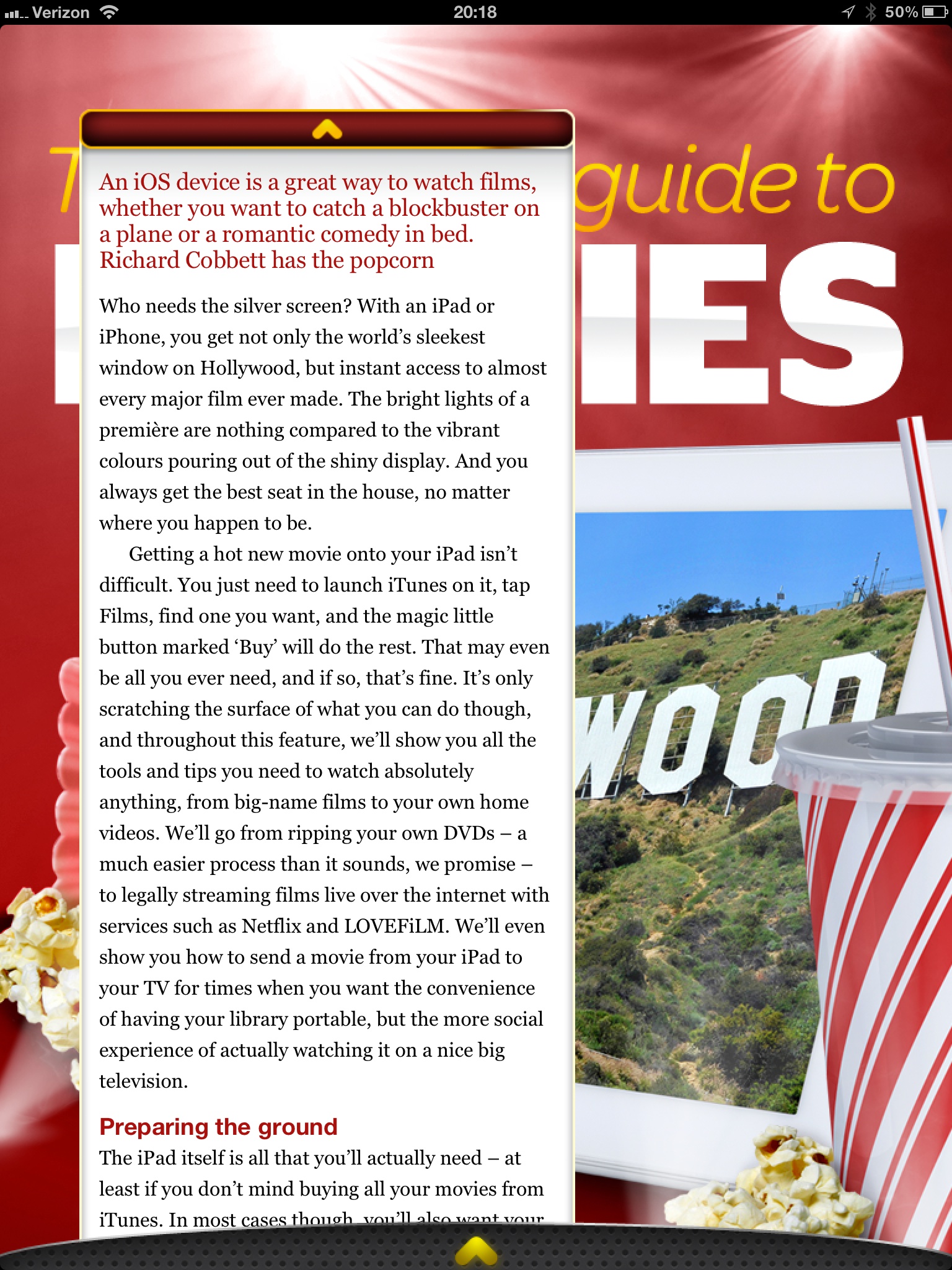
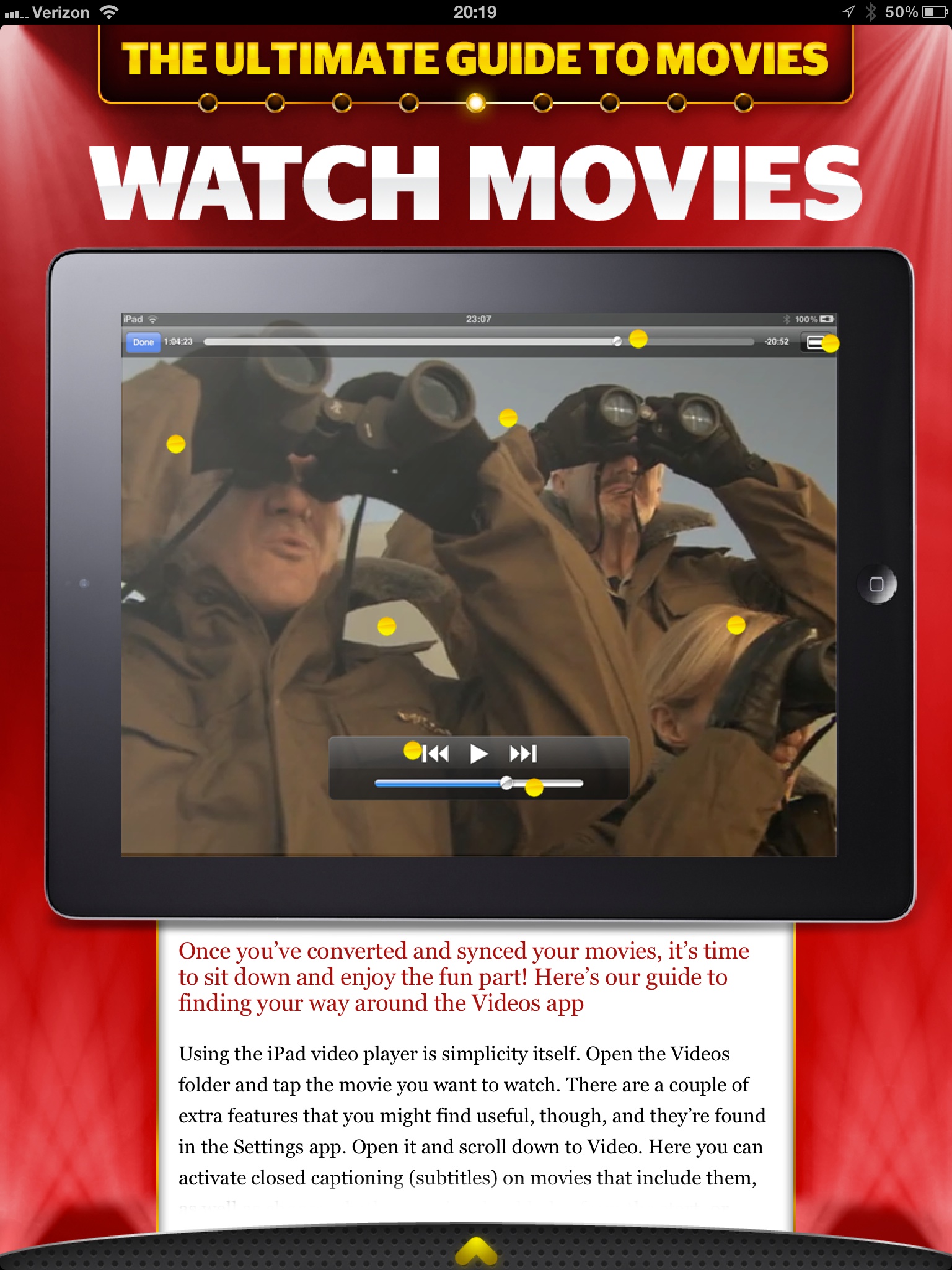
I am really not trying to pick on Tap! here, because they did a great job to actually decide that PNGs is not an acceptable way to serve up text on the iPad. However, the bulk of the magazine looks more like the first two pictures than it does the latter two pictures. That’s where my problem with the magazine is: Tap! seems to be trying to sell based on the same merits that sold magazines and I am not sure that works on the iPad for me.
I like the last picture of all the options, it shows the most text at once and fewest distractions, but again that’s not the majority of the magazine. With the short blurbs about apps I can understand the default to huge screenshots — they say more than what you would write — but even at that the text seems like an after thought. When the same trick is employed for howtos, I start to scratch my head.
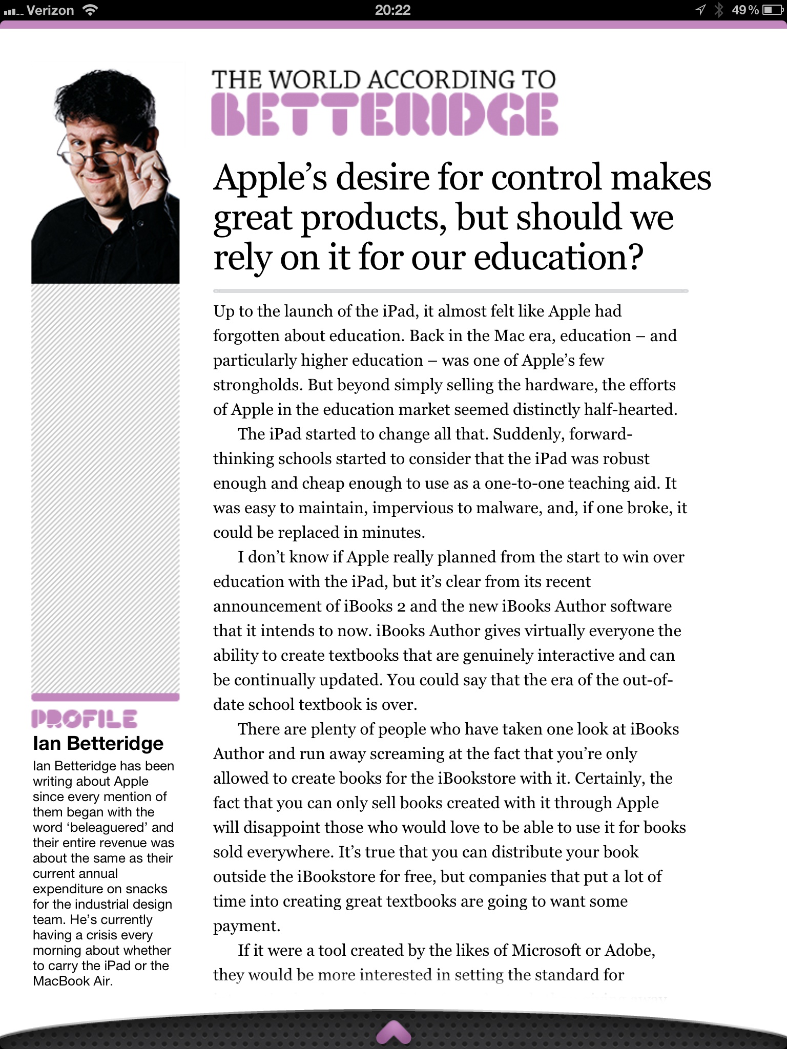
There’s both good and bad with Tap!, but ultimately I think it is probably the best general consumer grade magazine experience on the iPad. What that means is that this is the magazine I would tell my dad to buy, because I think he would appreciate it more than crafting his own magazine in Instapaper.
This doesn’t make Tap! bad by any means, it just doesn’t make Tap! a magazine that is for me.
*(I should also note that the download finished before my iPad screen went to sleep — which is a feat all by itself.)*