Alli Dryer reviewing Felix, an iPhone ADN client:
>The main problem with the icons, though, is that there are just way too many of them. A row of icons (reply, view conversation, repost, and star) accompanies every single post, and is therefore repeated over and over AND OVER on every screen that displays a stream. Coupled with the generous 256 character limit on App.net, this creates a situation where only two or three posts fit on screen at any time on my squatty iPhone 4S. I’d prefer it if these icons only revealed themselves after I tapped on a post (in order to save space).
When I first started testing [Felix](http://itunes.apple.com/us/app/felix-for-app.net/id562447652?mt=8) I felt the same way. The fact that the actions for each post are repeated makes the app look less visually appealing and I felt it detracted from the surrounding beauty of the app. Here’s what we are talking about:
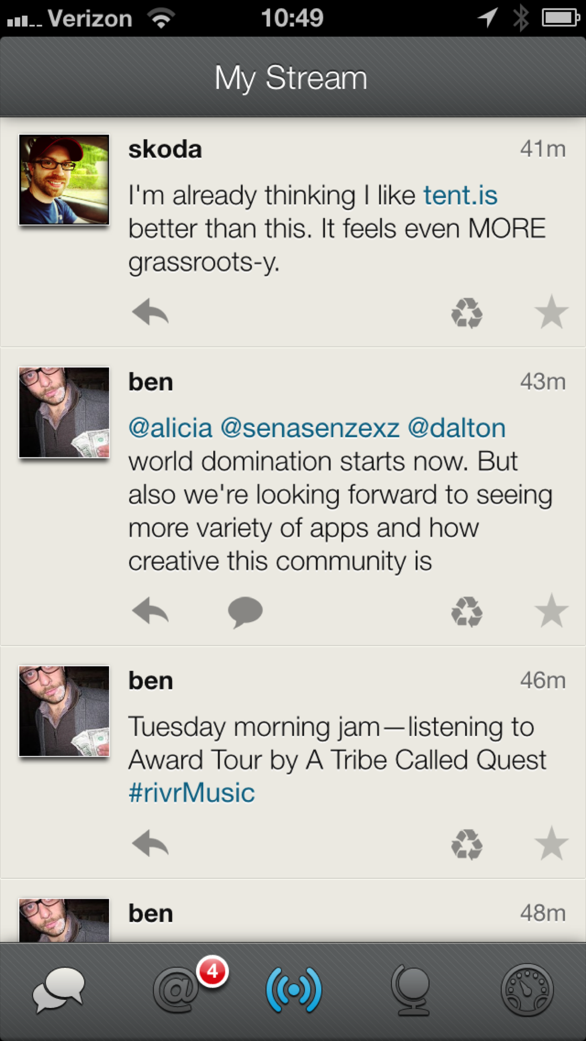
It would present a much cleaner view if these icons were hidden until the user took some action as Dryer suggests. However, after using this app exclusively (it’s in my dock after all) I can say that I no longer want these icons tucked away. Having them readily available is simply better for me. I can respond with less taps/gestures and because of that the entire app’s flow feels faster to me.
I’ve tested a few ADN clients that use the old Tweetie style of “swipe to reveal the actions” and now they just feel slow to me. This is one instance where I am happy to let the beauty of something be slightly marred for the benefit of utility.