Year: 2012

  • ‘Apple and Twitter’

    [Patrick B. Gibson is the latest to posit that Apple should buy Twitter — Gibson argues that Apple needs Twitter in order to make successful web services](http://patrickbgibson.tumblr.com/post/36041799210/apple-and-twitter). On the surface this is a pretty solid argument, with this being the most quoted line of the article:

    >My friend and co-worker Tom has a thesis about Apple’s biggest problem: Google is getting better at design faster than Apple is getting better at web services.

    That’s a gross oversimplification of the competition to Apple that Google poses and truly isn’t much of a problem. I think the problems need to be broken down by each company to see what is really happening.

    Apple’s current problems:

    – Under-age and poor working conditions in overseas factories.
    – Web services that have yet to be proven reliable.
    – Intellectual property theft, resulting in shockingly similar competing products.
    – Inability to keep up with demand.
    – No social networking presence.
    – Mapping problems.
    – Voice search.

    Google’s current problems:

    – Design that is lacking.
    – A social networking presence that is as robust as Microsoft’s.
    – Lack of profitability from Android.
    – Motorola’s, umm, “issues”.
    – Infringement on other’s intellectual property (see: Motorola).
    – No control over hardware, must partner with other companies.
    – No presence in the living room.

    The problem isn’t as simple as Google getting good at design faster than Apple is at web services — just as it wouldn’t be a problem for Google if Apple was suddenly amazing at web services.

    The real thing that should be concerning people is how shockingly well Apple has all of their problems under control:

    – Factory conditions are being solved by starting to open factories in the U.S., independent audits, and threatening to cease business with factories that don’t meet Apple standards.
    – To say that Apple is horrible at web services, is becoming a statement like the old adage: “Macs are too expensive.” It used to be true, but with each passing day Apple’s web services are getting shockingly good and reliable. I use iCloud everyday and have yet to have a problem with syncing, backups, or document storage. It’s not that people don’t have problems, but it’s more that the problems truly are less and less everyday.
    – As for IP theft, enter licensing and lawsuits — which Apple has proven they are pretty damned good at.
    – The inability to keep up with demand is not only a good problem to have, but an easy one to fix with more factories (which is what Apple is doing).
    – I have yet to see a valid reason why Apple needs a social network. If Apple just chooses to partner instead they don’t ever have to worry about their offering being relevant, only that they partner with the relevant social networks. As they have with Facebook and Twitter — why would we need an Apple social network when we have two massive ones already?
    – The mapping issues are very real, but also very new. They are also not the type of problem that will sink Apple — Apple would swallow its pride and go back to Google Maps before they let mapping sink the company. Give it a year, this problem will be gone.
    – Voice search is an interesting one. Siri is very good when it works, but it’s not consistent, or as fast as Google. This is one problem Apple really needs to focus on as they have questionable control over it right now.

    So, out of all the issues I think you could make a good case that Apple has two large problems with Maps and Voice Search — neither are huge problems with web services, but with fine tuning the current offerings (the hard part is already done).

    Now look at Google’s problems:

    – Design is still an issue, and while they are improving, Android still looks like crap compared to iOS or Windows Phone.
    – They have a social network, but it’s not popular. It’s not only then a money pit, but a talent pit.
    – Not making money from your mobile OS is a real problem. Luckily I don’t think that is the case, but it’s hard to argue that they are making anywhere close to the money Apple is (from either iOS or soon Android).
    – Motorola is going to become a huge red number on their income statements soon — and will/is causing trust issues with Android “partners”.
    – While Google hasn’t directly been sued, every Android “partner” is, including Motorola. Not just by Apple either, Microsoft too. Bottom line, whether directly or indirectly Google is going to pay for the IP problems in Android.
    – The lack of hardware control is always going to be problematic as we see now that Google is starting to see the issues with always relying on another company with conflicting motivations. Most Android users say they have a Samsung, or HTC, or just Android — you’ll never here the Google name in there. Further what if HTC and Samsung jump to another platform — what then of Android? That’s why they bought Motorola, but they were also only able to buy Motorola because Motorola isn’t a popular device maker right now.
    – And lastly Google TV, Q, whatever. The Apple TV may just be a hobby, but it’s a damned great one for Apple devotees. No one can say that about Google — so if Apple comes out tomorrow with a dominant media offering for the living room, they are already set to move on it for millions of users. Google would find itself with its pants down.

    Apple is in control of most of its problems, Google is focusing on the wrong problems.

    Even my small list here is a gross oversimplification of the problems, but far more accurate than Gibson’s oversimplification.

    Oh, and on the idea that Apple should buy Twitter: why? The top talent is already leaving the company — it’d be easier and cheaper just to offer them a million each to come to Apple for a couple years — you can’t buy Twitter for $100 million, but I bet you could buy 80-90 of their best engineering talents for that sum.
    [via DF]
  • The Surface Solution

    [Jim Dalrymple, commenting on the Microsoft Surface, notes that he sees the fundamental flaw of the Surface being that it does not actually solve any need or problem](http://www.loopinsight.com/2012/12/05/microsoft-forgot-to-solve-a-problem/):

    > Which brings me back to the Surface. What did it solve? Microsoft loaded the Surface with a 16GB operating system that isn’t optimized for a tablet, but rather is a hybrid desktop/tablet OS that tries to do both.

    At first read I was nodding along and right there with Dalrymple on this, but then I got to thinking about it just a bit more and I think Dalrymple is actually wrong on this one.

    If we take iOS and Android devices, I think it is safe to lump them into the focused device category. They are purpose made to not doing everything, but to do many of the things one would want to do. The reward is ease of use and high portability with great battery life. The downside is that you likely will still need another device at times to accomplish all that cannot be accomplished on these diminutive devices.

    Now take Mac and Windows — both are full blown desktop operating systems. Both can do just about everything one could want to do with a computer and do it exceedingly well. There’s not much (if anything) that iOS or Android can do that Windows or Mac OS X cannot do. However there are tons of things that only can be done on these larger OS devices — almost everything is faster on the larger OSes too. Of course the trade off with a full-blown OS is that the devices required to run them are not nearly as portable as iOS and Android — more importantly they are power hungry devices with relatively short battery life.

    Of course certain devices turn these generalizations on their heads (the MacBook Airs for example), but overall a user chooses between highly portable and less capable, or highly capable and less portable.

    This is where I think the Surface comes in. I think it is a device that fits between these two categories. Not quite as easy to use, portable, and battery efficient as the iOS and Android counterparts, but it is *more* capable (at least on paper). And unlike full-blown OSes it is not as bloated, more portable, and more energy efficient. It’s a hybrid of the two as Dalrymple noted. The Surface does nothing better than either category, but does (hopefully) all the good of each category. (That goes for both the Surface RT and the Surface Pro.)

    So back to Dalrymple’s question of what the Surface solves, which I would answer with: it solves the same problem that car manufacturers solved (or tried to solve) with SUVs. Some people want both a car and a truck, but can’t afford both. That doesn’t necessarily mean that the Surface solves the problem well, but it solves the perceived problem of needing a hybrid device. It’s essentially the same thing original tablets tried to solve, just in a different form factor this time around.

    The problem is really a manufactured problem — because you can’t really have a truck that drives like a car. Just as you can’t have a full-blown OS that drives like a mobile OS. You can however create a new class of devices that are good enough at some of the things that the other two categories excel at and you will find a very willing and large user base.

    Essentially the Surface is for the “soccer mom” of mobile devices — who the “soccer mom” of this category is has yet to be identified, but I’d wager there are millions of them out there.

    The analogy isn’t a perfect fit, but the idea is. The Surface is trying to be the best of both Windows and Mobile/Touch Windows, yet as of right now it doesn’t do either very well, but it may also not have to do both well as long as it does both well *enough*. The idea of the Surface is a very good one, but the execution of the Surface is, so far, very poor.

    That’s why the introduction of the Surface excited many iOS lovers, while the actual product has disappointed almost all that held hope for it.

  • ‘iOS Keyboard Has Room for Improvement’

    [Chris Bowler brings up a great point about the iOS basic keyboard](http://chrisbowler.com/journal/ios-keyboard-has-room-for-improvement):

    >Using Mail’s keyboard is a significant reduction of efficiency compared with writing in iA Writer. Here’s hoping Apple recognizes the better design and embraces the approach.

    The keyboard in Writer really is better, but it’s not the best. [As Shawn Blanc notes in his link to Bowler](http://shawnblanc.net/2012/12/ios-keyboard/):

    >Speaking of which, in Writing Kit the left and right margins of the app are tap targets to move the cursor to the left or right, respectively. This is a feature that first appeared in the app, Writings.

    Shawn goes on to liken that feature to Pull to Refresh — as in it is something that should become iOS standard.

    The iOS keyboard has a lot of room to grow, but it needs to grow wisely — adding keys at the top of the keyboard is handy, but it also cuts a line or two from the viewable content. This is likely why Apple hasn’t added such a row.

    Likewise adding gestures that are hidden over the top of the existing interface is a clever solution, but far too clever to be discoverable or teachable to the masses embracing the iPad.

    Neither of these solutions are good solutions — they are all hacks that exist because the base OS keyboard is lacking.

    My solution is a bit less clever, but I think overall a bit *more* useable. Just add the fifth row, of what I will call action keys, to the keyboard whenever the user switches to the numerical keyboard. So you still have a full-ish view of your text, but then by tapping just one key you get a row of action keys that allow for broader selection. A hybrid approach if you will.

    If Apple wanted to be even more clever it could have a default set of keys and then three slots that add your most used keys. So for a guy like me, brackets, and asterisks would bubble up into a couple of those slots.

    I don’t like the idea of adding this row of action keys as a user selectable row — it needs to be set in stone. However, the idea of one to three keys changing based on how someone actually uses the device would be a clever compromise that would go a long way towards efficiency.

    Now the question becomes: is Apple motivated to make changes to the keyboard? If you think Apple sees the iPad as a creation device, then Apple certainly must be motivated — and I don’t think there are many left that think Apple sees the iPad as just a media tablet.

  • The Periodical Co

    [Yesterday I posted about Laker Compendium](https://brooksreview.net/2012/12/laker-ipad/), an HTML 5 based iOS app framework for publishing magazines yourself. It looks very nice, but it still requires a lot of work and tweaking around in Xcode.

    [Today I found out about The Periodical Co, a new shop that has set out to](http://theperiodical.co) create a platform for building your own Newsstand iOS app — all without needing to know code. The best part is that the price is only a cut of your subscriptions — sounds like a win-win to me. What will be interesting is to see how this is accomplished, but I for one am keeping a close eye on this. I very much hope that it is done in a way that utilizes simple Markdown or HTML formatted text files that are uploaded somewhere to create a new issue — after the publisher sets the overall design. That’s what I am looking for:

    – Allow me to create a look.
    – Allow me to push content into the app at will, you can call them issues if you want — I don’t care.

    I have a feeling this is just the tip of the iceberg and can’t wait to see what the future holds with this micropublishing movement.

  • StickNFind

    [A while back I posted about the nRF8002 from Nordic Semiconductor and had this to say/wish](https://brooksreview.net/2012/06/bluetooth-proximity/):

    >I’ve long speculated that a better way to use geofencing is to make use of bluetooth chip to tell your phone where you actually are. Turns out, someone else makes the hardware already.

    The chip is a way to interact with your phone based on proximity — not needing to always look for and connect to bluetooth or use highly inaccurate GPS coordinates. My wish has always been for my phone to be able to “know” it is in the car and thus the volume needs to be turned all the way up (and on).

    [Today we get step one in the form of an already funded Indiegogo campaign for this very chip. A chip that you stick to things you want to later be able to find.](http://www.indiegogo.com/sticknfind?c=home). Is it gimmicky? Hell yeah. Is it useful? Not *really* useful because you can’t tell direction, only proximity.

    But, BUT, it is the first step in using these chips for proximity based control. Who’s to say that some clever iOS dev won’t reverse engineer these little chips and make a sensor that knows when you are at your desk, or on the “throne”. ((That’s *your* cue to start making that app for me.))

    I backed the project for six of them — if nothing else it will be better than the Elevation Dock, or Hidden Radio. Hell, they already have working prototypes.

    [via reader David E.]

    **Update:** I no sooner post about this, then I see this message in my inbox about the project:

    >By placing Stick-N-Find stickers in your Car, Home, Office, etc., the StickNFind Task Launcher has the ability to change automatically a user’s phone settings, launch applications, change ringtone music etc.

    That’s Android only, but man are we getting close to what I want.

  • Quote of the Day: Nicholas Haralambous

    “I started to become overly interested in how others operated and other benchmarks and achievements.
    What I should always have been concerned with was my own context and what my company needed.”
  • Laker Compendium

    [This is a fascinating way to create HTML5 based iOS apps.](http://www.lakercompendium.com) This model uses The Baker framework and adds custom styles giving a non-coding user a complete system for publishing an iPad app that is a Magazine. All you need to know is CSS and HTML — and from the 20 minutes I have spent with it that seems to hold.

    All of the content is simple HTML pages.

    Fascinating.

    I may just have to give this a go.

  • ‘The TSA as We Know It Is Dead’

    [Christopher Elliott may have written the best thing I have ever seen LinkedIn used for, reporting on a congressional hearing about the TSA](http://www.linkedin.com/today/post/article/20121130115318-332179-the-tsa-as-we-know-it-is-dead-here-s-why):

    >Charles Edwards, the Department of Homeland Security’s acting inspector general, described the TSA as bureaucratic and dysfunctional. Stephen Lord of the Government Accountability Office, suggested the agency was ignoring the thousands of complaints from air travelers. And Kenneth Dunlap, who represented the International Air Transport Association, criticized the current TSA as expensive, inconsistent, and reactive.

    Oh and the TSA Administrator was a no-show, because he’s got civil rights to violate — not that he knows what those are.

    Everyone knows that TSA is a sham for security. Up and until this point everyone was also scared that they might not be reelected if they vote down funding the TSA — should something happen related or not. Let’s hope now someone has the balls to stand up to the TSA and call them on their bullshit.

  • Quote of the Day: Jamie Ross

    “He said the Navajo saw mistakes as moments in time. And since you can’t change time, why try to change a mistake that already happened?”
  • The Sketchnote Handbook

    [I’ve been to a few conferences where there stands an artsy guy with a large white sheet of paper that draws out what the speaker is saying over the course of the talk. These are called Sketchnotes.](http://rohdesign.com/book) Previously I thought these were the whim of the talented drawing type — something I am not. As it turns out they are not only simple to create, but far better to use and understand when you take notes.

    To that end Mike Rohde has released a book on the matter — not just a book but more of a guide. Mike sent me an early PDF copy of the book and I have been reading through it — it’s fantastic. I’ve yet to try Sketchnotes, but they are on my list of goals to accomplish before the end of the year.

    They just look fun, and meetings are boring — natural fit.

  • The Search For the Best Everyday Pocket Knife (Part Two)

    [When we last left off, I had come to the conclusion that the SOG Aegis Mini was the knife for me](https://brooksreview.net/2012/11/edc-search-pt1/). I love that little knife, but readers started to pour in with suggestions of their own — I whittled those suggestions down to five knives to try out.

    I purchased all five of these knives with the intent to see if any of them could de-throne the Aegis Mini and two did. First a refresher on my criteria:

    – Has to be under ~$100, so the coveted Chris Reeve Small Sebenza is out of the picture (for now).
    – Could not have a thumb wedge that could potentially wear holes in my pockets.
    – Has to be sturdy enough, that should the worst case scenario happen, I would feel confident in using the knife in the wild to survive.
    – Has to look great. Whereby I mean it needs to have a discernible personality that I like. (Dangerous, sleek, tactical, old-timey, etc.)

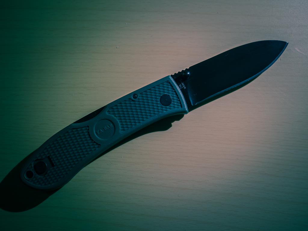
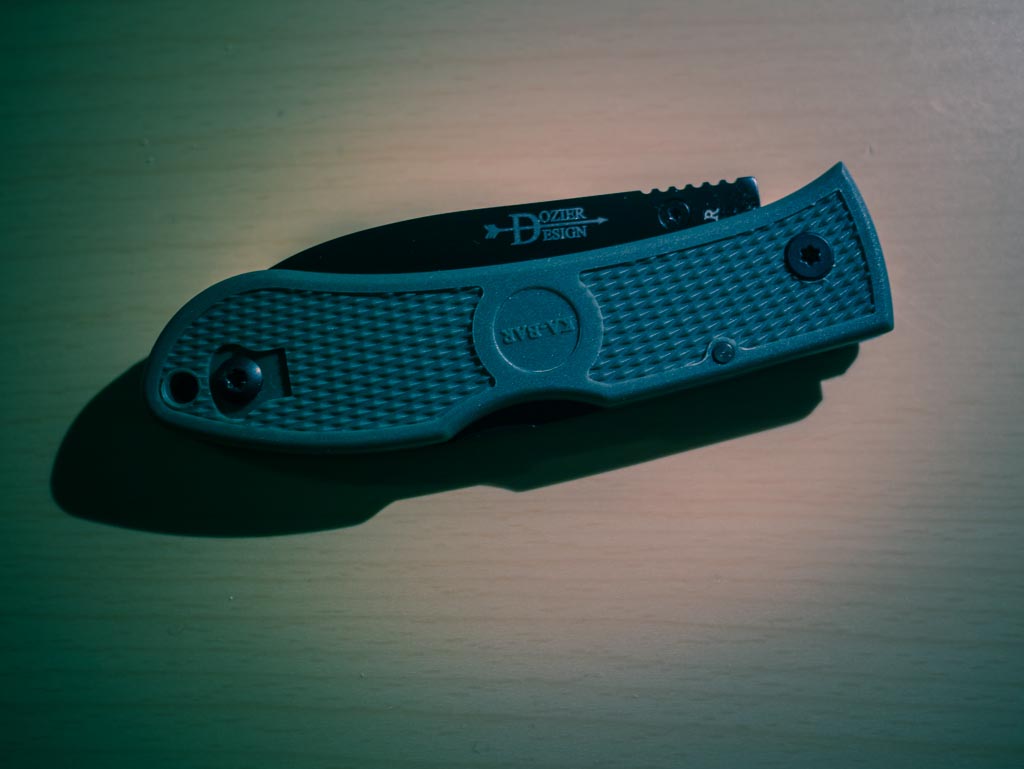
    ## KA-Bar Dozier


    I won’t provide a link to this knife because I think you would be better off with your butter knife. This is easily the worst knife I have tested.

    Of the things I hate about the knife:

    – It feels like a cheap knife you would be given at a corporate golf tournament.
    – The thumb stud is not ambidextrous so one must decide which hand they want to be able to open the knife with one-handed — you can’t have both.
    – The lock-back is terribly easy to disengage when using the knife.
    – The handle feels like you’d break it if you cut anything harder than packaging tape.

    I really could go on, but I think you get the picture: don’t buy this knife.

    ## CRKT Drifter G10 & Stainless Steel Handle

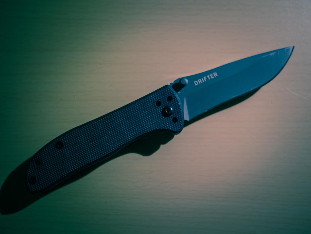
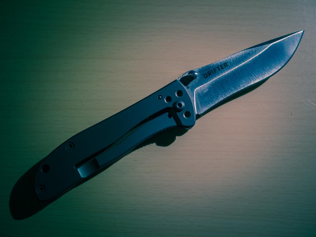
    [This knife](http://www.amazon.com/exec/obidos/ASIN/B001DZMBY4/ref=nosim&tag=brooksreview-20), and it’s [stainless steel counter part](http://www.amazon.com/exec/obidos/ASIN/B001BG8PP4/ref=nosim&tag=brooksreview-20) are seriously inexpensive — both under twenty dollars. In fact, for the price, it’s hard to fault these knives at all. They are leaps and bounds better than the Dozier. Both are more capable, better balanced, and easier to deploy.


    Yet neither are better than the Aegis Mini. So while these are solid knives on their own, when we compare them with the winner of the last round of testing, they aren’t even close.

    What bugs me most about these knives is their lack of personality. I find them both a bit boring and knives should never be boring.

    Both knives are comfortable to hold and have a recurve in their blade to make for a little easier control when whittling wood and other things. All around this is a solid average knife — just not what I am looking for.

    On the bright side, the G10 without pocket clip is an amazingly light knife to pocket. Easy to stash away and forget you are carrying — that alone makes it a handy knife for some. Just not for me.

    If I am pressed to decide between the two I would take the G10 over the stainless steel handle for no other reason than the weight — but the stainless steel handle model looks and feels much better.

    ## Spyderco Sage 1

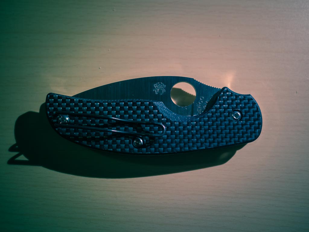
    Ah yes, Spyderco, far and away the most recommended brand to me from readers. I had my doubts as I previously carried one for years, but the overwhelming support for Spyderco forced me to try them out again. [After careful research I purchased the Sage 1](http://www.amazon.com/exec/obidos/ASIN/B0013AW8Y2/ref=nosim&tag=brooksreview-20), a tribute to Michael Walker, when I saw that [Dan at Blade Reviews has it pegged as “the perfect EDC”](http://bladereviews.com/spyderco-sage-i-review/) I knew I had to try this blade.


    This is one hell of a knife.

    The fit and finish is to Apple standards. The handle has an internal metal frame with a Walker liner lock (remember, tribute knife) and a carbon fiber shell that is wrapped around it.

    When held, this knife feels exquisite.

    Further the knife is made from S30V which many hail as the best knife steel out there right now — and holy shit are they right. This knife holds an edge like no other knife I have used before. I am seriously impressed with this knife steel and now am beginning to think I won’t buy another knife with lesser steel.

    My one complaint: is this knife is big, not too big to carry, but it is noticeable in your pocket. Whereas the Aegis Mini slips away until you need it, I found the Sage 1 to be impossible to carry, and get to quickly, without a pocket clip being used — something I am not very fond of.

    In fact my only complaints about the knife are:

    1. You need to use a pocket clip with it.
    2. I worry about the long-term durability of the handle — especially if one needed to rely on it in a survival situation. This however is really a nitpick as I think it would take years of abuse in the woods before flaws would be seen in the handle. Still I have my concerns about the handle durability in extreme cases.

    After using this knife full time for a week, I was pretty sure it had won the whole thing. It is a better blade shape, steel, and lock than the Aegis Mini. It feels better in my hand. It is far more useable in a survival situation than the Aegis Mini. Things look pretty perfect after testing this knife.

    ## Spyderco Sage 2

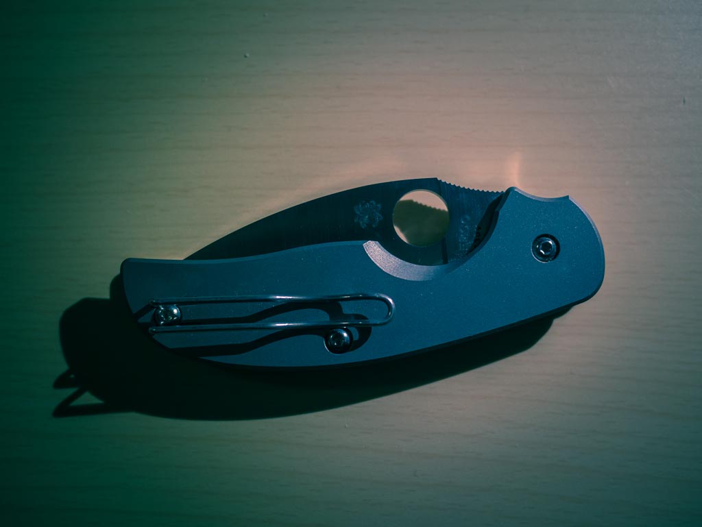
    Of course, [I bought the Sage 2](http://www.amazon.com/exec/obidos/ASIN/B002DUZL3G/ref=nosim&tag=brooksreview-20) alongside the Sage 1 — this one is a tribute to Chris Reeve, as it has a titanium handled frame lock. The Sage 1 and 2 have identical blades, both S30V, both phenomenal to use.


    The big difference is in the handle. The Sage 2 has an all titanium handle with an integral frame lock. This is a heavier knife to carry, but I’d argue a much better looking and handling knife.

    I used this knife last out of all that I tested, as I expected it to be clearly the best of all of them. But I’m not so sure that actually is the case.

    The Sage 1 is very nearly a 50-50 balance between the handle and blade and the Sage 2 is more 60-40 with the handle being heavier. That’s not necessarily a bad thing, but it is a thing. This is something that will likely be loved by many, but not all. Personally I like the extra weight tilting back towards my hand instead of away.

    My first concern about the Sage 1, the size, carries over on the Sage 2 as they are very close in size — the Sage 2 also needs a pocket clip. But the biggest plus, the blade steel, also carries over as well.

    With the Sage 1 I had an outside concern of wilderness durability, but with the Sage 2 that fear is completely gone. The all titanium frame should last through even the worst abuse and then some. In fact this feels just as solid as the Ontario RAT folder that I tested last time.

    My biggest concern with the Sage 2 is that it is a bit slicker than the Sage 1. Because the handle is smooth, my hand tends to slide on it when I am holding, but not using, the knife. My concern is what happens if my hands are cold, wet, and muddy? Will I be able to grip the knife confidently? With the Sage 1 and the Aegis Mini, I know I would be able to, but I’m not sure with the Sage 2. Then again, how often does that happen? Still like with the Sage 1, this is a concern — as minor as it may be.

    The last concern is that this knife breaks my budget, clocking in at `$156` on Amazon. It’s not horribly expensive, but it is more than the $100 I wanted to spend — [and I have good reason to not want to spend over a hundred dollars](https://brooksreview.net/2012/11/knife-follow-up-2/). Even so, I almost don’t care after having spent time using the knife — it’s just a really good knife perhaps the best of the lot.

    ## The Winner

    The winner still isn’t clear to me. What I know is that the Aegis Mini is out as the best of the group — it’s still an awesome knife, but the Sage 1 & 2 are both better in many ways. Mainly: the Sage knives take away all concerns I have about survival situations with an EDC knife which was the primary concern I have about the Aegis Mini.

    For me, the Sage 2 holds a slight lead over the Sage 1 for two reasons:

    1. For whatever reason my Sage 2 deploys easier and more fluidly than my Sage 1.
    2. I prefer the frame lock to the liner lock in most scenarios. This is largely due to the fact that I am left handed and thus the frame lock is easier to operate in my left hand than the liner lock.

    Having said that, there’s no way I am getting rid of either knife and expect to oscillate between the two for months to come.

    And having said all that, I also expect to get continued use out of the Aegis Mini, as I will be keeping that as well and rotating it in from time to time. All three, great knives.

    ## For You

    If you are new to knives, if you have been reading all my writing about pocket knives, and you are thinking about taking the plunge — if that is you — I’d suggest you buy the [CRKT Drifter G10](http://www.amazon.com/exec/obidos/ASIN/B001DZMBY4/ref=nosim&tag=brooksreview-20). It’s not the best knife, but for `$17.40` on Amazon with Prime shipping I am confident that you will get value out of the knife regardless of whether you form the habit of carrying it with you.

    Then again if you just want the best one, pick between the Sage 1 and the Sage 2 based on their looks. Both are excellent knives.

  • ‘It Wasn’t Always Like This’

    [Harry Marks takes Dana Levine and Shawn Blanc to task over their stance on retina displays](http://curiousrat.com/home/2012/11/30/that-disruptive-retina-display):

    >Visible pixels matter and now that they’ve gone away, we certainly don’t want them to come back.

    Like Marks, I was pretty shocked to see [Shawn’s comment about the retina display, specifically this bit](http://shawnblanc.net/2012/11/levine-ipad-mini/):

    >As awesome as Retina displays are, they don’t fundamentally change the usability or use-case scenarios of the iPad.

    Sorry Shawn, that’s bullshit.

    Retina displays, on any device, absolutely change the usability of the device. Retina displays make text sharp, make text readable, reduce eye strain ((At least for me, but I wouldn’t be shocked to find out that they are easier on your eyes than a normal pixelated shit screen across the board.)) and they absolutely make me want to use these devices more.

    I just cannot rationalize why anyone would think that retina displays are not a big deal. I get that they aren’t a feature that you find revolutionary *now*, but step back to when you first saw the iPhone 4, iPad 3, or retina MacBook Pro screens and you will quickly realize just how impossible it is to go back to non-retina.

    If you even once find yourself saying: “after using technology X, you can’t go back to technology W” — then you sir have just found a feature that is fundamentally important. I don’t care what some book in the late 90s said about disruption in technology, I can tell you that retina displays have absolutely disrupted the way I use technology — so too with most people I know that have a retina display.

  • The Design of a Site Meant to be Read

    A couple of weeks ago I chided The Next Web on App.net over their (then current) design. I like The Next Web, but I’ve never been a fan of their site design. In fact: most sites that I like and read have a pretty poor design.

    I get a lot of new writers asking me where I got my design (I made it) and what theme they should choose. These are the wrong questions to be asking, just as I assume that unreadable sites are asking the wrong questions about their design.

    (more…)

  • The B&B Podcast #86: Interview With Shaun Inman

    >This week Shawn and Ben are joined by special guest and Internet Hero, Shaun Inman. Shaun is a designer and developer, the creator of Mint, Fever, The Last Rocket, and much, much more. We talk about web design, development, growing in your skill sets, learning new skills, video game jams, and launching a Kickstarter campaign.

    A huge thanks to our sponsor: [NeuYear, makers of a big, awesome calendar for tackling the year and your dreams.](http://goo.gl/4FNEs) You can use promo code `B&B` to get 30% off your order, and listen to the show for your chance to win one of ten free calendars they are giving away.

  • Quote of the Day: Harry Marks

    “The Verge: We don’t mind dropping our paychecks on $500 tablets and $300 smartphones, but we draw the line at two dollar TV shows and fifteen dollar apps.”
  • Fantastical for iPhone

    My first and only thought when I heard about [Fantastical for the iPhone](http://flexibits.com/fantastical-iphone): I wonder how that app translates…

    I wasn’t very excited and because I like Agenda I wasn’t yearning for a new iPhone calendar app.

    Time passed, and my love for Agenda began to wain from love to like — nothing major, just realizing it wasn’t a perfect solution for me. Then I was contacted by Micheal Simmons, asking if I would like to check out Fantastical for the iPhone in advance.

    I was sent a copy of Fantastical for iPhone to test out. Again, I didn’t know what to expect, but wasn’t that excited over the prospect of the app because I didn’t think it would be as great on the iPhone as it is on the Mac. Reason being: natural language input on the Mac is easy, but on the iPhone I’m skeptical about the utility.

    Fantastical for the iPhone is awesome.

    ## The Good

    The app is fast and light, so it just pops open as you would expect. The icon is what I expected and is nothing great, but it’s also not blue, so let’s just consider that a win for everyone.

    The icon.

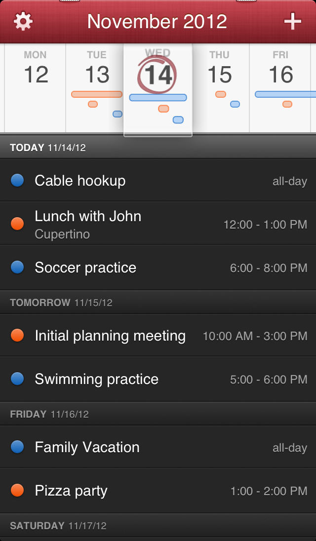
    What I really love is the date picker (not the design). I love that I can slide the date picker to get an overview of how busy my schedule is all without having to look at the appointment names and times. I can see that my Thursday is loaded up in the afternoon, that Friday has an all day event, and so on. It’s a very nice way to get an overview, without having to be overwhelmed by the who-what-when-where of calendars.

    Main view.

    And of course you can enter new events with natural language — which isn’t new on the iPhone, but is still pretty nice. So even though I was very skeptical about the utility of natural language input on the iPhone in reality Fantastical implements it very well. I love the way the data is pulled from your natural language string to give you a glance-able confirmation that Fantastical has it right — this is done better than it is on the Mac.

    Natural language feedback.

    Even better is that with one tap you can get a more normal looking event entry screen. A lot of my appointments are entered via Siri these days, however it is really nice to have this option for those times when I can’t lecture Siri.

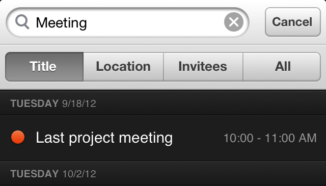
    There’s also a little hidden gem: if you just give a light tug down on the date picker, the app will reveal a search bar. Yes, searching isn’t new — but I bet you will love how it is implemented.

    Search!

    In Fantastical you can search everything, or by: Title, Location, and Invitees. This is a killer feature if you are trying to find the last time you met Sally at your office. (To those that never have to recall meetings, this isn’t much of a feature, but for those that do this is awesome.)

    ## The Not Very Good

    There’s not a lot of bad things, but there is one thing that I don’t think is very good. The action from moving to and from the day picker view to the month view is not very good.

    The action is a swipe down on the days which makes a lot of sense, so when you want to rid yourself of the day view what do you do?

    Swipe up? Nope.

    Same swipe down? Yep.

    Maybe I am the only one that finds that counter intuitive, but I stumble when I am switching between the two. It’s not horrible, and with more use I’ll get used to it, but this doesn’t follow the normal iOS app conventions and really bugs me.

    ## The Ugly

    I wasn’t aware that there are problems with app title bars falling from the top of the screen to the bottom, so it is a little unsettling to see two (what I assume are) staples holding the app title bar up.

    The staples.

    Yes, the textures and “real calendar” feel have always been a Fantastical *thing*, but it doesn’t mean I have to like it.

    ## The Wishes

    My absolute biggest wish is for the app to allow me to turn off the calendar color dots that appear next to each event. I use one calendar for everything and would love to clean up the UI with the absence of those dots.

    My second wish is for a little better design of the event details screen — it is iOS standard as far as I can tell and I would hope for a more consistent look as it seems like an after thought as it is.

    ## The Wrap

    Overall this is a really solid app. It’s on my iPhone home screen now and for an introductory price of `$1.99` I can’t see how you could go wrong with this app. Even with the staples, I love [Fantastical for iPhone](http://flexibits.com/fantastical-iphone).

  • Keyboard Maestro Macro: Docu Store

    *(This post is a part of a series on Keyboard Maestro, [see more here](https://brooksreview.net/tag/KM-SERIES/).)*

    As a blogger (I’m sure this applies to others) there are a lot of times when I am writing and need/want to grab a lot of source material to use. For me this typically involves a lot of copy and pasting and command-tabbing between Safari and Writer.

    I was fed up with this, so I created a system where I could just copy an infinite amount of data and paste it back into an app all at once.

    Enter Keyboard Maestro: with these two macros you can write things to a simple text file with one shortcut and then paste it back out of the text file into your writing (and then you clear the text file). This is all done quickly and simply.

    Here’s how:

    ## Docu Store – Build

    The first part I had to build was the engine that would write everything I want to a text file. Here’s how I did this:


    I’ve set the hot key trigger to `CTRL+CMD+C` so that it is not something easily triggered on accident, but only one modification from a standard copy command. ((An added bonus, that made it easy to remember, was that it is the Windows copy shortcut and the Mac copy shortcut in one.))

    From there, Keyboard Maestro performs three simple actions:

    1. Copies the text so it is on your clipboard.
    2. Appends what is on your clipboard to a specific text file. In my case that is stored in Dropbox, in a Workflows folder, with a file name called `Docu-store.txt`. This writes the info you want to the text file. I’ve further set it to write in plain text, thus removing any formatting.
    3. The last bit is a simple formatting preference. If you don’t add this part, all the stuff you copy will all be on one line. I’ve added two carriage returns between each entry add by telling Keyboard Maestro to append `%Return% %Return%` at the end of every add to the file. This way, when my text is pasted in the next macro, it is easy to see. (You can also use: `%LineFeed% %Return% %Tab% %Space%`.)

    That’s it for the first macro — we can now add text. Next we just need to extract it.

    ## Docu Store – Paste

    Now we need to extract that text back out of the file and paste it at will.

    Here’s how I have that setup:


    I’ve kept things standardized by using the `CTRL+CMD+V` shortcut. From there Keyboard Maestro runs four actions:

    1. I first set the contents of the text file we were writing to, to a variable called `DocuStore`. All this does is get data in a place where we can use it. (I first tried loading the data directly to the clipboard, but had very inconsistent results when I did that — this seems to be the most predictable way to get the file contents.)
    2. Next I set the clipboard to the `DocuStore` variable. (Again, this could be one step, but it wasn’t working correctly for me.)
    3. The data is then pasted by hitting `CMD+V`.
    4. This last action is one you might want to think about not adding. I write back to the text file nothing — which clears everything out of the text file, making it a blank slate for the next round.

    All of that gives you a nice clean way to grab say an author name, link to the article, and block quote from the article — all in one fell swoop.

    I love it.

    ## Notes & Tips

    You may not always want to wipe the file, so there’s an easy way to make that an option you can decide on at the time:


    By adding that one action a dialog will pop up asking if you want to wipe the file. Say `no` and nothing is done.

    Lastly, I use a text file because it is a non-volatile way to store the data. It will persist if you restart your Mac, it won’t be wiped out for some odd reason, and is backed up. You could use a custom clipboard for this, but a text file has an added advantage of being a document you could just open and edit if you wanted or needed.

  • Quote of the Day: Sam Weiner

    “Also, are nightmares covered by AppleCare? Because my sleep mode is NOT working right.”
  • A Better Way to Append the Date with Keyboard Maestro

    [Miłosz Bolechowski wrote in to tell me that using Automator to change the date was silly because all of it can be done in Keyboard Maestro](http://www.fabryka-pikseli.com/2012/11/28/keyboard-maestro-i-data-w-nazwie-pliku/). This is a really complex version, but does work much faster than using Automator (my method).

    I actually had no clue just how easy it was to grab files from Finder in Keyboard Maestro, so this is incredibly helpful to me long term as well.

    Thank you to Miłosz Bolechowski. This is awesome.

    *(You’ll probably need to translate the page, but the last link in the post is a zip to download the macro.)*

  • Newsstand, Publishing, Apps, and Developers

    [Craig Mod in, what I am sure will become a point of reference for a lot of tablet-only publishers, has this to say about publishing on the iPad](http://craigmod.com/journal/subcompact_publishing/#sub_clarity) (via [Shawn Blanc](http://shawnblanc.net/2012/11/mod-publishing/)):

    >I’d be shocked if there weren’t a dozen other publishers prepping to launch similar magazines. Or, even better: someone building a system by which anyone could launch a Newsstand app like The Magazine — for minimal cost with minimal complexity.

    *(If you are at all interested in the future of publishing, then Mod’s essay is a must read.)*

    When Marco Arment first told me about his idea for The Magazine it was pretty obvious that it would be amazing to have such a tool for publishing in the hands of individual writers.

    And it appears I am not alone in that thinking. [Here’s David Heinemeier Hansson on the matter](http://37signals.com/svn/posts/3333-publishers-shouldnt-be-app-developers):

    >Apple should save its customers from these cruddy experiences by either putting out something like iMagazine Creator (ala iBooks Creator) or find a better way to get existing HTML magazines on the iPad.

    [And Heinemeier Hansson’s fellow co-worker Ryan Singer on the matter](http://37signals.com/svn/posts/3334-tablets-are-waiting-for-their-movable-type):

    >Now is a great time for another Movable Type. Writers would love a way to push serialized content straight to tablets, and the experience would be a boon to readers.

    This is a rare case where everyone is correct. Apple, readers, and writers would have a win if a simple, yet effective, tool were to come out that any writer could use to:

    – Publish a periodical to the iPad.
    – Allowed for paid subscriptions.
    – Control over design.
    – Downloads in the background.

    Most of the hard parts are in place for Apple, now *we* just need the tool to put the content in the frameworks.

    My personal vote, would be for a system where you design the “app” one time (setting all the outlines as you do with any blog) and from there you just push content to it via something like MarsEdit. I would not only love to use that, I’d pay a premium to use such a tool.