For a long time I have argued for a smarter calendar. Jason Snell, [in an article for Macworld][1], outlines some great features that seem rather obvious, yet are missing from most apps.
> And yet it all feels a bit pedestrian, like I’m really just using a computerized, networked version of a paper calendar. What’s missing are features that could turn my calendar into something more like a personal assistant.
I agree with Jason and it got me thinking about [a post I wrote about the problems with calendar apps][2]. Let’s reconsider what a really great Mac calendaring app would be like.
To the right is what I have come up with.
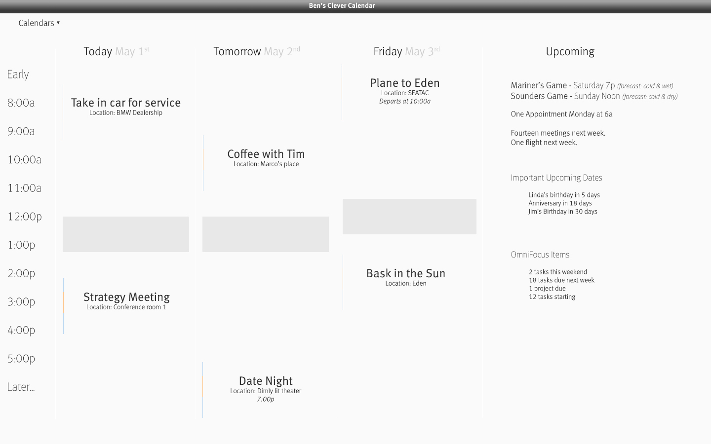
Looks aside, I want to take a look at the data, how it is presented and why I made these design decisions.
## The Main View
There is only one view. No month view. No day view. You see today, tomorrow, and the following day, including an overview of a user-defined future time period.
I have always found a view of an entire week overwhelming. My forward planning capacity is about three days. Beyond three days everything is too far out to think about in detail right now. It’s good to have future events planned, but not good for your mind to stress about things so far in the future. Thus, three days.
The upcoming section shows events that fall outside of the current view in a snapshot-like way. There will be a preview of the weekend, as seen with the first two lines, and a heads-up about how next week starts (or how the next working day begins, if Friday isn’t the last day in the viewport). Then a more distant forecast, excluding specifics of each event, showing only a high-level overview of how fucked next week is.
My ideal calendar would pull out important things that may need pre-planning — as I have shown with the ‘flight’ notice in this area. Flights are something you want to know about more than a few days ahead, so it’s important to show them here.
Next come upcoming important dates, which is where birthdays and anniversaries are shown. Why should birthdays be an all day event at the top of my calendar?
Lastly, a pane to show upcoming task information from OmniFocus — again this is to give an idea of how busy next week is. I prefer to see a high-level, generic view of next week’s events because typically I wonder: “Will next week be busy?” And not: “Do I have a meeting at 11AM with Bob on Wednesday?” This viewport better answers my question, than seeing all the details of the next week.
## Specific Touches
You’ll notice that instead of showing twelve hours, I just set the times from 8AM – 5PM. This would be a user definable range, which should be set for the times you actually want to allow people to schedule meetings with you — since I assume you use a calendar service that shows others when you’re busy.
Before or after that period the app just shows “earlier” and “later” — times when you *can* have things scheduled, but really don’t want to. If you *choose* to schedule things outside of the core hours, they are more likely to have ambiguous timing — like date night. If an appointment is scheduled in the “early” or “later” block, the start time is shown in text.
### Events
Each event shows the title, location, weather (if wanted), and start time (if needed — see above). The colored bar to the left of each event denotes the duration of the appointment in orange/red and the travel times to and from the appointment in slate/blue. Ideally the app sets those automatically by grabbing travel time info from a mapping site (from a location you specify, to the location specified in the appointment).
Next you might notice the gray blocks around lunch time that prevent your lunch hour being snagged by a coworker wanting a meeting. These are not hard-coded blocks — instead you would set the default lunch time but can drag them around day-to-day to better fit your actual schedule.
## The Gist
The more I think about why calendars suck, the more I realize they *really* suck at two things:
1. Protecting my time for me.
2. Summarizing my time.
On the *rare* occasions when I *need* to see a month-view I can grab one of a million other calendar apps. What I need every day is an app that runs fullscreen, which I glance at for a grasp on the next couple days. This kind of calendar app keeps me from getting overwhelmed, but still informs me if a nightmarish number of OmniFocus tasks and too many meetings are on the horizon.
Now *this* idea is closer to the killer calendar app.
[1]: http://www.macworld.com/article/2036158/why-aren-t-digital-calendars-smarter-.html
[2]: https://brooksreview.net/2010/09/sucky-calendars/