A few nights ago I got an email from Bryan Clark, and he explained that he and Jesse Herlitz teamed up to make a new App.net client, and they are still excited about it even if App.net seems to be in a bit of limbo. I’ll be honest, I wasn’t too excited to test the app, but I checked out the other app these two worked on and was impressed with the app. Then, I accepted to promo code so I could see the app before launch ((If you don’t know, developers can have an app approved, but hold it so you cannot download it. Then they can share promo codes and people can download the app from the App Store that way.))
Boy am I glad I checked out the app. It’s called Blixt and it is an App.net client, though it doesn’t do private messaging.
It is gorgeous.
It is damned smooth.
I love so many things about this app that I wish people posted more on App.net so that I might use it more.
The Highlights
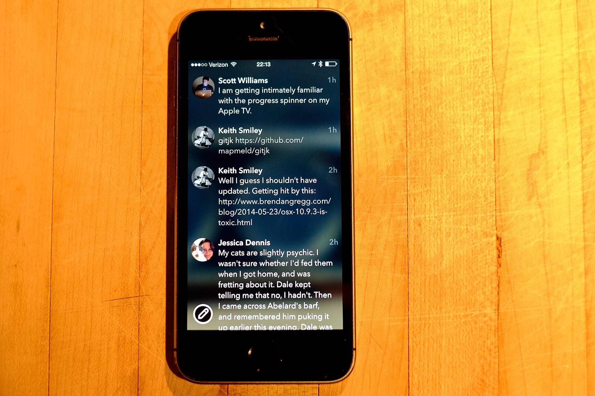
The scrolling in this app is possibly the smoothest scrolling I’ve seen, it’s like a plastic disc on an air hockey table. Simply fantastic, you just want to scroll around. I don’t know what gives it that feeling, but man is it silky smooth.
There are no delineating lines between posts, but somehow nothing looks cluttered and nothing is confusing. It’s really clean feeling and super flat, but yet it feels like slick glass. It feels made for the iPhone.
The animations are great. From the little bounce a post does when interacted with, to the loading indicator when using the browser. All these small touches make for an app that visually doesn’t get in the way, but never leaves you feeling lost.
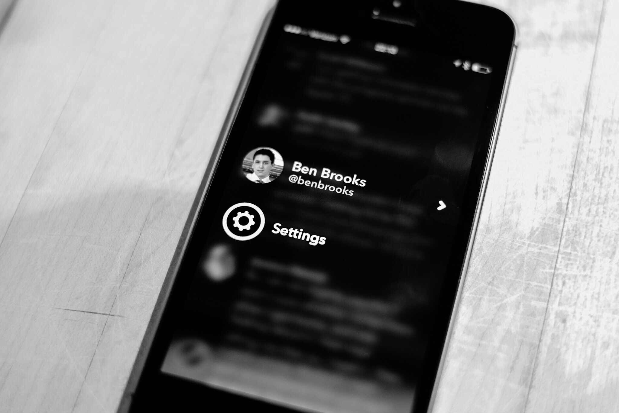
I was confused at first as to what the image is that is blurred out behind your timeline, as it turns out it is your cover image. However, when you browse to another user, or simply view the post view for a post that is not yours, the image switches to that user’s cover image. Very nice touch, and amazingly not distracting at all, it simply gives a little depth and character to the app. In fact it is a great way to skin the app a bit if you want.
Another nice touch is how large the few buttons are. This is best seen when composing a new post, as the buttons are a bit in your face, but thankfully easy to tap, which isn’t something I can say about most of iOS 7. Even though the buttons are larger they feel right, but not something you tend to see in iOS anymore.
The Misses
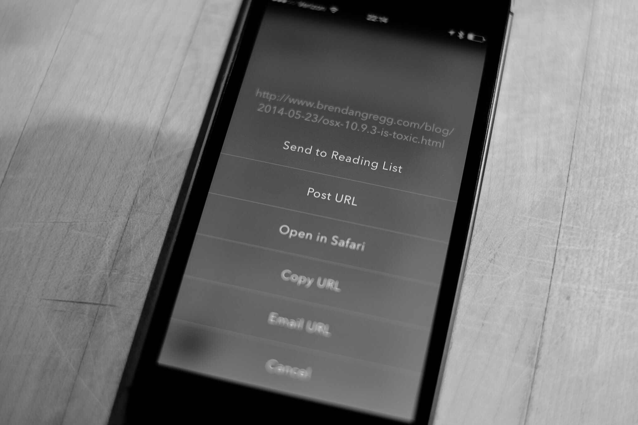
There’s a bug that I’ve run into when I tap on a post with a link the app seems to freeze (the developers are looking into it), all you have to do is go back to the home screen and back into the app (no force quitting needed) and all is fine. It’s odd and annoying, but a testament to just how good this app is that I am more than fine with putting up with that bug.
The swiping is a bit un-iOS, in that going back, say from mentions to timeline, requires a swipe starting near the middle of the screen to the edge. If you swipe from the left edge to the right, you pull up the account switcher and settings screen — I pull that screen up a lot. This isn’t consistent with the rest of iOS so it is likely to always be a challenge for me.
The Icon
I wanted to give the icon it’s own section, just because it is stellar. Of all the icons on my main home screen, this is the only one worthy of being there.
More like this please.
Go Buy It
Who gives a damn about what’s going on with App.net, this app is one of those apps you will appreciate the hell out of no matter what you think of App.net. Rarely do I like apps this much, but this app is very impressive in such a very simple and smooth way.