Many of us have had an iPhone 6 in our hands now for just under a week and many of us have already formed opinions on how good, or bad, decisions around the new phone designs are in practice. Yes, the camera bump is unnatural and annoying, but you rarely notice it. Yes it is bigger — too big for some (many?).
There’s been a lot going around about the size of these two new iPhone models. Charts showing where a generic white males thumb can and cannot reach (because all iPhone users are generic white males, right?). Talk about zoomed versus native, and chiding at those developers who did not scramble to update their apps for the new display resolutions.
Me
One thing that clearly needs to be discussed is me: I am six-foot-three and have normal sized hands for a person of my height. That is to say I am above average in this aspect, and well: I cannot fucking reach the top inch of my iPhone comfortably — which means this must be really annoying for those with smaller hands.
I don’t find this to be of issue on the home screen as I simply moved down the important app icons, but once in the app it becomes a huge problem. And this is because, since the iPhone came out, the top bar of the app is your navigation bar: where you go back, or create new things from. The bottom bar has always been reserved for different actions, and if we step further back, for tabs switching in apps.
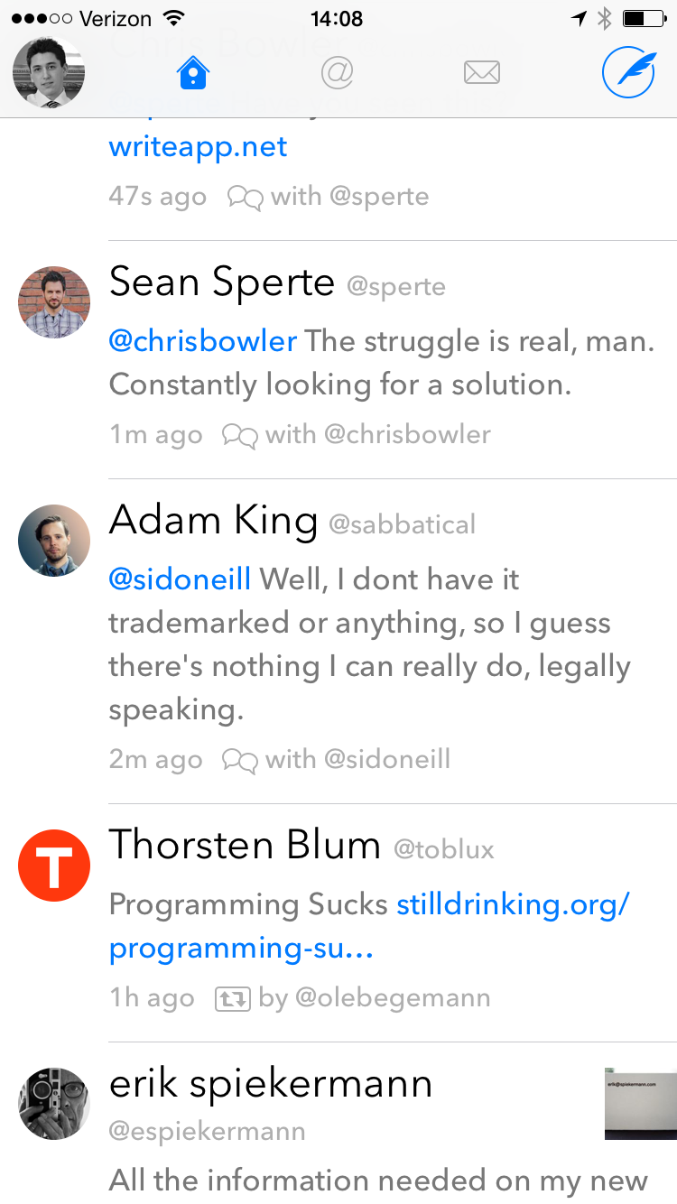
And this historical iPhone app design trend, of navigation at the top, makes using apps on the iPhones 6 ridiculous. Take an app like Twitterrific, recently updated for the iPhones 6, and you can see the entire app navigation interface is pinned to the top. I can already tell you, this does not work for users.
I don’t blame Twitterrific, they haven’t had much time to play with the devices either, but it is still a major usability issue.
Solutions


Apple seems to think the they solved this with the introduction of the ‘universal’ swipe to go back action, but sorry — no — that doesn’t solve this. It’s a handy action, and sublime feeling on the iPhone 6, but you can’t seperate Timeline and Mentions like that, or can you?
Take a look at Blixt, for App.net. No menus, all swiping, and it works pretty damned well on the iPhone 6 (despite not being optimized for it). Or take Unread, again menus, settings, quick menus, and different views, but all swiping and tapping in the center of the screen not at the top.
Both of those apps work exceedingly well, and I think they both point to how apps are going to have to be designed for these larger screened devices.
The Bottom
Of course the simple solution would be navigation at the bottom of the screen, but I think that too is a poor solution as it is too prone to accidental taps when reaching for the home button. Likewise, only the bottom corners opposite your hand are very reachable with one-handed use.
I think placing navigation at the bottom is more of a hack than a solution.
Not Easy
Non-obvious navigation, like in the above mentioned apps, is problematic for user familiarity and learning, but I am struggling to come up with a better solution that takes into account larger screen sizes.
What is clear, at this point, is that the current design trends in iOS apps doesn’t scale well to larger screens.