There was a recent update to Slack for iOS and it said it paid special attention to the iPhone 6 and 6 plus. This is of particular importance to me because I am a 6 plus user and Slack is my most used iPhone app. Upon opening the app I didn’t notice much, but then I swiped to switch channels.
Woah, they made that wider, now it’s easier to select new channels one handed with my right hand. Sweet!
And then, since I’m left handed, I switched my iPhone to my left hand and saw the problem.
Take a look:
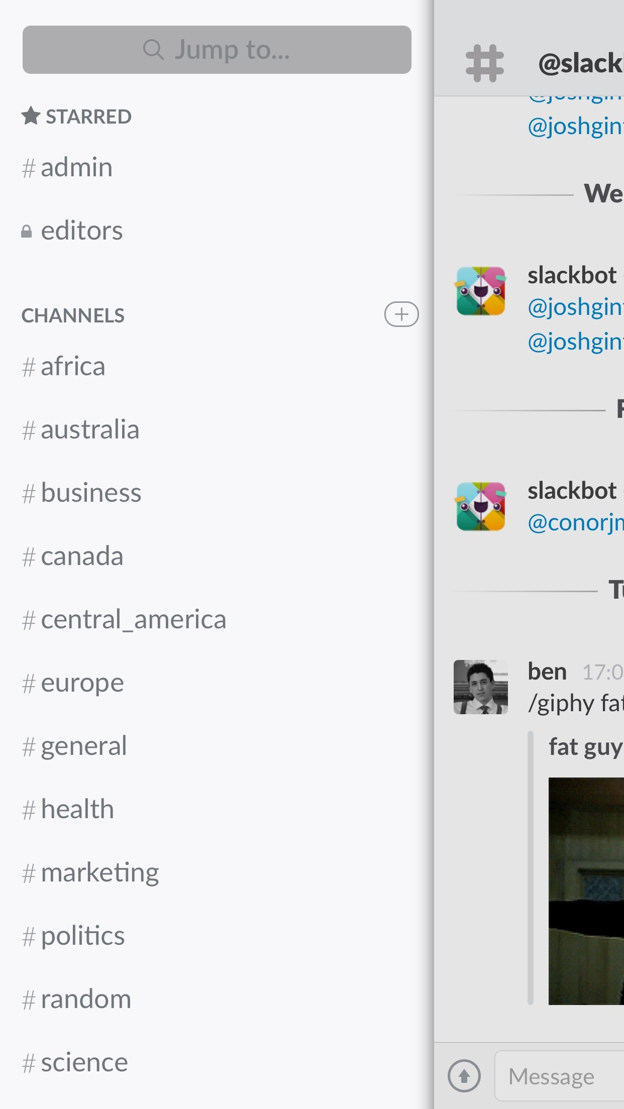
You see that? It appears the channel switcher is weighted to right thumb users because the top layer now slides disproportionately to the right edge of the screen. Because what was easily reachable left handed is now difficult for left handers, but easy for right handers. ((Yes most of the world is right handed, but I don’t think handedness should dictate design in this case.)) I have no clue what Slack’s decision looked like for this, so this is all speculation on my part.
What I see, as a user, when something like this pops up is a lack of thought. Instead of thinking through a hard problem, I see a quick fix that “works for us”. It could be no left handed users tested it. Or it could be that they did and thought it was fine.
I don’t know. And it doesn’t matter in the long run. The final decision still feels to me like a quick fix and not a well thought out solution.
Testing things all the possible ways it could be used is a huge pain in the ass and not possible. But, in this case, instead of this being a great update for me, it made the app worse in the end. And I hope that wasn’t intentional, and doubt it was. But it still happened and feels poorly thought out.