The wait is over.
Maybe you weren’t waiting, but I’ve been waiting for this day for a long time. And most Ulysses users have been waiting for this day for quite some time as well.
Today my favorite writing app, Ulysses III (now renamed to just Ulysses and shipping alongside an updated Mac app), gets a full blown iPad app. Gone are the days of syncing your Ulysses documents through Daedalus Touch (no one will miss that).
I’ve personally been nagging, bribing, and pleading with The Soulmen to get a beta version for what feels like years (probably for them too) and I about had a heart attack when they finally told me that it was time.
When that beta invite arrived in my inbox I was scared. What if it sucked? After all that anticipation, it could be really bad and then what?
Sometimes wanting is better than having, as my parents so often told me.
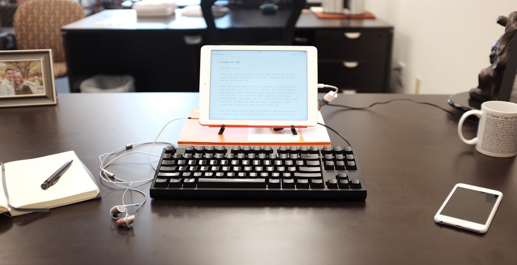
Thankfully, that’s not the case here. Ulysses for iPad might be even better than the Mac version, which is blasphemous to write, I know, but after spending so much time with the app it doesn’t feel like that much of a stretch to say that Ulysses for iPad is the canonical version of Ulysses.
Let me first tell you what Ulysses for iPad is not: a dumbed down version of Ulysses for Mac. This is an app that had creators who early on decided: we are bringing Ulysses to the iPad, and we are doing that because the iPad is on the same playing field as the Mac, not because it would be nice to have a companion app. There is simply no dumbing down of anything here, which is hugely refreshing and works incredibly well.
The app looks and feels the same as the Mac version. It iClouds over your files, themes, and folder structures. Your tags, your attachments, your document notes. Everything is where and how it should be right from the get go. (And it’s even better than before, but I will get to that in a bit.)
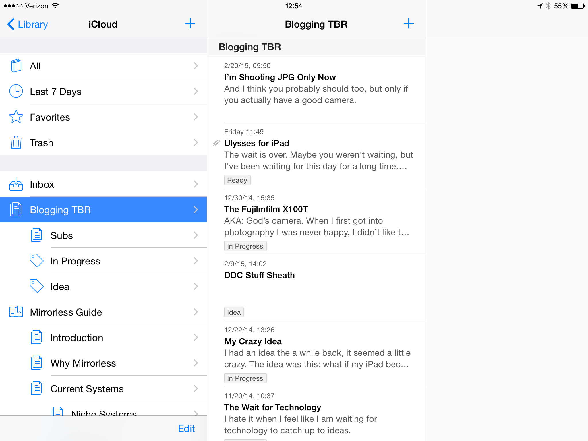
I truly, love this app. It’s like no other that I have used on the iPad. Whereas there have always been simple writing apps, or overly powerful ones, there was always something missing with each of those apps, something that told me I was having a lesser experience either by design, or because of my device I chose to write on.
Editorial is amazing, but for purely writing it isn’t great unless you keep all your writing in its Dropbox folder. Writer Pro, Byword are fantastic apps, but my words feel trapped in them. They feel like a typewriter, and I don’t want just a typewriter.
With Ulysses, I have finally found an app that truly gets out of my way, that hides all the powerful features behind closed doors, until such time I am ready for them. The same is true with this version of Ulysses for iPad. Yes, there’s a tool bar that allows you to do any manner of things quickly, but it’s unobtrusive. It doesn’t nag.
Maybe that’s the slogan for this app: “it doesn’t nag, it allows you to just write and publish.”
And when you are done writing, what then? Jump back to the Mac to export? I think not. I’ve not used a single app on the iPad which has allowed me to write in bliss, and then export in HTML, ePub(!), PDF(!), .md, or RTF. It’s a feat of magic. I can tweak the style and the look in the app and preview it all. A wondrous thing for any writer.
The magic of Ulysses has always been that it is wonderful to write and organize in, but that the app also understands that more needs to be done with your text once you are done adding characters to it. The work isn’t done just because you are done composing, that was just a step in the process of writing — and Ulysses truly understands the process.
That’s really the killer feature here. Yes, publish to a blog is missing — that slowly kills me — but at the same time this app is nearly identical to the Mac version and its copied those features over in a way that feels natural on the iPad.
The only difference I’ve noticed between this version and the Mac version is the device which it runs on. And that device is my favorite device.
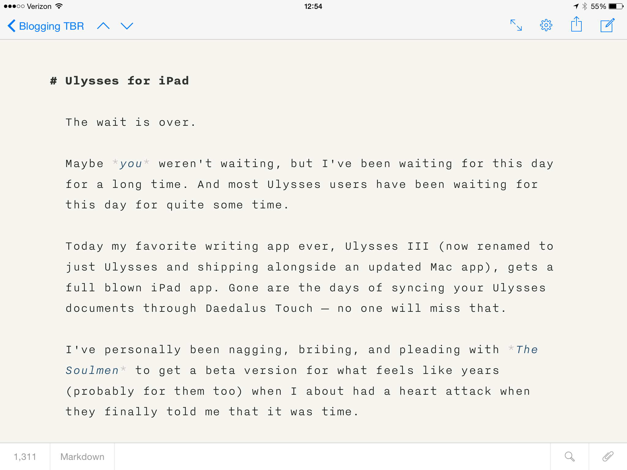
And just being on the iPad makes Ulysses better. Better because the iPad is a better writing device, by the iPad’s very nature writing on the it is less distracting — and since getting the first beta of Ulysses for iPad I have written more than 70% of my work on just the iPad version. Typically I publish longform, image laden, posts directly from my iPad having only used Ulysses and Editorial to write and then publish the post. That’s actually less complex than how I write on the Mac.
Themes and Styles
Thus far I have been touting that there is no difference between the Mac version and the iPad version, but there is one small difference: you cannot edit/create new themes or export styles on the iPad, as you can on the Mac. This is pretty minor if you ask me, and something that is even a bit complex on the Mac to begin with.
That said, your custom themes and style do sync over from the Mac. And, even better, you can directly install news ones from the Ulysses Style Exchange on your iPad with no Mac needed. So while you can’t get very clever customization you can still get new themes/styles and even sync them back and forth.
To be honest I’ve yet to create anything other than a custom theme for Ulysses, so the Style Exchange is far more important to me.
Typing on the iPad
In the promo video for the app, the teaser video, a bunch of people are shown typing on iPads in portrait. A fact I teased The Soulmen about, because who does that, right? Turns out, now that I have Ulysses on my iPad, I tend to type in portrait — a lot.
Who would have guessed?
As it turns out Ulysses pairs fantastically well with the iPad keyboard. Whether using the on screen keyboard or one of my many external keyboard options, I’ve found pure joy typing in Ulysses. I’ve always been a huge proponent of the iPad on screen keyboard, because if you take the time to get used to it you have a fantastic keyboard on hand at all times.
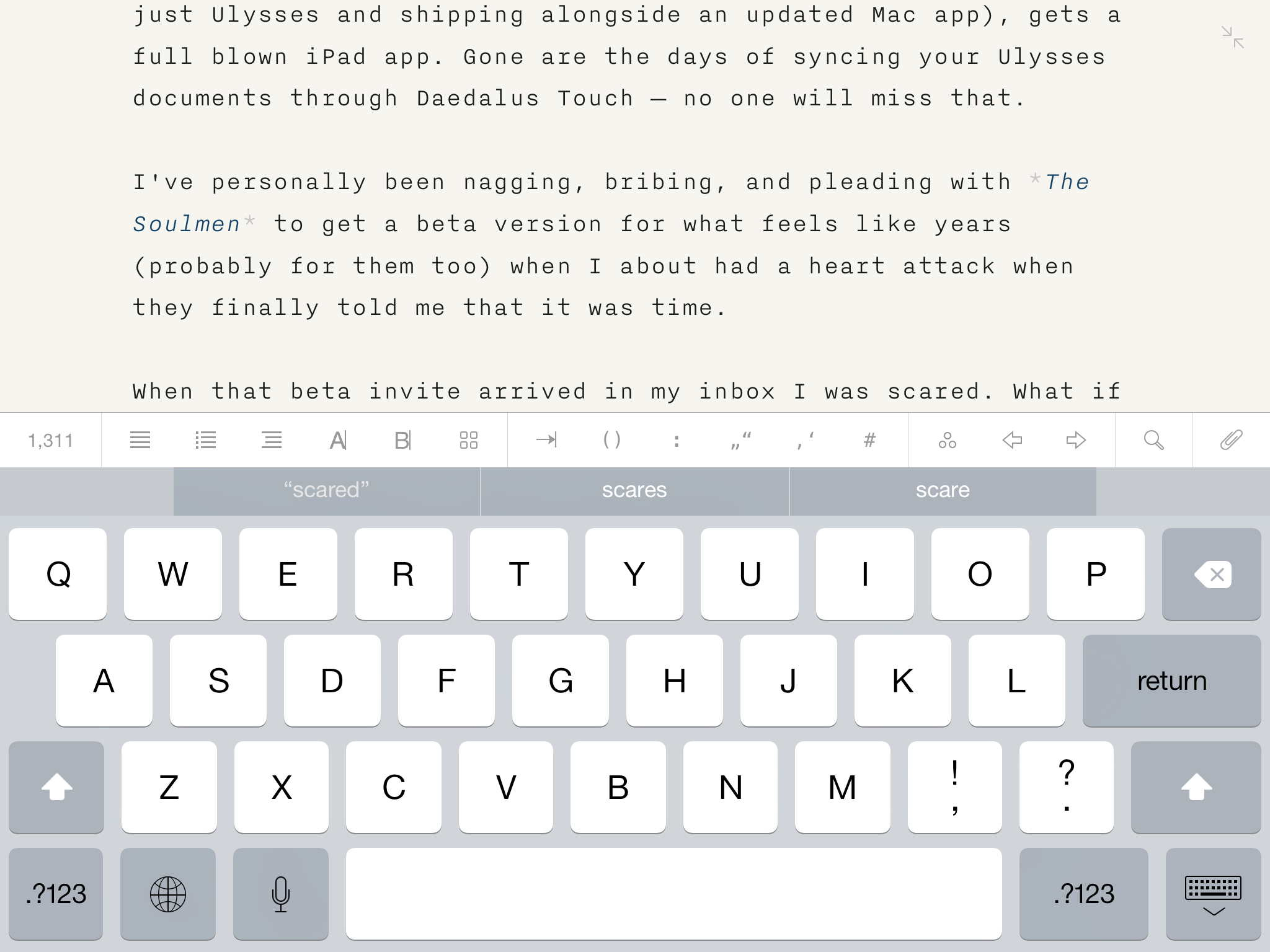
However, with Ulysses, I’ve found an even greater reason to find the perfect hardware keyboard to compliment my iPad: because now I want to do all my writing on my iPad.
A Few Nitpicks
1
My biggest Ulysses nitpick remains: I have some great options for publishing my prose in the app — except publishing to a blog. And that’s what I do with my text 98% of the time. It’s a shame this isn’t there, as it is probably one of the best features of Byword.
2
When you go to export Markdown it is in plain text and not stylized for preview at all. Essentially the editor is a better Markdown preview than the export Markdown preview option, and I find that odd. Now you can switch to HTML and things get very pretty for a very nice preview. Just an odd thing with the app.
3
Ok my last nit: the text is too small in portrait. Yes I can adjust that, but I’d like two toggles: typing on screen in portrait, and typing with a keyboard in portrait. The latter of which would have a larger type size set. A minor thing, but it would make the app seamless.
The Icon
There used to be a time on this blog when I wouldn’t end any review without talking about the icon for the app — and if it were blue the world would end. I’ve mostly given up on this, but since Ulysses made a drastic change to the icon I thought it was worth mentioning.
Here’s the icons for the Mac and iPad app:
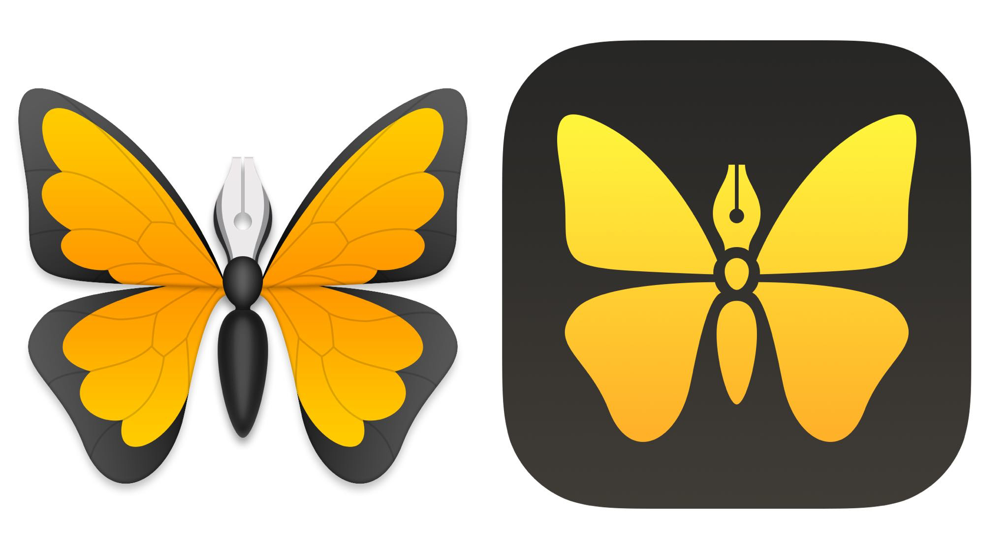
It is quite a change from the candy-glossed-style U that used to grace the app. I’m a big fan of the iPad version of the icon, but still haven’t gotten used to the Mac version of it. Overall I like the icon, but it is quite a departure.
(I’m glad they kept that orange/yellow color though, that’s a great color.)
I asked Max Seeleman of The Soulmen if he could shed some light on the new icon:
Ben: I’ll be the first to admit I haven’t read Ulysses, so knowing that, can you share where the butterfly came from?
Max: For a starter it can’t hurt to know some history: Ulysses – the app – was named after Ulysses – the book – by James Joyce, a novel considered one of the greatest of the 20th century. That book was named after the ancient Greek hero Ulysses (or Odysseus) as both describe an … odyssey. With that analogy in mind, we designed the old icon to have the “U” shape while resembling a ancient harp. That was nice icon and it had a very rememberable shape. But we’ve had that 12 years now and to be honest it didn’t make clear Ulysses is a writing app.
Out with the old, in with the new, we looked for other things called Ulysses. Besides the spaceship, a few songs and a TV series – all of which are difficult analogies for a writing app – there’s mostly just a butterfly left, the Papilio Ulysses. And that did fare quite well.
One of the main concerns was that the icon should be based on a glyph. We wanted it to have a shape that, when printed black on white, was still recognizable. We started out with the idea of an origami butterfly, but had to find that it wasn’t strong enough.
Then Marcus came up with the idea of a “pen” body. At first we found it cheesy, then we started to like it. After a few sketches, several design revisions and lots of talk, we had a glyph of a butterfly with a pen body. A flying pen making writing so easy. Our Papilio Ulysses – albeit in orange not blue.
Ben: While the shape of the iPad and Mac icons are similar, they are different icons. The Mac having more texture, and detail — while the iPad getting a more simplistic look. What drove those differences?
Max: Mac and iOS are different platforms that have different icon constraints. Especially since the iOS 7 redesign, much more than a gradient and a shape would look out of place as an iOS app icon. That’s also one of the main reasons we started by designing the icon glyph first and only when we were satisfied making it into the actual icon.
Mac is a different story: The easy (and our my opinion ugly) way would have been to take the iOS icon and just put a circle around it – done. Apple does that, it’s okay for them, but I’d argue barely for anybody else. While Mac icons did get simpler with Yosemite, they are still permitted to show detail and have much more structure than on iOS. So we did just that, add some structure and make it look nice.
Final Praise
I write more and fiddle less on my iPad — and I enjoy the writing experience because I have a powerful app to write in. Ulysses removes most friction. I don’t know what app I am writing in while I am writing, and that’s how it should be, likewise when I am exporting I know exactly what app I am in — as I should.
Yes, there is a fancy bar for formatting. Yes themes, yes fonts, exporting, dark mode, and full screen. But at the heart of this is an app that works the way I want it to work and which, at the same time, houses all of my writing without any clutter.
It’s the best journal, word processor, writing, distraction free, note taking, zen app I have on my iPad. I could easily use it for all text based input, and I just may.
I’ll give you the best writing tip I can:
- Open a document in Ulysses for iPad
- Swipe up to get control center and enter DND mode.
- Write
Welcome to bliss. ((Now where’s the iPhone app? I’m told the icon will be the same.))