If you use iOS then you’ve likely run into the most annoying part of iOS: the terrible shift key. It’s so bad it has a dedicated website to helping you understand if shift is on, or off.
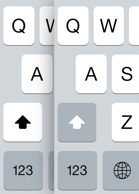
Aesthetically the key works as it blends nicely with the look and feel of the keyboard, but from a usability perspective it is a miserable failure. Now Apple isn’t alone, there’s another offender I recently found for public flogging: Skype on the iPhone.
Here’s the mute button on Skype for iPhone:

The button is white when it is on, but do you notice the icon? It has a slash through the mic when the button is off. The amount of times I look at that and assume the mic if muted is insane.
Now, Skype has already solved this issue because the button is clear on the iPad:

Here when the mic is muted it has a slash through the button, and when it is not muted, no slash. Very clear.
It’s amazing to me that the same app can be so clear on one (or more) platforms and such shit on the iPhone. But such is life. When you have to design for “flat” that means color and iconography become the language which you must express button state — and that’s a problem if you don’t think through what each state is saying.
Hand your app to someone who has never seen it, and ask them what each button does and means, you’ll get less one star reviews if you make it clear to people who have never used your app.
While We are on the Subject
While I am on the subject of silly stuff in iOS, what the hell is this about:
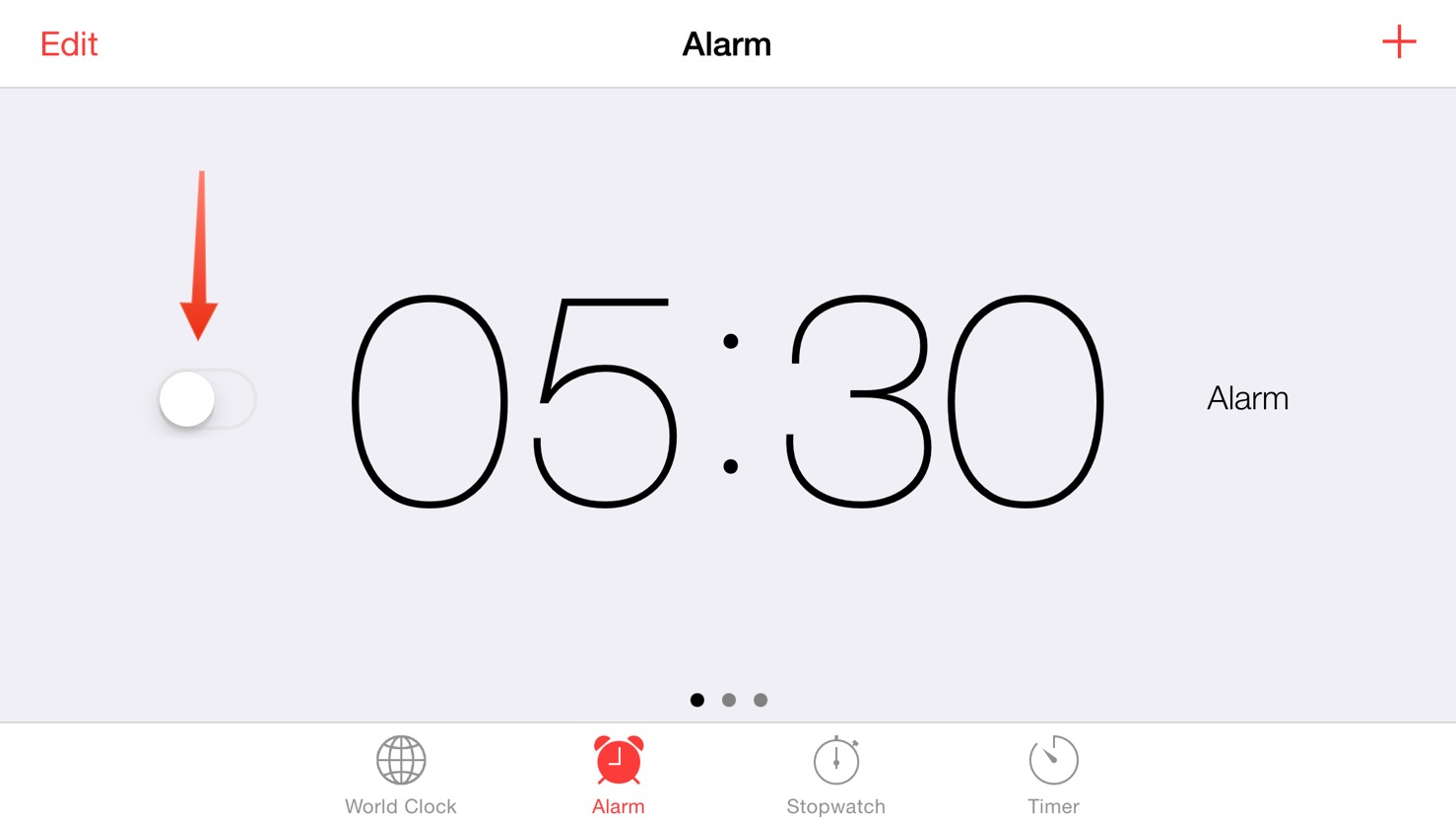
Seriously, is this just where Xcode auto moves the button to, because I find it hard to believe someone chose to put a button toggle right there in no mans land.
One more, what about this badge:
![]()
Why hasn’t that been fixed?
Anyways
The point of this whole post is this: if you can’t explain in one short sentence what an on and off button state looks like, then perhaps your button states are confusing and need to be rethought. Perhaps.