Category: Articles

  • Google+ and “Privacy”

    [Lukas Mathis on Google+](http://ignorethecode.net/blog/2011/07/07/oliver_reichenstein_on_googleplus/):
    >To me, it feels as if Facebook is constantly trying to trick me into doing things that are good for Facebook’s bottom line, but bad for me.

    and later:

    >Perhaps most importantly, Google+ handles privacy in a prominent and intuitive way.

    In fairness Mathis is likely talking about privacy between users, not privacy between users and the service provider (Google in this case).

    However, the latter case of privacy is far more important and is identical between Facebook and Google: in both cases, you the user, is the product that the company is selling.

    As far as Google+’s [privacy policy](https://www.google.com/intl/en-US/+/policy/):

    >We will record information about your activity – such as posts you comment on and the other users with whom you interact – in order to provide you and other users with a better experience on Google services.

    That’s the same stuff they use in the normal privacy policy language, and correct me if I am wrong, but the number one Google “service” is targeted advertising. I’m not so stupid to accuse Google of handing over your information to advertisers — that’d be a bad business move by Google (they want to own that information) — but certainly Google+ is a fantastic way to serve even more targeted ads to users (even if those ads never appear on Google+ itself).

    Yes, call me paranoid, but [Gruber’s right](http://daringfireball.net/linked/2011/07/05/bray-google-plus) — Google wants Google+ to be huge, because it is the fastest and most accurate way to better target advertising — of which it makes billions off of doing — not because they want to compete with Facebook.

  • The “Cloud” and “Privacy”

    *This is a reminder.*

    Unrealistic expectations: I think that is probably the best way to describe the general ‘internet communities’ take on Dropbox and the privacy/security woes the company has been facing. I know this to be the case because the fastest way to be the #1 story on the web right now, would be to post about how your entire life was ruined by any security lapse or overreaching policy that Dropbox has.

    “Man has entire life savings wiped out from security lapse at Dropbox.”

    “Women faces lawsuit after incriminating data turned over by Dropbox.”

    Normally it would be fair to say any and all of the following about me:

    1. Picky
    2. Paranoid
    3. Pessimistic

    However in the case of Dropbox I am not paranoid, nor am I pessimistic about their future. I think the biggest problem that Dropbox faces is user education.

    Companies really need to start hitting users over the head with the following information:

    – Bad things happen to good people and good companies. Once the data is out of your control, it is indeed out of your control — be vigilant about what data you let out of your control.
    – In the U.S. the government can and will seize your data through the use of the legal system. U.S. companies **must** comply with this, but you only need be concerned if your are doing something shady. ((Because of that ‘innocent until proven guilty’ thing we got going on I am going with shady instead of illegal.))

    ### Smart Usage

    I took a look through everything that I keep in Dropbox yesterday and I determined that, of all the files I keep there the most sensitive ones are financial files for iBank. These files don’t contain bank account numbers (they could, but I choose not to) so essentially you would just get to see how much money I make and how much *more* money I spend if you hacked into my Dropbox account.

    That is, yesterday you could potentially have seen that data.

    In about 5 minutes I created a few encrypted DMGs with the password saved on my Mac. That adds one extra step (opening the DMG) when I do weekly accounting, yet that one tiny step secured everything “sensitive”.

    Sure, I don’t *want* everything in my Dropbox folder to be public, but if it was to get exposed it certainly wouldn’t amount to anything more than a really bad day.

    With any “cloud” service you run the risk of your data being seen by someone other than you — it doesn’t matter which company is providing the service — this can and will happen.

    If you accept this inherent risk, and you use the services accordingly, there is nothing to fear. So stop freaking out about Dropbox and it’s security — either accept the risks or don’t use the service.

    ### Pondering a Way for a Better Security System by a Guy Who Knows Nothing About Security or Programming

    If you take Dropbox and how it currently works, say you ditch the website version. Once you ditch the website, Dropbox itself (as an entity) has no need to know which files are yours and where those files are, only your computers need to know that information.

    It would be like a giant pool of those gross plastic balls that kids “swim” around in, only each ball is owned by a different person. Each person has marked the balls that they own in a unique way, but only the person that marked the ball knows what the mark is theirs. Thus an individual can find the balls that they own, but no one else would know that those balls belong to them and since all balls look the same, well you get the point.

    Of course the whole thing is kept in a locked cage to keep out puzzle solvers.

    This is security by obfuscation. If you couple this type of routine with what Dropbox [is doing](https://www.dropbox.com/privacy#security), then you have a system that becomes exponentially more useless to would be attackers. That is, you could see my financial “data” above (again without the account numbers) but you wouldn’t have much of a way to attach that data to me.

    This also significantly makes government seizure a more difficult process — if Dropbox literally doesn’t know where, or what is, my data then how could they possibly hand it over?

    No system is going to be perfect, so remember that when iCloud launches.

  • Review: Keyboard Maestro 5

    Peter N Lewis, the creator of my favorite Mac app, Keyboard Maestro, sent me an email — I thought it was just one of the newsletter emails, then I read it — an invite to test out [Keyboard Maestro 5.](http://www.keyboardmaestro.com/main/)

    At this moment the heavens opened up and the sun shown on me brightly through the Seattle rain. Why do I tell you this: so that you, the reader, know that this review is written by a huge Keyboard Maestro fanboy — HUGE.

    ### What the Hell Does it Do?

    I really, truly, struggle to define what Keyboard Maestro (‘KM’) does for most computer users. Simply put, it makes my life very easy. It isn’t a tool for the ‘average’ user, it is a tool for people who don’t like repetition, a tool for people who want speed. There’s a learning curve to the app, but it’s not insurmountable.

    If I find myself doing the same repetitive task over and over, there stands a good chance that I can automate that action with KM, saving me a lot of time. You can do so much more though, that even such a miraculous sounding statement is not doing KM justice. Best just to tell you some of the things that I use KM for.

    #### My Uses:

    – Snap a screenshot using Acorn instead of the Mac’s built in tools.
    – Append a date to file names.
    – Set a click delay on the mouse so I can walk to the printer and load envelopes, then the print button is clicked.
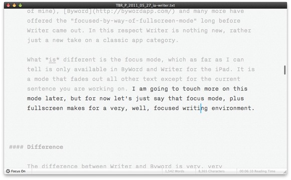
    – [Create a ‘focus mode’ for TextMate](https://brooksreview.net/2011/05/km-tricks/).
    – Connect to a WebDAV server via keyboard in Finder.
    – [Launch Transmit with a shortcut and login to a desired favorite](https://brooksreview.net/2011/05/km-tricks/).
    – Mail the currently selected file with a specific email account (more on this later).
    – Launch various AppleScripts with keyboard shortcuts.
    – [Move selected files to a ‘To Archive’ folder](https://brooksreview.net/2010/12/keyboard-maestro/).
    – Create a new (from anywhere):
    – Blog Post
    – Email
    – iA Writer Document
    – Note
    – OmniOutliner Document
    – TextMate Document
    – Tweet
    – Check OmniFocus at certain times for unprocessed items in the ‘inbox’.
    – [Open my most used apps while closing windows of apps I don’t want to see after they are open](https://brooksreview.net/2010/12/keyboard-maestro/).
    – Paste current clipboard in plain text.
    – Running various Automator workflows with a keyboard shortcut.
    – [Super Quit](https://brooksreview.net/2010/12/keyboard-maestro/) (quits all open applications).
    – [Open Terminal and SSH into my servers](https://brooksreview.net/2011/05/km-tricks/).
    – [Create a Markdown style link from any app just like MarsEdit does](https://brooksreview.net/2011/03/mad-links-km/).
    – Center Reeder every time I switch to it.
    – Create a link blog post (more on this in a bit).
    – Grab current Safari URL and add it to the clipboard as a markdown formatted link with current window title as the linked text.
    – Create a quote blog.
    – Resize my Safari window to my preferred size.
    – [Move Twitter for Mac back to the perfect location on my screen](https://brooksreview.net/2011/05/km-tricks/) (I am forever accidentally moving that window).
    – Send current Writer document to TextMate for posting.

    That’s 30 things that I use KM for almost everyday and it’s not even all the macros that I have set up. It is crazy to think how much tedious work this program has saved me and I am forever thankful for it.

    ### KM 5

    With the release of [Keyboard Maestro 5](http://www.keyboardmaestro.com/main/) the software gains the following very awesome features (only the highlights as I see them):

    – Control Flow
    – Variables
    – Calculations
    – Undo-Redo

    If you aren’t a KM junkie that list may seem pretty underwhelming, but I assure you that the second item on that list is huge for KM and that is what I want to talk about the most. (The others are excellent features, but I haven’t found good uses for them just yet and I didn’t want to reach to find a use for them just to write about.)

    #### Variables

    For me the biggest addition is variables, which allows you to ask the user for input and output it in specific areas without having to rely on clipboard history. Meaning that making more complex macros just got a whole lot easier.

    Best just to show an example workflow. I mentioned above that I use KM to post linked posts to this blog, [here’s how I did it in the past](https://brooksreview.net/2011/03/cmd-one/) — now the process is much more automated. Here’s the process:

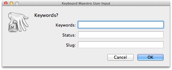
    The key here is the variables, which as I have them implemented present dialogs like this:


    When it is all said and done I get a TextMate document that looks like this:

    [](https://f3a98a5aca88d28ed629-2f664c0697d743fb9a738111ab4002bd.ssl.cf1.rackcdn.com/km-post.jpg)

    Pretty neat, right? I was able to do this before, but I had to click around and fill out the different ‘fields’ in TextMate, now all I need to to is add my comments and publish.

    ### Workflow, Mastered

    The way I like to think about Keyboard Maestro is that it is a way for me to master my workflow — to command it — so it doesn’t command me.

    Keyboard Maestro makes your computer work for you, not the other way around. It is one of the five best apps I have ever used on my Mac, hell on any device period. It is that good — be warned though, there is a learning curve with this software, but I believe the payoff is well worth the time spent getting to learn it. KM 5 also comes with a library of macros to get new users started.

    ### Learning, or How to Think About Macros

    Showing you everything that I do isn’t likely to be that helpful to you — we all work differently. I show you my workflows and tell you about things that I do in hopes that I will be able to spark an idea of how you could use KM — there is more than one way to do things.

    When I start to set up a new macro in KM here is how I work through getting the macro set up (I share this to help, if I can, you get going with KM):

    1. Defining the end result that I want to achieve. (e.g. Creating a TextMate document formatted the way I want to be, pre-populated with certain information.)
    2. Next I work through the steps that I would have to manually take to do this, noting along the way the areas that I would want to enter in specific data. (e.g. A file name or date.)
    3. I then set up the new macro in KM starting with a name and hotkey. This is done so that I an can quickly test the macro as I go along.
    4. Next I start to try and replicate each step in KM using the provided actions.
    5. If I can’t do something with the actions KM gives me I go into the app I am interacting with (e.g. TextMate) and see if there is a menu item, or something that I provided that I can call on.
    6. If I am still short on an action I move to Automator to see if it can do what I want.
    7. Still having problems? Time to look for solutions via AppleScripting on DuckDuckGo.
    8. Still issues? Time to dive into the command line and shell scripts.
    9. Button it all up.

    That’s less than ten steps that will take a look of planning, but hopefully pay off in spades. There has only ever been a few things that I couldn’t get accomplished with KM, kudos on version 5 — it is a great step forward.

    [Go get it](http://www.keyboardmaestro.com/main/), it’s $36 for new users or an $18 upgrade for current users.

  • The HP Camry

    I was actually hoping that this would be a great tablet, alas that doesn’t seem to be the case.

    [Joshua Topolsky](http://thisismynext.com/2011/06/29/hp-touchpad-review/):

    >Hardware quality feels cheap
    >Developer support is thin right now

    [Tim Stevens](http://www.engadget.com/2011/06/29/hp-touchpad-review/):

    >The shortage of apps is a problem, no doubt, but that will change with time. What won’t change is the hardware, and there we’re left a little disappointed.

    [Jason Snell](http://www.macworld.com/article/160858/2011/06/hp_touchpad_first_look.html):

    >If it can get developers engaged in its platform and iron out all the bugs while also growing webOS as a smartphone operating system, it might really have something here.

    [John Biggs](http://www.crunchgear.com/2011/06/29/review-the-hp-palm-touchpad/):
    >Fingerprints and scratches galore. Get a case when you get the TouchPad. It needs one.
    >WebOS is amazing, but I worry its features aren’t being done justice with the paucity of apps.

    [Walt Mossberg](http://allthingsd.com/20110629/touchpad-needs-more-apps-reboot-to-rival-ipad/):
    >But the tablet’s hardware is bulbous and heavy compared with the iPad 2 or the svelte Samsung Galaxy Tab 10.1, an Android tablet.

    I intentionally only pulled out the parts talking about the apps for the TouchPad and the hardware of the device. The reason being: those are the two elements that make the iPad *the* iPad. Yes, iOS is a very nice operating system, but so is WebOS.

    Let’s pull cars back into this analogy. The reason I was looking purely at third party app comments and hardware quality is because that is the difference between a Camaro and a Ferrari — both sports cars, but hardly comparable. Where as the difference between WebOS and iOS (all other things like hardware and apps being equal) is akin to the difference between a Ferrari and a Lamborghini — now the little things really matter. ((Clearly the Ferrari is the choice a discerning reader would make, however someone who wants to live on the edge of losing control could make the case for the Lambo.))

    The OS on these devices is only really going to shine when you have two really equal competitors. From the sound of it, HP made themselves a lovely Camry.

  • Google + (-Me)

    As the title states, I won’t be joining Google’s [new social network](http://www.google.com/intl/en/+/demo/) any time soon. I wasn’t even going to post about it, until I started to get people asking me about it. I have two problems with Google +:

    1. It’s made by Google.
    2. I don’t trust Google.

    That is: I don’t trust Google with my private info, unless the offering is so compelling that it would be detrimental to me to not use their offering. (That’s why I use Google Reader and Google Analytics, but not Gmail.)

    [Dave Winer on Google +](http://scripting.com/stories/2011/06/28/googleYawn.html):

    >Products like the one Google just announced are hatched at off-sites at resorts near Monterey or in the Sierra, and were designed to meet the needs of the corporation that created it. A huge scared angry corporation.

    If you don’t believe what Winer is saying, then take this passage from Steven Levy, [writing for Wired.com](http://www.wired.com/epicenter/2011/06/inside-google-plus-social/all/1):

    >And after Page formally took the CEO title, he reportedly mandated that 25 percent of the annual bonus check for all Google employees would be dependent on how well the company does in its social efforts.

    They didn’t create Google + because they thought they could do social better, they created it because they *need* to be in the social game and to be in the social game, they must do it better.

    I am not saying that Google + is bad, but I can tell you that it will be an uphill battle for it to succeed, it must not only beat out Facebook, but Twitter too. I fear though that it will suffer the same fate of Google Wave after reading [this](http://googleblog.blogspot.com/2011/06/introducing-google-project-real-life.html):

    >Coordinating with friends and family in real-time is really hard in real life. After all, everyone’s on different schedules, in different places, and plans can change at any moment. Phone calls and text messages can work in a pinch, but they’re not quite right for getting the gang together. So Google+ includes Huddle, a group messaging experience that lets everyone inside the circle know what’s going on, right this second.

    That sounds killer, but it doesn’t work unless your entire family is on the “+” and that they actually use “+”.

    Earlier today I posted this quote from [Tom Coates](http://twitter.com/#!/tomcoates/status/85782655769116674):

    >Fundamentally, Google is a utility. No one wants to hang out at their power company.

    What I think Coates is saying here, and the way that I read it, is that Google is a dumb pipe, not a hip club. Facebook and Twitter are hip clubs, not Google.

    How do you become a hip club?

    From everything I read Google has done one major thing right — they made the tool easy to use, [MG Siegler](http://techcrunch.com/2011/06/29/google-plus-is-actually-pretty-good/):

    >Overall, it took me about 15 minutes to get fairly comfortable with all the major elements of the Google+ system. That’s good, especially given how much you can do. At first, it seemed a bit overwhelming, but the concepts are actually pretty easy to learn once you experiment and understand how things work.

    That was not the case with Google Wave, which I never really figured out. It is also likely a problem for new Facebook users, and is a huge problem for new Twitter users.

    Twitter suffers from ambiguity — it is only what you make of it. Facebook suffers from confusion from feature creep: what does it mean to be a fan, what do all these privacy toggles mean, what is right?

    Google wins by eliminating these problems.

    ### In the End

    At the end of the day I just don’t see this being the savor that Google is looking for, it’s the Motorola Droid to Apple’s iPhone. A good, solid offering, but it’s not an iPhone.

    Dave Winer in a [follow-up post](http://scripting.com/stories/2011/06/29/pagesMistake.html) to his passage above:

    >Forget about dipping your big toe in to get a sense of the temperature. These are the advantages of the upstart, when they’re starting. People have responded to yesterday’s piece by saying basically that Facebook can’t rip up the pavement any more than Google can. True. But their innovation is done. Now they’re reaping the rewards.

    This is exactly what we are seeing now with iPad competitors, they are dipping their toes in the water — they aren’t feature complete. They are a competitor to *last years* iPad, not this years.

    This is what Google + feels like, a competitor to social networks of last year, not now. Twitter isn’t my only social network, Instagram is another that I use, ditto Gowalla.

    Google + could be around for ages, but I doubt it will ever gain the traction it needs to be a true force in social. Even if it does, will it ever become compelling enough for a guy like me?

    Doubtful.

  • Review: Moom

    The one feature that Mac users seem to be clamoring for that their Windows brethren have is that ability to ‘snap’ windows to half the screen. There are a ton of apps for the Mac that seek to provide this functionality, tools like [Divvy](http://mizage.com/divvy/) and [SizeUp](http://irradiatedsoftware.com/sizeup/). Recently I stumbled across another app of this breed called: [Moom](http://manytricks.com/moom/).

    Aside from the name, I quite like Moom.

    Size Up is not a tool I enjoy using, because while I am a keyboard junkie, even I can’t remember all the shortcuts for that app. I do however like that it can “remember” the last size of the window. Divvy is very nice but again it never was something that I really liked using and quickly passed on.

    In truth, I rarely need a tool for managing the size and positions of windows on my Mac. It is something that I rarely change and can easily do “manually” or if I want it to be a constant I will make a Macro for it in Keyboard Maestro.

    Moom however, does something really incredible: it makes use of that stupid, pointless, irritating, inconsistent, green plus button found at the top of most windows on the Mac. You see, with Moom hovering over that green button presents you with options for how you want to manipulate the window. Imagine that.

    It’s actually kind of amazing that Apple doesn’t just build this in, because it *is* pretty slick.

    ### Features

    With Moom the hover allows you to manipulate the window in the following ways:

    – Full Screen (for you switchers)
    – Move & Zoom to left half of screen.
    – Same thing on right.
    – Move & Zoom to top half of screen.
    – Same but for bottom of screen.

    Once you have manipulated the window with Moom you can hover again and revert back to the original dimensions of the window — without this feature these utilities aren’t worth using.

    These features alone are pretty sweet and well worth the $5 price tag. But Moom also allows you to set up some custom controls that appear in the menu, my favorites of which are: send window to another screen and proportionally resize it, and centering the window on screen.

    It’s hard not to like Moom, it is $5 when the two competitors listed above are $14 and $13 respectively. Oh, and you can set some keyboard shortcuts if you are good at remembering thousands of those.

    Now, you can try Moom for up to 100 times for free, or buy it and it comes with a generous 60-day money-back guarantee (which is kind of amazing for such an inexpensive app). This tool is not for everyone and honestly I rarely use it, but I love it for the very fact that it makes the green plus button useful.

    **Pro Tip:** Set the app to run faceless in the preferences.

  • Some 1Password Follow-up

    I kind of had a feeling that [this post yesterday](https://brooksreview.net/2011/06/jb-password/) would ruffle some feathers, but I never shy away from posting something I feel strongly about. A lot of the responses that I received revolved around these arguments:

    1. Not using something doesn’t make you an idiot.
    2. You can make secure passwords without 1Password.
    3. Not many people use it, so is everyone and idiot?
    4. I keep nothing important online, therefore I don’t need it.

    Arguments 1 and 2 are valid points. However in this case, with the pending doom from hackers, you really need to be using highly secure passwords — passwords that resemble something like: `F3)NqfPD^rgdMfz9t89Du=VXEojTg`. That is an average length and complexity for my passwords and I don’t know about you, but I can’t remember that password without help — and Post-It notes defeat the purpose of passwords.

    Not using 1Password is a lot like using a rope with a really *good* knot to secure your bike instead of a bike lock. Sure a lot of people won’t bother your bike or try to untie the knot, but it is undeniable that the bike lock is far more secure. The weakest point should never be the thing that you are in control of (in the bike case you can’t control how strong your bike frame is, but you can control what you lock it with).

    Argument 3 is just ridiculous, I prefer to think most just aren’t aware of tools like 1Password.

    Argument 4 is the one that bugs me the most, because it is a blatant lie. If you aren’t willing to hand over your password to a random person, then that means you don’t want everyone, or anyone else, to have access to that thing (e.g. Facebook, Gmail, Twitter, Tumblr). If that is the case, if you aren’t willing to hand over your password to anyone, then guess what? You should be using 1Password because you keep things on the Internet that you clearly care about.

    Your email alone may not be *that* sensitive, but I bet it would really mess up your life if someone hacked into it and started emailing people posing as you (like emailing your spouse, telling them that you cheated, a lie — I imagine that would make you wish you had 1Password). Again, if you are on the Internet, then you keep important things, that you want secured, on the Internet — that’s the very reason we started with passwords to begin with.

  • The ‘Mobile’ Web

    One thing that really bugs me is when I encounter an ‘mobile optimized’ website on my iPhone/iPad. I hate these sites because they are akin to going into a Ferrari dealership to see a Ferrari and instead only getting to see a Mercedes, that some guy traded in — you feel screwed over.

    What’s more annoying is when these sites don’t give you the option of viewing the ‘full-site’ — how stupid must you be to not even allow that? Then you come across sites that throw up notifications every place they can to let you know that they (in all their genius) have created a dedicated iPhone app for you — because *that* is much easier to use than following the link from Twitter.

    The situation is pretty bad right now, but just when I thought it couldn’t get worse the quality “journalism” that is the New York Post, up and [decides](https://brooksreview.net/2011/06/ny-post-stupidity/) that their users **must** use the native iPad app instead of being allowed to see the site in Safari on the device. So *now* if you follow a Post link from Twitter you are basically screwed, having to manually find that link in the iPad app — or more likely moving on to better publications.

    ### Why

    What possible reason is there to create these ‘optimized-experience’ for mobile devices, when the very nature of the web browsers that current mobile devices are equipped with are explicitly designed to work with sites as they *currently* are?

    Let’s take a look at some advantages of each “solution”.

    #### Advantages

    ##### Native Apps

    – Run faster and don’t require 100% of page elements to be loaded over the web.
    – Full of hype, which excites people.
    – Opens your site to a new market for discovery (via App Stores).
    – Can do things that you can’t do with a website (e.g. uploading from camera roll).

    ##### Mobile-Optimized

    – Theoretically loads faster.
    – The user doesn’t have to double tap to ‘zoom’ in on areas. (Theoretically)
    – Content can specifically be formatted for the screen the user is using. (Again, theoretically.)

    ##### ‘Full-Site’

    – Easier on the web site owner.
    – Instant recognition that the user is in the right place.
    – Users are comfortable with the layout and don’t have to re-learn how to use the site.
    – Cheapest option.

    ### Disadvantages

    ##### Native App

    – Expensive and a resource hog for the web site owner. (By way of time to make it and funds to make the app.)
    – Twitter and Email links don’t open in the app.
    – Most content driven sites (blogs) don’t offer a compelling reason to use the app over the website, or an RSS reader.
    – Can lead to user confusion.

    ##### ‘Mobile-Optimized’

    – Can lead to user confusion of whether they are at the correct site.
    – Often less content/features are shown.
    – Doesn’t always look great on every device outside of the iOS sphere.
    – Many users prefer the full-site experience.

    ##### Full-Site

    – Not everything that a standard ‘full’ web browser renders will render on mobile devices.
    – Likely the slowest loading option.
    – User must scroll and zoom in and out more.

    ### Just Leave Well Enough Alone

    The issue isn’t that it is hard to build for mobile, but that it is unnecessary at this point *to* port your website for mobile devices. If you really find it necessary use [responsive design](http://www.alistapart.com/articles/responsive-web-design/) from the outset, or at the very least give me an option to go to the full site.

    What is clear: forcing users to use a crappy mobile ‘theme’ for your fancy blog is just silly and unnecessary.

    *A note: If your site tries to force me to use anything other than the full-site you run the risk of me not coming back to your site.*

    UPDATE: A couple of good points brought up by [Sean Sperte](https://twitter.com/#!/sperte) on Twitter. Mainly that I am talking mostly about designs that are made as substitutes for the full site and not designs made as alternates for the full site — an important distinction that I felt I did not make clear. Lastly that there must be different standards for web apps than for non-web apps.

  • Review: Agenda

    Since the iPhone came out I have been less than enamored with the stock calendar app — it’s not that it is *bad* — it’s that the stock calendar app doesn’t meet my [calendar criteria](https://brooksreview.net/2010/09/sucky-calendars/).

    To sum up the linked post about calendars: I don’t see any reason why a calendar app should ever show me the ‘past’ by default. In that respect the built-in calendar app fails miserably unless you keep it in day or list view — neither of which is very good.

    I have — off and on — for quite a while now been using Calvetica. The problem with Calvetica is that I have always liked looking at Calvetica more than I have liked using it. That is: I find it a bit cumbersome to use, but very beautiful to look at. (Yes adding calendar items is a touch faster in Calvetica than the native calendar app.)

    I was lucky enough to get contacted a while back about a new calendar app: [Agenda](http://getappsavvy.com/agenda/). I was told (as I have been before) that this was THE calendar app and that I was going to love it.

    After using it for weeks now I can report that I do, indeed, love it. However, before I talk about what I love, I should probably mention what I don’t love about the app (and it is a short list):

    1. I am not a fan of the icon (surprise). It’s not terrible, but it is also not representative of the app in the least. It shows an old desktop style calendar when this app is anything but mimicking that design.
    2. The last thing that I am not a huge fan of is the bottom toolbar being translucent — that design choice just kind of bugs me. Again, it’s not terrible and many probably like it — I just find it distracting.

    ### The Good (Really Good)

    The good part about this app is that it is just a never ending scrolling list of days, no times shown unless you have an appointment on that day — then it shows you the start time of the appointment. This is awesome, this is what I need, this is perfect.

    On my iPhone I don’t need to know anything other than what is coming up and Agenda excels at showing me this. If the app did nothing more than that it would be worth the $1.99 price tag, but it does so much more.

    The entire app is driven by left and right swiping (even though [Nokia just invented that](https://brooksreview.net/2011/06/nokia-n9/)). By default you see the list of days, swiping left to right zooms you out, meaning you now see a month view, then a year view. Swiping right to left moves you into a day view, then appointment view. The animation and swipes are very fast and well done.

    What makes this interaction so good is not that it exists, but that it makes using the app one handed a joy — this is an app that you can check as you run out the door.

    I love that.

    ### Some Oddities

    The current version in the App Store doesn’t have one of the best improvements to the app: double tap the top to return to “today”. That is coming in an update already submitted and the lack of the feature really slows down the usage of the app — because getting back to ‘today’ without it is really cumbersome. I wouldn’t mention that this was being improved, but since it is already submitted I think it is safe to judge the app with that being a part of the app (added to it that I have used the app with this feature).

    All the calendars are grabbed from Apple’s Calendar app, which is fine, but do note that all the calendars appear as one color (black) in the main view. I can’t decide if I like this choice or not, on the one hand the other views color code the calendars so it is nice not to have to be disgusted with the rainbow that is my schedule — on the other hand it is sometimes frustrating trying to “dig” deeper to find out which calendar that event is on.

    ### Buy It

    This is all a rather long winded way of saying: [buy this app](http://itunes.apple.com/us/app/agenda-a-better-calendar-todays/id440764409?mt=8). It is a great calendar app, the best I have used on the iPhone thus far. Well done.

    UPDATED: A lot of people have commented on the badge icon, this is optional and can be completely turned off in settings. The badge, by the way, shows the current date. I recommend you leave it off, then again I hate all badge icons.

  • Buying New Tech

    If you are the geek in your family then you are likely the person that gets asked two things quite often:

    1. What should I buy?
    2. When should I buy it?

    The former is pretty easy now days: I just steer people to the current Apple tech that will best suit their needs. It’s a blanket rule of mine with the caveat: “If you buy a non-Apple product I will not be able to help you fix it.” (In other words I make my family and friends well aware that I have no interest, time, or knowledge in helping to fix their Win/Google products.)

    The second question, the “when”, is damned hard to answer. We all know when Apple *usually* launches a new product (8-12 month cycles), but we never actually know *if* they will be launching a new update. That makes it incredibly hard to confidentially tell someone in your family when to buy something — especially considering that they are likely not to be the type wanting or needing to buy a new iPad each year, that is reserved for us obsessed geeks.

    ### The Best Time

    We all know that the best time to buy any new Apple gear is in the first month following its release. As I said above, Apple is on 12 month cycles for iOS devices and roughly 8 month cycles on Macs. That’s the blanket timing that I use for judging these things.

    The easiest products are iPads and iPhones, typically you can tell your family when it is a good time to buy these things is. With Macs though the problem is a bit harder, realistically Apple may refresh the product anywhere from 6-12 months after a “new” version goes on sale.

    ### My Rule

    OK enough talking about stuff you guys probably already know, or could suss out on your own. When my family comes asking: When should I buy X (assuming X is an Apple product because if it isn’t you should tell them to burn their money instead). I ask them three questions (if I don’t already know the answers):

    1. What do you want to do with X? (This is not always needed, but if they want to buy a product like a Mac and they would be better suited for an Air, but an Air that is a touch faster — that’s when this question becomes paramount to the decision of “when”.)
    2. When or what do you need it for? (e.g. upcoming trip, school, is this a time sensitive purchase)
    3. When will you be *able* to buy it? (i.e. Do you have the cash for this purchase now? Or are you asking me when you should buy it starting two months from now? This question serves as a sanity check for me, if the answer isn’t “right now” I tell them to get back to me when they have the money — let’s not waste each others time speculating about something we don’t need to speculate about just yet.)

    *(Note: As you can likely see by this point I am a bit of an ass in real life too. I have no qualms with saying these things to my family members, but depending on who they are I may tone down the bluntness factor. However, what I won’t do is tell someone what they want to hear, if it isn’t true or accurate.)*

    #### Edumacated Guessing

    Here comes the hard part: guessing. Unless you work in the top secret divisions of Apple you aren’t likely to know 100% when someone should upgrade or buy in, so you need to do your best guessing work.

    ##### Quickly

    For anyone that needs product X right now — for whatever reason they can’t wait — tell them just to go buy it right now. This is where you can explain that waiting isn’t a real option and that what is on sale right now is very good and will last.

    For iOS devices I generally tell people to expect to get two years worth of use out of the device. (Mainly because new versions of iOS are never very good on 3 year old hardware.) For Macs I tell people that they can expect to get 3-4 years use out of the device with no problem. That’s not to say the hardware won’t die, but that the machine should still be running serviceably fast in 3-4 years time. The less horsepower a person needs out of the machine the longer I extend that time, and vice versa.

    ##### Anytime

    Now we are on to the ‘anytime’ crowd, the folks that have decided they *want* a new computer, but have no urgent need *for* a new computer. My general rule here is to tell people what I know and what others are reporting as rumors. For instance: if a person wants to know when they should buy an iMac (now or later) I would look at the following:

    1. Date the iMac was last updated.
    2. Rumor mill.

    I would tell the person that typically Apple updates every 8 months and that the iMac was last updated 3 months ago (this is fictitious data). I would also tell them that I haven’t heard of any rumors of a new model, so now would be a probably be a pretty good time to buy.

    Simple, logical and easy. Except when the product is 6.5 months old and there are a ton of rumors circling (and have been for a month), in this case I tell them what I know and leave it up to them. There is risk in advising someone to buy something only for a new model to come out 15 days later (just outside of the return window) since they know where to find you. If the hardware they want to buy is 8+ months old I tell them to wait it out.

    **Pro Tip:** Have the person use their American Express card if they have one. AMEX has some consumer protections built in that can allow you to go get the newer model if it comes out within a set window of time — often longer than the return period. I have also heard that they will often extend the manufacturer warranty by an extra year. Be sure to verify this on your own, as these are things I heard from various different people.

    ### How I Roll

    To avoid the eventual emails about how I think when I personally purchase new Apple products, it boils down to a few factors.

    #### iOS Devices

    For iOS devices I go into every purchase knowing that I will buy a new device in a year. I buy the cheapest option that I can that still has the storage/options that I will want and need based on my planned activities for the year. (e.g. A lot of traveling means I will want 3G on the iPad and perhaps more storage space for movies.) ((My wife typically gets my old devices unless there is a compelling new feature that *I* want her to have, such as FaceTime.))

    #### Macs

    For Macs I go into every purchase with an idea of how long (all else being equal [read: my income]) I will need to use the computer before I replace it. The more money I spend on the computer the longer I will demand that it can last.

    So for my MacBook Air I planned/plan on keeping it for two years at the very least. For a MacBook Pro I would say three to four years, longer with something like a Mac Pro.

    ### Here’s Hoping

    Here’s hoping this helps you when your family comes rolling around with these often annoying questions. I know it has helped me to work this all out before I try to answer these questions when they inevitably catch me off guard.

  • The “New” Nokia N9

    Everyone is all hot and bothered by this new [MeeGo Nokia N9](http://swipe.nokia.com/) (wait didn’t they declare this [OS dead already](http://www.wired.com/gadgetlab/2011/06/nokias-meego-based-n9-is-sleek-and-hot/) — wow that should help with 3rd party adoption). The phone is pretty looking, but it is comical to watch the videos they produced about the phone.

    The videos themselves are very good, but how Nokia can pretend like what they created is anything new — well that I don’t get. They talk a lot about the “swipe” gesture — that’s great and all, but it’s not something new to cellphones. We have had the “swipe” since (guessing here) June of 2007.

    As I mentioned above, this is likely the last MeeGo powered phone from Nokia for a while — so why in the world would a 3rd party developer create an app for this? They won’t — hard enough to get them to do it for Windows Phone 7. They list the Ovi store as the place to get apps, but those apps are created on a phone by phone basis and the N9 has yet to be listed.

    Lastly they interface works in a way that a swipe from the left or right edge into the middle will put you into an app launcher or switcher — which is great, right up and until the point and iPhone/Android/WP7 user comes along and tries to “swipe” through their pictures only to find that it keeps kicking them to the homescreen. New concepts aren’t bad when they fix a broken system, but the current navigation on Android, iOS, and Windows Phone 7 isn’t broken — why break it?

    [Charlie Sorrel](http://www.wired.com/gadgetlab/2011/06/nokias-meego-based-n9-is-sleek-and-hot/) says of the “swipe” that Nokia invented:

    >This could be annoying or awesome, depending on implementation.

    Given Nokia’s history, I am going with annoying.

    Lastly, when Nokia claims “All it takes is a swipe” — is it just me or does it feel like they are “swiping” this entire concept from others with a much poorer implementation? Watch the videos and decide for yourself.

  • The Good, the Bad, the Ugly: iOS App Icons

    This is a look at the apps that I have currently installed on my iOS devices — it is in no way a look at every app in the App Store. This also means that I use and like every app on this list, just because the icon is bad doesn’t mean I don’t like the app.

    I am including ‘good’ icons to give you a bit of insight into what I like. I classify bad icons as icons that I don’t particularly like, but that are tolerable. The ugly icons are ones that make me feel nauseated.

    ### The Good


    First up is OmniOutliner. What I really like about this icon is the subtle hat tip to the outline culture in the background and the huge nod to what the app really does: captures ideas. That’s why I like this icon so much.


    Articles is another icon that I really like because it conveys what the apps does for me: gives me a huge drawer of information. I don’t typically like this type of design, but I think it really works well for this Wikipedia app.


    Gowalla on the iPhone (not iPad) has always been a favorite of mine. I love the strong use of orange and the simple nature of it. The icon also fits so well with the Gowalla brand by simply putting “Go” on the icon. Really is one of my all time favorites.


    Everyday is another app that really is a simplistic description of the app. The faded heads and similar coloring as the Camera app really speak to what the app does.

    ### The Bad


    First up is Apple’s Mail client. How is a cloudy blue sky with an envelope supposed to convey that this is for email? This app icon seems better suited to an app that helps you send envelopes via carrier pigeon than it does for an email app. Still, I have seen worse.


    Reeder, for the iPad because I like the iPhone icon, is painful to me. Don’t get me wrong it is one of my favorite apps, but why in the world is the bottom right corner curled? Why? Remove that and you have yourself a lovely icon, but with that page curl I find myself scratching my head.


    Kindle… Is this is a shot at the fact that I can only read outside with my iPad while in the shade? If not why would you depict someone clearly reading a paper book, sitting very awkwardly under a tree?


    Simplenote, oh you knew your turn was coming. Yes, this is the best iteration of your icon to date, but the more I look at it the more I wonder what the hell it is all about. It’s very neat looking and very modern feeling, but — actually — it gets quite boring.

    ### The Ugly


    TextExpander you inspired this post because I find your icon so awful. It hurts me to look at you so very much that I can’t even stand to see it in the small view/preview that folders show. Why is there a balloon, in what world does expanding text through shortcuts lend a balloon as the representation? While I have you, why in the world do you have such an ugly, busy, orange background?


    Oh 1Password you know I can’t live without you, but seriously your icon really bugs me. You are a vault of my secrets and should convey such a thing, so can you explain why you show a lock **and** the key to that lock. My word, what am I to leave my passwords stuck to my monitor now?


    Twitter, specifically Twitter for the iPad: you suck.


    Photos: you cheery sunflower bastard stop looking at me. I hate you and I hate how uninspiring you are and the fact that I must look at you daily. Your not even a real photo and yet I find everything about this fairy-tale-sunflower-photo to signify everything that is wrong with photography today.

  • The Cable Internet Racket

    In the U.S. we see ‘monopolies’ as a bad thing — well bad for anyone that doesn’t own the monopoly. We also have laws in place to protect consumers, innovation, and competition. As a country we work hard to make sure that, where possible, there isn’t just one rooster ruling the roost.

    That’s why garbage service, recycling, power and water always pisses me off. Most cities/counties specify one company to handle each of the above so that there is a cost benefit to the citizens ((It would be hard to allow multiple companies to come in and just pick up your neighbors garbage, well at least it wouldn’t be cost effective for anyone.)) — the problem though is that if you have a major issue with just one of those companies you often have to move far away to rid yourself of them.

    I have lived my entire life in western Washington, it’s a great area that I very much love. Yet, more and more, I loathe the Internet options provided to me. Most of western Washington only offers two ISPs: Comcast (cable internet) and Qwest (good ol’ DSL, aka: slow Internet).

    Comcast offers average speed Internet, for very high prices. Qwest offers very slow internet for average prices. Occasionally you will find pockets where there are other service providers, people like Verizon (DSL, or if you are lucky FiOS), or if you are in Tacoma you may be able to get Click (the City’s own Internet service) and there are others here and there, but they are in the minority.

    ### Comcast Blows

    Mid-Sunday afternoon I (my wife) noticed that our Internet was down. This happens from time to time and usually it comes back up quickly. After about an hour my Wife was pretty annoyed so I set to work on trying to ‘fix’ it.

    I restarted everything — in the correct nerd order. ((Disconnect all devices, power off all routers, power off modem. Reestablish in the reverse order.)) Nothing worked. I broke down and called Comcast, here’s what they told me to do:

    1. Unplug and plug back in the modem.
    2. Unscrew the coax cable and blow gently on each end to clear any dust (no joke).
    3. Plug stuff back in.
    4. They performed a reset of the modem on their end.

    Number four worked, at least for the next six hours. Why Comcast doesn’t do the fastest, less user invasive, option of number four first is beyond me — as is why in the world they think that number 2 will actually solve *anything*.

    I awoke the next morning to emails from my wife telling me the Internet went down for 45 minutes, and then finally at around 1am it went down for the rest of the night. That morning the Internet was not working and I tried restarting things again. No luck.

    I placed another call to Comcast and this time told him I was not doing steps 1-3 and asked to not waste my time (I was more than irritated at this point). We tried step 4 with no luck. Only after I had been on the phone for 10 minutes did he think to check for service outages in the area, once he did this — well — he found the area had an active outage that was being worked on. Or as he put it: “I see we have outage in Washington State” how amazing that he can narrow down the outage to just one state, amazing.

    At 6am I was told that the Internet would be back in about an hour. I asked for a credit on my account and was told that I would get one for the disruption. ((Side note: Comcast is very good at quickly issuing credits to customers — always ask for one.))

    #### A note to Comcast:

    When a customer calls in with no connectivity do this, in this order:

    1. Check for service outages (crazy that this is first, right?)
    2. Push a modem reset from your end (because it will be easier that walking a customer through blowing dust off the cable).
    3. Ask the customer to power cycle their modem.
    4. Send out a technician.

    What is missing is blowing on the end of any cable — this is not a Nintendo game.

    ### Back to the Story

    Before I left for work I told my wife to let me know when the Internet comes back online (she works from home and requires Internet access). Around 10am there was still no Internet. My wife called Comcast and whatever was said led Comcast to say a technician would be out — the soonest anyone could be there would be Tuesday morning and it was Monday morning.

    That means that we would be without Internet in total for close to 48 hours before it would (hopefully) be fixed.

    Amazing and pathetic.

    The odd thing is that the Internet service kept returning for short bursts throughout the day, yet today — Tuesday — there is still no service. (I am hoping Comcast decides that I am worthy of Internet once again because my iPad is quickly coming up on the 2gb cap.)

    ### The Problem

    The real problem isn’t Comcast’s terrible customer service, slow response, or the fact that they generally just don’t give a fuck. The problem is that my **only** other option is DSL — and that isn’t a *real* option to begin with.

    I don’t live in a small city, or in a rural state. I live in a large, well known, city and I only have one option for high-speed Internet.

    All this while I have four options for cellphone service and hundreds of pizza options, and can have groceries with fresh produce and frozen goods delivered to my door, but just **one** option for Internet service.

    If Comcast decided that they wanted to charge $100 a month I would have to pay it. If they decided to throttle internet speed to 5 mbps, I would have no choice but to be OK with it.

    This is the United States and even with all of our laws and controls I am somehow forced into only having one cable Internet provider.

    That’s a bad monopoly, that’s something that we must change if we want to advance the adoption and speed of our Internet services to the masses. To move the U.S. and it’s millions of households into the future we mustn’t be at the mercy of one ISP per area.

    I don’t know whose palms Comcast is greasing, but it sure as hell isn’t mine.

    We need change, because I swear if Comcast tells me to blow the dust off the cable one more time, or thanks me for “choosing Comcast” I am going to go postal.

  • Dismissing iWeb

    I asked aloud on Twitter a few days ago (last week?) if anyone had confirmation of Apple planning to do away with the iWeb hosting they have been providing to MobileMe users. Today it seems I am one step closer to confirmation of this thought, with the [publication of a purported email from Steve Jobs](http://www.macrumors.com/2011/06/12/steve-jobs-confirms-discontinuation-of-iweb-in-icloud-transition/).

    This email (if authentic) confirms that iWeb and the MobileMe hosting service is soon to be no more (one would guess in June of 2012 when MobileMe is said to be ending).

    Most of you reading this will probably be surprised to know that I always thought iWeb + MobileMe hosting was a great offering. Apple basically gave everyone a dead simple way to host their own website, with little to no knowledge of webservers needed.

    It is still one of the only tools that you can use that will allow someone who doesn’t know a lick of html to make a decent to good looking website. ((Not good in the sense that the code is pretty, or that it renders perfectly on every device. Good in the sense that it doesn’t look like utter crap in the way that GeoCities [RIP] did.))

    I know plenty of “web developers” who use iWeb as their only tool and I am glad they will be going away, but for the average Mac user this is not a *good* thing.

    The dismissal of iWeb and the subsequent hosted MobileMe websites is bad news for families that have little desire to hire people to create a full scale site, and even less desire to learn how to do it themselves (right or wrong for better or worse). It is one of the few things that Apple is doing that isn’t very user friendly.

    This is also an interesting philosophical change for Apple, and truly represents what they are trying to create with iCloud. Everything about MobileMe was pushed based — most certainly iWeb was — what though will replace this functionality when we get iCloud?

    I think in part Apple is deciding that it doesn’t want to be the “sharing” hub for it’s users — rather it wants to be the creation platform and force opportunities for people to fill the easy web-hosting needs that MobileMe will be creating.

    The problem though: there is no other easy solution for users that mimics what you can do with iWeb and MobileMe and that is precisely because of the deep integration Apple created. Every other option takes away some control from the user, or adds in a layer of pre-requisite knowledge that most users don’t have.

    (e.g. Have you seen how dead simple it is to add a dynamic Google Map in an iWeb based site? Try telling a user how to do that on say, SquareSpace or WordPress.com.)

    ### It’s the Future, Baby

    There isn’t much we can do about this change. Most people simply won’t care, or more likely, will quickly get over the fact that they can’t make pre-designed websites fast and cheap anymore.

    The problem though is that this is not the right future we should be pursuing. From the sound of it Apple will be willing to host all your media files, mobile backups, and emails — but if you want to build something that others can see, well, you are S.O.L.

    That is the crux of the issue for me: I want people to be encouraged to share what they do — which is exactly what Apple did with MobileMe galleries and websites. Apple seems to be moving away from that.

    Apple is seemingly not wanting to do this anymore — this at the exact time I think they should be moving towards such services.

  • Apple’s Magnum Opus

    It’s been a few days now since Apple’s epic WWDC keynote, I have been sick everyday since that keynote so I have been passively following all the reactions from my RSS reader.

    Here’s two things going on right now:

    1. Apple’s keynote message was loud and clear: iOS 5, Lion, and iCloud are **not** feature bumps — they are revolutions in how consumers are to think and use computing devices. They are game changers. This is very clearly the message Apple wanted to send, and it seems that many people received this message, but some missed it.
    2. The tech media’s response has been to talk about what these new things are “killing” (e.g. text messages, Instapaper, et al.), while completely ignoring what looks like a bigger issue.

    What Apple may or may not kill isn’t *the* big news. What is *the* big news is how Apple is cleverly shifting the consumer mindset — all without asking the consumer to lift a finger. Ok, maybe only asking them to lift one finger.

    It is about more than things that ‘just work’ or things that ‘push’ or “clouds” — it is about a culmination of a vision finally starting to come together. That vision is, I believe, called magic.

    I think the entire tale is summed up with the iWork suite of apps, where [Apple states](http://www.apple.com/icloud/features/apps-books-documents-backup.html) that with iWork and iCloud:

    >Documents you’ve written, presentations you’ve prepared, spreadsheets you’ve made — your iWork apps can store them in iCloud. Which means you can view and edit the same document, in its latest state, on all your devices. And since iCloud automatically updates any changes you make, you don’t even have to remember to save your work.

    Don’t read the above from the mindset of the savvy geek that you are — read that and think of how it will change computing for your mom or grandparents.

    I don’t know of a single other way to take a document I am working on with my iPad and jump to my Mac having the document up-to-date and the cursor in the same position without pressing an extra button — to me, that *is* magic. It’s magic because logically that is how everything should have always worked, but in reality it is how nothing works.

    You need to press this, turn this sideways, move two feet that way, reboot that router, no wait the modem first — what was I doing?

    Apple introduced a lot of little nice features: notifications, camera volume shutter, wireless syncing and so forth — but the biggest thing they introduced was a magical system.

    Not a magic OS, or magic device, but magic interconnectedness. This is something that will change computing for not just geeks or moms, but for everyone.

    What Apple has done here is to sit down and say: “what bugs me and ideally how should it work”, then they turned that into WWDC’s announcement. These changes don’t feel like bug fixes or feature upgrades, they feel like a rethinking of computing.

    A look at the way things should have always been done, but weren’t for one reason or another. That starts with all devices (PCs, Macs, Phones, Tablets) being seen as equal — what it ends with I have no clue.

    I’m not saying that this is all bug free — that it is all perfectly implemented — but the idea, the core premise, is all there neatly in place. It feels like Apple just penned their magnum opus and iOS 5, Lion and iCloud are phase I of implementation.

    Can you imagine what phase II will be?

    Apple can still fall flat on their face with all of this, it could all fail miserably and never take off. At least they are trying…

  • Footnotes

    Over the past couple of weeks you have probably [read about the em dash](http://www.slate.com/id/2295413/) — I’m not giving it up — and [about logical punctuation](http://www.slate.com/id/2293056/). Those two posts address a lot of the grammar complaints I get on the blog — and rightfully so. The one complaint left (besides spelling) that I get a lot, is also one of the first complaints I received: footnotes.

    I know how footnotes are *supposed* to work, but I choose to ignore all rules on them. I use footnotes as I see fit.

    Sometimes that means that I write asides in footnotes, sometimes I make disclaimers, sometimes I just write odd weird things. None of that really matters, what does matter is this: I try to write all footnotes so that the reader loses nothing if they don’t read my footnotes.

    So if my footnoting annoys you, you *should* be fine if you just skip past them.

  • WWDC: The Big Stuff

    I am not going to rehash everything that was announced today, but I want to touch a some important things introduced and provide my thoughts on those — not the details you are likely to already know about.

    ### Mac OS X Lion

    None of the blogs that I was following made mention of this being 10.7, it sounded like Apple simply referred to it as ‘Lion’ and I find that very telling. In that it is the most consumer friendly, non-geeky, way to refer to an OS. It also is a direct shot at Microsoft’s calling the next Windows release: ‘8’.

    The biggest thing with Lion has to be that it even further propels the ‘it just works’ mantra. If you step back and look at Lion, UI candy aside, what you see is an OS that has been made for “normal” folks.

    That is: auto-saving and versioning will take the OS to a whole other level in the general consumer mind. Add to that Mac App Store availability (instant gratification) and the price of $29 — adoption will soar.

    These small changes, in my eye, are massive and strong reasons why Apple will continue wild growth of the Mac platform. Most telling though is that Lion feels more like iOS 4 — in that iOS 4 didn’t truly shine until developers updated their apps, in the same vein I think Lion will really shine once developers start pushing out those updates. (Support for versions and auto saving and such.)

    ### iOS 5

    iOS 5 is not only a big leap, but it is a massive pole vault ahead of where every other competitor currently is. There is far too much to touch on, so I want to touch on my three favorite things.

    #### One

    Camera. I can’t tell you how amazing the quick access and shutter controls for the camera are going to be. This is going to be one of the most useful new features in iOS 5 for every user.

    #### Two

    Twitter is the biggest thing in iOS 5 as far as people outside the mobile industry are concerned. I personally think this is the catalyst that Twitter was waiting for to propel their user base forward. This is going to be big. Many don’t think this will drive adoption, I think this will really drive adoption — time will tell.

    #### Three

    iMessage. This is a big deal because it basically offers a better, more secure, messaging system for iOS users. It is also free with a data plan. Thus you could theoretically rid yourself of overpriced text messaging plans and just use iMessage.

    This also is a major play against Twitter DMs, as the system looks far more robust and better suited to the type of DMs that I regularly send.

    The best part is that this comes to the iPad, iPhone and iPod touch.

    #### Bonus

    No doubt that OTA updates and backups is huge, but of the two, backups is the bigger deal. Yes, OTA updates is important, but not nearly as important as knowing you lost nothing the next time you drop your phone in water.

    ### iCloud

    The biggest thing about iCloud is its integration to the devices. Meaning that it is not just about iOS, but about iOS and Mac OS being equal in the eyes of iCloud. This makes the *entire* thing simple.

    Most cloud based services are pull services, where you need to go get the data you want from the cloud. Dropbox is the notable exception to this rule and it is also the exact same solution that Apple came up with.

    As most dropbox users will tell you: Dropbox is pure magic. I expect the same out of Apple with iCloud.

    ### A Bit More

    Lastly, I want to share these tweets that sum up today’s WWDC pretty well:

    [Mike Lee](https://twitter.com/#!/bmf/status/77810289143332865): “I can finally redownload my lost iTMS purchases. Yay.”

    [Shawn Blanc](https://twitter.com/#!/shawnblanc/status/77808856339718144): “I’m gonna miss the square toggle switch in iOS.”

    [Rands](https://twitter.com/#!/rands/status/77808807140540416): “This is what happens when you’re no longer beholden to cables, carriers, and labels. #WWDC”

    [Dustin Curtis](https://twitter.com/#!/dcurtis/status/77804441293688832): “Apple just pissed off: Dropbox, Sparrow, Instapaper, Readability, Remember the Milk, Facebook, RIM, & the carriers. Well done.”

    [Fraser Speirs](https://twitter.com/#!/fraserspeirs/status/77791693323239424): “Lion “only in the Mac App Store” <- sound of a million sysadmins killing themselves." and, lastly: [Marco Arment](https://twitter.com/#!/marcoarment/status/77796293510037504): "Shit."

  • PayPal’s Missed Opportunities

    PayPal was once an up and comer — *the* hot web commodity — a service that users loved and were rightfully excited about.

    *Remember when it didn’t suck?*

    You probably don’t because for the past few years it has really been a miserable experience. The service is still the best out there, but that’s not saying much given that it’s only real competitor is Google and Google is only *now* starting to put an effort into it.

    I use PayPal for all the banking on TBR and the B&B Podcast, so I am regularly on the site. There are not a ton of transactions being made, but there are enough that I regularly interface with PayPal on both my phone and computer — I rely on it. My experience has been less than great since I started using PayPal again regularly in January, which surprised me because when I was regularly selling on eBay back in college, I remember being quite fond of PayPal.

    It’s not that PayPal as an idea or product is bad, but much like with Twitter, PayPal’s management and leadership is questionable at best. Quite honestly there are a lot of missed opportunities that PayPal could have snatched in order to move into a much stronger position than where they are today.

    ### History

    Here is, [according to PayPal’s own website](https://www.paypal-media.com/history), a list of the notable moments in PayPal history (my comments added in italics):

    ##### 1998

    – August: It Started at Stanford. *This is not referring to the founding of the company, rather a talk between two people that would later form a company.*
    – September: Levchin and Thiel dream up digital wallets. *Actually they founded a company that created a digital wallet on, primarily, Palm Pilots.*
    – December: Confinity is founded. *This is the company that actually started to work on money transfers between PDAs. This also marks the start of innovation.*

    ##### 1999

    – July: If you can beam $10, then why can’t you beam $4.5 million? *This is just the company raising funding, but they received the funding via their service. Neat, but hardly note worthy.*
    – October: PayPal is born. *Finally they come to realize that emailing payments maybe far easier than sending them between PDAs with IR. Though this is just a demo, it is huge for everyone.*
    – November: Get paid for referring pals! *I have no clue why they include this in the company history. No clue. It is just a referral program.*
    – November: PayPal develops the Money Market Fund. *Starting to become more like an online bank, stepping the right direction.*

    ##### 2000

    – January: PayPal’s first foray into eBay. *This was the money making moment, when they see that eBayers love the service they embrace it full on and PayPal jumps to 100,000 users. This is the best move on this entire timeline — hands down.*
    – March: One million and counting! *Three months later and they are still reaping the rewards of eBay users.*
    – March: Confinity becomes X.com. *Some background stuff, not that important at this point. Just goes to show that they were a hot company at this point.*
    – April: First customer service center. *No comment.*
    – August: Palm Pilots can’t beat the Internet. *PayPal has 3 million accounts and the Palm Pilot program has 10,000. The web was a smart move, eBay accelerated growth.*

    ##### 2001

    – March: The war on fraud. *CAPTCHAs!*
    – June: PayPal officially takes its name. *Another name change, everything is now officially PayPal. Also I start using the service regularly to buy and sell on eBay.*
    – September: Igor. *PayPal gets even more fraud protection. This is a trend we will see for a while.*

    ##### 2002

    – February: PayPal goes public. *Notably it is the first IPO after 9/11 and was a success.*
    – June: eBay Live! *eBay users demand that the service integrates with PayPal, nothing but good news for PayPal. May be the last time that people rally for PayPal.*
    – October: eBay Inc. acquires PayPal. *The most obvious acquisition ever.*
    – October: Bonjour, PayPal. *Paying with Euros and Pounds allowed — why did it take this long?*

    ##### 2003

    *PayPal has literally nothing listed. For an entire year the company did nothing noteworthy. This is amazing to me, and this also marks the slow down of my usage of the service. Wow.*

    ##### 2004

    – May: PayPal Web Services. *PayPal gets into the API game so that people can build off of the service. This is actually big and good.*
    – December: The British invasion. *PayPal is integrated with eBay UK and revenue surges by 300%. Good numbers, but it took this long to integrate with your UK parent company? Odd.*

    *Notice too that the only major thing PayPal did to outwardly improve and expand the service is to add an API. This most likely is a result of the eBay beast controlling PayPal and the pains of integrating the two companies.*

    ##### 2005

    – August: PayPal customers give back. *$2.1 million raised for Hurricane Katrina support.*
    – October: PayPal acquires VeriSign’s Payment Gateway. *More security and a smart move.*

    *Notice now that it has been well over a year since any type of innovation has taken place. One would have expected some huge consumer facing moves at this point.*

    ##### 2006

    – April: PayPal goes mobile. *Back in the days when ‘mobile’ used to mean texting.*
    – October: PayPal expands internationally. *Woah, it took that long to be ’officially’ international?*

    ##### 2007

    – January: Safety first. *More anti-fraud stuff, this time by way of a security key, thus complicating a super secure access process.*
    – March: PayPal continues international growth. *…*
    – June: Travelers take off with PayPal. *PayPal now a payment method for Northwest Airlines. They also note that PayPal is accepted as a payment means for all top 10 U.S. airlines. Meaning that now, in June of 2011, I am just learning about this. Seriously.*
    – August: PayPal debuts new logo. *Yippee.*

    ##### 2008

    – January: PayPal improves its safety features with Fraud Sciences. *They kicked off the year with a security acquisition.*
    – October: eBay Inc. acquires Bill Me Later. *eBay made this move, but the service was — from the outset — intended on being combined with PayPal. Right idea, poor service choice. Basically it makes PayPal a credit card company without the actual credit cards.*
    – November: PayPal expands globally. *Really? Just now? I thought we just talked about PayPal being international — I guess I don’t know the difference between the two.*
    – December: Happy Birthday, PayPal! *10 years old, just as ADD as a human 10 year old.*

    ##### 2009

    – August: The new way to ask Mom and Dad for money. *This was/is and allowance account thing. Truly though how useful is this unless your kid also has the PayPal debit card or something.*
    – October: October 2009, eBay and PayPal offer Bill Me Later. *A way to pay interest without having a credit card.*
    – November: PayPal now available in 24 currencies. *Again, just now?*
    – November: PayPal opens its global payments platform, PayPal X. *I won’t repeat my last. Also, I thought we were already global. Confusing, unless they mean another planet.*

    ##### 2010

    *2010 looks like it was a big year, at least a long list.*

    – February: Pay with PayPal on Facebook! *Wonder how long that lasts…*
    – March: Magento and PayPal Expand Relationship. *A small-ish partnership for payments. Move along.*
    – March: Send Money from your mobile phone! *Wait I thought we had that already back in April 2006? Oh wait, now we mean the iPhone.*
    – April: PayPal Mobile iPhone App Hits the One Million Mark! *Meaning 1/3 of the customers that you had in August of 2000 are now using the service on the iPhone. Congrats.*
    – April: Alibaba.com Introduces Payment with PayPal on AliExpress. *Here is another partnership for payment solutions. Boring.*
    – May: PayPal’s Mobile Payments Library Now Available for Android
    – July: PayPal Bling. *I honestly don’t even know what this is after reading the blurb about it. Honestly.*
    – August: PayPal Mobile App now for Android.
    – September: PayPal Expands Purchase Protections
    – October: Bill Me Later Comes to More eBay Shoppers
    – October: Take a Photo, Transfer a Check! *Finally a feature that truly benefits the end users. Man thought PayPal forgot about us for a minute there.*
    – October: PayPal Unveils New Payment Solution for Digital Goods. *Read: A way to pay without being routed through PayPal’s website.*
    – November: PayPal’s local Israeli site now available in Hebrew
    – December: PayPal and VIVO bring mobile payments to Brazil. *They are still expanding, wow.*

    ##### 2011

    – January: New Customer Support Center Opens in Malaysia. *Fun.*

    #### The Point Already

    My point is that while PayPal has expanded a lot and partnered with a lot of places, there really was no innovation happening. Look through that list and tell me where they were a first mover, or even where they had a novel idea anytime after oh, 2001.

    Everyone was doing an iPhone app when they did theirs. Every bank was offering picture deposits when they enabled it.

    Amazing.

    ### Mobile payments

    PayPal was a first mover in online banking and more importantly, in securing eBay transactions. They made eBay what it was 4-6 years ago: a juggernaut. If it weren’t for PayPal, eBayers would still number in the thousands and would be sending checks via snail mail — hey maybe then USPS would be in better shape.

    PayPal changed that.

    When the market changed and it became quite obvious to many that mobile payments was the new hot market, well, PayPal didn’t do much. You can most certainly pay back your friends and receive money from anyone for very low fees, but doing so on your mobile device is anything but fun and only works well when all parties involved have a PayPal account.

    Perhaps you disagree, but which would you rather use to buy a chair at a garage sale: PayPal or Square? If you know what Square is, then Square will be your choice hands down. Let me just say that Square wouldn’t require *you* to be a user of the service, just a passive payer as you are at most all stores.

    NFC? PayPal could have been, and should have been, the go to payment system for everything — yet their ambitions stopped at freelancers and eBayers. ((A nice market, but not as robust as what they should have at this point.)) If you think about it, iTunes probably handles more transactions than PayPal does in a year.

    ### Expanding Outside the Internet

    All of this is leading me to say that PayPal should have pushed to be people’s one and only bank — not just their online bank.

    You accomplish this much in the same way that USAA has done. By creating top notch customer service and making it easy for your customers to get money into their account (free deposit mailing envelopes for checks, mobile “scanning” of checks, and so on).

    You further establish yourself in such a position by ridding your customers of one of the most frustrating charges they face: ATM fees. Again, USAA, will reimburse you for ATM fees monthly up to about $15 with some other restrictions, even with restrictions that is a great deal, should have been a PayPal move.

    #### Brick & Mortar

    What really baffles me though is that PayPal never sought to expand into tech savvy retail locations to make themselves a payment option. Retailers already pay fees to Visa/AMEX and others for processing, one would think that with the rise in ‘self-checkout’ lanes at big box retailers — PayPal would be a natural payment option for customers. Login to your account using a secure pin, your member perks card is stored there and added to the transaction — receipt emailed to you. Done.

    I can’t be the only one thinking this…

    #### Customer Fears

    The biggest hurdle to becoming a full time, one stop banking solution is to reduce fear. The thing that scares me the most about PayPal is not someone breaking into my account, but PayPal freezing my account to sort out a dispute.

    Simply put, this should not happen. If a customer complains about a transaction (or vice versa), the entire balance of an account should not be frozen. Freeze the disputed amount and call it good until it is resolved — don’t screw over your customers because you are slow to act. ((Not sure what the laws are on freezing just a portion of a bank account, but I do believe it can be done given what I have seen in ‘traditional’ banking.))

    Hacking, simply put, should never happen to PayPal. If accounts get hacked because of weak passwords, stop allowing weak passwords. Fix the hole in the ship, don’t try to make it back to dock faster.

    ### Customer care

    Of course a large part of all of this is the customer service and care that PayPal shows towards its users — of which most of us see very little of.

    Here are some suggestions:

    – Better, top notch, fast dispute resolution tools for buyers **and** sellers.
    – Stop assuming that buyers are always right and instead take the approach that everyone is wrong and move from there. It seems that PayPal is biased towards protecting buyers and not sellers.
    – Escrow. Why PayPal isn’t heavy into the escrow game I don’t know — it could have been the leading way people to facilitate the sale of cars online and the transfer of things like domain names. Makes so much sense.

    ### Business Friendly

    Each month I get a ton of checks for all the properties that I manage, we also send out a ton of checks to different contractors and vendors. A lot of companies are trying to move to ACH payment methods to reduce the cost of stamps and administrative time (among other things). This is great, but presents some legal challenges for landlords (like me), of which we don’t need to get into.

    I have always wondered what PayPal could have done to solve these issues if they had made a stronger push into the business to business sector. What if all invoices just came via PayPal and you paid them with PayPal each time. Thus eliminating a ton of paper waste, stamps, and time for all parties involved… what indeed.

    ### Story of the Wrong Leaders

    Once again this is another case of poor, to little, leadership. There is no doubt that PayPal did well for itself, but it *could* have been so much more that it should make the top brass at PayPal cry.

    There were a ton of wasted opportunities and short-sighted strategies.

    PayPal became content with what they had and rested on that.

    They had one great first mover idea and stopped thinking.

    Too bad.

    -•-

    **Check please.**

  • On Software Patents

    [Fred Wilson says](http://www.avc.com/a_vc/2011/06/enough-is-enough.html) what we are all thinking about software patents right now. Though I agree largely with what he is saying, I don’t think abolishing software patents is the solution. Wilson’s first point is:

    >First of all, the idea of a transaction in an application isn’t novel.

    I fully agree that it *currently* is not novel, but when this patent was granted that *was* not the case. As a result a patent was granted, that’s not a broken system — it is a short sighted one.

    The solution to such a problem is not abolishing the system, rather refining it — perhaps just by shortening the period of time that software patents are upheld.

    >Second, Lodsys didn’t even “invent” the idea. They purchased the patent and are now using it like a cluster bomb on the entire mobile app developer community.

    This is what irks most people, but it will hurt just as bad if the original inventor comes after developers. Don’t confuse the fact that quite often the “real” inventors are the ones that go after people, it just so happens that this is not the case with Lodsys.

    The fact isn’t that patent trolls shouldn’t exist — it’s that the patent system is so egregious that in order to protect patents inventors must rely on patent trolls. It’s that, as a society, we are not rewarding inventors for these inventions and instead are forcing them to do what ever they can to make money (selling patents to patent trolls).

    This is the whole “pay teachers more money” argument, but in this case replace teachers with inventors. If we embrace this and seek to reward these individual instead of cribbing their work — that’s when things change.

    >Third Apple and Google, the developers of the iOS and Android app ecosystems (and in app transaction systems), did license the Lodsys patents but that is not good enough for Lodsys.

    Plain and simple: I don’t think that is a fair or accurate statement to make. We don’t know the terms the license that Apple or others paid to Lodsys and the understanding that went with that. Is it shady? Yes, absolutely. Is it wrong? That’s for a judge to decide.

    The patent system is very much broken, but abolishing it is not the solution. You don’t abolish traffic by ridding the world of roads and highways. This is no different, it’s time to make a change — but that change is not abolishing software patents, that change is modifying the rules surrounding them.

  • Review: iA Writer for Mac

    The latest app from Information Architects, [iA Writer for Mac](http://www.iawriter.com/), has been highly anticipated since iA launched their incredibly popular iA Writer app on the iPad. Writer is in every way, shape and form, an exercise in minimalism and focus.

    I have long been a fan of their iPad version and was really excited to see what they could do with the Mac version. This app is so very basic and simple, yet so very interesting that I find myself both struggling to describe what makes the app good and having to hold back praise of the app at the same time.

    To give you a very short synopsis, iA Writer may once again make me rethink the way I write and that’s a good thing.

    ### Currently

    Currently I write everything in TextMate on my Mac, this was a conscious decision I made to standardize my writing environment. When I open TextMate I know it is time to write. Since OmniOutliner came out I began outlining posts on my iPad, tossing that outline into TextMate and writing and editing in TextMate. I did this all with the occasional post written in Notesy or iA Writer on my iPad when my Mac wasn’t convenient to use.

    That’s what I did before iA Writer came out and before we get into what I am doing now (and what I think I will continue doing) let’s take a look at iA Writer for the Mac.

    ### First Words

    I am constantly testing different text editors on all sorts of platforms and because of this I have a standard way of testing these apps. Typically I open up a new document and just start writing stream of conscious thoughts about the app, once I am done those thoughts sometimes become reworked and interweaved into whatever I may write about the app. More often it is another text file that lies in a wasteland of old text snippets in Dropbox.

    Here’s my first (unedited) stream of conscious thoughts on iA Writer for Mac:

    >This is a test to see how much, or how little I hate iA Writer for the Mac. It is a $17.99 Mac app, available in the Mac App Store — setting the bar high for the “focused-writing-app” category.

    >This falls in the category of apps that is made by people who actually use the product — in this case — writers.

    Lofty words for having just played with the app for a few moments of time. Usually I cannot post those stream of conscious thoughts because they are laden with curse words and typos — that to me was most telling about Writer. (Not the lack of typos, just caught me in one of my better moods.)

    When I immediately have a connection with an app I know there is far more than meets the eye — this is very much the case with Writer.

    ### It’s All Been Done Before

    Of course many of you will note that apps like [Ommwriter](http://www.ommwriter.com/), [WriteRoom](http://www.hogbaysoftware.com/products/writeroom) (long time favorite of mine), [Byword](http://bywordapp.com/) and many more have offered the “focused-by-way-of-fullscreen-mode” long before Writer came out. In this respect Writer is nothing new, rather just a new take on a classic app category.

    What *is* different is the focus mode, which as far as I can tell is only available in ByWord and Writer for the iPad. It is a mode that fades out all other text except for the current sentence you are working on. I am going to touch more on this mode later, but for now let’s just say that focus mode, plus fullscreen makes for a very, well, focused writing environment.

    #### Difference

    The difference between Writer and Byword is very, very significant. Writer has zero preferences and while Byword has limited preferences it has far too many options. Allowing you to pick what you see in “focus mode” is nice on a bullet point feature list, but in practice it is far too much choice. On and Off is all you really need. Not to mention Byword doesn’t “lock” into focus mode nearly as well as Writer.

    #### Writer
    [](https://f3a98a5aca88d28ed629-2f664c0697d743fb9a738111ab4002bd.ssl.cf1.rackcdn.com/writer-ss.jpg)
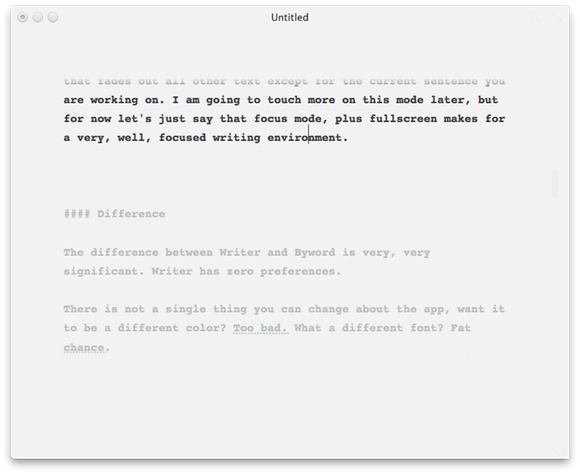
    #### Byword
    [](https://f3a98a5aca88d28ed629-2f664c0697d743fb9a738111ab4002bd.ssl.cf1.rackcdn.com/byword-ss.jpg)

    There is not a single thing you can change about Writer. Want it to be a different color? Too bad. What a different font? Fat chance.

    The difference is full featured versus focus. It’s something that Hog Bay got right the first time with Writeroom — don’t bother with features, make the main feature the lack of features. Writer takes that thought process to the next plateau and does a really good job of doing so.

    I paid $17.99 for an app that has no preferences, forces one font and one color on me and doesn’t even show me spelling errors while I type! Yet, I am perfectly happy with my purchase.

    Byword is for people that know they want to do all their writing in one app. Writer is for people that just want to open something and write. CMD+D versus CMD+1, or CMD+OPT+1, or CMD+2, or… you get the point.

    I often joke about how much time I waste in Keyboard Maestro crafting funky things, or how much time I spend in OmniFocus tweaking the look and layout of the app. The problem is that the more powerful something is — the more features you give the user — the more dangerous it is to tinkerers, and I am very much a tinkerer. Writer keeps me from doing any of those non-writing activities.

    ### Design

    [Chuck Skoda](http://chuckskoda.com/entry/callout/) will love this, but UI design is not a feature until it *is* a feature. In iA Writer for Mac, design is very much the prominent feature of the app. ((Don’t bother asking how I am differentiating this statement from what [I said about Tweetbot](https://brooksreview.net/2011/04/appsuration/) — because I fully intend on ignoring such statements. Suffice to say that Tweetbot is more like a theme applied to an app, rather than a radical rethinking of a category of apps — which is what I believe Writer has done.))

    There is an amazing amount of attention that has been paid to the entire app — from the background and its subtle horizontal lines and slight grey-white appearance. To the not quite black appearance of the text, to the overly large and cyan-ish colored cursor.

    There is not a single facet of this application that was not thought about in great detail. And as a user you not only see that, but you *feel* it.

    ### Design’s Effect on Writing

    I say that the design is a prominent feature of the app because it is so damned effective on keeping me writing. How often have you been working on a document, stepped away or switched out of the app, only to come back and not be sure where you were? Well the grayed out text will get you right back on track and the big blue cursor will make itself readily apparent — why don’t all apps do it like this?

    I can’t speak eloquently enough about the idea of why this app feels so right, so let’s have another random designer do it for me:

    >It feels almost like, ‘well, of course it’s that way. Why would it be any other way?’

    That’s [Jonathan Ive speaking about how he designs](http://www.youtube.com/watch?v=t0fe800C2CU&feature=youtube_gdata) in the film *Objectified*, but I think it perfectly encompasses what iA has done with Writer for the Mac.

    ### Markdown

    Writer supports Markdown recognition and does so with title tags by pushing the formatting into the left margin. The side effect of this method is that you can quickly move through the document and see where your sections start — that’s much easier than a hard margin.

    The rest of the Markdown support has been implemented very subtly allowing you the writer, to once again focus on your craft.

    ### Writing Process Now

    I teased above that I think Writer will change how I write for the better. The biggest problem that I face when I write is poor editing and structure. I solved a lot of structure problems by going back to outlining posts, editing though continues to be my problem.

    I tend to gloss over goofy mistakes because I edit for flow and red squiggly lines. This means I read my posts very quickly and miss a lot of small things — much to the annoyance of all of you. Writer’s focus mode forces me to read sentence by sentence, meaning that I am far more likely to actually read the sentence instead of just flying by it.

    The result has meant a slight revamping of my writing:

    1. Outline in OmniOutliner (both Mac and iPad)
    2. Copy outline into Writer (both Mac or iPad)
    3. Write in Writer
    4. Edit for non-spelling mistakes in Writer’s focus mode. Make use of estimated reading time too (this is a far better metric than word counts and gives me a good idea of how many people will actually read a post).
    5. Paste into TextMate for spelling, final editing, image insertion, link adding, and posting to blog.

    The neat thing is that all the formats are compatible and easy to use with one another. At first this seemed like overkill and using too many apps to me when I got by with just two before. However I have been sitting in this Starbucks now for 2 hours doing nothing but writing in Writer and have yet to get the normal urges I had to ‘go do something else’ — that’s what matters to me, not how many apps it takes me to get there, but the end result.

    ### The Caveats

    To navigate between sentences in the app you use the command key plus the left or right arrow keys. This is very nice and easy to do, but it means that you can no longer use CMD+Right Arrow to move to the end of the line. This is not completely a deal breaker, but it does trip me up at times.

    When focus mode is on and you are in fullscreen mode I tend to page through sentences and the text does not scroll fast enough. I would very much like Writer to always keep a few lines of text below the current “focused” sentence so that the text doesn’t get paged off the screen. This actually is the biggest annoyance I have right now.

    ### Check it out

    Go check out Writer on the [fantastic site for it](http://www.iawriter.com/). Forget about the price and instead ask yourself if you think it would make you want to write more — if so, that alone is worth far more than $20.