Top Posts


Recent Articles

  • Welcome to the staticDimension

    There has been a lot of talk around the web lately about building ‘baked blogs’ — [Brent Simmons](http://inessential.com/2011/03/16/a_plea_for_baked_weblogs) (and he is not alone) is tired of not being able to read sites that John Gruber links to on [Daring Fireball](http://daringfireball.net/), because the sites tend to go down under heavy traffic influx. This is typically due…

    There has been a lot of talk around the web lately about building ‘baked blogs’ — [Brent Simmons](http://inessential.com/2011/03/16/a_plea_for_baked_weblogs) (and he is not alone) is tired of not being able to read sites that John Gruber links to on [Daring Fireball](http://daringfireball.net/), because the sites tend to go down under heavy traffic influx. This is typically due to one of two things: cheap, crappy, hosting; or not properly “baking” one’s blog. The former is easy to fix, but costs a bit more money. The latter is also easy to fix, but can be quite complicated, costing you time.

    Unfortunately most blogs that go down are WordPress blogs that aren’t being cached and thus, are dynamically being generated. The problem is that ‘baking’ a WordPress blog can be quite complicated and more than the average user wants to deal with (I will go into this more in a later post). In light of all this recent discussion I have been exploring all sorts of different blogging platforms — from Movable Type to things like Jekyll. I came across one true gem in all of this configuring, SSHing, and general time wasting — that gem goes by the excellent name: [staticDimension](http://subdimension.co.uk/pages/projects.html).

    How great is that name?

    This is a fully baked, static blogging platform. It is bare bones. It is free. And I think it just maybe perfect for new bloggers that are serious about the craft of writing on the web, and serious about not spending lots of money on hosting. Looking at the current blog software ecosystem I see two choices for bloggers that want to be able to provide ‘linked lists’ mixed with articles (like I do here, and [Shawn Blanc](http://shawnblanc.net/) does, and [Gruber](http://daringfireball.net/) and [Kottke](http://kottke.org/) probably started), the first choice is [Tumblr](http://www.tumblr.com), the second is [staticDimension](http://subdimension.co.uk/pages/projects.html). Sure, you can do this with WordPress and other platforms, but only if you are comfortable digging around some code — there is still no easy way to set this up on WordPress. Both Tumblr and staticDimension come with this feature built-in.

    We know enough about Tumblr already and it’s hosted, but free, platform, that has been seeing growing pains of late. This newcomer though, staticDimension, is also free and is dead simple to install on just about any web server. All you have to do is upload the files to the servers public directory and then change the username and passwords — you are now done. There are no plugins, no database configuration, no nothing. Upload, set preferences, done.

    Simple.

    What does it look like? Head on over to benb.me for a look at a blog running on staticDimension. (The site is running on the same server as TBR.) It is pretty simple and out of the box allows you to make three types of ‘posts’: pages, articles, linked posts. I think that is pretty much all that any new blogger is going to need to get going. All articles are written in Markdown and saved as plain text files on the server, making it easy to both backup and get your data back out of the platform if you decide to move to a more robust platform later on.

    The entire system is easy and simple.

    ### The Backend ###

    It drives me nuts when you can’t see what the backend of a blog really looks like, so here is the control panel of staticDimension:

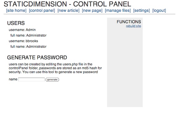
    [](https://f3a98a5aca88d28ed629-2f664c0697d743fb9a738111ab4002bd.ssl.cf1.rackcdn.com/sd-cp.png)

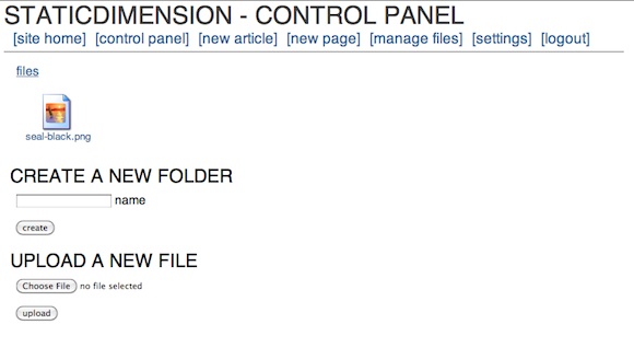
    [](https://f3a98a5aca88d28ed629-2f664c0697d743fb9a738111ab4002bd.ssl.cf1.rackcdn.com/sd-f.png)

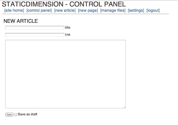
    [](https://f3a98a5aca88d28ed629-2f664c0697d743fb9a738111ab4002bd.ssl.cf1.rackcdn.com/sd-art.png)

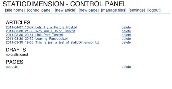
    [](https://f3a98a5aca88d28ed629-2f664c0697d743fb9a738111ab4002bd.ssl.cf1.rackcdn.com/sd-artlist.png)

    The whole thing is dead simple. My biggest complaint is that you can’t post from MarsEdit or TextMate (yet), but for a new blogger I doubt that matters as much as having an easy to setup system does. The backend is so fast and easy that it works fine on iOS — meaning you can write in your favorite program and copy and paste in the content with ease (not the case with WordPress). The options are far and few between, but the system has what you need — with one exception: auto-tweeting. It’s not the end of the world, but it does add a step that a service like Tumblr and WordPress don’t add.

    ### Design ###

    The stock template leaves a lot to be desired and truthfully this is the biggest downfall of the system at the moment. There really is no other templates that you can install. I took about 30 minutes and modified the four template files that are needed for the system to run (easy to do if you know HTML markup) and I also edited the CSS file to change the look and add in Typekit (again standard CSS if you know how to write that). After doing that I found that I like the way the site looks, love the site speed and am pretty darn happy with it.

    This is a flexible system for CSS writers, but I couldn’t find a way to edit the headline behavior on the site. For instance if I wanted to make the post headline of an article link through to the post page, I couldn’t find where that code lies. That’s a bit annoying, but again this is not for people who want full customization (not yet at least, it’s version 1.1 right now). I do think this is a good system if you know how to tweak a bit of CSS and you just want to get up and running. The stock theme is pretty, well, not attractive out of the box.

    ### Speed ###

    This is fast, granted I only have a few posts on the site, but it rebuilds instantly. You don’t even need to rebuild unless you edit one of the template files (not including the CSS, that changes when you upload the new version). Browsing speed is lightening fast, even with Typekit installed.

    ### Archives ###

    The archives are pretty basic and you have to drill down from year, to month, to day before you see a post. Then you see the post names as they appear in file names — a bit lame, but again not unusable. There are a few tricks to get the CSS working right past the main archives page, but emailing the developer will help you solve that problem.

    Archives are really not good by default in any blogging system. WordPress’ are unuseable (mine work because there is a lot of extra code being used) and Tumblr’s are silly unless you add a photo to every post you write. So while the archives are not great, this is something that is simply not great on any platform. I would love to see the archive system grab the title instead of the file name — that would remove at least one level of ugly.

    ### Annoyances ###

    I like the platform, but there are some things that need work:

    1. Your page name is what appears in the navigation, and in the page heading when you go to it. Leaving no real room for customization of wanting the nav to say one thing and the page title to say something else.
    2. As I mentioned before, no way to auto-tweet.
    3. No way to post from blogging clients like MarsEdit.
    4. Limited theme customization.
    5. No other themes available.
    6. Sidebar needs to be modified on each of the four template pages. To reflect the actual sidebar — there is no one sidebar template the system pulls from.
    7. No search, though adding in a Google site search box wouldn’t be hard.

    Again, this is a version 1.1 system and I am sure lots of changes are being worked on.

    ### Final Thoughts ###

    If you are just getting started with blogging and you want to run the web server yourself — give this a go first. I honestly think that you could run this off of a cheap $10/mo hosting plan and withstand a DF link — assuming you are not image heavy, or just don’t serve the images yourself (I don’t, S3 works great for that). The setup is stupidly simple. The backend is just what you need, nothing more. The files are stored as plain text so you can move them wherever, whenever.

    It’s just easy and it really is pretty nice. If you hate databases and SQL (who doesn’t) and you wanted to have linked list posting — this is a system you really need to check out. I say give it a try first because it really is that easy to set up and, frankly, if you are wanting to put your writing on the web you should be the one that owns the content.

    [Updated: 4.12.11 at 1:17 PM]

    One thing I didn’t mention is that the developer is incredibly nice and very responsive. I emailed with him a bit when I was playing with the platform and trying to work out some kinks. Since posting this review the platform was updated to version 1.2 and then to version 1.2.1 shortly after he read my thoughts. The biggest change is in the archives and how they display the post names — great work!

  • The Price of Free

    Eric F. Myers in the Google Reader support forums: >If you’ve come here from the”Something is Broken” forum thinking that this problem has been Answered, I’m sorry to say that it has not been. It’s been six months since I’ve posted this question and there’s still no answer from Google. The post in question still…

    Eric F. Myers in the Google Reader support forums:
    >If you’ve come here from the”Something is Broken” forum thinking that this problem has been Answered, I’m sorry to say that it has not been. It’s been six months since I’ve posted this question and there’s still no answer from Google. The post in question still has a star next to it.

    Another 283 people seem to echo his problem, that’s [what happens](https://brooksreview.net/2011/03/fragility-free/) when something is “free”.

    [h/t to reader King Yip]
  • Facebook Is Not as Truthful as Previously Thought — Shocking

    Kevin Sablan: >All tolled, the like buttons claimed that those pages were liked or recommended 4,622 times. In fact, they were liked or recommended only 1,790 times. Shocking, I’m sure. More information [here](http://almightylink.ksablan.com/statistics/facebook-button-count-is-wrong-use-realshare/). [via Hacker News]

    Kevin Sablan:
    >All tolled, the like buttons claimed that those pages were liked or recommended 4,622 times. In fact, they were liked or recommended only 1,790 times.

    Shocking, I’m sure. More information [here](http://almightylink.ksablan.com/statistics/facebook-button-count-is-wrong-use-realshare/).

  • Smartphones Killed the Video Star

    Cisco is shutting down Flip and canning its 550 employees — I feel bad for those employees and wish them the best. This was a company that made a great low-priced product, but the ever increasing quality of smartphone video cameras pretty much made it pointless to carry around a dedicated device. Next up: crappy…

    Cisco is shutting down Flip and canning its 550 employees — I feel bad for those employees and wish them the best. This was a company that made a great low-priced product, but the ever increasing quality of smartphone video cameras pretty much made it pointless to carry around a dedicated device. Next up: crappy point and shoot cameras.

  • Quote of the Day: Randy Murray

    “But thinking is working.” — Randy Murray

    “But thinking is working.”
  • Engadget on Android’s Fragmentation

    Vlad Savov: >Where the trouble arises is in the fact that not all Androids are born equal. The quality of user experience on Android fluctuates wildly from device to device, sometimes even within a single phone manufacturer’s product portfolio, resulting in a frustratingly inconsistent landscape for the willing consumer. This is a really good post…

    Vlad Savov:
    >Where the trouble arises is in the fact that not all Androids are born equal. The quality of user experience on Android fluctuates wildly from device to device, sometimes even within a single phone manufacturer’s product portfolio, resulting in a frustratingly inconsistent landscape for the willing consumer.

    This is a really good post by Savov and he touches on a lot of really important points. The above quotes passage though is the heart of the problem for consumers — it’s like buying a GM car and having nothing but troubles with the car, you will be forever biased against GM cars.

    It’s not the Android is necessarily bad — its that, right now, buying an Android phone is a bit of a crapshoot for the general consumer.

  • Android From an iPhone Switchers View

    Mike Melanson: >I opened the Android Market, searched for Flickr and quickly clicked on the app named Flickr that had the Flickr icon. Great. Once the download completed, I tapped on the icon and suddenly a website opened up to a phishing warning. I tried to exit, but it just reopened. Again and again. No…

    Mike Melanson:
    >I opened the Android Market, searched for Flickr and quickly clicked on the app named Flickr that had the Flickr icon. Great. Once the download completed, I tapped on the icon and suddenly a website opened up to a phishing warning. I tried to exit, but it just reopened. Again and again. No matter what combination of buttons I tried, the phone re-entered this unusable state of trying to reload this prohibited website and randomly rebooting.
    >Not in a year and a half has my iPhone done anything similar.
    >Now, I’m not saying this makes the thing unusable. I rebooted the phone, deleted the app and went on with my day, but I can only imagine a less confident mobile user going through this experience

    *Sounds fun.* I mean you need to reboot your phone and forceable remove the app before you can use the phone — yeah that’s the pillar of **not** being unusable. ((Lots of sarcasm here folks.))

  • Quote of the Day: Jeffrey Zeldman

    “I am your fan. Just not on Facebook.” — Jeffrey Zeldman

    “I am your fan. Just not on Facebook.”
  • Review: Notesy

    If you are a regular listener of [The B&B Podcast](http://thebbpodcast.com/) that Shawn and I co-host than you probably already know that I think pretty highly of [Notesy](http://notesy-app.com/) — a [Dropbox](http://db.tt/MrqICTQ) (that’s a referral link, it helps us both) syncing note app for iOS. If you don’t listen to the show ((You should.)) then you may…

    If you are a regular listener of [The B&B Podcast](http://thebbpodcast.com/) that Shawn and I co-host than you probably already know that I think pretty highly of [Notesy](http://notesy-app.com/) — a [Dropbox](http://db.tt/MrqICTQ) (that’s a referral link, it helps us both) syncing note app for iOS. If you don’t listen to the show ((You should.)) then you may be surprised to hear that I like Notesy so much that it has replaced [Simplenote](http://simplenoteapp.com/) on my iPhone home screen — and it replaced Simplenote after only 4 hours of usage.

    ### Syncing OTA ###

    The most noticeable difference between Simplenote and Notesy is that the former syncs using the excellent Simplenote sync engine and the latter syncs using the still very good Dropbox. You would think that there would be little to no difference with that, in fact, nobody should care about this. I thought the same thing, then I found out that there is quite a difference here.

    Surprisingly, Dropbox is slower than the Simplenote sync engine. ((I use [Notational Velocity](http://notational.net/) syncing to Simplenote with the Simplenote engine and store the plain text files in Dropbox. Now this works well so long as your Mac is always on and syncing. If that is not the case, then you run into the potential for sync conflicts if I changed the same note in Notesy and Simplenote without Notational open and running. Buyer beware.))

    It is not slower to the point where you are slowed down by the syncing of Dropbox, but it is slow enough that you notice the syncing — whereas with Simplenote I never really noticed it syncing. I don’t think this has anything to do with the app itself, I think it is just a difference in the speed and the way that the two engines sync.

    Where all of this matters is when you switch to the iOS device needing to get at your notes that you just added to the folder using, say, [Notational Velocity]([Notational Velocity](http://notational.net/)). When I was syncing Notational Velocity with Simplenote the notes just seemed to be in Simplenote on my iPhone moments after opening it. Using the Dropbox setup on Notational Velocity and Notesy the notes seem to pop in noticeably slower. ((Upon further investigation this could also be a result, in part, to the animation used when new notes come in.)) For the most part this doesn’t matter — truly we are talking about fractions of seconds here — but I thought it worth pointing out.

    What is important about this is the Dropbox is very good and Notesy integrates very will with it — so much so that if you never got on the Simplenote bandwagon this is likely to feel magical to you.

    ### Looks ###

    I am just about as picky as they come with the design and looks of any app. When I first opened up Notesy I wasn’t too impressed with the look of it. I opened up the settings and found that there is a plethora of options for customizing the looks of the app, and after about 20-30 seconds of playing around I can say that I now have an app that looks better than any other note app I have used on iOS.

    By default Notesy comes with a ‘textured’ theme set that has a very subtle canvas texture behind the text. I really like this texture on the notes themselves (you can set the backgrounds separately), but I am not a fan of it on the main notes list. The main notes list with the plain theme set, no lines of the note shown ((Except on the iPad where I show two lines.)) and timestamps turned off looks pretty good. My only complaint about the notes list view is that there are little green check marks on the right edge to show when the note has been synced — that’s nice to see, but I would much rather not see that, or just see a subtle looking check mark — I assume that the app has done its job and synced the note. ((I have heard that I may be getting my wish soon on this.))

    When you get into the individual note view, is when you get to the part of the app that I adore. With the subtle textured note background and ‘Thonburi’ set as the font at 17pt — well you just have heaven. Thonburi is incredibly legible on the iPhone/iPad screens — much more so than Helvetica ((I am a Helvetica fan, but it is not great in every instance and small type is hard to read with Helvetica.)) . I set the fixed width font to ‘DejaVu Sans Mono’, but more on this in a bit. Overall I think this a great looking interface.

    As with most apps that provide a ‘textured’ background I also find it a bit off putting when you scroll the note and the background remains static. It would feel a lot better if the texture moved with the text, but this may be a limitation of iOS itself.

    ### The Icon & Name ###

    I am, [admittedly](https://brooksreview.net/2011/03/app-naming/), very picky about app names and their icons, Notesy passes the test in my book. The name is simple and short, easy to say and descriptive. I know what this app is about just by reading the name.

    The icon though, man do I love it. It is not blue. Also, the icon is not blue. A simple looking ‘n’ with a nice light gray background that has ruled lines like a sheet of stainless steel notebook paper. It is subtle and elegant — an icon that I truly love. I think it maybe the best icon on my iPhone/iPad home screen — edging out Reeder and Gowalla.

    ### The Interface ###

    There isn’t much innovation to be done in the iOS note taking app arena, but there are a couple of nice things that the developer did with Notesy and a couple of really confusing things too.

    #### The Confusion ####

    I don’t get why there is a keyboard button when just tapping the screen pops up the keyboard. It almost seems like this was done to have six icons across the bottom. I really just don’t get why you need this — then again I am sure it is a sigh of relief for others.

    [Updated: 4.11.11 at 10:52 AM]
    The developer emailed me to say that this button actually is used as an append text button. That way if you have a long note you can tap this keyboard button and begin adding text to the bottom of the note, rather than scrolling down to the bottom and tapping on the screen. That is a nice touch, sorry for not realizing that — I don’t keep many long notes.

    Then we get to the ‘send this’ button, the button that typically allows you to email things — but in Notesy will also allow you to do things like: rename the note, duplicate the note, change the note to fixed width mode, email it, or print it. I get the last two options, those make sense, but the first three seem like they are in the wrong place. Again, I just don’t quite get it.

    I feel like those note action buttons need to be placed in their own menu item, but with the amount of icons along the bottom there really isn’t room. This isn’t something that is a deal breaker, but it does take a bit of getting used to. It is also likely that the average user may never know that these features exist because they never hit the button that they are accustomed to seeing as an ’email’ button. Having said that, the confusion about what the rectangular box with arrow popping out button really means. Safari uses it in very off ways, much like how Notesy uses it.

    #### The Nice Touches ####

    One of the coolest features of this app is that you can change notes (on a note by note basis) to a variable width font or a fixed width font. Essentially allowing you to flip the notes between the two sizes and fonts that you chose in the options. If I want a smaller note font I can change to fixed width and the size and font changes (because I set it to be a smaller font size) — not everyone will use this feature, but it is a great option for those that need it.

    What I would really like is that the background was able to switch when you changed the font style — then I could get fixed width on a white background, and variable width on the lovely textured one. Hopefully this comes in future updates, but there is a downside to this: too many style options leads to too much fiddling. Perhaps Notesy is saving me a bunch of time by omitting this option.

    I also noticed that setting a note to fixed width on my iPad did not sync that across to my iPhone — not sure if this is possible, but it would be neat if it did. Right now it is just a minor annoyance since most of my notes stay in the standard variable width font view.

    Unlike some other apps that argue over showing you no length, reading time, or word count Notesy hides this off on a dialog that you must invoke. There it shows you the basic word count information along with the creation time, modified time and current path. That’s the kind of information that you rarely need, but when you need it you want to be able to easily get at it — a very nice touch to keep it out of sight until needed.

    You can also select the folder you want Notesy to sync with — something that many other apps don’t allow. This is great because I can keep all my apps in sync and easily switch between them — I don’t feel stuck. I despise apps that don’t allow you to set the Dropbox folder that you sync with, it just feels silly to limit a user to a Dropbox folder named after your app.

    ### The Complaints ###

    I have two major complaints about this app:

    1. When you create a new note it asks for the note title — instead of just grabbing the first line of the note. I really dislike this practice because for notes that you have made in Notational Velocity that don’t have a ‘real’ title line it puts part of the first sentence in the ‘title’ view and the rest in the note body — making it very hard to read. I would love to be able to turn off this ‘feature’.
    2. The app looks identical to its iPhone counterpart on the iPad — while this can be advantageous for some apps, it makes this app not feel ‘right’. The list in landscape view is simply too wide and the app would really benefit from having a list to the left and a note preview to the right — just like how Simplenote chose to implement it. Truthfully anything to make that list a bit smaller, or to better use the space, would be welcomed.

    ### Two Thumbs Up ###

    No app is perfect ((Which is unfortunate.)) but the negatives of Notesy are far outweighed by its positives — so much so that I think it is a better solution than Simplenote. It is only $2.99 and for that you get both the iPhone and iPad versions — I’d easily pay $4.99 for this app. Give it a try.

  • Array Cameras

    David Zax: >A company called Pelican Imaging recently announced it had developed the first prototype “array camera” for mobile devices. Instead of using one lens, Pelican uses an array of multiple lenses; it combines all the data from these multiple viewpoints and then builds a single high-quality image. The benefit is a thinner footprint (many…

    David Zax:
    >A company called Pelican Imaging recently announced it had developed the first prototype “array camera” for mobile devices. Instead of using one lens, Pelican uses an array of multiple lenses; it combines all the data from these multiple viewpoints and then builds a single high-quality image.

    The benefit is a thinner footprint (many speculate the iPod touch gets crappy camera’s because a better one can’t be fit in the device). The down side? I have no clue, but I would guess it will be a while before they match the quality and ‘feel’ of a regular image sensor.

  • Rent Adobe Photoshop

    From the Adobe Press Release: >With subscription pricing customers can use flagship products, such as Adobe Photoshop® for as little as US$35 per month, Adobe Design Premium CS5.5 for US$95 per month, Adobe Creative Suite 5.5 Master Collection for US$129 per month. No word yet on whether you get a pro-rated refund for every crash.

    From the Adobe Press Release:
    >With subscription pricing customers can use flagship products, such as Adobe Photoshop® for as little as US$35 per month, Adobe Design Premium CS5.5 for US$95 per month, Adobe Creative Suite 5.5 Master Collection for US$129 per month.

    No word yet on whether you get a pro-rated refund for every crash.

  • $95 ARM Tablet

    Charbax: >World’s cheapest ARM Cortex-A9 Tablet thus far (single core), it is to be sold at $95 FOB Shenzhen, meaning for orders of at least 500 pieces. Add taxes, import, licences, profit margins and the retail price in Europe and USA may be around $149/149€. Also it has a mouse input interface, for when you…

    Charbax:
    >World’s cheapest ARM Cortex-A9 Tablet thus far (single core), it is to be sold at $95 FOB Shenzhen, meaning for orders of at least 500 pieces. Add taxes, import, licences, profit margins and the retail price in Europe and USA may be around $149/149€.

    Also it has a mouse input interface, for when you get tired of using your finger.

    *(Extra bonus is how excited the guy in the video is.)*

  • Quick Takes on Five Apps (#8)

    This is the eighth [installment](https://brooksreview.net/tag/quick/) of the Quick Takes series, where I look at five apps and tell you my thoughts on them. ### [Dealnews](http://itunes.apple.com/us/app/dealnews-app/id405566099?mt=8) (iPhone) ### When I first got a Mac I used to visit Dealnews every morning to see what I could afford on the little cash I had at the time.…

    This is the eighth [installment](https://brooksreview.net/tag/quick/) of the Quick Takes series, where I look at five apps and tell you my thoughts on them.

    ### [Dealnews](http://itunes.apple.com/us/app/dealnews-app/id405566099?mt=8) (iPhone) ###

    When I first got a Mac I used to visit Dealnews every morning to see what I could afford on the little cash I had at the time. In recent years I haven’t looked at the site, but somehow I came across the app for the iPhone. The app is easy and straightforward and still only appeals to those shoppers that like buying things because it is a ‘deal’. My biggest complaint is the way the app displays the information seems to *not* take into account its primary users.

    It would seem that if you specialize in showing low priced items, that your customers would naturally be most interested in the price and the product. Instead, the point that draws your eye is the ‘hotness’ meter, the price is buried at the end of the product name, in the same font and the same color and size. That’s a little backwards if you ask me.

    ### [Alpine Crawler](http://itunes.apple.com/us/app/alpine-crawler/id416060151?mt=12) (Mac OS X) ###

    This is a simple little game that is free in the Mac App Store. It reminds me a lot of Excite Bike for the Nintendo — except you are in a truck and can (apparently) kill yourself with too big of jumps. Other than that…

    This game is not great, it’s not even really that good. That doesn’t mean that my buddy and I didn’t have a hell of a good time playing it the other night.

    ### [Battle Bears -1](http://itunes.apple.com/us/app/battle-bears-1-mac/id413013033?mt=12) (Mac OS X) ###

    Another free one that my buddy and I grabbed from the Mac App Store the other night. It is a first person shooter where everyone is bears, luckily your bear has a variety of guns to fend off the onslaught of attacking bears that will hug you to death (bastards). I want to point out that while I don’t think this is the best game out there (not by a long shot), it is free and entertaining as all hell.

    I love that the developers had a good time writing the copy for the game — it makes the entire thing that much funnier to play. One annoying thing I did notice is that this game doesn’t seem to work with the Magic Trackpad — not sure why, not that you really want to be using that for a first person shooter.

    ### [Bing for iPad](http://itunes.apple.com/us/app/bing/id345323231?mt=8) ###

    It searches stuff using the Bing engine — surprising huh? It’s a very interesting app — not in a bad way, but it feels more like a home screen replacement app than a search app. When you pull up the app it shows you a ton of data that is all somewhat relevant. It really looks nice on the main view, though the search results are presented in a less than pleasing way (white background, blue links).

    I also like the ‘card’ type navigation for moving back and forth between an individual search result and the list of results. I just can’t get over the feeling that this looks like what a Windows Tablet *should* look like — meaning it truly feels like it is trying to replace iOS, not compliment it. Interesting.

    ### [Jetsetter](http://itunes.apple.com/us/app/jetsetter-for-ipad/id416813861?mt=8) (iPad) ###

    It doesn’t rotate — no seriously you can only use it in portrait, which almost made me uninstall it. I don’t get why you would develop for a device that rotates around and then lock your app to one orientation — stupid. Having said that, this is a great app for people looking to spend a lot of money on vacation. There has been some rumbles around my home about taking a trip to Hawaii — specifically Maui. So I searched for Maui and two hotels came up, I clicked on the Fairmont Kea Lani which boasts rooms starting at $699 a night — something I can’t afford right now. That said I really like that the app also told me that WiFi costs an additional $14.50 a day (absurd).

    Another great use case for this app is if you have a specific hotel in mind that you want to know more about — if they have it in their database I can’t imagine a better way to get all that information. The pictures are stunning and the details about the hotels are unmatched by other sites I have used in the past. Including the information that a taxi will cost $70 from the Airport to the hotel (again, absurd).

    *If you liked this installment be sure to check out the other installments).*

  • Great Dropbox Wishes

    Three really great things that Dropbox needs — first things first, let’s get the icon [out](http://thebbpodcast.com/2011/04/episode-6-wonderful-people/) of the menubar.

    Three really great things that Dropbox needs — first things first, let’s get the icon [out](http://thebbpodcast.com/2011/04/episode-6-wonderful-people/) of the menubar.

  • “Immersive”

    Mary Jo Foley: >“Immersive” is the way that Microsoft is describing the Windows 8 app experience on tablets and slates running the MoSH interface, from what I’ve been told. Inside the company, some Softies use “immersive” and “modern” or “modern client” apps as synonyms. Once a user installs an immersive application, a tile for it…

    Mary Jo Foley:
    >“Immersive” is the way that Microsoft is describing the Windows 8 app experience on tablets and slates running the MoSH interface, from what I’ve been told. Inside the company, some Softies use “immersive” and “modern” or “modern client” apps as synonyms. Once a user installs an immersive application, a tile for it will appear on the user’s Windows 8 dashboard.
    >An immersive app is one where the navigational elements of the operating system take a back seat to the application itself.

    I thought we just called this type of app, “good”? Huh, learn something new everyday I guess.

  • What It’s Like to Share an Article From One of These iPad Magazines

    Neven Mrgan highlights the biggest frustrations users have with iPad magazines — well done.

    Neven Mrgan highlights the biggest frustrations users have with iPad magazines — well done.

  • Quote of the Day: Mike Tyson

    “Everyone has a plan until they get punched in the face.” — Mike Tyson

    “Everyone has a plan until they get punched in the face.”
    — Mike Tyson
  • Dropbox Endgame

    Jacques Mattheij: >What if dropbox would simply replace your local file system. On *all* your digital devices? If the future is ‘always on’ and ‘always connected’ for every device, be it a mobile phone, a desktop computer, laptop, netbook or tablet, then all those devices can synchronize their content using dropbox, without having a local…

    Jacques Mattheij:
    >What if dropbox would simply replace your local file system. On *all* your digital devices? If the future is ‘always on’ and ‘always connected’ for every device, be it a mobile phone, a desktop computer, laptop, netbook or tablet, then all those devices can synchronize their content using dropbox, without having a local user filesystem at all!

    I could see it, Dropbox is more or less where every single file is stored on my computer — well — the ones that I create.

  • All New Archives

    I have never been happy with a single instance of the archive function on a WordPress blog before — after spending hours trying to get the archive to work the way I wanted it to, I decided to hire a professional. I got in contact with [Pat Dryburgh](http://patdryburgh.com/) and asked him if he would take…

    I have never been happy with a single instance of the archive function on a WordPress blog before — after spending hours trying to get the archive to work the way I wanted it to, I decided to hire a professional. I got in contact with [Pat Dryburgh](http://patdryburgh.com/) and asked him if he would take a stab at it.

    It is now done, and all I can say is wow.

    All you get is the Articles and Quotes (no linked list posts) and you get them in a readable and easy to digest way. Click on the month and a fancy bit of javascript magic happens that shows you all the articles from that month. I hope you enjoy it as much as I do — don’t be shy about [hiring](http://patdryburgh.com/contact/) Pat to help you!

  • B&B Episode 7

    Shawn and I discuss the 5 apps we would choose if we were so limited and other random things. Oh, and Shawn’s rule is that the OS counts as one app and nothing comes pre-installed. Thanks to the awesome [Notesy](http://notesy-app.com/) for sponsoring us.

    Shawn and I discuss the 5 apps we would choose if we were so limited and other random things. Oh, and Shawn’s rule is that the OS counts as one app and nothing comes pre-installed.

    Thanks to the awesome [Notesy](http://notesy-app.com/) for sponsoring us.