Month: April 2011

  • Seasonality Go, Weather Done Better(ish)

    I had a ton of questions come in after researching the [iPhone weather apps](https://brooksreview.net/2011/04/weather/), none more frequent than people wanting to know what I thought about iPad apps. I left them out for many of the reasons that Marco lists [here](http://www.marco.org/2011/04/26/iphone-weather-apps). I was turned on to one app from a follower on [Twitter](https://twitter.com/kilsey/status/62942528357412864) called: [Seasonality Go](http://itunes.apple.com/us/app/seasonality-go/id373913405?mt=8) for the iPad. It costs $9.99 and it is *just* a weather app. Here’s what I downloaded, installed and tried before Seasonality Go (along with a one-line review of sorts):

    – [Fahrenheit](http://itunes.apple.com/us/app/fahrenheit-weather-temperature/id426939660?mt=8): Like the iPhone version, only bigger.
    – [Weather HD](http://itunes.apple.com/us/app/weather-hd/id364193735?mt=8): Nice if all you do is rest your iPad in a stand and look at it like it is art.
    – [Weather+](http://itunes.apple.com/us/app/weather/id403692190?mt=8): No thanks, same as the iPhone version.
    – [The Weather Channel](http://itunes.apple.com/us/app/the-weather-channel-max-for/id364252504?mt=8): Hideous, but again useful.
    – [Weather Forecast](http://itunes.apple.com/us/app/weather/id421106297?mt=8): Oh god this is ugly.
    – [AccuWeather](http://itunes.apple.com/us/app/accu-weather-free-for-ipad/id364616869?mt=8): The layout is just confusing, as is the “tab-switching” interface they made. Very non-standard.
    – [Pocket Weather](http://itunes.apple.com/us/app/pocketweather-1-weather-app/id375727893?mt=8): Portrait only… on the iPad. Doesn’t come close to making use of the iPad screen size.
    – [WunderMap](http://itunes.apple.com/us/app/wundermap/id364884105?mt=8): Not my cup of tea, but at least they tried to do something different.
    – [The Weather](http://itunes.apple.com/us/app/the-weather/id351064928?mt=8): They still insist on shoving data that could all fit on one screen on to others. Even in the custom view things are tiny and that ghost view of the next tab is just stupid. Stupid.
    – [WeatherStation Pro](http://itunes.apple.com/us/app/weather-station-pro/id364904462?mt=8): I have always been a fan of how this app looks, but I never use it. Not sure why, I guess to me all the information feels static and not dynamic — this is a personal thing, nothing against the app itself.
    – [Easy-Weather](http://itunes.apple.com/us/app/easy-weather/id388855478?mt=8): The colors are gross, the current temp is in a silly spot and hard to see.
    – [My Weather](http://itunes.apple.com/us/app/my-weather/id415172659?mt=8): When I reviewed the Samsung Galaxy Tab, I noted how many apps looked stretched to fill the screen. I get the same feeling with this app, it’s just really, really bad.
    – [WeatherBug](http://itunes.apple.com/us/app/weatherbug-for-ipad/id363235774?mt=8): Why exactly do we need the map to cover up 3/4 of the screen? How often do you open a weather app with the first thing you want to see being the doppler?
    – [Weather Pro HD](http://itunes.apple.com/us/app/weatherpro-for-ipad/id373515261?mt=8): Nice graphs, but blue overload.
    – [SimplWeather](http://itunes.apple.com/us/app/simple-weather/id346541931?mt=8): Well, it is simple, but I would hardly call 48° “pretty cold” — chilly, yes but not cold.

    So that’s what I tried and tested out. I was so dismayed that I finally went back to the app that cost an arm and leg, thinking that at the very least I could be accurate with my conclusion: “all iPad weather apps suck balls”. Luckily for me Seasonality Go turned out to be a very strong offering.

    Let’s get one thing straight from the get go: that icon needs some serious help. ((You already knew I wouldn’t like it though.))

    When I launched the app I thought: “damn that was a waste of money.” I flipped through the different pages you could add, but was dismayed by the lack of the perfect view. Then I hit the settings pane and noticed an ‘Edit Layout’ button. Oh boy, everything changed.

    Turns out that each pane can be moved around **and** resized. You use pinch-zoom gestures to resize it and you can get a really sweet layout. This still doesn’t address all of my complaints, but it does come closer than any other app that I have tried.

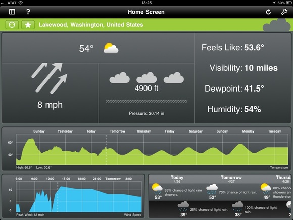
    Here’s what the default view looks like for me:

    [](https://f3a98a5aca88d28ed629-2f664c0697d743fb9a738111ab4002bd.ssl.cf1.rackcdn.com/seasonality-go.jpg)

    That’s very good, but not great. I like that the current conditions are the focal point, but there are some odd things going on. Why is the temp so small? The dew point is just as large and that seems wrong. Why are the arrows for the wind indicator cut off? That seems terrible. Still though, I get most of the info I want in a fairly scannable format.

    Then you get the two graphs, the largest of which is scrolling and shows me how the temperature will be trending. The neatest part? You can pinch and zoom on the graph to see it by day, or down to hours and minutes — fantastic. Same with the wind speed graph, which is not completely necessary, but I found it fun to keep on the screen.

    Last pane is the forecast, which is a bit odd. You get the daytime, then night positioned below that in a new column, then a new day — that is not really *standard* and takes a bit of getting used too. What that layout does do is gives you easy way to scroll with a flick and see if you are getting clouds or sun during the day — I do like that. So while it takes some getting used to, there is a clear benefit to presenting the data in such a way — you can scan the data quickly to see what will happen during the day versus night, once you get used to the formatting.

    Overall this is not a perfect app, it is not even great — it is very good and better than any other weather app I tried by a long shot. At $9.99 though? That’s tough to pull the trigger on.

  • Marco Arment on Weather Apps

    Marco Arment:
    >I’d like to know if it’s going to be noticeably humid or dry, but only if that humidity level is unusual for the season and region.

    Me too. Marco lays out some really good points and there is a reason I didn’t go into Weather apps on the iPad, it is just a much more difficult device to layout weather information on. Most weather apps on the iPad just make things bigger, instead of actually trying to figure out how to use the extra space.

    Marco’s points on giving you the data only when it is relevant is spot on. We simply don’t need to see dials and gadgets for information that is, essentially, irrelevant (such as a wind speed of 0).

  • “How to beat Apple”

    Jason Kottke on how to beat Apple:
    >Openness and secrecy. Competitors should take a page from Apple’s playbook here and be open about stuff that will give you a competitive advantage and shut the hell up about everything else. Open is not always better.

    His entire post is excellent.

  • Windows Phone 7 Location Data Storage

    It is interesting that Microsoft went on the offensive to detail how Windows Phone 7 stores location data and it honestly looks like they have a decent system in place. One thing that is noted though is that this data is not stored on the phone. I know many will think that is a good thing, but I think it is terrible. You want that type of data stored on a device that is within your control, preferably encrypted.

    Do you really trust Microsoft to store your location data for you?

  • Finding a Good Weather App for the iPhone

    Last week my favorite iPhone weather app was updated to include iAds — not just any iAds, but ones that are pixelated and crappy looking. It is so bad that I don’t even want to use the app any more. So I set out to find an app that would show me the same type of data, in a similar or better manner.

    Here’s what I want from a weather app:

    1. Speed, needs to launch a pull the data quickly (especially over 3G).
    2. Needs to immediately show me the current conditions. With current temperature and whether is is raining being paramount.
    3. Needs to show me the forecast in a way that I can quickly scan the data to get an idea of the weather trend, I prefer not to scroll in this view.
    4. If there are doppler maps, they need to work and work quickly. (Looking at you Weather Channel app)
    5. I don’t want to click through many panels to get basic information that could be shown on one screen.

    Here’s what I found.

    ### [WeatherSnitch](http://itunes.apple.com/us/app/weathersnitch/id390175535?mt=8) ###

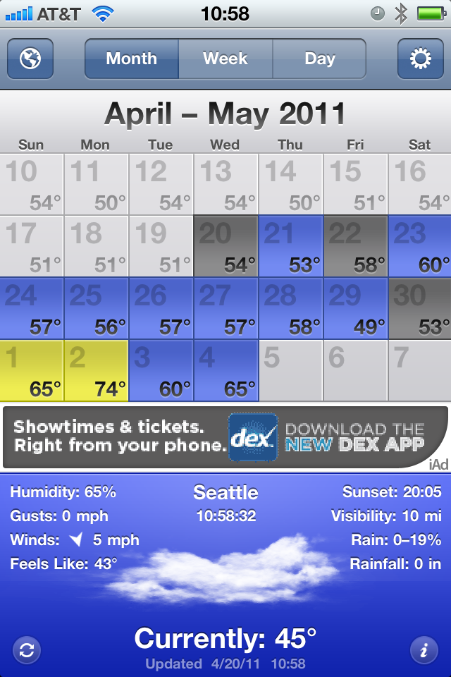
    This is the app that has been my go to for months. I love to keep the app on the month view and it shows me 14 days worth of weather data. I have. in the past, had problems with some of the further out forecasts and general accuracy, but for the most part it is a fast and an easy way for me to see what the weather trend will be for the next couple of weeks. Unfortunately, they have implemented iAds and given the user no option to pay for an upgrade to remove them. WeatherSnitch is my baseline for all of these test and here is what may favorite view of the app looks like:

    [](https://f3a98a5aca88d28ed629-2f664c0697d743fb9a738111ab4002bd.ssl.cf1.rackcdn.com/weathersnitch.png)
    ### [Fahrenheit](http://itunes.apple.com/us/app/fahrenheit-weather-temperature/id426939660?mt=8) ###

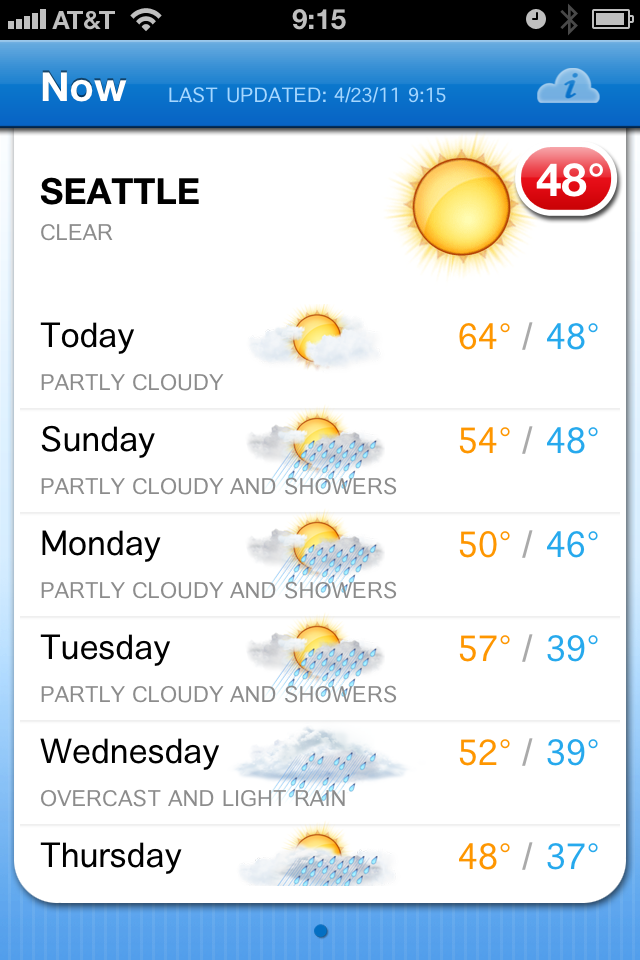
    This app has been making the rounds lately for its novel ability to display live temperature information on the apps icon by way of badge notifications (the little red bubble with a number in it). The app is $0.99 and universal. The interface is clean and uninspiring. You get nine days worth of forecasts in a scrolling view and tapping any of those days gives you more information about the forecast for the day. Overall the data is presented in a very clean and fast manner.

    While I know that the badge notification is the main feature of the app — I wish you could turn it off. This would be a very good app without that badge indicator on it all the time. Turning it off in the notifications panel on the iPhone only resulted in stale information on the badge. The app only has one view, but I think it presents the data fairly nicely, but it makes point #2 above very had to glean. The current conditions are barely any more prominently displayed than the forecast data — that’s a losing proposition for me. 95% of the time I look at a weather app it is so that I know what the weather is like right now.

    [](https://f3a98a5aca88d28ed629-2f664c0697d743fb9a738111ab4002bd.ssl.cf1.rackcdn.com/fahrenheit.png)
    ### [Weather+](http://itunes.apple.com/us/app/weather/id403692190?mt=8) ###

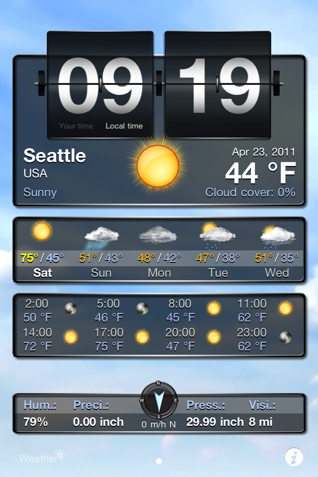
    This app is made by the same company as the last, and this app is pretty weird — costing another $0.99. The entire experience feels more Android like than it does iOS. You get a series of widgets (which you have very minimal control over) that are overlaid on top of a moving image that rotates based on current weather conditions. The whole app is just not my cup of tea — from the non-standard UI to the ugly icon.

    [](https://f3a98a5aca88d28ed629-2f664c0697d743fb9a738111ab4002bd.ssl.cf1.rackcdn.com/weatherplus.png)
    ### [WxQuickie](http://itunes.apple.com/us/app/weather-quickie/id399072639?mt=8) ###

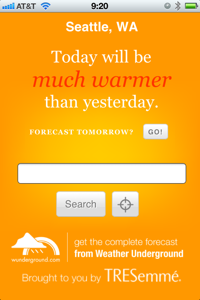
    This is an odd app — a niche app much like Thermo — it is free and only shows you the weather information for the day. Instead of telling you precise numbers you get something that says “Today will be *much warmer* than yesterday.” That’s definitely a niche market. You can, in fact, get tomorrows forecast shown in the same one sentence line by hitting a little button. Once you do that though the only way to get back to the current weather is to let the application “find” your location once again — yes, there is no back button. There is also a tastefully done add along the bottom that blends very nicely in the app. (The icon is ridiculous.) I rather like the app, but I don’t see it being very practical for people that live in areas that have different weather on different days (if you live where it is always sunny, then this is perhaps all you need).

    [](https://f3a98a5aca88d28ed629-2f664c0697d743fb9a738111ab4002bd.ssl.cf1.rackcdn.com/wxquickie.png)
    ### [The Weather](http://itunes.apple.com/us/app/the-weather/id351064928?mt=8) ###

    This has the most impressive icon of the bunch and the most UI chrome as well — it was also recommended by many with the caveat that it is slow and crashy, sounds great. It’s going to set you back $0.99 to use and for that you get a very fragmented weather app. There is a series of tabs along the top that fragment data other apps show on one screen. The first screen tells you the current conditions, which doesn’t include wind or temperature. Next you get the temp, then humidity, next up is wind speeds and direction, then the six day outlook (which surprisingly has all the data that was broken apart for each day), then you get any weather alerts, and lastly you have a nice doppler map. This is a rather cumbersome way to view the weather and while it is all presented very nicely, it is anything but quick to see this information. I am passing because I feel like I would need to update the app and start over by the time I get done seeing all the original information about the *current* weather conditions.

    [](https://f3a98a5aca88d28ed629-2f664c0697d743fb9a738111ab4002bd.ssl.cf1.rackcdn.com/theweather.png)
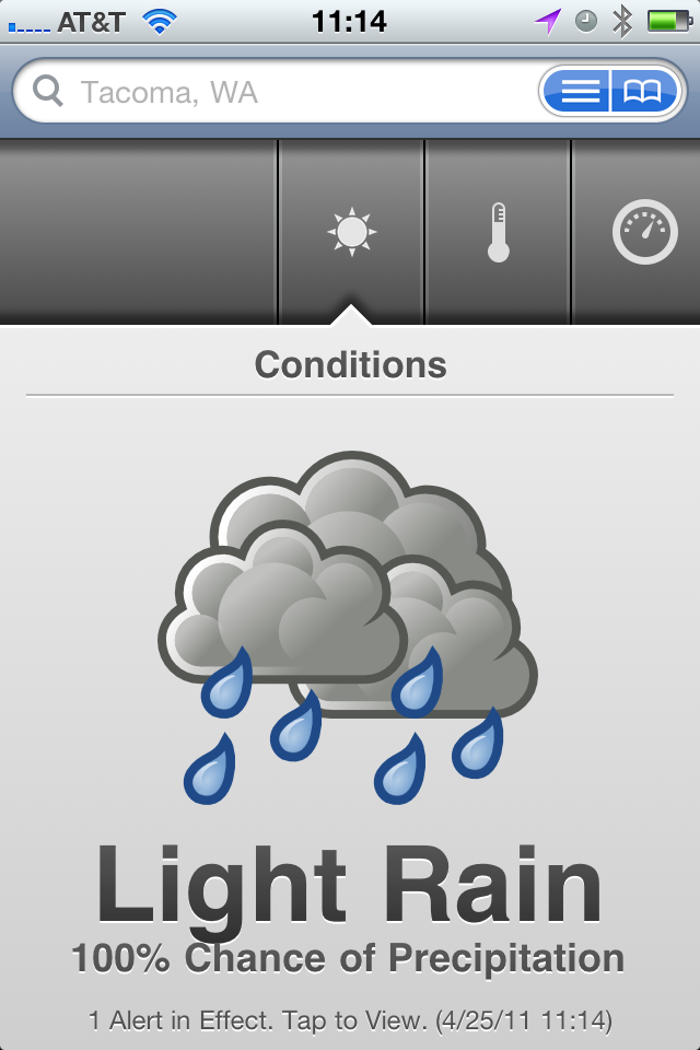
    ### [The Weather Channel](http://www.weather.com/mobile/pda/iphone/) ###

    This is a pretty generic free app — the data I have always found to be spot on, but the look of the UI has always been something just shy of terrible. Nothing has changed, but in a pinch this is an app I know that I can go to that will give me fast, accurate, information. It’s good, it’s better than the stock weather app, but it is not great by any definition — mostly the UI is hideous and I have always found the doppler maps to be very slow.

    [](https://f3a98a5aca88d28ed629-2f664c0697d743fb9a738111ab4002bd.ssl.cf1.rackcdn.com/theweatherchannel.png)
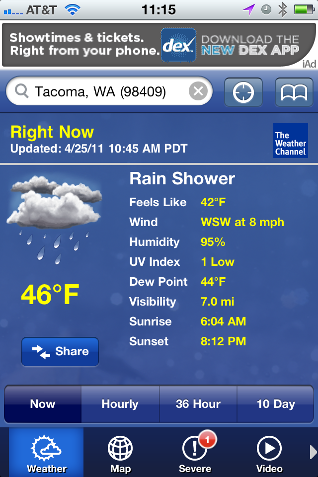
    ### [Weather!](http://itunes.apple.com/us/app/weather/id399987733?mt=8) ###

    It uses Marker Felt. It has iAds. Hitting the info tab actually brings up relevant weather info that you would expect to be a part of the main view. This isn’t very good at all.

    [](https://f3a98a5aca88d28ed629-2f664c0697d743fb9a738111ab4002bd.ssl.cf1.rackcdn.com/weatherbang.png)
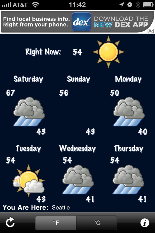
    ### [WeatherBug Free](http://itunes.apple.com/us/app/weatherbug/id281940292?mt=8) ###

    This is the only app that needed a progress bar to find my location — why? Not all of the graphics are optimized for the retina display. The graphics are a bit cheesy looking, but the data presented in the initial view is adequate. The forecast tab is anything but great. While a synopsis for upcoming days is given (nice touch) the data requires too much scrolling, making it hard to get a general idea of what the weather will be like — typically I just need a general idea, not a day by day detail.

    [](https://f3a98a5aca88d28ed629-2f664c0697d743fb9a738111ab4002bd.ssl.cf1.rackcdn.com/weatherbugfree.png)
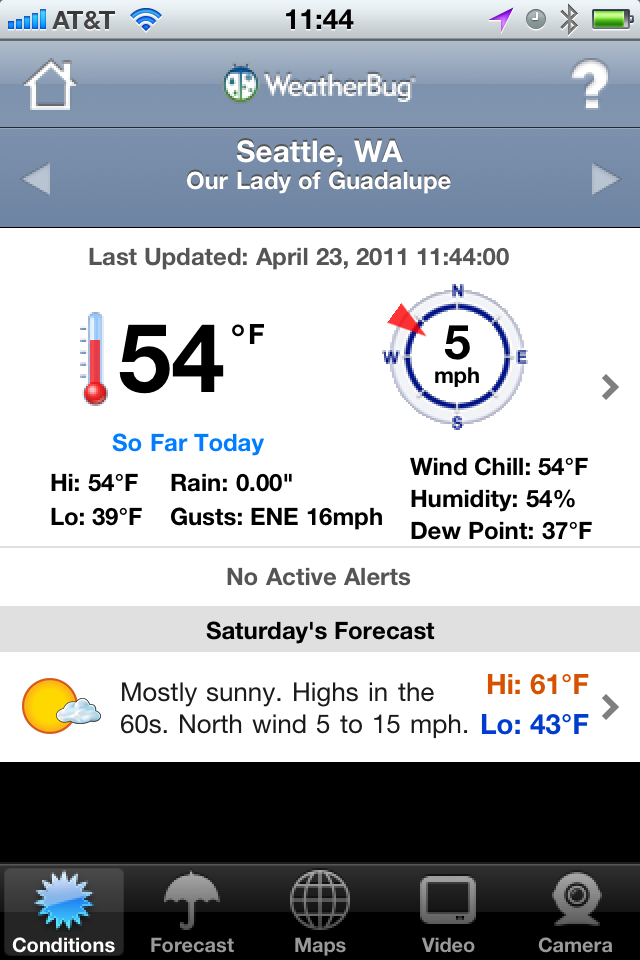
    ### [Weatherbug Elite](http://itunes.apple.com/us/app/weatherbug-elite/id310647896?mt=8) ###

    Many people recommended this over the free version, so I gave it a go. My thoughts are the same as the free version, just minus the comments on iAds.

    ### [AccuWeather](http://www.accuweather.com/iphone.asp) ###

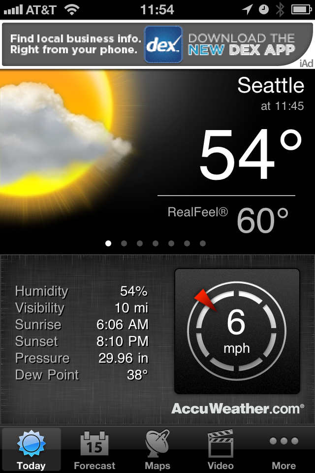
    First things first, you have to agree to the ToS for the app before you can use it — not sure why, this is after all a weather app. This is also the only app that didn’t find my current location by default, forcing you to go into the settings to add your location and delete the default ones — that seems a bit antiquated to me. There is an iAd along the top, a bit distracting, however I really like how the data is displayed in this app. The current temp and conditions is clear and very crisp. Extra niceties are shown like, sunrise and sunset, wind speed, and others. A quick swipe brings up the hourly data without leaving the main screen. There is a full week forward outlook and the data is again displayed very cleanly. Tapping forecast days gives you a bit more information and the large condition graphics allow you to scroll quickly to get an idea of what the weather will be doing. For me though I can’t get a sense of trends quickly and I still have to stare at an iAd.

    [](https://f3a98a5aca88d28ed629-2f664c0697d743fb9a738111ab4002bd.ssl.cf1.rackcdn.com/accuweather.png)
    ### [Pocket Weather](http://itunes.apple.com/us/app/pocketweather-1-weather-app/id375727893?mt=8) ###

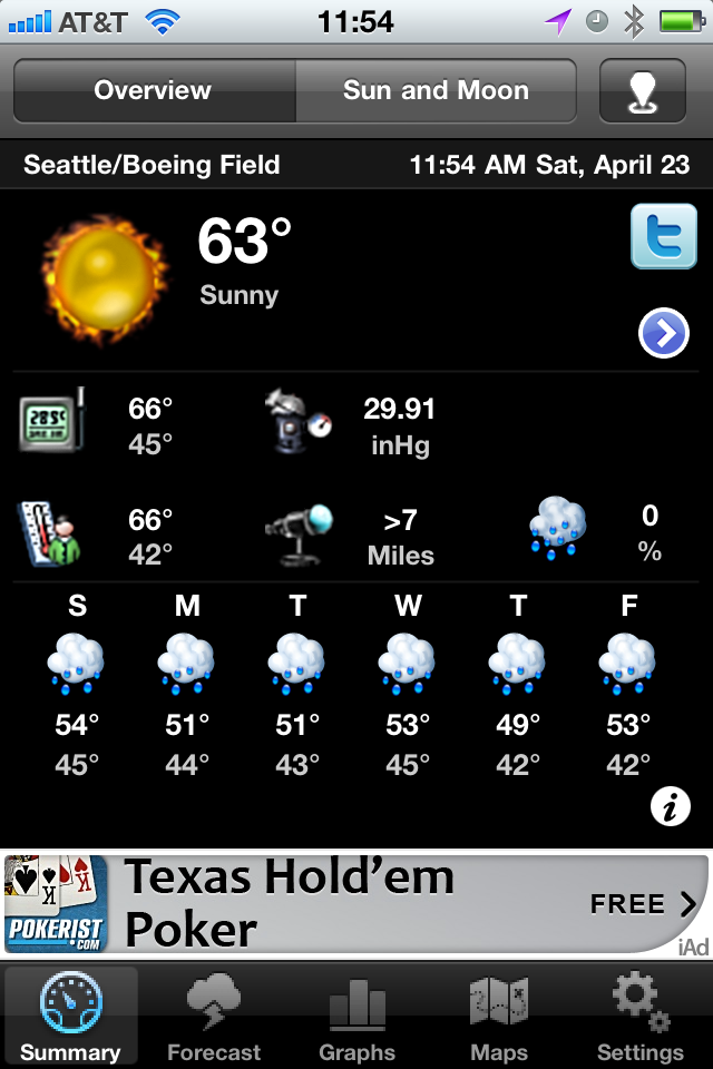
    This is by far the slowest of all the apps tested to get new data. The graphics are very cheese ball as well. Honestly this app isn’t very good. There is an iAd along the bottom and the graphics are goofy and don’t allow you to just glance at them to see what is going on. The font is too small and makes it hard to get data fast.

    [](https://f3a98a5aca88d28ed629-2f664c0697d743fb9a738111ab4002bd.ssl.cf1.rackcdn.com/pocketweather.png)
    ### [Weddar](http://itunes.apple.com/pt/app/weddar/id431659526?mt=8) ###

    Weddar is a new entry in the overly crowded app store market for weather apps. It is social, so it is crowd sourced information. It’s a great concept — except there are no users. Here’s all I got out of it:

    [](https://f3a98a5aca88d28ed629-2f664c0697d743fb9a738111ab4002bd.ssl.cf1.rackcdn.com/weddar.png)
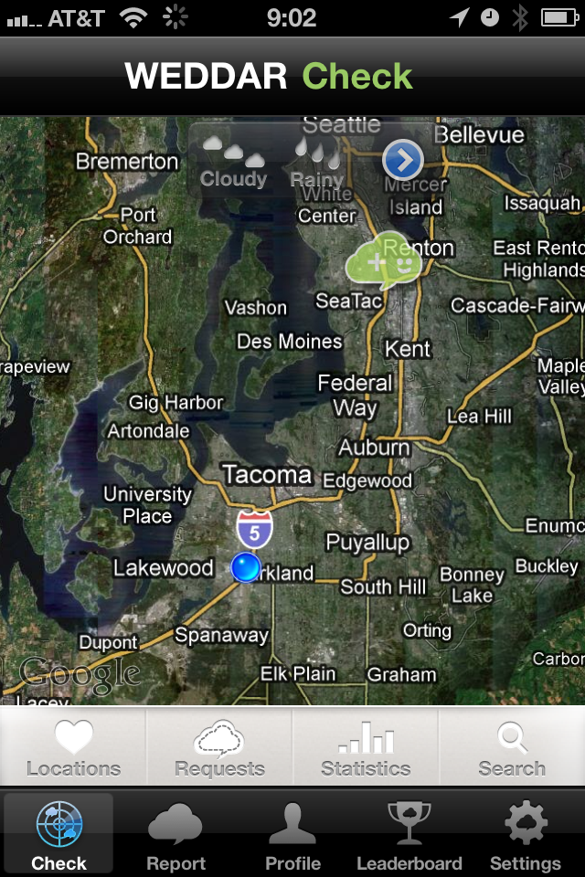
    Testing out the app the next day I got three more bubbles for a total of four — that’s just not going to cut it for me.

    ### [Mercury](http://itunes.apple.com/us/app/mercury-worldwide-weather/id308794306?mt=8) ###

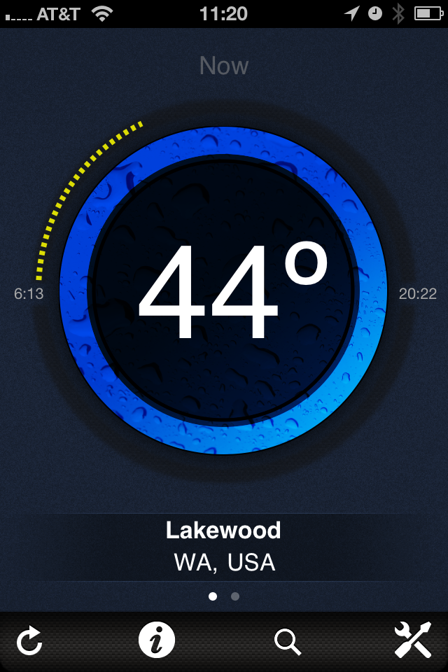
    Mercury is like a new twist of Thermo — you get the current temp in large text, the progress of the day (meaning dots to represent how far past sunrise you are, and obviously how close to sunset you are). A nice little graphic to tell you what the conditions are (rain, cloudy, sunny). Your location and a tab bar at the bottom. Swipe to the left and you get tomorrows forecast. Tap the temp and you get today’s forecast (highs and lows). Tap the information tab and you get a ton of details for today’s weather, love it. Here’s the thing, I love this app — more so that I do Thermo — but it’s not THE weather app for me since I would still need two apps.

    [](https://f3a98a5aca88d28ed629-2f664c0697d743fb9a738111ab4002bd.ssl.cf1.rackcdn.com/mercury.png)
    ### [Weather Underground Web App](http://i.wund.com/) ###

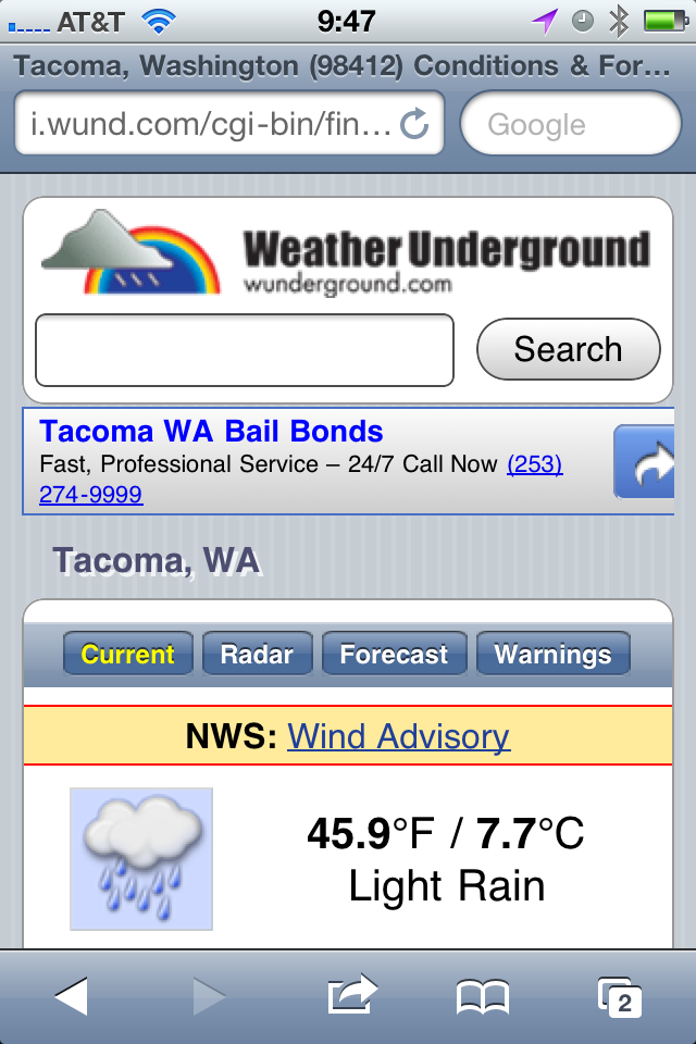
    This was recommended a few times so I “installed” it — being that it is just a mobile webpage, I added it to the homescreen. It is quick and provides a lot of detail and information — none of which is easy to pick out. This is an app for people who want to read about the weather, not for people who want to glance at the weather — I am a glancer. That’s neither good or bad, it just is. The tap zones for switching between current and forecast are also uncomfortably small for my fingers, overall though this is a nice little web interface.

    [](https://f3a98a5aca88d28ed629-2f664c0697d743fb9a738111ab4002bd.ssl.cf1.rackcdn.com/wund.png)
    ### [My-Cast](http://itunes.apple.com/us/app/my-cast-weather/id348779486?mt=8) ###

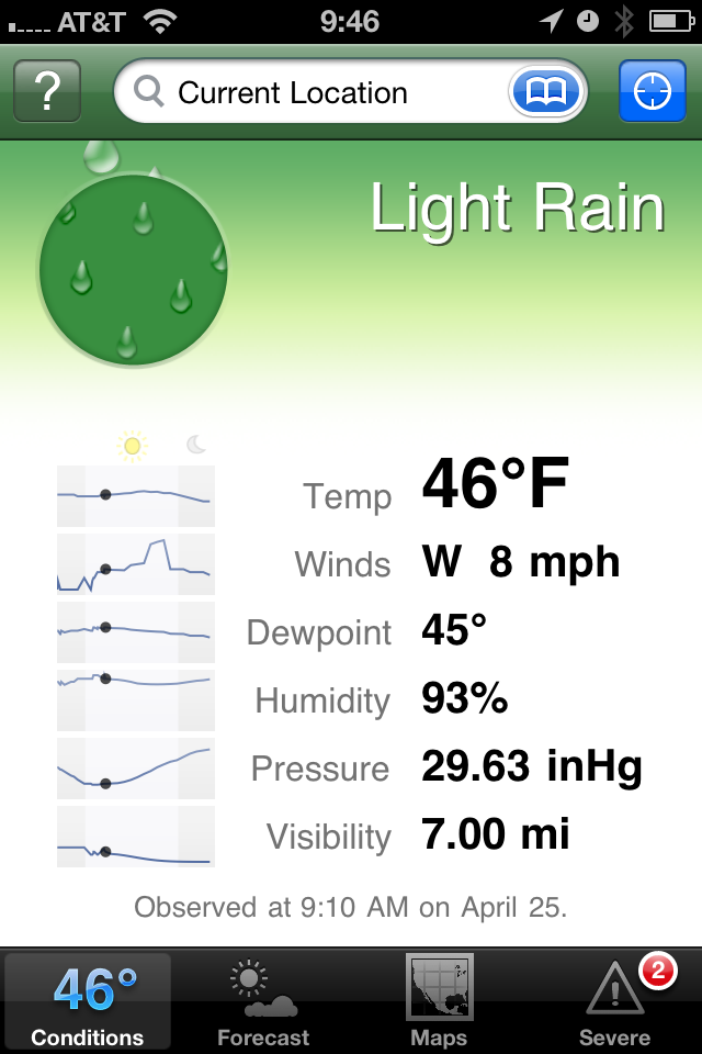
    This app is a bit hard to find in the app store and is priced at $3.99, which initially turned me away. At the recommendation of more than a few people I purchased it. I like the opening screen — showing me the current conditions and temperature in larger type. There is a nice bunch of additional data like wind speed and pressure. Scrolling down you get historical averages and the highs and lows for the day that have been recorded thus far.

    The forecast tab is where this app really earns its money — it only shows you six days into the future, but the data is very scannable to see what the weather will be doing. Most importantly, is the landscape view — you get a graph that shows you the temperature as a bar chart over the forecasted period, which very quickly will allow you to get a sense of the weather trend. Awesome.

    This app also has the best and fastest doppler radar map integration I have seen — which is to say that it actually works. The graphics are just OK in the app and the icon is rather poor. Having said that, this is the best of all the weather apps I tested and my new go to. I also like that the current temperature is shown in the tab bar so that you always know that while looking at the other data — a nice touch.

    [](https://f3a98a5aca88d28ed629-2f664c0697d743fb9a738111ab4002bd.ssl.cf1.rackcdn.com/my-cast.png)
    ### Weather Apps In General ###

    The main problem with weather apps is that there are too many and 99% of them suck. That means finding the gems, the useable ones, is incredibly difficult and often expensive. Part of the problem that is leading to this clutter is how freely available weather data is — you just need to design the presentation, no gathering of information is really needed since you just pull it from APIs.

    Most apps try to add too much eye candy, instead of thinking about what the users of the app really need and want to see. There are some very good single purpose offerings like Thermo and Mercury, most though are cluttered messes that have an ad stuck somewhere on the screen. Most are pretty bad.

    As I said My-Cast is the best of the lot that I tested, but it is far from being perfect. I would love to see someone take a weather app seriously — for now though My-Cast will be on my homescreen.

    *Apps recommended to me, but not tested:*

    – Stock Apple weather app (never have liked it).
    – [Weather HD](http://itunes.apple.com/us/app/weather-hd/id364193735?mt=8). While beautiful, I have it for the iPad, it’s not what I want for my iPhone.
    – [WeatherStation](http://itunes.apple.com/us/app/weatherstation-free/id376368426?mt=8). Great app, but again not what I am looking for.
    – [Outside](http://outsideapp.com/) app. It just looked so damned goofy from the screenshots I couldn’t bring myself to download and pay for it.

    [Updated: 4.26.11 at 3:12 PM]

    Here’s a follow-up post to this one, touching on somethings I left out.
  • Just In: Sitting All Day is Still Really Bad

    Patti Neighmond on workers who sit all day:

    >”Those who were sitting more were substantially more likely to die,” Blair says.
    >Specifically, he found that men who reported more than 23 hours a week of sedentary activity had a 64 percent greater risk of dying from heart disease than those who reported less than 11 hours a week of sedentary activity. And many of these men routinely exercised. Blair says scientists are just beginning to learn about the risks of a mostly sedentary day.

    I read a similar article in the [New York Times a while back](https://brooksreview.net/2010/07/the-men-who-stare-at-screens/) and made the decision that I needed to stand. I now stand all day M-Thursday while I am at my office. The rest of the time I try to move about as best as I can, it’s worth it to me. ((I do prefer to sit in a nice comfy chair, but I also prefer to live — or so I assume.))

  • iPhone Knowledge

    Alexis Madrigal on his iPhone:
    >This thing remembers more about where I’ve been and what I’ve said than I do, and I’m damn sure I don’t want it falling into anyone’s hands.

    It’s pretty impressive what tools like Lantern can rebuild about your life with physical access to your phone. Impressive and scary.

  • Quote of the Day: Mike Lee

    “So busy bitching about iPhone location logs I forgot to check in on Foursquare.”
  • Turning Left

    As humans we have the tendency to fall into routines — routines which can become rather boring — more importantly routines that give us little reason to “Think Differently”. We drive the same route to and from each place, we work at the same desk, at the same computer, at the same chair. We stare at the same colors, wearing the same seven outfits — which often consist of just a few colors. We have the same conversations with different people, and different conversations with the same people.

    It’s all habit and habit is boring.

    I am prone to falling prey to habits, just the same as everyone else. When I catch myself stuck in a habit — stuck in a routine — I pull myself back into the interesting world of spontaneous. I buy a shirt or a pair of pants that don’t blend with the rest of my clothes — that don’t fit the preconceived image of me that I store locked away in my brain. Most importantly, to me and to my life, I change up the routes I drive.

    I turn left where I would normally turn right. So what if it adds fifteen minutes to my drive, those are going to be fifteen interesting minutes. You are going to pass things you don’t normally see and in turn you are going to excite parts of your mind that we rarely use any more — the parts that help us to navigate.

    I drive 45 minutes to work and 45 minutes home from work, four days a week, every week. I drive countless other places during everyday of every week to go to places like: buildings I manage, drug store, liquor store, grocery store, take-out, bank, restaurants, bars — the usual places for any 28 year old guy living in Seattle. What I try to do — much to the annoyance of my wife — is to occasionally take the road less traveled.

    The fastest way for me to get to work is to turn left, then right, right again, merge onto I5, take the exit, turn right, right again, right yet again, then left and left. I’m there. Some days I turn in the opposite direction or take different exit, somedays my life is a little different.

    I won’t sit here and tell you that on those days I am better at my job, or that I am even happier. I won’t tell you that I get any real meaning out of changing how I get from point X to point Y — but I do know that it doesn’t hurt me. Sure, it takes me an extra 5 minutes to get somewhere — big deal.

    If “variety is the spice of life” then turning left where you turn right is anything but bland.

    People often ask me how I think of topics to write about, or how I find the motivation to do “so much”. The truth is: much of the ideas I come up with are arrived at while I am driving somewhere — and I can’t help but think that, in some small way, this is because I turned left where I should have turned right.

  • iOS Notification is Fundamentally Flawed

    Nik Fletcher makes some great points about why the iOS notification system is flawed in general, not just for the tech obsessed bloggers out there.

  • Black Screen of Death

    If you are Microsoft and you decide that, in order to remove negativity from your OS, you are getting rid of the infamous “Blue Screen of Death” (BSOD) — so you change it into a black screen, which you can also abbreviate BSOD. Meaning you have changed nothing. Come on.

  • Quick Takes on Five Apps #10

    This is the tenth [installment](https://brooksreview.net/tag/quick/) of the Quick Takes series, where I look at five apps and tell you my thoughts on them.

    ### [World War](http://www.storm8.com/games/world-war/) (iPhone) ###

    This is a game that, from the icon and splash screen, makes you think that you are getting a first person shooter. Then you get into the actual game and you think you are playing something more akin to Risk. Except that there is no description for what this game is and overall it is just not that great. It can be addictive if you have friends that you can form an ‘alliance’ with, but you can’t discover that in app. Leaving you to type in these random alliance codes. Overall I’d pass on this game. The game play is a lot of automatic button pushing with a slight amount of strategy applied to what you “spend” your fake money on (unless you use in-app purchase to turn your real money into fake money).

    ### [Evernote](http://www.evernote.com/) (iPhone) ###

    It’s been a long time since I last used Evernote (Aug 2009), but after seeing how far the mobile app has come I decided to give it another try. While it’s really not for me (text files FTW), Evernote has done a fantastic job revamping their mobile offering. If I was someone who took a lot of pictures of text (white boards, labels, papers) then I don’t think there really is a better option than Evernote. It is much quicker and much better looking (aside from the icon) than past versions. Worth a look if you left Evernote because of the poor mobile offering back in 2009 — I really like the Loren Brichter styling on the new note entry fields.

    ### [Flight Track Pro](http://www.mobiata.com/apps/flighttrackpro-iphone) (iPhone) ###

    This is an oldy, but goody. I have been using it for quite some time now and you can’t beat this app for tracking your flights (or those of people you are picking up from the airport). The best feature: the ding-dong sound it makes when sending you push notifications, love that identical to that ‘fasten-seatbelt’ chime you hear on the plane. I have found that the data for when the flight landed (not the time it will land, but whether it is landed already) is always wrong. Always.

    ### [Easy Release](http://itunes.apple.com/us/app/easy-release/id360835268?mt=8) (iOS Universal) ###

    If you are a photographer that ever needs to get a model release or location/property release — you might want to give this a look. It’s not the best UI, in fact it really sucks. But it gets the job done without paper. Both people can sign on the device and have a pdf emailed to them. I can’t speak to how strong the contract is from a legal perspective — but this app has saved my butt quite a few times when I forgot to bring a model release with me. I also like that the models info is saved in the app for quick creation of a new release when needed. Good stuff. (Again the icon and app itself needs a lot of love from a designer.)

    ### [Mactracker](http://itunes.apple.com/us/app/mactracker/id430255202?mt=12) (Mac) ###

    Did you know that the Macintosh Centris 660AV was released July of 1993 for a price of $2,300 and weighed in at 14lbs? I didn’t either, but Mactracker does. Sure you can get some of this info from Wikipedia, but having it all in one place for every Apple product is quite awesome. It’s also a free app so you really can’t go wrong. A great thing to play with is the timeline view to see what Apple launched on a year by year basis. Neat stuff to play with, especially if you write about Apple.

    *If you liked this installment be sure to check out the other [installments](https://brooksreview.net/tag/quick/).*

  • “Oh yes they do.”

    In an email response allegedly from Steve Jobs, responding to the statement that a user may switch to a Droid because it won’t track his location:

    > Oh yes they do. We don’t track anyone. The info circulating around is false.

    That’s a great statement. We know that Android users are tracked as well, but to say that information surrounding the very obviously existing location database is ‘false’, is just odd.

    [Updated: 4.25.11 at 8:53 AM]

    It has occurred to me that he could be responding to whether or not Apple is using that data, but I think the strong argument being made on the web is: “why”.

  • Design Is Not the Goal

    Francisco Inchauste:

    >Content has always been king, until we forgot about it when some shiny device came out and designers went crazy with the pixels. Even if you can raise millions and build up a ton of hype for your startup, people will soon discover whether or not the content is all that, or just not there. When you forget to design a purposeful experience, you’re guaranteed to launch vaporware.

  • Rinse

    Real Networks:

    >Rinse is the smartest way to seamlessly organize and repair your iTunes music library. We’re powered by an intelligent online database which finds what you need without searching or typing.

    A lot of people having been giving Real crap for creating an Adobe Air application that does something many other people can do for free, all while charging $39 for the privilege. They are right, a lot of the “features” of this app are utter crap. Except one, finding and removing duplicate tracks. You can find them easily in iTunes, but I have over 1300 duplicates, which means I manually have to remove that many — I don’t have that much patience or time.

    So I bought Rinse and let it go through my library to find the duplicates, guess what? It worked, and from what I can tell it did exactly what I have been trying to do for over a year now: get rid of a mass amount of duplicates with one push of the button. Good times.

    As for the other features: they seem to be hit and miss. Worth the $39 dollars to me though. (I know you think I am crazy for saying that, but I had two libraries that I merged which have lots of duplicates on them.)

  • Quote of the Day: @WillFerrell

    “Facebook is like jail, you sit around and waste time, you write on walls and you get poked by people you don’t know.”
    @WillFerrell (a parody account)
  • Cranking

    This is the first thing you should read this weekend and the last thing you should read before Monday. This is Merlin Mann and the written word at its best.

    Merlin, if you are reading, thank you.

  • Topolsky on The iPhone 5

    Joshua Topolsky over at This Is My Next is reporting on a mock up of the next iPhone based on his sources. Look at that mock-up and think about what is being rumored here. Then ask yourself, how does a phone that thin, or even as thin as the iPad 2, have respectable battery life and include the power hunger global CDMA/GSM chipset and retina display as well as something at least as powerful as the A4 chip?

    Color me skeptical on this one.

  • B&B Podcast Episode 9: Glass Half Empty

    Shawn and I discuss News.me and RSS feeds and how news curation is a hot area right now.

    Huge thanks to our sponsors United Camera and Tommy Schaefer — be sure to listen to see how you can win an hour of free tech support.

  • Butcher’d Twitter-Tweetdeck Analysis

    Mike Butcher wrote this article for TechCrunch and the entire article makes no sense. I also couldn’t disagree more. Let’s take a look, shall we?

    Butcher on the importance of Tweetdeck’s users:

    >But as any journalist or social media expert will tell you, these are power users, producing many of the most influential content. Indeed Cornell University and Yahoo! Research found that a tiny minority of users – around .05% of the site’s population or 20,000 elite users – are generating around half of all the Tweets. These are divided into celebrities, media, organisations (such as Google) and blogs.

    What Cornell and Yahoo! didn’t say is that these users are using Tweetdeck, apparently though we are just to assume that since the two sentences were put next to each other. Also, where’s the citation on either of those statements… but I digress.

    So apparently Twitter is good because of the people that use Tweetdeck — sorry but I am not buying it. Twitter is not good because it has celebrities tweeting — if that’s what you think makes Twitter “good”, then I would strongly suggest that you don’t, in fact, understand Twitter.

    Here’s Butcher’s opening salvo — his argument for Twitter to buy Tweetdeck:

    >The question is this: What is it worth to Twitter to keep Tweetdeck out of Bill Gross’ hands? For in Tweetdeck lies the balance of power in the Twitter eco-system.

    In other words the argument he is trying to make is that Tweetdeck is the most important 20% of the all Twitter users. That simply is not true. I took a look at the people I follow and the tools they use to tweet — the only ones on Tweetdeck are Windows users that I follow. If those people disappeared from my Tweet stream I would not know as much about the Mariners as I currently do, and I would be lost on the current tiredness of some of my favorite celebrities. That would be a bummer, but it actually would probably make Twitter *more* useful for me. For *me*, though, just *me*. ((Oh, and everyone else who needs less crap in their lives.))

    >So if Uber becomes the owner of Tweetdeck, the most valuable 20% of the audience would not be owned by Twitter.

    That makes no sense — Butcher is arguing that Ubermedia would be able to hold a “.44 magnum” to Twitter’s head. That’s just stupid, here’s how a scenario would actually play out if Uber bought Tweetdeck and tried to strong arm Twitter:

    Uber: We are serving our own ads in Tweetdeck now.
    Twitter: That’s against the rules and we will lock you out of Twitter if you do so.
    Uber: Then we will create our own network and force Tweetdeck users to use that network. Do you really want to loose 20% of your user base?
    Twitter: (laughing)
    Uber: We are very serious. WE own Tweetdeck.
    Twitter: We just launched a native Windows client that doesn’t run off Adobe Air and looks beautiful, designed by Loren Brichter, heard of him? Have a great day.
    Uber: Shit.

    That’s a more likely scenario, but why? That’s easy — celebrities and “social media experts” (read: marketers) aren’t going to waste their time spamming each other with Tweets. They want access to their fans and their customers — they get that access with the “other 80%” of Twitter users. Proof: ask MySpace how well their service worked out for them when the only people left were no-name bands…yep.

    >If Uber buys Tweetdeck, Twitter can eviscerate their business by shutting Uber off (and a large swathe of their top users). Or they come to a deal, based on Uber’s terms.

    Yeah right. What’s more valuable in the Twitter ecosystem: 100 followers that are all “power users”, or 10,000,000 followers that are regular people?

    I think you get the point.

    The bottom line is that Twitter is valuable because:

    1. Popular, influential people use it.
    2. A ton of regular people also use it.
    3. People in point 1 can connect to people in point 2.
    4. People in point 2 can connect to people in point 1.

    The popularity **and** scale of the service is what makes it good, not any one subset of users. To make a rival service that stands any chance of survival would need both the influential users **and** the 180 million other users.