A simple app isn’t simple by virtue of having fewer options, a simple app is simple because of usability. The fewer the options an app has, the more complicated it can actually become to use — I know that sounds counter intuitive, but allow me to explain.
I started thinking about this a while ago when I wrote about switching back to Ulysses III from Writer Pro, in that post I wrote:
Both Ulysses III and Writer Pro are exceptionally simple. Writer Pro is a no-nonsense ‘here is what I am, and that is all there is’, type of app. Ulysses III is more of a ‘this is your writing space and it is as simple as you want it to be’, type of app.
And:
Everything you do in Writer Pro, outside of writing and editing, must be done somewhere else — not in the app. So while Writer Pro is more simple, it adds more complexity to my overall workflow as I need more and more tools to do something — anything — with that text I just labored over.
This got me to think about a lot of apps that we herald, and seemingly love, just because the are so called “simple” or “minimal” apps.
Let’s step away from the contentious writing app space and look at calculator apps to start.
Calculator Apps
A calculator app can run the gamut from a simple calculator as found on the iPhone pre-installed, to something more complex like Soulver or PCalc, all the way to extremely complex like Excel (which, yes, is mostly just a calculator).
Apple Calculator
Here’s what Apple’s basic calculator app looks like on the iPhone:
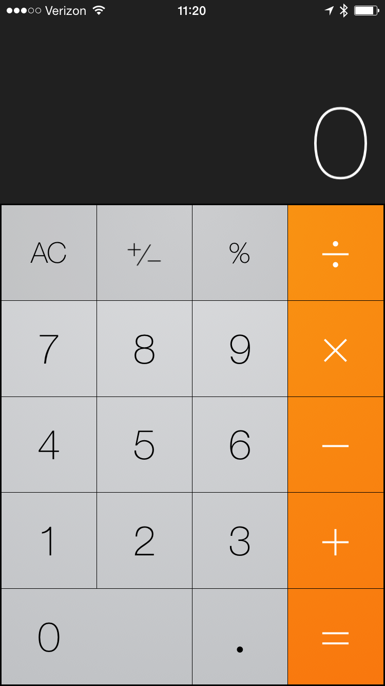
It’s very hard to argue that this app is anything but extremely simple. But I think that’s the wrong argument to make, it is a minimal app, not a simple app.
There isn’t much to the app so it is minimal, but try to do anything more than a basic calculation in the app and things are not so simple anymore. Suddenly you need to know formulas which you forgot in high school.
Soulver
Now let’s look at my favorite calculator app: Soulver. Here is what Soulver looks like:
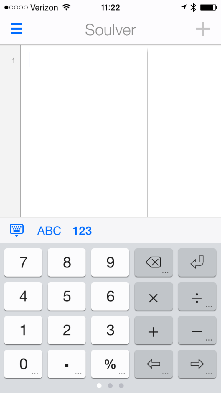
Again, pretty simple and minimal looking. But in reality this is a simple app, not a minimal app. For instance I have two different keyboards, and one of those two has three panels to swipe between to show more options. And once you start inputing data, minimal goes out the window, but simple remains.
This I think is best illustrated through examples in the app. Let’s take a unit conversion. I hate doing this and really don’t know much about it. But let’s say I want to convert millimeters into inches so I can comprehend the size of a new gadget, here’s what that looks like:
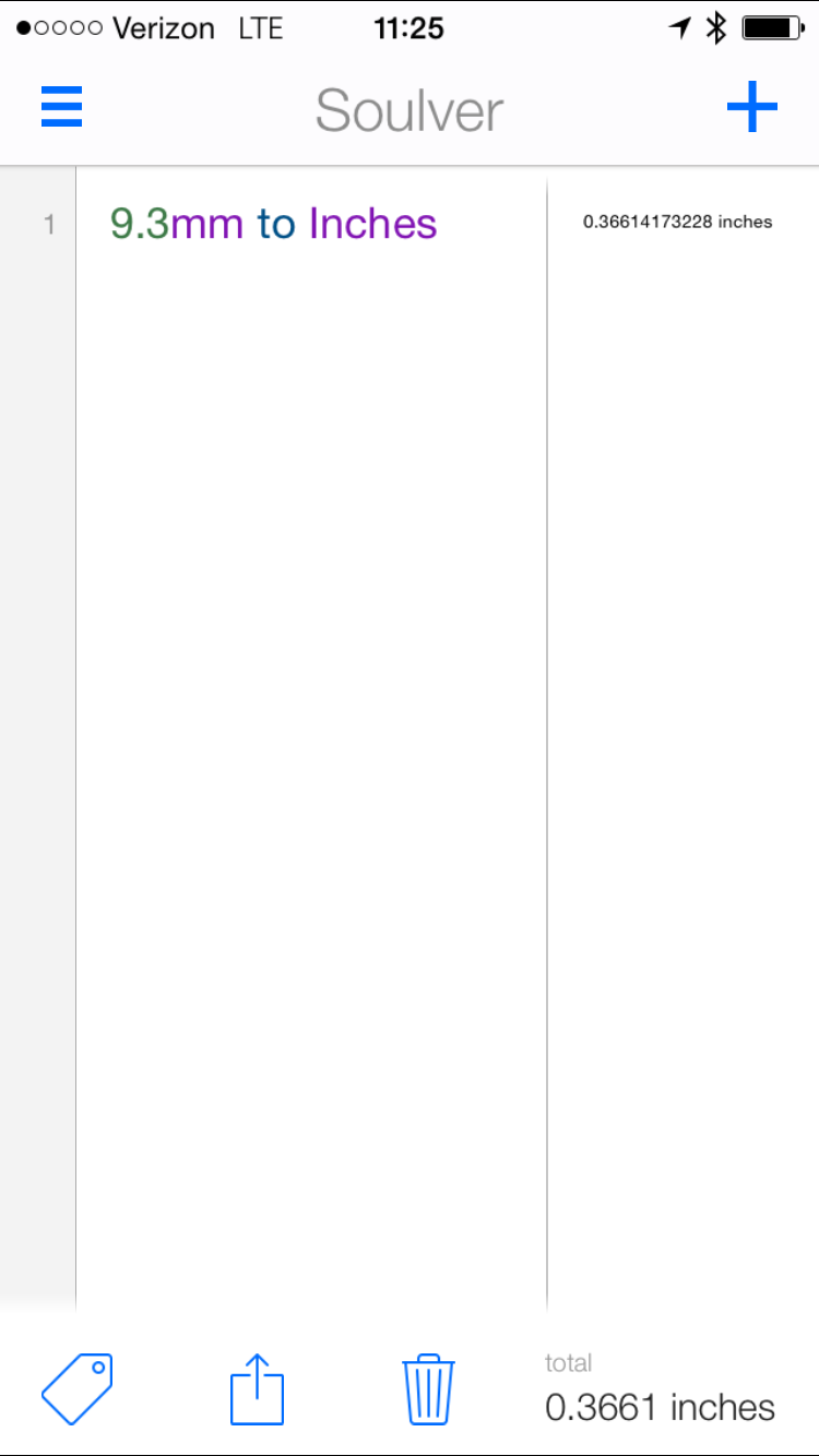
All I did was type in the number and unit and then the text of what I wanted to convert to in natural language. That’s simple, not minimal. I don’t even know how to do that calculation on Apple’s calculator.
Or how about if I wanted to see if I can afford something in my budget:
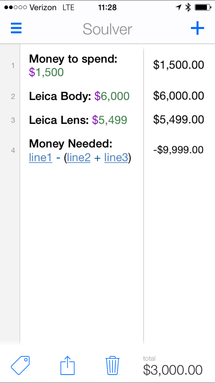
Looks complicated right? Not really. Line four was the hardest part, but even that was easy. Now I can continuously update that budget as I get more money available, or as the camera gear prices change.
I can do updates because Soulver saves these sheets, and I labeled my values. That’s simple because I didn’t have to do it that way, but in doing it this way I am always able to quickly come back to the sheet and know what is going on. Soulver focused on working the way I wanted to work, not only the way it was designed to work.
That’s simple, over minimal. A flexible, easy to use app, that has what you need and presents those tools in an easy to use manner.
PCalc
PCalc takes a different tact on simplicity. Instead of allowing for natural language type input, one can make their own calculation buttons. More complexity up front, for massive simplicity down the line. Dr. Drang has detailed this well.
This is yet another approach on designing an app which helps the user do what they want, without forcing them to have a bunch of knowledge. Though I would argue here that Pcalc is less simple than Soulver.
Excel
And then there is Excel, the ultimate in complexity. I don’t think I need to explain why it is complex, because we all intuitively know it is complex. Yes, Excel is more than just a calculator, but Soulver is also more than just a calculator too.
Excel is very complex, which means it also handles complexity well — but it is far from simple or minimal.
Minimal is Not Simple
A minimal app is one which has very few options, preferences, modes, states, or general cruft. It is often an app that doesn’t do very much. It is the bare necessity to still call the app of a certain type (e.g. Calculator, Calendar, etc).
A simple app may be robust in features, but everything is presented in a manner which is very easy to understand. So where a minimal calendar app might offer a new event screen which has only 2-3 options on it, a simple calendar app is likely one that just offers the user a robust natural language input options.
The difference between tapping and typing the event name, tapping and typing the location, tapping and selecting the date, tapping and selecting the time — is profound difference between typing one sentence that encapsulates that entire routine and the software processes. The latter is infinitesimally more simple than the former. However the tap and enter routine often looks more minimal, and less psychologically heavy.
What I’ve come to realize is that minimal software is just that, minimal. The lack of things can either make software more complex, or less complex, but minimal by its very nature does not necessitate simple.
Once you then remove the minimal tag from things, you will find that simple apps are made simple not by the feature amounts, or the design, but rather by whether or not the app truly understands the task at hand. Apps that understand, and thus help the user accomplish a goal, are truly more simplistic than those that do not. And thus, simple apps are highly subjective as our uses vary from case to case.
Writing Apps
Let’s go all the way back to writing apps — those contentious apps that Markdown powered bloggers like to drink down faster than a cup of AeroPress. I want to single out four very popular apps: Writer Pro, Byword, Scrivener, and Ulysses III.
Writer Pro
Famously, Writer Pro and its sibling Writer, offer no preferences screen in the app. You cannot change anything about the app. This would certainly make the app minimal, but does it make it simple? For the longest time I answered that with a resounding yes, this is a simple app.
The more I think about it, especially in the case of Writer Pro, the more I am convinced that this is actually a complex app and not a simple one.
With Writer Pro it is made complex from the features it incorporates:
- Syntax Control: the once patented tool for highlighting different parts of speech. We took a look at this on this site and found that it is mostly not helpful, just added complexity to the app.
- Storage Buckets: Originally Writer Pro used folders within iCloud to store the files in different writing states. Now Writer Pro uses a different file extension for each state — though the files remain standard plain text, they now have confusing file extensions. Unlike every other app you have to manually manage files, and those files also are not of a common file extension. This is one of the oddest changes to the app.
- Document States: You have to decide if you are in: Note, Write, Edit, or Read states for each document. As noted above the app will remember this, but what about just writing instead of picking what form of writing? And if you are in the Read state, well you cannot edit even if you find a typo. This is not a simple toolset to work with.
- Export: PDF, HTML, Word and that’s it. I am not sure anyone would export a file from Writer Pro to use it as exported, so in a sense this app has no way to get the text out of it, short of copy and paste.
To me a writing app needs to go from: idea, notes, writing, editing, proof-reading, useable state (e.g. publishing) seamlessly for the writer. In every aspect of Writer Pro the act of handling your written work is made harder and more complex.
Minimal, not simple.
Byword
Byword is a minimal app, and yet it is actually also a simple app, with a caveat. You see Byword is very similar to Writer Pro, but it offers no syntax control, or documents states — removing complexity already. More importantly Byword excels by baking in tools to publish with — even directly to WordPress.
But the problem with Byword is that it is really a tool best designed to be simple for web writers, specifically those that publish to WordPress. Otherwise all other writers will find themselves back to where they were with Writer Pro.
And like Writer Pro, you are left organizing your own files.
Byword is perhaps the best example of a minimal app which is also simple, but mostly for a niche set of users.
Scrivener
Now we pop to the other end of the spectrum and find the beloved Scrivener. This is a complete solution style writing app, and it is a mess of complexity. It is neither simple, nor minimal. Refreshingly Scrivener seeks to keep your documents organized for you, and helps publish your works to useable longford formats, but that’s where my praise ends.
I won’t go into much detail, but just to get up and running one most configure a multitude of things to get the app to work right. Each time I personally use the app I find myself spending more time fighting the app to do what I want, than I do writing in the app.
Matt Gemmell even wrote a post about getting Scrivener setup for writing a novel, something that it is designed to do. I think of Scrivener like I do Photoshop: there’s a lot of power there, none of which most people will benefit from taking the time to learn.
Not minimal, not simple. But not useless either.
Ulysses III
Which brings us to the world’s best writing app — where I am clearly biased by my love for the app. In my mind Ulysses strikes the best balance of all these apps between minimal and simple. I find Ulysses far from minimal, but exceptionally simple.
I can organize all of of my documents easily in the app, utilizing multiple syncing tools all at once. I can publish to everything except a website (major problems with that shortcoming).
But more than any of that, this is an app that says: I am built for writing, and we are only going to fiddle with stuff when you go to publish.
What makes Ulysses simple is that I can start a new sheet, and leave it as just that, a simple sheet of words. Or it can combine with others. I can take that same sheet and split it into multiple sheets.
I can start writing about a camera and realize I really have three posts and the app will split that for me without me having to worry about files or organization.
Likewise I can start a bunch of posts and realize I have the making of a book. I can group those posts together and eventually export to beautiful ePub or PDF files.
Where all the other apps are rigid in their usage, Ulysses is flexible. It says I can do all of this and be all of this — or I can be none of this. Tell me what you need — for today — and that’s what we will do.
There is no fighting, just lots of writing.
Simple, not minimal. It works with you, not against you.
Get to the Point
So now that I have gone through all of this, what is the point? My point is that simple software is good for users, but minimal software is not necessarily good for users.
That truly simple software is that which you forget you are using, because you are just getting shit done.