This will mark the fifth version of Mac OS X that I have used since I “switched” to the Mac. With every new OS X version I have thoroughly enjoyed the new features that were delivered and the slight UI improvements that also came with each update. New versions of Mac OS X are far more important than most other software updates — my life simply revolves too much around my laptop to not pay close attention to OS X and any updates that Apple makes to it.
Ignore the fact that this is still the “same old” Mac OS X. Lion represents the most polished operating system that I have ever had the privilege and opportunity to use — iOS included.
With Lion we begin to see a subtle obfuscation of the file system and a move toward skeuomorphic design for certain apps — yuck. This represents exactly what Lion is: a nudge forward that pushes what seem to be subtle changes, which are in fact a rethinking how computers *should* be used.
Not a nudge in the sense that this is an entirely new OS, but a nudge in the sense that this is an OS built *for* today’s computer users. In stark contrast to what we are used to: systems built for people that want, or know, how to use the *system*.
Yet it is the same old Mac OS X that were all very used to.
Lion then, is built for people — plain and simple. One could argue that the Mac from day one was built that way, but then I would ask you how many times you heard someone say: “I don’t know where I saved it”. Until you eliminate those phrases, until you eliminate the confusion, you don’t have a system built for *real* people. Lion is a step in the right direction towards removing this confusion.
### The Gist
As I said Lion is not about massive operation changes — it is more about subtle refinement of every aspect of not just Mac OS X, but of computing in general. That’s why at first glance it is harder to see the system files in Finder and easier to just see every user created file — OS X is showing you what you are likely to be looking for first not the logical structure of all your data.
Lion is not about the ‘iOSification’ of OS X — that is a short-sighted summary of Lion in my opinion. There is edge smoothing, feature additions and all sorts of stuff like that, and yes some cues were taken from its sibling iOS — but it’s not iOS, it doesn’t want to be and it doesn’t try to be.
Lion makes a full-fledged operating system feel intuitive in a way that you think: “I always *should* have been able to do this, but only *now* can I do this.”
This is best shown with the addition of tools that allow you to virtually sign a PDF only using a webcam. Keeping you from having to buy expensive hardware to ‘get’ a signature on to your Mac. You see it with the refinement of the system-wide autocorrect and the beautiful way that your Mac transitions from being a laptop, to a desktop.
These features alone are not enough to convince most that this is anything but a feature upgraded OS, but when you start to use Lion — all these small refinements — tell you that this is an OS made for users and not for programmers. ((With no offense intended towards programmers.)) That’s a good thing — a really good thing.
### Biggest Changes
Let’s go through some of the bigger changes that will be most apparent to upgrading users.
#### Scrolling
As most of you have heard by now, scrolling has underwent some major changes in Lion, not the least of which is the reversal of the way the scrolling works. Apple changed the scrolling behavior so that your interaction with the trackpad or magic mouse (or scrolling wheels) manipulates the windows in the same way that it would if you were directly touching the screen.
Therefore sliding your fingers downward scrolls up and not down. It is a major change that takes some getting used to, but once you get used it everything seems far more logical. This can of course be turned off, but I urge you to keep it on for a couple of weeks. I have really come to prefer this scrolling reversal, especially when using a Magic trackpad, which is what Lion seems to be built around.
Apple also changed the looks of the scroll bars — you don’t see them — they only appear on hover and have no arrows for up and down. This is a welcomed change from those terrible looking bright blue plastic looking scroll bars. My biggest concern with this change is that it is no longer readily apparent to users that the content is scrollable.
I believe this is a change that will be welcomed by long time users, and mobile first users (the current crop of ‘kids’). However casual computer users, the group I usually refer to as “my Mom” will likely have a long adjustment period to this UI change. Overall, it seems like a change made for aesthetics and a logical move for the more advanced users — my fear is the added hurdle this will add for “new” OS X users.
The best change though, is the addition of elasticity in scrolling. As Apple did with iOS you can see the document run past the end of the actual document before it *snaps* back, and some apps are now implementing pull down to refresh types of behaviors. ((Notably: Twitter for Mac.)) This is the addition that makes reversal of the scrolling, momentum, elasticity, and multi-touch gestures, feel ‘natural’.
I am a huge fan of all the scrolling revamps in Lion, they are all welcomed in my book and really make the entire OS *feel* much different.
#### UI Looks
There is a lot of craziness going on with Lion’s overall UI changes, and to list off what has changed we would need to start a whole other blog. There are three major design themes that come with Lion.
##### Skeuomorphism
This is all the hideous screenshots you have seen of iCal and Address Book. This is the worst thing I have seen Apple do in quite a while, I half expected Mail to turn into a postal box with letters you had to pull out and unfold — thankfully that is not the case (yet). However, you do get these lovely looking apps:
Arguments for an against each app’s new design has been rehashed here and other places quite a few times since the screenshots first leaked. No need to go over them again, it’s just a design trend that Apple has decided they would like to do in a select few apps — and that I am glad they only chose to do in a few apps.
##### Rounded corners
All four corners of every window are now rounded. The rounded corners look really nice on the bottom of every app, but for looking at certain documents I find it a bit odd to have those corners cut off. For instance: Pages. If I am designing a newsletter, or whatever else you do in Pages, I am going to guess that you won’t be trimming those corners off the bottom of your printed paper. Therefore I would really appreciate a more *accurate* view of the documents I am creating.
Those corners just give you an unrealistic view of what you are working on, so for things that you are creating for physical production I don’t like those rounded corners. However for most other things the rounded corners are a nice touch that ease the lines of the OS.
One thing about this though that bugs me: a few versions back of OS X the top two corners of the menubar itself were rounded, thus there was a few pixels on every Mac’s screen that were rarely used. Then Apple changed it so that those top corners were no longer rounded and every thing looked a bit better. Now, we have sharp corners on the OS itself, and rounded corners for every window — it’s not that important, but does seem oddly contradictory.
##### Monochrome everything
This might be the most apparent change in Lion, Apple decided to save users money on LCD ink and change their OS to one that need only show shades of bluish gray. We saw this change coming in iTunes and it has permeated it’s way through much of the OS. Finder is a primary example, and while it looks nice, it makes Finder a touch harder to use.
I like the subtlety of the monochrome and I like to look at it. However, I don’t like using the OS as much with these changes, I find it just to difficult to find what you are looking for — too much subtlety and not enough usability.
I can see the argument for both sides of this coin:
1. Too much color is just as useless (case in point, most people’s Dock). So Apple wanted to simplify the color schemes for the sake of aesthetic appeal and to make a change.
2. Too little color is just as problematic as too much color. Now when I look at playlists in iTunes, ‘favorites’ in the Finder sidebar — well everything looks the same.
Or:
>If you make everything bold, nothing is bold. —Art Webb
We need a compromise here.
### Best Changes
#### External monitor support
By far my favorite change in Lion is the way the OS handles external monitors. It used to be that when you wanted to run your Mac in clamshell mode (external monitor attached, lid of portable Mac closed) you had to plug everything in and close the lid. The computer would then sleep and you would then need to wake it by hitting the keyboard or mouse — this would put the Mac into clamshell mode.
Now, under Lion, closing the lid of the computer with an external screen attached just results in a momentary flash of blue while the machine switches over to clamshell mode. This also means that opening back up the lid on your Mac will put it back into dual screen mode — all automatically.
I have to do this at least twice a day, so this change alone has made Lion an awesome upgrade for me. This is just another ‘commons sense’ update for Lion.
#### Finder
No, Finder is not magically less sucky in Lion, it does however offer some very cool new features. The biggest of which is the obfuscation of the underlying Mac file system. Instead of showing you the pure directory structure of Mac OS X, Finder shows you the information that the average user is likely interested in seeing: their files.
Apple is placing a primary importance on the user and what the user needs. This is most apparent by the new way that the list of folders and drives is ordered along the sidebar of the Finder window. The Finder first shows you the new ‘All Files’ option that seeks to show you every file on your Mac that is a user created document (Pages files, text files, pictures and PDFs), from there you get common folders (Documents, Music, Movies, Pictures) then you get shared computers and lastly drives that are connected to your mac.
Whereas in Finder previously the user saw drives at the top, the shared computers, then commons folders, then smart folders — Apple has refocused the attention away from drilling down through the file system, to just presenting you with the files that you will likely want to access.
This is just one small step in Apple’s over arching goal in Lion to disconnect the users from the file systems that they are used to, and get them into a mindset of one repository for finding files. Essentially Apple wants you to stop worrying about where you saved things.
It’s a change that will be off putting for advanced users, but that will be loved by more novice users (novice to both the Mac and new computer users) in the same way that iOS has done for mobile users. Quite honestly the ‘All Files’ view is something that I find to be rather nice.
##### AirDrop
A feature that will likely to be that ‘hallelujah’ feature for small offices and Mac obsessed homes is: AirDrop. Finally a way to quick and easy way share files (large files) with other users on the same network — this is killer.
I can’t tell you how many times I need to send my wife a folder of RAW images that weigh in over 1GB — right now we have to use the public ‘Dropbox’ built into Mac OS X, AirDrop will make the process way less confusing for my wife. Likely, this will be a big hit among small business users.
#### Forget about what is running
Continuing the iOS trend Apple has decided that, by default, the user doesn’t need to know or worry about what is running on their Mac. This isn’t to say that programs will be closing by themselves, but that the indicators on the dock are not shown by default.
There is a push towards just using your Mac and not worrying about RAM, or how many of anything you have open. Macs have done a marvelous job of managing RAM for most users that don’t use Adobe products on a regular basis, so this change is only natural. Those little glowing lights have always been a nag to users that know what they mean — the clear advantage being that a user should just use and not think about the ‘resources’ available.
This sounds small and odd that I should send this much time talking about it, but I really think this is one of the major themes of Lion. The thought that users should just be able to use the operating system without thinking about how they are using it and how they *should* be using it.
*(Side note: This change is also huge with the move toward SSDs as the swaps are much quicker and therefore RAM above 4GB is likely not to matter for the majority of Mac users.)*
#### The new preview
Since getting a Mac I have consistently been blown away with how good Preview.app is. It is an incredibly powerful tool, one that is so versatile it amazes me the application is free. The version of Preview that ships with Lion has one feature that blows me away, and I really mean that. This is a futuristic type feature: signature scanning through your Mac’s webcam.
I have to “sign” PDF files all the time and have a saved TIF file on my Mac with a digital signature that I made with a Wacom tablet and Illustrator. That has served me well over the years, but it looks like a digital signature. Scanning in a signature of mine has never looked great, so I stuck with my TIF.
Preview allows you to sign a piece of blank paper, hold it up to your Mac’s built in camera and presto — you just signed the PDF. This is a feature that when shown or talked about seems like a better idea than it would actually work. I have used this feature about a dozen times since I installed Lion and it has worked perfectly every single time.
I am blown away by this feature and all the other new features in Preview — this is likely to be a huge selling point for people that deal with contracts on a regular basis. I’d pay the $29 to upgrade to Lion if this was the *only* new feature.
#### State Saving
Another huge difference is that Lion remembers what and how your screen looked before you restart the OS. This means that restarting for installing Office or Adobe products is slightly less painful as your Mac will be “restored” when you boot back into it.
This is slightly hit and miss right now, as developers need to update their apps for better functionality with this. However, it is likely to be a huge differentiating feature of the Mac.
There is also state saving when you close applications, be sure to close windows/documents before quitting an app unless you want those to reopen when you next open that application.
#### Quicklook
I think Quicklook may be one of the most underrated features of the Mac, Lion makes some much needed changes to the service. For starters you can Quicklook a document and CMD+Tab away from it to another app. In the past that action would make Quicklook go away until you tabbed back, that’s not so in Lion — Quicklook stays up and I can’t tell you how nice that is.
There are some various visual changes that I don’t like (the milky white background), but overall the improvements are welcomed.
### Worst Features
Lion is not all good though, there are quite a few changes that were made that don’t sit well with me. I want to highlight just a few of the ones that are likely to be more obvious to current Mac users.
#### iCal & Address Book Design
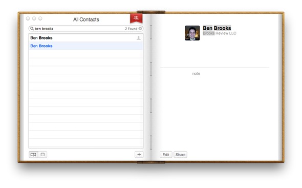
These two designs are almost enough reason to never upgrade to Lion — almost, but not really. They are absolutely atrocious designs that are overly skeuomorphic and physically hurt me to look at. There is the [little bits of torn paper](https://brooksreview.net/2011/04/mimics/) and the over all stupidity and navigational confusion that exists in the new version of Address Book.
My biggest gripe about Address Book is that it uses a red bookmark flag as the navigation between seeing all the contacts and seeing the contact groups — this took me a bit to figure out, pure confusion with the UI when you do something unintuitive like this.
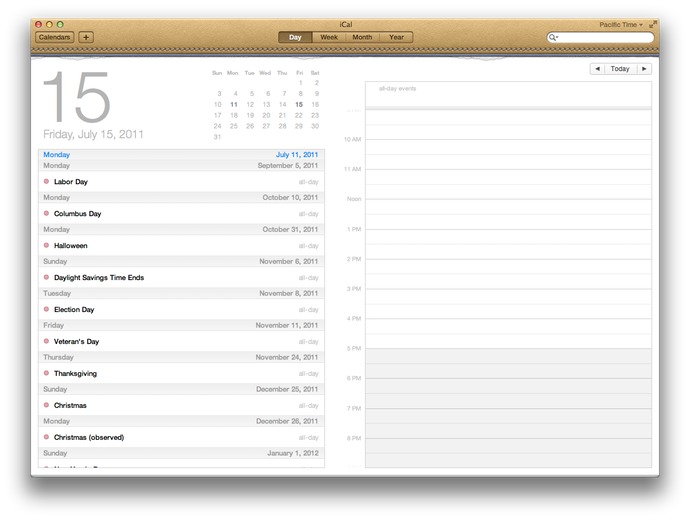
iCal on the other hand doesn’t suffer from navigational woes, it just gets the award for ugliest top bar of any Mac app that I have ever seen — even if you account for the ‘Ribbon’ interface in Microsoft Office. It’s that bad, I recommend using only Fantastical for your calendaring on Lion and BusyCal if you need more.
#### Fullscreen mode
As long as I have been following the Mac scene and talking with people who have switched to the platform I have been hearing the complaints about the lack of native “full-screen” mode like Windows has (through the use of the maximize button). Lion introduces fullscreen mode, but it isn’t the same as ‘maximizing’ a window is in Windows.
It is better to think of Lion’s fullscreen mode as maximizing the app to fill your screen, while also pushing that app onto its own virtual desktop. You are basically pushing the app onto its own desktop and forcing it to be the only app you can see on that screen, all without the menubar too.
Not all apps support this right now and I don’t find it a very compelling feature at all. The success of this mode will largely depend on how developers implement the features in their apps — apps like iA Writer will likely make good use of it, however I find Safari to be useless in this mode, even on my MacBook Air’s screen smaller screen.
I also find Mail a bit ridiculous to use in this mode too, though very ‘focused’. It is just so much and so bright that it isn’t better. I would love to see apps make use of this feature by radically changing the interface when you invoke this mode, but if Apple is setting the example then such designs don’t seem likely — the glaring exception to the rule being iPhoto, more like that please.
Lion’s new fullscreen mode, if only used to maximize an application to the full size of the screen is poor. Lion’s fullscreen mode used to change the UI of the app when you pop it into fullscreen mode has the potential to be very interesting.
#### Dashboard
Dashboard has an odd new ‘feature’ that is on by default — which shows your Dashboard widgets on their own “space”, or virtual desktop. Meaning they don’t overlay over the current desktop, though you can turn this feature off, I really don’t get this and think that it defeats the purpose of the Dashboard (which is bad given the limited utility of Dashboard to begin with).
An odd change to be sure.
#### Launchpad
I hate this feature. Yes, it was created as a way for novice users to see a visually pleasing view of all their installed apps, all without having to clutter their dock. However, there is no way to manage what shows up here — all your apps appear.
Oh, if you hold down Option to try and remove them? Yeah that removes them from your computer, not just Launchpad — this is useless to all but the most novice computer users. ((Note: I say novice computer users, not novice Mac users.)) It is not easy to access and the icon is terrible, please let this die.
As best I can tell you can only actually ‘delete’ applications from your Mac using Launchpad if it was installed via the Mac App Store, otherwise you are s.o.l. Further, since I have Parallels installed running a Windows VM — yep all those crappy Windows app show up in Launchpad. Overall, this is pretty crummy.
### Other odds and ends
Those are the major things, here are some of the other items that are worthy of a mention.
– Versions: this is likely to be pretty cool once apps start to support it, definitely helpful for people who don’t like to remember to make duplicates of documents before they make considerable changes. I for one can’t wait for apps like Writer and TextMate to support it. This is huge for advanced users and once ‘regular’ users get the hang of it, well user error support issues should drop.
– Auto-save: Awesome feature for those stubborn fools whom don’t save a document until they are *done* with the document. Should make the ‘IT’ guys of the family much happier.
– Mail: The new layout is great. That’s about all that is great about it. My biggest problem with Mail is that they removed the ability to ‘Bounce’ an email message — what the hell! Search is vastly improved and is a really great change to the overall archiving versus folder system of email storage. The conversation view in Mail is really welcomed, but is oddly in conflict with interleaved emailing. Conversation view makes pretty much every message interleaved, however if you do interleave emails I find this view to be a bit troublesome and redundant. More on this to come at a later date.
– Find my Mac: coupled with iCloud you now can track your Mac without having to use services like Hidden.
– Reboot in Safari only trick : If you have the find my Mac option turned on there is an option on the lock screens and login window to reboot the Mac into a Safari only mode. Essentially this means that an anonymous user can boot into Safari and connect to WiFi to surf the web. What this is really for: to get your Mac online so Apple can tell you where it is if you lost it, or it is stolen. Very clever.
– New Auto Corrections: very iOS like, you get a little bubble that shows the correct spelling suggestion that Lion will use if you keep typing. This is a very nice change, but takes a lot of getting used to if you aren’t used to this type of spelling correction. (It has caused me quite a bit of trouble if I don’t carefully proofread posts.)
– Font Book: Still sucks, get [Fontcase](http://www.bohemiancoding.com/fontcase) instead.
– When copying a file into a folder that already has a file with the same name, Lion will ask if you want to ‘keep both files’ — what a great change to a minor annoyance that I see all the time.
– Safari: Much faster than before, Chrome like speed. The new downloads indicator is nice, but takes a bit of getting used to — I much prefer it integrated as part of the app instead of a separate window. You can also double tap the trackpad with two fingers to ‘zoom’ into a text block much like you would in iOS ((This is actually a system wide gesture, set in preferences.)) — what a great touch. The back and forward navigation is a bit screwy, as horizontally scrolling a page that doesn’t need to be horizontally scrolled with take you back a page or forward a page. ((Again this can be disabled.)) I find this behavior really odd, and it takes a bit of getting used to.
– Gestures: I honestly can’t remember which of the gestures were in Snow Leopard, and which are new. Suffice to say this is the area that many are split on their opinions about — to me they are only good with a Magic trackpad and serviceable with a MacBook (Pro/Air) trackpad.
### Upgrade Worthy
At $29 I don’t see any reason to not get Lion. In almost every aspect it is better than every version of Mac OS X that has preceded it. It is faster, smoother, more stable, and generally better looking than Snow Leopard. All of the apps that I depend on work well with it already, it’s a no-brainer upgrade.

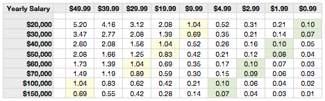 ](https://f3a98a5aca88d28ed629-2f664c0697d743fb9a738111ab4002bd.ssl.cf1.rackcdn.com/salary.png)
 ](https://f3a98a5aca88d28ed629-2f664c0697d743fb9a738111ab4002bd.ssl.cf1.rackcdn.com/calvetica/new-event.jpg)
 ](https://f3a98a5aca88d28ed629-2f664c0697d743fb9a738111ab4002bd.ssl.cf1.rackcdn.com/calvetica/more.jpg)
 ](https://f3a98a5aca88d28ed629-2f664c0697d743fb9a738111ab4002bd.ssl.cf1.rackcdn.com/calvetica/details.jpg)
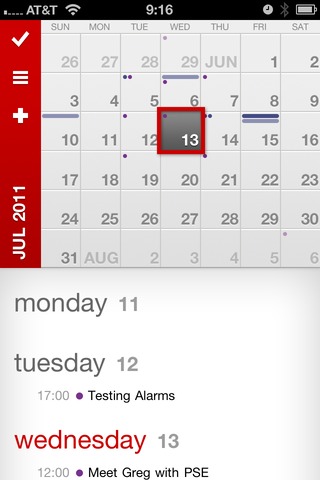 ](https://f3a98a5aca88d28ed629-2f664c0697d743fb9a738111ab4002bd.ssl.cf1.rackcdn.com/calvetica/week-view.jpg)
 ](https://f3a98a5aca88d28ed629-2f664c0697d743fb9a738111ab4002bd.ssl.cf1.rackcdn.com/calvetica/quick-remind.jpg)