Category: Articles

  • Quick Takes on Five (Perhaps, Three) Apps #6

    Thanks for all the great suggestions last week, I will be checking a lot of them out. There also were some great ideas for me to do follow-up on some of these apps and I will try to do that every once and a while.

    Everyday (iPhone)

    Everyday is a photo app, but one where you take a picture of yourself everyday and the app will make a little movie out of it so you can see how your physical appearance changes over time. I have been taking pictures of myself for over a year now, but I had been using Photobooth, which means that I miss some days here and there. Everyday is great because it will shoot you a push reminder AND it helps you line up your pictures so that the movie will look even better. I really dig it.

    DaisyDisk (Mac OS X)

    DaisyDisk is a dead simple way to see what is eating all the space on your Mac’s hard drive. I used the tool recently to find 20GBs of wasted space that I reclaimed. It is a great tool and presents the data in a view pretty looking view. I like to have tools like this around so that I can check in from time to time on what is taking up space on my SSD.

    QR Code Reader and Scanner (iOS)

    I don’t really care at all about QR codes and have never felt the need to scan one — that is until REI sent me some dividend stuff and there was a QR code on it. Now I felt that I had to check that out. I knew that finding a good QR code app might be a challenge, so I downloaded a bunch (only free ones, because after all this is a stupid technology). Here’s the thing, this app is fast and works as advertised — so I don’t know what there is to complain about. Oh wait, I though of something: The name of the app is “…” on the homescreen which is just stupid of a developer to do.

    Be sure to check out more installments that actually have five apps in them: here.

  • Twi$$er

    We have a problem: Twitter one of the last useful “social networks” ((I spit on you Facebook.)) needs to start making money and fast. Making money isn’t really the problem, the problem is how Twitter wants to make money and how the need for money is fundamentally changing the service itself.

    Right now Twitter seems to be using “Promoted Tweets” and “Promoted Trends” as their way to monetize the service. I have no clue how much these ads cost, or how many they run at once, but lets just say they are making $100,000 (This article says $80k and this WSJ article says $100k) off of each of the two — for one day. Let’s assume there are 3 of these running each day. That means that in one month Twitter has made roughly $9 million dollars (again assuming they can find 3 advertisers willing to pay $100k every day). I think that is unlikely given how ineffective I can only imagine these ads are.

    Marco Arment on the latest episode of Build & Analyze pleaded for Twitter to just inject ads into the users tweet stream every so often. A good idea (one that I support), but again it would be very difficult to keep the revenue at a high enough level without allowing just about every advertiser. Google makes a lot of money in $1000 chunks, not in $100,000 lump sums.

    What if Twitter decided to start charging users?

    Imagine that Twitter’s estimated 200 million user base was asked to pay $6 a year to use the service (something that would amount to $0.50 a month). I would guess Twitter would lose some users — let’s be brutal and assume they lose 70% of users instantly. That leaves the service with about 60 million users – a large drop.

    That is 60 million paying users though, and at $0.50 each monthly that amounts to $30 million dollars in revenue each month. To put it another way: if Twitter charged users $0.50 a month and lost 70% of their user base, they would still make $21 million dollars more each month than I estimate they do with promoted tweets and trends.

    Now we have to go back and look at my original math, to get a promoted [whatever] to reach $30 million in revenue each month Twitter would need to be running 10 of these promoted items everyday at $100,000 each. That just doesn’t seem likely to me. Perhaps they are and I just don’t see them, but if I am not seeing them, then how beneficial can they possibly be to businesses? And if they are of little benefit to businesses, then they won’t sell for very long.

    There are some obvious things going on here:

    1. We must assume that Twitter wants the service to remain free to users at all costs. ((Given their current behavior.))
    2. We must further assume that Twitter doesn’t want to display traditional ads. ((Given their current behavior.))

    Making those assumptions means that Twitter has decided a large, vast, user base is better than a small profitable user base. I am not here to argue which they should do, but I think it needs to be noted that if 30% of Twitter’s estimated 200 million user base paid just $0.50 a month — Twitter would be making gobs of money.

    Or think about this: what if you could pay $29 a year (like a Flickr Pro account) and in return your account would be verified (telling the world it is actually you) and you wouldn’t see promoted anything. Thus, Twitter could keep serving those promoted items and charge the power users not to see them. I would guess that the ‘Pro’ accounts would bring in more money than the ads do on a month by month basis if such a system were to be implemented.

  • Creating Markdown Links with Keyboard Maestro

    In a past episode of The B&B Podcast my co-host Shawn Blanc was giving me some grief over the fact that I didn’t have a keyboard shortcut setup for Markdown links in TextMate. Being a TextMate fanboy I knew that I could create a solution using bundles, but honestly I have never done that before and that thought of spending that much time concerned me. Instead I knew that I could create a solution using the best weapon I have at my disposal: Keyboard Maestro.

    In MarsEdit you can select text and hit the shortcut: Shift+CMD+A to paste the current url on your clipboard and set the selected text as a link to that url. It is all pretty damned easy and I really like the way the system works in MarsEdit and I really like the shortcut key. So the question became: how do I make that a universal shortcut on my Mac that does the same thing for any text anywhere.

    It was actually pretty easy. Here’s how I did it with Keyboard Maestro:

    1. Create a new Macro and set the ‘Hot Key’ trigger to: Shift+CMD+A.
    2. Tell Keyboard Maestro to execute the CMD+C or ‘Copy’ action.
    3. Add the ‘Insert Text’ action and tell it to paste the following: [%CurrentClipboard%](%PastClipboard%1%)

    You are now down. Any text you select anywhere on your Mac will now be converted to a Markdown link, which is great for people like me who go back through blog posts in TextMate, entering in new links. But wait, there is one obvious problem here — this macro will have a conflict in MarsEdit, especially if you use MarsEdit in HTML mode and not in Markdown.

    Keyboard Maestro provides an easy work around for this. Create a new macro Group and label it something like ‘Not in MarsEdit’. In the editor for that group (just select the group folder) change it so that the macros in that group are ‘Available except in the following applications:’ and then just add MarsEdit. Now you have made it so that any macros housed in this group are disabled when you are working in MarsEdit. Last step then would be to move the Macro you just made into this group (by dragging it).

    Done.

    [Updated: 3.23.11 at 3:23 PM]

    Reader Drew Franklin tweeted to me that TextMate already does this using the Hyperlink Helper bundle and the shortcut: Control + Shift + L. Though I still prefer my universal solution it is nice to know that you can do this with no work.

  • Quick Takes on Five Apps (No. 5)

    I’m back with the latest installment of the Quick Takes series where I look at five apps.

    ThinkUp App (free, web-server tool)

    ThinkUp is a social media insight platform — this may be the most confusing name ever. Basically you can connect certain social media accounts, like Twitter, and ThinkUp will crawl through that data and present it in a meaningful way. For instance if I post a new link on Twitter I can see the retweets and replies to that tweet. I could also take that Tweet and embed the replies to it on any website I control — pretty neat. It is a free tool for now and is getting better all the time.

    If you run a blog or are ever asking for feedback on Twitter this is worth your time to check out.

    TouchPad (iOS universal)

    TouchPad turns your iOS device into a trackpad that can control your Mac. I use it just about everyday to control an old Mac mini we have connected to our TV. It launches and connects very quickly and gives you a keyboard that also has modifier buttons (like CMD). It is a killer app for anybody who uses a Mac without a keyboard and mouse attached. Occasionally VNC clients fail to connect with my Mac mini, but I have never once had a single problem using TouchPad — I cannot recommend this app enough.

    TestFlight (iOS Developer Tool)

    If you have ever had to beta test an iOS app without TestFlight then you know how annoying it is. This may not be useful to many, but this service is a godsend for me and, frankly, I won’t test your app if you don’t use TestFlight.

    MoneyWell (Mac OS X)

    MoneyWell is a way to track your money. It is easy to use and easy to learn financial tracking and management. It is fast and cheap. Most importantly it has always made me feel like I am on control of not only the data, but of my finances. I love the way the app lumps charges into different buckets that you can define — thus allowing me to see just how much money I am spending on certain things (ahem — iOS apps). I used to be a big fan of iBank, but I have since switched to MoneyWell and I love it.

    xScope (Mac OS X)

    If you have ever tried to align something on you computer monitor then you have probably — at one time — pulled out a ruler and put it on your screen. It can be a pain and xScope luckily will solve all of that and much, much, more. I use the guides on a fairly regular basis to make sure that all the elements on the site are lining up just the way I want them to. What a handy little tool and on top of that the trail period is killer, it counts hours that you have used the app. Clever.

    Note

    One last thing, I am struggling to keep up with this series — so it would be a big help if you sent in any suggestions that you have for me to check out. Thanks!

  • AT&T-Mobile

    Here are some great links for staying up to date on the AT&T acquisition of T-Mobile.

    Consumer Reports kicks it off with this tidbit by Paul Reynolds:

    For one, the FCC, among the key regulatory bodies that will assess the deal, has already expressed concern about the state of the wireless market, opting last year to declare it not competitive. There’s also the recent example of the merger of cable giant Comcast and broadcaster NBC Universal. The deal received close scrutiny from regulators and, when it was approved, it was with what Consumers Union called “real strings” that “could help to limit anti-consumer, anti-competitive behavior.”

    Over at The Wall Street Journal on the ‘Digits’ blog Jennifer Valentino-DeVries adds this to the mix:

    The companies use different radio frequencies even though they have the same wireless technology, but they will “dual band” the two networks so that phones will work on both, they said.

    That is an interesting tidbit and could really mean a better network overall for AT&T-Mobile customers in areas, like say, San Francisco.

    Ed Oswald over at Technologizer adds:

    While AT&T talked up the benefits to its own subscribers in the merger announcement, the real winners are the T-Mobile customers. With identical technologies (save for their 3G frequencies), almost immediately after the merger is approved those subscriber’s coverage area will increase several times over. (For T-Mobile subscribers, the biggest gripe is always coverage.)

    Again this is a good thing and Oswald makes a great point about what T-Mobile gets even if the two can’t merge (lots of cash).

    Om Malik thinks this deal is bad all around because the decrease in competition means that prices will likely rise:

    T-Mobile USA has been fairly aggressive in offering cheaper voice and data plans as it has tried to compete with its larger brethren. The competition has kept the prices in the market low enough. This has worked well for U.S. consumers. With the merger of AT&T and T-Mobile, the market is now reduced to three national players: AT&T, Verizon and Sprint. Net-net, U.S. consumers are going to lose.

    I can certainly see the danger in this happening, but I think that two large carriers with your odd-ball discount carriers should be enough to keep prices down. Should.

    Ina Fried has a rather boring interview with AT&T President Ralph De La Vega — in which I couldn’t find anything worth quoting. It is worth mentioning though that he seems very confident that DOJ won’t block this. Interestingly he does state that this should help with a faster LTE roll-out — though color me skeptical on that one.

    Lastly T-Mobile has a nice Q&A up for its current customers where they pour cold water on the wet dreams of nerds every where when they state:

    Is T-Mobile USA getting the iPhone?
    T-Mobile USA remains an independent company. The acquisition is expected to be completed in approximately 12 months. We do not offer the iPhone. We offer cutting edge devices like the Samsung Galaxy S 4G and coming soon our new Sidekick 4G.

    Or translated: not until we are officially called AT&T.

    Overall we need to take the wait and see approach here. I am not at all worried about the DOJ blocking this merger, nor am I worried about pricing hikes or anything else. I think this will be a net-positive for every AT&T and T-Mobile customer. The only loser here is Sprint and man did they lose.

  • Raising the Bar

    I have been struggling to write an iPad 2 review for everyone that can better summarize the iPad 2 than this tweet by Sean Silvius:

    @marcoarment I think we all feel the same way but I bet Apple makes more in covers than all their competitors do in tablets in 2011.

    It’s a nod to both the marketing machine that Apple has become and to just how damned good the Smart Cover truly is. The iPad 2 is most certainly better than the original iPad in every aspect. It is thinner, faster, lighter and solves the bulky cover problem — all while keeping the same battery life and price. Amazing. But that Smart Cover is the real winning prize that you get with the iPad 2.

    There isn’t a whole lot that I can add to the iPad 2 discussion that you most likely have not already read, John Gruber does an excellent job summarizing the iPad 2 with this:

    The iPad 2 is a solid second-generation iteration. Easier and more comfortable to hold, noticeably faster, equippable with foldable covers that are both literally and figuratively magnetic.

    The Feel

    Before the iPad 2 came out I wrote a longer piece about why I didn’t want to see a thinner iPad come out, in that piece I said:

    I honestly believe that a thinner iPad will be much less comfortable to hold. Especially one with a flat back.

    Well I have had the iPad 2 in my possession for quite a while now and I can say that I was, without a doubt, dead wrong about the above assumption. My worries were that a thinner iPad would be more difficult to grip and at the same time would be to sharp feeling on the edges. What I didn’t anticipate was that Apple has seemingly rid the iPad 2 of every single sharp edge. Where as on the iPhone 4 and the original iPad there are sharp angles, every edge on the iPad 2 has been eased and is very soft feeling.

    The iPad 2 is a fantastic device to hold in your hand. It is better from an ergonomic standpoint in every single aspect than the original iPad. Even with the Smart Cover on, whether it is open or closed, the iPad 2 feels leaps and bounds smaller and lighter than its predecessor.

    The flat back not only makes the iPad 2 easy to use when resting flat on a table ((Because for once it can actually rest flat on the table.)) but the flat back actually makes holding the iPad 2 for extended periods of time a true pleasure.

    Unfortunately 1.3 lbs is still much too heavy and comfortable to hold while reading in bed without supporting the weight in some fashion — make no mistake, this is not “Kindle light”.

    3G

    Many people are making the case that there is no reason for most consumers to get the 3G iPad model and I made my case for why I went with 3g here where I said:

    This is where the last factor comes into play: convenience. What is more convenient: having to pull out your iPhone and activate the hotspot feature, or just doing it all on your iPad. As someone who has had to effectively do that routine for almost a year now with my MiFi, I can tell you that there will be times that you won’t want to use your iPad when you could, because it is just too much of a hassle to get internet access. I want to eliminate that.

    I want the future and the future is internet where you need it, when you need it.

    I still stand by that and I don’t regret my 3G iPad purchase in the slightest. I have already used over 250mb of data and I continue to use the 3G radio at least 3-4 times a week — I am just not always at my house.

    For most users I would tend to agree that the personal hotspot feature of the iPhone would be more than enough to suffice (especially given that it transmits GPS info as well), but for people who are truly on the go the 3G built in to your iPad will be a far better experience overall.

    I have found the AT&T 3G service to be excellent, even while in Austin at SXSW the 3G on my iPad was comparable to the speed I was getting from my Verizon MiFi. I leave it on all the time and I really love the added convenience. One thing that I do need to report is that leaving the 3G on all the time will drain your iPad battery considerably faster. I have never had to charge an iPad as much as I have had to charge the iPad 2 — this is 100% attributable to the 3G radio as during the times I have turned it off battery life has been impeccable.

    The only caveat to this is that if you live in a known AT&T black hole (New York and San Francisco) then you should probably think about the Verizon model.

    Speed

    The iPad 2 finally feels right. It isn’t that the original iPad was slow — it wasn’t — it is that the iPad 2 reaches a sweet spot of performance where the user no longer notices delays. The iPad 2 doesn’t feel fast, so much as it just feels right. So a Safari tab dropped out of RAM and now needs to be reloaded, that experience is fast and painless. You launch a game and you are in and playing in no time. Opening a link or PDF from Mail is seamless. Scrolling media intensive pages and documents (like The Big Picture) is smooth and fast, just like you would expect it to be.

    That is the heart and soul of the iPad 2 — things are quicker than you expect them to be. They aren’t fast when compared to a standard notebook computer, but they are beyond what most expect — once you can surpass expectations then you get very happy customers and the iPad 2 does just that.

    Camera Crazy

    Again I had some opinionated thoughts on putting a rear facing camera on the iPad. Basically my thinking was that the camera wouldn’t be high quality (it isn’t) and would only do FaceTime and video (it does do stills) and that above all it would be pretty useless as a camera (again, it is).

    It is a pretty useless camera — not only do you look like a complete idiot holding up the iPad to take a picture, but the shutter button is in one of the worst possible locations: dead center along the bottom. How are you supposed to hold a 1.3lbs device with one hand while you try and tap that button, all without shaking or moving the iPad? You can’t.

    The video is what surprised me the most though — shooting video with the iPad still makes you look like an idiot, but man is it easy and nice to do — a better experience than you get with the iPhone 4. The video isn’t better, but the framing is. That is you can actually see what you are doing on the large, bright, iPad 2 screen, where as with most other video cameras you don’t get as clear of a picture.

    I actually like shooting video with the iPad — as stupid as it makes me look.

    That said the still picture quality is beyond terrible. The video quality is average. The FaceTime quality though is perfect for what FaceTime is. It is clear to me that these cameras are meant for FaceTime, but to appease the check list mongers they allowed the use of the cameras for video and stills — makes sense.

    Wrap-Up

    There is no logical reason to buy anything other than and iPad at this point. If you can afford to buy the iPad 2 then you are golden for a couple of years. If you can’t then go help a fellow geek out and get the original iPad for a heavily discounted price — the original iPad is still better than any other tablet on the market today (except that iPad 2) — the iPad 2 just took that bar and raised it higher — much higher.

  • A Touch of Video

    For better or worse I have never been a huge “video guy” — always into photography and never that much interested in motion photography. I have though over there years tried piecing together crappy video clips I have taken with various versions of iMovie. Even screencasts that I recorded resulted in a frustrating video editing experience.

    Frustrating because nothing was ever easy — a constant fight between what I see in my minds eye and what the software won’t let me do. Then comes the encoding and compressing and general software operations that will make your Mac into a makeshift George Foreman Grill.

    All of this to say that I was rather skeptical about the viability of iMovie on an iPhone when the iPhone 4 came out. Sure enough, iMovie on the iPhone is a rather poor and imprecise experience. An exercise in masochism. Then Apple decided that iMovie on the iPad 2 makes a whole bucket of sense and I loathed having to give it a go.

    I bought iMovie, opened it and looked around and then moved on. I knew I would have to come back so I could write something, but I wanted to wait for that moment when I actually had something to create — I can only film my cats so much before they start to get annoyed.

    Down at SXSW I decided that I wanted to shoot a little video to show people what my “mobile” setup looked like. Instinctively I grabbed my iPhone to shoot the video, but quickly put it down and decided to shoot and edit the entire clip on my iPad. Something I had never attempted before.

    In less time than it has ever taken me to record and edit a video I produced a short clip with a voice over added after the fact in no time at all. The iPad did the encoding and converting quickly and painlessly. Had I had full broadband speed internet the entire affair would have been but a blip in my day — instead thanks to too many nerds the network speed and subsequent upload to Vimeo was quit slow.

    What I learned is this: editing video on the iPad is the only way to go. I can’t see a need for ever wanting to edit on my Mac again. iMovie for the iPad really hits a sweet spot and that sweet spot is called user experience. It offers a grand user experience. I think the iPad is really starting to find its spot in my life.

  • Smart Cleaning

    I purchased a new smart cover with my iPad 2 and I have to say that I can’t see a need for any other case or cover. That’s coming from a huge case/bag junky. One thing that intrigued me with the Smart Cover when Apple launched it, is this bit of marketing speak:

    And since the microfiber lining gently buffs off any smudges or fingerprints as you move, iPad always looks good on arrival.

    Which I translated to: “Our cover is soft on the inside and touches your screen. Perhaps even removing some smudges.” Because otherwise how would it actually make a difference?

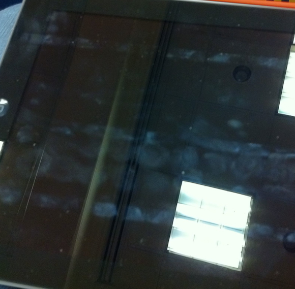
    The question becomes: does the Smart Cover actually clean your screen at all?

    Surprisingly I think the answer to that is yes, but not 100% of the screen.

    Since purchasing my iPad 2 I have not cleaned the screen in any way, and I have used it so much (especially at SXSW) that I have ended most days with less than 20% battery life.

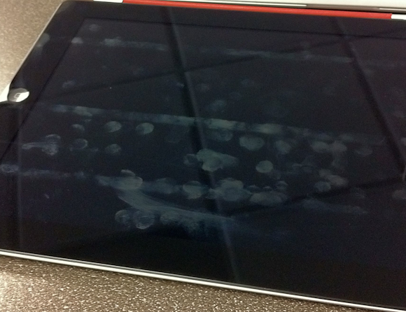
    Here is a shot of the screen while I was at SXSW and first noticed the cleaning properties of the Smart Cover:

    Here is a shot I just took on my desk at work:

    What should be obvious from both pictures is that there are three distinct lines running the length of the screen that have never been cleaned. These three lines correspond with where the case folds and therefore where the case does not touch the screen. Admittedly I have been typing in landscape most of the time, so it is natural that this section of the screen is home to more fingerprints.

    What I find odd though is just how clean the top section is — I mean I have been using the iPad as normal. Further, you can see from the top line that there would/should be a lot more smudging at the top. I can only conclude that somehow the Smart Cover is helping keep my screen clean. My guess is that it is the motion of the cover rubbing against the screen while the iPad is in my bag that is doing this. I would also guess that a desk user wouldn’t see these type of results.

    Still though, the iPad 2 with Smart Cover does look much cleaner than my iPad 1 screen ever did — that makes me just a touch happier.

  • A Toy

    I wanted to get a white iPad 2 because I had yet to see many people talking about how the white changes the user experience of the device, but after playing with one in the Apple store I am glad I didn’t get one.

    Shawn Blanc and I talked a bit about this on our last podcast, but I wanted to make a point to mention it here. There are two things that really turn me off about the white version of the iPad 2.

    1. The white frame, unlike the black version, looks plastic. I suspect that this is because (to my eye) the white looks like it is closer to the surface than the black, or maybe it’s the reverse. What ever it is when you get finger prints on the white it makes the white look like cheap plastic and less like a cold sheet of glass. This gives the white iPad the over look of a toy. Again, this is really hard to explain with words, but after talking to a few people about it, I don’t seem to be alone.
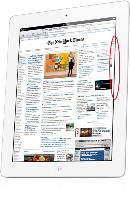
    2. The iPad’s screen does not extend from edge to edge of the bezel — there is a very slight gap between where the white iPad frame ends and the screen’s display starts. You can see this depicted in the below image, circled in red:

    [Image Source: Apple]

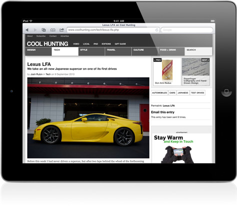
    This is not a knock against Apple’s manufacturing, but it does contribute to a major problem. That problem is the screen on the white version looks to be set farther back from the glass. You don’t notice this same edge on the black iPad 2 as you can see in the below picture — it’s there, but harder to see:

    [Image Source: Apple]

    This only further contributes to the overall toy look to the white iPads.

    What I am not trying to say is that you shouldn’t buy a white iPad 2 — rather you should see one in person first before you buy one. It’s not a bad device, it is still very good — but for me the look isn’t quite right.

  • Random Thoughts Gleaned From the SXSWi Trade Show Floor

    I took a quick hour long stroll through the trade show floor during my visit and here are some random things that popped into my head as I wandered around.

    • Blogger still exists. I don’t exactly know what it does anymore, but I did see their logo.
    • If your booth is across from Google’s booth you better get used to looking at the backs of potential customers. It really isn’t even fair.
    • SEO marketing booths look exactly how you would expect SEO marketing booths to look. By that I mean they look like crap and everybody speeds up a half tick as they walk by.
    • The trade show really is not that happening of a place.
    • WordPress geniuses were on hand and I thought that was pretty neat. I didn’t quiz any of them, but the booth was packed with people talking to them.
    • The only product I stopped to play with was the DAS keyboard. Which is a mechanical keyboard and is very loud and requires a firm keystroke. The keyboards weren’t connected to anything so I couldn’t get a good test of how typing on them is, but I am, and always have been, intrigued by them.
  • Fragility of Free

    I like to pay for things I use, even if I get no benefit out of paying — I like to pay. It wasn’t always that way for me, as most of my life was years of trying to find, and trying to use, nothing but free software. As such, one of the first Mac apps that I fell in love with was the excellent Quicksilver — a free application launcher and so much more.

    I spent untold hours learning how to wrench every last drop of power I could out of the app and thanks to sites like 43folders.com I learned to use the crap out of Quicksilver. I mean I know how to use it — like guru level.

    Then, like so many other free apps, Quicksilver died a slow death. ((It has since been reborn, but will never be the same.))

    When Quicksilver went away I paid for a version of LaunchBar and moved on with my life. ((I am omitting a passage about tears and other un-manly things here.)) It’s not cheap, at $35, but that money gives the developer a reason to stick with development — it becomes a real business instead of just an elaborate hobby.

    I paid for Tweetie and subsequently Tweetie 2 not solely because it was the best Twitter client, but also because I could pay for it and therefore support the development of it. What happened to Tweetie though may be the perfect testament for just how fragile a free app truly is.

    When Twitter bought up Tweetie and then rebranded it as Twitter for iPhone all seemed ok as Loren Brichter was staying on board as lead developer. I think the past few weeks have taught us all one lesson — it’s hard to force changes in a free app.

    Before Tweetie was free the customers were in charge because Brichter needed those customers to be paying and happy so that he could have a viable business. When it went free — well things changed.

    When Twitter introduced the Quickbar — more affectionately known as #dickbar — users revolted at the forced interjection of promoted trends and an object that ‘messed’ with the view in the user’s content stream. Had Twitter for iPhone still been Tweetie and cost the users money I can assure you that Brichter would have removed the Quickbar immediately and would have been very communicative with users about that.

    Ratings effect sales more than they affect free downloads for apps.

    Instead, Twitter quietly pushed an update that made the Quickbar slightly less annoying. ((I say slightly because it is still ugly as sin. I mean I get that it is a flip clock style — what I don’t get is why then swiping from side to side changes it. That makes no sense and is absurd. If you want to change a flipping interface the last thing you would try is swiping at it. Just silly.)) I think it was at this point that everyone saw the fragility of free as I see it.

    The fragility of free is a catchy term that describes what happens when the free money runs out. Or — perhaps more accurately — when the investors/founders/venture capitalists run out of cash, or patience, or both. Because at some point Twitter, and all other companies, have to make the move from ‘charity’ to ‘business’ — or, put another way, they have to make the move from spending tons of money to making slightly more money than they spend.

    It’s at this moment that we begin to see the fragilities of the free system. Things that never had ads, get ads — things that were free, now cost a monthly fee. We have all seen it before with hundreds of services — many of which are no longer around.

    Again, I like to pay for things and here is why:

    1

    When you pay for software/services upfront you know how much it is going to cost right away. That may seem obvious, but imagine if the developers over at the beloved Alfred App decided that the only way they can keep developing is to begin charging for it? Things wouldn’t be so pretty.

    What if tomorrow Google decided that they would start charging for Gmail? How much would you be willing to pay — don’t think for one moment that they can’t make that call, they can. You see when a developer sets out to charge from day one they set the price at an amount that will sustain them so long as they get X sales. Most users won’t even get around to using the app until well after it has surpassed X sales — safe to say then that it will be more likely the developer lowers the prices than raises it.

    With something like Alfred you have to be concerned that the developer decides that they need money so they will start charging $5 — then that’s not enough so they bump it up to $8, then $10, and so on. The problem is that they don’t want to charge money and they feel bad about it, but they need to charge money. Instead of charging $10 on day one they waited until it was too late.

    2

    Sticking with Gmail for another example, imagine if Google decided that Gmail was a money loser and that it was to be shut down. Doesn’t matter what you offer to pay, in a week it’s gone.

    This happens with free software and services, sometimes with paid services (but that is far less likely). Sometimes the funding for free just runs out — perhaps it was just someones hobby, a hobby that you depended on — doesn’t matter because it is gone now.

    3

    The above two scenarios are perhaps the best ones that a user can face, this last one though is what Twitter currently faces: the we-need-to-make-money-but-still-want-to-be-free situation.

    It’s a pain in the ass for users.

    Users don’t care whether you are profitable, they only care whether and how your profitability will affect them. With Twitter it seems users will be putting up with only using the official Twitter clients and then on top of that putting up with advertising being forced into their streams.

    This, when there are a lot of users screaming that they will pay for the service — just leave the damned thing alone. Unfortunately this is a rather vocal group that is also known as the minority.

    I say that this is the worst of the scenarios because it often means death by indecision. Everyone wanting to create something new and great when something old and useful is sitting right there. It’s trying to re-invent the wheel. Twitter’s options are simple: sell user data and information to marketers (not likely), advertise everywhere (seems where they are headed), charge customers (would make the service smaller, but the end users would be loyal and happy).

    Again, I would rather pay up front, on day one.

    Stabilizing Free

    The only free things I like and trust are free things that are trials, or labeled as beta. Everything else should be charging from day one — I don’t mean to get all 37Signals on people here, but they have a good point. What good will Twitter be next month when 20% of the average user’s stream is advertising?

    Will I even want to use it?

    Will you?

    I’d rather pay for the long term survivability and ad-free usage that a monthly fee would fetch.
  • Quick Takes on Five Apps (No. 4)

    I’m back with the latest installment of the Quick Takes series where I look at five apps.

    NHK World TV Live (iOS Universal)

    I didn’t even know this app existed until the tragedy in Japan. It’s a fantastic little app that streams live news from NHK in Japan, that is both fast and high quality over 3G. I really dig this app.

    AroundMe (iPhone)

    This is not a new app to me and likely not to any iPhone user. What I want to say though is that this app is never more valuable then when you are in a city that you don’t know. Sometimes you just need to know what is around you.

    Grouped{in} (iPhone)

    This app is easily the most advertised at SXSWi and if you even look at the screenshots in the App Store you will be stricken with the thought: “Oh God”. Indeed, it’s ugly. Also it’s not very good at all — move along.

    PlainText (iOS Universal)

    When this app first came out I wasn’t a huge fan — I thought it was nice enough and quickly became happy with Writer. This trip though I downloaded PlainText again and have really started to like it. I don’t think it will replace Writer just yet, but the auto syncing has proven to be killer. I love the piece of mind that the couple of words I typed before darting into another session is stowed away safely in the cloud — without the archaic pressing of a sync button.

    9 Innings 2011 Pro (iOS Universal)

    It is a ridiculous little baseball game that has terrible graphics and questionable attributes to the players. ((For instance Washburn has never in his life thrown a 98 MPH fast ball — never.)) The game play is dead simple and not revolutionary. It’s really not that good, which is why I am embarrassed to say that I happen to be a bit addicted to it at the moment. I guess none of that matters when you have fun playing the silly little thing.

  • The Very Difficult Problem of Notifications

    There has been a lot of talk lately about mobile notification systems and specifically what Apple might/should bring to iOS — I think that everyone can agree though that all notifications systems fall short of being great (even WebOS). Every single mock-up of a different notification system that I have seen solves only a subset of the problems — they certainly are better than what we currently have on iOS, but these “solutions” are in no way a real solution.

    They are neat studies in graphic design and user experience, but for me they only ever solve one of the two main notification problems.

    The Two Problems

    1. The notification system must actually alert you to important things (that meeting you are about to be late for) and the system needs to be in your face about it, else you won’t truly be notified of a damned thing. That is a subtle color change here, and a small icon there, is simply not good enough. If every icon has a badge that reads 1 in a little red dot, or everything is glowing your favorite shade of color, then nothing is really being conveyed — instead everything is being ignored.
    2. The notification system must get out of your way when you need it to. Anybody who has woken up their iPad to find 7-8 notifications on the screen knows what I am talking about — it takes a long time to get rid of these irrelevant notifications. Most often everything that it was notifying me about is no longer relevant, or has already been done. However a blanket dismissal creates other problems (more on this in a bit).

    Solutions

    The problem that most people have when they attempt to fix notification systems is that they solve one of the two above problems, but rarely both. ((I am being generous here because I actually don’t think any one has solved both of these problems.)) To solve both is difficult at best and, impossible to most (including me).

    How do you design a notification to simultaneously be annoying and alerting, while at the same time getting of the way when it needs to get out the way. That is, to say it better: how do you design a notification that notifies you and reminds you of things, all the while it doesn’t annoy you and notify you about erroneous stuff?

    Is it even possible?

    In the past this was solved by hiring a real, live, human being to sit at a desk outside of your office — this was a stellar system. This person (let’s call them an “assistant”) knew when you were in a rush and cranky, they knew exactly what you needed to know as you ran out the door to the next meeting that started 15 minutes ago. The assistant knew and they knew not because they were good at notifying you, but because they were intelligent. They could read so many non-verbal cues that allowed them to know exactly what was going on from just a glance of you.

    That was (and for some is) a great solution — then HP and Palm and others decided it was best to replace them with digital calendars and even more people decided it would be great to take phones and email with you everywhere you go. Which compounded the problems that we currently have.

    If you leave all the default notifications on my iPhone, iPad and MacBook Air then you will have a rather obnoxious symphony of beeps, boops, bops, pops, and windows showing up. It ain’t pretty.

    iOS

    When I click on my iPad and I see a notification that I dismiss, only to get another, then another, another, and another — I always stop and think: “where is the clear all button?”

    A dismiss all button would have been a colossal mistake for Apple to have included, because just maybe the third notification is one that I REALLY need to see. Right there is the problem with adding a “dismiss all” button — the point of a notification is that it is something that needs to be seen before you casually dismiss it.

    Again this is why people are so good at notifications, we inherently know when something is and is not relevant based on who we are notifying and simultaneously know when something that was important is no longer important.

    A Modest Proposal

    I don’t have a solution the the hardcore UI, UX, and technical design problems that exist above, but I do have a practical way to help.

    Stop the notifications.

    The simple problem is that most people are getting too many notifications about things that just don’t matter. Or, as Art Webb said, “If you make everything bold, nothing is bold.”

    Amen.

    Do you really need to know when the Mighty Eagle is ready again in Angry Birds? Do you really need to know every time your favorite team scores? Do you need a reminder on every calendar appointment? Do you?

    What do you need?

    Start there.

  • Post-PC Device Elitism

    There is an article that has been making the rounds on sites like Hacker News that has a very link-baity title: “If iPads are “post-pc devices” why must I sync with iTunes before I can use one?”. Fun.

    Here is the main point of Paul Hontz’s argument (as I see it):

    You can’t even turn your iPad on the first time without being tethered to iTunes.

    Which is true, but paints an inaccurate picture. You see, you indeed can not turn on an iPad — for I don’t know what reason — without first connecting with iTunes, except that none of this means that you ever need to have iTunes on your home computer. If you walk into an Apple Store and buy an iPad you can have them do the initial sync to get your iPad up and going, thus you never have to have synced the iPad with your iTunes. I think Hontz’s argument is pretty silly, but let’s look at this new term more closely.

    All of this depends on what your definition of “post-PC device” really is — Wikipedia (the aggregator of all that is relevant) doesn’t even have a page for this term just yet. I would define a post-PC device as a device that moves the user beyond the computer — a device that could/does replace a computer for the general consumer.

    And the iPad is pretty damned close to that, if it is not already, the definition of the post-PC device.

    Let’s take no further evidence than this video from April 22nd showing a 99 year-old woman using her first computer: the iPad. I don’t recall her having troubles with iTunes syncing. Sure you could say that we need an open platform, or that we need one that is completely detached from the computer — but if this is the argument that you hold, then you must also complain about the fact that 3G service must come through carriers that charge you and that to use WiFi means you need to setup a WiFi router.

    Me? I just argue that a post-pc device is something that just works substantially better for most people than your typical PC/Mac would — and I think the iPad fits that bill rather nicely.

  • Quick Takes on Five Apps (No. 3)

    I’m back with another set of quick takes, check out the past posts here.

    CalendarBar (Mac OS X)

    A very handy menubar app that shows you upcoming appointments. I typically don’t like apps like this, but this one is done very well and I really have found it useful to me. I like that it can pull your information from multiple services at once and you Facebookers will like that it integrates with events you have in Facebook. Mostly though it is just a great way to see what is coming up.

    Instacast (iPhone)

    I don’t like the name — in fact I don’t like the fact that “insta” has become so popular — but the app really is clever. Basically you can search for and browse podcasts that are in the iTunes directory and subscribe to them in the app. The app will then download episodes and allow you to watch and listen to them on your phone. This means no more plugging into your Mac to get the latest and greatest episodes of podcasts.

    You should subscribe to The B&B Podcast when you are checking out the app. ((Shameless plug.))

    You won’t like this app if you are not a podcast person, but if you are this is a great little app.

    Canned Mail (iPhone)

    From the guys who made the excellent Canned app comes Canned Mail. Just like with the former you create precomposed messages that you can quickly send out when needed, this time with email instead of text messages. Great for creating responses that you have to send on a regular basis (mailing addresses and directions for me). Be sure to check it out — it’s nice to have in your arsenal.

    That said I have only used it once since I installed it — unlike with text messages I rarely send that many of the same emails. This is definitely a niche app.

    Acorn (Mac OS X)

    It’s like Photoshop without all the crashes and stupid UI design. It is a great Photoshop-ish replacement and I have been using it a lot lately for compressing down images and resizing them. It is fast and light and I really like the way it is laid out in comparison to Pixelmator. Check this out (free trail on their website) before you consider Photoshop — you will be surprised.

    Having said that, Acorn is certainly not Photoshop — you can do a lot in Acorn, but not a lot as easily as you can in Photoshop. Where with Photoshop you get great tools like Background Eraser, you can do the same in Acorn — minus the automatic / easy part. My problem has always been that I have used Photoshop for as long as I can remember, so when a new tool comes about it is not as easy for me to think “outside” of the straightforward tools PS offers.

    NetNewsWire Lite (Mac OS X)

    I know a lot of you don’t want to use Reeder, or simply don’t like the look of it. Have no fear NetNewsWire is back with a free Lite version for the Mac App Store. The looks are cleaned up, but the Lite version doesn’t offer Google Reader syncing. That maybe the deal breaker for most, but if you just read RSS feeds on your Mac this is a good place to start.

    It’s not of any use to me without Google Reader syncing, but I really like the direction it is headed with the design of this Lite version. I can’t wait for the full version to come out (and it is coming with Google Reader syncing).

  • A Reason Against the White iPad 2

    Reader Sam Simmons wrote in with this very smart reason why I shouldn’t get the white iPad 2:

    The decision is easy for me. Do you ever watch movies/netflix on your ipad? Of course you do, everyone does.

    Know those black borders you get on a TV when watching a widescreen movie?

    Now imagine them in white.

    That’s a damned good point and I hadn’t considered what the movie viewing experience would be with a white frame around it — likewise what viewing a slideshow would be like. I guess it comes down to how you use the iPad and for me I rarely use it for watching movies or for viewing slideshows.

    For me the iPad is all about reading and most reading backgrounds are white. But that brings up another problem — Instapaper is white on black at night and that might look a bit out of sorts with a white iPad 2…

  • Additional Thoughts on the iPad 2

    Yesterday I posted about why I think the iPad 2 is the deathblow to all other tablets, today I want to talk about some of my thoughts surrounding the iPad 2 itself (instead of the tablet industry). I want to touch on why I want a 3G model, why the Smart Cover is a good thing for everyone, why you shouldn’t wait for the iPad 3, and the color choices.

    To 3G or Not

    The last time the iPad was launched I bought the WiFi only model for one reason: it was the first iPad available. This go around all signs point to a simultaneous release of both the WiFi and WiFi+3G models and I am buying the latter. I am buying it to save money and add a tremendous amount of convenience.

    Let’s start with the money aspect first. It is $130 more to buy the 3G model over the comparable WiFi only model, so one would think that you can’t save money buying the 3G model — but I can. Currently I pay (roughly) $60/mo to Verizon for the 5GB of data on my MiFi. The times that I use the MiFi are all times that I could easily do the same work on the iPad (with exception of blog posting which we will ignore because I want to keep this post under 10,000 words). Effectively, in just a tick over two months time, I will have paid back the added cost of the 3G model by eliminating the MiFi bill — but that’s not fair because I still need to pay for data on the iPad.

    Here is the great part though: 3G iPad data is pay as you go on a month-by-month basis. Therefore I can pay for the data only when I need it, and for the sake of argument I will assume that when I need data — I need data, and will go with the 2GB plan. Thus I will have to pay $25/per use when I want the 3G data. If I look at my expected travel plans for the next year and factor in how much I would use the data based on my MiFi usage (adding for convenience of built in 3G, I am upping the frequency of usage by 20% from what I used on the MiFi). I would guess that I will need to pay for data 8 months out of the next 12 months.

    Or to buy the 3G iPad and pay for the expected data usage, for the next year, it will cost me: $330 for the year. By dropping the MiFi I will save: $720 for the same time period. Basically then I will come out $390 ahead, that is no small number — that’s presumably an iPhone 5.

    Of course that is not the end of the story though, because as Shawn Blanc pointed out during our podcast yesterday I could use the personal hotspot feature on my iPhone. If the reports that I am seeing are right I would need to pay the $20/mo for tethering in addition to my normal iPhone data plan for the same 2GBs. That would seem to be an ideal solution because I wouldn’t also have to pay the $130 up front premium on the 3G iPads.

    We also have to consider how these plans work though — I could certainly turn the tethering plan on and off for the iPhone, but not with the same ease I can with the iPad data. That means that I would effectively be paying for 12 months worth of data at $20 a month — or paying $240. Which is $90 less than I would be paying for the same data with the iPad 3G and the added bonus of being able to use that data connection with my Mac.

    This is where the last factor comes into play: convenience. What is more convenient: having to pull out your iPhone and activate the hotspot feature, or just doing it all on your iPad. As someone who has had to effectively had to do that routine for almost a year now with my MiFi, I can tell you that there will be times that you won’t want to use your iPad when you could, because it is just too much of a hassle to get internet access. I want to eliminate that.

    I want the future and the future is internet where you need it, when you need it.

    Smart Ass Cover

    A lot has been said about how great the new Smart Cover is for the iPad 2 and I would be lying if I didn’t say that it does look rather fantastic. There is no doubt in my mind that it will be a hit, especially since there is likely to be no other covers for the iPad 2 in the Apple Store when it launches on March 11th — a clever business trick Apple used with the iPhone 4.

    John Gruber posted on Twitter when the Smart Cover was launched:

    Third-party iPad case market is in trouble.

    I can see where he is coming from on this thought: if Apple’s case is so fantastic, why would a consumer buy anybody else’s case? I think if one thing can be learned from the iPhone and the first iPad it is that consumers like cases and they like a huge diversity of them. What Apple did with the Smart Cover was to give every case manufacturer a killer way to secure their case to the iPad 2.

    Everyone can copy the magnet trick to use with their cases and I don’t just mean for cases that cover the screen only.

    I think the far more likely outcome is better cases across the board — which is a winning scenario for everyone. Third party case manufacturers should have no problems selling their versions.

    Waiting for the iPad 3

    Don’t wait for the iPad 3 because you think it will be better — I can tell you with 100% certainty that it will be better — otherwise why would Apple make it?

    If you are waiting to get the iPad (whether you have one or not) because you think the next version will be better — then you will be waiting indefinitely. If you held off buying the first iPad and really want one — I don’t see any reason to keep denying yourself even if there is another new model in September — which is far from a guaranteed.

    The big question is whether you should upgrade, or not — if you already have an iPad — to which I direct you to Patrick Rhone over at MinimalMac.com who hits the nail on the head:

    I think if you were using and loving your iPad before today’s news, you can and should do so after it. It is still very much the magical and revolutionary […] device it was when you woke up this morning.

    Indeed. The only people that should consider this a must upgrade immediately (outside of tech writers and enthusiasts) should be educators and presenters where the full HDMI mirroring is invaluable.

    Doesn’t Matter if you are Black or White

    So Apple is assuring us that we can get the white iPad 2 on day one, along side the black model. The internet seems split on these models with a slight preference to the black model. Initially I was all about the black model, but I am starting to be swayed in the white models direction.

    The white looks terrible when the screen is off, but when the screen is on it blends with the screen far better than the black does. Add to that the general idea that it may look cleaner in the long run — given that black surfaces show a lot more dirt and grime than white surfaces do.

    It is a tough call and honestly I am really hoping that I can see them both in person before I decide which to buy. Right now though I am 52% in favor of black, but trending towards white. Damn this indecision.

  • Finish Him…

    The iPad 2 is out and without even touching one (though I have watched and read a lot of reports from people who have) I think this second iteration is going to leave many of the iPad’s competitors in a bad way. It’s like Sub-Zero in Mortal Kombat just dealt you a cold blast that freezes the iPad competitors solid — one of two things will happen when they unfreeze, there will be a bloody announcer saying “Finish Him…”, or Apple will come back at them with a swift roundhouse sealing their fate. ((Said roundhouse would be the iPad 3 with iOS 5.))

    None of this has to do with how well the iPad 2 actually performs.

    Size

    It’s safe to say that most of the competitors are going with the 7” form factors and those that are trying their hands at 10” (truthfully 9.7”) tablets are doing so with much thicker devices. That is: most manufacturers were struggling to create a tablet as thin as the original iPad and now the iPad 2 changes the game by creating a mind boggling thin iPad 2. The iPad 2 is thinner than the iPhone 4 — which when the iPhone 4 was announced it was proclaimed to be the thinnest smartphone on the market.

    Let that sink in for a moment: the iPad 2 is thinner than the iPhone 4.

    Battery Life

    10 hours — Apple couldn’t make the device smaller and at the same time increase the battery life, so they are giving you what you already have. By all accounts, Android makers have yet to get anything better than 10 hours — safe to say then that 10 hours is the entry battery life you need for a successful tablet and the iPad 2 has it.

    Check.

    Dual Core

    It doesn’t even matter how fast the dual cores are — Apple effectively swiped the buzzword that all other tablet competitors have been freely slinging in the iPads direction. In the average consumer mind it doesn’t matter which tablet is actually faster, it only matters if they can check off a feature list — and they can with the iPad 2.

    Dual core? Check.

    Not to mention that by all accounts the new A5 processor is absurdly snappy.

    Verizon and AT&T

    You could complain about the fact that the iPad was only available on AT&T and use that as your reason for getting another tablet, but again Apple just took that away.

    Two largest U.S. wireless carriers? Check.

    Apple wasn’t about to listen to people complaining and judging their device based on the carriers that it works on, so it was crucial that they have Verizon out of the gate.

    Price

    The real death blow — the real jewel — in the announcement is the price. $499 to start. This is a price that every other competitor has yet to figure out — sure 3G costs more, but in the consumers mind it is all about the price you can advertise — and Apple can say $499.

    It is all about the up sell and even though we all know that, we still feel like devices that we get up sold on cost much less.

    Final Thoughts

    I was going to skip this version of the iPad if it was a minor update, but this is no minor update. This is a major revision and one that I will be buying on day one.

    I think the iPad then deals a death blow before you even start to talk about the benefits that iOS has over Android and others.

    (P.S. I am going with the leather cover in red — I don’t know why red though, it just jumps out at me. Probably black and hopefully 3G on AT&T.)

    [Updated: 3.4.11 at 9:56 AM]

    In TUAW’s link to this post they make it sound as if I want the iPad to kill the competition — which couldn’t be further from the truth. I very much want competition, as it’s a good thing.

  • A Yeti Review

    Nothing is worse then watching a TV show in standard definition when you know that the high definition version exists — granted you have to find the channel first. Likewise listening to audio in mono, instead of stereo is equally as annoying. Or listening to your favorite song being piped through your laptop speakers instead of through your $300 Bose headphones. Or having to make do with a non-retina display iPhone — blurry text is no fun.

    When you know there is something better out there, it becomes very difficult to sit back a deal with subpar things, especially when the better version is within your grasp.

    Recently I posted a list of podcasts that I love to listen to, and what should be clear to most is that I really like podcasts that have great production quality. Quality matters.

    Occasionally a podcast, or a guest on a podcast, will be saddled with a pretty cheesy microphone — perhaps the one built into their computer, or the headphones that came with the iPhone, or a cheap USB headset bought to be used with Skype. You can hear the difference.

    Mike Vardy contacted me and asked me to be interviewed for the WorkAwesome podcast and I graciously accepted. I knew that I needed better audio fidelity and fast (I didn’t want to be that guy). I swung in and exchanged something at the Apple store for the Blue Snowball microphone. I was immediately unhappy with this microphone — it was just too ugly looking and I couldn’t find ideal sound.

    As most of you are aware now, Shawn Blanc and I started The B&B Podcast. We started the podcast by recording a few trial runs and the first try was recorded with me on the Snowball. Not having pro mixers for the audio, my levels ended up being massively lower than Shawn’s and everything sounded like amateur hour. Not our forte.

    I quickly exchanged the Snowball for the Yeti so that I could get gain control on the mic and Shawn bought the same.

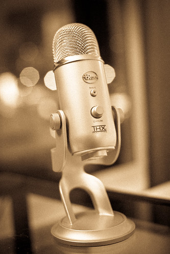
    Yeti

    The Yeti is a damn fine microphone.

    It is big. It is heavy. It is sexy looking.

    I tested recording on the Yeti against recordings from the built-in Air’s, the Jawbone Jambox, the iPhone headset, and the Blue Snowball’s microphones. The Snowball is a nice mic, but the Yeti is an excellent mic.

    With the Yeti you get:

    • Gain Control: allows you to adjust how loud your output is.
    • Passthrough Audio: you can plug headphones into the bottom of the Mic so you can hear your audio and the audio coming out of your Mac.
    • Patterns: decide which type of mic sensitivity is right for you.
    • 2 People One Mic: the Yeti is actually packed with three microphones arranged in a manner that you can set the Yeti in the middle of a table with two people facing each other, so they can use that same mic.
    • Volume: you can also control the output volume on the mic for your headphones.
    • Mute: you may never use the mute button, but it’s nice to know that you can.
    • Price: $150 might sound expensive to most, but it is far more costly to sound crappy in audio recordings. You can also find the same microphone on Amazon for $99 (affiliate link if you would be so kind).

    Yeti

    Noise Pickup

    My biggest complaint about the Yeti is that it is too good at times. To get the audio levels to a good point the microphone needs to be turned up a bit and with that comes the pick-up of a lot of background noise. Especially any noise from clicking and tapping on the desk. The foam on the bottom of the Yeti’s stand is not sufficient to muffle that sound. I solved this problem by using a piece of foam cloth material I had kicking around my camera bag and Shawn solved it with a hand towel under the stand.

    The best solution of course is to get a boom arm with a shockmount, but the shockmount that fits the Yeti costs more than the microphone itself — a none starter.

    The Yeti does a decent job blocking out background noise in the room, but you are still going to hear it if the noise gets loud enough for you to hear through your monitor headphones — which is precisely why you want the monitor headphones.

    Overall I am incredibly happy with what the Yeti does and does not pick up, unless you are in a studio you can’t expect perfection. With the Yeti I have found that it is perfectly manageable to sit in my living room and record a podcast.

    The Sound of You

    I have never been happy with the way my voice sounds when it is recorded. To me the sound never sounded like me — I am told this is because of the way we hear our own voice, compared to how others hear us. ((Has something to do with our bones and how they pick up sound when we speak versus when we listen.)) My voice always sounded too deep or deep tinny when I heard it, but now with the Yeti I am very happy to say that my voice sounds pretty close to how I hear it — my wife agrees.

    I think this is the most important factor for whether you are happy with a microphone or not: you need to be happy with the way you sound. It doesn’t matter as much to other people because they are likely to not know the difference between you in person and you on compressed audio being served up from a remote Amazon server somewhere presumable in the Amazon.

    Yeti

    Conclusion

    Even if the Yeti gets barely used I am very pleased to have it sitting on my desk. The Yeti is a truly great looking product and a great feeling one (it weighs a lot). I love the way it makes me sound and the way it looks. For $99 from Amazon you really can’t go wrong.

    However I think that you can get decent sound out of cheaper microphones with a little more work and planning. The Yeti offers me the sweet spot of less editing and less planning for equally great (and often better) sound. I would be lying though if I didn’t acknowledge that the look of the microphone plays a huge role in just how happy I am with it.

    Tips

    After using the Yeti for quite some time here are a few tips that I have found useful:

    • Put the Yeti on something padded and tape the USB cable coming into it down. This keeps a lot of noise from bumping and tapping the desk down, ditto with the cable as a slight jostle there can cause a nice audio pop in the Yeti.
    • If you have the Yeti on your desk with your Laptop and mouse do yourself a favor and find a way to deaden the tapping sound coming out of your computing activities. I rest my Air on a Rain Design stand when we record for B&B, that allows me to type without the listener hearing it. To solve the problem on my Magic trackpad I set tap-to-click to on and try to remember to only tap on it.
    • I position my Yeti between me and the keyboard when I am recording. This is not ergonomic or comfortable, but it puts the Yeti right where I need it to get good vocals. I try to stay between 10-12 inches from the mic.
    • Recording audio is a lot like taking a picture — you just can’t rely on Photoshop to make your pictures look great. Same with recording, if you don’t want to spend all day editing the audio tracks then you really need to take the time getting the setup correct. That means that if you have two people you need to adjust your levels until you are both pretty equal.
    • Controlling your voice is key — if you notice how singers will back away from the microphone when they belt out a word, the same is true with speaking. You don’t have to be monotone, but you should be aware that a loud outburst should be followed by leaning back from the Yeti.

    Well, at least that’s my experience so far.

  • TUAW Doesn’t Get It

    Victor Agreda, Jr writing on Mac OS X Lion’s NDA:

    It’s become painfully clear that Apple wants all of us to poke and prod and test and above all write, record and post about Lion.

    I am assuming that they are referring to this, from Apple’s developer website:

    In case you can’t read that, this is what the text reads:

    “Pre-release software, including information about pre-release software, is Apple Confidential Information and is subject to the terms of your Mac Developer Program License Agreement. Unauthorized distribution or disclosure of Apple Confidential Information is prohibited.”

    So I ask TUAW, what about the above statement makes it painfully clear to you that Apple wants this information disclosed?

    I can tell you that if someone comes by and steals $1 from me, I am not going to report it to the Police — why? Well, because reporting a $1 theft to the cops really isn’t worth my time, nor is reporting a $100 theft — but I still don’t want anyone taking my money. Perhaps it is not that Apple wants someone to break the NDA, but that it isn’t worth their time to yank access and send out C&Ds to all these websites.

    Agreda again:

    So from here on we’re going to ignore the NDA like every other Mac news outlet on the internet.

    Cool, because I remember when all the Verizon iPhone testers broke their NDAs and when the original iPhone testers broke their NDAs too. ((Actually that didn’t happen.))

    I am not saying you shouldn’t break the NDA — I don’t care — but don’t rationalize breaking this agreement by claiming that Apple clearly wants you to break the agreement.