Month: March 2011

  • “Could Blogging Be the Key to Raising a Generation of Great Writers?”

    Liz Dwyer:
    >The desire for reader feedback keeps the students excited about wanting to write more posts, and they’re eager to improve their writing skills for their readers’ benefit. “They now have a worldwide forum instead of an audience of one,” Christens said, noting that the students “see themselves as writers—real writers.”

    This is awesome.

  • To Each His Own

    Hugh Sissling shares how he organizes his iPad homescreen and — well — it is the polar opposite of what I do.

  • WSJ Review of Firefox 4

    Walt Mossberg on Firefox 4:
    >Though Mozilla doesn’t say so, I believe one reason for the revamp is to try to win back the hearts and minds of those techies and influential users who shun IE and once swore by Firefox.

    I’m guessing that those users aren’t going back full time. Firefox has become quite the resource hog.

  • My iOS Wallpapers

    More than a few of you asked for my iOS wallpapers, here they are:

    – [iPhone](https://f3a98a5aca88d28ed629-2f664c0697d743fb9a738111ab4002bd.ssl.cf1.rackcdn.com/iPhone-wallpaper.jpg)
    – [iPad](https://f3a98a5aca88d28ed629-2f664c0697d743fb9a738111ab4002bd.ssl.cf1.rackcdn.com/iPad-wallpaper.jpg)

    Enjoy.

  • Homescreen Organization Methodology

    Reader Nikolay Andreev emailed in this morning to shoot me a link to his post about organizing your iPhone homescreen — he also asked if I would share my tips. After taking a look at his post I thought I would share my thoughts on how to organize and arrange your homescreen icons for any iOS device.

    Andreev’s method is to put every app in a folder — every one. [Hit this link](http://lantinian.blogspot.com/2011/03/my-iphone-homescreen-layout.html) to see how he does it. He likes the way it looks and I like that it keeps you to only one homescreen (for most non-app-crazy users). What I don’t like is how it works in practice and how it looks, to me it looks like walking into a room full of bins that house all your goods — I hate bins.

    At least I hate *seeing* bins, I don’t mind them when they are neatly stored out of sight.

    Anything that is on my homescreen is there because I want to get access to it and I really don’t want to have to open a folder to get to those icons. That is just too many taps and about 6 months ago I purged all folders from my homescreen for this very reason.

    ### My Homescreen Organization Method ###

    I keep only three screens on my iPhone/iPad at all times. There is a very logical order to everything:

    – **Screen 1** contains only the most used apps, never any folders.
    – **Screen 2** contains a couple of apps that don’t fit on screen one and everything else in folders.
    – **Screen 3** contains apps that I am testing or just downloaded (meaning I am unsure how long they will be on my device for).
    – **iOS Dock** contains apps that I want to be able to access immediately, no matter which screen I am viewing.

    I don’t stop there with the organization though, I also have a hierarchy for how and where the app is positioned on the screen.

    ### Positioning on iPhone ###

    I break down my positioning by usage of the app (that is the most used apps go in the most optimum positions). I have determined that since I hold my iPhone with both my left and right hand equally (I am left handed and I use my iPhone more with my right hand). That means that the most premium positions are the four corners of the screen, then the next premium spots are the three icons that move vertically down the left and right sides (between the corner icons), then the two at the top and bottom in the middle positions. That leaves six icons in the middle that are of 4th priority. Here’s how this looks visually:

    What you see here is the visual representation of how I view the app layout in some really hideous colors. I have further broken it down with numbers where I put the most important app in position #1 and then go down from there. The only exception is the dock apps — which are important, but they must also be apps that often need to be quickly accessed.

    The end result of all this is a homescreen that looks like this:

    All of the dock items are items that I need to access frequently when I unlock my phone. Dialvetica and Messages are the next most frequently used apps and then follow the hierarchy on down. For the curious among you, here is the other two screens that I use — both follow the same general logic:


    ### Positioning on iPad ###

    On the iPad I still follow the same general order as I do on the iPhone, but I make one huge change that makes all the difference to me. You see the iPad homescreen rotates, offering a new level of complexity to the entire arrangement. I arrange my homescreen based on how I am likely to use the device given the orientation it is in. That is, I read in portrait, not landscape view — so I make sure reading apps are in premium spots when held in portrait — likewise for writing apps in landscape. This of course is quite confusing and often leads to an odd layout, best just to show you what I mean. (You can click the images to see a larger version.)

    Portrait:

    [](https://f3a98a5aca88d28ed629-2f664c0697d743fb9a738111ab4002bd.ssl.cf1.rackcdn.com/ipad-homescreen-portrait.jpg)

    What is most important here is that my ‘reading’ apps: iBooks, Kindle and Instapaper are all along the right edge — as I know I tend to read while holding with my left hand.

    Landscape:

    [](https://f3a98a5aca88d28ed629-2f664c0697d743fb9a738111ab4002bd.ssl.cf1.rackcdn.com/ipad-homescreen.jpg)

    Here I move the writing apps (iA Writer and Simplenote) to the left edge as they are more frequently used in this orientation.

    As before I am simply trying to get the most used apps to the edges, but because the screen rotates I decided to further prioritize based on how I use the device when holding in landscape or portrait.

    For the curious here are the other two pages I have on the iPad:

    [](https://f3a98a5aca88d28ed629-2f664c0697d743fb9a738111ab4002bd.ssl.cf1.rackcdn.com/ipad-page-2.jpg)

    [](https://f3a98a5aca88d28ed629-2f664c0697d743fb9a738111ab4002bd.ssl.cf1.rackcdn.com/ipad-page-3.jpg)

    I hope this at least helps someone who is just as *nerdy* as I am.

  • Dickbar No More

    From the Twitter blog:
    >Rather than continue to make changes to the QuickBar as it exists, we removed the bar from the update appearing in the App Store today. We believe there are still significant benefits to increasing awareness of what’s happening outside the home timeline. Evidence of the incredibly high usage metrics for the QuickBar support this. For now, we’re going back to the drawing board to explore the best possible experience for in-app notification and discovery.

    Half of the above I believe to be a lie, specifically: “Evidence of the incredibly high usage metrics for the QuickBar support this.”

    Why remove a feature if it is *truly* that popular? You don’t.

  • It Takes One to Know One

    John Oates:
    >Microsoft has made a formal complaint against Google to the European Commission accusing the search and advertising giant of using various illegal methods to dominate the European search market.

    Something comes to mind about throwing rocks and glass houses…

  • Quote of the Day: James Shelley

    “So don’t pretend to know everything. That’s just dumb.”
  • Broken iOS Icons

    Neven Mrgan commenting on icons and specifically app names that get truncated on the homescreens of iOS users:
    >I understand that iOS icon-label limits are frustrating, but please, please, pick a name that fits! This truncated nonsense looks super unprofessional.

    Agreed.

  • Why There Won’t Be an LTE iPhone This Year

    This [coverage map](http://network4g.verizonwireless.com/pdf/VZW_4G_LTE_Coverage_Map.pdf) of ‘4G’ LTE coverage from Verizon says it all. Ignore all the red, that’s just 3G coverage. Look at the yellow circles with the green outline — those are the **current** 4G coverage spots ((Truly they are spots, not areas.)) .

    All those green stars you see are slated for 2011 — slated.

    3G coverage was better than this when Apple passed on it for the first iPhone and 3G coverage was rolling out faster than the current 4G coverage is. I just don’t see an LTE iPhone coming in 2011 — perhaps mid 2012.

    ### Note About AT&T ###

    There really is no coverage map that I can grab for AT&T because, well, it appears AT&T is just modding the 3G network to get ‘faster than’ 3G speeds. If you know of one please send it my way.

  • iPad as Digital Whiteboard

    Fraser Speirs on using the iPad as a digital whiteboard:
    >So, what does iPad + Penultimate + AluPen get you? It gets you a digital whiteboard with infinite pages and undo. The beauty of this is that you get to keep every whiteboard you draw during the lesson. You can flip between whiteboards and go forward and backwards and insert new pages in between the others. It’s really kind of remarkably powerful.

    What a great use case.

  • ⌘+1 (How I Blog with Keyboard Maestro and TextMate)

    About 72 hours ago I decided that I was going to start publishing blog posts directly from TextMate instead of writing in TextMate and posting with MarsEdit (more on this in a bit). ((Don’t worry I still love MarsEdit.)) This did present a problem for me though, it would be nearly impossible to post linked list items (which are far more frequent and fast paced). Justin Blanton ((That magnificent man.)) posted a new plug-in yesterday that completely changed how I blog. He created a way to post linked list items by enabling custom field support using his ‘[cf]’ syntax in the body of your post.

    This changes things in a big way — you see now you can actually use the WordPress iOS app to create a blog post with a custom slug and a linked list url embedded. I can do this all inside the iOS app for the first time ever. Before I invoked a custom ‘Press This’ plugin, then saved that as a draft, then opened up the post in the WordPress backend in Safari — then I could finally edit and so on. It was a pain in the ass, still is if you don’t have Justin’s plugins.

    I was pretty happy with having just that tool at my disposal (especially since I have been posting more from my iPad of late), but then I realized that I could use the same trick to post linked list items from TextMate on my Mac. Oh boy.

    The immediate problem though is that it is not as convenient to post a linked list item in TextMate, as it is with MarsEdit and the great bookmarklet that it comes with. I decided that even that experience could be improved upon and took it upon myself to write a Keyboard Maestro macro that will create a linked list post in TextMate — with even greater ease than the MarsEdit bookmarklet can.

    End Result

    Here’s the end result of what this macro outputs when you select text you want to quote in Safari/Webkit:

    End Result

    What you end up with is the basic headers needed to send a post to your WordPress blog with TextMate, the category is automatically set to ‘Links’. I also set the custom field (which in my case reports to the linked_list_url custom field) to the current URL, then I grab the selected text (even though we didn’t copy it to the clipboard) and paste it as a Markdown blockquote item.

    All I need to add at that point is the Author’s name ((I wish there was a standard way to grab this automatically, but I have yet to devise a decent solution for that.)) and my comments. Perhaps a ‘via’ link if needed.

    Why

    A lot of you may wonder why I would want to blog with a text editor rather than use something dedicated like MarsEdit. The answer is actually pretty simple: text backups. I like the fact that I have a copy of every article I have posted to TBR stored in Dropbox as a plain text file. What I don’t like is that I don’t have the same for Quote posts or link posts. Using TextMate I can blog faster than I can with MarsEdit and I get to save the published file as a text file in Dropbox. It’s just one more little back up and reference bit for my own paranoid-self-satisfaction.

    The Macro

    The entire macro is incredibly simple to setup, with the exception of grabbing the URL from Safari — this is why I was asking for an AppleScript on Twitter yesterday. What I was reminded of thanks to Ian Hines was that the simple shortcut CMD+L highlights the URL bar — bingo.

    Here’s the entire macro:

    Full Macro

    So I find that while showing people this macro allows you to duplicate it, it doesn’t do much to explain the actions that I took, that’s why I want to step through them.

    1. I first set the clipboard text to a blank space. The reason I do this is because later on when we go to grab the blockquote material you won’t get this odd double pasting error that I was getting. This was a result of instances when you don’t select any text to blockquote, adding this solves that problem.
    2. Now we enter into the bare bones stuff. First we hit CMD+C to copy the selected text to the clipboard so that we can blockquote it later.
    3. We highlight the URL in the address bar by pressing CMD+L.
    4. A simple CMD+C to copy that URL.
    5. Now we are calling upon another macro I have set in Keyboard Maestro that opens a new, blank, TextMate document. You achieve the same result by telling Keyboard Maestro to switch to TextMate and press CMD+N — that’s basically all that macro is doing.
    6. I apologize that you can’t see everything in this last box, but here is what is in that box:

    Type: Blog Post (Markdown)
    Blog: TBR
    Title:
    Slug:
    Keywords:
    Status:
    Pings: Off
    Comments: Off
    Category: Links

    ["cf"]%CurrentClipboard%["/cf"]

    >%PastClipboard%2%

    [via ]

    I had to add quotes to the ‘[cf]’ tag to get it to show.

    Basically I am pasting in all the header information and filling in two fields with the information we stowed on the clipboard earlier. Inside the [cf] tags I am pasting the most recent clipboard item, which in this case will be the URL we grabbed from the browser. Lastly using the Markdown > syntax for blockquotes I am pasting the clipboard item that is two items back, instead of the typical one, this allows me to paste in the material we want to blockquote (the stuff that was highlighted when you invoked the macro).

    That’s it. I have this macro set to run when I press ⌘+1, but only when I do so inside Safari or the Webkit nightly builds. Thus, overriding the MarsEdit bookmark that would normally launch when I press this shortcut. ((You can limit which applications this works in by creating macro groups and setting that group to only work in certainly applications — which is exactly what I have done.))

    To-Do List

    This macro is far from perfect and there are somethings that I want to add to it that I don’t quite know how to do just yet. Among those things are:

    1. Grabbing the title from Safari and pasting it in the ‘Title’ field. I am sure this can be done with a little AppleScript, I just haven’t gotten around to it yet.
    2. I would love to be able to run a script that scans the article content for keyboards and drops those (comma separated) into the ‘Keywords’ field. I am not going to lie — I don’t even know where to start on that one.
    3. Lastly I would love to add a script or action of some sort that would analyze and clean the URL. This way when I have URLs that contain tracking (such as ?utm-source and that crap) it would strip off the unneeded bit and keep Feedburner from freaking out on me every other day.

    If anyone figures those things out please send it over to me with a link so I can share it. Also if you have any other unique way you are blogging I would love to hear about it.

    I hope this helps at least a couple other Keyboard Maestro + TextMate junkies.

    Bonus Tip on Clipboard Usage in Keyboard Maestro

    One thing that a lot of people miss (gloss over) when they are setting up macros in Keyboard Maestro is that you can input dynamic content and rather than memorize the calls for that content there is a handy ‘Insert Token’ menu. As you can see here:

    This can also come in handy if you want to run shell scripts based on variables.

    Quote Posts

    I have a similar macro mapped to OPT+CMD+1 that does a similar trick, but marks it up as needed for the ‘Quote of the Day’ posts that I do.

  • Dual-Screen Touchbook

    You know what I want? A 14″ laptop with not one, but two screens — oh yeah and get rid of that silly keyboard. Clearly carrying this around would be better than an iPad **or** a laptop.

    Who wants this?

    This is one of those devices that looks really cool in movies, but sucks in real life. Why does it suck in real life — because in real life you have to actually use the damned thing.

  • Quote of the Day: Seth Godin

    “If you’re working with a spreadsheet or a thread of correspondence or a set of data, I’m not sure you’re doing your best work if you’re doing it on an iPhone.”
  • RIM Will Ship PlayBook Without Mail, Messaging or Contacts

    Charlie Sorrel, reporting on a leaked document that says the PlayBook (RIM’s upcoming tablet) will ship without a basic email, messaging or contact app on the device, adds this nugget:
    >You can almost smell the desperation that has crept into RIM ever since the iPhone arrived on the scene.

    The smell is getting pretty strong too.

  • Quote of the Day: A Mother

    “‘Cause that’s the first thing [people] ask you: ‘What’s your e-mail address?’ So now, that makes me feel that I’m part of something–and then I feel that I can see and do more things now than I did before, because I didn’t have it a computer.”

    That quote is from his mother, upon using the iPad — her first computer. I love stuff like this.

    [via DF ]
  • Clarity

    Camera+ came out with a new update (version 2.2) that boasts a new ‘filter’ called Clarity. Typically when you see the words ‘clarity’ or ‘definition’ in photo editing software it means that it will be adjusting the micro-contrasts. Basically it is going to make your shots look a little sharper and give them some more depth — as with any photo filter this can be both a good and bad thing.

    I took an iPhone snap from Victoria B.C. that I took and ran it through this new filter to see what it looks like. Here is the [original iPhone photo](https://f3a98a5aca88d28ed629-2f664c0697d743fb9a738111ab4002bd.ssl.cf1.rackcdn.com/Stock.jpg) taken with the stock Camera app; this is the [HDR version](https://f3a98a5aca88d28ed629-2f664c0697d743fb9a738111ab4002bd.ssl.cf1.rackcdn.com/HDR.jpg) of the same shot from the Camera app again; here we have the [Camera+ version](https://f3a98a5aca88d28ed629-2f664c0697d743fb9a738111ab4002bd.ssl.cf1.rackcdn.com/Clarity.jpg) with Clarity applied; lastly this is the original photo [edited in Lightroom](https://f3a98a5aca88d28ed629-2f664c0697d743fb9a738111ab4002bd.ssl.cf1.rackcdn.com/Lightroom.jpg) 3 ((I applied a ton of tweaks and settings in Lightroom, taking only 30 seconds to make the photo look as good as I can in that time period. I have no doubt you can get a better image with more time, but that’s not the point of this post.)).

    I have no comment on which is best, but I thought it would be nice to show the range of editing you can do on these photos.

  • CF Setter

    Following up on his work to make his Slugger+ plugin work with iOS WordPress apps so that you can set the ‘slug’ field in WordPress — Justin Blanton made another plugin that allows you to set a custom field using the same framework.

    This is absolutely amazing — I can’t tell you how much of the ‘pain-in-the-ass’ factor this will eliminate when blogging on an iPhone or iPad. Thank you very much Justin!

  • Pricing Problems and The New York Times Digital Subscription

    Peter Merholz on the NYT paywall and pricing structure in general:

    If you look at the companies that offer the most confusing pricing plans (telcos, health insurance providers, most major airlines), they are also the companies that deliver the poorest customer experience. This is not a coincidence. These are companies whose success is built on little competition, and who know they can squeeze money out of their captive audiences.

    That is so very true. To get an even better perspective on just how terrible the NYT’s pricing plan is read the second paragraph in this article — if you don’t clearly remember and understand how the pricing plan works, then guess what: it’s a bad pricing plan.

  • Why Your App Name is Dumb

    Have you noticed how absolutely stupid some iOS app names are? I really mean this — just calling your app “InstaX” doesn’t mean it is as good or as cool as the original. ((Which would be Instapaper.)) When I am browsing the App Store you have two chances to catch my attention:

    1. With your icon.
    2. With your app name.

    If I can’t decipher what your app does from one of those two (or both), then you need to be:

    – Featured on Daring Fireball, or;
    – immensely popular.

    Just take a look at some of the apps that you have on your iOS device and ask yourself: “If I didn’t already know what this app did — is it self-evident from the icon and name?”

    Chances are that it isn’t and some of the time this isn’t the developers fault. Perhaps the name is too long to fit, or the name is already taken by another developer. Then developers need to get creative, but they should never get so *creative* that potential new users can’t figure out what in the hell your app does.

    Let’s look at some examples. ((I know this is what you were waiting for, and all the apps I am about to name are ones that I use and love — I just happen to think the names are poor choices. Then again, I don’t have an app so can I even really talk about this? I think yes, because after all I am a customer and ultimately what I, or any other customer thinks matters. I vote with my wallet.))

    ### Bad iOS App Names from Apps I Love and Use ###

    First up has to be [Calvetica](http://calvetica.com/) which is a great little calendar replacement app for the iPhone. I absolutely love this app and can’t imagine going back to the built in app, but even at that, the name and icon are pretty poor choices.

    Here is the Calvetica icon:

    Calvetica Icon

    Take a look at that icon — if I hadn’t told you what the icon was for, would you know what the app does? I look at that icon and it tells me two things:

    1. I can seemingly add something with it (the plus sign).
    2. The app must be very simple in design using light grays and red.

    Truly the icon sells the fact that design and minimalism seem to matter in the app. That’s all I get out of it and perhaps that’s all I need given the name:

    #### Calvetica ####

    In looking at the name and the icon together I only get one clarification: the app must use the typeface Helvetica, because that is clearly what the name is playing off of for the ‘vetica’ portion. Let’s look at the first part though: the ‘Cal’. If this app was just called ‘Cal’ put with an icon that has a giant plus sign on it — what would you think that app does? Personally I would think it is a calculator app, actually the full name and icon very much make it seem like a lovely swiss designed calculator app for my iPhone. I would still buy it it because hey a nice calculator app is always handy, but this isn’t about calculators — it is about calendars. Given that both the icon and the app name don’t seem to be that self-evident.

    Moving along let’s look at another app: [Foursquare](http://foursquare.com/devices/iphone). Again let’s take a look at Foursquare’s icon first:

    Foursquare Icon

    All that icon tells me is that it is either a game or a check-list app. It’s a blue blob with a purple golf ball and a check mark — I am not sure what else you could get out of that icon (assuming you don’t already know about the service) ((Even if you do know about the service there is a fair bet that you have only heard the name and still don’t know what it is all about.)) . So let’s look at the name:

    #### Foursquare ####

    Oh I know foursquare, it’s a game I played in elementary school during recess — clearly this is an iOS game where I bounce a rubber ball around against the computer — neat. Except we all know that’s not what the app does, it checks you into different locations and declares you the Mayor of random places. Yet, the only part of the name and icon that even vaguely resembles that fact is the check mark — which again is more closely associated with to-do lists and not check-ins.

    This, I think, is a major problem with many iOS apps that aren’t games — you see this repeated over and over. If you are not a game you might consider being a little more explanative in your icons and naming conventions.

    ### An App Name That Is Saved by the Icon ###

    Just like above, this is an app that I use and love. What makes this app different is that even though it has a poor name, the icon saves its bacon.

    The app is [Instagram](http://instagr.am/), which has a name that really doesn’t mean a whole ton to those unfamiliar with the app. Insta + Gram — sounds more like a telegram or one of those little singing teddy-grams, than it sounds like a social Polaroid app. In fact if I had to guess based off the name alone I might guess that it is another group messaging app.

    Take a look at the icon though:

    Instagram Icon

    Now you know this is one of one-million photo apps in the iTunes store. Pair that icon with the name ‘Instagram’ and you now get the sense that this app is about quick photos of some sort — which in truth is a pretty accurate description. The icon in this case aves the mediocre name. This is a fine solution as you rarely ever see the name standing alone in the app store — so the fact that the larger attribute (the icon) is easily descriptive of the app means that potential customers are more likely to be drawn into the app description page.

    Runner-up: **[Soulver](http://www.acqualia.com/soulver/)**.

    ### An App Whose Icon Is Saved by a Name ###

    Now we need to pick on [Simplenote](http://simplenoteapp.com/) — an app and service that I really love. ((And that I pay for.)) Unfortunately looking at this icon tells you nothing about the app:

    Simplenote Icon

    What about this icon tells you what the app does, or even what the app could be called? Nothing, really. But, the name: “Simplenote” is damned descriptive and tells you exactly what the app is about: taking simple notes. That is pretty strong and even with the weak icon any person in the market for a note taking app should understand what this app is all about just from the name.

    Coupling the name and the icon together give the the clean, minimalist note taking feel that is actually a fair representation of the app itself. Unlike in the last scenario though, the strong name may not be enough to combat a user glossing over the app as they look for stronger icons. ((Note: There has been a long and troubled history with Simplenote and its icon choices. I don’t want to reopen that debate, I don’t hate the current icon, but I am also not sure it is the best icon to help grow the user base.))

    ### Apps That Have Descriptive and Clever Icons and Names ###

    Now we get to those apps that have both excellently chosen icons and excellently chosen names. I have two, non-Apple, examples to bring up — the first is [Delivery Status Touch](http://junecloud.com/software/iphone/delivery-status-touch.html).

    Of course that is not the name that is displayed on your homescreen, the much more succinct “Deliveries” name is used. Couple that with this icon:

    Delivery Status Touch Icon

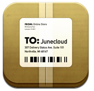
    Now coupling that icon of a brown box with a shipping label on it, with the name Deliveries and you get a pretty decent idea of what this app does: updating you on the status of deliveries. OK maybe not that clear, but you do get the idea that this app is all about shipping and receiving — which is pretty good for one word and a small icon that actually contains a fair bit of detail in it.

    Another great example is [Pastebot](http://tapbots.com/software/pastebot/), where you have a name that means something to computer users in “Paste” and the expectation of something being automated with the use of the word “bot”. Add to that this icon:

    Pastebot Icon

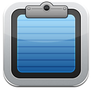
    Seeing that icon I can immediately see it is a clipboard and putting two and two together I now know it has something to do with automating the pasting of your clipboard. Interestingly, I still don’t know what the app does exactly (allowing you to paste items from your Mac’s clipboard in iOS), but then how the heck do you convey that utility with one word and one icon?

    Both of these apps do a great job of combining short descriptive names with pleasingly well designed app icons to convey a general understanding of their apps to non-users.

    ### Sales versus Clever ###

    In looking at tons of app icons and app names it seems to be evident to me that iOS developers are attempting one of two things most of the time:

    1. Developers are going for sales numbers with straight forward and obvious naming and icon conventions. Weather apps are most prone to this, but other apps like Twitter clients are also guilty. This is not necessarily a bad thing — it is just a ‘thing’.
    2. Developers are going for a very clever name — clarity be damned. This is what happens when you start adding “Insta” to everything, or when you start making abstract art your icon. This is far more trendy among developers targeting early adopters.

    I am not saying one is right and the other wrong, but there is an important distinction and very few apps that hit the nail on the head with both a marketable icon and name while still being a clever name. I think both Delivery Status Touch and Pastebot bridged that gap, but that doesn’t necessarily mean that they have instant success.

    ### An Aside on Clever Names ###

    Perhaps the most clever app name in the entire app store is Garrett Murray’s aptly named: [Ego](http://ego-app.com/). You see Ego is the name of his app that tracks your popularity stats (Mint, Google Analytics, Twitter followers, Vimeo Plays and so on). Ego is an app that helps to either feed your ego (if you are popular) or deflate your ego, if, well you get the picture.

    Ego isn’t an app that if you come across it in the app store you would immediately know what it was — either by its icon or its name. It is though perhaps the most clever name I have seen in the app store, because anybody who knows what it is — gets the name and usually finds the humor in the name.

    ### What I Mean To Say ###

    What I really spent all this time talking about is the absurd names and icons that developers are using. Should an iPhone user really have to get used to the fact that the name and icon of their new calendar app is best suited for calculator app, or should they immediately know what’s what? I for one have never been confused by the name of the official Twitter app, nor have I been confused by the icon. I do need to get used to many other apps and their icons and that just seems silly to me — it seems a bit lazy on the developers part.

    If I decide that I want to switch my current calculator app for another on my homescreen shouldn’t the icon be recognizable as a calculator app — thus keeping me from having to read the small Helvetica type? I think so.