This post makes one huge assumption: I assume that Marissa Mayer does not want Yahoo to continue to suck.
If that assumption holds true, here’s two acquisitions Yahoo should make to become awesome, and a service that I use daily.
### Acquire 500px
[Just yesterday I pondered about Yahoo buying 500px](https://brooksreview.net/2012/07/photo-tip/), I awoke today thinking it is an even better idea than it was yesterday. The play here is simple: buy 500px and rebrand it as “the new Flickr”. Migrate the entire existing Flickr user base and instantly make them all happy.
Next get hard to work on a mobile app for iOS uploads and see about getting direct integration into iOS from Apple for iOS 7/8.
This is smart because 500px is a business already, not some free service that Yahoo would need to figure out how to monetize.
I doubt every Flickr user would be happy with this, but it’s a better option than the “dying the slow death” path that Flickr is currently on.
### Acquire DuckDuckGo
It would pain me to see DuckDuckGo bastardized with ads, but I think there is a smart play here. Yahoo buys DuckDuckGo and starts serving ads on it, and make it the default Yahoo search engine. Yahoo is already an option on most browsers and devices (like iOS) so the potential user base is there. Putting the Yahoo brand behind the DuckDuckGo power, might be a win-win for both.
Of course the awesome privacy features of DuckDuckGo may suffer, but I have a solution for that: charge users to keep DuckDuckGo as it is — if they want. Figure out how much each user is worth to you in ad dollars. Divide that in half, and charge that a year for “pro” DuckDuckGo users. I bet it comes out to less than $10/yr — cheap!
This *is* a better option than [partnering with Google](http://searchengineland.com/yahoo-microsoft-search-alliance-google-127843).
### Who This Hurts
This is a play against Microsoft and Google. Yahoo would become a better search engine than Bing, and an excellent alternative to Google. Yahoo would also have (once again) the strongest photo offering for everyone from mom and dad, to pro level photographers. Both businesses would be easy to integrate, have a place in the company, and be able to immediately contribute to the bottom line.
Notice who this doesn’t come after: Apple. The enemy of my enemy is my friend, right? If Yahoo can show it is savvy, it would make itself a far more attractive partner to Apple than Google — and that could pay off in spades.
[Marco Arment brings up a really good point with regard to Marissa Mayer leaving Google to become the CEO of Yahoo!](http://www.marco.org/2012/07/17/the-real-reason-marissa-mayer-left-google):
>Every time Apple loses one of its Senior VPs, we see stories questioning Apple’s leadership and future, suggesting that there may be significant inner turmoil.
>Well, Google just lost one of its top people.
Mayer was the 20th employee at Google and has been with the company for most of the company’s existence. So I think Arment’s statement is very interesting. What happens when Google loses top “talent” — is that bad for the company?
Steven Levy seems to have had a lot of access to not only Mayer, but Google itself, [and in his post for Wired he notes](http://www.wired.com/business/2012/07/why-marissa-mayer-the-ultimate-googler-makes-sense-for-yahoo/):
>And it must have been disappointing that she was not included in the “A” team of top product lieutenants that Larry Page chose when he became CEO last year.
That surprised me, I always thought she was one of the top people at Google — certainly the only non-creepy Google execs. ((Looking at you Schmidty.)) So Levy is painting a picture of someone who seems to have hit their peak at a company — only natural then for an ambitious person to leave.
More to Arment’s point though is this passage from Levy in the aforementioned Wired article:
>I did an informal survey of the young managers and asked each to guess if he or she would be working for Google in five years. Not a single one answered in the affirmative. When I reported this to Mayer (we were in Israel by then), she was unruffled. Actually, she told me, it would be a positive thing, because Google DNA would be spread throughout Silicon Valley, to the benefit of all.
I certainly wouldn’t want to run a company, and train new employees, if every one of those employees didn’t expect to be there in five years time. That line about spreading Google DNA just seems like a bunch of PR brush-off speak to me — this matters. Should be interesting to see how Google changes as they continually turn over managers.
I have been thinking about this idea for quite a while now, approached a few developers I know to see if they wanted to take the idea and run with it, but now I just want the app. So here is my idea, you can have and I only ask for two things in return for you taking this idea:
1. That you get me on the beta.
2. That you charge for the app.
Now that that is out of the way, my idea is essentially a [Dark Sky](http://darkskyapp.com/) like app for traffic. The idea is simple: when I am driving down the road and I see traffic coming up I always have two questions, ‘how bad’ and ‘how long’. Of course right now I grab my iPhone and pop open Google Maps and take a look at the traffic. That’s not ideal though for a couple of reasons:
1. I often turn off the traffic data on Google Maps so that I can see the street names.
2. Google Maps zooms in on the area where you are, but that’s often too close to see the traffic ahead since Google centers your location on the screen.
Google Maps is just too cumbersome to try and use (safely or not) while you are driving a car. Enter “Open Road” (you are welcomed to choose your own name, I just need something to refer to).
### The Idea
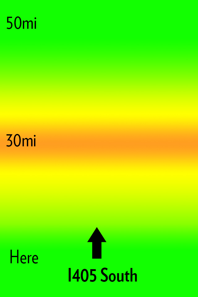
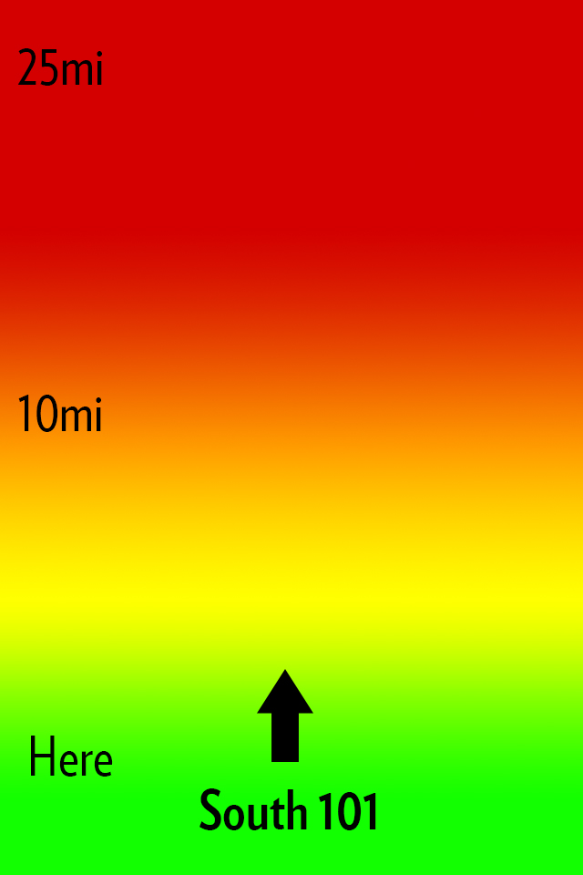
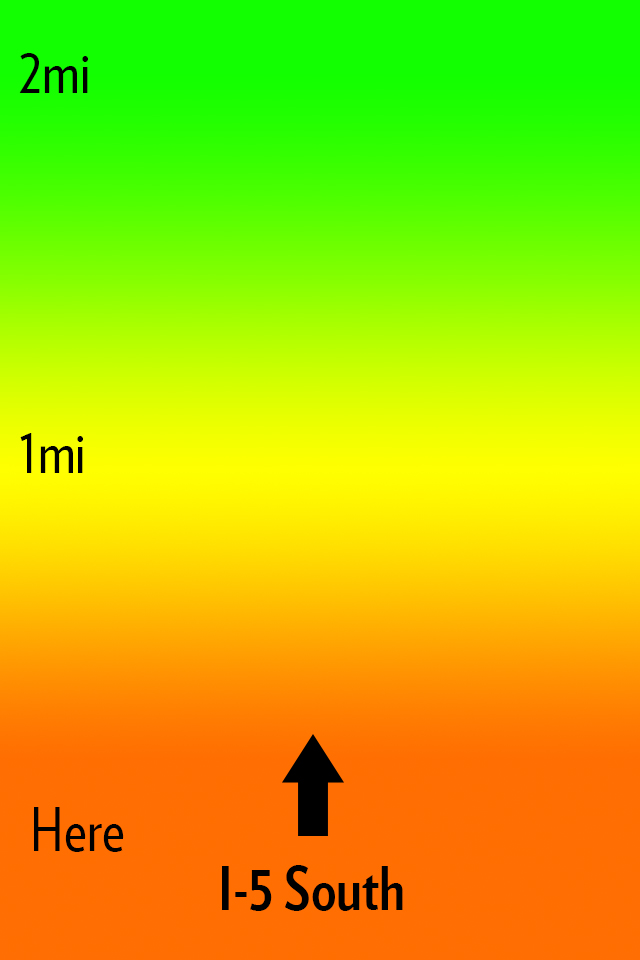
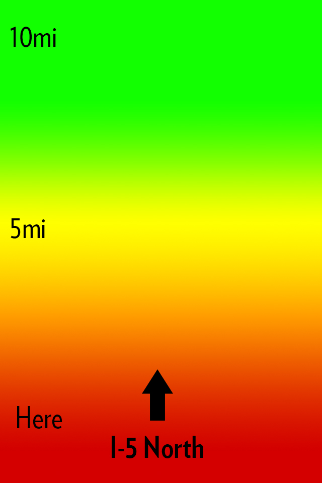
My idea for Open Road is to create an app that does one thing: shows you the traffic ahead of you in a quick and glance-able format so that it can be used one handed without much thought or interaction while you drive. Here’s how I envision this looking:
The main interface.
All that you see is a screen with a heat map, the distances from you, and the road that the app thinks you are on. Green is open road, yellow is slower, orange sucks, red is the makings of a bad day. Pretty simple, here’s some more mockups:
Now you might notice I changed the distances in the screenshots. The way I see the app working is that a driver can slide his finger up or down the screen to change the distance of the traffic from him. Perhaps I am only driving for another 5 miles on this road and I need to know if I can tough out the traffic — maybe I am on a long haul for 100 miles.
This is the idea in a nutshell.
### The Warning
iOS 6 is bringing a new map platform with crowd sourced traffic data. I have no clue how this looks or works, but there is potential it could compete with an app like this. I do not however see Apple making an app like this, but if they enabled push notifications of upcoming traffic then it’s game over.
### That’s All
If you like the idea run with it. Good luck.
*Let me just state again that I won’t pay for someone to develop this, and I certainly do not want any kind of equity or my name attached to any apps you may build. The idea is one I had, but the execution (the hard part) is all you.*
[Craig Grannell writing about Tap! magazine](http://reverttosaved.com/2012/07/12/it-really-annoys-me-when-i-see-people-reviewing-ios-apps-badly/):
>People still bang on about magazines being rubbish on the iPad (something I wrote about in March) and, more recently, argue the iPad’s corner in terms of content creation. Bizarrely, Tap! almost never gets a mention, despite being a magazine designed specifically for the iPad and that’s actually put together on an iPad and in the iPad simulator on a Mac.
Grannell got me a free copy of Tap! back when they launched the app for the iPad (full disclosure and all) and he is right: Tap! is not like any other magazine you will find on the app store. I know I am among the lot that makes fun of iPad magazine apps. I make fun of them because for the most part they are a digital copy of what the magazine would normally print. Which is both boring and hostile towards the user (non-selectable text, huge files sizes, etc.). Tap! is different, but I have never been a huge fan of the kind of different that it is.
It’s great that Tap! is specifically made for the iPad, that truly is great, but the UI is very odd. Print magazines have always been about three things that readers care about:
1. The pictures.
2. The ads (a lot of people used to buy magazines to see the ads, mostly women’s magazines I am told).
3. The layouts.
Magazines are visually interesting and compelling to look at, but when you get right down to it, they are usually pretty terrible to read. And on the iPad we *want* to read, because the iPad offers other *more compelling* things to just look at and drool over. So to **me** a good iPad magazine app is one that is highly readable.
Does Tap! excel at this?
To answer that I am going to let you see some screenshots taken from the March 2012 issue, but first you should know that Tap! is mostly short form articles about a bunch great little apps, tips, tricks, tools, and gadgets.
The background “lights” blink and flash.Want that text box bigger? Too bad.Now this is the best reading experience on the app.
I am really not trying to pick on Tap! here, because they did a great job to actually decide that PNGs is not an acceptable way to serve up text on the iPad. However, the bulk of the magazine looks more like the first two pictures than it does the latter two pictures. That’s where my problem with the magazine is: Tap! seems to be trying to sell based on the same merits that sold magazines and I am not sure that works on the iPad for me.
I like the last picture of all the options, it shows the most text at once and fewest distractions, but again that’s not the majority of the magazine. With the short blurbs about apps I can understand the default to huge screenshots — they say more than what you would write — but even at that the text seems like an after thought. When the same trick is employed for howtos, I start to scratch my head.
There’s both good and bad with Tap!, but ultimately I think it is probably the best general consumer grade magazine experience on the iPad. What that means is that this is the magazine I would tell my dad to buy, because I think he would appreciate it more than crafting his own magazine in Instapaper.
This doesn’t make Tap! bad by any means, it just doesn’t make Tap! a magazine that is for me.
*(I should also note that the download finished before my iPad screen went to sleep — which is a feat all by itself.)*
I started writing this long before anyone knew about this change — in fact only a handful of people know about this change as I write this sentence. The change I am making today, has a huge potential to fail and this, I accept.
Simply put: I hate the business model of this blog, well actually I *hated* the business model of this blog. It was simple, well known, and commonplace. It’s the standard blog business model:
1. Build a readership.
2. Sell ads those readers must see.
In my case, here, I sold two ad spots: one to Fusion and one to RSS Sponsors. Both are very different types of advertisements.
Before we go any further I want to be clear about something: I have no problem with ad supported websites — they play an important role and both Fusion and the Syndicate were nothing but great to me. Ad supported sites will always be around — and truthfully that is fine.
But an ad supported site is, ultimately, not the site *I* want to run — so before I go any further I thought it prudent to craft the kind of site that I actually want to run, or as is actually the case: a site much closer to the one I want to run.
I want a direct relationship with you, my readers.
So starting today the business model becomes even more clear ((There are still Amazon Affiliate links, but those are still you directly deciding to pay me by using them.)) :
1. You pay me.
2. I write.
Of course this model isn’t new either, we typically just call it a “paywall”. But a paywall in its basic form is ineffectual for what I want, because then it becomes a massive hurdle to gain new readers (since all my content would be hidden out of the public eye) — I don’t want that.
### The Challenge
What I needed to solve was a few issues with a pure paywall model:
1. How to continue to attract new readers and thus expose my writing to new people.
2. How to keep my writing quotable and linkable by other sites.
3. How to keep the current readers I have.
4. Provide a firm reason why a membership model *is* better than the ad supported model, for those reading the site. (This was something I personally had to answer before I felt good about moving forward.)
### New Readers
The first problem I hit with a paywall model was how I attract new readers. Word of mouth is just too slow, so I needed some way to offer potential new readers a taste of my writing. What I was strongly against doing was:
– Truncated posts on my site.
– Trial periods of any kind, or length.
– Sample writing posts.
All three of those methods seemed way too crappy for me to put up with and would personally piss me off. I needed something better. In looking at how other sites worked I honed in on *The New York Times*. They have a modified paywall that allows readers to view a certain amount of articles every month. That, I thought, was closer to what I needed, but I could do my readers one better.
What I have going for me that *The New York Times* doesn’t have, is that I am *not* a news site. And since my opinions should stand the test of time, I do not need to move at the speed of light, therefore: time itself should really not be a big deal to me or the readers of this site.
All non-members of the site will have access to *every* post that members have access too, with one caveat: non-members won’t see those posts until *seven* days after I posted them.
Therefore, you can still enjoy this site, in full, without paying a dime or seeing a single ad — you just have to be OK with enjoying it seven days after members enjoy it.
I realize this isn’t ideal, but being as what I write is not time relevant, I feel that this is a decent tradeoff. If you aren’t a member you won’t be able to see what you are, in fact, missing — thus the content is indeed new to you when it does become “unlocked”. (This is the plan at least.)
I arrived at seven days because I think that is the minimum point of pain. Meaning I think that anything shorter would be too easy for a reader to decide it’s not worth becoming a member. Anything longer than seven days and I felt that I was being too punitive against readers who simply cannot afford to pay for a membership.
### Incoming Links
This model brought about one other snag that really dumbfounded me: what happens to the readers of my site that want to link to one of my posts on their own site when my post is still behind the paywall? I could have easily forced those members to make their readers wait seven days, but that didn’t seem right to me and it didn’t seem like a site that I would want to link to.
Again I turned to *The New York Times*.
I have decided that if you are linking to my site, then a reader that comes here from your site can also view the article you link to, without having to become a member. ((Thus opening up a loophole for less than quality individuals to exploit, but I have provisions in place for this — don’t worry.))
So if member Jim wants to link to a TBR article from his site, and his reader Bob wants to read my article — he can do so if he follows the link from Jim’s site to my site — even if Bob isn’t a member here.
It’s not a perfect system, but the very last thing I wanted to do was close my content off from being commented on by other sites and shared around. ((If you notice a bug in this at all, or feel I have unfairly blacklisted your site — just get in touch.))
### Current Readers
I wanted to make sure that what ever changes I made to the site, I made them in such a way that all current readers could continue to enjoy the site without having to pay. That’s why there is the “free after 7 days” mechanism built in.
No matter if you pay for membership, or not, you can still read everything I write. The only difference now is that it isn’t the very latest thing I wrote, but you get the added benefit of *never* having to see an ad.
### The Benefit
Why go this route? Why not stick with tried and true advertising? Why change? Why is this *better* for readers?
Lots of good questions, and truthfully this is one big guess, but I do want to share my reasoning.
No matter if I am the one booking advertising slots, or someone else is booking them: the companies I write about are the ones that must decide to book the spot and pay me (indirectly). Therefore if I write something negative (gasp!) about a company, that company may decide **not** to sponsor the ad network that is powering my site in the future. Likewise if a company is sponsoring the RSS feed in a given week and they do something stupid, I may feel that I need to refrain from making fun of said stupid move — that notion never sat well with me.
I have always tried to never let this play a role in my writing, but it weighed on me. Even though the issue rarely came up, it always made me feel less genuine. It was upon that realization that I knew something had to change — I couldn’t and shouldn’t be held to worry about advertiser’s feelings when my first (self-imposed) duty is to write with complete honesty.
That’s part one.
Part two is that advertising is ugly and distracting on a page. I wanted a pure reading experience, one that is, from the outset, unbiased and direct. Removing all ads and designing a site that need only give room to the pixels I choose ((Because I didn’t get a say in what the square Fusion ads look like.)) : that’s the ultimate goal.
And that, my friend, is the way it *should* work. It is a simple plan.
### Pricing
The pricing is pretty simple: $4 a month. That gets you everything, ad free, without delay.
It’s automatically billed through Stripe. Yep, no need to have to deal with PayPal for either of us. You sign up on my site, you get processed by Stripe, and you can cancel your account right here on my site. So you need only to come here if you want to cancel — it’s one click — no trying to figure how to cancel.
Once you sign up you immediately get login credentials, a unique (to you) RSS feed for all the posts, and you are on your way.
### Changes to My Writing
Before I wrap this up: the writing here is going to change.
I can’t buy new things to review unless I have the money to do so — so that may taper off for a bit until the membership base (hopefully) grows. Also, since I am not worried about the timeliness of my linked items and articles, I am going to try and write all of them with a lasting and value added motivation (keen readers may have noticed that my commentary has slowly been getting longer on linked list posts — this is what I am talking about).
Linking to a post and commenting “cool” is now against my own rules. If I can’t add value to a link with thoughtful analysis and opinion, then that post isn’t getting a link on this site.
If my article or review won’t be as helpful in seven days as it is today, then it’s not worth posting at any point.
I am going to hold myself to a higher standard. ((Additionally I will not be accepting promo codes for apps any longer either. Again, I want nothing influencing me. I will still be accepting beta invitations, but will always say so when writing about an app. The reason for accepting beta invites is simple: I feel I pay for a beta invite in the form of my direct feedback to the developer.))
### That’s a Wrap
Enjoy the tweaked design. Enjoy the lack of ads. Become a member if you can and want to.
A big thanks to [JR Tashjian](http://jrtashjian.com) for the coding.
And a huge thank you to all of you — regardless of whether you become a member or not.
To join up, [go here](https://brooksreview.net/members).
#### Programming Note
Just a heads up on a couple of things:
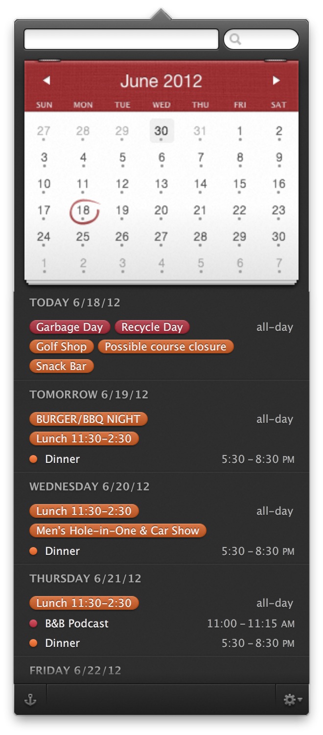
1. Because of the new 7-day rule, this site would be a wasteland for the next 7 days if you aren’t a member. Of course that wouldn’t be OK with me, so I will be passing one post a day through the paywall for all to read. It will just be one of the linked list posts that I normally post — no articles. Now, this causes another problem to anyone that reads the site by visiting just the homepage: new posts will be appearing intermixed with the posts I pass through the paywall for a week, meaning the chronology of things will be messed up on the homepage for non-members. Sorry about that, but this is the best, albeit hacky, solution I could think of.
2. If you use Twitter as your RSS reader, and Twitter is how you look to get updates on new posts, well things are going to be a bit different now. Non-members will still see tweets on the @brooksreview account, but they will show up (hopefully) when the actual posts are available for non-members to read. For members, the best solution I could come up with is a protected Twitter account @TBRmembers — request to follow that and if you are a member I will grant access.
Lots of good stuff floating around the web today about RIM, no doubt because they held their annual shareholders meeting. There are four specific articles that I think need to be called out for their interconnectedness alone.
### MarketWatch
Dan Gallagher for MarketWatch posts a short snippet titled: “[RIM board kicks off meeting with support for execs](http://www.marketwatch.com/story/rim-board-kicks-off-meeting-with-support-for-execs-2012-07-10).” Which is great all by itself, but his quote from RIM is great too:
>The statement said the board believes the current team — led by CEO Thorsten Heins — is “well positioned to lead the company forward.”
Keep that in mind for the next article about RIM.
### VentureBeat
[Devindra Hardawar reports on VentureBeat that](http://venturebeat.com/2012/07/10/rim-hires-a-search-firm-to-find-more-tech-experience-for-its-board/):
>Today at its annual shareholder meeting, RIM chairwoman Barbara Stymiest confirmed that the company is indeed seeking out new board members with technical experience with the help of a search firm.
So just to get you on the same page as I am: RIM’s Board has complete faith in the executives running the company, **but** RIM’s board does **not** have complete faith in themselves.
See the problem here?
### e27
Shifting gears, [RIM announced that they will be bribing developers with a $100 million pool](http://e27.sg/2012/07/10/research-in-motion-announces-us100m-investment-to-grow-developer-community-for-blackberry-platform/) to get them to develop apps for BlackBerry 10. Joash Wee reports:
>One of such programs incentivizes developers to build apps for BlackBerry 10 by guaranteeing the developers US$10,000 in revenues from the app.
This is actually consistent with the arrogant and oblivious nature in which RIM conducts itself, but even more interesting is the implication of this. Are the best developers, the ones that actually make fantastic apps on other platforms, motivated by $10k in guaranteed revenue? Isn’t this likely to attract the second-tier developers, the ones who have solid apps, but not apps that motivate users to switch platforms?
Paying developers to make apps for your platform is not inherently a bad a idea, but it has yet to prove effective ( `*cough*` Microsoft `*cough*` ).
### Bits Blog
Lastly, as if to perfectly sum up everything that RIM has become, [Ian Austen has this to say about the annual meeting](http://bits.blogs.nytimes.com/2012/07/10/at-rims-annual-meeting-some-unpleasant-questions/):
>So much new software was integrated into BlackBerry 10 over “the last few weeks and months” that the system had become “destabilized,” he said. He added that finishing BlackBerry 10 promptly is simply a matter of time — a process that cannot be accelerated by spending more money or hiring more developers.
Austen is quoting RIM’s CEO, and there’s two phrases in that paragraph that sum up RIM nicely:
1. “The system had become destabilized.”
2. “A process that cannot be accelerated by spending more money.”
RIM doesn’t seem to realize that it is RIM itself that is “destabilized” and yet (perhaps because of that) they are trying to right the ship by spending more money.
Crazy.
Ok, I can’t leave this post alone because this is another laugh out loud moment in it:
>He said many wireless carriers were pleased with the delay because they won’t be unveiling higher speed networks that can fully exploit BlackBerry 10 until next year.
With rumors going around [today of a 13″ MacBook Pro — retina — circling](http://www.appleinsider.com/articles/12/07/10/purported_13_retina_macbook_pro_benchmarks_appear_launch_rumored_before_oct.html) I thought about why Apple keeps that stupid 13″ MacBook Pro around — I mean the 13″ Air is almost better in every way. Then it occurred to me: what if in Apple’s eyes a retina screen is really just a “pro” feature for now?
The rumor is that the iPhone 3GS will live another year — and the 3GS is the entry level iPhone. The entry level iPad is the iPad 2 — again, non-retina. The entry level laptop is the 11″ Air — non-retina.
The 15″ MacBook Pro is the workhorse laptop for Pro Mac users, it is *the* machine and likely that is the reason it got the retina display first among Macs. The 13″ MacBook Pro is the entry level pro Mac laptop — just as the iPhone 4 (with its retina screen) is the entry level “pro” iPhone.
So what if then, Apple sees retina screens as “pro only” while they wait for economies of scale to bring the price of the screens down?
Well, that would mean that the MacBook Airs won’t be getting a retina screen any time soon — which is really too bad.
I don’t know about you guys, but I can’t wait for the iPad nano, with it’s 3.5″ retina screen.
While we wait for those rumors, let’s take a look at what is going around this time.
We’ll just blame this flare up on [MacRumors](http://www.macrumors.com/2012/07/03/apple-planning-for-7-85-inch-ipad-mini-with-igzo-display-later-this-year/), [Bloomberg](http://www.bloomberg.com/news/2012-07-03/here-comes-nexus-7-nightmare-the-ipad-mini.html), and the [Wall Street Journal](http://online.wsj.com/article/SB10001424052702304141204577506471913819412.html) all together. Since the reports are all similar we can break it down as such:
– 7-8 inch screened iPad.
– 1024 x 768 Resolution.
– Before the end of 2012.
– Sources “close to the matter”.
This is nothing new, since “sources close to the matter” have been reporting an iPad mini, and Apple Television for well over a year now. The discussions are largely the same “yay” or “nay” depending on how you view the future of a smaller tablet, but I have a few thoughts about such a device.
There’s been a [strong argument made by Joel Bernstein](http://castirony.com/post/26466421254/the-case-for-a-7-8-ipad) on why a 7.8″ screen would mesh well with the rumored resolution. His strongest point, I believe, is this one:
>The iOS Human Interface Guidelines say “The screen size of iOS-based devices might vary, but the average size of a fingertip does not. Regardless of the device your app runs on, following these guidelines ensures that people can comfortably use your app. Give tappable elements in your application a target area of about 44 x 44 points.”
So let’s just make it a given that Apple could/can/would produce a ~7″ tablet with little to no harm to the current crop of iPad apps. With that, then the question becomes: should they make one?
In the “for” camp this argument from [Rene Ritchie strikes me as the strongest](http://www.imore.com/apple-release-7-inch-ipad):
>The reasons Apple was planning this, we heard, was the same reason they planned and executed on the lower price point iPod mini and iPod nano — to take the oxygen out of the market. In this case, to leave no room for discount competitors like Amazon and Google.
The reason this bit is so compelling to me is a two part answer. First, it is generally believed that Steve Jobs had a large hand in the product road map for at least the next 5 years at Apple. Part two, [is this quote (curiously the only source I could find for it is *Daring Fireball*) from Steve Jobs](http://daringfireball.net/2010/08/n92):
>Once a company devises a great product, he says, it has a monopoly in that realm, and concentrates less on innovation than protecting its turf. “The Mac user interface was a 10-year monopoly,” says Jobs. “Who ended up running the company? Sales guys. At the critical juncture in the late ’80s, when they should have gone for market share, they went for profits. They made obscene profits for several years. And their products became mediocre. And then their monopoly ended with Windows 95. They behaved like a monopoly, and it came back to bite them, which always happens.”
I think it is pretty certain that Apple knows they have a hit with the iPad. So now do they rest on their laurels or go for market share?
For that we look at the iPhone — and yep, just checked, Apple still sells the 3GS. Why? Because they are going for market share.
With the iPad it isn’t so simple because there are no carrier subsidies to drastically cut the price, but they have already started going for market share by keeping the iPad 2 around. With a smaller, cheaper, iPad they could aggressively pursue market share.
That’s why *I* like the 7 inch iPad rumors right now, but there’s a problem with these rumors.
The problem is: I don’t know where the hell a 7 inch iPad would fit for Apple users. The iPhone, iPad, and Mac all complement each other, but I have a hard time seeing where the 7 inch iPad would fit in.
To me the 7 inch iPad would be a bit like the iPod touch, not likely something you would buy if you already have an iPhone. Again though the iPod touch does sell well, so perhaps I am just not the target market for the 7 inch iPad?
So let’s just assume I am not the target market for such a device, that there actually is a group of buyers that is the target market, and that a smaller iPad would be cheaper — given all that I still have one question: how does Apple market it?
Apple doesn’t like to market things as being cheap. You don’t see commercials for the iPad 2 floating around, because the only reason Apple keeps it around is because it is cheaper. You don’t see Apple engaging in marketing price wars.
Right now Apple sells and markets devices by showing users why they need/want such a device. The amazing screen on the retina MacBook Pro. The amazing form factor of the MacBook Air. The intimate web and portability of the iPad. The amazing do everything, go everywhere iPhone. 10,000 songs in your pocket iPod.
How does Apple market a seven inch iPad if they are only making it because it would be cheaper to buy? What is demonstrably better about a 7 inch tablet?
Those are two questions I would expect Apple to have a firm answer to before they launch a tablet.
I like carrying a seven inch tablet around because it is small and easy to hold, but I hate using them because they are too small to actually use.
This should be a very interesting move if Apple makes it.
[Marco Arment talking about how his app was corrupted on Apple’s side of things](http://www.marco.org/2012/07/04/app-store-corrupt-binaries):
>Because if this happens to you, all of your most active users, the people who will install updates within hours of them becoming available, will be stopped in their tracks. They’ll think you’re careless, incompetent, and sloppy for issuing a release that doesn’t work. And they’ll leave you a *lot* of angry 1-star reviews.
Typically I am one of the first to install new updates, but because of the holiday I didn’t get around to updating Instapaper until yesterday. I had no problem by then, but as Marco notes this problem is widespread and in fact is an egregious error on Apple’s part.
Let’s think about this for a moment from a non-geek user perspective of updating an app to a crashing binary:
– Favorite app Instapaper is updated.
– You download update.
– You launch Instapaper to see what is new.
– The app crashes immediately.
Now, a few assumptions that I think are fair to make about these non-geek users:
1. They don’t follow Marco or Instapaper on Twitter.
2. They don’t/won’t think to go to the Instapaper blog to see things there.
3. They probably Google for the answer, which probably just shows them more people complaining.
So here are likely next steps/thoughts they take:
– Assume Marco is actually a hack and doesn’t know what the fuck he is doing when he is releasing an update.
– Look in the App Store at the reviews, see that others are bitching about the app crashing. Thus assuming they are out money that they spent, get pissed and write a one star review confirming that they now know Marco to be a hack and Instapaper to be a garbage app.
Even if 1 in a 100 write a 1 star review it will tank an apps ratings — when the developer is not at fault, but Apple is.
Here’s Marco’s recourse:
– Email Apple.
– Complain on Twitter.
– Complain on his blog.
– Wait
– Wait
– Wait
– Wait
– Wait
– Wait
Here’s what Apple is likely to do:
– Quietly fix the problem.
– Make no mention of the problem.
– Do nothing to remove the bad reviews that they are at fault for.
Here’s what Apple *should* do:
– Admit the problem to developers and hold all updates until it is resolved.
– Apologize via form email to developers that were affected.
– Send out an email to all App Store users that updated an app during this period, explaining it was an error in the store and that crashing apps should be deleted and reinstalled.
– Delete all reviews left for that version number, good or bad.
I know it won’t happen though, and that is the problem. This is Apple’s Achilles heel and the thing that could bring this all crashing down. If you are a developer that wants to make money iOS is the place to be right now, but what if that changes? Would a developer that is constantly treated like shit from Apple really have the loyalty to *not* jump platforms if the opportunity presented itself?
And if all the great apps leave iOS then so too will the users. Apple needs to pull its head out of its ass on this one.
More than a year ago I [posted a list of 13 rules that software developers should follow](https://brooksreview.net/2011/04/rules/) — all from my perspective as a user.
Since it’s been more than a year I thought it would be worth a look back to see where we are today — have things gotten better. So excuse me for gratuitously quoting myself.
> Blue makes for a great icon color and everyone else uses it — be the exception, not the rule.
Since I wrote the original post I have noticed a sharp decline in blue app icons (Apple is the exception). I still don’t like it when there’s a new app with a blue icon, but even more annoying is the new trend of low-contrast silver/gray looking icons. Writer, Instapaper, Drafts, Launch Center Pro, Notesy, all these apps (if put next to each other) present the same problems as too many blue apps presented.
My best suggestion to an app developer: look at what people are putting on their home screen and determine how your app icon can complement “normal” home screen app icons. (Hint: that doesn’t mean making your icon red, so think more like the original Gowalla icon.)
> Make the name of your app/service something that a normal person can pronounce, on first try, without help.
Yep.
> Spell the name like a normal person. Twitter works because it makes logical sense, spelled as it sounds. Tumblr is hard to explain to a non-tech user — tell your Mom to go to Tumblr.com and see what she types in. I don’t want to remember which consonant you doubled or which vowel you dropped. Things like Digg work because you can tell people: “it has a double g” — stray from the basics too far and your service/app will confuse people.
This too seems to be getting better. So I would then amend this to ask that we stop with the `insta-xxx` names. It worked for Instagram and Instapaper — let’s let that be it. I would also amend this to say that we need to stop with the annoying, confusing, and generally bullshit names that append `lite` and `pro` to them. The truly good apps don’t have `lite` or `pro` versions — they just have one app, one name. (e.g. Agenda, Dark Sky, Instapaper [there used to be a free version], OmniFocus.)
> Ditto for your URL. 37signals couldn’t get basecamp.com, so they chose basecamphq.com — I can remember that and so can most people, more importantly I can say that: basecamp “H-Q” dot com. Don’t make it hard on the user.
Funny enough, they now have that URL. I still stand by what I say here, but let’s append some additional rules to this. Mainly: make your app URL easy to remember/find. Most users don’t need this, but as a writer it is a pain in the ass to find most app websites to link to.
> If you are going to change a standard UI behavior, you better have good reason for it — looking cool doesn’t count.
Re-read that.
> People look for save buttons, if you don’t need your users to worry about saving — tell them that.
I think I was misleading by saying “tell them that” — what I really meant was: make it obvious to the user that they need not worry about hitting a save button. Lion does too subtle a job with this in my opinion.
> In fact if you change anything that a user would normally press button to do, best to tell the users that you don’t have the button and why.
Again, “tell” was a poor word choice. I also don’t think you need an explanation if the change was done well and logically. I would revise this statement to say: If you deviate from the norm in any way (on that specific platform) then you need to have hints for the user. I can’t tell you how many apps I have tried and stopped using because I thought the app couldn’t do something I wanted it to do — only to find out you can via a hidden gesture.
> If I am putting data into your app/service I damned well better be able to get it back out with a click — in some sort of useable format.
Yes, a thousand times yes.
> If you can’t come up with an innovative user interface — stick with generally accepted standards. ‘Unique’ is never a good word when a person is referring to your UI.
An innovative user interface is Clear, and ‘Unique’ user interface is Apple’s Podcast app.
> Beta testing is free, users understand this — but please charge for your product once you launch, that is, unless you have another reliable income stream setup already (e.g. a trust fund).
I am happy to say that more and more apps are charging now — so let me append this to say: charge for updates (find a way) and charge more. The last thing anyone (but cheap asses) want is a race to the bottom which leads to crappy me-too apps.
> No one has a perfect version 1.0 product, just make it stable.
There’s always going to be a million things you want to add to your 1.0 app, but I will tell you right now that I won’t bother using your app if it is not stable. I will wait for features, I will *not* wait for a stable app.
> Look at what other apps do wrong, more than you look at what they do right — fill the voids, don’t clutter the market.
I think everyone glossed over this one, because the clutter is worse than ever before.
> If you are replicating a stand alone product (e.g. Calculators) try to think about how it is best implemented on the particular interface you are building for — don’t focus on directly copying the device. (e.g. Soulver’s reinvention of the calculator UI)
I have been seeing more and more really neat apps come out, but nothing that I would say is redefining a category of apps. This bums me out.
Overall I have seen progress over the last year. Progress towards a better crop of apps.
For my 2012 list let me add two things:
1. If your app has a nag dialog for ratings, remove it and apologize to the users of your app. Not only is it whiny, but it actually gets in the way of using your app — thus detracting from the functionality of your app.
2. New rule: You are only allowed to have ads in your app if it needs a million plus users in order to be useful to one individual user.
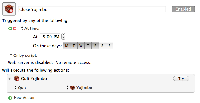
I’m a big fan of Yojimbo and have been using this tip to sync Yojimbo using Dropbox — except that I never had two Macs using Yojimbo before, so for me this was mostly just a backup solution. Now that I have two Macs I need to make sure that Yojimbo closes on one before I use it on another.
Luckily my dual Mac setup is pretty specific: one Mac at work, one at home. Therefore I know what time I will be at either Mac. So to keep away any conflicts, and to solve my poor memory issues I invoke Keyboard Maestro to do this:
KM closes Yojimbo for me Monday through Friday.
On my Mac at home I set it to close Yojimbo at 8a M-F.
[Andy Ihnatko on Twitter](http://twitter.com/Ihnatko/status/218051100333457410):
>Interesting that Google is being so open about Glass dev process. Prob because they’ve no idea how to turn this neat idea into a product.
I’d clarify that statement as such: Google has no idea how to turn this idea into something that is neat, let alone an actual product. When the iPad launched Apple knew they had something really neat on their hands. The best they could reckon, at the time, was that it was a fantastic tool for browsing the web and consuming content.
What they didn’t think of, imagine, or conceive was some of the amazing apps that would eventually come out. Once they saw those, that’s when Apple figured out how to market the device as a mass market consumer good.
That’s when the iPad became a hit.
With Google Glass I am not sure we even have a neat idea to start such a fire because I have yet to see one feature that makes me want it for even a one-off scenario.
Which brings us to [Erin Biba’s comment on Twitter](http://twitter.com/alexismadrigal/status/218051609433882625):
>Google Glass is the Segway of wearable accessories.
That’s another interesting comparison, because the Segway is both neat and a product. However the Segway is not a mass market product because of the limited utility and the price. The Segway works well for security guards at malls and events, but is pretty much ridiculous for everything else. Luckily the segment that Segways do work well for are also segments that can and *will* spend that money on a Segway.
Compare that to Google Glass, where it is going to be $1,500 for a pair. So now Glass is an idea that may or may not be ‘neat’, has no fit as product (yet), and is limiting itself to a small market based on a high entry price.
Everyday I use two devices from Apple: an iPhone 3GS and an original iPad. The 3GS is basically an iPod that sits in my car all day, but I use an old iPhone so that Instacast can update itself when I park in my garage. That old original iPad is in use as a dedicated baby monitor, so its pretty much on all night long.
It’s great that Apple decided to continue to support both of these devices, at least it is great in theory, because in practice I kind of wish they hadn’t. Both devices are running iOS 5.1.1 and both are laggy and buggy. Updating apps on either is an exercise in patience and control to not throw the device against the nearest hard surface — entering the password for iTunes alone can even cause stuttering.
Don’t even get me started with how shitty the implementation of iTunes Match is on the 3GS, because only a masochist would like it. ((Which brings me to another point. If a masochist, by definition, is someone who gets pleasure from pain/etc, then wouldn’t it stand to reason that they should never endure something painful because failing to endure pain would be *more* painful for them, thus giving them more pleasure? Ah who cares…))
Now we learn that Apple is [offering](http://www.apple.com/ios/ios6/) iOS 6 support for the 3GS, but not the original iPad (which is newer and faster). I know why they are doing this: you can still “buy” a 3GS new — so they feel compelled to support it. Ok, but why not also support the iPad?
My guess: because Apple knows that iOS 6 is going to run even worse on the original iPad than iOS 5 does. So really Apple is doing iPad users a favor by not supporting it.
But what about the 3GS getting iOS 6? Why support these legacy devices, if said support is going to be pretty poor anyway? I never remember the original iPad being laggy and buggy, nor do I remember the 3GS being that way when it came out. Both seemed to work perfectly up and until the moment that iOS 5 was loaded on them (to be fair there were issues with iOS 4, but I can’t remember if that was the 3G or 3GS).
My point is: if you are going to do something, don’t half ass it.
As a daily user of a 3GS and an original iPad, I can say with 100% confidence that I *would be* better off not having put iOS 5 on either device, because iOS 5 optimization for either device feels and works like an after thought.
I am scared at what iOS 6 might bring for 3GS woes and I really do think Apple should abandon devices faster (for the user’s sanity) if they aren’t going to make sure that these new updates work just as well on the legacy devices.
“I’m done buying laptops. I’m not buying another laptop. I don’t need a laptop anymore because my iPad *is* my laptop.” -Me as of Monday, June 11th, 2012 9:00am PT.
That’s what I’ve been telling myself for the last few months. That’s what I kept telling Shawn Blanc for the last few months.
So, of course, on Monday, after the WWDC keynote I purchased… a retina MacBook Pro.
*A laptop*.
The new retina MacBook Pro was just too good on paper not to buy. The performance, the screen, the design, and even the price was spot on for what I needed and what I wanted.
To be clear, I still plan on using it mostly as a desktop, but that’s a topic for another time.
Here is a review the entire machine, not just the screen.
### The Screen
Though, we’ll start with the screen. By now you have heard all the praise this screen is receiving and everyone is right — actually they may be underselling this screen a bit.
Bottom line: I don’t like using any other computing screen as much as I like using this screen. It is that sharp, that crisp.
#### The Web
You have also likely heard that the screen really makes the web look bad, which is only part of the story. What the screen does is point out where graphics exist that are not (hopefully we can say: “not yet”) upgraded to retina levels. [Egg Freckles](http://eggfreckles.net/), would logically seem like a site that would look poor on the retina MacBook Pro, but Thomas Brand has done painstaking work to make it look pixel perfect on the retina screen — without even knowing that this would be the case beforehand. Likewise any site (like this one) that doesn’t utilize many (or any) images for design elements looks fantastic as is. Text looks fine and sharp as long as it is actually text.
It’s not that the retina screen makes things look bad on the web, it just points out where designers are using low quality graphics – like ads.
CSS ‘only’ sites look perfect.
So whether or not the web looks bad, depends on what sites you frequent. To be clear, I am not talking about pictures, but the actual graphics used to make up the design itself. Pictures don’t look horrible in most cases. Text looks amazing (as long as you don’t use Chrome).
#### Apps
Where this screen does make things look bad is on apps that aren’t updated, but you’ve heard this before. Instead of rehashing let’s just do some showing:
Pages ’09.Osfoora MacNumbers ’09FantasticalChrome
That’s just a few examples, I could really go on all day. So the question is: does this make those apps unusable? The short answer is: not really. But the expanded answer: only if you rely on using text in the app and that app is rendering text in a way that looks blurry. That right there means Apple’s iWork suite, and Office are out, so too is Chrome. This alone may be reason enough for people not to adopt the retina MacBook Pro yet, and it doesn’t look much better if you change the display mode from retina to something else. You could still use these apps fine if you hooked up to an external monitor, but then why spend the extra for this computer?
Just like with retina screens on iOS, developers for OS X will need to issue updates. My guess ((Perhaps ‘hope’ is a better word here.)) : all major apps are retina within 6 months, most in the next 6-8 weeks. I’m willing to make do until then.
#### Backgrounds
One of my larger concerns was that this resolution would render all of my background images obsolete. While it doesn’t make the images look great, [they don’t look horrible](http://fiftyfootshadows.net/2012/06/15/a-quick-word-on-resolution/). For me: I am keeping what I currently use as background images, while also keeping an eye out for higher resolution images too.
You can make do here without much problem.
#### Photos & Video
Photos and video are why I bought the machine: I want see my images and video crisper than ever before. I am impressed. I’ve spent 10-20 minutes staring at the “[new blue marble](http://www.flickr.com/photos/gsfc/6760135001/sizes/o/in/photostream/)” Earth image from Nasa — it’s amazing how crisp and deep the image seems (I truly get lost in it).
In fact my images seem like completely different images when I edit in the retina optimized Aperture. This is a fantastic screen for working with, and viewing, imagery.
#### Glare
Apple made a big to do about the glare on the screen and how they have reduced it.
Glare from my office lights.
To me the glare is better than it used to be in MacBook Pros, not quite as good as the Air, and no where near as good as a matte screen. It’s better — a lot better — but the glare is still very much present. This gives me hope for future Macs — at least the acknowledgement from Apple that glare *is* a problem.
### The Chassis
Almost as big of a deal as the screen, is the new-ish chassis on the retina MacBook Pro, so I want to dive into a few interesting things that I noticed.
#### Texture
I think Apple has refined its aluminum coating/milling process because the casing on the retina MacBook Pro feels smoother to both my hand and my Wife’s hand. The Air feels almost rough in comparison. I also compared the casing to that of a unibody MacBook Pro from 2008, and even with wear on the older Pro, the new retina Pro feels smoother.
I wouldn’t say it’s noticeable enough if you only use the retina MacBook Pro, because I only noticed when switching between the Air and retina MacBook Pro every few minutes.
It is different, but just *ever so slightly* different.
If this is how all new retina MacBook Pros feel, then it’s a good thing — a welcomed improvement.
#### Thinness
We all know the new Pro is thinner, but what I want to note here is how the Pro feels in your hand, lid closed, just by itself. Because when you carry the Pro around in your hand, the machine feels oddly thin. Where as on a MacBook Air the thinness to size ratio feels in check, the same ratio on the retina MacBook Pro feels out of sync.
In other words the retina MacBook Pro feels almost too thin for how large the foot print is. I don’t say that as a bad thing, it just is a *thing*.
One thing that is surprising, is that the retina MacBook Pro feels even more rigid than the MacBook Air — and that’s a first for me with 15″ MacBook Pros.
#### Keyboard
It may be odd that I am writing about a keyboard on an Apple laptop, given that Apple really hasn’t changed the keyboards they use in so long. But there is something slightly different about this keyboard.
First it feels like the key stroke is a bit more shallow, not terribly different, just ever so different. I can’t tell if I like this more or less, but I am leaning towards more right now.
(I seem to remember one of the live blogs mentioning something about the keystroke being shorter, but I can’t find that reference now.)
Also the keyboard button engagement feels softer, a bit mushy. This, again, is in comparison to the Apple wireless keyboards, MacBook Air, and unibody MacBook Pro from 2008.
This is not a drastic change, but I suspect clicky-keyboard people will notice the slight change and feel that it makes everything worse off. Personally, while the changes don’t bug me that much (I am pretty used to them now), I do wish the keyboard felt more like the MacBook Air keyboard than what is in the retina MacBook Pro.
#### Heat
I didn’t have a chance, or way, to get very scientific heat measurements, but I want to note two things.
Under normal usage where I had the fans kick on a couple of times, my infrared thermometer noted 96°F in the center back and 86°F everywhere else on the top side of the Mac. Neither makes the Mac uncomfortable to touch or hold.
Numbers aside, this computer feels considerably cooler than my MacBook Air, but I suspect that is partly because the CPUs in the retina MacBook Pro don’t have to work nearly as hard as the Core 2 Duo does in my Air.
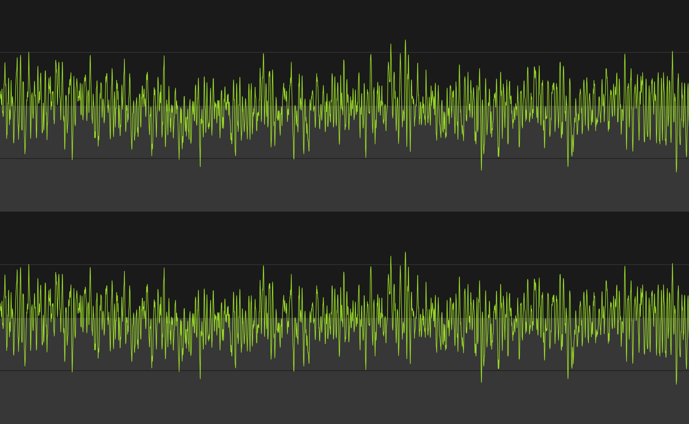
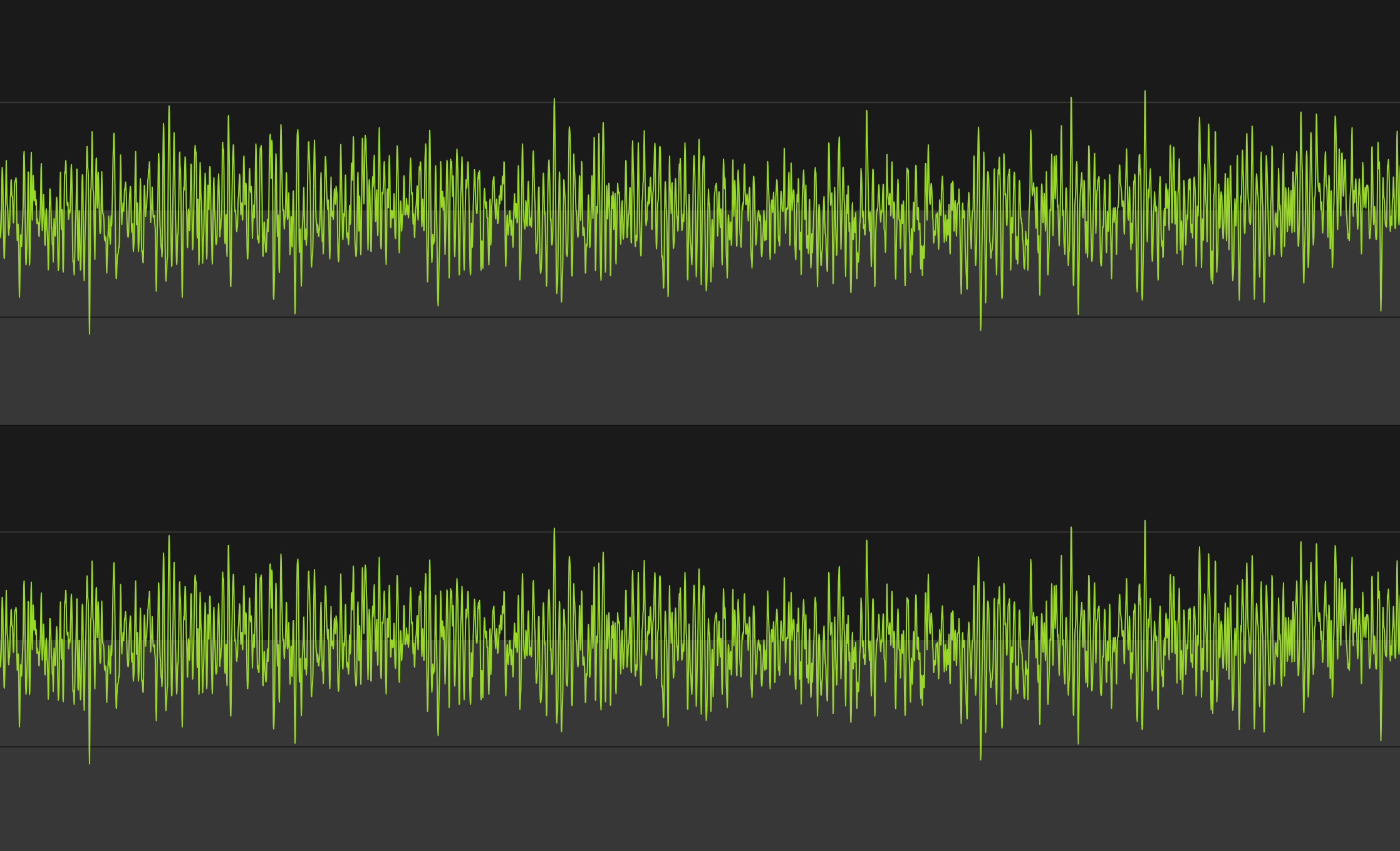
#### Noise
To my ear the retina MacBook Pro sounds very different from other Macs when the fans spin up. There is a noticeable lack of whine and drone from the fans. Does this make them better, or more pleasing? To my ear it does, but I have heard a few people comment that they *like* the constant fan sound.
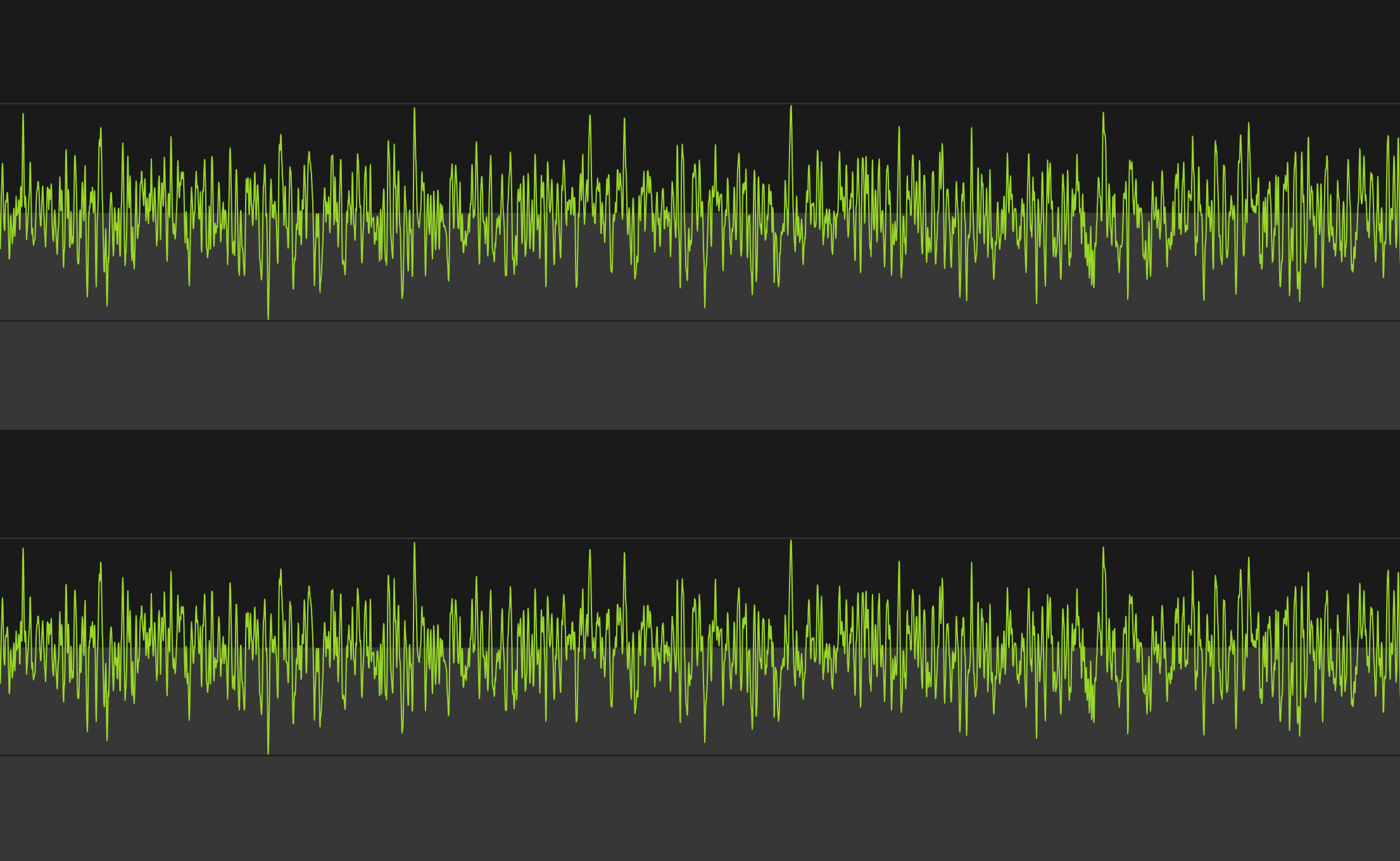
Here’s what each one sounds like, visually represented:
2010 Core 2 Duo MacBook Air, running at max fan speed.2008 Unibody MacBook Pro (Core 2 Duo), running at max fan speed.Retina MacBook Pro, running at max fan speed.
The images certainly look different (I did my best for apples to apples comparison, but I’m no audio expert). Let’s take a listen:
MacBook Pro (2008 Core 2 Duo):
MacBook Air (2010 Core 2 Duo):
Retina MacBook Pro:
*(Note: I did my best to record each at the same level into the Mic, but that doesn’t come through in the playback. In reality the retina MacBook Pro was audible the quietest of the lot with the Air being the noisiest.)*
The old MacBook Pro sounded the whiniest to me, while the MacBook Air had the most constant droning sound. The retina MacBook Pro certainly sounds different, and it *is* a different that I like.
#### MagSafe 2
There’s just two things I want to point out about the new MagSafe 2 adapters:
1. They have aluminum ends.
2. They don’t have the round end where the cord heads back away from the computer, a design that started with the MacBook Air.
I find the first observation to be nice. I find the second observation to be annoying. I wish Apple had went with the old MacBook Air style of MagSafe end because I find it puts less stress on the cable where it connects to the end. It is also a much more sleek design.
Hopefully there is an engineering reason for this and not just a design change — an engineering reason that they can overcome soon.
#### USB 3
To test USB 3.0 I purchased [this external Seagate HD](http://www.amazon.com/exec/obidos/ASIN/B005IA844G/ref=nosim&tag=brooksreview-20) and transferred and read large amounts of photos and video to and from the drive. I’m impressed.
Transferring 1.3GBs, broken up into 6 files, was done in less than 13 seconds. It was fast compared to USB 2 drives. USB 3 is a great addition for people (like me) that don’t want to pay the premium that Thunderbolt drives are demanding, but that want performance better than what USB 2.0 offers.
If you have a Mac with USB 3.0, do yourself a favor and switch your external drives to USB 3, you’ll love it.
#### Lack of Lights
[I posted about this the other day](https://brooksreview.net/2012/06/apple-lights/), but like the MacBook Air the new retina MacBook Pro has no externally visible lights. Nothing to indicate when the computer is asleep, or how much of a charge the battery currently has.
I think this is more than just a hardware space limitation. I think this is a signal to the user that it just doesn’t matter. All that matters is if the lid is open or closed, not battery life (because it’s really good) and not sleep state (because boot times are now fast enough the users shouldn’t care).
### Extras
A few more things before I wrap this up.
#### Benchmarks
I ran a [benchmark on this machine using Geekbench](http://browser.primatelabs.com/user/19559) and compared it to my 13″ MacBook Air and former 15″ MacBook Pro (which had an OWC SSD in it at the time). Those came at around 3,400 and 4200, respectively — the retina MacBook Pro came out at 11,800.
So yeah, fastest Mac I have ever had by a long shot.
#### Gigabit Adapter
I purchased the Thunderbolt gigabit ethernet adapter just to see if I could squeeze out a bit more performance from my home internet with it. On my MacBook Air the download speeds over WiFi seem to top out around 48 Mbps. On the retina MacBook Pro they top out (on my home internet) around 61 Mbps, which is the max speed for my Internet account.
Since WiFi was no longer limiting my Internet speed, I could only test local area network speeds, which are much faster over Gigabit (obviously). Overall it’s what you expect. It’s plug and play, works flawlessly.
#### MagSafe to MagSafe 2 Adapter
It’s a funny little adapter to buy. I don’t much like it, but it beats the hell out of buying new power adapters. I actually only bought it to store in my bag for that one time in my life I may need to use a charger and there is only a MagSafe charger available.
(Also for my Cinema display at work.)
### Wrap-Up
I am really happy with this machine, the screen is the best screen I have ever seen and the performance is almost as impressive. If you haven’t had the chance to look at this retina display in an Apple Store, it’s worth it to stop in and take a look. Specifically look at high resolution images and zoom in on some text.
If you can’t tell: I really like this machine, and that’s probably an understatement.
I’ve talked about this off and on to [Shawn Blanc on listeners of the B&B Podcast](http://5by5.tv/bb/65), but I thought I would write up my recent experience here — should one of you find yourself to be this foolish with computer buying at any point, ever.
### The Story
On Friday June 8th, 2012 my MacBook Air started acting up. In fact, it would later turn out, the logic board was shorting out. I noticed it when I went to put away my Air in my backpack before heading to work. A quick troubleshooting at the office and a genius appointment later, I found myself without a Mac — until Tuesday at the latest, I was told at the time.
That’s OK, it was the weekend and then 1-2 days of iPad only, I would be fine. It’s not ideal, but I can make that work — I’ve done it before for a day here or there.
Sunday night I received a call from the Apple Store, bad news, they needed to ship out my MacBook Air to “the depot” for repairs — that’ll be 5-7 days starting now. *Crap.*
Since WWDC was the next day, I decided that it was time to get a new machine — that should something awesome be announced, that would be what I get — I resolved myself to getting something new to replace/compliment the Air. I just needed it to be under $3,000.
After the WWDC keynote my plans were further complicated. The retina MacBook Pro was announced and it looked perfect for me, but you could only order them online. I still needed a computer for what could be 7 days worth of work — 7 days that I now realized I did *not* want to do with only an iPad.
So I order the retina MacBook Pro, then drove to the Apple Store and purchased a Mac mini. I’ve [already posted about why I didn’t like that Mac mini](https://brooksreview.net/2012/06/mac-mini/), but there’s more to the story.
My entire idea was that I could restore the Mac mini from a backup overnight, be up and running Tuesday, for the rest of the week. No problem.
I spent all day Tuesday watching Time Machine and Migration Assistant fail to restore from my Time Capsule and from a cloned HDD. Ugh. Finally, Wednesday afternoon, I was up and running.
*(As it turns out, the issue was that I had Mountain Lion backups from the Air, and was trying to restore from that on a Lion machine — OS X doesn’t like that.)*
I used the machine happily Thursday morning, then got a call from Apple: my MacBook Air was ready for pickup.
So I purchased a Mac mini to make my life easier for a week, only to waste a day and a half setting it up, to make my life easier for 4 hours of work.
Yeah, that sounds about right. I figured my Air would be out all week — and had it been, I probably would be less embarrassed about this story, but Apple under promised and over delivered. Lesson learned.
### Why iPad Only Didn’t Work
There’s something interesting that I learned about myself along the way. There are two main reasons I didn’t want to be iPad only all week:
1. With Shawn down at WWDC with no Mac, I needed to be able to record the B&B Podcast with him — I knew I needed a Mac for that. And I didn’t want to have to push around the show. (I did get my Air back just before we recorded.)
2. I really didn’t like the idea of being iPad only for a week.
The first one is hard to get around (aside from borrowing a Mac and installing needed software), but the second really seems silly to me. I *can* and *am able to* do all of my work on the iPad, but I was terrified at the prospect of doing that for a week.
Again: I can work productively on my iPad for both this site and my day job, with no problems.
When I travel I typically only take the iPad, unless I know I need a Mac for a specific something, so this wasn’t an unproven theory. The idea of a week going iPad only was something I simply wasn’t willing to do, and I think I know why: there’s a stigma that I perceive to be attached to the iPad.
I work in an office, like a real office with older people, and I think that they view the iPad as a toy and not a work machine. I think they view the iPad as something for consumption, not creation. Who knows how they actually view it — this is how *I* think they view it. And that mattered more to me than I thought it would.
So only using an iPad for a week, well, I was worried that everyone would assume that I really wasn’t working. Turns out that in my effort to appear to be productive to others, I ended up being far less productive than I would have if I would have just used the iPad. Lesson learned.
One of the most popular posts that I have written is “[The Ballmer Days are Over](https://brooksreview.net/2011/05/ballmer/)” — wherein I argue that it is time to kick Microsoft’s CEO, Steve Ballmer, out of the company. I argue this as: a person that lives in Microsoft country, a person that owns Microsoft stock, and an Apple fan.
Up and until this week I still believed that Ballmer should be gone. This week though, well Ballmer is making his move.
Ballmer seemed to be a pompous ass, perfectly happy to rest of the success of the past — not really his success, mind you, but the success of the company he runs. Ballmer has famously dismissed Apple and everything they created, including the iPhone. He’s been proven wrong, many times over.
This week, here’s what Microsoft did:
– Announced a new tablet.
– Got into making integrated software and hardware devices (see said “new tablet”)
– Announced Windows Phone 8
Those seem like par for the course if you are an Apple fan, but they are amazing feats if you are a Microsoft fan. Windows Phone 7 hasn’t been out that long and now we have 8? For the record Windows itself is just about to reach version 8.
Then there’s the tablet, while it looks to largely copy the iPad, there’s clever features like a keyboard integrated into the cover. Now, they haven’t shipped this yet, but the simple fact that Microsoft is willing to piss off its hardware partners is impressive enough to believe that Microsoft is serious about doing this.
So to recap Steve Ballmer:
1. From 2001 to 2007 he had Microsoft on cruise control, rarely beating the stock market.
2. From 2007 to 2011 he was Captain of a sinking ship and he seemed to be the only one not aware the ship was sinking.
Today, today Ballmer is bailing water out of the ship. I don’t know if he can bail fast enough to right the ship, but I do know that I am willing to give him a chance to do that.
What Ballmer has done this week (though to be fair these are *just* announcements) is something that I didn’t think Ballmer was capable of: he’s changing Microsoft’s core.
Technically, desks are really big things, and most people will take their time in finding one that they like and that fits their office/room. This post isn’t about finding a good desk, it’s about making sure that you look at three little things about desks before you buy your next desk.
Thing 1: Stability
If you are going to buy your desk online, then this is one thing that you really need to pay attention to. Before buying any desk you need to stand above it and push down hard on the front edge — if it moves, then you should move on.
I hate desks that lack stability.
What happens if the desk flexes on the front edge is that it will tend bounce ever so slightly when you type. And, unless you have a sturdy monitor, so too will your monitor, ever so slightly, bounce. I can’t stand that.
This is why I recommend that you get a desk with four legs, and not one with just two in the back that cantilever forward.
There’s one other thing, try swaying the desk from left to right. If it does that, then I would take a pass on the desk. My current desk is rock solid in every facet except the side swaying, so I secured it to the wall — this isn’t always practical.
It may seem silly to worry about how stable a desk it, but a stable desk gives you the feeling that you are working on something solid. When you feel that way about your work surface, then you work without worry.
Thing 2: No Glass
Warning: the linked image is huge.
Nothing looks cooler (in my mind) than a glass desk with a Mac sitting atop it. Seriously, that is some cool looking kit. There are, however, two main problems with glass.
The first: they show every cord you have. So unless you want to spend a massive amount of time keep every cord “just so”, you should steer far away from a glass desk.
Secondly, glass desks get dirty — really dirty. I had a glass desk (my wife uses it now and hates it) that I was constantly having to clean. Every little spec shows. Every finger print and moist palm smudge. Nothing grossed me out more than sitting down at that desk after a day of working on it.
I kept a cloth and Windex at the ready the entire time I owned it.
Just don’t buy a glass top desk, it’s not worth the headache.
The one quasi-exception: frosted glass. With frosted glass you get a lot of the same looks without having to worry about cord tangles and they show less grime. However, do see ‘Thing 1’, because I find glass desks to be the least stable.
Thing 3: Leg Room
Ok this is my last point and the one that I hold most dear to my heart. Don’t buy a desk with any drawers or trays. Whether it be a keyboard tray, a pencil drawer, or a set of drawers down the side. Just say no. Also don’t buy a desk that is too narrow, nor one that isn’t deep enough.
You want your legs to be able to fit below the desk in any manner that is comfortable. That’s why my minimum desk depth is 32 inches and I won’t use a desk unless it is at least 52 inches wide. I prefer a 36”x72” desk.
The moment you have drawers on the desk is the same moment you start whacking your knees on the corners of those drawers. Likewise, if the desk is too shallow you are going to constantly be kicking the wall behind your desk, or having your feet hang out in no man’s land.
If your desk is too narrow, or has drawers down the side, you are going to be forced to only work from the center of the desk. Thus you now need to move your keyboard/laptop/monitor/mouse out of the way if you actually need to use the desk for anything else.
If you are buying a desk, make sure you can use the entire desk.
Build It
Take these three tips to heart the next time you are buying a desk and you will be happier about the desk you buy. If it’s me, I would build my own desk and I’d start by stealing this cable management method.
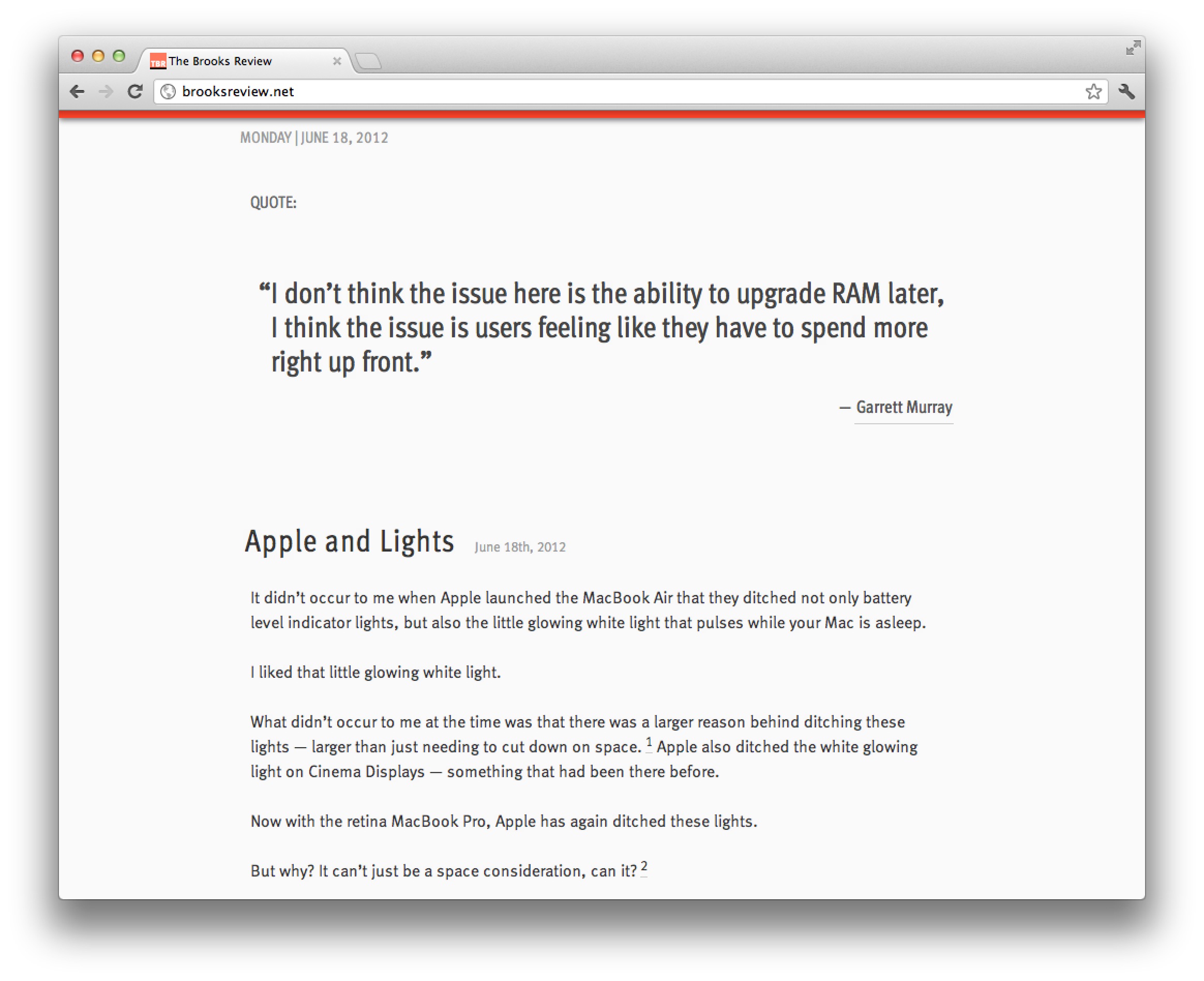
It didn’t occur to me when Apple launched the MacBook Air that they ditched not only battery level indicator lights, but also the little glowing white light that pulses while your Mac is asleep.
I liked that little glowing white light.
What didn’t occur to me at the time was that there was a larger reason behind ditching these lights — larger than just needing to cut down on space. ((Though that reason is just as likely.)) Apple also ditched the white glowing light on Cinema Displays — something that had been there before.
Now with the retina MacBook Pro, Apple has again ditched these lights.
But why? It can’t just be a space consideration, can it? ((It probably is.))
I don’t think it is — I think this tells a larger story, something we should have seen coming from iOS.
I think removing lit indicators is Apple’s way of saying: stop worrying about the state the device is in and start using it.
Don’t worry if the Mac is asleep or awake — it will spring to life fast either way.
Don’t worry about your battery power either. These laptops go 30 days while asleep and the batteries last at over 5 hours.
Apple is telling users to stop using their Macs like computers and to start using them like iOS devices. When’s the last time you worried about your iPad battery, or whether it was on or off? It’s just: screen on, screen off.
With Mountain Lion gaining the ability, in newer laptops, to do tasks while the computer is “asleep” the distinction will matter even less.
To me the fact Apple has ditched these indicator lights says one thing: whether your Mac is charged, asleep, or awake, none of it matters anymore — now it’s just: lid open, or lid closed?
Those that listen to the B&B Podcast know, that in response to my MacBook Air needing to go in for service, I bought a Mac mini to use and test out. My hope was that the fast processors in the Mac mini would make the machine at least on par with my MacBook Airs speed, thus allowing me to replace the Air with the mini. ((I have a Core 2 Duo variety.))
I bought the Mac mini on Monday (6/11/12), with these specs:
The Mac mini model I purchased.
On Friday afternoon (6/15/12) I returned this machine to Apple. I owned it for four days and used it only two of those days — no really.
Putting aside all the silly woes that I had with getting the machine up and running (of which there were many, but user error on the setup problems), I didn’t have a good experience with the machine at all. I’ve pared down my bad experience to three reasons, so let me share those with you (just in case you agree thinking about buying a mini).
### HDD
By far the most noticeable part of the mini is the HDD. I’ve been using SSDs since 2010 and can tell you that it’s practically impossible to go back to a slow HDD after you’ve been using SSDs for so long, there is just too much lag.
Whereas on my MacBook Air I constantly feel that all the performance related issues are a direct cause of the CPU not being fast enough and nothing else. That was a performance tradeoff that I was ok with, but on the mini this isn’t the case.
On the mini every single thing I did felt like it was being bogged down by the hard drive. Want to search for a file, sure thing, just let me think about that for 15 seconds.
Boot up and shut down was slow.
Search was slow.
Opening apps was slow.
Scrolling large lists of files in a Finder was slow.
Everything I did on the mini was slower than it was on my MacBook Air, with the exception of a few CPU intensive tasks like running a noise gate on podcasts.
To be fair: you can get a Mac mini with an SSD, but it will set you back $1399 for the model I bought to have an SSD in it. $1399. For $100 more you can get a 13″ Air with the same sized SSD, that also comes with a screen, battery, keyboard, and trackpad. I get that for some the mini will be a better buy because it *should* be slightly faster with an SSD, but it makes no sense for most people to buy a mini and then get an SSD.
In my mind it’s a waste to put an SSD in a Mac mini — better to spend your money buying a different Mac.
The HDD is the sole reason I still don’t own the Mac mini. It’s just too slow of a machine if you are coming from an SSD. Using the mini was an exercise in frustration to the point where I was upgrading to using my iPad for tasks at times. I just cannot recommend a mini unless it has an SSD in it, and I simply cannot justify spending the money to have an SSD installed in a mini.
### Bluetooth
Actually, the Bluetooth works fine, but I ran into constant lag in connecting to my keyboard and trackpad. Perhaps this is because I was using the mini in an odd way, taking it to and from home everyday, but every time I started the machine up I had to go through a ridiculously long process of getting the keyboard and mouse working. It was a pain in the ass.
This likely would be a non-issue if you don’t turn the mini off much, but it drove me nuts.
Not to mention: booting into recovery mode with a Bluetooth keyboard will make you feel as if you are going crazy. I pressed command-R… I swear!
### Slippery
Overall the Mac mini is a decent feeling machine from a build quality perspective, solid really, but there is one thing I was constantly annoyed with: it’s slippery little butt.
I tried the mini on a few different desk surfaces and found it impossible to plug in, or unplug, a USB cable using one hand. I do it all the time on Mac laptops one handed, but this mini decided to just slide instead.
This isn’t a deal breaker by itself, but you should be aware of that annoyance if you are looking to buy one, because it would drive me nuts long-term.
### Finding its Place
I was reluctant to write this post because I was worried that all these issues were only things that mattered to me — that my feelings weren’t representative enough to share — however, after thinking about it more, I decided I wanted to share this because of one thing: I don’t think it is worth your time to buy a non-SSD Mac. ((Unless you have a very specific need for huge amounts of storage, then be sure the drive is at least a fast one.))
The MacBook Airs have reached a performance and price point where they make *the most* sense for average computer buyers. I’ve no doubt an Air will be a great machine for 3 years of ownership and they will be faster than an HDD based Mac for most every user. Not to mention that this is the cheapest way to get an SSD based mac.
If you are thinking about buying a mini, stop. Start thinking about getting an Air, you’ll be much happier with the performance. After all, I chose a 2010 Air over a brand new mini.
[Reeder](http://reederapp.com/2/) is an RSS reading application for Mac and iOS and it is one of the most popular iOS RSS apps. Reeder has always been my favorite RSS reader out there, Mac or iOS — it was a godsend when it came out. What makes Reeder 3.0 so very neat is that Silvio Rizzi did not rest on his laurels — of which — I would say, Reeder is already one of the finest iOS apps in the App Store.
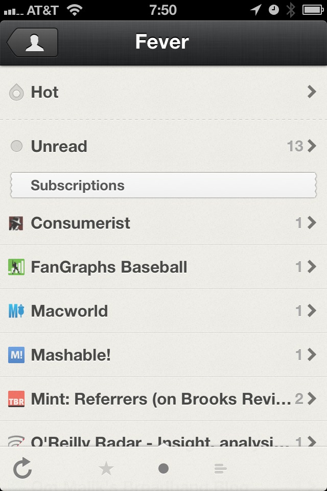
Instead Rizzi rebuilt the entire app, from the ground up. He also listened to the fact that some people (read: me) don’t want to use Google Reader any longer. I have been testing Reeder 3.0 for what seems like a year now and using it with nothing but [Fever°](http://feedafever.com), my RSS reading platform of choice.
Since this is a 3.0 release I am going to just point out three new things that I love about Reeder 3.
### Thing 1
The best feature of all: Fever° support. This is a self-hosted RSS reader, with an API for apps like Reeder to interact with it. Fever° got Google Reader out of my life and I couldn’t be happier.
Reeder does a great job of integrating with Fever°, including the addition of the Hot List. Overall I find Fever° to be faster than using Google Reader in Reeder, but that’s also dependent on your web server.
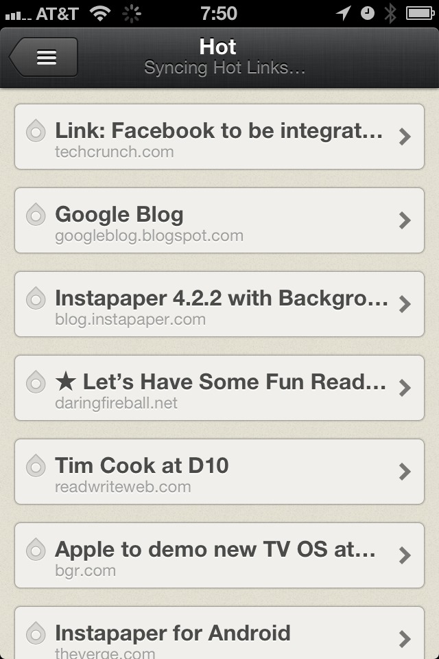
The Fever° Hot List
Otherwise Fever° works just as GReader does, but without the privacy concerns that come with Google.
### Thing 2
Next up is the new/updated UI of the app. Once in single item view, the app feels like a hand made letterpress card for each of your RSS items. Except these cards are made of rubber, not paper — because they stretch and bounce all over.
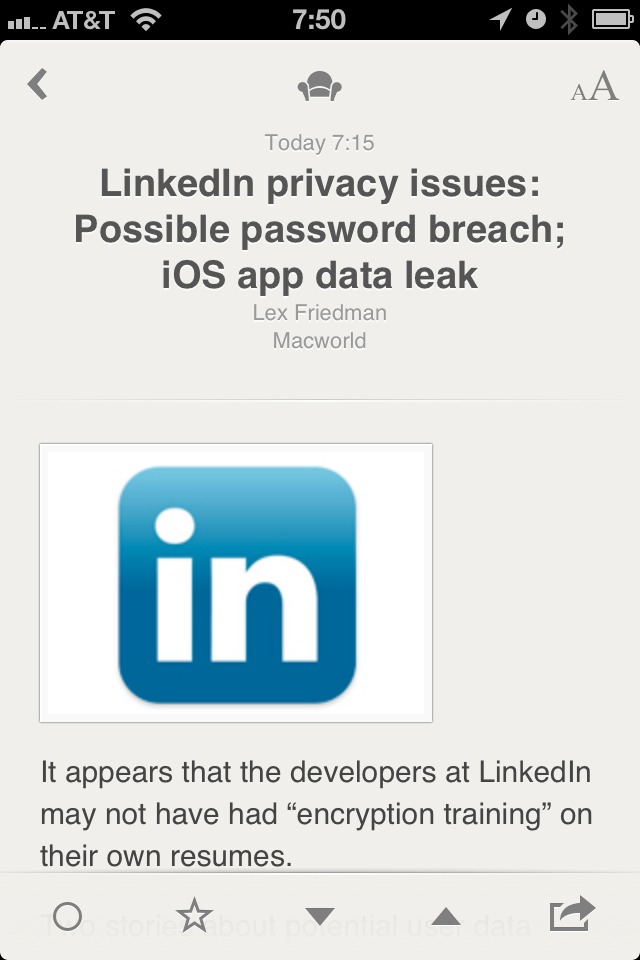
Single item view.
I really love the UI of Reeder, it has the right amount of texture and a simple yet elegant feel to it. The banding animations that are prevalent in Reeder will be jarring at first, but quickly fade after the first use.
### Thing 3
Mark above and below as read with just a two finger gesture. Ok, so here’s the deal, it used to be that my thumb would get really tired in Reeder because I was constantly tapping to move from item to item. In Reeder 3 there’s a handy gesture: swipe up or down with two fingers in the list view to mark the items above or below that point as read.
I really, really like this feature. It was a last minute addition and it really makes for a fantastic addition to the app.
### Small Things I Don’t Like
Well, for starters, I wish the status bar was hidden when in single item view. That would be a great, immersive, experience while reading your RSS items. I also wish the Hot List for Fever° was a bit more informative and allowed you to control the time period — as currently implemented I rarely use it. I also dislike the jagged edges of the headers for the date and feeds sections, like really dislike these.
Silly jagged header.
### Bonus Points
Reeder has a new icon and it is fantastic.
### Worth It
Overall this is a great app that further secures Reeder’s place as one of the best iOS apps in the store. [Go get it](http://reederapp.com/2/) (launches 6/13/12 as an update).