Category: Articles

  • Updated Thoughts on the Panasonic GX1

    [When I purchased and reviewed the Panasonic GX1](https://brooksreview.net/2012/03/gx1/), I left out one crucial reason behind my decision for buying this particular camera: I knew I had a baby girl on the way. I wanted a camera that was small enough to hold in one hand and snap a picture ((Yes I can shoot my Canon 5D one handed, but it’s less than ideal to do so.)) , yet high enough quality to not make me regret leaving behind my dSLR.

    Asleep on Mom.

    I also wanted a camera that could take excellent pictures at high ISO, relatively quietly, so that I could snap those precious “sleeping baby” photos.

    That was a huge factor in my choosing the GX1.

    Even without a baby, I have found the GX1 to be a phenomenal camera, one that has seriously made me consider selling off my Canon 5D and the lenses that go along with it — just maybe not quite yet.

    When my daughter was born I almost immediately started snapping images with the GX1, my wife uses it too. It’s been a fantastic camera for us.

    Sloane with Grandpa.

    I was worried that the 20mm might be too limiting for indoor shots of a baby, but it’s turned out to be perfect — and thank goodness it is an f/1.7 lens, because low-light shooting is all I seem to do any more.

    Which brings me to ISO and noise. I don’t think I have shot many pictures below ISO 1600 with the GX1 since Sloane came along. In fact I have gone up to 6400 and beyond more than a few times. While 6400 isn’t as clean as I dream that it should be, it’s still a good enough picture that I can be happy looking at it.

    Also a quick noise reduction in Lightroom yields very satisfactory results ((The noise reduction engine in Lightroom is the primary reason I use Lightroom over Aperture.)) .


    I simply cannot say enough good things about the GX1. It has been rock solid. Battery life has been fantastic. The quality is excellent. The noise control is very good.

    I truly love this camera.

    Sloane with Mom.

    I did notice right away that with a baby around, I needed a strap on the camera so that I can attend to her when she needs me, without trying to find a good spot to set the camera down at.

    At [Justin Blanton’s recommendation](http://hypertext.net/2012/04/dsptch) I ordered both the [wrist strap](http://www.dsptch.com/collections/wrist/products/camera-wrist-strap-black) and [sling strap](http://www.dsptch.com/collections/sling/products/camera-sling-strap-black) from DSPTCH and have been quite happy with them. The way that both clip on to the camera makes it really easy to switch to the wrist strap when at home and the sling strap when out and about.

    My wife and I tend to leave the GX1 on the coffee table in the living room, and even though it is a longer reach than our iPhones, we tend to go for the GX1 first when we want to shoot a photo. And that right there perfectly sums up why I am so happy with the GX1: I choose it over the more readily available iPhone camera every chance I get.


  • Taking a Cut

    Last night we saw a story break about (gasp!) Apple no longer approving apps that use the Dropbox SDK. The reason: if a user digs around enough they could find a link on Dropbox’s site that allows them to sign up and (double gasp!) pay for Dropbox.

    Shocking, I know.

    Of course, as [Federico Viticci explains](http://www.macstories.net/stories/11-13-and-the-dropbox-sdk/), this is not only blown out of proportion, but nothing new:

    >Apple’s 11.13 rule isn’t new, and before we dabble in speculation about Apple wanting to “kill Dropbox”, I suggest we wait.

    I, for one, am not particularly concerned about this fiasco, but it did raise and interesting thought about Apple’s insistence on taking their cut of everything they can: is what Apple is doing good for anyone other than Apple?

    There’s a few sides to this: developers, Apple, bloggers/media, and consumers. Let’s tackle each separately.

    ### Developers

    For developers, whose service does not rely on iOS, this is quite an annoying and often deal-breaking restriction. Dropbox likely can’t be profitable giving Apple a 30% cut of their paid plans and we know Amazon can’t sell Kindle books profitable this way (though do they even sell Kindle books profitably?).

    However, other apps that rely solely on the App Store likely can make this profitable — they just raise all their prices and hope that the sheer reach of iOS gives them the returns they need.

    When looking at Apple’s cut from the perspective of a developer, it is fairly easy to make the argument either way — depending on what you are trying to seek and where the bulk of your customers are. Most would assume that Apple’s cut is too big, but they offer quite a bit in reach and exposure — also the most willing group of consumers to spend money on software. Good and bad.

    ### Apple

    It seems pretty clear now that Apple is heavily benefiting from demanding the 30% cut, but let’s not forget that it was and *is* a huge risk for the company. There are only two reasons this is playing out well for Apple right now:

    – Apple has a ton of leverage given the popularity of iOS among developers.
    – iOS users have shown a much higher willingness to spend money than users of any other mobile platform.

    If the former reason wasn’t true, this likely wouldn’t work as developers would just hold off until Apple started paying them (like Microsoft is having to do with Windows Phone). If the latter reason wasn’t true, then this would be a non-issue because developers would be on another platform, and you can argue with me here, but I don’t see that many compelling paid apps for Android that haven’t first been an iOS only app for a while.

    It’s clear today, that for Apple, this 30% cut of everything is a fantastic strategy. It’s hard to argue with their pile of cash.

    ### Bloggers / Media

    Though bloggers like to complain (a lot) about Apple taking its cut, what would we talk about otherwise? It may be odd that I include bloggers in this break down, but they/we play an important role in informing consumers. Therefore, how this policy affects bloggers will directly effect most of the other categories (to some extent). ((No way to make that statement without sounding completely jackasstic.))

    As I said above, Apple’s supposed ”greed” gives a lot of fuel for the writing fire, but it also pits many bloggers in an awkward position. On the one hand bloggers like to promote products other than Apple’s and end up establishing friendships with various developers. So bloggers can sit on either side if the coin.

    On the one hand shaming Apple for rejecting universally loved Dropbox compatible apps, while on the other eyeing with amazement all that Apple has done to change their lives with the tools they use.

    Rock and a hard place. Bloggers should be fair and unbiased in the issue, but because “we” use these vary tools all day, we simply cannot be. It’s both good and bad for bloggers and that really creates a problem when trying to look at this object fully because there are mounds of citations supporting either side.

    ### Consumers

    Ultimately this is the most important group.

    Apple is a for profit company, and consumers vote with their wallets. Thus, if consumers don’t like Apple taking a 30% cut *and* they stop buying Apple products because of it — well that’s how you get Apple to change its mind.

    So does Apple taking a cut effect consumers?

    I say yes, massively so. In fact I think Apple taking a 30% cut is a large part of the reason so many consumers are willing to spend money for software. For the first time consumers have one, easy to use, place where they can buy digital goods from a company they trust. And trust really is the real issue here.

    Going back to Dropbox for a moment. As a consumer, not a blogger, I would feel far more comfortable paying for Dropbox via an in-app purchase than I do through Dropbox — and increasingly I would guess that the first interaction that many users have with Dropbox is via iOS.

    Apple is a known quantity, third-party app developers (for the most part) are not known. Consumers don’t know who is behind [Instapaper, LLC](http://www.instapaper.com), [App Cubby](http://appcubby.com/about/), [Sky Balloon](http://skyballoonstudio.com/) and others. As bloggers we know the people behind the companies, as developers you know or know how to check, as Apple you know, but consumers? They probably don’t even look at who the app is from, they just trust that *everything* they do within the realm of that app has been OK’d by Apple.

    This is the heart of the issue. Consumers don’t, can’t, and shouldn’t have to know the people and motives behind purchases in apps — all consumers should need to do is trust that Apple has done their job vetting all of this.

    Apple failed to do that with [Path](https://brooksreview.net/2012/02/arment-privacy/) and [other apps](https://brooksreview.net/2012/02/hipster-too/) that uploaded user contacts, but I have yet to see a scenario where in-app purchases turned out to be a scam. Apple vets the in-app purchases closely because they know that consumers trust them to do just that — and because Apple must spend the time and resources to vet these goods, Apple feels they are entitled to their cut.

    I think Apple is entitled to their cut too — just so long as they continue to do an excellent job vetting the apps.

  • Gamification is for Dicks

    It’s that thing where an app developer thinks it would be really neat to make parts of their non-game app into a game. I hate it, and I think it’s bullshit.

    Actually, I have hated it for a while, but this is the catalyst for my rant today:

    >So what’s your favourite “secret” theme in Clear? Let us know in this Facebook Poll! facebook.com/questions/2169… — Clear for iPhone (@UseClear) April 27, 2012

    Now Clear had this all along, [even when I reviewed it](https://brooksreview.net/2012/02/clear/), but at the time I figured this aspect was more of and easter egg than it was a long-term *thing* for the app.

    As it turns out, I figured wrong.

    And gamification bugs me quite a bit, because I think it is disrespectful to users of the app. If I pay for your app, why do I still need to jump through hoops to get all of the features of your app? I can only assume it is because making me jump through hoops amuses the developer in some way.

    Don’t just take my word for it, [here’s Brent Simmons on the issue](http://inessential.com/2011/12/23/gamification_sucks):

    >“Gamification” treats people like children — children who need to be manipulated, who need to be tricked into doing what’s good for them.
    >And it makes bad software.

    And it makes the software developer look like a dick.

    It’s time to put an end to this.

  • The Nest

    I bought the [Nest](http://www.nest.com/), despite [knowing that it may completely suck](http://www.marco.org/2011/12/17/nest-incompatibility-without-c-wire) and I waited excitedly for it to arrive knowing that I may be setting myself up for the biggest let down I have ever faced ((Not a joke.)) .

    I actually have quite a bit of knowledge about thermostats (unfortunately) since my day job is that of a property manager. I would say that during the summer the most common phone call I get is: “The A/C isn’t working right”. By my estimations 60% of the time it is user error — people not knowing how to work a thermostat. Therefore I need to know how to program just about any thermostat I come into contact with — and I can (sadly).

    So I feel perfectly confident in claiming that all thermostats suck, including the Nest. Don’t just stop here though, because while the Nest still sucks it has two things going for it:

    1. It sucks less than everything else.
    2. With each software update it sucks less.

    So it’s conceivable that the next software update could make it move from the suck category to the “hey, alright” category. But I’m not holding my breath.

    ### The Non-Nest Thermostat

    For the most part you can break down non-Nest thermostats into two categories:

    1. Static
    2. Programmable.

    Static thermostats are often just a dial that you set to your desired temperature and they heat to that temp — pretty simple. As you can guess with programmable thermostats, you can program them to change your desired temperature based on the day and time of the day. Again, pretty simple.

    So what’s the problem with the current slate of thermostats, well there are two issues:

    1. They are all, almost completely, hideous — yet they are an item that must be in a visible and easily accessible place in your home. Making the fact that they are hideous a bit of a head scratcher.
    2. The second issue is that they all assume that you operate on the same schedule everyday, or at least that you have a set weekly schedule. This works pretty damned well for businesses, but borders on absurd for most American’s home lives.

    What the Nest claims to be is a “learning” thermostat, but truthfully I think a more accurate description is that it is a “self-programming” thermostat. More on this in a bit, first let’s dive into the Nest hardware.

    ### Design, Touch, Installation

    First things first, the Nest is the most Apple-like product you will ever handle that isn’t made by Apple (no surprise here). The packaging is not quite as simple, but it is very well done.

    The most impressive part about the Nest is that everything you need to get up and running is in the Nest box (with exception of wire strippers and cutters, should your thermostat wiring have been installed by an idiot, like mine was). They give you a cute little screwdriver, that is all but worthless for anything other than installing a Nest, the mounting bracket has a built in level, and so on.

    Installation is a piece of cake — I really think my Mom could have figured it out.

    The cleverest bit about the Nest is that, once installed, you immediately fall in love with it — and I really mean this. The Nest looks simply gorgeous on the walls. Once you stop staring and touch the Nest you are met with a well honed tactile feedback — it’s almost perfect. The dial turns smoothly, but a little too easily for my liking.

    Everything about the Nest hardware seems perfect when compared to any other thermostat. The only hardware I have that has a better fit and finish are made by Apple or cost well beyond $1000.

    ### Software, Where the Bugs Wait

    My Nest wasn’t on the 1.0 version of the software, but the next version up (and later updated itself), but even with that there are two horrendous bugs that I found right off the bat.

    #### WiFi

    Connecting to WiFi (almost required for the Nest) was a huge pain in the ass. Not only is my WiFi password complicated, but it just would not work. I even tried changing it to get it going, but nothing. I initially had to set it up without WiFi so I could get the heat back on.

    When I tried later on, the WiFi just worked — I changed nothing — very odd. I don’t know what changed for the Nest, but it was beyond frustrating to have to spend 30 minutes just trying to get a WiFi connection.

    #### Heating / Turning on the Furnace

    I am not sure what kind of quirk exists between my furnace and the Nest, but occasionally (once a week after we manually adjust the temp) the Nest will fail to get the furnace started. This is not the same issue Marco had with the battery needing a charge and pulsing the furnace — no this is the Nest just not talking right, because it was trying to turn on the heat and not charge.

    This alone makes me really leery leaving my home for a week with no one there. I simply don’t trust the Nest to always work — which is kind of something rather basic for a thermostat.

    Aside from those two bugs, everything has been ok, but those two bugs are pretty annoying.

    #### The Purpose of the Nest

    The purpose of the Nest is that you need not ever program it: just change the heat when you are cold or warm and it will adjust. I thought that this meant the Nest would work in a dynamic nature, sadly that’s not the case.

    With the most recent Nest update you can view and edit the schedule the Nest makes on your iPhone — and when you go to do that you see a shocking screen: the same programming info you would put into a regular thermostat. That’s why I say that the Nest isn’t really learning, as much as it is just self-programming. This really bums me out.

    The Nest could be so much more, but instead it is just a fancy GUI in front of a “normal” thermostat.

    One very neat feature the Nest has going for it is the auto-away setting. The Nest has a motion sensor and when it doesn’t detect movement it will drop the heat down to the pre-determined minimum that you set. The thinking here is that you save money by the Nest turning off when you decide to spend a Saturday away instead of at home — like normal (or normal for me). This feature (amazingly) actually works really well. Note: you should disable this feature if your Nest is not in an area you regularly walk by.

    Update: In the original post I stated some information about how cool you should let your house get. This seems that it maybe in accurate and I have removed the section until I can research more.

    ### Improvements

    Beyond all those items, the Nest still needs one major improvement — the Nest needs to be made proactive. My home only has heat, so the Nest can’t cool my home, but the Nest also knows this so shouldn’t it be able to take that into account?

    As of right now the Nest basically is a ‘heat-to’ gauge for me. Meaning: continue to heat my house until X degrees and when temp drops below that, then go ahead and re-heat my home to X degrees. This is standard stuff for any thermostat, but the Nest should be (and can be) better.

    The Nest is connected to the Internet, and therefore can get weather data — proven by the fact that the iOS app shows the outside temp. So why can’t the Nest determine that every time it is 75° outside, my home heats up to 71° so in order to keep my home at the desired 70° the Nest should be careful not to heat my house fully to 70° when the temp outside is starting to close in on 75°?

    That is I want the Nest to take into account weather forecasts to properly adjust for the temperature fluctuations in my home — and really why shouldn’t it?

    ### To Buy or Not

    Ok enough, I need answers.

    Is the Nest revolutionary? No.

    Is the Nest the best thermostat you can buy? Yes.

    Should I buy the Nest? Only if you think your current thermostat is ugly, or you have a $250 desire to change the temp from your iPhone. I like the Nest, but I mostly like it for its looks and the hope that one day it will be really awesome.

  • Dark Skies Ahead

    [](http://c276381.r81.cf1.rackcdn.com/dark-sky-1.jpg)

    Before I started writing this post I thought it would be neat to tally how many weather apps I have tried for iOS, then I realized how many that really was, became sad and gave up.

    I have tried a lot of iOS weather apps.

    The sad truth is that not a single one is fantastic, some are good, while most border on offensive.

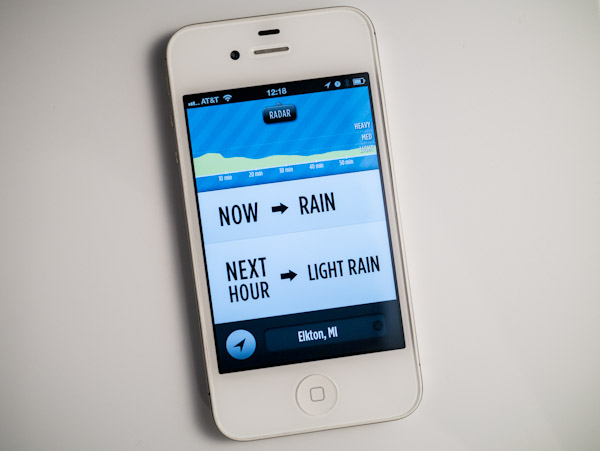
    When [Dark Sky](http://darkskyapp.com/) came up on KickStarter I had an unusual reaction: I was excited. I backed it, and prodded everyone I knew to back it. I wanted the app and I wanted it badly.

    When the app came out earlier this week I received a flood of questions about how good it was, but I couldn’t answer because the Puget Sound region of Washington was having an odd bout of very dry weather. The past few days the normal weather has returned and I was able to put Dark Sky through its paces. Here you will find my long winded thoughts on yet another weather app.

    The short version: It’s on my home screen and will likely stay there. It’s very good, but not perfect.

    [](http://c276381.r81.cf1.rackcdn.com/dark-sky_001.PNG)

    ### A Bit About Needs

    My needs for a weather app *will* vary from your needs. Dark Sky is all about precipitation — not temps or long term forecasts. It is specifically about the type of perception you can expect in the next hour, and when in that hour you will see rain. This is a fantastic tool if you live in the Puget Sound region because 90% of our weather can be split in three categories:

    1. Overcast (this isn’t “cloudy with blue skies” this is all gray skies all day).
    2. Cold Rain.
    3. Not Cold Rain. (I don’t mean warm here.)

    The funny thing about it: all three of those weather events visually look the same if you look at the sky. Sure there are ways to tell if it is going to rain, but you can never be sure. Since no self respecting Puget Sounder will be caught with an umbrella, that means we need to know if we need to wear a waterproof jacket or not. Enter Dark Sky.

    [](http://c276381.r81.cf1.rackcdn.com/dark-sky_002.PNG)

    So for me, Dark Sky is filling a very immediate need.

    This is not to say that in other parts of the world Dark Sky won’t be useful — it’s just to say that if you live in Phoenix, AZ you can stop reading.

    ### The Icon

    I’d be lying if I didn’t say that I was disappointed in the icon. For starters it’s blue (luckily there’s a lot of black). It has a border and uses the glossy overlay that Apple puts on by default. I don’t hate the icon, but it’s far from something that I even remotely like.

    I can tolerate it, because the rest of the app outweighs its icon.

    ### The Forecast

    [](http://c276381.r81.cf1.rackcdn.com/dark-sky_003.PNG)

    The heart and soul of this app is the main screen which is the forecast for the next hour. By default Dark Sky pulls up your current location, you can however specify a location if you like. I found that these locations are very sensitive, meaning the data seems to change even if you are only 10-15 miles from the last spot. That alone impressed me.

    That’s not all, because Dark Sky does some very important things that are massively helpful:

    – Tells you what it *thinks* the weather is currently doing. This I find is a good baseline for trusting the app. In my testing it is 100% accurate when it thinks the precipitation is light rain or heavier, but 50/50 when it thinks there is only a light sprinkle. I can’t fault that — rain here is very fickle.
    – Tells you what to expect in the next hour. Sure lots of apps do this, but here’s how it tells you (examples from what I saw in usage): “Rain in 35 Minutes”; “Possible Sprinkling”; “Light Rain in 3 Min”. I found those little descriptions very helpful — they are the type of forecast that makes the data useable and I love that.
    – The last bit on this screen is a little graph. This is the heart of the app — this is the power part of the app. This graph shows precipitation predictions for the next hour, but it does something even more clever: the graph tells you how confident it is in that prediction.

    #### Confidence

    The confidence level in the predictions is the one thing that most apps seem to omit — likely because they pull their weather data from other sources and just display it. Here, Dark Sky is trying to tell you that it sees rain coming, but it’s not sure (or it is really sure, depending on the case). In my testing the app was always confident for the next 30 minutes and usually fairly confident through the hour.

    So how does it show the confidence level? Easy. The graphs wiggles and shakes. The more wiggly and shaky the less confident the prediction.

    I remember seeing [this video about the changes to the graph](http://vimeo.com/34575091) and I honestly think it was a very clever and intuitive way to design confidence levels into the app.

    Overall this is great.

    ### The Radar

    The radar is fantastic looking and it’s actually fast. You can manually move a time slider to animate the radar image and you can zoom in and out on a regional basis.

    [](http://c276381.r81.cf1.rackcdn.com/dark-sky_004.PNG)

    I don’t use radar much, but I must admit that this radar is so pretty I find myself often just looking at it. (Especially true on the iPad.)

    ### Overall

    Ok so I haven’t said a negative thing about the app other than the icon — so why isn’t this the perfect app for me? Easy,]: it’s a niche app. It’s great when I want to know about the next hour’s rain — which is 90% of the time — but horrible if I want to long term plan.

    I can’t see beyond an hour, I can’t get the temp, wind, or sun forecasts. For everything this app does well, there are loads of things that, by design, the app does not do at all.

    [](http://c276381.r81.cf1.rackcdn.com/dark-sky_005.PNG)

    Since I was previously using Apple’s Weather app I placed Dark Sky in its spot on the home screen and now just use the widget in notification center for the longer forecasts — this works well for me — but this is a trade-off.

    I don’t want all the extra data crammed into [Dark Sky](http://darkskyapp.com/), but would it kill them to add at least the rest of the days worth of precipitation information? (e.g. “It gonna rain!”)

  • Ruffled Feathers

    I knew my post yesterday, [about my stance on “free” services](https://brooksreview.net/2012/04/viticci-free_not-as-in-he-needs-to-be-freed_like-free-as-in-a-business-model/), was likely to not go over very well with most people.

    I knew that, but that’s not why I posted it.

    I wrote that post because it is what I believe and I felt it needed to be said — if for no other reason than to be on record.

    As such things do, the post generated a flurry of responses to me, here are some things that were said that I think bear repeating.

    @BenjaminBrooks That’s where we disagree. Regular people don’t care about their attention as long as Facebook is free.

    — Federico Viticci (@viticci) April 17, 2012

    This lead to the normal argument of what “free” means. I say Facebook is not free because: ads distract and vie for attention, and Facebook uses your personal data for profit. The cost to the end user is not free because it is costing you attention and privacy — whether or not you accept that is up to you, but the cost is very real, if unseen. However, if free is simply what you have to pay monetarily to use something, then yes, it is free.

    @viticci @BenjaminBrooks To many, it’s not even an illusion. For better or worse, many would much sooner part with attention than money.

    — Ryan Wilson (@adudenamedRyan) April 17, 2012

    Exactly, but you need to know this up front (more on this in a bit).

    @viticci @BenjaminBrooks The word “free” clouds the discussion. It’s more about who the customer will be – the user or someone else.

    — Greg Pierce (@agiletortoise) April 17, 2012

    I’m impressed he fit this notion into 140 characters because it sums up the general misunderstanding on the web. Who is the customer? On this site my readers are (sadly) not my customer, nor are the advertisers. Fusion and The Syndicate are my customers — you the reader need to know that because even if I claim I am not swayed by it, that’s something that you, my user, need to judge for yourself. ((To that end I wish my readers were my customers, but that’s another post.))

    [Marcelo Somers](http://behindcompanies.com/2012/04/pocket-the-free-anything-bucket-for-the-rest-of-us/):

    >However, Pocket fails because from day one they don’t have the option of paying them for something. They hint that there are greater monetization options coming in the future, but users will kick and scream if their storage gets limited in the future, which is the natural business model that’s coming. It’s Dropbox and Evernote’s business model.

    Somers is getting more to the point that I was making at the end of my post yesterday and I want to come back to this notion because [Matt Alexander](http://www.one37.net/blog/2012/4/18/misjudging-free.html) also hits on the same topic from a counter viewpoint:

    >The presumption — without justification — that a company will *hurt* you and your interests betrays an infrastructure of fearful thinking. Moreover, it is not in keeping with the nature of the age in which we live.

    I think this is where the larger misunderstanding took place. That I somehow think those that choose “free” business models are evil — I don’t think that — I think they are stupid. There’s a difference between the two and I know plenty of swell people that are also stupid — we all do. ((Most of us are just more polite than me and won’t admit someone is stupid. I am an ass, I think we all know this by now.))

    When I ended yesterday’s post I cautioned:

    >No service can remain free indefinitely and that’s why it is negligent not to question a new free service when it comes out, because “figure it out later” can often end up being something that you, the user, aren’t going to be OK with and that is relevant.

    Somers was hitting on this, theorizing that in the case of Pocket they may limit certain aspects that were not previously limited — they may — and that probably would lead to backlash. ((But I think Somers is wrong about the Dropbox comparison because Dropbox has been limited from day one. It’s always been 2GB, or pay. That’s a sound model — that’s a model that works. That’s not free.)) And that is something the user should want to know upfront, because it may change whether they use the service or not. It’s why bait and switch laws are in place across the country — it’s deceitful to know that you will later try to force a customer into a paying customer by enticing them with a free something for a limited time.

    I think Alexander assumes that when I made the above point, that I presume all “free” services will eventually be evil. That’s actually not what I was cautioning. Let me restate my caution with a touch more precision.

    At some point every service must be paid for in one manner or another. This is true of all free services from Instagram to iCloud. Perhaps Instagram starts flooding your feed with ads, or iCloud requires you to buy the latest gear to be able to use it.

    One way or another a free service must financially benefit those that run it, or that service will die.

    Therefore, as a user, you need to be OK with the changes that may come, well before those changes occur, because the ramifications of those changes may be significant. You may be forced to pay, or the changes may be such that you no longer want to use the service at all — wishing you had never invested time into learning the service and integrating it into your life.

    That’s what I meant when I said: “because “figure it out later” can often end up being something that you, the user, aren’t going to be OK with”.

    What happens if you switch all your email correspondence to an iCloud account and next month Apple decides your iCloud account will cost you $99 a year? Ouch.

    This is why I believe this debate is important.

  • I Am Condemning Free on Principle, So Should You

    [Federico Viticci venting on his personal blog about writers that condemn services because they are free](http://ticci.org/condemning-free-on-principle):
    >There is a shared sentiment among independent writers and developers that “free” is inarguably bad as a business model.

    It is bad. In fact it’s the worst business model in the world, short of paying someone to use your product/service. There is nothing good about a free business model, nothing.

    Viticci, though (and perhaps other writers that he is referring too), seem to assume that a free business model includes what Google or Facebook is doing. And that assumption is dead wrong.

    Facebook, Google, and *this* site do **not** operate within the “free” business model. We have an advertising supported model, and such a model is very much a viable and sometimes successful business model.

    Free, however, is not viable.

    When I wrote “[Fragility of Free](https://brooksreview.net/2011/03/fragility-free/)” I stated:

    >The fragility of free is a catchy term that describes what happens when the free money runs out. Or — perhaps more accurately — when the investors/founders/venture capitalists run out of cash, or patience, or both. Because at some point Twitter and all other companies have to make the move from ‘charity’ to ‘business’ — or, put another way, they have to make the move from spending tons of money to making slightly more money than they spend.

    Twitter is making the shift, and so too will every other “free” service.

    So I don’t think it is wrong for any writer to question the viability of any product or service when the company behind it has the business model of “free”. What is wrong, what is short-sighted, is to *not* question a service when they are running on the free, VC funded, model (I’ll come back to this).

    The most popular argument for using “free” is stated by Viticci himself and it’s a poor one:

    >Some people often make witty remarks about “growing the userbase, then we’ll figure it out” types of announcements. While I appreciate their entertainment efforts, they’re actually trying to make fun of a universal truth: normal people are reluctant to pay for things they don’t know.

    That’s simply not accurate. In business one of the first things that you are taught is this graph. It’s a simple little thing that shows how consumers (generally) adopt products. But the argument above assumes that the first two consumers don’t exist.

    But that’s wrong, because we know that innovators and early adopters exist. In actuality “free” to “get” “massive” “users” is an impatient shortcut devised to skip over the first two classes and get right to “early majority”. Why? Because it takes too long and VCs/Investors need growth to show a return, and yadda yadda yadda.

    The way to get people to adopt your product or service is simple: make it compelling. Get the innovators and compel them to pass the word on down the curve. That’s how you grow, and guess what: if you charge from the beginning you can afford to wait (and you can eat more than Top Ramen).

    Free is not only a bad business model, but it is short-sighted and short-lived. No service can remain free indefinitely and that’s why it is negligent not to question a new free service when it comes out, because “figure it out later” can often end up being something that *you*, the user, aren’t going to be OK with and that is relevant.

    *(As for the free with ads business model, I think there’s going to be a massive shift in that arena too, but for now it is better than no business model — which is exactly what free is.)*

  • ‘Why Airport Security Is Broken—and How to Fix It’

    [Over the weekend a lot of readers sent this in to me](http://online.wsj.com/article/SB10001424052702303815404577335783535660546.html?mod=WSJ_hps_editorsPicks_1), a lot — it’s an article about the TSA and its faults. I saw it, thank you. The problem is, that while former TSA administrator Kip Hawley denounces some of the tactics used, he still has concluded that the TSA *is* a necessary evil.

    I disagree.

    The problem with the TSA is twofold:

    1. The policies that they follow, both on what is and isn’t allowed and how they screen. This is addressed very well by Hawley and it is a major problem.
    2. The people, the job.

    The second problem is what isn’t addressed, and it’s the bigger issue. Because even if we succeed in getting rid of porno scanners and allowing liquid through, we still face the issue of TSA “officers” over stepping their bounds.

    Since the inception of the TSA I have thought that airport screening should be handled not by a new agency under the directive of a dubious agency tasked with “homeland security”, but rather by the FBI.

    I say this because here is the requirement for being a TSA screener:

    Those aren’t stringent requirements, and yet they are (as the TSA would have you believe) the people on the front lines protecting this country from terrorism. Yeah.

    [By comparison here’s what it takes to be a Special Agent with the FBI](https://www.fbijobs.gov/1111.asp). [And then here’s the application process.](https://www.fbijobs.gov/112.asp)

    You may not like the FBI, but not just anyone can be *in* the FBI. And that’s the difference. The TSA was built out in a couple of months and staffed as quickly as possible with the most readily available people — and that’s why the TSA is as bad as it is.

  • Instagram’s Business Model

    [Marco Arment has the best take on what Instagram did](http://www.marco.org/2012/04/15/instagram-independent), that I have read. But after reading his take I couldn’t help but wonder if this was the plan all along, to sell to a another company for big money, and if that plan is “ethical”, or whatever you want to call it.

    That is: if Instagram’s plan was to get huge and sell to another company, then the plan is essentially a greedy plan. Because the plan *must* be to grow as fast as possible at all costs, doesn’t matter if people like the service so long as they use it (the way I think most people feel about Facebook).

    However, if the plan was to create a great service and figure out the money part later, then the plan was a stupid — but noble. They were creating something out of passion, but naively assumed making money off of a free product later on would be easy — it’s not.

    Of course there could have been a great plan to make money in place all along, allowing them to create a great free service that they were passionate about, but we may never know that.

    I don’t think the first option, being acquired, could have been the business model. The service was/is just too good not to have a passionate group behind it. You can feel that in the app.

    So the only leaves the last two options.

  • Drafts for iOS

    I posted about [Drafts](http://itunes.apple.com/us/app/drafts/id502385074?mt=8) on [Saturday](https://brooksreview.net/2012/04/drafts/) when [Stephen Hackett posted his review of it](http://512pixels.net/drafts-capture-and-share/), but — despite having a three day old baby in the next room — I think I need to say a little more about this app. The reason? I think it is truly fantastic.

    ### Idea

    The thinking behind [Drafts](http://itunes.apple.com/us/app/drafts/id502385074?mt=8) is that sometimes you just need a piece of paper to jot something down on, you don’t need titles or anything else, you just need to type something quick. Get in and get out.

    That’s Drafts and it is excellent at this very task.

    Is it niche? It sure sounds like it, but I think it is no more niche than Post-It Notes — because to me that’s what Drafts is: the realization of a digital Post-It Notes.

    #### Pop for iOS

    I want to mention a similar app: [Pop](http://itunes.apple.com/us/app/pop-for-ios/id508555382?mt=8) and while the purpose may be the same (scratch paper), the implementation is very different. The apps are philosophically different and while Pop isn’t for me, maybe it is for you — be sure to check both out.

    In my mind, if Drafts is Post-It Notes, Pop is just a sheet of paper — nothing wrong with that — so it’s worth checking that out too if you are interesting by this type of an app.

    ### Wants

    There are two things that I want more out of Drafts (and the developer knows this):

    1. A better icon. This app is in my dock, but I almost didn’t put it there because of the icon.
    2. Dropbox integration. Initially I thought Dropbox syncing, but that’s not what I want. I want Drafts to have a button that I can send the `.txt` file for the Draft to a folder in my Dropbox. Not every note needs to go there, but I want to be able to send one if needed.

    ### Conclusion

    I love it. No, I *really* love Drafts. Drafts has kicked Notesy off my home screen and displaced Mail from my iPhone dock. It’s easy to tell you what I love about Drafts: I can open it, be presented with a blank field in which I can type, exit the app and be done. If the next time I enter the app has been over 3 minutes, boom its another blank field to type in. That’s what I love, no organization and not naming things.

    Just type and be done.

    This is going to be perfect for meetings, for remembering tidbits, for drafting tweets ((Sorry Birdhouse)), for life really. [Go get it](http://itunes.apple.com/us/app/drafts/id502385074?mt=8).

    UPDATE: Be sure to go into the settings (in the share menu options) and change the appearance from default to something else, you can thank me later. (I prefer grayscale.)

  • Wait a CEO Said That?

    [Google’s CEO Larry Page released a rather boring letter](http://investor.google.com/corporate/2012/ceo-letter.html), but there are some sentences in this long letter that really make you scratch your head. Actually they make you wonder: a CEO said that?

    The following is a list of my favorite lines from Page’s letter.

    Page, begging for followers on Google+:
    > I strongly encourage all of you to follow me on Google+—I love having this new way to communicate and share with all of you!

    Page taking a dig at Twitter and Facebook for not partnering with Google:

    >And privacy considerations certainly limit the information that can be shared between platforms—even if the third parties hosting it were willing to work with Google, which hasn’t always been the case.

    I am really not sure why he even included this bit when talking about Google Wallet:

    >No more claiming you left your credit card at home when your friend asks you to pay for lunch!

    Pro tip: don’t accuse *your* user as being the schmuck that is mooching off of his friends.

    Page claiming that Chrome is great and basically telling people that his software is never the problem — no your computer is probably the problem:

    >I promise it won’t take too long to install, and if it does you probably need a new computer.

    Pro tip: just don’t ever say that.

    Page on making money off some of the projects coming out of Google:

    >People rightly ask how we’ll make money from these big bets.

    Ok so that sentence isn’t that funny, but he goes on to explain how much more money they are getting from advertising on mobile — never does he actually answer the question, instead just pointing to Google’s successes and thinking that should be enough evidence that their projects will pay off. Pro tip: when writing a letter don’t ask yourself a question that you don’t have a good answer to.

    Page winning the award for best parenthetical in a letter from a CEO of a major corporation:

    >That is a mighty big check (actually lots of smaller checks!) and I’m delighted we’ve been able to support our partners with that much resource.

    Page showing his math skills:

    >One thing I’ve learned is that if you keep doubling things, it really adds up fast!

    Page giving an example of a bigger project that failed, but still made Google money:

    >The team failed at understanding the Web, mostly, I think, because they were distracted by their work making advertisements amazingly relevant.

    Pro tip: if you are a web company, it’s probably not a good idea to say that you “failed at understanding the Web” in a letter to investors.

    Mostly this letter taught me that Page really loves a good exclamation point!

  • Obviousness vs. Tutorials

    [John Gruber on the lock screen camera access for iOS 5.1](http://daringfireball.net/2012/04/obviousness):
    >To invoke the button, you must slide it upwards rather than simply tap it, for the same reason you must slide the unlock button rather than simply tap it: to avoid inadvertent invocation while the phone is in your pocket or purse. But if you do just tap on it, which is an obvious thing to try, you get a clever hint: the lock screen playfully jumps and bounces, suggesting visually that you can slide it upward.

    This is exactly what Shawn and I were talking about on [the latest B&B podcast](http://5by5.tv/bb/55). We were trying to figure out how apps like Paper and Clear can teach the users how to use those very apps, given their general lack of “normal” UI controls (like buttons).

    I never even thought about how clever that little jump that iOS does is, but reading this post showed me one step that developers can take to reduce confusion.

    I imagine, for instance, on an app like paper: when a user pauses after drawing the tips of the brushes would ever so slightly slide up from the bottom. This of course would only occur on the first dozen or so launches of the app — thus training the user where the tools are and then eventually the tips disappearing from the app and this getting out of the users way.

    I personally don’t think tutorial splash screens, or even tutorials as a function of the app like with Clear, are the way forward. They are simply too cumbersome and too easily forgotten — they are inelegant solutions to a very real, and common, problem.

    Not everything can work in an obvious way when you are trying to rid the UI of buttons, but many things can easily be learned. Looking through my favorite apps on the iPad, it’s clear to me that they are also the apps with the least amount of buttons.

    For all the trouble that gesture based interaction causes with learning curves, [this statement from Gruber](http://daringfireball.net/2012/04/obviousness) seems off the mark to me:

    >That’s why I like the analogy that gestures are to iOS what keyboard shortcuts are to Mac OS — an alternative way to do something as a convenience for advanced users. The default, true way to do things should be visual.

    I very much believe that gestures are the ‘true’ way to do things on iOS. Buttons are just the step ladder, the transitional tool, that is being used to get users familiar with the common gestures. Gestures, however, are still not perfect and present a very real problem — but a problem no more complex than the mouse and pointer presented when first being adopted.

    It was no easy task to teach users to point and click on things — let alone right click — and as Gruber states single and double clicks are still an issue for many Windows users. We did, as a society, overcome the non-obvious nature of ‘click-able’ UI elements and so to shall we overcome the non-obvious nature of touch-based gestures. It just takes some time, we’ve only given it a year and even then only now are these UI-less apps really starting to appear.

  • Paper App

    [Gabe over at Macdrifter wrote up a review](http://www.macdrifter.com/2012/04/paper-app-review-2/) of [Paper by FiftyThree](http://itunes.apple.com/us/app/paper-by-fiftythree/id506003812?mt=8) and I think this sums up his thoughts quite well:

    >I haven’t deleted it, but I will revisit it after updates to see if it gets any better.

    I found that odd because I personally think that Paper is quite good. I actually love it.

    ### UI / UX

    Paper has one of the most cleverly intuitive and simple interfaces I have seen. If we take the app’s goal at face value — being a piece of paper — then I think it is hard to say that they have done anything but succeed. Because when you get right down to it, Paper is nothing but a sheet of blank paper. There is no UI chrome, [as John Gruber said about such design](http://daringfireball.net/linked/2012/03/29/paper):

    >The tension is between simplicity and obviousness. Eliminating on-screen chrome is simpler, more elegant and beautiful.

    This is the reason why I think Gabe is struggling with the app:

    >However, Paper’s concerted effort to remove all chrome has created an app that makes users dumb. The drawing tools are only revealed after swiping from the bottom of the screen. This is not obvious. If a user misses the instructions at the beginning or forgets the gesture, they are left with an app that can only draw black lines.

    I think though, that while confusing, there is a good argument to be made that this is exactly how such an app should work. Look, I am no fan of skeuomorphic design — and Paper is the epitome of such design — but I think it is fair to say that in this case the design is spot on with the function of the app. That isÚ Paper, works exactly like a sheet of paper, because last I checked there were no buttons for pen type, color, new page, or undo on an *actual* sheet of paper.

    So while the controls may be non-obvious without instructions, they are also not hard to remember once you figure it out. Swiping up from the bottom to get pens really is not complicated or unique for an iPad user to remember. Nor is swiping for a new page, or pinching to go back.

    In fact the only gesture I find cumbersome is the undo/redo action, but then again this is something that actual paper never comes with — it’s a `pro` level feature and is treated as such.

    So yes, Paper is overly simplistic in the UI design, but that is actually the point of the app — it’s meant to be a sheet of paper residing in a Moleskin notebook. They succeeded at that.

    ### In-App Purchase

    I was actually really off-put by the fact that the app was free, but to get any of the useful tools you needed to buy them via an in-app purchase. It does seem shady to me, but at the same time I doubt Paper would have seen any success at $7.99 for the app.

    So for all the shadiness that IAP brings, I also think it adds a nice upgrade path for users. You get to try out a hot app for free and add on to it $0.99 $1.99 at a time at your convenience.

    It’s a tricky situation and while I don’t think Paper handled it perfectly, I do commend them for having a business model. I personally wish they just made the app $0.99 with IAP for additional tools — this would have set the expectation for the user that the app is not free.

    ### Paper

    Paper isn’t the best thing ever to happen to the iPad, but it is my favorite sketching app on the iPad. So much so that it actually gave me reason to finally order a [Cosmonaut](http://www.studioneat.com/products/cosmonaut).

  • Baseball Season

    I know not all of you are baseball fans ((Though I don’t know why.)) , but I wanted to share a few of my favorite baseball blogs:

    1. [FanGraphs](http://www.fangraphs.com/): these guys cover all of baseball and they do a hell of a job at it. If I could only subscribe to one baseball site, this would be that site.
    2. [MLB Trade Rumors](http://www.mlbtraderumors.com/): One of the best parts about baseball is speculating on trades. These guys are usually first with the news.

    ### Mariners ###

    Smart readers are likely to be interested in Mariners news, here are my two favorite Mariners sites:

    1. [U.S.S. Mariner](http://www.ussmariner.com/): it’s like FanGraphs, but just for Mariners fans and that makes it a winner in my book.
    2. [Prospect Insider](http://prospectinsider.com): Jason A. Churchill and company do a great job at taking a more scouting centric look at the Mariners (as opposed to the saber-metric approach usually seen in USS Mariner). I have been a long time reader of this site and I still love all the information they give about up and coming prospects.

    Lastly: thank God it’s baseball season.

  • State of the iPad App Store: Calendar Apps

    Along with Weather apps, I like to keep tabs on the current state of the art for calendar apps — I am still looking for that perfect app. Right now Agenda on the iPhone comes to [near perfection](https://brooksreview.net/2012/03/cal-redux/) for me and Fantastical/QuickCal suffice on my Mac.

    Here again though I am faced with very little innovation in the iPad sector. This time around the problem seems to be the abundance of screen real estate and the love of skeuomorphic design.

    Before we dive into the iPad calendar apps here are a couple of primers about what I am looking for in calendars:

    1. [Calendar Apps Suck, Here Are My Suggestions](https://brooksreview.net/2010/09/sucky-calendars/) – in this post I talk about what I want out of a calendar app.
    2. [Calendar Redux](https://brooksreview.net/2012/03/cal-redux/) – in this post I talk about why I like Agenda and how I oscillate between Fantastical and QuickCal.

    ### Back to the iPad

    I think the biggest problem that iPad calendar developers face is with how people use the calendar on their iPad. I am going to make a very general assumption, but that assumption is that most iPad users own a smartphone and desktop/laptop computer of some type in addition to the iPad — something that I don’t think is too far off from reality.

    The fact that users have multiple devices creates an interesting problem to solve on the iPad. By far the iPhone/smartphone is going to be much more readily available for checking appointments and entering new ones. The computer is also going to be far more heavily used than an iPad because people are more used to it — and because of the (generally speaking) larger screen nature of the computer, coupled with the fact that this is likely what people are sitting in front of while at work for 8 hours out of the day.

    That leaves the iPad with an odd swatch of real estate to cover. The iPad needs to be both good at quickly looking up the days appointments and also great at long term planning and entering new events. In my opinion it’s almost an unfair situation for the iPad — so it’s not wonder to me that there aren’t any great calendar apps for it.

    ### Apple’s Offering

    Apple’s built in calendar app is annoying at best and down right hideous most of the time. If you can get over the [little bits of torn paper](https://brooksreview.net/2011/04/mimics/) at the top, then you likely can’t get over the fact that it is just a rather useless port of iCal. My largest gripe here (besides the design) is that I can’t pinch to zoom at all to move from day to week to month views — or even to adjust how much of the screen the hour takes up.

    Add to that the fact that the day view is a nightmare of wasted space and repetitive data, and well I can’t stand to use the app.

    ### The Incumbents

    There has been only two calendar apps for my iPad that I thought were worth keeping around: [Agenda](http://getappsavvy.com/agenda/) and [Calvetica](http://mysterioustrousers.com/calvetica). Both are nice apps, but both don’t fill the void for me. Lacking in both utility and design.

    #### Agenda

    The app I love to use on my iPhone, seems to have lost its way in the port over to the iPad. My biggest gripe is that there is not one good viewport that accomplishes everything in a logical manner.

    The week view is nice, but the layout is confusing. The day view has the signature scrolling list down the side, but wastes a ton of space showing just one days appointments. It’s a solid app, but it’s not a great app.

    #### Calvetica

    A slightly different approach than Agenda, Calvetica features a design that is more pleasing to my eye, but still feels like it is wasting too much space.

    Is the best use of the screen to show a large scrolling month view? Not for me it isn’t. I do like the gestures for switching between day, agenda, and week views on the right — but I also find the app really sluggish at loading in the calendar data when scrolling through the months.

    I’ve always had a soft spot for the design of Calvetica and think they have done a great job creating a quick entry system, but the fact remains that I mainly use a calendar for viewing appointments and in this case Calvetica doesn’t fit the bill for me.

    ### Interesting New Options

    Again I dug through the App Store looking only at paid calendar apps. Of all the offerings just three caught my eye enough to download and try out because they were the only three that looked to be trying to do things a bit differently.

    #### iCalendar

    Not to be confused with iCal, [iCalendar](http://itunes.apple.com/app/icalendar/id492076105?mt=8) is an interesting option for one reason and one reason only: the design is a departure from the norm. iCalendar features very large type, and while that doesn’t work out too well for short appointments, it does make your data a bit more “glance-able”.

    Honestly I just downloaded the app because the design caught my eye. Nothing about this app screams “new” or “different”, but if dark backgrounds are your thing, you may find the app nice (once they get a retina update out).

    #### 12months

    First a note about [12months](http://www.app.net/12months): no retina support here. It is a very unique app though. The entire years worth of calendar dates are listed out as little numbers. Tapping on any date shows the appointments for that date in a pop-up window. That’s it.

    As far as I can tell there is no way to add an appointment, but it you can edit them. The app also only works in portrait orientation.

    This is a niche app if I ever saw one. I’m not sure in what scenario this app would be useful, but I am sure it would be of interest to some. Personally I just find it odd.

    #### Calendar ABW

    Let me first start by saying that [Calendar ABW](http://itunes.apple.com/us/app/calendar-abw/id478605600?mt=8) is the only app of the lot that doesn’t pull in your calendar data — a nugget I learned only after plopping down the $9.99 for it. The calendar data you enter is all sandboxed in the app — making it the hardest of all the apps mentioned here to start using. That said it is also the most interesting of the apps I tried.

    Your entire day is broken into one hour segments, shown four at a time. Each day is one row. When you add an event you can either have it be 30 minutes or a full hour. That’s it.

    This is quite interesting, and though it doesn’t work for me, I bet it would be great if you practiced time boxing. Here’s a screen shot so you can see what I mean:

    [](http://c276381.r81.cf1.rackcdn.com/IMG_0057.PNG)
    It seems to be to be built as an app you reference a lot, maybe for a conference schedule — as a day-to-day calendar app I don’t find it to be that great given that it doesn’t sync with my Agenda calendars.

    ### State of the App Store Summary Findings

    At the end of all this searching I am left with two conclusions:

    1. It must be incredibly difficult to build a calendar app for the iPad, because;
    2. All current calendar apps for the iPad leave a lot to be desired.

    For now, I’ll stick with alternating between Agenda and Calvetica.

  • Anil Dash Calls Foul

    [Anil Dash responding to criticism of Readability writes](http://dashes.com/anil/2012/04/readability-instapaper-the-network-and-the-price-we-pay.html):
    >But, foolish fanboy enthusiasm on both sides has got people choosing “sides” between the apps and turning legitimate feature debates into some sort of moral judgment of the people building the tools.

    That’s three sentences into his entire argument and he has already discredited himself (in my opinion) by dropping the term “fanboy”. But let’s see what else he has to say.

    > First, I should loudly and clearly disclaim: I’m theoretically conflicted all over this. I am an enthusiastic and proud advisor to the good people at Readability and consider them friends. I am a long-time fan of Marco Arment’s from even before Instapaper was created, and whenever we’ve seen each other socially, I’ve been really impressed by his thoughtfulness.

    Actually, there’s nothing “theoretical” about his conflict: Anil Dash is an advisor to Readability and therefore has a vested interest in the success of Readability. That he is a “fan” of Marco Arment is a “theoretical” conflict, but in no part is there anything “theoretical” about his bias towards Readability. There’s nothing wrong with bias — we all have it — but to pretend it only “theoretically” exists is bullshit, pure and simple.

    I consider Marco a friend, and for that people have said that I only am defending Instapaper because of that friendship. I can see how people get there, but let’s go into some background on this:

    1. I became friends with Marco because I love Instapaper — so my defense and love for Instapaper predates the friendship.
    2. I am the loudest and biggest critic of things out there and doubly so if they are a friend. I can’t verify that, [but I am sure anyone who listens to Shawn Blanc and I talk every week can verify my critical nature](http://5by5.tv/bb).

    That’s my bias and I own it. I do not, however, think it comes into play with my main complaint about Readability: that they are collecting money in the names of other people, without the consent of those people. That’s not a complaint about popularity or competition — it’s a legitimate complaint about ethics behind such a model.

    Back to Dash:

    > And, since I’ve been through this kind of stupid fanboy battle before and know exactly what it costs, I want to explain what I think is at stake and why we’re headed down a dangerous road.

    There’s that word again, a word meant to belittle the situation via negative connotation without having to provide a strong argument why. This is not, in my eyes, a “stupid fanboy battle” this is a select group of publishers very clearly stating that they do not, and will not stand for, someone else collecting money in their name without entering an agreement with that person first. The only reason that Instapaper is mentioned is because it is a popular competing service that does not commit this egregious act of collecting money in the name of others.

    The way I see it: this is akin to emailing someone asking for permission and stating in the email that you will assume permission is granted if no response is received. Again, this is a bullshit move.

    Dash goes on to list out some of the arguments and here’s what he lists as one of the “debatable” issues:

    > Apps like Readability offer a system where a subscription payment holds the majority of its revenues (in their case, 70%) for publishers, but requires the publisher to register with the app in order to receive their payment. Some people consider this objectionable because it’s opt-out instead of opt-in for the publishers, and because it’s not clear enough what happens to unclaimed payments.

    Firstly, it’s not clear at all what happens to the unclaimed money. I have heard it was intended to be donated to a literacy charity and if that is really the case, how hard is that to setup and write a blog post about? Secondly, it’s not just that the system is opt-out, it’s that unless the publisher opts out the user has no way of knowing if their money is actually going to the site they hope it is going to.

    This isn’t so much an issue for sites like the New York Times, but imagine if a reader only reads two sites and wants to contribute to them, but neither site is signed up, or opted-out. The reader has no way of knowing this, but every month has to pay the subscription — where is that money going and why not tell the reader if a site is signed up?

    >I saw a number of critical posts which (falsely) described Readability as “VC-backed” or as a “big company” swooping in on the little guy.

    I’ll take ownership of making that mistake and I do apologize for alleging that Readability was VC-backed.

    Lastly Dash alleges:

    > Because if we succeed in vilifying Readability for trying to figure out a publisher payment model, Instapaper is going to go down with it for charging for its app. If we succeed in attacking Instapaper for providing ad-free views of content within its app, Readability is going to go down with it.

    I agree with the latter statement, but the former makes no sense to me. How is Instapaper hurt if Readability’s business model doesn’t work — they are two separate and distinctly different business models.

    This is a long post on a subject that many of you are losing interest in (I am sure), but the fact is that the argument keeps getting twisted.

    There is one major argument: We do not want Readability collecting money in our name, without our permission.

    I can’t say it any more clear.

    Lastly, there’s two questions that I feel Readability must answer:

    1. Why does Readability feel it is OK to collect money in another’s name without that persons permission?
    2. What, specifically, happens to the unclaimed money?

    I think users and publishers deserve answers to both of those questions.

    UPDATE: I missed [this post where Readability CEO Rich Ziade](http://curiousrat.com/home/2012/4/2/interview-with-readability-ceo-richard-ziade.html) states that all unclaimed money thus far is still in an escrow account. That’s great, but doesn’t change the fact that we don’t know what will happen to that money.

    UPDATED 2: [At some point Readability did add a check mark to indicated sites that are “signed up” to get payments](http://twitter.com/chartier/status/186908355737042944). That’s a very welcomed feature.

  • State of the App Store: Weather Apps

    I love to nerd out on weather apps and weather data in general. I have always been fascinated by weather forecasts and I have always relied on them for planning events and my wardrobe. Yet there is still no good weather apps out there.

    The best weather app on iOS is Apple’s own weather app, but it’s only available on the iPhone for some damned reason. It used to be among the bottom tier of weather apps, but the addition of the current location and hourly forecasting moved it to the top of the list. A very close second is [My-Cast](http://itunes.apple.com/us/app/my-cast-weather-radar/id348779486?mt=8), but it’s starting to get long in the tooth.

    So we have a useable — serviceable? — weather app on our iPhones, but what about our iPads? Sadly, we face a choice between bad and useless on the iPad.

    Just the other day I browsed the app store, looking only at paid weather apps for the iPad. There seems to only be two types of displays that developers are using.

    ### Display Type One: Weather Station

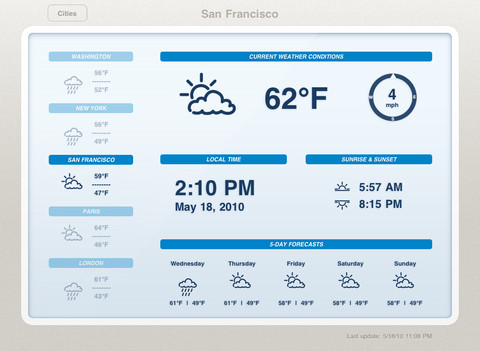
    The first display design are modeled around LCD weather “stations” that *used* to be popular among the Sharper Image crowd. This is the type of weather app that generally looks like this:

    It’s not bad, but I would argue it’s not even scratching the surface of possibilities given the device that is powering it. These types of apps are static, not interactive, and that’s bad.

    ### Display Type Two: Demo

    The second type of app is what I call a demo app — it’s an app that looks and works fantastic for giving a demo, or presentation, to someone — but when you get right down to it, it too sucks. The best example of this is [Weather HD](http://itunes.apple.com/us/app/weather-hd/id364193735?mt=8). It’s a beautiful large graphic that is clearly taking advantage of the iPad, just not in a way that helps someone wanting weather information.

    By and in large most of the “new” weather apps I see on the iPad app store take this approach:

    1. Show incredibly beautiful graphic of the current weather conditions.
    2. Relegate all other (more important) weather information to a smaller section of the screen.

    I cannot be clear enough: I hate these apps.

    In my mind, they are completely useless.

    ### Both Display Types are Useless

    Thinking about it a bit more I actually think it is fair to say that both display arrangements are fairly useless, because both assume the same thing: that the user is going to leave their iPad on, and with that app up in the foreground.

    That’s the only way these apps become useful: if you are dedicating your iPad to the display of these apps. ((To be fair, weather apps are not alone in this category.)) The problem with that is that weather data is begging to become interactive.

    Radar maps look like they are from the 90s, and yet they could be so much more. [Take a look at the wind map across the U.S. to see just how amazing weather data can be if we try](http://hint.fm/wind/). You may think that wind map isn’t useful, but I actually learned quite a bit by looking at it and the way the wind was moving throughout my corner of the country, but just imagine what we can do with precipitation and temperatures…

    ### Is There Anything Good?

    Short answer: no. Longer answer: [Seasonality Go](http://getseasonality.com/go/) is about the most interesting of the iPad weather apps ([still](https://brooksreview.net/2011/04/seasonality/)), but it’s not very nice looking. Where it lacks in design, it somewhat makes up for it by making graphs and layouts interactive. Additionally the Radar map actually works — and does so quickly. It’s not good, but it’s the only thing I found worth keeping on my iPad.

    ### Moving Forward

    As I said above, it seems to me that developers of weather apps for iOS have reached an impasse, where they can’t move outside of the box of current weather display methods. The last thing the app store needs is another Weather app that shows a giant sun radiating heat with the temperature data shoved in the corner.

    What iOS needs, the iPad specifically, is a weather app that asks what a user truly wants and needs — because I really doubt there are many people that want to buy a $500 device to leave it in a stand showing your fantastic radiating sun all day long.

    UPDATE: Some confusion over what I am trying to say here. First that weather apps suck right now. Second that the weather data needs to be more interactive. If you are wondering what a “perfect” weather app for me would look like, I can’t tell you. I think that, right now, developers are just trying to show weather states and temperatures, instead of asking what a user wants to learn from weather info, and that goes beyond: “do I need an umbrella?”

  • Reset to Default

    A while back I posted a link about productivity by [Tony Schwartz from the Harvard Business Review that was titled](http://blogs.hbr.org/schwartz/2012/03/the-magic-of-doing-one-thing-a.html): “The Magic of Doing One Thing at a Time”.

    In my link I quoted this bit:

    >The biggest cost — assuming you don’t crash — is to your productivity. In part, that’s a simple consequence of splitting your attention, so that you’re partially engaged in multiple activities but rarely fully engaged in any one. In part, it’s because when you switch away from a primary task to do something else, you’re increasing the time it takes to finish that task by an average of 25 per cent.

    Nothing Schwartz was saying was particularly new to me, but I liked the reminder, so I posted about it.

    I spent the rest of the weekend working on projects around my house. I was dead focused on the task at hand. I didn’t stop to check email or Twitter — or anything — I just kept working, completing one thing at a time. ((I recommend that you do not multi-task while using power tools.))

    After I finished up I sat down at my computer and looked at the screen.

    Twitter was running, Mail was running, ditto Messages, Yojimbo, OmniFocus, Notational Velocity, Safari, Dashboard, and on and on.

    I thought back to what Schwartz wrote and realized that when I am working on my Mac I am constantly jumping between these apps — I am increasing my time it takes to do any one thing because I allow myself to engage too many things at once.

    This — I assume — is why many people find the iPad to be such a refreshing writing tool: it forces focus. I know this and I have said this before.

    This time I wanted to bring that forced focus to my Mac. Somehow. Fullscreen apps took me a step towards that, but the three finger swipe became too convenient to procrastinate with.

    I needed a solution, well truthfully a band-aid. Because the solution is discipline, and that is a far reach from the fix I implemented. My fix, though is the solution to the long term need of more discipline when I work.

    So I asked myself to define the activities that I used my computer for, and then to break down what apps I need to have open to best do these activities. I came up with four activities (but I am adding more as the need arises):

    1. Casual computing. In this mode I am not doing anything that is important so distractions are welcomed interruptions — a way to spur other thoughts.
    2. Default. This is the state I always want to “enter” my computer with. It is the pure state, there are minimal distractions, but maximal apps to get to any immediate task right away.
    3. Writing. This is a pure mode where only the tools needed to write are running.
    4. Work. This is the “day job” mode, where like the writing mode only the tools needed are running.

    Ideally I wanted to be able to hit a keystroke and flip my computer from one mode to another — so that’s what I created with Keyboard Maestro.

    Pressing `SHIFT+CONTROL+OPTION+R` activates a Keyboard Maestro macro that presents me with the four modes, but instead of calling them “modes” I actually call them: resets. I chose ‘resets’ because that’s what I am doing. I am not shifting my mode from work to writing, I am resetting my computing environment from work to writing.

    All that Keyboard Maestro does is open and close the apps needed for each reset so that only the apps that I want open for each reset are open.

    ### Reset my Usage

    This can, of course, be done manually — hell you can even just ignore offending apps if you want — but I like this approach because it forces me to commit to doing something different. Practically speaking, I can’t just start writing a post if I am in the middle of an IM conversation — I must first have decided to either end the conversation and get to writing or to continue the conversation and delay the writing. Doing both cannot be an option any longer.

    More than just that, the drastic shift in what windows I see on my desktop — going from open windows to no opened windows — resets my mind. Effectively I am shoving everything off my desk and then saying: go.

    I am also changing my viewport by displaying a new background for each mode shift thus helping my brain to shift into the new work at hand.

    I know that I can do this without an elaborate Keyboard Maestro setup. I know that I don’t need to close these apps if I instead just ignore them. None of that knowledge changes the fact that I simply don’t ignore those apps when they are open. So truthfully I really do need to use these macros to achieve this level of concentration.

    [When I wrote about why I prefer Writer over Byword](https://brooksreview.net/2012/03/writing-2/) and how I see the two apps very differently I received a lot of feedback. The feedback seemed to be wild agreement, even if the person preferred another app, or criticism that I was simply too fiddly. Perhaps I have other issues — suggested some — if I can’t just sit down and write.

    Perhaps.

    Or perhaps I am not alone and that’s why tools like iA Writer exist.

    Either way, I do like this little trick.

    #### Setup Notes

    Here’s some screenshots of the four resets in Keyboard Maestro:

    – [Default](http://c276381.r81.cf1.rackcdn.com/Screen%20Shot%202012-03-30%20at%201.37.18%20PM.png)
    – [Writing](http://c276381.r81.cf1.rackcdn.com/Screen%20Shot%202012-03-30%20at%201.37.27%20PM.png)
    – [Work](http://c276381.r81.cf1.rackcdn.com/Screen%20Shot%202012-03-30%20at%201.37.22%20PM.png)
    – [Casual](http://c276381.r81.cf1.rackcdn.com/Screen%20Shot%202012-03-30%20at%201.37.13%20PM.png)

    [Here is how I am changing the desktop background (using Automator)](http://c276381.r81.cf1.rackcdn.com/Screen%20Shot%202012-03-30%20at%201.37.52%20PM.png).

  • Modahaus Steady Stand

    [](http://c276381.r81.cf1.rackcdn.com/modahaus-2.jpg)
    A while back a rep for [Modahaus](http://www.modahaus.com) contacted me about a new photography stand they had come out with for the iPhone and small cameras. It looked pretty neat, so when they offered to send me one of my choosing to review, I took them up on it. International shipping being what it is, the stand arrived a few days ago.

    The [Steady Stand](http://www.modahaus.com/store/steady-stands/) is meant to take product photos from directly above the item. It’s pretty simple, or so I thought. I wasn’t sure what to expect, but I am actually really surprised with the results from this stand.

    Modahaus makes the stand in four different sizes. The different sizes not only fit different devices, but they also hold different sized objects inside the stand (the area where you take the picture of the object). [I opted for the SS200 which is the second largest stand, because I wanted to see if the stand would hold my GX1 (it does)](http://www.modahaus.com/store/steady-stand-200/).

    Here’s what the stand looks like when you get it:

    [](http://c276381.r81.cf1.rackcdn.com/modahaus-1.jpg)
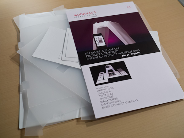
    I was really pumped to open it once I saw the packaging, but when I did — well — this is what I saw:

    [](http://c276381.r81.cf1.rackcdn.com/modahaus-3.jpg)
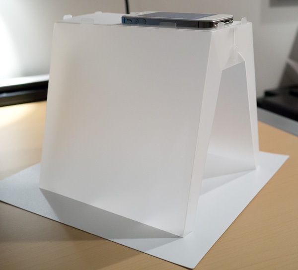
    There was a lot of little bits of plastic, I feared I was in for an Ikea level assembly operation. Pleasantly, that wasn’t the case. There is actually only one solid piece of plastic that makes up the stand, and the directions amount to:

    1. Re-crease the creased edges.
    2. Put four tabs in two slots.
    3. Done.

    It didn’t take long to figure out at all, and the end result is this:

    [](http://c276381.r81.cf1.rackcdn.com/modahaus-4.jpg)
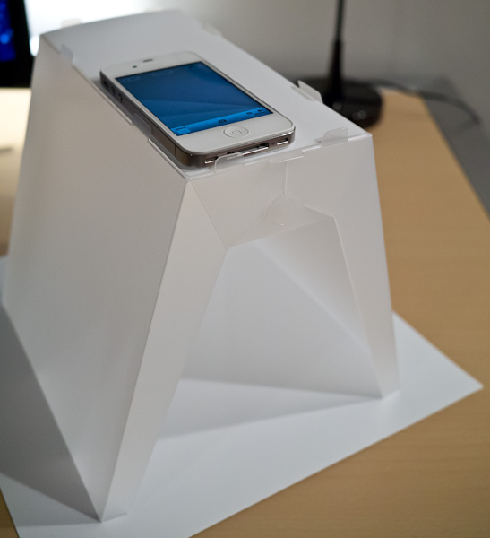
    That’s not a piece of paper on the bottom, it’s a piece of plastic that came with the stand. There are a few different inserts that rest on the top to adapt to different types of cameras — including the one shown for the iPhone. ((Side note: there is also a smaller piece of solid white plastic that can be rested on top of a coffee mug to provide an even more macro like level of focus, a nice touch.))

    [](http://c276381.r81.cf1.rackcdn.com/modahaus-5.jpg)
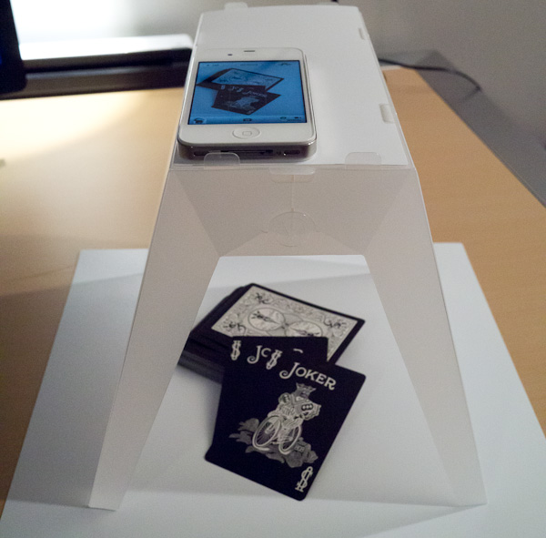
    There isn’t much else to say, because to be honest this stand works as advertised.

    [](http://c276381.r81.cf1.rackcdn.com/modahaus-6.jpg)

    Anyone who takes product photos knows that a good photo isn’t as easy as you think it is. So in the above arrangement I placed some playing cards in the stand and used my iPhone to shoot the photo. The only light in the room was the overhead light and my desk lamp pointing away from the stand. It was so dim in the room that to shoot the above photo of the stand I had to do it at ISO 3200 on my GX1. So it was dim, but here’s the photo as it was directly out of my iPhone:

    [](http://c276381.r81.cf1.rackcdn.com/modahaus-9.jpg)
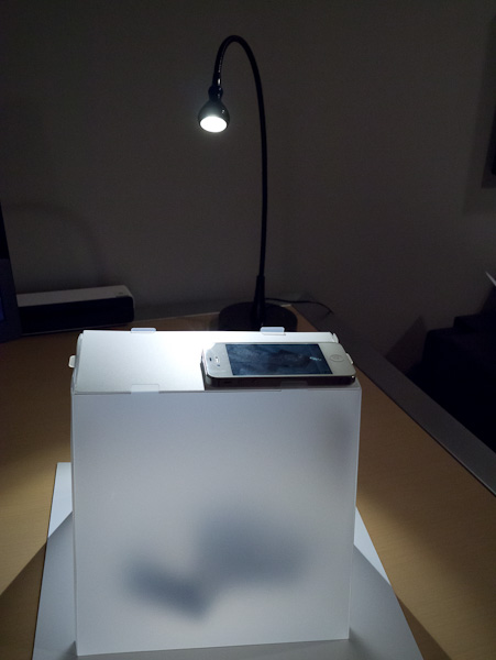
    The color balance could use a tweak, but overall not that bad. I wanted a better shot though, so I spent about 5 seconds redirecting the light from my desk lamp directly into just one side of the Steady Stand and turning the stand a bit, like so:

    [](http://c276381.r81.cf1.rackcdn.com/modahaus-7.jpg)

    That small, but significant change resulted in this:

    [](http://c276381.r81.cf1.rackcdn.com/modahaus-10.jpg)

    Again that’s straight out of the iPhone. The light is a bit uneven in both the color balance and the levels. The color balance issue is the difference between my desk lamp and the overhead lights (both were on). Lastly the lighting balance issue is just from shining the light into one side in such a harsh manner.

    I have absolutely no doubts that you can create fantastic product shots with this stand with a minimal level of setup and time needed.

    Here’s the same exact setup, but using the GX1 as the camera instead:

    [](http://c276381.r81.cf1.rackcdn.com/modahaus-8.jpg)

    My guess is that in a brightly lit room, or one with sunlight pouring in, you could get some fantastically even images.

    I quite like this stand, and the best part for me: you can fold it back flat and stow it away. That’s a killer feature.

  • Calendar Redux

    Every so often [this post I wrote in September of 2010](https://brooksreview.net/2010/09/sucky-calendars/) about digital calendar paradigms pops back up. (It features a horrible design mockup of a calendar app I would like to see for my Mac.) This go around I think I am going to blame Patrick Rhone for the article’s resurgence:

    The thing is, for the most part, Calendar apps still really suck (maybe they suck more given how Calendar in Lion looks). Every time this post bubbles back up I get emails from developers that either want to develop the app I want (never seems to happen) or that think they have the app I want (they never do). That’s fine and nice to see, but seeing this again reminded me that there is light at the end of this tunnel.

    No, there’s still no perfect OS X calendar app — hell not even a good iPad one — but we are getting damned close on the iPhone. This near perfection comes in the form of one app and one iOS system level service working in harmony: [Agenda](http://getappsavvy.com/agenda/) and Siri.

    Since I received my first beta invite to test [Agenda](http://getappsavvy.com/agenda/), I fell in love with it. For me Agenda perfectly encapsulates what I need in an iPhone calendar app: showing me what’s next.

    Agenda excels at this.

    For the longest time my main complaint about Agenda was that it was still very cumbersome to enter in a new appointment, but Siri changed that. Now I can just speak my appointment at my iPhone and it shows up in Agenda (even though Siri just inputs it into the Calendar app). It’s a solution that works surprisingly.

    So well in fact, that I do 95% of all my calendaring in Agenda on my iPhone — even when my hands are already on my keyboard.

    If you are still having problems with finding a good calendaring app — give Agenda a try and forget about calendaring on your Mac or iPad.

    *Seriously, forget about it.*

    ### For Those of You That Just Ignored That Advice

    Ok, so you just ignored me and want to know what I use on my iPad and Mac — because I *must* have something better than you, right? Well, I don’t.

    Truthfully the only time I use a calendar on my Mac is to input a new event — for that I alternate between [Fantastical](http://flexibits.com/fantastical) and [QuickCal](http://itunes.apple.com/us/app/quickcal/id416581096?mt=12), just depending on my mood and the lunar cycle.

    On my iPad I use Agenda (recently switching for the nicely polished [Calvetica](http://mysterioustrousers.com/calvetica)) simply because it is the lesser of two evils. I don’t love Agenda’s UI on the iPad — I think it is a bad balance between too sparse and to cluttered, if that makes sense. ((I hate to say that about an app that a lot of time went into, but it is how I truthfully feel about it.)) In my opinion I have yet to see anyone create a calendar app ((Or weather app for that matter.)) for the iPad that properly utilizes the iPad screen size — I’d be happy to be proven wrong.

    So for those of you that loathe all the digital calendar solutions: I hear you. But I bet you would be pretty happy with Agenda on your iPhone 4S (so you can get Siri) and ditching the thought of using a Mac calendar app for anything more than creating the odd new appointment. That solution really has worked out well for me.