Category: Articles

  • Why the 13″ Air Is Better Than the 13″ Pro

    After posting about “Macs and Cars” yesterday I received a lot of great comments from readers, none more annoyed at me then those that actually like the 13″ MacBook Pro. To each your own and all that, but truly the 13″ MacBook Pro is a pretty silly choice at this point. Instead of refuting each claim let’s just try to do it all here.

    Reasons the 13″ MacBook Pro is silly:

    – Lower screen resolution than the 13″ Air
    – To get everyday use performance equal to a MacBook Air you will need the SSD. Making the cheapest 13 Pro option $1449 ((Honestly this is the only way you can make the Pro better than the Air.))
    – Disk drives are going the way of pagers — you are buying something you will never use.
    – It’s heavy.

    Here’s the crux of the issue: you are essentially paying a premium for “specs” that you are likely to never use or notice. While at the same time forgoing things that you will notice *every* time you use the computer (screen resolution and the performance of an SSD). If you really need more power than you get out of a 13″ Air then you honestly should be looking at the 15″ Pro as it is much faster. The 13″ line is dual core only, while the base 15″ is quad core.

    To stick with the car analogy, buying a 13″ Pro is like an SUV that doesn’t have 4-wheel drive — that’s just pointless. What though of users who are budget constrained and want the most horsepower for their dollar? MacBook Air or iMac both will cost you around the same amount. The iMac will give you the CPU speed, but the drive speed will be had by the Air (comparing base specs here). Unless you are doing lots of gaming or encoding work the Air is likely to feel faster than any MacBook Pro/iMac that doesn’t have an SSD.

    I am not saying that the 13″ MacBook Pro is an inherently bad computer — what I am saying is that it is a pretty bad buying decision given the current slate of Macs. I would be so bold to guess that if I plopped my MacBook Air in front of any current 13″ MacBook Pro owners and asked them to use it for an hour and tell which computer is faster — 98% would say the Air is faster. It’s not about performance specs, it about user experience and how people use their computers — most people just don’t do that many CPU intensive tasks on anything but an occasional basis.

    That’s why the Air makes more sense than the 13″ Pro.

  • BlackDeath

    I don’t think BlackBerry stands a chance to be relevant in 2012. They lack innovation, they lack strategy and they lack vision. Their history proves that they had one great idea and kept selling the same idea until — well — now, when it isn’t selling anymore. ((Relatively speaking.))

    Here is where BlackBerry started:

    Here is BlackBerry today, with a just announced new phone:

    That’s called iteration, not innovation.

    That’s the crux of BlackBerry’s problem — their devices aren’t compelling in the current landscape to both the general market and to the current BlackBerry users. If your customer base can’t be compelled to update their device then why should anyone want to buy your device? The users that you have, should be the most vocal proponents of your products, not silent “it’s ok” advocates.

    [Updated: 5.5.11 at 7:33 PM]

    Also see Marco here.

  • Thinking About Macs as Cars and Trying to Figure Out What the Hell You Should Buy

    Marco Arment [posted some great advice](http://www.marco.org/2011/05/04/imac-vs-mac-pro-vs-macbook-pro) about Mac buying decisions and he is right on his thoughts about the new iMacs being more disposable like laptops are seen. Since I am also a car nut, I find it much easier to break down the current slate of Macs by applying a car type to each model. This makes the decision process easier for most people.

    **Mac Pro**: This is your workhorse truck. Its the big Chevy/Ford barreling down the road with all sorts of crap mounted to the bed. Maybe you have a fifth-wheel setup, maybe a toolbox with an oil pump on it. Perhaps you have a fancy rack carrying a ladder and some doug fir. Trucks are highly versatile machines that bear the brunt of the hard tax labor. Of course they can always be cleaned up and driven into the city — but that’s a bit over kill. Good luck finding parking too. Often your truck will be too big for parking garages and too big for parallel spots.

    **iMac**: You know those large sedans that you see people driving around so comfortably in? That’s what we have here, lots of power for your average drive and plenty of room and creature comforts for those riding along. You can take it into the city with ease — though parking garages and valets are your domain. Old ladies drive these, so do car services and so do “normal” people. This isn’t the car for most people, often it is too much car, but for a great many this will be a perfect car.

    **MacBook Pro 17″**: Stupid — I mean it’s a really big SUV. Think Hummer, or Ford Excursion — both that have seen end of life because of the limited market. This is a car without the full benefits of a truck, while still having all the downsides of the truck. Such as not being able to fit in parking garages, or in parallel stalls — all while not having the versatility of a truck. Basically you get all of the bad, without *much* of the good.

    **MacBook Pro 15″**: This is the workhorse of the everyday man, best represented by your average SUV. It has all the benefits of a “normal” car and some of the power and versatility benefits of the truck. You can take it most everywhere and do most everything with it — certainly there are tasks best suited to trucks (like moving), but these are tasks most people don’t face that often. For the average person, this purchase represents a “safe” choice.

    **MacBook Pro 13″**: It’s a Geo Tracker. Ok, well it’s really not *that* bad, but it is stuck in the same rut that the 17″ model is. You get all the bad things of the “Pro” line (size and weight) without the benefits of the “Air” line. It truly is the mini-SUV of the Mac line-up — far too small to be supremely useful, with limited power and a funky size class.

    **MacBook Air 13″**: Mid-sized Sedan all the way. It’s the car that most of us *should* be driving instead of the SUV that we convinced ourselves that we *needed*. You get all the power you need for most everyday life driving around, enough room to comfortably fit four when needed and yet a perfect size for taking into the city and parking anywhere. You can haul groceries, golf clubs, or take and extended road trip — sure there will be some times of the year when this car isn’t right — it will be the *right* car 90% of the time for 90% of people.

    **MacBook Air 11″**: This is your two-door car (not to be confused with a sports coupe, which is a different class) it isn’t as practical as an everyday driver for most, but makes a very nice secondary car. You get a smaller more efficient package, while sacrificing room for people and luggage.

    **iPad**: I am including this because I have an analogy and because some are considering it as a secondary computer. The iPad is really the motorcycle of the Mac line-up. You can get a great many places with it and go where cars won’t fit, but you do so at a sacrifice to overall utility of the vehicle. Passenger support is limited and you can’t carry much with you. You can however park it on the sidewalk, or annoy the crap out of everyone else around you with how “small” it is as you dive in and out of traffic.

    **iPhone**: Same reasons for including the iPad, except I don’t know where the iPhone exactly fits here. Initially I was billing it as a bicycle, but I don’t think that fits. I think the best fit for the iPhone is actually your shoes. You can go most anywhere with just your shoes, but you are going to get damned tired of using just your shoes after a few miles. Yet your shoes are always with you.

    ##### The Key #####

    So how do we decode the above information? Here’s a limited key for you:

    – Luggage = storage space (think hard drives).
    – “Going into the City” and Parking = storing your computer and carrying it with you.
    – Versatility and Utility = ports and expandability.
    – Passengers = nothing really.
    – “Creature Comforts” = things like backlight keyboards.
    – Power = CPU, RAM, ports.

    So while it makes sense to buy a truck and also have a small two-door car as a secondary, it doesn’t make sense to buy a Truck and a large sedan. It also doesn’t make a ton of sense to buy and SUV if you never go off-road or drive in poor weather. Likewise it doesn’t make sense to buy a mid-sized sedan if you have a need to go off-road or drive in snow on a fairly regular basis.

    *P.S. I am aware I left out Mac minis and the MacBook. There are many reasons, but suffice to say I don’t seem them as compelling options for anyone over what is currently listed here. Much more niche, like say smart cars (small, pointless and expensive) and oh Scions (the appeal of being cheap, but to get something decent it’s going to cost you the price of a ‘regular’ car).*

  • “Less Software”

    The other day, talking about my MacBook Air, I made [reference](https://brooksreview.net/2011/04/mba-qs/) to the fact that I am trying to use less software:

    >It is also important to note that while software wants to use every bit of juice it can get its hands on — I personally am using less and less software to get tasks done. So while more resources are needed for each app, I am using less apps.

    I didn’t think much about that statement when I wrote it, but I got a few questions about what I meant and how I was accomplishing this. Let me start by saying that, upon reflection, that statement is not entirely accurate. I am using less software, but I am also using different software to achieve better resource management — I am doing a little bit of each and reaping some nice benefits.

    So for instance, I went from using Ulysses, TextMate, and MarsEdit on a regular basis — to instead just using TextMate. That is one app open instead of three and this makes a noticeable difference to overall performance. ((It is important to note here that I tend not to quit applications if I think I will be coming back to them in the next hour or so, meaning none of those apps would ever truly be quit.)) I have done things like switching from MS Office apps to iWork — they aren’t as robust, but they launch faster and use less resources. I use Acorn instead of Photoshop when I can. Instead of getting rid of apps, I added in a low resource apps that I use in place of the resource “hog” apps where and when possible.

    I *could* delete Office and Photoshop and get by with the other apps, but my goal isn’t to decrease HD space (I have plenty of that), nor is my goal to reduce the usefulness of my computer — my goal is to use less resources while I am working.

    I can get by just fine with out Photoshop or Word, but it is far less convenient to do so. My move towards this type of software has nothing to do with the power of my computer so much as it has to do with using better tools for the task at hand. There are times when you don’t need the power of a huge 4×4 truck — so why drive it around everyday?

    The idea of my using “less software” is really about both physically reducing the number of applications that I use *and* using applications that use less resources — all without compromising the usability of my computer.

  • Checking Off My ‘Bugs Me’ List

    Knocking off some chores on my ‘Bugs Me’ project in OmniFocus last night meant that I spent a lot of time playing in Keyboard Maestro.

    First up is Twitter.app and how I like it to stay near the upper left corner of my screen. Sometimes I move it, whether by accident or for some odd reason. I like the window to sit just below the menu bar and just off the left edge so that I can use the app without bugging the Dock and so that it doesn’t feel smashed against the side, like so:

    The thing is I want to be able to have Twitter snap back to that position at my command, but not automatically in case there is a reason I don’t have it in that corner. Here’s the Keyboard Maestro commands to do just that:

    Please note that this macro is inside a group that only works on the Twitter app so that I don’t get weird things occurring in other apps that use this same shortcut.

    Next up is TextMate. When I write I like TextMate to be centered on the screen and I like nothing else to be shown behind it — basically I hide all my windows and start writing. This is a pain though when I am bouncing back and forth to Safari to grab links, or text. So I created this little magic in Keyboard Maestro:

    What we are doing here is centering the TextMate window on the screen — just how I like it. I keep this Macro in a group that only works in TextMate, for no real reason other than I made it a while back.

    This little bit doesn’t look like much, but that keyboard shortcut invokes Isolator [LU] so that the rest of the screen is almost completely out of my way.

    This undoes what I just did above and is really magical for me. Basically with this setup, whenever I open a TextMate document I get a very focused view, but CMD+Tabbing out of TextMate turns it all off without any effort on my part. Thus I have the best of a lot of different things all done automatically.

    The end result looks like this:

    That brings us to the last really magical bit that I did, which was to create a keyboard shortcut to send items to Instapaper in Reeder, with one keystroke. It is a real pain that there is no menu item or built in shortcut to do this, so you really do need Keyboard Maestro for this.

    In order for this trick to work your menu needs to look like this in Reeder:

    You do that be adjusting the services you have, you can have more but Instapaper needs to remain in spot 2 — otherwise you need to adjust the macro a bit. Here’s the macro:

    Again this macro is in a group that only works on Reeder. I also chose the shortcut because it is similar to what I use in Safari to send to Instapaper — making it easier to remember.

    Just for Fun

    A couple of others that I setup to help out with server stuff:


    (Thanks to David Findlay for that.)

  • What would you buy first?

    Here’s an interesting thought experiment: if you had to start over, buying all of your apps from scratch, in what order would you buy them (the assumption being you couldn’t afford to re-buy them all at once, but over time you could afford them all). I have been thinking about this for a while now and I started with a list of all the apps I normally use that I would need to purchase. From there I started arranging them in order of what I would buy first.

    Here’s where I stand:

    – [Dropbox](http://db.tt/nQKF6kW) ((Yes this is technically free, but if you want it to be a success you need to start paying.))
    – [1Password](http://agilewebsolutions.com/onepassword)
    – [LaunchBar](http://www.obdev.at/products/launchbar/index.html)
    – [Keyboard Maestro](http://www.keyboardmaestro.com/main/)
    – [TextExpander](http://smilesoftware.com/TextExpander/)
    – [Lightroom](http://www.adobe.com/products/photoshoplightroom/)
    – [Transmit](http://www.panic.com/transmit/)
    – [Acorn](http://flyingmeat.com/acorn/)
    – [TextMate](http://macromates.com/)
    – [OmniFocus](http://www.omnigroup.com/products/omnifocus/)
    – [Parallels Desktop](http://www.parallels.com/products/desktop/) ((This is higher on the list than I want it to be, but my job necessitates it.))
    – [Numbers](http://www.apple.com/iwork/numbers/)
    – [Pages](http://www.apple.com/iwork/pages/)
    – [Yojimbo](http://www.barebones.com/products/yojimbo/)
    – [Reeder](http://madeatgloria.com/brewery/silvio/reeder) ((Assuming this will be priced above free.))
    – [SuperDuper!](http://www.shirt-pocket.com/SuperDuper/SuperDuperDescription.html)
    – [Tower](http://www.git-tower.com/)
    – [xScope](http://iconfactory.com/software/xscope)
    – [InDesign](http://www.adobe.com/products/indesign.html)
    – [Photoshop](http://www.adobe.com/products/photoshop.html)

    That’s my order — I’m curious to see how you would order your own list, if you have a blog and create a post like this please share it with me.

    I’ll try to add links below as I get them.

    ### Reader’s Lists: ###

    – [Jordan Patterson](http://www.thecheapgeek.org/what-software-would-you-buy-first)
    – [Recenseo](http://recenseo.tumblr.com/post/5189832441/what-would-you-buy-first)
    – [Scott Jack](http://scojj.posterous.com/what-would-you-buy-first)
    – [Brian O’lyaryz](http://www.allisinfinite.com/post/5190137968/a-reply-to-ben-brooks)
    – [Kennon Bickhart](http://kennonb.tumblr.com/post/5190760480/what-would-you-buy-first)
    – [Shadow Huard](http://smarterbits.tumblr.com/post/5189881667/re-what-would-you-buy-first)
    – [Michael Kalina](http://3th.be/2011/05/04/in-dieser-reihenfolge/) (Written in German)
    – [Craig Grannell](http://reverttosaved.com/2011/05/04/what-would-you-buy-first-or-my-favourite-mac-apps/)
    – [David Silva](http://davidsilvaonline.com/notepad/what-app-would-you-buy-first/)
    – [Josef Szotten](http://josef.co.vu/post/5192554542/what-would-you-buy-first)
    – [Michael Rockwell](http://mickerlodeon.com/2011/05/what-would-you-buy-first/)
    – [Michael Anderson](http://appleink.wordpress.com/2011/05/04/buy-first/)
    – [Hugh Sissling](http://www.woooster.co.uk/?p=495)
    – [Nik Fletcher](http://nikf.org/post/5194684867/what-would-you-buy-first)
    – [Robert Falck](http://streakmachine.com/post/5194632024/what-would-i-buy-first)
    – [Michael Doan](http://michaeldoan.com/2011/05/clean-start/)
    – [Brandon Bohling](http://brandonbohling.com/2011/05/04/buy-first/)
    – [Jon Snyder](http://ministrymac.tumblr.com/post/5196892338/what-would-you-buy-first)
    – [Steven Teskey](http://therealsteventeskey.com/2011/05/04/What_Would_I_Buy_First.html)
    – [Adrian Boioglu](http://www.boio.ro/experiment-ce-aplicatii-ai-cumpara-din-nou/) (In Romanian — awesome.)
    – [Thomas Brand](http://www.eggfreckles.net/tech/buying-my-app-list/)
    – [Giovanni Lanzani](http://blog.lanzani.nl/2011/what-would-you-buy-first/)
    – [John Kmiecik](http://jkbc.co/post/5230564717/paid-applications-or-the-lack-thereof)
    – [Gabriel Ponzanelli](http://gabrielponzanelli.net/2011/05/what-software-would-you-buy-first/)
    – [Robert Lo Bue](http://robertlobue.com/2011/05/09/what-would-you-buy-first/)
    – [Steve Lyb](http://astroaficionado.net/2011/05/09/clean-broke-apps/)
    – [Jon Siddle](http://randombrainactivity.com/what-would-you-buy-first)
    – [Nic Lake](http://niclake.com/2011/05/what-would-you-buy-first/)
    – [Carlos Eduardo de Paula](http://carlosedp.com/posts/what-would-you-buy-first.html)

    Let me know if I missed you.

  • Fontcase 2.0

    Bohemian Coding was kind enough to let me check out [Fontcase 2.0](http://www.bohemiancoding.com/fontcase) before it was released and all I can say about it is: “Wow”. Before Fontcase it was pretty common for me to open an InDesign document, paste in text and play with the fonts and sizes. Font Book has never been a very good app for selecting fonts, Fontcase though is fantastic for choosing fonts.

    By far the best new feature is the Typesetter, once activated will display a webpage and allow you to click on a body of text and see what it would look like with another font. This will save me a ton of time when designing sites and more importantly: this will keep me at bay when wanting to tweak this sites font. Here’s Typesetter in action on TBR:

    [](https://f3a98a5aca88d28ed629-2f664c0697d743fb9a738111ab4002bd.ssl.cf1.rackcdn.com/tbr-typesetter.png)

    The last feature that I want to mention is the glyphs feature — it is a real pain to grab html codes for glyphs, or even to view them — Fontcase makes that process dead simple. Are these things that you could do in other apps? Certainly, but not with the ease and beauty that Fontcase gives you.

    At the very least it is worth checking out the free trial — I really love the app.

  • It Was a Very Good Year

    On April 30th, 2010 [I wrote](https://brooksreview.net/2010/04/hps-very-smart-acquisition/):

    >Hey thanks HP for acquiring Palm — I almost forgot you were still around.

    That’s the sentence that started this blog. Not a post about Apple, not a review — an analysis of HP’s acquisition of Palm. I haven’t actually read that since I posted it, but I did just now. Reading that post I remember why I wrote it and what I was trying to say when I read the last line:

    >So in short, HP forget about Windows (phone) Mobile, spend money on Palm’s marketing. But most importantly forget about Apple and do your own thing, because you can’t beat Apple at its own game, so beat them at yours.

    Boy, I could say that again today and still would be relevant — yet we are a year removed from when I originally wrote that. In fact that entire article is still relevant to HP/Palm — that’s not me tooting my own horn, that’s me shocked at the ineptitude of HP.

    The next month, just weeks after launching the site, I switched hosts because I was fed up with downtime at Bluehost. I moved to the Media Temple (gs) and was so overly happy with the move. Near the end of that month I wrote about Google and Apple, and [stated](https://brooksreview.net/2010/05/google-vs-apple-gaining-perspective/):

    >Before the iPhone it was more common for someone to not have a data plan on their phone then it was for them to have one — let alone an unlimited data plan.

    Funny now that a year later we are without the ability to buy unlimited data plans — because of the sheer overwhelming demand for mobile bandwidth and the greed of the carriers.

    In May 2010 The Brooks Review had less than 150 total readers for the entire month. ((Which was far more people than I actually shared the blog URL with.)) I had no idea what I was doing, or where this was all going — but I was having a hell of a good time sharing my thoughts with a small audience.

    July 2010 saw my first “big” post, it got a couple of points on Hacker News and occasionally people still come across it. I liked it at the time — though now I very much regret writing it in a list way, lame.

    [Email Mistakes That Irritate Smart People](https://brooksreview.net/2010/07/email-mistakes-that-irratate-smart-people/):

    >It is really awesome that you figured out how to embed your company logo in your email signature, but I know who you are and what your company logo looks like. I still hate it. Don’t waste bandwidth sending me email attachments of your logo.

    Yeah, that *sounds* like me.

    Thanks mainly to that single post I had what I thought was a huge month, at 766 unique views for the month — I was a very happy guy. ((Still am, though most would argue that.))

    Unbeknownst to me this was the first turning point of everything, from here it would be nothing but up, up, up.

    For October the only post that really generated discussion was [this one](https://brooksreview.net/2010/10/mba-fits/), where I refuted some of John Gruber’s claims about the new MacBook Air’s. To which, after seeing that I was buying one as my primary machine, he [responded](http://daringfireball.net/linked/2010/10/26/brooks-air): “And he’s putting his money where his mouth is.”

    Luckily I didn’t have to eat those words. It also happened that buying my MacBook Air was one of the best purchases I have ever made.

    The next month I wrote what still may be the longest post on The Brooks Review, my [MacBook Air review](https://brooksreview.net/2010/11/mba-review/). I remember slaving for days over this post to be as accurate and interesting as I could be. It was one of the toughest things I did all year and one of the most satisfying.

    I am going to skip over the rest of the year — there is just too much to process at this point, suffice to say: thank you for reading and emailing and correcting my grammar.

    Things I learned this past year:

    – I don’t know how to use a comma.
    – My readers know how to spell and use commas.
    – Positive, interesting, email outweighs the bad 6 to 1.

    It… was a massive good year.

  • “Blue da ba dee da ba di”

    >I have a blue house with a blue window
    >Blue is the color I thought that I’d wear
    >Blue are the streets and all the trees are too
    >I have a girlfriend and she is so blue
    >Blue are the people here that walk around
    >Blue like my corvette its standing outside
    >Blue are the words I say and what I think
    >Blue are the feelings that live inside me.

    — Eiffel 65

    There seems to be a building consensus that if your app uses blue in the icon, or main interface elements, that I will — at some point — mention how much I dislike that and to be fair, that’s probably accurate. What isn’t accurate is the idea that I somehow hate the color blue when, in fact, that couldn’t be further from the truth. Blue is, and will always be, one of my favorite colors (if that even means anything).

    When I comment on the color blue I am not so much commenting on the actual color itself — as I am commenting on the lack of originality using the color brings to apps. Exactly 50% of the icons in the my dock right now use the color blue (in one shade or another) as the main component of the icon. Blue, on it’s own is a great color, blue in everything is boring and meaningless.

    That’s my problem with blue — it’s like a good song that you have listened to one too many times.

    People can still design wonderful apps using blue, and these will still be apps I recommend — but for the love of creativity I think it’s time to try some other colors. ((There *are* other colors.))

  • Quick Takes on Five Apps #11

    This is the eleventh [installment](https://brooksreview.net/tag/quick/) of the Quick Takes series, where I look at five (or so) apps and tell you my thoughts on them.

    ### A Bunch of Weather Apps (skip if you are tired of this): ###

    #### [Pocket Weather World](http://www.shiftyjelly.com/products/pocket-weather-world) (iPhone and iPad)####

    This app was kindly provided to me from the developer. I don’t care for the visual styling of the iPad app. I do however like the ‘high visibility’ theme on the iPhone app — but it just doesn’t meet my needs in a weather app. If the forecast data was easier to scan for trends this might be the winning weather app on my iPhone. I do however like that all the data is on one screen — no tabs.

    #### [Weather Watch](http://www.shiftyjelly.com/products/weather-watch) (iPhone) ####

    The same developers of the above app provided me with this app as well. This is a very nice app, but falls in the category of many other apps that show a large clock and smaller weather information. More of a display app, than an information app.

    #### [Wx](http://itunes.apple.com/us/app/wx-for-ipad/id376956323?mt=8) (iPad) ####

    This looks like a Sharper Image gadget circa 1997. That’s not to say that it is bad, just that the interface feels like a dated geek gadget. There is all the information you need, but I don’t think it makes very good use of the iPad screen space. That said if the visual styling was better I could find myself getting into the app. There are great graphs for seeing trends and nice little radar maps. Interestingly this app is not easy to set a new location for, you can’t just say: “give me the information for my current location”. This app wants to know which reporting station you want to use for temperatures, which to use for radar, and so on — it’s not for the quick and easy folk.

    All of that aside, once set up it is apparent that this app is for data geeks.

    #### [Umbrella](http://itunes.apple.com/app/umbrella-the-simplest-weather/id331519827?mt=8) (iPhone) ####

    Drop dead simple app that tells you if you need to carry an umbrella with you. In smaller print it also shows the temperature range and allows you to set the chance of precipitation as a badge on the icon. Not very useful in Seattle ((Because 90% of the time in Seattle it is a good idea to have a rain jacket on hand. Let’s also be honest and admit that only tourists carry umbrellas in Seattle — it’s just not a practical item to have with you when it is raining 10 months out of the year.)) , but a nice little app.

    **End of Weather Stuff**

    ### [Tower](http://www.git-tower.com/) (Mac) ###

    I recently setup GitHub and in doing so quickly found out that I didn’t know what I was doing with it. I wanted a GUI, Transmit, like interface and Tower does exactly that. I haven’t dived into it too far, just yet — but I will say that the generous 30-day trial makes for an easy recommendation to at least try it out. I have personally found it a great way to interface with GitHub and perhaps the only reason I am using GitHub is because of how easy Tower makes it for me.

    ### [Analytics HD](http://itunes.apple.com/us/app/analytics-hd/id364894285?mt=8) (iPad) ###

    This is a handy little iPad app for checking in on your Google Analytics (since Google insists on Flash content). I can’t say that this is a great app, and quite honestly $6.99 is a stretch for this app. Then again there isn’t much an iPad app can do to make Google Analytics look as pretty as something like [Mint](http://www.haveamint.com/). I also find the data refresh rates to be slow, but that is a Google problem as all apps I have tried pull the data very slowly.

    The best feature is the ‘Today’ and ‘Yesterday’ options, allowing you to be able to quickly see the data for those days. If I am completely honest I think that GA on the web actually looks better than in this app, but you can’t see that on the iPad so there is a need for me to have this app.

    ### [Terra](http://itunes.apple.com/us/app/terra-web-browser-tabs-full/id394704159?mt=8) (iPad) ###

    It doesn’t do much to better the built in iPad browser. That said it gives you a much more Safari on Mac feeling than the native browser gives you. The two compelling features in this free app are:

    1. The ability to open files in apps.
    2. Access to downloaded files via iTunes.

    Those are nice features, but I had to force myself to use them because honestly I just rarely need these features on the iPad. It is nice to have, but not the end of the world not to have. Hey, it’s free though.I also found the tabs too small to comfortably hit without thinking about it. I find the lack of a bookmarks bar a huge oversight and the fullscreen mode more of a ‘bullet point’ feature and the usability improvement.

    ### [Photosmith](http://itunes.apple.com/us/app/photosmith/id427757668?mt=8) (iPad) ###

    This app promises to be your Lightroom companion for the iPad. The idea for the app is that you off-load your images from your camera to the iPad, then Photosmith will allow you to tag and rate the photos. You can also organize the photos and share them on a the standard “social” sites. The entire thing syncs with Lightroom with the help of a custom free plugin.

    This is a pretty neat tool, but in it’s current state it is hardly worth $17.99. Tagging, rating, organizing is not as valuable to me as basic color adjustments and cropping. I was pumped to try this app out and was hoping it would make for a nice tool to have on my iPad — I think that if I was on a trip without my Mac, then yes this app would be worth it. However, if I am going to be gone long enough to want to organize photos, why wouldn’t I have my MacBook Air with me?

    *If you liked this installment be sure to check out the other [installments](https://brooksreview.net/tag/quick/).*

  • Ripping Open a Link-Bait Fool

    I have been told that people don’t think I should link to obvious link bait posts, I can see why. Instead of causing a direct link, how about I provide [this link](http://swizec.com/blog/ubuntu-better-for-app-management-than-apple/swizec/1672) to the post and we go on to dissecting this load of drivel.

    Some guy that goes by the handle “Swizec” posted an article titled: “Ubuntu’s app management better than Apple’s”. Obviously this grabbed my attention and caused me to read the post — after all it has been a while since I was last using Ubuntu and I was curious to hear about the improvements made to the OS.

    >But what I wanted to talk about today was how a bunch of opensource geeks have managed to beat the paragon of usability and App Stores and all things shiny and awesome when it comes to managing apps, installing software and so on.

    Clearly from the the article title he is meaning Apple — meaning Ubuntu has created a better App Store interface than Apple has. At this point I am incredibly excited and I want to hear more, because I don’t think the current App Store for Mac OS X is quite up to par.

    Next “Swizec” breaks down the 15 steps he identifies one needing to do before getting a new app on a Mac or Windows box — 15 steps, you have got to be kidding me. What he seems to forget is that we have Google, type in one line, read the article and download the app — that’s pretty straight forward and far less than the 15 crazy steps he takes. But, I will agree that it is not always easy to find a good app. I took way more that 15 steps to find a good seating chart app when I was planning our wedding, but I digress.

    He then lists 9 steps for the average “package manager”. Now having used linux for a while I know what a package manager is, but I would guess that 90% (probably more) of computer users don’t. So then really steps 4 and 7 must be confusing for people when they have to `apt-get` something — do you know what that means? ((Yes I know what it means.))

    >The most notable difference is that suddenly you have this authoritative source of applications where everything is available in a single place. Sure, if you have specific needs you might still have to visit a website or two, three, four, five to get the specific version of the package you need just in case the one your distro offers is too old … but all in all, the process is much nicer.

    No the most notable difference is actually the fact that only command prompt geeks know what you are talking about at this point. The most notable difference is that my mom couldn’t download an app using this method — hell our average high schooler probably couldn’t either.

    Me: “No, Mom, listen you need to go look on Google for version X of the package because the distro you have is too old.”

    My Mom: “…can you come over and do that?”

    >Recently Apple has done some improvements and became more like Linux with its variety of App Stores, the one on iOS works pretty well, the one on MacOS is … well it’s just a dash bit strange to be honest.

    Wait… what? Macs are more like Linux — no, my friend, you simply have that backwards.

    >It doesn’t feel right. It isn’t tightly integrated into the OS itself, it doesn’t really offer anything to make me want to use it.

    Now I buy that, the Mac App Store was clearly intended for 10.7, not 10.6.

    >Another big issue with the App Store that I have is that it only works for Apps. What about all the other software I need on my computer?

    Wait, now we are arguing the semantics of what an “app” is? Let me explain, it is the same as software. You’re welcome.

    He then devolves the conversation into a plethora of screenshots from Ubuntu and Mac OS X 10.6 with the apparent point being that in the App launcher folder on Ubuntu you are also recommended apps that are similar. Meaning you are shown ads in the app launcher in Ubuntu — perhaps that’s just the way I view it, but most people turn off Genius recommendations in iTunes for a reason.

    Then we get his conclusion, which states:

    >All in all, I think Ubuntu has made a great leap to making the whole experience of using third party software much much easier on the palate.

    Agreed, but that’s not what you said the whole time — your posit is that it *is* better than everything else, not that it simply made the experience easier.

    >There’s still a long way to go and a bunch of geeks are already complaining that the whole interface sucks, but they keep forgetting just how much it sucks for everybody else who isn’t using linux. We’re just spoiled.

    Keep the above in mind for later.

    >Of course there is still a long way to go and the new interface does have its issues. There’s also a big chance that cometh MacOS 10.7 everything might change. The App Store was meant for the new version after all and the fact we’re even allowed to use it already is supposed to be a grace of the Gods and so on.

    Or just Apple pushing out a new product, either way I agree that it seemed rushed out to 10.6. This statement though is a “hedging my bets” statement, whereby he is trying to make sure that everyone knows that what he started off by saying is 100% fact, is now only a vague opinion — you need to own and article like this.

    >We’ll see, I really hope they come even close to Ubuntu Natty Narwhal because my laptop is (and always will be) running a Mac OS.

    Remember that passage I asked you to keep in mind — read it again, now. So life sucks for everyone not using linux and the new App Store is better than Apple’s, but alas he will always be running Mac OS even though he knows it to be crap compared to Ubuntu. Does this confuse anyone else?

    The title sets that the writer believes that Ubuntu has created a better App Management system than Apple. He then explains in detail why he believes that to be the case. Then, in the **conclusion**, he says that linux users are now “spoiled”, yet he will always use Mac OS. It’s not like he can’t boot Ubuntu on his Mac, he can (for free), but no he is choosing what he just got done explaining to be inferior. Odd.

  • Speculating on Apple’s Traffic Database

    Apple said this in the [iPhone location database Q&A](http://www.apple.com/pr/library/2011/04/27location_qa.html):

    >Apple is now collecting anonymous traffic data to build a crowd-sourced traffic database with the goal of providing iPhone users an improved traffic service in the next couple of years.

    The above could mean a lot of different things, a lot of different stupid things such as:

    – Apple is going to try and replace Google Maps.
    – Apple is going to build turn-by-turn navigation.
    – Apple is going to build a car.
    – Apple is going to save the world.

    Personally I don’t think it means any of the above things, I think Apple wants to fix this:

    Collecting a massive amount of historical traffic data doesn’t make a ton of sense for providing real-time traffic information. That information could be crowd sourced real-time, but that would require users opting-in and a lot of computational power on servers somewhere else — plus why do that when most states have sensors built into the roadways to provide the same data?

    No, I think Apple is more likely to use this historical data to improve the accuracy of the drive time to different locations. A database that massive with that much traffic information should be able to provide a good statistical analysis of how long it takes to get from point A to point B on Tuesday at 10am. Essentially it would seem that the database being built could say that on Monday’s from 6am-8am I5 through Seattle is 20 minutes slower than it is on Friday’s at the same time. Thus allowing Apple to say that with no traffic your route takes 39 minutes, but if you left right now it will take you (on average) 59 minutes — that is a powerful feature.

    Google Maps will already show you how long something can take “with traffic”, but it won’t tell you how it is determining what “with traffic” means and most of the times I find it wildly inaccurate. Now imagine a database built off of actual data and based on the current day and time that you are traveling. I imagine that would be far superior to what we currently have.

    Especially so if that database could take into account sporting events and allocate time for that traffic, but now I am dreaming.

    Apple’s statement also said “the next couple of years” — which I read to mean, iOS 6 (possibly iOS 5). I tend to lean towards iOS 5, otherwise I think Apple would not have asked itself that question in the Q&A they wrote — this was a warning shot over the bows of its competitors, and I think Apple is going to be counting faster than its competitors think.

    [Updated: 4.29.11 at 9:02 AM]

    It is, of course, not lost on me that this could mean data traffic and not road traffic. However the wording makes it sound like the latter and not the former.

  • Answering Reader Questions About My MacBook Air

    Reader Brendon Cromwell (among many others) writes in to ask about my MacBook Air:

    >How is it holding up for you in your daily routine? What’s your feel for how long you think it will hold up under the increasing software requirements?

    >I’m going back and forth between a 128GB MacBook Air (& replacing my older iMac w/ a new one) and an 128GB SSD MacBook Pro (& keeping my older iMac).

    I am quoting Brendon because he rather succinctly asks everything that other people have been asking me about my setup, this is my attempt to answer these questions based on where I am today.

    ### Daily Routine ###

    This is a question that most people forget to ask, but my MacBook Air is the best Mac I have ever owned — hands down — no contest. I have had everything from the fabled 12″ Powerbook G4 to a pimped out Mac Pro — the MacBook Air takes the cake here. It is incredibly fast for 95% of everything that I do and the screen resolution is amazing give the small footprint of the machine. The size and weight of the machine still amazes me every time I touch it.

    I love this machine.

    I also take my MacBook Air to and from my office everyday and on travels. Just like all unibody MacBooks it is holding up very well from the wear and tear of everyday life. My cats are often found running over the lid when it is closed (and one cat weighs more than 12lbs) and they can be found sleeping on the keyboard too. (I don’t like them on my computer, but such is my life.) This machine has exceeded all my expectations, and they were [pretty lofty expectations to begin with](https://brooksreview.net/2010/10/mba-fits/).

    ### Longevity ###

    This is the area that worries me the most — I typically like to keep a machine for 2-3 years before replacing it. So what will this machine perform like in 3 years? I have no clue and honestly only SJ would be likely to know that. My general sense though is that the most of the applications that I use (Safari, Mail, TextMate) will continue to fly for years to come.

    My only concern areas are with:

    – Photo Editing
    – OS Upgrades
    – Parallels running Windows

    I get the feeling that everything is constantly being optimized for lower powered hardware and that even though my MacBook Air may not run it as fast as the next generation — it will still be more than adequate. Parallels is especially good at making their system faster and faster with each update — so much so that it is probably faster than actually using a netbook for Windows at this point.

    It is also important to note that while software wants to use every bit of juice it can get its hands on — I personally am using less and less software to get tasks done. So while more resources are needed for each app, I am using less apps.

    The last thing I need to consider is price. When I buy a laptop I buy the fastest model I can (I ignore HD and RAM if I can upgrade it easily myself). My MacBook Air was $1,799 and the equivalent MacBook Pro (top of the line 15″, because why would you buy the 13″?) would cost me just over $3,200 (adding 3rd party SSD, Apple 8GB RAM and the Hi-Res screen). So if the MacBook Pro needed to last me 3 years, the MacBook Air could last me less and I still would be paying a similar computing cost year over year. That’s not a bad deal.

    *(If you don’t follow I am saying that because the MacBook Air is cheaper I can afford to upgrade it more frequently than I could a MacBook Pro that I would want to use.)*

    ### Desktop versus Mobile Desktop Conundrum ###

    The decision that Brendon is struggling with is something that I have found myself asking a lot too. It boils down to:

    1. Do you get a MacBook Air and a desktop machine like an iMac, or;
    2. Do you get a powerful 15″ MacBook Pro, or;
    3. Do we just get the fastest, smallest machine we can afford?

    That’s a tough call and to answer that I have to call on my own experiences. Here’s the computing setups I have had since leaving college. ((That’s the best timeframe that represents what a ‘normal’ business user does.))

    – Powerbook 12″ G4 and Mac mini G4 *circa 2005*
    – Powerbook 12″ G4 and Mac Pro and Mac mini G4 (from this point forward the Mac mini is a media center only) *circa late 2006*
    – MacBook Pro 15″ and Mac Pro and Mac mini G4 *circa 2007*
    – MacBook Pro 15″ Unibody and Mac mini G4 *circa late 2008*
    – MacBook Pro 15″ w/ SSD and Mac mini G4 *circa 2010*
    – MacBook Air 13″ and Mac mini G4 *circa late 2010*

    In all my years of computing, no matter what the setup, I couldn’t be happier than I am now with just my MacBook Air. The problem with a dual computer setup is picking which machine to use. If you want a desktop for the power and a MacBook Air/Pro for portability then you will never be happy with your setup — because you will always be using the wrong computer at the wrong time.

    It’s a pain in the ass to use two computers — even with Dropbox. Getting the settings the same, the shortcuts and the like consistent is never fun and always a pain. Running just a high-end MacBook Pro is a great solution, but often overkill and a pain in the back. I always found myself leaving my MacBook Pro behind, or not using it, because it was too big or too heavy for where I was going (especially a tough call to make when going away for just a weekend).

    When I had my Powerbook it went everywhere with me, and since I got rid of it I never took another laptop as many places as I have now, again, with the MacBook Air. Here’s how you decide:

    – If you plan on taking your computer somewhere other than your desk at least once a week (hell even once a month), get a MacBook Air (as fast as you can afford).
    – If you plan on leaving your computer at your desk and only removing it once, maybe twice a year — get an iMac/Mac Pro with an SSD. Then buy a used iPad (new if you can afford it) and set it up to screen share over WAN with your desktop. This should solve most of the rare on the go problems you may encounter.
    – If you need the fastest, most portable (or not) powerhouse money can buy for highly specialized needs — then you already know what to buy.

    In my opinion, it’s just not worth getting an iMac and a MacBook Air because for most people the MacBook Air will be more than enough. There are always exceptions and fringe cases, but those users already know that they are the exception.

    Since getting my MacBook Air here’s some of what I have done on it with no problems:

    – Ran all Creative Suite (CS5) apps at once, copying and pasting between them.
    – Edited 1,200+ photos in Lightroom.
    – Recorded and edited every episode of the [B&B Podcast](http://thebbpodcast.com/).
    – Partitioned the HD to run another OS on a partition.
    – I run Parallels with Win XP Pro nearly everyday.
    – Power a 24″ LED Cinema Display
    – Converted movies for my iPad.

    The only time I notice a difference between this machine and my old MacBook Pro ((Now my Wife’s)) is when:

    – Playing back a 1080p h.264 video using the 24″ Cinema Display (in full screen), the computer drops a lot of frames doing this.
    – Saving 3.5GB AIFF audio files is slooooow.
    – …

    Regular readers know that I don’t put praise on things where it is not due — the MacBook Air is due all the praise I can heap onto it. I love this machine.

    *You can check out my original review [here](https://brooksreview.net/2010/11/mba-review/).*

  • iPhone Weather App Follow-Up

    A few follow-up points on the iPhone [weather app round-up](https://brooksreview.net/2011/04/weather/) that I did.

    ### The Weather ###

    I left out that you can, in fact, create custom views in this app. The problem is still that those custom views still don’t work right for me and just adds another tab that you have to switch between. If I was only using the app to view one set of data, then yes this would be ideal — however I only want to have one, full-featured, weather app on my phone. This is a very nice looking app and it will be optimal for many people, but not for what I need and want.

    ### [Gismeteo](http://itunes.apple.com/us/app/gismeteo-lite/id419371996?mt=8) ###

    This was a reader recommendation that intrigued me. I really like the way the information is displayed, but the forecast views and advanced features are just lacking — you get the same data you would out of the standard Apple app. Not to mention the lack of U.S. centric measurements.

    ### [eWeather HD](http://itunes.apple.com/us/app/eweather-hd/id401533966?mt=8) ###

    Another app emailed into me — it looked ugly in the screenshots sent to me, but the data displayed is robust, so I decided to spend the $1.99 so you don’t have too. The first thing I noticed is that the app is indeed pretty ugly in the setup phases. Having said that the data display is pretty nice looking. It also has a bar graph to show the temperature trends, overall though I found the app to be buggy, case in point:

    [](https://f3a98a5aca88d28ed629-2f664c0697d743fb9a738111ab4002bd.ssl.cf1.rackcdn.com/eweather.jpg)

    That’s not a scrolling thing, it just started cutting off the location bar. Odd. Relaunching the app solved the problem, but what it didn’t solve is the fact that when “scrolling” through the forecasts along the bottom: there is no “home” or “now” buttons to shoot you back to current information — it is actually quite hard to get back to the current weather view. That reason alone is enough for me not to use it.

    *Let me know if I missed anything else.*

    * [Updated: 4.28.11 at 8:09 AM] *

    A lot of you have written in to mention Weather Pro — it’s a very solid offering and very popular among Europeans. I have tried it now, but it just has way too much blue in the interface for my tastes. Nice app, though I will stick with My-Cast.

  • Seasonality Go, Weather Done Better(ish)

    I had a ton of questions come in after researching the [iPhone weather apps](https://brooksreview.net/2011/04/weather/), none more frequent than people wanting to know what I thought about iPad apps. I left them out for many of the reasons that Marco lists [here](http://www.marco.org/2011/04/26/iphone-weather-apps). I was turned on to one app from a follower on [Twitter](https://twitter.com/kilsey/status/62942528357412864) called: [Seasonality Go](http://itunes.apple.com/us/app/seasonality-go/id373913405?mt=8) for the iPad. It costs $9.99 and it is *just* a weather app. Here’s what I downloaded, installed and tried before Seasonality Go (along with a one-line review of sorts):

    – [Fahrenheit](http://itunes.apple.com/us/app/fahrenheit-weather-temperature/id426939660?mt=8): Like the iPhone version, only bigger.
    – [Weather HD](http://itunes.apple.com/us/app/weather-hd/id364193735?mt=8): Nice if all you do is rest your iPad in a stand and look at it like it is art.
    – [Weather+](http://itunes.apple.com/us/app/weather/id403692190?mt=8): No thanks, same as the iPhone version.
    – [The Weather Channel](http://itunes.apple.com/us/app/the-weather-channel-max-for/id364252504?mt=8): Hideous, but again useful.
    – [Weather Forecast](http://itunes.apple.com/us/app/weather/id421106297?mt=8): Oh god this is ugly.
    – [AccuWeather](http://itunes.apple.com/us/app/accu-weather-free-for-ipad/id364616869?mt=8): The layout is just confusing, as is the “tab-switching” interface they made. Very non-standard.
    – [Pocket Weather](http://itunes.apple.com/us/app/pocketweather-1-weather-app/id375727893?mt=8): Portrait only… on the iPad. Doesn’t come close to making use of the iPad screen size.
    – [WunderMap](http://itunes.apple.com/us/app/wundermap/id364884105?mt=8): Not my cup of tea, but at least they tried to do something different.
    – [The Weather](http://itunes.apple.com/us/app/the-weather/id351064928?mt=8): They still insist on shoving data that could all fit on one screen on to others. Even in the custom view things are tiny and that ghost view of the next tab is just stupid. Stupid.
    – [WeatherStation Pro](http://itunes.apple.com/us/app/weather-station-pro/id364904462?mt=8): I have always been a fan of how this app looks, but I never use it. Not sure why, I guess to me all the information feels static and not dynamic — this is a personal thing, nothing against the app itself.
    – [Easy-Weather](http://itunes.apple.com/us/app/easy-weather/id388855478?mt=8): The colors are gross, the current temp is in a silly spot and hard to see.
    – [My Weather](http://itunes.apple.com/us/app/my-weather/id415172659?mt=8): When I reviewed the Samsung Galaxy Tab, I noted how many apps looked stretched to fill the screen. I get the same feeling with this app, it’s just really, really bad.
    – [WeatherBug](http://itunes.apple.com/us/app/weatherbug-for-ipad/id363235774?mt=8): Why exactly do we need the map to cover up 3/4 of the screen? How often do you open a weather app with the first thing you want to see being the doppler?
    – [Weather Pro HD](http://itunes.apple.com/us/app/weatherpro-for-ipad/id373515261?mt=8): Nice graphs, but blue overload.
    – [SimplWeather](http://itunes.apple.com/us/app/simple-weather/id346541931?mt=8): Well, it is simple, but I would hardly call 48° “pretty cold” — chilly, yes but not cold.

    So that’s what I tried and tested out. I was so dismayed that I finally went back to the app that cost an arm and leg, thinking that at the very least I could be accurate with my conclusion: “all iPad weather apps suck balls”. Luckily for me Seasonality Go turned out to be a very strong offering.

    Let’s get one thing straight from the get go: that icon needs some serious help. ((You already knew I wouldn’t like it though.))

    When I launched the app I thought: “damn that was a waste of money.” I flipped through the different pages you could add, but was dismayed by the lack of the perfect view. Then I hit the settings pane and noticed an ‘Edit Layout’ button. Oh boy, everything changed.

    Turns out that each pane can be moved around **and** resized. You use pinch-zoom gestures to resize it and you can get a really sweet layout. This still doesn’t address all of my complaints, but it does come closer than any other app that I have tried.

    Here’s what the default view looks like for me:

    [](https://f3a98a5aca88d28ed629-2f664c0697d743fb9a738111ab4002bd.ssl.cf1.rackcdn.com/seasonality-go.jpg)

    That’s very good, but not great. I like that the current conditions are the focal point, but there are some odd things going on. Why is the temp so small? The dew point is just as large and that seems wrong. Why are the arrows for the wind indicator cut off? That seems terrible. Still though, I get most of the info I want in a fairly scannable format.

    Then you get the two graphs, the largest of which is scrolling and shows me how the temperature will be trending. The neatest part? You can pinch and zoom on the graph to see it by day, or down to hours and minutes — fantastic. Same with the wind speed graph, which is not completely necessary, but I found it fun to keep on the screen.

    Last pane is the forecast, which is a bit odd. You get the daytime, then night positioned below that in a new column, then a new day — that is not really *standard* and takes a bit of getting used too. What that layout does do is gives you easy way to scroll with a flick and see if you are getting clouds or sun during the day — I do like that. So while it takes some getting used to, there is a clear benefit to presenting the data in such a way — you can scan the data quickly to see what will happen during the day versus night, once you get used to the formatting.

    Overall this is not a perfect app, it is not even great — it is very good and better than any other weather app I tried by a long shot. At $9.99 though? That’s tough to pull the trigger on.

  • Finding a Good Weather App for the iPhone

    Last week my favorite iPhone weather app was updated to include iAds — not just any iAds, but ones that are pixelated and crappy looking. It is so bad that I don’t even want to use the app any more. So I set out to find an app that would show me the same type of data, in a similar or better manner.

    Here’s what I want from a weather app:

    1. Speed, needs to launch a pull the data quickly (especially over 3G).
    2. Needs to immediately show me the current conditions. With current temperature and whether is is raining being paramount.
    3. Needs to show me the forecast in a way that I can quickly scan the data to get an idea of the weather trend, I prefer not to scroll in this view.
    4. If there are doppler maps, they need to work and work quickly. (Looking at you Weather Channel app)
    5. I don’t want to click through many panels to get basic information that could be shown on one screen.

    Here’s what I found.

    ### [WeatherSnitch](http://itunes.apple.com/us/app/weathersnitch/id390175535?mt=8) ###

    This is the app that has been my go to for months. I love to keep the app on the month view and it shows me 14 days worth of weather data. I have. in the past, had problems with some of the further out forecasts and general accuracy, but for the most part it is a fast and an easy way for me to see what the weather trend will be for the next couple of weeks. Unfortunately, they have implemented iAds and given the user no option to pay for an upgrade to remove them. WeatherSnitch is my baseline for all of these test and here is what may favorite view of the app looks like:

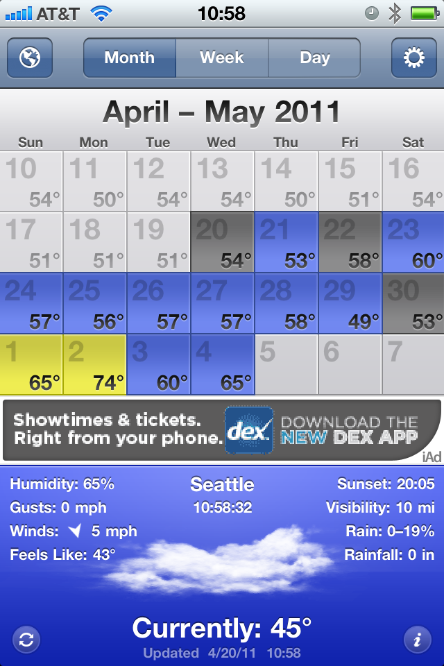
    [](https://f3a98a5aca88d28ed629-2f664c0697d743fb9a738111ab4002bd.ssl.cf1.rackcdn.com/weathersnitch.png)

    ### [Fahrenheit](http://itunes.apple.com/us/app/fahrenheit-weather-temperature/id426939660?mt=8) ###

    This app has been making the rounds lately for its novel ability to display live temperature information on the apps icon by way of badge notifications (the little red bubble with a number in it). The app is $0.99 and universal. The interface is clean and uninspiring. You get nine days worth of forecasts in a scrolling view and tapping any of those days gives you more information about the forecast for the day. Overall the data is presented in a very clean and fast manner.

    While I know that the badge notification is the main feature of the app — I wish you could turn it off. This would be a very good app without that badge indicator on it all the time. Turning it off in the notifications panel on the iPhone only resulted in stale information on the badge. The app only has one view, but I think it presents the data fairly nicely, but it makes point #2 above very had to glean. The current conditions are barely any more prominently displayed than the forecast data — that’s a losing proposition for me. 95% of the time I look at a weather app it is so that I know what the weather is like right now.

    [](https://f3a98a5aca88d28ed629-2f664c0697d743fb9a738111ab4002bd.ssl.cf1.rackcdn.com/fahrenheit.png)

    ### [Weather+](http://itunes.apple.com/us/app/weather/id403692190?mt=8) ###

    This app is made by the same company as the last, and this app is pretty weird — costing another $0.99. The entire experience feels more Android like than it does iOS. You get a series of widgets (which you have very minimal control over) that are overlaid on top of a moving image that rotates based on current weather conditions. The whole app is just not my cup of tea — from the non-standard UI to the ugly icon.

    [](https://f3a98a5aca88d28ed629-2f664c0697d743fb9a738111ab4002bd.ssl.cf1.rackcdn.com/weatherplus.png)

    ### [WxQuickie](http://itunes.apple.com/us/app/weather-quickie/id399072639?mt=8) ###

    This is an odd app — a niche app much like Thermo — it is free and only shows you the weather information for the day. Instead of telling you precise numbers you get something that says “Today will be *much warmer* than yesterday.” That’s definitely a niche market. You can, in fact, get tomorrows forecast shown in the same one sentence line by hitting a little button. Once you do that though the only way to get back to the current weather is to let the application “find” your location once again — yes, there is no back button. There is also a tastefully done add along the bottom that blends very nicely in the app. (The icon is ridiculous.) I rather like the app, but I don’t see it being very practical for people that live in areas that have different weather on different days (if you live where it is always sunny, then this is perhaps all you need).

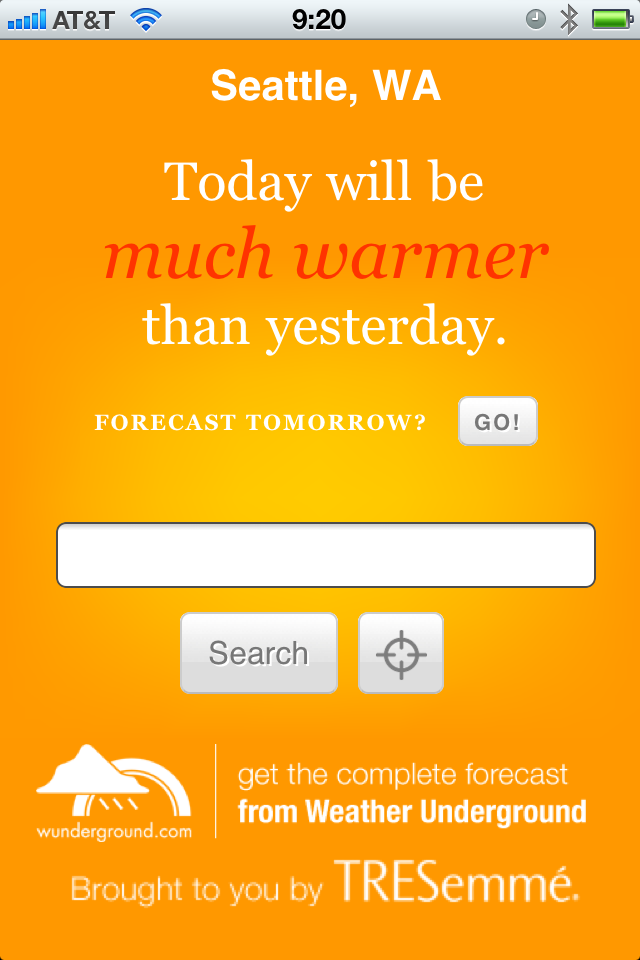
    [](https://f3a98a5aca88d28ed629-2f664c0697d743fb9a738111ab4002bd.ssl.cf1.rackcdn.com/wxquickie.png)

    ### [The Weather](http://itunes.apple.com/us/app/the-weather/id351064928?mt=8) ###

    This has the most impressive icon of the bunch and the most UI chrome as well — it was also recommended by many with the caveat that it is slow and crashy, sounds great. It’s going to set you back $0.99 to use and for that you get a very fragmented weather app. There is a series of tabs along the top that fragment data other apps show on one screen. The first screen tells you the current conditions, which doesn’t include wind or temperature. Next you get the temp, then humidity, next up is wind speeds and direction, then the six day outlook (which surprisingly has all the data that was broken apart for each day), then you get any weather alerts, and lastly you have a nice doppler map. This is a rather cumbersome way to view the weather and while it is all presented very nicely, it is anything but quick to see this information. I am passing because I feel like I would need to update the app and start over by the time I get done seeing all the original information about the *current* weather conditions.

    [](https://f3a98a5aca88d28ed629-2f664c0697d743fb9a738111ab4002bd.ssl.cf1.rackcdn.com/theweather.png)

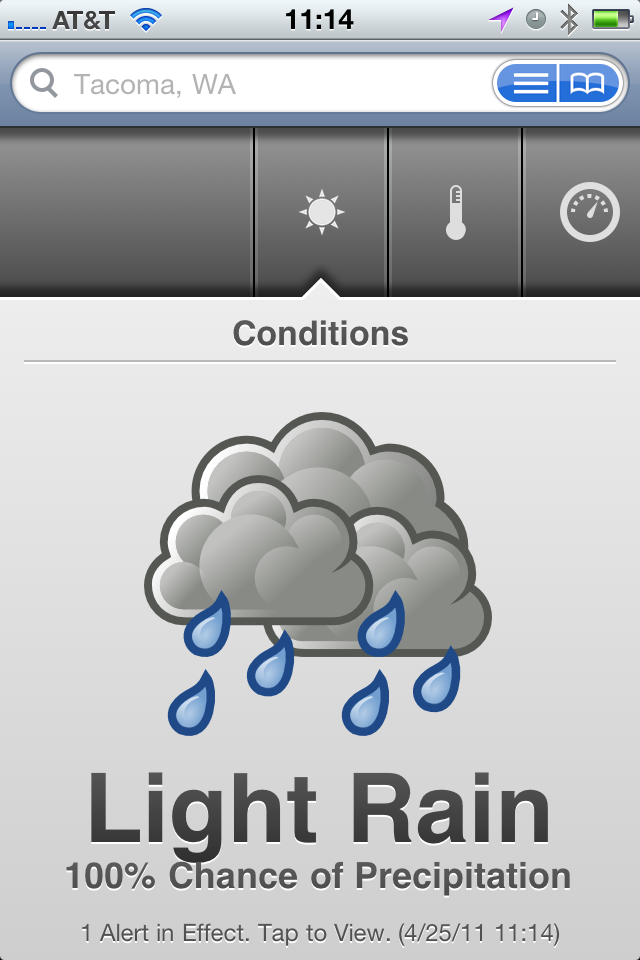
    ### [The Weather Channel](http://www.weather.com/mobile/pda/iphone/) ###

    This is a pretty generic free app — the data I have always found to be spot on, but the look of the UI has always been something just shy of terrible. Nothing has changed, but in a pinch this is an app I know that I can go to that will give me fast, accurate, information. It’s good, it’s better than the stock weather app, but it is not great by any definition — mostly the UI is hideous and I have always found the doppler maps to be very slow.

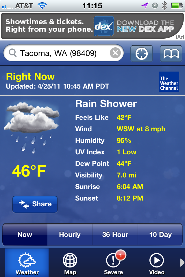
    [](https://f3a98a5aca88d28ed629-2f664c0697d743fb9a738111ab4002bd.ssl.cf1.rackcdn.com/theweatherchannel.png)

    ### [Weather!](http://itunes.apple.com/us/app/weather/id399987733?mt=8) ###

    It uses Marker Felt. It has iAds. Hitting the info tab actually brings up relevant weather info that you would expect to be a part of the main view. This isn’t very good at all.

    [](https://f3a98a5aca88d28ed629-2f664c0697d743fb9a738111ab4002bd.ssl.cf1.rackcdn.com/weatherbang.png)

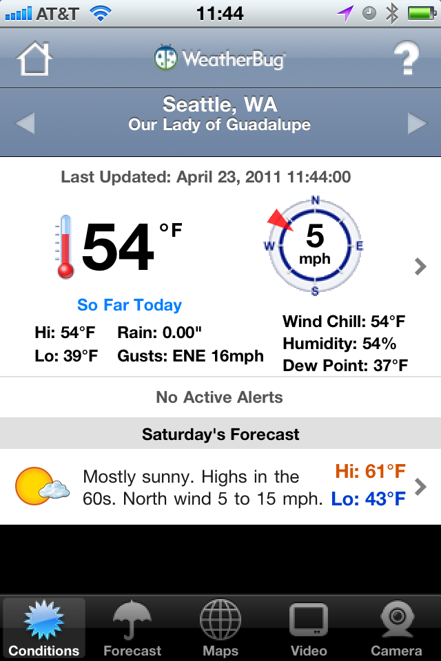
    ### [WeatherBug Free](http://itunes.apple.com/us/app/weatherbug/id281940292?mt=8) ###

    This is the only app that needed a progress bar to find my location — why? Not all of the graphics are optimized for the retina display. The graphics are a bit cheesy looking, but the data presented in the initial view is adequate. The forecast tab is anything but great. While a synopsis for upcoming days is given (nice touch) the data requires too much scrolling, making it hard to get a general idea of what the weather will be like — typically I just need a general idea, not a day by day detail.

    [](https://f3a98a5aca88d28ed629-2f664c0697d743fb9a738111ab4002bd.ssl.cf1.rackcdn.com/weatherbugfree.png)

    ### [Weatherbug Elite](http://itunes.apple.com/us/app/weatherbug-elite/id310647896?mt=8) ###

    Many people recommended this over the free version, so I gave it a go. My thoughts are the same as the free version, just minus the comments on iAds.

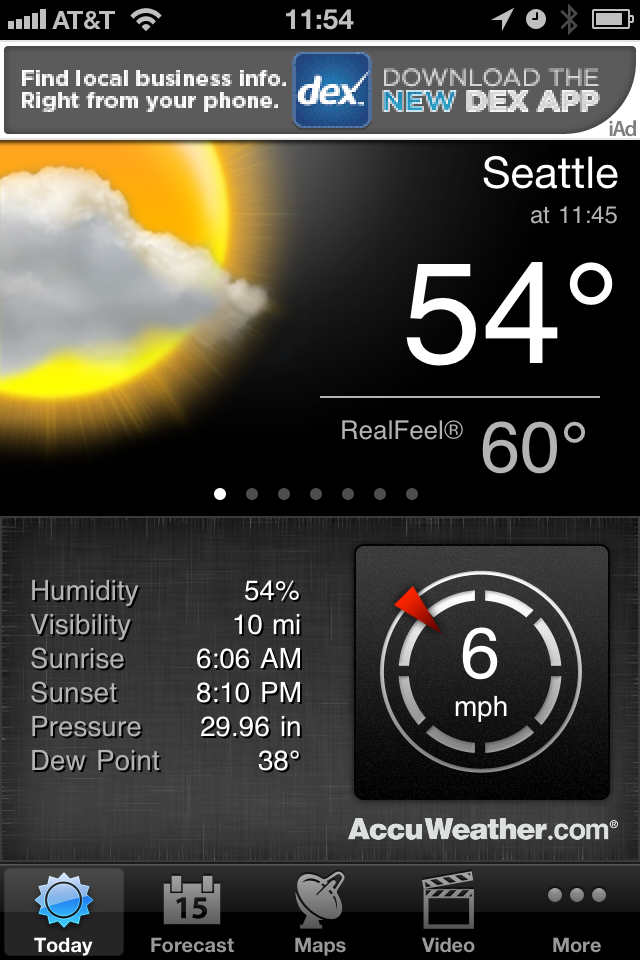
    ### [AccuWeather](http://www.accuweather.com/iphone.asp) ###

    First things first, you have to agree to the ToS for the app before you can use it — not sure why, this is after all a weather app. This is also the only app that didn’t find my current location by default, forcing you to go into the settings to add your location and delete the default ones — that seems a bit antiquated to me. There is an iAd along the top, a bit distracting, however I really like how the data is displayed in this app. The current temp and conditions is clear and very crisp. Extra niceties are shown like, sunrise and sunset, wind speed, and others. A quick swipe brings up the hourly data without leaving the main screen. There is a full week forward outlook and the data is again displayed very cleanly. Tapping forecast days gives you a bit more information and the large condition graphics allow you to scroll quickly to get an idea of what the weather will be doing. For me though I can’t get a sense of trends quickly and I still have to stare at an iAd.

    [](https://f3a98a5aca88d28ed629-2f664c0697d743fb9a738111ab4002bd.ssl.cf1.rackcdn.com/accuweather.png)

    ### [Pocket Weather](http://itunes.apple.com/us/app/pocketweather-1-weather-app/id375727893?mt=8) ###

    This is by far the slowest of all the apps tested to get new data. The graphics are very cheese ball as well. Honestly this app isn’t very good. There is an iAd along the bottom and the graphics are goofy and don’t allow you to just glance at them to see what is going on. The font is too small and makes it hard to get data fast.

    [](https://f3a98a5aca88d28ed629-2f664c0697d743fb9a738111ab4002bd.ssl.cf1.rackcdn.com/pocketweather.png)

    ### [Weddar](http://itunes.apple.com/pt/app/weddar/id431659526?mt=8) ###

    Weddar is a new entry in the overly crowded app store market for weather apps. It is social, so it is crowd sourced information. It’s a great concept — except there are no users. Here’s all I got out of it:

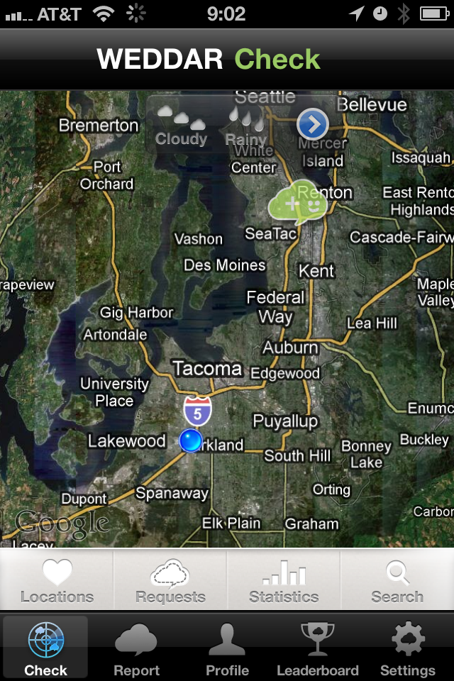
    [](https://f3a98a5aca88d28ed629-2f664c0697d743fb9a738111ab4002bd.ssl.cf1.rackcdn.com/weddar.png)

    Testing out the app the next day I got three more bubbles for a total of four — that’s just not going to cut it for me.

    ### [Mercury](http://itunes.apple.com/us/app/mercury-worldwide-weather/id308794306?mt=8) ###

    Mercury is like a new twist of Thermo — you get the current temp in large text, the progress of the day (meaning dots to represent how far past sunrise you are, and obviously how close to sunset you are). A nice little graphic to tell you what the conditions are (rain, cloudy, sunny). Your location and a tab bar at the bottom. Swipe to the left and you get tomorrows forecast. Tap the temp and you get today’s forecast (highs and lows). Tap the information tab and you get a ton of details for today’s weather, love it. Here’s the thing, I love this app — more so that I do Thermo — but it’s not THE weather app for me since I would still need two apps.

    [](https://f3a98a5aca88d28ed629-2f664c0697d743fb9a738111ab4002bd.ssl.cf1.rackcdn.com/mercury.png)

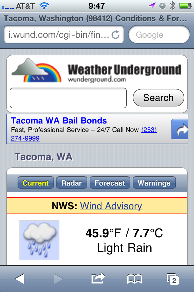
    ### [Weather Underground Web App](http://i.wund.com/) ###

    This was recommended a few times so I “installed” it — being that it is just a mobile webpage, I added it to the homescreen. It is quick and provides a lot of detail and information — none of which is easy to pick out. This is an app for people who want to read about the weather, not for people who want to glance at the weather — I am a glancer. That’s neither good or bad, it just is. The tap zones for switching between current and forecast are also uncomfortably small for my fingers, overall though this is a nice little web interface.

    [](https://f3a98a5aca88d28ed629-2f664c0697d743fb9a738111ab4002bd.ssl.cf1.rackcdn.com/wund.png)

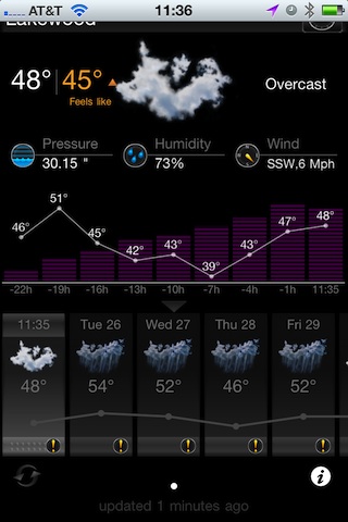
    ### [My-Cast](http://itunes.apple.com/us/app/my-cast-weather/id348779486?mt=8) ###

    This app is a bit hard to find in the app store and is priced at $3.99, which initially turned me away. At the recommendation of more than a few people I purchased it. I like the opening screen — showing me the current conditions and temperature in larger type. There is a nice bunch of additional data like wind speed and pressure. Scrolling down you get historical averages and the highs and lows for the day that have been recorded thus far.

    The forecast tab is where this app really earns its money — it only shows you six days into the future, but the data is very scannable to see what the weather will be doing. Most importantly, is the landscape view — you get a graph that shows you the temperature as a bar chart over the forecasted period, which very quickly will allow you to get a sense of the weather trend. Awesome.

    This app also has the best and fastest doppler radar map integration I have seen — which is to say that it actually works. The graphics are just OK in the app and the icon is rather poor. Having said that, this is the best of all the weather apps I tested and my new go to. I also like that the current temperature is shown in the tab bar so that you always know that while looking at the other data — a nice touch.

    [](https://f3a98a5aca88d28ed629-2f664c0697d743fb9a738111ab4002bd.ssl.cf1.rackcdn.com/my-cast.png)

    ### Weather Apps In General ###

    The main problem with weather apps is that there are too many and 99% of them suck. That means finding the gems, the useable ones, is incredibly difficult and often expensive. Part of the problem that is leading to this clutter is how freely available weather data is — you just need to design the presentation, no gathering of information is really needed since you just pull it from APIs.

    Most apps try to add too much eye candy, instead of thinking about what the users of the app really need and want to see. There are some very good single purpose offerings like Thermo and Mercury, most though are cluttered messes that have an ad stuck somewhere on the screen. Most are pretty bad.

    As I said My-Cast is the best of the lot that I tested, but it is far from being perfect. I would love to see someone take a weather app seriously — for now though My-Cast will be on my homescreen.

    *Apps recommended to me, but not tested:*

    – Stock Apple weather app (never have liked it).
    – [Weather HD](http://itunes.apple.com/us/app/weather-hd/id364193735?mt=8). While beautiful, I have it for the iPad, it’s not what I want for my iPhone.
    – [WeatherStation](http://itunes.apple.com/us/app/weatherstation-free/id376368426?mt=8). Great app, but again not what I am looking for.
    – [Outside](http://outsideapp.com/) app. It just looked so damned goofy from the screenshots I couldn’t bring myself to download and pay for it.

    [Updated: 4.26.11 at 3:12 PM]

    Here’s a follow-up post to this one, touching on somethings I left out.

  • Turning Left

    As humans we have the tendency to fall into routines — routines which can become rather boring — more importantly routines that give us little reason to “Think Differently”. We drive the same route to and from each place, we work at the same desk, at the same computer, at the same chair. We stare at the same colors, wearing the same seven outfits — which often consist of just a few colors. We have the same conversations with different people, and different conversations with the same people.

    It’s all habit and habit is boring.

    I am prone to falling prey to habits, just the same as everyone else. When I catch myself stuck in a habit — stuck in a routine — I pull myself back into the interesting world of spontaneous. I buy a shirt or a pair of pants that don’t blend with the rest of my clothes — that don’t fit the preconceived image of me that I store locked away in my brain. Most importantly, to me and to my life, I change up the routes I drive.

    I turn left where I would normally turn right. So what if it adds fifteen minutes to my drive, those are going to be fifteen interesting minutes. You are going to pass things you don’t normally see and in turn you are going to excite parts of your mind that we rarely use any more — the parts that help us to navigate.

    I drive 45 minutes to work and 45 minutes home from work, four days a week, every week. I drive countless other places during everyday of every week to go to places like: buildings I manage, drug store, liquor store, grocery store, take-out, bank, restaurants, bars — the usual places for any 28 year old guy living in Seattle. What I try to do — much to the annoyance of my wife — is to occasionally take the road less traveled.

    The fastest way for me to get to work is to turn left, then right, right again, merge onto I5, take the exit, turn right, right again, right yet again, then left and left. I’m there. Some days I turn in the opposite direction or take different exit, somedays my life is a little different.

    I won’t sit here and tell you that on those days I am better at my job, or that I am even happier. I won’t tell you that I get any real meaning out of changing how I get from point X to point Y — but I do know that it doesn’t hurt me. Sure, it takes me an extra 5 minutes to get somewhere — big deal.

    If “variety is the spice of life” then turning left where you turn right is anything but bland.

    People often ask me how I think of topics to write about, or how I find the motivation to do “so much”. The truth is: much of the ideas I come up with are arrived at while I am driving somewhere — and I can’t help but think that, in some small way, this is because I turned left where I should have turned right.

  • Quick Takes on Five Apps #10

    This is the tenth [installment](https://brooksreview.net/tag/quick/) of the Quick Takes series, where I look at five apps and tell you my thoughts on them.

    ### [World War](http://www.storm8.com/games/world-war/) (iPhone) ###

    This is a game that, from the icon and splash screen, makes you think that you are getting a first person shooter. Then you get into the actual game and you think you are playing something more akin to Risk. Except that there is no description for what this game is and overall it is just not that great. It can be addictive if you have friends that you can form an ‘alliance’ with, but you can’t discover that in app. Leaving you to type in these random alliance codes. Overall I’d pass on this game. The game play is a lot of automatic button pushing with a slight amount of strategy applied to what you “spend” your fake money on (unless you use in-app purchase to turn your real money into fake money).

    ### [Evernote](http://www.evernote.com/) (iPhone) ###

    It’s been a long time since I last used Evernote (Aug 2009), but after seeing how far the mobile app has come I decided to give it another try. While it’s really not for me (text files FTW), Evernote has done a fantastic job revamping their mobile offering. If I was someone who took a lot of pictures of text (white boards, labels, papers) then I don’t think there really is a better option than Evernote. It is much quicker and much better looking (aside from the icon) than past versions. Worth a look if you left Evernote because of the poor mobile offering back in 2009 — I really like the Loren Brichter styling on the new note entry fields.

    ### [Flight Track Pro](http://www.mobiata.com/apps/flighttrackpro-iphone) (iPhone) ###

    This is an oldy, but goody. I have been using it for quite some time now and you can’t beat this app for tracking your flights (or those of people you are picking up from the airport). The best feature: the ding-dong sound it makes when sending you push notifications, love that identical to that ‘fasten-seatbelt’ chime you hear on the plane. I have found that the data for when the flight landed (not the time it will land, but whether it is landed already) is always wrong. Always.

    ### [Easy Release](http://itunes.apple.com/us/app/easy-release/id360835268?mt=8) (iOS Universal) ###

    If you are a photographer that ever needs to get a model release or location/property release — you might want to give this a look. It’s not the best UI, in fact it really sucks. But it gets the job done without paper. Both people can sign on the device and have a pdf emailed to them. I can’t speak to how strong the contract is from a legal perspective — but this app has saved my butt quite a few times when I forgot to bring a model release with me. I also like that the models info is saved in the app for quick creation of a new release when needed. Good stuff. (Again the icon and app itself needs a lot of love from a designer.)

    ### [Mactracker](http://itunes.apple.com/us/app/mactracker/id430255202?mt=12) (Mac) ###

    Did you know that the Macintosh Centris 660AV was released July of 1993 for a price of $2,300 and weighed in at 14lbs? I didn’t either, but Mactracker does. Sure you can get some of this info from Wikipedia, but having it all in one place for every Apple product is quite awesome. It’s also a free app so you really can’t go wrong. A great thing to play with is the timeline view to see what Apple launched on a year by year basis. Neat stuff to play with, especially if you write about Apple.

    *If you liked this installment be sure to check out the other [installments](https://brooksreview.net/tag/quick/).*

  • Butcher’d Twitter-Tweetdeck Analysis

    Mike Butcher wrote this article for TechCrunch and the entire article makes no sense. I also couldn’t disagree more. Let’s take a look, shall we?

    Butcher on the importance of Tweetdeck’s users:

    >But as any journalist or social media expert will tell you, these are power users, producing many of the most influential content. Indeed Cornell University and Yahoo! Research found that a tiny minority of users – around .05% of the site’s population or 20,000 elite users – are generating around half of all the Tweets. These are divided into celebrities, media, organisations (such as Google) and blogs.

    What Cornell and Yahoo! didn’t say is that these users are using Tweetdeck, apparently though we are just to assume that since the two sentences were put next to each other. Also, where’s the citation on either of those statements… but I digress.

    So apparently Twitter is good because of the people that use Tweetdeck — sorry but I am not buying it. Twitter is not good because it has celebrities tweeting — if that’s what you think makes Twitter “good”, then I would strongly suggest that you don’t, in fact, understand Twitter.

    Here’s Butcher’s opening salvo — his argument for Twitter to buy Tweetdeck:

    >The question is this: What is it worth to Twitter to keep Tweetdeck out of Bill Gross’ hands? For in Tweetdeck lies the balance of power in the Twitter eco-system.

    In other words the argument he is trying to make is that Tweetdeck is the most important 20% of the all Twitter users. That simply is not true. I took a look at the people I follow and the tools they use to tweet — the only ones on Tweetdeck are Windows users that I follow. If those people disappeared from my Tweet stream I would not know as much about the Mariners as I currently do, and I would be lost on the current tiredness of some of my favorite celebrities. That would be a bummer, but it actually would probably make Twitter *more* useful for me. For *me*, though, just *me*. ((Oh, and everyone else who needs less crap in their lives.))

    >So if Uber becomes the owner of Tweetdeck, the most valuable 20% of the audience would not be owned by Twitter.

    That makes no sense — Butcher is arguing that Ubermedia would be able to hold a “.44 magnum” to Twitter’s head. That’s just stupid, here’s how a scenario would actually play out if Uber bought Tweetdeck and tried to strong arm Twitter:

    Uber: We are serving our own ads in Tweetdeck now.
    Twitter: That’s against the rules and we will lock you out of Twitter if you do so.
    Uber: Then we will create our own network and force Tweetdeck users to use that network. Do you really want to loose 20% of your user base?
    Twitter: (laughing)
    Uber: We are very serious. WE own Tweetdeck.
    Twitter: We just launched a native Windows client that doesn’t run off Adobe Air and looks beautiful, designed by Loren Brichter, heard of him? Have a great day.
    Uber: Shit.

    That’s a more likely scenario, but why? That’s easy — celebrities and “social media experts” (read: marketers) aren’t going to waste their time spamming each other with Tweets. They want access to their fans and their customers — they get that access with the “other 80%” of Twitter users. Proof: ask MySpace how well their service worked out for them when the only people left were no-name bands…yep.

    >If Uber buys Tweetdeck, Twitter can eviscerate their business by shutting Uber off (and a large swathe of their top users). Or they come to a deal, based on Uber’s terms.

    Yeah right. What’s more valuable in the Twitter ecosystem: 100 followers that are all “power users”, or 10,000,000 followers that are regular people?

    I think you get the point.

    The bottom line is that Twitter is valuable because:

    1. Popular, influential people use it.
    2. A ton of regular people also use it.
    3. People in point 1 can connect to people in point 2.
    4. People in point 2 can connect to people in point 1.

    The popularity **and** scale of the service is what makes it good, not any one subset of users. To make a rival service that stands any chance of survival would need both the influential users **and** the 180 million other users.

  • Bullet Point

    Growing up there was really only one bullet point on computers that I cared about: clock speed. I knew that the faster the CPU, the faster the computer. This drove my buying decisions (rather, my guidance of my parents buying decisions) for many years — this also lead the buying decisions of many consumers during this time as well. CPU speed was the horsepower benchmark for the computer industry. Yet, as true car fans know, horsepower is only one component of a fast car, but it is — none-the-less — an important factor.

    In college I learned about the magic of 512mb of RAM and as the clock speed boom slowed (as did my income), RAM became my go to benchmark — if the CPU was decent I knew that juicing the RAM would lead to a nice performance pay-off. I laughed at anything with less than 512mb of RAM — what a joke to use any less RAM. Of course RAM is more like a good car suspension — like horsepower it is important — but not the determining factor of the race, it’s what helps you get that horsepower down to the road. It also just so happens that both suspension changes and RAM changes are a bit cheaper than adding more horsepower. ((This, as I am sure I will get emails about, is an over generalization. I am simply saying that adding performance shocks, lowering springs, strut braces and the like can be bought at different times for less money each time — whereas most upgrades that truly boost HP cost a great deal all at once.))

    Later in college, and post-college, it came down to software. I switched to a Mac with less RAM, a slower CPU and yet the computer still felt faster. The only explanation had to be the software I was running — Mac OS X now instead of Windows 2000 — all the hardware was the same, if not slower. ((I am omitting the obvious difference between PowerPCs and Intel, because in the end I think the PowerPC architecture was actually slower at that time. As somewhat evidence by the tremendous speed boost when Apple moved to Intel.)) If we stick to the car metaphor I think the software aspect of computers best represents the driver. Where a good driver can make a slow car faster, just as good software can make slow hardware faster ((More of a *feel* faster than actually making the hardware faster. That it is, the software is fully utilizing the hardware.)) . We inherently know that Michael Schumacher can drive our car faster than we ever could ((Most of us, that is.)) .

    A year or more ago I discovered SSDs and just how much faster they can make your machine. It is, still, the biggest performance boost you can do to your computer. If I had to be forced to put a car analogy on SSDs I would have to say that it is akin to switching from an automatic gearbox to a sequential-manual gearbox used in F-1 cars, it helps in all instances of racing.

    With Intel busily trying to obscure the true speed of their chips, GPUs satisfactory for all but the power users, SSDs starting to become main-stream ((Thanks MacBook Airs.)), most computers coming with plenty of RAM from the factory, and most software reaching excellent optimization levels (certainly on the Mac side of things) — what now is the benchmark upon which a nerd can fixate?

    I give you: **Battery life**.

    If you go to buy a new phone, laptop, tablet, or gadget today, I would guess you are pretty concerned with how long that battery will last and less so about CPU speeds, and RAM sizes. The really interesting thing about battery life is just how dependent it is on every single factor I talked about above. To get good battery life you need optimized hardware and optimized software (a large battery cell helps as well). Everything that we have cared about in the past has now lead us to the point where we can care about the one thing that is more annoying than memory swapping and slow boot times: carrying power cords.

    ### Why This Matters ###

    Battery life matters because we need to be able to use our computing devices when and where we want — tablets with a 2-hour battery life makes doing so, very challenging. Battery life matters because we don’t want to be the guy in the meeting unravelling the extension cord and power brick. Battery life matters because if your cellphone dies, you are — effectively — cut off. Battery life matters because both airplanes and coffee shops have too limited a supply of power outlets.

    Battery life is the new benchmark — it’s the first thing that I look at on any new piece of hardware. We can now, finally, make the reasonable assumption that both the hardware and software is fast enough on most devices — so now what matters is portability — with battery life being the bullet point at the top of the list, set in **bold**.

    When I read reviews and I see that a MacBook Air competitor struggles to get 6 hours of battery life, I chuckle and dismiss the product. Crazy right? I bet you do the same — when you heard that the HTC 4G phone only gets 4.5 hours of battery life — I bet you thought: “no way I want that”.

    Rightfully so.

    The real change that has happened is that all software is pretty decent at this point (Yes, even Windows 7), all hardware is pretty equal ((For the average user, they don’t notice the small speed difference — unless you are thinking netbooks, those still suck.)) and most all machines come with enough RAM to do most all but the more serious work. That really only leaves design and battery life to compete on — well pricing too I suppose.

    Having the battery life I do on my MacBook Air makes me feel like I got a two-year old F-1 race car with the fuel efficiency of a Prius — in other words: awesome.

    In fact, we are so intrenched in our feelings that batteries are just not good enough, that more than 50% of my Twitter followers charge their phone nightly, regardless as to whether they need to recharge. ((I started only charging every other day, unless I have less than 50% battery life left when I go to bed.)) I don’t think this is really representative of the actual device’s battery performance ((Except for Android, as respondents often said multiple times a day.)) instead I think is has to do with something that Liam over at Remacable [touched on](http://remacable.com/2011/04/07/old-habits-and-living-in-the-future/):

    >When my iPad tells me it has 40% battery remaining, I get anxious. I start wondering where the charger is. If I’m watching video, I wonder whether I should turn off the wifi radio. If I’m reading, I consider turning down the screen brightness. I can’t help myself. This is, after all, decades of learned behavior.

    We have been so used to crappy battery life for so many years, that now we freak out when a battery that lasts for 10 hours shows only 40% remaining (meaning 4 hours battery life left). He’s not alone, last night my iPhone 4 was at 10% battery life and I only had another 20 minutes before I went to bed — yet the prospect of the battery reaching single digits before then was very unnerving.

    This is why, when I look at the mobile computing space (Laptops, Tablets, Smartphones), it is hard to see anything but Apple as the clear winner. People are going to realize that with Apple they only need to charge their devices, at most, while they sleep (for the most part, perhaps not quite yet for some iPhone users). Thus far it is hard to make that case with most any other mobile computing device on the market — certainly not at the price points of the iPad, iPhone, MacBook Air and in their corresponding size. ((Extended battery packs are a joke and they are a reason not to buy a device — if the manufacturer sells an “extended” battery, walk away.))

    Apple isn’t doing anything magical with battery life — they just make it a priority, and it needs to be top priority. No one really cares about how much RAM your phone has, or how many megapixels the camera shoots — what people care about is if, when they go to use the device, it works like they want and need it to. They care that they don’t have a depleting battery and have to start shutting off “features”.

    I think the new plateau, the new bullet point, is becoming battery life. Notebook manufacturers, tablet manufacturers and phone manufacturers want to build and sell devices that have a battery that will last all day with continuous use. I want that too.

    I think we all do.