Category: Articles

  • Businessweek for iPad

    I have to admit that I have been a long time fan and reader of Businessweek ((I refuse to add that Bloomberg bit, I didn’t add McGraw-Hill when they owned the publication.)) . When I saw that they had an iPad app out, well, I shuddered to think what it would be like. There are just no good apps where a publisher takes a popular periodical and ports it to the iPad — they are either overpriced, or just don’t have some of the more obvious features (like selecting text). Imagine my surprise then when I downloaded this app and found out that it really is not *that* bad.

    This is no great app, this is not the model that all other publishers should follow on the iPad. What it is, is a very good app and one that lays good framework for apps to build off of. More importantly it is probably the best magazine app on the iPad right now.

    The key it would seem is to not think about how you would port a magazine to the iPad, but how you would view the same type of content on the iPad. It is an important difference and one that I think Businessweek at least thought about, though this approach feels more like a hybrid — porting and re-thinking. There are some good bits and some head scratchers.

    ### The Text ###

    One thing that immediately caught my attention about this app is the text is not an image. So often you get PDF images of actual magazine pages, with this app you get real text. Real text that you can select, and copy and paste elsewhere. One of those things that you would think would be an obvious addition to such an app, so it is nice to see that it as actually available in the app.

    Even better, you can increase and decrease the size of the text — again seems novel, but not standard issue in many of these apps. Nice to see that in there for people who actually want to read and use the app.

    ### Download & Price ###

    Like most magazine apps the app is actually free to download — once you get in the app you will have to cough up some money before you get any content. Where Businessweek differs for everyone though is on the pricing model: just $2.99 a month for weekly editions of the publication (I actually believe you get 54 issues in a full year). That’s a killer price, but not better than a paper subscription — for an iOS magazine it is a steal. It is $4 an issue for back issues, which isn’t great, but given the news nature of the articles there will hardly be a time when you want back issues. Unless you want to read about potential out-dated and often very wrong opinions. ((I saw often wrong because it is more likely that people can’t predict the future, then it is that people can see the future.))

    The downloads are also significantly faster than most apps — I hear they weigh in around 100 MB — not great, but not the 500-600mb that Wired has. This is going to be a major concern for apps like this as users are not likely to want to try and download this over their 3G connections. Therefore I probably wouldn’t be able to use this app on an airplane unless I thought about downloading the current issue in advance. In all likelyhood these magazines could shave a lot of space off if they streamed the videos instead of embedded them. This would be a negative when you are on WiFi, but I would guess that most users would be fine with that as it would allow for smaller downloads.

    ### Navigation ###

    The navigation isn’t at first obvious and at times it is hard to know if you skipped over an article. If you start by swiping right to left to advance the view, you feel as though you are thumbing through the articles. Once you get out of the “opening remarks” section though you stop moving between articles and start jumping through sections. This I still find rather confusing and often forget that I need to click and article to enter into that viewport.

    What is neat though is that the navigation isn’t linear. You can skip to different sections which are conveniently listed along the top as tabs. Once in a section you can view the articles, and skip between them. Of course you can also just move through the entire issue page by page if you want (works best in portrait view), but as I said above you need to make an extra click at the start of each new section. Again the navigation isn’t always obvious, but they added nice arrows everywhere to help direct you around the app — these arrows are both obvious to see and not distracting, rather well done.

    One thing that I really do like is that the app shows you how many pages an article is and what page you are on — the app also shows how many articles are in a section and which article you are on (1/9 or 3/5 articles). Things like that show that the developers looked at how people like to read things, and showing these status updates is very nice when you are trying to figure out if you actually have time to read an article.

    ### Readability ###

    The body copy isn’t set in Helvetica, which means that overall the text is pretty readable ((I find small Helvetica print on the iPad to be less that desirable from a readability standpoint.)) . It isn’t perfect, there isn’t a font that has been designed for iPad use — but it does a great job at keeping the text from being cluttered and unreadable.

    One thing that I wish the app did is change the column width when you increase and decrease the font size. The column widths are very comfortable on the smallest font size — go any larger and things start to look a bit comical. On the largest font size the average line (in landscape) holds between 5-6 words. If you need larger text you would be better suited to the portrait reading orientation as it looks better in the single column view.

    A note about using the app in portrait: articles are no longer paginated and instead scroll.

    To my eye the line-height could be a bit larger, but it is not uncomfortable to read. I do like the mix of Helvetica and (what seems to be) Georgia, it is nice to see the two classics paired with each other. It is also nice that they are both reserved for special roles (where Helvetica seems to be more informational and navigational and Georgia is set where you need to stop and read things).

    ### Social Crap ###

    You can share snippets and stories by email, Twitter, or Facebook — nothing special here, but again very nice to see these options in the app from day one. Having said that, the Twitter integration has yet to work for me.

    My biggest complaint here is the layout of the email text. You send an email and it looks like this by default:

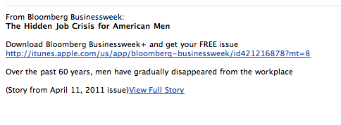
    The problem here is that the biggest and most obvious link will cause you to download the app, instead of taking you to the story being shared. The small link almost forgotten at the bottom will pop the story open in the browser. What if I have the app installed on my iPad already, and I open the email on the iPad — you mean to tell me I can’t just open that link in the app, instead I have to read it in Safari? That’s kind of lame.

    Luckily you can edit this text and help delete the irrelevant crap they add in — still that should be the default, putting that obligation on the user. Is the goal to get more readers, or more downloads of your app in iTunes?

    ### Missing ###

    One thing that still kills me is that app supports swiping gestures, but not pinch-to-zoom gestures. I would love to be able to zoom in and out of text with multi-touch instead of having to select from three different font sizes. This is a minor annoyance, but I find it silly that it is not in there given the multi-touch nature of the iPad itself.

    ### Overall ###

    Overall I really do like this app — in part I think that has to do with my long term readership of the publication. It is also just a great little app to sit down with and peruse through. All the content is available on the web, so it’s not that special, but there are some nice things about the app. Not the least of which is a nice forward thinking pricing model. Here’s hoping they start a trend of periodicals for $2.99 a month on the iPad.

  • AppSuration and Unique Traits

    #### App Saturation and the Lack of Unique Features ####

    On [episode #8 of the B&B Podcast](http://thebbpodcast.com/2011/04/episode-8/) Shawn Blanc and I discussed the hottest new Twitter client: [Tweetbot](http://tapbots.com/software/tweetbot/). While I have yet to decide if I like Tweetbot any more, or less, than I like the official Twitter app — I did note two annoying things:

    1. The app doesn’t have the “one” single feature that is unique to it.
    2. The app feels like a nice wrapper of eye candy applied over the existing apps out there (mainly the official Twitter app).

    This though is a very common problem that I see over and over in the App Store and I think it comes from the amount of saturation that app categories like RSS feed readers, note taking apps, and Twitter apps are experiencing. It’s not a factor of bad development — it’s [groupthink](http://en.wikipedia.org/wiki/Groupthink), or perhaps more accurately lack of innovation.

    ### Being Unique ###

    I don’t want to pick on Tweetbot, but it is one of the best examples of what I am referring to, it enters a very well populated landscape — Twitter apps for iPhones. What is fascinating is that if you really boil an app like Tweetbot down, there is no innovative feature — there is not a single feature that you can point to and say: “yeah you only get that on Tweetbot”. Yes there are uniques gestures, and taps, but those are all performing the same basic actions as other Twitter apps.

    It is not that Tweetbot is the same as every other app, its just that Tweetbot is like a new Honda Civic — it’s new, but it’s not really *new*. Still a great car, but hard to say if it really is any better than the last model.

    You could also argue that the ability to set a list in place of your timeline is just such a unique feature, but I would argue that it is just a different way of showing the lists (instead of making me drill through a menu like the official app does, I can view these lists on the main screen — even though you still view them relatively the same once you find the lists). The two examples I gave in the podcast of good, unique, features was for [Twitterrific](http://iconfactory.com/software/twitterrific) and [Echofon](http://www.echofon.com/).

    The former has a unified timeline where you see mentions and DMs all in the timeline with your ‘normal’ tweets. That is something that (as far as I know) is only done in Twitterrific and while I don’t care for that feature, it is compelling to many users — it is a reason to buy the app — a way to differentiate itself from other Twitter apps.

    Echofon has a similar feature (one that it alone does not have) which is to sync the place of your timeline across all other Echofon apps that you are using (iOS and Mac). That’s a fantastic feature and one that has made me wish that the rest of the app was better so that I could use it. That’s a feature that is incredible compelling compared to the rest of the Twitter apps out there, it is more unique than it is common.

    Too often though — as I believe the case may be with Tweetbot — we get a new app in a crowded category that offers no unique feature, thus they just serve as more clutter. They may still be good and still look better than other apps, perhaps even they are cheaper, but if they weren’t in the store it wouldn’t be a huge loss, because they aren’t offering features that can’t be found in other apps.

    This type of problem is seriously apparent in the note taking app market where every app seems to sync with Dropbox and there is really very little difference between the apps out there. Writer for Information Architects differentiates itself with a crazy 3-line-only view and a custom designed, iPad optimized, font. Notesy gives the user the ability to switch between fixed width and variable width fonts. The built in Notes app gives you the ability to sync with iTunes…

    Why release an app if you aren’t going to *add* to the existing offerings something that will be truly useful to ,at least, a select few users?

    ### A Wrapper ###

    The last complaint I lodged against Tweetbot was that it just seemed like an incredibly beautiful wrapper that was put over the official Twitter app. That is, everything is too similar in layout and functionality ((Again, excluding those fancy gestures and tap controls.)) that it just seems like you are using the same old app with a lovely new theme applied.

    This all sounds rather horrible, like I am accusing people of swiping someone else’s work — that’s not what I am saying. It’s no different than if someone built another WordPress theme with the text down the left and a small menu on the right, but different colors and fonts — they aren’t copying the theme I use, they just employed a similar layout without a slightly different wrapper.

    The more likely cause is that they chose a similar layout because they liked the way it worked and the user familiarity with that layout. Nothing wrong with that — except that I have to again ask where they are adding value that didn’t already exist?

    We all like to theme things, but is such a theme really needed in a crowded marketplace?

    Is a Kia automatically better if it is made to look like a Ferrari? Perhaps to a few people who want a slow Ferrari, but to most I would guess they wouldn’t care all that much — most are buying a Kia for reasons other than looks. ((Over generalization perhaps, but they have killer warrantees with very low prices. I would think that this is the main reason people buy Kia’s, and not performance or looks.)) Especially if the one that looked like a Ferrari is a more expensive option.

    ### The Question ###

    Is your app a Ferrari, or does it just *look* like one?

    If you found yourself reading this wondering what compelling features a Twitter app could add, or that a note taking app could add — then you are asking the right questions. The questions that need to be asked before a developer starts coding a new app. This isn’t saying that Tweetbot is bad, or that it isn’t worth the $2 — all I am saying is that time and time again it seems I am testing the same app with an improved color scheme.

  • Quick Takes on Five Apps #9

    This is the ninth [installment](https://brooksreview.net/tag/quick/) of the Quick Takes series, where I look at five apps and tell you my thoughts on them.

    ### [Atari Greatest Hits](http://itunes.apple.com/us/app/ataris-greatest-hits/id422966028?mt=8) (iOS Universal) ###

    It’s junk. You can download it for free, but then you have to use in-app purchase to buy any of the good games. I bought Asteroids because I used to love that game ((My Uncle had the arcade game at his house and I remember spending hours playing with with my cousins. It’s a great game that this app ruins.)) and it is utter crap to the point of being unplayable. Not to mention the game doesn’t even take up the full screen, or in any way look like it has been optimized for the high resolution iPhone screen. The objects are tiny and the controls are non-sensical.

    ### [Prompt](http://panic.com/blog/2011/04/introducing-prompt-ssh-for-ios/) (iOS universal) ###

    The app icon is not blue and makes good sense, so right away this app has my attention. Overall I don’t have much use for a SSH app for iOS, but being that Panic made it, I had to try it. The app is well done and has an awesome feature: passcode lock. I don’t know why more developers don’t take the time to implement this option, but it is killer. I can store my SSH passwords in the app for quick logon, but make sure that most other people can’t access the app.

    Overall I don’t use SSH much, but with the recent server troubles I have been having it has been nice to have this app so that I can ‘check-in’ on my server. It doesn’t seem like there would be much that would make an SSH app good or bad, but Panic has done a great job with this app by adding terminal specific controls at the top of the keyboard. If SSH is your thing, then I recommend you take a look at this.

    ### [Moleskin](http://itunes.apple.com/us/app/moleskine/id429657255?mt=8) (iOS Universal) ###

    So the people that make the wonderful Moleskin notebooks have been adding a lot of crap to their offerings lately (things like bags and laptop cases) — this is another in that long line. I was excited to see the app as it allows you to add images to the notes, type text, and doodle. That sounds pretty neat for a free app, alas it took me 10 minutes to figure out how to draw on the page.

    In looking at this offering and all the stuff you have to enter before you get a note page open — well you are better off with many of the other free notebook apps, actually you would be better off paying for an app. One better implementation in this same style that I can think of is the Muji notebook app.

    ### [Blogsy](http://blogsyapp.com/) (iPad) ###

    I was excited to try this app after I saw some decent comments about it. It is a blogging app for the iPad, one of the rarer apps in the iPad store. Unfortunately it really isn’t that good. It is poorly designed, has a terrible icon and doesn’t give power users any of the features they would want.

    If the most important thing to you in a blogging app is being able to layout and style your post, then maybe you will like this app. Especially if you want to create media rich apps from the iPad. However, if you want to set the post slug, or even just add a custom field — then you are SOL. It feels like an app built by someone who doesn’t blog, but that wanted to build an app to suit what they *think* a blogger does.

    ### [It’s Friday](http://itunes.apple.com/us/app/its-friday/id427931660?mt=8) (Who Cares) ###

    A terrible, utter crap, misogynistic app. Made for a terrible, horrible song — that has an even worse music video. I feel so incredible bad for the app reviewer of this app. Please don’t download this — even as far as sound boards go it does a poor job. The audio sounds terrible and it is not faded in or out — just all around not good. I am so happy I can delete this now.

    *If you liked this installment be sure to check out the [other](https://brooksreview.net/tag/quick/) installments.*

  • Don’t Mimic Real-World Interfaces

    There have always been those few apps that insist on looking like their physical, real world, equivalent. Calculator apps, date books, calendars, note taking apps, “stickies” — you know what I am talking about. Despite there being better options out there, better ways of displaying the data, designers stick with the known representation of the tool.

    Now, though, Apple is taking it too far.

    If you have seen any of the screenshots linked across the web about the new iCal interface you know what I am talking about. If you haven’t seen those, iCal is looking a lot like it does on the iPad right now in Lion’s developer preview. It’s ugly, and we should be way past this style by now.

    I have [proposed a better calendaring solution](https://brooksreview.net/2010/09/sucky-calendars/) and [Marco Arment has talked about what he would like to see](http://www.marco.org/480805355) as well. The problem right now is that we have the graphics processing power and the design acumen to make realistic looking interfaces, and designers think they should make them look realistic.

    Who wants that?

    In theory, and perhaps in movies, this is a great look — in fact from an eye candy perspective it looks amazing. The problem is that these apps that mimic a real world interface make for pretty terrible computing interfaces. Real interfaces, those printed on paper for calendars, or molded out of plastic for calculators are static — computing interfaces are dynamic. The difference is that to make a sheet of paper show 7 days worth of appointments means that you have to print all seven days. Once it is past the first day it would be impossible to dynamically shift the content so that it keeps the seven forward looking days view. On the computer though this is easily done, yet no one does it — why?

    I guess it is because that is not how paper calendars work, and that is just a silly convention to stick with.

    In the early days of computing modeling interfaces, such as a calculator, after an actual calculator was very user friendly because users had a base understanding of how to work a calculator already. This lowered the bar for the prerequisite knowledge to use early applications. Ditto apps like calendars, datebooks and address books.

    Now, I would guess that most “new” computer users actually don’t know that these things are mimicking their physical counterparts — well they know in the sense that it looks like a physical good, but I doubt they every think: “I used to have a calculator just like this one”.

    How many teenagers today are likely to have ever owned or used a DayRunner? Mimicking these interfaces is not about creating a more usable interface, or about giving the consumer what they know — it is about creating eye candy, while the usability and productivity of the app suffers. Eye candy can aid a design and the usability — as it did with the first computer applications — more often though is forces the app to look and behave in a manner that is not very helpful to the user.

    Ask any person who has used [Soulver](http://www.acqualia.com/soulver/) for Mac or iOS if they think Soulver was difficult to figure out — it is leaps and bounds better than any other calculator app, yet it doesn’t look like any other calculator app. It took me all of two minutes to figure out how to work the app and to realize just how much better it is. What Soulver did was not try to replicate the beloved HP 12c, instead they rethought what a calculator app was to be — and how it should be designed if it is only made for use on a computer, from day one.

    It is what calculators would have been if they were invented at the same time computers were, instead of what we have with most calculator apps.

    ### Little Bits of Paper ###

    Brent Simmons [calls it](http://inessential.com/2011/03/31/torn_paper_derangement_syndrome_tpds_) Torn Paper Derangement Syndrome (TPDS) and I most certainly have it:

    >If this rumored new UI for iCal is real and not just a mockup by a misanthropic Photoshop sadist, then I’m going to be distracted forever by the bits of torn paper under the toolbar.

    When I used paper notepads in school I would take an Exacto knife to remove those bits of paper weekly — can’t stand it. It is a sign of a flawed product — one that is designed to tear with ease and perfection at the top, but that never lives up to its expectation, much like checks (remember tearing those out). Why remind everyone of the imperfect days of yore by bring that bit of imperfection across. That is akin to Microsoft deciding that Excel should stop calculating *pi* after 3.14 — stupid and pointless given the tools at hand today.

    Nobody misses those bits of paper. Nobody wants iCal to look like their Franklin Covey — people want it to work like that, but not look like that. That is: people love the feel of pen and paper and scratching stuff off, but that feeling is not best replicated through showing static, arbitrary, bits of torn paper. People love how organized they became with these old school paper tools, yet instead of taking that organization to the next level with computing we just get the same thing we had in paper form (less the paper cuts and waste).

    The way to get people to love a calendar app is not to make it look like what they used 10 years ago, but to make it better than what they used 10 years ago. So far the only feature we have that consistently works is alarms that sound 15 minutes prior to meetings. Not even invites work on a regular, consistent basis across all devices.

    ### Feels Nice ###

    The best part about how these interfaces work is how they feel — can’t you feel the texture of the paper grain as you move your mouse pointer over it? Wait, all I feel is the glass desk below my mouse and subtle twinge of annoyance as I pass by the intended resting spot for my mouse pointer. We can’t feel the textures drawn on the screen.

    Real life interfaces are made to be pressed with the wide human finger, to be grasped in your hand and held in your briefcase. That’s why buttons can never be too small and why writing zones are large and the physical size is critically important. That’s also why a lot of these interfaces transfer nicely to touch based devices like the iPad or iPhone. That’s also why they suck so much on a ‘regular’ computer — a mouse pointer is tiny and doesn’t need huge click zones. Fonts are legible at small sizes and don’t need huge areas to fill. Screen sizes are anything but static and the interface needs to work well on all of them.

    There is a separation between the needs of the real world and the needs of the computer world. Making direct porting of interfaces a poor decision.

    ### Looks Great, Sucks to Use ###

    I can’t tell you how many apps there are that I could say the above about. Then there’s the small subset of apps that seem to really get how people actually want to, and do use, their apps — those are the apps that just leave you saying: wow.

    These are the apps we need and crave.

    It’s great that you spent 16 hours making that wood grain and stainless steel look exactly like the real thing — looks nice — but does your app work? Does your app make sense?

    Calvetica isn’t good because it works like a DayRunner — it’s good because it works well with my fat fingers tapping at a slick, backlit, glass screen. It works because when I turn in to landscape the information changes, it works because they thought about how people use the product (yet, they have not solved Marco’s complaint, nor most of mine.) The subtle texture of the Reeder background doesn’t make me love the app more, the navigation and presentation of only what is important makes me love the app. I don’t think OmniFocus on the iPad is better than it is on the Mac because it looks more like a paper check list — I know it is better because it shows me only what I really *need* to see at any given time.

    Some of the apps that are coming out for mixing boards and DJ scratching — they all look really cool, but they suck to use. You can’t physically turn a knob on the iPad screen — so why make knobs an essential part of your interface?

    Why haven’t people figured this out yet?

  • OmniFocus Solarized Themes

    I threw together the dark and light themes in OmniFocus, here’s what that looks like:

    ![Solarized Light for OmniFocus](https://f3a98a5aca88d28ed629-2f664c0697d743fb9a738111ab4002bd.ssl.cf1.rackcdn.com/of-light-solarized-tmb.png)
    ![Solarized Dark for OmniFocus](https://f3a98a5aca88d28ed629-2f664c0697d743fb9a738111ab4002bd.ssl.cf1.rackcdn.com/of-dark-solarized-tmb.png)

    I prefer the light and this is version 1.0 — if I make any changes or tweaks I will update this page.

    [Download Here](https://f3a98a5aca88d28ed629-2f664c0697d743fb9a738111ab4002bd.ssl.cf1.rackcdn.com/OF-Solarized%20Themes.zip)

    *(The font shown is DejaVu Sans, you can [get it here](http://dejavu-fonts.org/wiki/Main_Page).)*

    Updated versions:

    Version 1.0.1 — fixes colors for completed items.

  • Welcome to the staticDimension

    There has been a lot of talk around the web lately about building ‘baked blogs’ — [Brent Simmons](http://inessential.com/2011/03/16/a_plea_for_baked_weblogs) (and he is not alone) is tired of not being able to read sites that John Gruber links to on [Daring Fireball](http://daringfireball.net/), because the sites tend to go down under heavy traffic influx. This is typically due to one of two things: cheap, crappy, hosting; or not properly “baking” one’s blog. The former is easy to fix, but costs a bit more money. The latter is also easy to fix, but can be quite complicated, costing you time.

    Unfortunately most blogs that go down are WordPress blogs that aren’t being cached and thus, are dynamically being generated. The problem is that ‘baking’ a WordPress blog can be quite complicated and more than the average user wants to deal with (I will go into this more in a later post). In light of all this recent discussion I have been exploring all sorts of different blogging platforms — from Movable Type to things like Jekyll. I came across one true gem in all of this configuring, SSHing, and general time wasting — that gem goes by the excellent name: [staticDimension](http://subdimension.co.uk/pages/projects.html).

    How great is that name?

    This is a fully baked, static blogging platform. It is bare bones. It is free. And I think it just maybe perfect for new bloggers that are serious about the craft of writing on the web, and serious about not spending lots of money on hosting. Looking at the current blog software ecosystem I see two choices for bloggers that want to be able to provide ‘linked lists’ mixed with articles (like I do here, and [Shawn Blanc](http://shawnblanc.net/) does, and [Gruber](http://daringfireball.net/) and [Kottke](http://kottke.org/) probably started), the first choice is [Tumblr](http://www.tumblr.com), the second is [staticDimension](http://subdimension.co.uk/pages/projects.html). Sure, you can do this with WordPress and other platforms, but only if you are comfortable digging around some code — there is still no easy way to set this up on WordPress. Both Tumblr and staticDimension come with this feature built-in.

    We know enough about Tumblr already and it’s hosted, but free, platform, that has been seeing growing pains of late. This newcomer though, staticDimension, is also free and is dead simple to install on just about any web server. All you have to do is upload the files to the servers public directory and then change the username and passwords — you are now done. There are no plugins, no database configuration, no nothing. Upload, set preferences, done.

    Simple.

    What does it look like? Head on over to benb.me for a look at a blog running on staticDimension. (The site is running on the same server as TBR.) It is pretty simple and out of the box allows you to make three types of ‘posts’: pages, articles, linked posts. I think that is pretty much all that any new blogger is going to need to get going. All articles are written in Markdown and saved as plain text files on the server, making it easy to both backup and get your data back out of the platform if you decide to move to a more robust platform later on.

    The entire system is easy and simple.

    ### The Backend ###

    It drives me nuts when you can’t see what the backend of a blog really looks like, so here is the control panel of staticDimension:

    [](https://f3a98a5aca88d28ed629-2f664c0697d743fb9a738111ab4002bd.ssl.cf1.rackcdn.com/sd-cp.png)

    [](https://f3a98a5aca88d28ed629-2f664c0697d743fb9a738111ab4002bd.ssl.cf1.rackcdn.com/sd-f.png)

    [](https://f3a98a5aca88d28ed629-2f664c0697d743fb9a738111ab4002bd.ssl.cf1.rackcdn.com/sd-art.png)

    [](https://f3a98a5aca88d28ed629-2f664c0697d743fb9a738111ab4002bd.ssl.cf1.rackcdn.com/sd-artlist.png)

    The whole thing is dead simple. My biggest complaint is that you can’t post from MarsEdit or TextMate (yet), but for a new blogger I doubt that matters as much as having an easy to setup system does. The backend is so fast and easy that it works fine on iOS — meaning you can write in your favorite program and copy and paste in the content with ease (not the case with WordPress). The options are far and few between, but the system has what you need — with one exception: auto-tweeting. It’s not the end of the world, but it does add a step that a service like Tumblr and WordPress don’t add.

    ### Design ###

    The stock template leaves a lot to be desired and truthfully this is the biggest downfall of the system at the moment. There really is no other templates that you can install. I took about 30 minutes and modified the four template files that are needed for the system to run (easy to do if you know HTML markup) and I also edited the CSS file to change the look and add in Typekit (again standard CSS if you know how to write that). After doing that I found that I like the way the site looks, love the site speed and am pretty darn happy with it.

    This is a flexible system for CSS writers, but I couldn’t find a way to edit the headline behavior on the site. For instance if I wanted to make the post headline of an article link through to the post page, I couldn’t find where that code lies. That’s a bit annoying, but again this is not for people who want full customization (not yet at least, it’s version 1.1 right now). I do think this is a good system if you know how to tweak a bit of CSS and you just want to get up and running. The stock theme is pretty, well, not attractive out of the box.

    ### Speed ###

    This is fast, granted I only have a few posts on the site, but it rebuilds instantly. You don’t even need to rebuild unless you edit one of the template files (not including the CSS, that changes when you upload the new version). Browsing speed is lightening fast, even with Typekit installed.

    ### Archives ###

    The archives are pretty basic and you have to drill down from year, to month, to day before you see a post. Then you see the post names as they appear in file names — a bit lame, but again not unusable. There are a few tricks to get the CSS working right past the main archives page, but emailing the developer will help you solve that problem.

    Archives are really not good by default in any blogging system. WordPress’ are unuseable (mine work because there is a lot of extra code being used) and Tumblr’s are silly unless you add a photo to every post you write. So while the archives are not great, this is something that is simply not great on any platform. I would love to see the archive system grab the title instead of the file name — that would remove at least one level of ugly.

    ### Annoyances ###

    I like the platform, but there are some things that need work:

    1. Your page name is what appears in the navigation, and in the page heading when you go to it. Leaving no real room for customization of wanting the nav to say one thing and the page title to say something else.
    2. As I mentioned before, no way to auto-tweet.
    3. No way to post from blogging clients like MarsEdit.
    4. Limited theme customization.
    5. No other themes available.
    6. Sidebar needs to be modified on each of the four template pages. To reflect the actual sidebar — there is no one sidebar template the system pulls from.
    7. No search, though adding in a Google site search box wouldn’t be hard.

    Again, this is a version 1.1 system and I am sure lots of changes are being worked on.

    ### Final Thoughts ###

    If you are just getting started with blogging and you want to run the web server yourself — give this a go first. I honestly think that you could run this off of a cheap $10/mo hosting plan and withstand a DF link — assuming you are not image heavy, or just don’t serve the images yourself (I don’t, S3 works great for that). The setup is stupidly simple. The backend is just what you need, nothing more. The files are stored as plain text so you can move them wherever, whenever.

    It’s just easy and it really is pretty nice. If you hate databases and SQL (who doesn’t) and you wanted to have linked list posting — this is a system you really need to check out. I say give it a try first because it really is that easy to set up and, frankly, if you are wanting to put your writing on the web you should be the one that owns the content.

    [Updated: 4.12.11 at 1:17 PM]

    One thing I didn’t mention is that the developer is incredibly nice and very responsive. I emailed with him a bit when I was playing with the platform and trying to work out some kinks. Since posting this review the platform was updated to version 1.2 and then to version 1.2.1 shortly after he read my thoughts. The biggest change is in the archives and how they display the post names — great work!

  • Review: Notesy

    If you are a regular listener of [The B&B Podcast](http://thebbpodcast.com/) that Shawn and I co-host than you probably already know that I think pretty highly of [Notesy](http://notesy-app.com/) — a [Dropbox](http://db.tt/MrqICTQ) (that’s a referral link, it helps us both) syncing note app for iOS. If you don’t listen to the show ((You should.)) then you may be surprised to hear that I like Notesy so much that it has replaced [Simplenote](http://simplenoteapp.com/) on my iPhone home screen — and it replaced Simplenote after only 4 hours of usage.

    ### Syncing OTA ###

    The most noticeable difference between Simplenote and Notesy is that the former syncs using the excellent Simplenote sync engine and the latter syncs using the still very good Dropbox. You would think that there would be little to no difference with that, in fact, nobody should care about this. I thought the same thing, then I found out that there is quite a difference here.

    Surprisingly, Dropbox is slower than the Simplenote sync engine. ((I use [Notational Velocity](http://notational.net/) syncing to Simplenote with the Simplenote engine and store the plain text files in Dropbox. Now this works well so long as your Mac is always on and syncing. If that is not the case, then you run into the potential for sync conflicts if I changed the same note in Notesy and Simplenote without Notational open and running. Buyer beware.))

    It is not slower to the point where you are slowed down by the syncing of Dropbox, but it is slow enough that you notice the syncing — whereas with Simplenote I never really noticed it syncing. I don’t think this has anything to do with the app itself, I think it is just a difference in the speed and the way that the two engines sync.

    Where all of this matters is when you switch to the iOS device needing to get at your notes that you just added to the folder using, say, [Notational Velocity]([Notational Velocity](http://notational.net/)). When I was syncing Notational Velocity with Simplenote the notes just seemed to be in Simplenote on my iPhone moments after opening it. Using the Dropbox setup on Notational Velocity and Notesy the notes seem to pop in noticeably slower. ((Upon further investigation this could also be a result, in part, to the animation used when new notes come in.)) For the most part this doesn’t matter — truly we are talking about fractions of seconds here — but I thought it worth pointing out.

    What is important about this is the Dropbox is very good and Notesy integrates very will with it — so much so that if you never got on the Simplenote bandwagon this is likely to feel magical to you.

    ### Looks ###

    I am just about as picky as they come with the design and looks of any app. When I first opened up Notesy I wasn’t too impressed with the look of it. I opened up the settings and found that there is a plethora of options for customizing the looks of the app, and after about 20-30 seconds of playing around I can say that I now have an app that looks better than any other note app I have used on iOS.

    By default Notesy comes with a ‘textured’ theme set that has a very subtle canvas texture behind the text. I really like this texture on the notes themselves (you can set the backgrounds separately), but I am not a fan of it on the main notes list. The main notes list with the plain theme set, no lines of the note shown ((Except on the iPad where I show two lines.)) and timestamps turned off looks pretty good. My only complaint about the notes list view is that there are little green check marks on the right edge to show when the note has been synced — that’s nice to see, but I would much rather not see that, or just see a subtle looking check mark — I assume that the app has done its job and synced the note. ((I have heard that I may be getting my wish soon on this.))

    When you get into the individual note view, is when you get to the part of the app that I adore. With the subtle textured note background and ‘Thonburi’ set as the font at 17pt — well you just have heaven. Thonburi is incredibly legible on the iPhone/iPad screens — much more so than Helvetica ((I am a Helvetica fan, but it is not great in every instance and small type is hard to read with Helvetica.)) . I set the fixed width font to ‘DejaVu Sans Mono’, but more on this in a bit. Overall I think this a great looking interface.

    As with most apps that provide a ‘textured’ background I also find it a bit off putting when you scroll the note and the background remains static. It would feel a lot better if the texture moved with the text, but this may be a limitation of iOS itself.

    ### The Icon & Name ###

    I am, [admittedly](https://brooksreview.net/2011/03/app-naming/), very picky about app names and their icons, Notesy passes the test in my book. The name is simple and short, easy to say and descriptive. I know what this app is about just by reading the name.

    The icon though, man do I love it. It is not blue. Also, the icon is not blue. A simple looking ‘n’ with a nice light gray background that has ruled lines like a sheet of stainless steel notebook paper. It is subtle and elegant — an icon that I truly love. I think it maybe the best icon on my iPhone/iPad home screen — edging out Reeder and Gowalla.

    ### The Interface ###

    There isn’t much innovation to be done in the iOS note taking app arena, but there are a couple of nice things that the developer did with Notesy and a couple of really confusing things too.

    #### The Confusion ####

    I don’t get why there is a keyboard button when just tapping the screen pops up the keyboard. It almost seems like this was done to have six icons across the bottom. I really just don’t get why you need this — then again I am sure it is a sigh of relief for others.

    [Updated: 4.11.11 at 10:52 AM]
    The developer emailed me to say that this button actually is used as an append text button. That way if you have a long note you can tap this keyboard button and begin adding text to the bottom of the note, rather than scrolling down to the bottom and tapping on the screen. That is a nice touch, sorry for not realizing that — I don’t keep many long notes.

    Then we get to the ‘send this’ button, the button that typically allows you to email things — but in Notesy will also allow you to do things like: rename the note, duplicate the note, change the note to fixed width mode, email it, or print it. I get the last two options, those make sense, but the first three seem like they are in the wrong place. Again, I just don’t quite get it.

    I feel like those note action buttons need to be placed in their own menu item, but with the amount of icons along the bottom there really isn’t room. This isn’t something that is a deal breaker, but it does take a bit of getting used to. It is also likely that the average user may never know that these features exist because they never hit the button that they are accustomed to seeing as an ’email’ button. Having said that, the confusion about what the rectangular box with arrow popping out button really means. Safari uses it in very off ways, much like how Notesy uses it.

    #### The Nice Touches ####

    One of the coolest features of this app is that you can change notes (on a note by note basis) to a variable width font or a fixed width font. Essentially allowing you to flip the notes between the two sizes and fonts that you chose in the options. If I want a smaller note font I can change to fixed width and the size and font changes (because I set it to be a smaller font size) — not everyone will use this feature, but it is a great option for those that need it.

    What I would really like is that the background was able to switch when you changed the font style — then I could get fixed width on a white background, and variable width on the lovely textured one. Hopefully this comes in future updates, but there is a downside to this: too many style options leads to too much fiddling. Perhaps Notesy is saving me a bunch of time by omitting this option.

    I also noticed that setting a note to fixed width on my iPad did not sync that across to my iPhone — not sure if this is possible, but it would be neat if it did. Right now it is just a minor annoyance since most of my notes stay in the standard variable width font view.

    Unlike some other apps that argue over showing you no length, reading time, or word count Notesy hides this off on a dialog that you must invoke. There it shows you the basic word count information along with the creation time, modified time and current path. That’s the kind of information that you rarely need, but when you need it you want to be able to easily get at it — a very nice touch to keep it out of sight until needed.

    You can also select the folder you want Notesy to sync with — something that many other apps don’t allow. This is great because I can keep all my apps in sync and easily switch between them — I don’t feel stuck. I despise apps that don’t allow you to set the Dropbox folder that you sync with, it just feels silly to limit a user to a Dropbox folder named after your app.

    ### The Complaints ###

    I have two major complaints about this app:

    1. When you create a new note it asks for the note title — instead of just grabbing the first line of the note. I really dislike this practice because for notes that you have made in Notational Velocity that don’t have a ‘real’ title line it puts part of the first sentence in the ‘title’ view and the rest in the note body — making it very hard to read. I would love to be able to turn off this ‘feature’.
    2. The app looks identical to its iPhone counterpart on the iPad — while this can be advantageous for some apps, it makes this app not feel ‘right’. The list in landscape view is simply too wide and the app would really benefit from having a list to the left and a note preview to the right — just like how Simplenote chose to implement it. Truthfully anything to make that list a bit smaller, or to better use the space, would be welcomed.

    ### Two Thumbs Up ###

    No app is perfect ((Which is unfortunate.)) but the negatives of Notesy are far outweighed by its positives — so much so that I think it is a better solution than Simplenote. It is only $2.99 and for that you get both the iPhone and iPad versions — I’d easily pay $4.99 for this app. Give it a try.

  • Quick Takes on Five Apps (#8)

    This is the eighth [installment](https://brooksreview.net/tag/quick/) of the Quick Takes series, where I look at five apps and tell you my thoughts on them.

    ### [Dealnews](http://itunes.apple.com/us/app/dealnews-app/id405566099?mt=8) (iPhone) ###

    When I first got a Mac I used to visit Dealnews every morning to see what I could afford on the little cash I had at the time. In recent years I haven’t looked at the site, but somehow I came across the app for the iPhone. The app is easy and straightforward and still only appeals to those shoppers that like buying things because it is a ‘deal’. My biggest complaint is the way the app displays the information seems to *not* take into account its primary users.

    It would seem that if you specialize in showing low priced items, that your customers would naturally be most interested in the price and the product. Instead, the point that draws your eye is the ‘hotness’ meter, the price is buried at the end of the product name, in the same font and the same color and size. That’s a little backwards if you ask me.

    ### [Alpine Crawler](http://itunes.apple.com/us/app/alpine-crawler/id416060151?mt=12) (Mac OS X) ###

    This is a simple little game that is free in the Mac App Store. It reminds me a lot of Excite Bike for the Nintendo — except you are in a truck and can (apparently) kill yourself with too big of jumps. Other than that…

    This game is not great, it’s not even really that good. That doesn’t mean that my buddy and I didn’t have a hell of a good time playing it the other night.

    ### [Battle Bears -1](http://itunes.apple.com/us/app/battle-bears-1-mac/id413013033?mt=12) (Mac OS X) ###

    Another free one that my buddy and I grabbed from the Mac App Store the other night. It is a first person shooter where everyone is bears, luckily your bear has a variety of guns to fend off the onslaught of attacking bears that will hug you to death (bastards). I want to point out that while I don’t think this is the best game out there (not by a long shot), it is free and entertaining as all hell.

    I love that the developers had a good time writing the copy for the game — it makes the entire thing that much funnier to play. One annoying thing I did notice is that this game doesn’t seem to work with the Magic Trackpad — not sure why, not that you really want to be using that for a first person shooter.

    ### [Bing for iPad](http://itunes.apple.com/us/app/bing/id345323231?mt=8) ###

    It searches stuff using the Bing engine — surprising huh? It’s a very interesting app — not in a bad way, but it feels more like a home screen replacement app than a search app. When you pull up the app it shows you a ton of data that is all somewhat relevant. It really looks nice on the main view, though the search results are presented in a less than pleasing way (white background, blue links).

    I also like the ‘card’ type navigation for moving back and forth between an individual search result and the list of results. I just can’t get over the feeling that this looks like what a Windows Tablet *should* look like — meaning it truly feels like it is trying to replace iOS, not compliment it. Interesting.

    ### [Jetsetter](http://itunes.apple.com/us/app/jetsetter-for-ipad/id416813861?mt=8) (iPad) ###

    It doesn’t rotate — no seriously you can only use it in portrait, which almost made me uninstall it. I don’t get why you would develop for a device that rotates around and then lock your app to one orientation — stupid. Having said that, this is a great app for people looking to spend a lot of money on vacation. There has been some rumbles around my home about taking a trip to Hawaii — specifically Maui. So I searched for Maui and two hotels came up, I clicked on the Fairmont Kea Lani which boasts rooms starting at $699 a night — something I can’t afford right now. That said I really like that the app also told me that WiFi costs an additional $14.50 a day (absurd).

    Another great use case for this app is if you have a specific hotel in mind that you want to know more about — if they have it in their database I can’t imagine a better way to get all that information. The pictures are stunning and the details about the hotels are unmatched by other sites I have used in the past. Including the information that a taxi will cost $70 from the Airport to the hotel (again, absurd).

    *If you liked this installment be sure to check out the other installments).*

  • Rules From a User to Software Developers

    Nothing special, just a bunch of things that have been bugging me lately.

    1. Blue makes for a great icon color and everyone else uses it — be the exception, not the rule.
    2. Make the name of your app/service something that a normal person can pronounce, on first try, without help.
    3. Spell the name like a normal person. Twitter works because it makes logical sense, spelled as it sounds. Tumblr is hard to explain to a non-tech user — tell your Mom to go to Tumblr.com and see what she types in. I don’t want to remember which consonant you doubled or which vowel you dropped. Things like Digg work because you can tell people: “it has a double g” — stray from the basics too far and your service/app will confuse people.
    4. Ditto for your URL. 37signals couldn’t get basecamp.com, so they chose basecamphq.com — I can remember that and so can most people, more importantly I can *say* that: basecamp “H-Q” dot com. Don’t make it hard on the user.
    5. If you are going to change a standard UI behavior, you better have good reason for it — looking cool doesn’t count.
    6. People look for save buttons, if you don’t need your users to worry about saving — tell them that.
    7. In fact if you change anything that a user would normally press button to do, best to tell the users that you don’t have the button and why.
    7. If I am putting data into your app/service I damned well better be able to get it back out with a click — in some sort of useable format.
    8. If you can’t come up with an innovative user interface — stick with generally accepted standards. ‘Unique’ is never a good word when a person is referring to your UI.
    9. Beta testing is free, users understand this — but please charge for your product once you launch, that is, unless you have another reliable income stream setup already (e.g. a trust fund).
    10. No one has a perfect version 1.0 product, just make it stable.
    11. Look at what other apps do wrong, more than you look at what they do right — fill the voids, don’t clutter the market.
    12. If you are replicating a stand alone product (e.g. Calculators) try to think about how it is best implemented on the particular interface you are building for — don’t focus on directly copying the device. (e.g. Soulver’s reinvention of the calculator UI)

  • Snap Judgments

    Every reader should know this already, but in case you don’t: I can be wrong and often am wrong. Whenever you put an opinion out there on the web, or state something as fact — you run the risk of someone smarter than you reading it. Often they correct you and you try to correct things where you can.

    Personally, both on this blog and in real life, I try to correct myself immediately upon learning that I am wrong. It’s a mark of a strong man to be able to admit when they are wrong, or to acknowledge an excellent competing argument.

    I think I may have been wrong about [Mr. Reader](http://itunes.apple.com/us/app/mr-reader/id412874834?mt=8&ign-mpt=uo%3D4) — an RSS client for the iPad that [I wrote a short quip](https://brooksreview.net/2011/04/quick-takes-on-five-apps-7/) about in my weekly Quick Takes series. I basically said the app sucks and made a very inaccurate statement about scrolling through news items. I apologize for that.

    What I meant to say (though I did very unclearly) is that you can’t thumb through a full view of the RSS item using arrow keys like you can in Reeder. Yet, that is not the case at all — via DM on Twitter Justin Blanton pointed out to me that not only can you do that — you can also change the position of that bar.

    While I still don’t care for the app, my original assessment of: “I think it sucks.” Is dead wrong.

    I think it is crashy as all hell and not ready to be a primary news reader for most all users — that can be fixed with a quick update and we are comparing it to apps that have been around for quite some time. ((Meaning they have had time to work out these kinks, I remember Reeder being crashy at one point.))

    My main problem with Mr. Reader remains that it just doesn’t feel and look as good as the rest of the iOS interface. ((Though the ‘New York’ theme is best.)) That leads to a disconnect, which in turn leads to a degraded user experience. Fortunately these are all things that can be changed with an updated theme, as my major usability problems all seem to be unfounded (aside from crashing).

    The coloring isn’t the only problem that I see — there is too much clutter going one, and too much UI chrome. This app needs a toning down before it is an app for me, I do think there are a good chunk of users that will enjoy it, especially after the crashes get fixed.

    To those of you that like Mr. Reader, those that considered not buying on my original advice, and especially to the [developer](http://www.curioustimes.de/mrreader/index.html) — I am sorry.

  • A Successful Failure

    There has been a lot of talk about Android market share versus the rest of the industry — but these ‘analysts’ are just talking about Android versus the iPhone. It is all rather pointless, as we know that market share is not the end all, be all of business. Ferrari makes a pretty nice living off of a small market share, as does Apple with Macs. So does Leica, ditto Rolex. I am not going to waste your time with *another* post about mind share or about profit share.

    *None of that matters.*

    I have something more Apple fanboy-ish ((I mention this to save both of us some emails.)) to talk about: the eventual demise, the non-starter, the successful failure, of Android.

    ### Successfully Failing ###

    This is exactly what Wil Shipley was talking about in his [recent post about farming versus mining](http://blog.wilshipley.com/2011/04/success-and-farming-vs-mining.html). This passage by Shipley is what I mean when I say a company is ‘successfully failing’:

    >The stock market itself encourages this behavior: what’s important to the market is the potential growth of your sales, not your current sales, since the point of buying stock is to sell the stock to someone else later on, at a higher price.

    In other words, not worrying about longevity of the company (or platform).

    The stock market has screwed over the consumer and investor perception of what success really means. I think success means turning a nice profit — not looking like you *could*, at some point (in the future), possibly turn a profit. This is the deception that so many companies are pulling right now — companies like (to name a few): Twitter, Tumblr, Facebook, and that new free service that just launched. Which is a polar opposite of the real money that companies like: Microsoft, Apple, EA, Disney and others are making… today.

    Android seems to be another platform (one in a long line) that is pulling this veil over peoples heads — except that they just aren’t fooling investors or tech pundits — they are fooling users and a few developers as well. What Google has done with Android is to quickly build it up as a market share leading (or soon to be leading, depending on who you ask) platform. They did this by leveraging:

    – minimal (if any) licensing fees to handset makers
    – opening up the software to allow handset makers **and** carriers to put crapware on the devices… I mean customize the devices
    – made it easy for developers to get into the marketplace ((Ahem, no Apple approval process.))
    – set a standard of free software in their store

    All of these things combined have lead to good market share, oh yeah, almost forgot one: being on every major carrier — every.

    Google lured developers with the promise of sales given a widespread and growing market. Google lured handset makers by giving them an iPhone-like OS, that they can cheaply and quickly use to compete with the iPhone. Google lured carriers with the same iPhone-like interface, but one that also allowed complete carrier hacking — I mean customization. They lure buyers because these devices look like an iPhone, are priced like an iPhone, but aren’t on a crappy network. ((By some people’s perceived estimations — except those poor bastards in SF, where AT&T hates you.))

    The reality is that to use Android the handset maker must:

    – make the handset
    – customize the OS to work with that handset
    – add in handset customizations

    Then we go to the carrier, who:

    – buys the device
    – customizes the software, again

    Then you get to the developers, who:

    – now have a different screen sizes on a multitude of devices
    – a different set of inputs ((Hardware keyboards, buttons and so on))
    – they “fix” their app to work with this device

    Then we get to the user, who:

    – pays for all these “extra features”
    – buys a case ((I have been told that it can be hard to find a case for any given Android phone. Personally I have seen a lot of Android users with cases, but if it is hard to find one — that’s just another negative.))
    – can’t get timely software updates
    – has on obsolete phone (and case) that the developers, carriers, and handset makers are no longer interested in supporting after 6 months and 20 new devices have hit the market
    – oh and, users are locked into a 2-year contract

    That’s the Android way — what about that reads long term success to you? The entire model looks more like a market share grab with no real idea of how to sustain that growth than it does a growing and healthy platform.

    Yet, [Fred Wilson continues to whine about](http://www.avc.com/a_vc/2011/04/android-continued.html) how developers should be developing for Android first — an argument he seems pleased to go down fighting with. He keeps saying this even though developers report similar findings as those released by MLB, according to [Edible Apple](http://www.edibleapple.com/mlb-ceo-bob-bowman-ios-more-likely-purchase-content-than-android-users/):

    >Just a few weeks ago, Bowman stated that MLB app sales on Apple’s iOS are 5 times greater than on Android.

    Yet it is Android that has the bigger market share.

    That’s a big difference, one that surely will perk up any mobile developers ears. So why on earth would you develop for Android first — that’s akin to trying to become a millionaire by donating millions to charity first.

    It doesn’t work.

    “Hey become a mobile app developer and start with Android, it will pay for the Top Ramen you can eat for the next 6 months you spend developing for iOS. Then the money you make from iOS will pay for the Filet Mignon you eat while you try to keep up with new Android device screen sizes.” *Sounds fun.*

    Except that it isn’t and as [Marco Arment so succinctly put it](http://www.marco.org/4295159845):

    >But, I digress. We’re talking about Android… which has terrible development economics hindered by severe fragmentation and poor payment integration, and is not generally used by most of the influential people needed to spread the word on new services.

    And that’s the key to this whole successful failure. How attractive is a mobile platform to both users **and** carriers ((They need to be able to advertise that their devices can compete with the iPhone.)) if there are no apps worth a damn? Truly, there are very few apps worth owning (free or otherwise) on Android — yet I own hundreds of iOS apps, most of which are damned good and the worst of which would be amazing compared to the best Android has to offer.

    This isn’t an argument about the quality of iOS versus Android, or the idea of “open” or closed systems. This is an argument that is basically saying: Android is pulling a fast one on just about everyone because while they have apps, they don’t really have *apps*.

    If Android can’t get happier users, then there is no Android future. That can’t happen, until Android starts getting quality developers. Which in turn can’t happen until Android can figure out how to make the time and effort worth a good developers time. Which in turn won’t happen until Android figures out what the hell it is trying to do longterm.

    Android isn’t a farmer (to use Shipley’s analogy), yet they aren’t quite a miner either — and that’s a problem. Google isn’t looking for a quick payout from Android — they want users to stay with Google services. Yet they aren’t performing the nurturing actions one needs to take to build a real platform. Android seems an awful lot like [Color](http://color.com/), but I digress.

    Without good, dedicated developers you can’t have the ecosystem that is making iOS a wild success among developers **and** users. [MG Siegler](http://parislemon.com/post/4347154066/a-nightmare) reports:

    >I’ve talked with hundreds of developers over the past few years on this very topic. The common refrain: nearly all of them talk about what a headache Android is to develop for when compared to the iPhone — both in terms of work put in and rewards gotten back.

    [Craig Grannell sums it up even better](http://reverttosaved.com/2011/04/05/iphone-dead-in-the-water-claims-blodget-while-apple-cries-tears-of-pure-profit/):

    >Devs go where the money is—it’s really that simple.

    It is completely plausible that Android could exist for years to come and that they will continue to be a market leader. There is, however, a reason that Linux has never taken off for “normal” computer users — while Windows and Mac OS has done quite well — Linux is just not user friendly. There is a market for Android, but it is the same market of users that prefer the command line to the GUI — that is: users that think its neat to dial via the command prompt rather than a keypad or address book interface. I am saying — hardcore nerds.

    Jon-Erik Storm [weighed in](http://pugjunk.com/is-android-taking-over/) on the matter wondering why so many people think there will only be one platform left standing:

    >That’s your evidence? Really? I can come up with three counterexamples. One, gaming consoles. There are three: XBox, Playstation, and Wii. There has almost always been more than one important gaming console. Two, there are several web browsers that people use. If IE were still the only one, standards like HTML5 and CSS wouldn’t matter. Three, is Facebook really the only social platform? What is Twitter then? Maybe iTunes would have been a better example, eh? And as for PCs, Apple seems content with it being the #1 laptop and #2 PC maker with its approximately 8% market share, but yet reaping more profits. But the point is these examples are unscientific and don’t explain why technology platforms stabilize that way (if they do) and why that will apply to smart phones.

    Agreed, and then some. The thing is I don’t think there will only be one platform left standing, but I do think that of the current platforms on the market, only iOS will still be a strong competitor in 3-5 years time — Android will either be dead, rebooted, or of little significance — do you think for one minute Nokia, HTC, Samsung, Sony-Ericsson aren’t working on a better OS?

    People assume that because Android has captured a larger market share, that Apple can’t catch up — I am saying that they can **and** will catch up — but that it doesn’t matter. We just got the iPhone on Verizon in the U.S. and make no mistake that it will soon come to ever major carrier — world wide. That’s the plan, it’s been the plan all along. Apple chose the slow roll-out approach, the conservative approach, and they are reaping the benefits in the form of cold hard cash. Success is not market share or mindshare — success is profits.

    What people are reluctant to write is that while Android is selling well — it is still a poor overall user experience. This is yet another factor of Android’s model that is actually detrimental to the platform. This is akin to the bargain basement PCs you can buy — sure they run Windows, but they have cheap motherboards that lock up and not enough RAM slots to make the computer useable.

    Only in phones it is not the motherboard or RAM slots that users care about — it is the battery life. Here again Android is failing miserably. In part you should pass some of the blame to Google for not making a more energy efficient OS, but most of the blame should fall on hardware manufacturers for not providing energy efficient hardware components and picking and choosing new technologies (like 4G) wisely.

    The last thing a user wants out of their brand new Android phone is to be able to use it for [only 4.5 hours](http://www.bgr.com/2011/03/28/htc-thunderbolt-review/).

    So the very “open” nature of Android causes two problems for the long term viability of the platform: user experience and developer experience. The user is suffering because they can’t get a good hardware/software solution that rivals the battery life and overall stability of something like iOS’ platform — this is something that Google has little control over. Even if Google were to make their OS a better user interface that iOS — the handsets would still be (for the most part) hit and miss — that’s not acceptable to users. ((Point of reference: Ford Pinto, Yugos, Pre-2000 Jaguars, eMachines, any Palm Treo after the 650, Blackberry Storm, Windows Mobile 6.5, etc.))

    ### Glimmer of Hope ###

    Amazon.

    Amazon knows how to sell stuff — specifically [they know how to sell digital goods](http://daringfireball.net/linked/2011/03/22/8-steps). Amazon has their own app store for Android, and [I am not alone in thinking](http://kenyarmosh.com/blog/how-the-amazon-appstore-addresses-the-other-android-challenge/) this may be, but a ray of light shining through the darkness. It is an interesting thought, Google could power the Android OS and Search/Contacts/Ads, HTC builds the handsets, and Amazon sells the content to the users — all the while each of those are battling with carriers for some semblance of control (or more likely to get the carriers to chill out on adding “features”).

    That, I guess, is the true upside of the “open” platform — even with handset makers and OS developers screwing the pooch, a third party can interject and completely save the platform.

    Question then becomes: can Amazon save Android, from itself?

  • Quick Takes on Five Apps (#7)

    I’m back with the latest [installment](https://brooksreview.net/tag/quick/) of the Quick Takes series where I look at five apps.

    ### [Vimeo](http://d.pr/z6Fq) (iPhone) ###

    Vimeo already works perfectly on all iOS devices — it is fast and far better than YouTube ((In both quality and speed/playback.)) and is my first choice for web video. The app is snappy and is very nice, but one huge omission is search. You can search the video *you* upload, but you can’t search all videos. You can browse by category, but if you know the title of the video you want to watch — you are SOL. The app is also an uploading app that allows you to shoot and edit video in the app that you can then upload to Vimeo. You can also add multiple video clips together which is pretty nice.

    Nice, but an odd choice. I always view videos hosted on Vimeo as a step up in quality than videos hosted anywhere else — certainly you can create great videos in the app — but I think this may lead to some lesser quality videos that sites like YouTube are more synonymous with.

    ### [Quotebook](http://quotebookapp.com/) (iPhone, iPod Touch) ###

    This is a neat little app that basically keeps all the quotes you store (if you store any) in a nice Simplenote type app. ((Quick note, I was given a promo code to test out this app.)) I keep a ton of quotes in Yojimbo and moved a few — manually — to Quotebook and I have to say that this is a far better way to store them. You can rate the quotes and you can browse by author — which is quite handy.

    This is definitely a niche app — but if you like to store quotes, then you can’t get much better than this. Having said that, it will be a real pain to move all your quotes into the app — luckily there is an export feature so your quotes aren’t trapped inside the app.

    ### [Hipmunk](http://d.pr/T7XO) (iPhone) ###

    Well we have a winner for worst app icon I have seen in quite some time, but this flight search app is really as good as flight search gets. Case in point: while loading the flights available there is a splash screen that shows ‘tips’ to the user — the first “tip” I received was:

    > Tip #7: Hipmunk for iOS doesn’t show flights that are both longer and more expensive than your other options.

    That makes perfect sense — who’d pick such a flight — so it makes me wonder why other apps show these flights. My second favorite thing I found about the app was that you can sort search results by: “agony”. Which I assume sorts by the cheapest and shortest flights first — awesome. Of course as with any other flight apps, this app doesn’t show you Southwest (Southwest doesn’t allow access to their flights).

    More than anything else I really like the way the flight data is represented, with clear breaks in the flight for layovers. You can quickly scan and see what you need to know about each flight. Great app and it is free — check it out.

    ### [Color](http://d.pr/EsrE) (iPhone) ###

    I typically read and few first impressions of apps before I bother to try them out and Color was no exception. Except I didn’t download it once I read more about it because, well, you know. On Friday night I was out with friends celebrating my buddies birthday — he had Color installed on his Android device and I decided to install it too so that we could play around with it.

    The app is stupid, pointless, and rather confusing. Don’t bother.

    ### [Mr. Reader](http://d.pr/fXK8) (iPad) ###

    It’s been a long time since I have bothered to play with a Reeder competitor for the iPad, but when I read a [respectable writer](http://carpeaqua.com/2011/04/02/mr-reader-—-ipad-rss-reader/) mention that an app replaced Reeder for them, well I had to try it out. I think it sucks.

    The name is silly, but works well — the app icon though, good lord it’s bad. Then you get to the interface which doesn’t allow you to scroll through the news items, instead you see a headline and excerpt and then you can click mark all as read. This is just silly.

    [Updated: 4.5.11 at 10:55 AM]
    I need to clarify that last statement, I never meant to imply that you can’t scroll the headlines. I mistakenly thought there was no button to flick through news items once you expand them to the “reading” mode — indeed there is a button to do this in the bottom right corner. Which is still a stupid spot for that button and (obviously) not apparent for me.

    [Updated: 4.5.11 at 11:59 AM]

    See here, for a better apology and description of the app.

    Though points to them for allowing you to actually manage your RSS items — Reeder we need this. Overall, I would stick with Reeder or NetNewsWire, because Mr. Reader, you just don’t quite pass muster.

  • Hey, Thanks TiVo

    So I received this message from TiVo this morning:

    [](https://f3a98a5aca88d28ed629-2f664c0697d743fb9a738111ab4002bd.ssl.cf1.rackcdn.com/tivo.png)

    This stuff happens, even though it shouldn’t, so I am not too bugged by this. But, this line really pissed me off:

    >Please note, it is possible you may receive spam email messages as a result. We want to urge you to be cautious when opening links or attachments from unknown third parties.

    Well that’s just lovely — TiVo I *urge* **you** to be more cautious with the information I intrust your company with.

  • My Workflow from 5/23/06

    *(This post is from May 23, 2006 — it was something that I wrote for an unknown reason, must have been for an old blog, and has been hiding in Yojimbo all this time. I am gone through and cleaned it up a bit and added in details as I remember them. I have also tried to get any links to some of the software mentioned.)*

    As I mentioned in a previous post I now use [OD4Contact](http://www.macworld.com/article/45387/2005/06/od4contact25.html) as part of my daily workflow. The greatest benefit of this new workflow for me is organization. I have made some major switches in my workflow’s recently to get better organization. I now tag all my files (using [Quicksilver](http://qsapp.com/)) so that I can quickly find them with Spotlight. I do not use folders any more — instead I dump everything in the documents folder after I have tagged it. I use spotlight and the open recent commands in individual programs to find files that I need.

    [Yojimbo](http://www.barebones.com/products/yojimbo/) organizes web clippings, links, and general notes and thoughts (including blog entries). I like Yojimbo because it has a nice little drawer that sits on the side of the screen and uses `.Mac` to sync with my other computer (( If memory serves I wrote this when I had either a Mac mini + Powerbook *or* a Mac Pro, Mac mini and MacBook Pro.)) . The heart of my workflow is OD4Contact, I take notes on all my phone calls with the program so that it is filed under the proper contact and is easily accessible for reference at later times ((This is before Highrise came out.)) .

    Here is how I work…

    ### New Notes / Links / Web Archives ###

    I create and store all of these in Yojimbo, since these are items that are for my personal use that I refer to often the .Mac syncing is a must — I can get the info on either computer without worrying. Yojimbo is also a much cheaper option for me that the seemingly more robust [DEVONThink](http://www.devon-technologies.com/products/devonthink/). I keep the drawer on the corner of my screen with all of the topics of my thoughts (my three companies, and the personal interest projects).

    This is a place to brainstorm and really allows me to get down information fast and in an organized way.

    ### Files / Documents ###

    The next step is organizing the pdf/doc/jpg/xls files, as well as others. When I make a new file I save it to a folder on my desktop labeled inbox. This folder is for all documents that I am currently working with and it can get very full. Before anything leaves this folder I tag the Spotlight comments section using Quicksilver. This is very fast and easy to integrate. I then move the files to the documents folder when I am finished working with them on a regular basis, this allows my fast recall using spotlight, but it is no longer cluttering my inbox folder.

    I use [You Synchronize](http://www.yousoftware.com/support/sync_notice.php) (no longer available) to keep both Macs in sync.

    *(ed note: I do remember all the trouble and pane I went through to keep both Macs in sync the way I do today with Simplenote sync and Dropbox — I do not miss those days.)*

    ### Correspondence ###

    As mentioned I use OD4Contact to keep all my correspondence in order — whenever I need to do something with correspondence or anything else I create a new task in OD4 and then assign the category, and contacts (seems tedious I know, but beneficial in the end). Then I use the new call/email/chat/mailing buttons to create that new correspondence, making sure to note when I contacted them, about what, what was said (phone call), and if follow-up is needed.

    Email is handled categorically, with the Inbox remaining empty at all times (I can’t stand a full inbox). I offset this with five other mailboxes in Apple’s Mail.app, I have one for my new company, which contains any information that deals with that company. The next is the Drafts mailbox that Apple creates for you. Then I have one that is called Follow-up, as you may have guessed I move all emails that I need to follow-up on in to this folder.

    Next I have a folder marked “old” — this is simply where every email ends up before I archive it. Lastly I have a mailbox called Reference, which is emails that I need to reference for current projects and to-dos (especially tracking numbers and such). I compliment this mailbox system with Mailtags, Mail Act-on, and the Notification plug-in. I will let you figure out how best to use those mail plug-ins for yourself, but once you get used to them, they are a huge time saver. ((I can’t believe how long I have been using Mailtags and Mail Act-on.))

    *(That’s all there was of the post, but I have a feeling it was longer at one point. Anyways it’s neat to look back at this and how much programs like OmniFocus or stuff from 37signals — hell just Dropbox — has changed everything.)*

  • AntiTrusting

    I really like playing Monopoly, but only when I have a couple of monopolies — otherwise it just isn’t fun to slowly go bankrupt. I suspect that’s why so many people despise the game. When I started to learn about what a ‘real’ monopoly was I began to think how sweet it must be to be someone like Bill Gates — who clearly had a Monopoly at Microsoft in the late 90s. I watched and read with great interest as the European Union tried to smack around Microsoft on anti-competitive practices and other fancy words that only mean: ‘unfair’. I know monopolies are not good for consumers or for innovation, but I can’t help but to look at them in awe — to build a monopoly is no easy thing, to stay a monopoly *is* easy.

    Short of breaking up a company, the most regulators can do are to force companies to change small bits (e.g. not installing only Internet Explorer by default or Windows Media Player) or fine you. When you are a monopoly fines mean nothing — you have the money to cover it — and breaking apart a company usually only makes the ‘real’ owners of the company even more money. Antitrust laws, and the enforcement of them, is a pretty tricky matter and not always effective.

    For example Verizon and AT&T originally came from the same company and now, decades later, stand to soon be the only two wireless carriers in the U.S. that matter. ((Sorry Sprint, but you know it’s true.))

    Back to this Google thing though — Microsoft running and telling mommy and daddy on Google. [Steve Lohr for the New York Times](http://www.nytimes.com/2011/03/31/technology/companies/31google.html) reports:

    >Microsoft plans to file a formal antitrust complaint on Thursday in Brussels against Google, its first against another company. Microsoft hopes that the action may prod officials in Europe to take action and that the evidence gathered may also lead officials in the United States to do the same.

    You see they are starting in Europe because they stand a better chance at winning (anything) there, which could in turn spur the U.S. Department of Justice (DOJ) to launch a similar investigation.

    The entire complaint seems to come down to one issue Microsoft has with Google, Lohr again:

    >But a central theme, Microsoft says, is that Google unfairly hinders the ability of search competitors — and Microsoft’s Bing is almost the only one left — from examining and indexing information that Google controls, like its big video service YouTube.

    Basically, Bing can’t search YouTube in the same way that Google can and since Google owns YouTube, Microsoft is claiming that this is anti-competitive behavior — which, if true, it is. The question though is if that constitutes an antitrust violation. Europe has different laws than the U.S., and I won’t pretend to know them, but here in the U.S. it is generally understood that antitrust violations are [defined as](http://www.merriam-webster.com/dictionary/antitrust):

    >consisting of laws to protect trade and commerce from unlawful restraints and monopolies or unfair business practices

    OK so that doesn’t help — which is exactly why antitrust regulation is so hit and miss. On the surface it would seem that Google does indeed have a monopoly in search and text ads, I think even Google would be hard pressed to argue that. So far though they don’t seem to be acting in a manner that would be unfair and thus stop Bing from succeeding in any of those areas — except with how they can index YouTube, which is why that is the point of attack for Microsoft.

    Microsoft in this case is hoping that the overwhelming popularity and the scent of unfair practices with YouTube indexing will be enough to cause the EU to take some form of action against Google. People know Google is massively popular and Microsoft is hoping that they can make people stop saying ‘popular’ and start saying ‘monopoly’. But should they?

    I think not and I think Microsoft jumped the gun a bit here.

    Let me frame this another way.

    If a new search startup came about (let’s call them Brick) and Brick was able to index YouTube and the rest of the web better than anyone else — would this constitute anti-competitive behavior? Hardly. So the real problem is not that Google may have better algorithms that Microsoft’s Bing, but that they must — because they own YouTube — be doing something that is anti-competitive to get better YouTube search results.

    Which is exactly what Brad Smith, SVP and General Counsel for Microsoft, is saying:

    >First, in 2006 Google acquired YouTube—and since then it has put in place a growing number of technical measures to restrict competing search engines from properly accessing it for their search results. Without proper access to YouTube, Bing and other search engines cannot stand with Google on an equal footing in returning search results with links to YouTube videos and that, of course, drives more users away from competitors and to Google.

    >Second, in 2010 and again more recently, Google blocked Microsoft’s new Windows Phones from operating properly with YouTube. Google has enabled its own Android phones to access YouTube so that users can search for video categories, find favorites, see ratings, and so forth in the rich user interfaces offered by those phones. It’s done the same thing for the iPhones offered by Apple, which doesn’t offer a competing search service.

    Interesting, but how do you prove it? Seems to me that all Google needs to show to regulators is that they simply came up with a better search tool than Microsoft did and that they are not actively doing anything to block Microsoft.

    If I was Google I would say to regulators that YouTube searching only makes up X percent of overall web searches and thus Google clearly does not have a monopoly on YouTube searches, they just have an advantage in it. I would essentially argue the market is too small to have an overall effect on Bing’s competition with Google. How many people really pick their search engines based on how well they search YouTube?

    To the second point that Smith brings up you have to wonder what he is smoking. He is trying to show that because YouTube and Google are one in the same they have a better integration with the service **and** because Apple doesn’t offer a search engine — Apple too has better integration with YouTube. The way I read this though is that Google and Microsoft couldn’t come to terms with a YouTube integration agreement and now Microsoft is whining about it.

    What I can’t help but wonder though is what Microsoft really hopes to gain from this.

    Do they want Google fined? That would do very little to hamper Google. Do they want them broken up? I doubt that would do anything to help slow Google down — I mean they may just have to spin Android and YouTube back into separate companies — plus I don’t think the EU can make that call, I think it would have to be the US DOJ. So they must want to force a change in these practices right? What would that achieve though? Sure their YouTube search results would be better, as would the Windows Phone 7 YouTube app — but that isn’t the reason people aren’t using Bing, or buying Windows Phone 7 devices.

    It would seem Microsoft doesn’t stand to gain much here. This just seems rather desperate.

    ### Jumping the Gun ###

    I honestly think Microsoft jumped the gun here and potentially screwed users in the long run. Had Google been left alone for another couple of years (so they could really become a monopoly) I would bet there would be a far better case to be made against them — here in the U.S. That case would likely be able to pull in Google’s ISP dreams, Android, Chrome, Ads, and YouTube. It would lead to far more damaging rulings against Google than just bitching about YouTube access.

    It’s not like Microsoft is grasping at straws to stay alive, yet they are acting like they are.

    ### Apple ###

    What really blows me away though is that HP/Palm, Google, and Microsoft has yet to go after Apple for a monopoly with the iTunes Store and iPods. I mean you could claim that because they own that market and won’t allow other devices to sync with iTunes, that indeed the iPod/iOS has a monopoly with the iTunes Store and thus something needs to be done to allow Android/WebOS/Windows Phone 18/Others to sync with iTunes.

    Just a thought…

  • My iOS Wallpapers

    More than a few of you asked for my iOS wallpapers, here they are:

    – [iPhone](https://f3a98a5aca88d28ed629-2f664c0697d743fb9a738111ab4002bd.ssl.cf1.rackcdn.com/iPhone-wallpaper.jpg)
    – [iPad](https://f3a98a5aca88d28ed629-2f664c0697d743fb9a738111ab4002bd.ssl.cf1.rackcdn.com/iPad-wallpaper.jpg)

    Enjoy.

  • Homescreen Organization Methodology

    Reader Nikolay Andreev emailed in this morning to shoot me a link to his post about organizing your iPhone homescreen — he also asked if I would share my tips. After taking a look at his post I thought I would share my thoughts on how to organize and arrange your homescreen icons for any iOS device.

    Andreev’s method is to put every app in a folder — every one. [Hit this link](http://lantinian.blogspot.com/2011/03/my-iphone-homescreen-layout.html) to see how he does it. He likes the way it looks and I like that it keeps you to only one homescreen (for most non-app-crazy users). What I don’t like is how it works in practice and how it looks, to me it looks like walking into a room full of bins that house all your goods — I hate bins.

    At least I hate *seeing* bins, I don’t mind them when they are neatly stored out of sight.

    Anything that is on my homescreen is there because I want to get access to it and I really don’t want to have to open a folder to get to those icons. That is just too many taps and about 6 months ago I purged all folders from my homescreen for this very reason.

    ### My Homescreen Organization Method ###

    I keep only three screens on my iPhone/iPad at all times. There is a very logical order to everything:

    – **Screen 1** contains only the most used apps, never any folders.
    – **Screen 2** contains a couple of apps that don’t fit on screen one and everything else in folders.
    – **Screen 3** contains apps that I am testing or just downloaded (meaning I am unsure how long they will be on my device for).
    – **iOS Dock** contains apps that I want to be able to access immediately, no matter which screen I am viewing.

    I don’t stop there with the organization though, I also have a hierarchy for how and where the app is positioned on the screen.

    ### Positioning on iPhone ###

    I break down my positioning by usage of the app (that is the most used apps go in the most optimum positions). I have determined that since I hold my iPhone with both my left and right hand equally (I am left handed and I use my iPhone more with my right hand). That means that the most premium positions are the four corners of the screen, then the next premium spots are the three icons that move vertically down the left and right sides (between the corner icons), then the two at the top and bottom in the middle positions. That leaves six icons in the middle that are of 4th priority. Here’s how this looks visually:

    What you see here is the visual representation of how I view the app layout in some really hideous colors. I have further broken it down with numbers where I put the most important app in position #1 and then go down from there. The only exception is the dock apps — which are important, but they must also be apps that often need to be quickly accessed.

    The end result of all this is a homescreen that looks like this:

    All of the dock items are items that I need to access frequently when I unlock my phone. Dialvetica and Messages are the next most frequently used apps and then follow the hierarchy on down. For the curious among you, here is the other two screens that I use — both follow the same general logic:


    ### Positioning on iPad ###

    On the iPad I still follow the same general order as I do on the iPhone, but I make one huge change that makes all the difference to me. You see the iPad homescreen rotates, offering a new level of complexity to the entire arrangement. I arrange my homescreen based on how I am likely to use the device given the orientation it is in. That is, I read in portrait, not landscape view — so I make sure reading apps are in premium spots when held in portrait — likewise for writing apps in landscape. This of course is quite confusing and often leads to an odd layout, best just to show you what I mean. (You can click the images to see a larger version.)

    Portrait:

    [](https://f3a98a5aca88d28ed629-2f664c0697d743fb9a738111ab4002bd.ssl.cf1.rackcdn.com/ipad-homescreen-portrait.jpg)

    What is most important here is that my ‘reading’ apps: iBooks, Kindle and Instapaper are all along the right edge — as I know I tend to read while holding with my left hand.

    Landscape:

    [](https://f3a98a5aca88d28ed629-2f664c0697d743fb9a738111ab4002bd.ssl.cf1.rackcdn.com/ipad-homescreen.jpg)

    Here I move the writing apps (iA Writer and Simplenote) to the left edge as they are more frequently used in this orientation.

    As before I am simply trying to get the most used apps to the edges, but because the screen rotates I decided to further prioritize based on how I use the device when holding in landscape or portrait.

    For the curious here are the other two pages I have on the iPad:

    [](https://f3a98a5aca88d28ed629-2f664c0697d743fb9a738111ab4002bd.ssl.cf1.rackcdn.com/ipad-page-2.jpg)

    [](https://f3a98a5aca88d28ed629-2f664c0697d743fb9a738111ab4002bd.ssl.cf1.rackcdn.com/ipad-page-3.jpg)

    I hope this at least helps someone who is just as *nerdy* as I am.

  • Why There Won’t Be an LTE iPhone This Year

    This [coverage map](http://network4g.verizonwireless.com/pdf/VZW_4G_LTE_Coverage_Map.pdf) of ‘4G’ LTE coverage from Verizon says it all. Ignore all the red, that’s just 3G coverage. Look at the yellow circles with the green outline — those are the **current** 4G coverage spots ((Truly they are spots, not areas.)) .

    All those green stars you see are slated for 2011 — slated.

    3G coverage was better than this when Apple passed on it for the first iPhone and 3G coverage was rolling out faster than the current 4G coverage is. I just don’t see an LTE iPhone coming in 2011 — perhaps mid 2012.

    ### Note About AT&T ###

    There really is no coverage map that I can grab for AT&T because, well, it appears AT&T is just modding the 3G network to get ‘faster than’ 3G speeds. If you know of one please send it my way.

  • ⌘+1 (How I Blog with Keyboard Maestro and TextMate)

    About 72 hours ago I decided that I was going to start publishing blog posts directly from TextMate instead of writing in TextMate and posting with MarsEdit (more on this in a bit). ((Don’t worry I still love MarsEdit.)) This did present a problem for me though, it would be nearly impossible to post linked list items (which are far more frequent and fast paced). Justin Blanton ((That magnificent man.)) posted a new plug-in yesterday that completely changed how I blog. He created a way to post linked list items by enabling custom field support using his ‘[cf]’ syntax in the body of your post.

    This changes things in a big way — you see now you can actually use the WordPress iOS app to create a blog post with a custom slug and a linked list url embedded. I can do this all inside the iOS app for the first time ever. Before I invoked a custom ‘Press This’ plugin, then saved that as a draft, then opened up the post in the WordPress backend in Safari — then I could finally edit and so on. It was a pain in the ass, still is if you don’t have Justin’s plugins.

    I was pretty happy with having just that tool at my disposal (especially since I have been posting more from my iPad of late), but then I realized that I could use the same trick to post linked list items from TextMate on my Mac. Oh boy.

    The immediate problem though is that it is not as convenient to post a linked list item in TextMate, as it is with MarsEdit and the great bookmarklet that it comes with. I decided that even that experience could be improved upon and took it upon myself to write a Keyboard Maestro macro that will create a linked list post in TextMate — with even greater ease than the MarsEdit bookmarklet can.

    End Result

    Here’s the end result of what this macro outputs when you select text you want to quote in Safari/Webkit:

    End Result

    What you end up with is the basic headers needed to send a post to your WordPress blog with TextMate, the category is automatically set to ‘Links’. I also set the custom field (which in my case reports to the linked_list_url custom field) to the current URL, then I grab the selected text (even though we didn’t copy it to the clipboard) and paste it as a Markdown blockquote item.

    All I need to add at that point is the Author’s name ((I wish there was a standard way to grab this automatically, but I have yet to devise a decent solution for that.)) and my comments. Perhaps a ‘via’ link if needed.

    Why

    A lot of you may wonder why I would want to blog with a text editor rather than use something dedicated like MarsEdit. The answer is actually pretty simple: text backups. I like the fact that I have a copy of every article I have posted to TBR stored in Dropbox as a plain text file. What I don’t like is that I don’t have the same for Quote posts or link posts. Using TextMate I can blog faster than I can with MarsEdit and I get to save the published file as a text file in Dropbox. It’s just one more little back up and reference bit for my own paranoid-self-satisfaction.

    The Macro

    The entire macro is incredibly simple to setup, with the exception of grabbing the URL from Safari — this is why I was asking for an AppleScript on Twitter yesterday. What I was reminded of thanks to Ian Hines was that the simple shortcut CMD+L highlights the URL bar — bingo.

    Here’s the entire macro:

    Full Macro

    So I find that while showing people this macro allows you to duplicate it, it doesn’t do much to explain the actions that I took, that’s why I want to step through them.

    1. I first set the clipboard text to a blank space. The reason I do this is because later on when we go to grab the blockquote material you won’t get this odd double pasting error that I was getting. This was a result of instances when you don’t select any text to blockquote, adding this solves that problem.
    2. Now we enter into the bare bones stuff. First we hit CMD+C to copy the selected text to the clipboard so that we can blockquote it later.
    3. We highlight the URL in the address bar by pressing CMD+L.
    4. A simple CMD+C to copy that URL.
    5. Now we are calling upon another macro I have set in Keyboard Maestro that opens a new, blank, TextMate document. You achieve the same result by telling Keyboard Maestro to switch to TextMate and press CMD+N — that’s basically all that macro is doing.
    6. I apologize that you can’t see everything in this last box, but here is what is in that box:

    Type: Blog Post (Markdown)
    Blog: TBR
    Title:
    Slug:
    Keywords:
    Status:
    Pings: Off
    Comments: Off
    Category: Links

    ["cf"]%CurrentClipboard%["/cf"]

    >%PastClipboard%2%

    [via ]

    I had to add quotes to the ‘[cf]’ tag to get it to show.

    Basically I am pasting in all the header information and filling in two fields with the information we stowed on the clipboard earlier. Inside the [cf] tags I am pasting the most recent clipboard item, which in this case will be the URL we grabbed from the browser. Lastly using the Markdown > syntax for blockquotes I am pasting the clipboard item that is two items back, instead of the typical one, this allows me to paste in the material we want to blockquote (the stuff that was highlighted when you invoked the macro).

    That’s it. I have this macro set to run when I press ⌘+1, but only when I do so inside Safari or the Webkit nightly builds. Thus, overriding the MarsEdit bookmark that would normally launch when I press this shortcut. ((You can limit which applications this works in by creating macro groups and setting that group to only work in certainly applications — which is exactly what I have done.))

    To-Do List

    This macro is far from perfect and there are somethings that I want to add to it that I don’t quite know how to do just yet. Among those things are:

    1. Grabbing the title from Safari and pasting it in the ‘Title’ field. I am sure this can be done with a little AppleScript, I just haven’t gotten around to it yet.
    2. I would love to be able to run a script that scans the article content for keyboards and drops those (comma separated) into the ‘Keywords’ field. I am not going to lie — I don’t even know where to start on that one.
    3. Lastly I would love to add a script or action of some sort that would analyze and clean the URL. This way when I have URLs that contain tracking (such as ?utm-source and that crap) it would strip off the unneeded bit and keep Feedburner from freaking out on me every other day.

    If anyone figures those things out please send it over to me with a link so I can share it. Also if you have any other unique way you are blogging I would love to hear about it.

    I hope this helps at least a couple other Keyboard Maestro + TextMate junkies.

    Bonus Tip on Clipboard Usage in Keyboard Maestro

    One thing that a lot of people miss (gloss over) when they are setting up macros in Keyboard Maestro is that you can input dynamic content and rather than memorize the calls for that content there is a handy ‘Insert Token’ menu. As you can see here:

    This can also come in handy if you want to run shell scripts based on variables.

    Quote Posts

    I have a similar macro mapped to OPT+CMD+1 that does a similar trick, but marks it up as needed for the ‘Quote of the Day’ posts that I do.

  • Why Your App Name is Dumb

    Have you noticed how absolutely stupid some iOS app names are? I really mean this — just calling your app “InstaX” doesn’t mean it is as good or as cool as the original. ((Which would be Instapaper.)) When I am browsing the App Store you have two chances to catch my attention:

    1. With your icon.
    2. With your app name.

    If I can’t decipher what your app does from one of those two (or both), then you need to be:

    – Featured on Daring Fireball, or;
    – immensely popular.

    Just take a look at some of the apps that you have on your iOS device and ask yourself: “If I didn’t already know what this app did — is it self-evident from the icon and name?”

    Chances are that it isn’t and some of the time this isn’t the developers fault. Perhaps the name is too long to fit, or the name is already taken by another developer. Then developers need to get creative, but they should never get so *creative* that potential new users can’t figure out what in the hell your app does.

    Let’s look at some examples. ((I know this is what you were waiting for, and all the apps I am about to name are ones that I use and love — I just happen to think the names are poor choices. Then again, I don’t have an app so can I even really talk about this? I think yes, because after all I am a customer and ultimately what I, or any other customer thinks matters. I vote with my wallet.))

    ### Bad iOS App Names from Apps I Love and Use ###

    First up has to be [Calvetica](http://calvetica.com/) which is a great little calendar replacement app for the iPhone. I absolutely love this app and can’t imagine going back to the built in app, but even at that, the name and icon are pretty poor choices.

    Here is the Calvetica icon:

    Calvetica Icon

    Take a look at that icon — if I hadn’t told you what the icon was for, would you know what the app does? I look at that icon and it tells me two things:

    1. I can seemingly add something with it (the plus sign).
    2. The app must be very simple in design using light grays and red.

    Truly the icon sells the fact that design and minimalism seem to matter in the app. That’s all I get out of it and perhaps that’s all I need given the name:

    #### Calvetica ####

    In looking at the name and the icon together I only get one clarification: the app must use the typeface Helvetica, because that is clearly what the name is playing off of for the ‘vetica’ portion. Let’s look at the first part though: the ‘Cal’. If this app was just called ‘Cal’ put with an icon that has a giant plus sign on it — what would you think that app does? Personally I would think it is a calculator app, actually the full name and icon very much make it seem like a lovely swiss designed calculator app for my iPhone. I would still buy it it because hey a nice calculator app is always handy, but this isn’t about calculators — it is about calendars. Given that both the icon and the app name don’t seem to be that self-evident.

    Moving along let’s look at another app: [Foursquare](http://foursquare.com/devices/iphone). Again let’s take a look at Foursquare’s icon first:

    Foursquare Icon

    All that icon tells me is that it is either a game or a check-list app. It’s a blue blob with a purple golf ball and a check mark — I am not sure what else you could get out of that icon (assuming you don’t already know about the service) ((Even if you do know about the service there is a fair bet that you have only heard the name and still don’t know what it is all about.)) . So let’s look at the name:

    #### Foursquare ####

    Oh I know foursquare, it’s a game I played in elementary school during recess — clearly this is an iOS game where I bounce a rubber ball around against the computer — neat. Except we all know that’s not what the app does, it checks you into different locations and declares you the Mayor of random places. Yet, the only part of the name and icon that even vaguely resembles that fact is the check mark — which again is more closely associated with to-do lists and not check-ins.

    This, I think, is a major problem with many iOS apps that aren’t games — you see this repeated over and over. If you are not a game you might consider being a little more explanative in your icons and naming conventions.

    ### An App Name That Is Saved by the Icon ###

    Just like above, this is an app that I use and love. What makes this app different is that even though it has a poor name, the icon saves its bacon.

    The app is [Instagram](http://instagr.am/), which has a name that really doesn’t mean a whole ton to those unfamiliar with the app. Insta + Gram — sounds more like a telegram or one of those little singing teddy-grams, than it sounds like a social Polaroid app. In fact if I had to guess based off the name alone I might guess that it is another group messaging app.

    Take a look at the icon though:

    Instagram Icon

    Now you know this is one of one-million photo apps in the iTunes store. Pair that icon with the name ‘Instagram’ and you now get the sense that this app is about quick photos of some sort — which in truth is a pretty accurate description. The icon in this case aves the mediocre name. This is a fine solution as you rarely ever see the name standing alone in the app store — so the fact that the larger attribute (the icon) is easily descriptive of the app means that potential customers are more likely to be drawn into the app description page.

    Runner-up: **[Soulver](http://www.acqualia.com/soulver/)**.

    ### An App Whose Icon Is Saved by a Name ###

    Now we need to pick on [Simplenote](http://simplenoteapp.com/) — an app and service that I really love. ((And that I pay for.)) Unfortunately looking at this icon tells you nothing about the app:

    Simplenote Icon

    What about this icon tells you what the app does, or even what the app could be called? Nothing, really. But, the name: “Simplenote” is damned descriptive and tells you exactly what the app is about: taking simple notes. That is pretty strong and even with the weak icon any person in the market for a note taking app should understand what this app is all about just from the name.

    Coupling the name and the icon together give the the clean, minimalist note taking feel that is actually a fair representation of the app itself. Unlike in the last scenario though, the strong name may not be enough to combat a user glossing over the app as they look for stronger icons. ((Note: There has been a long and troubled history with Simplenote and its icon choices. I don’t want to reopen that debate, I don’t hate the current icon, but I am also not sure it is the best icon to help grow the user base.))

    ### Apps That Have Descriptive and Clever Icons and Names ###

    Now we get to those apps that have both excellently chosen icons and excellently chosen names. I have two, non-Apple, examples to bring up — the first is [Delivery Status Touch](http://junecloud.com/software/iphone/delivery-status-touch.html).

    Of course that is not the name that is displayed on your homescreen, the much more succinct “Deliveries” name is used. Couple that with this icon:

    Delivery Status Touch Icon

    Now coupling that icon of a brown box with a shipping label on it, with the name Deliveries and you get a pretty decent idea of what this app does: updating you on the status of deliveries. OK maybe not that clear, but you do get the idea that this app is all about shipping and receiving — which is pretty good for one word and a small icon that actually contains a fair bit of detail in it.

    Another great example is [Pastebot](http://tapbots.com/software/pastebot/), where you have a name that means something to computer users in “Paste” and the expectation of something being automated with the use of the word “bot”. Add to that this icon:

    Pastebot Icon

    Seeing that icon I can immediately see it is a clipboard and putting two and two together I now know it has something to do with automating the pasting of your clipboard. Interestingly, I still don’t know what the app does exactly (allowing you to paste items from your Mac’s clipboard in iOS), but then how the heck do you convey that utility with one word and one icon?

    Both of these apps do a great job of combining short descriptive names with pleasingly well designed app icons to convey a general understanding of their apps to non-users.

    ### Sales versus Clever ###

    In looking at tons of app icons and app names it seems to be evident to me that iOS developers are attempting one of two things most of the time:

    1. Developers are going for sales numbers with straight forward and obvious naming and icon conventions. Weather apps are most prone to this, but other apps like Twitter clients are also guilty. This is not necessarily a bad thing — it is just a ‘thing’.
    2. Developers are going for a very clever name — clarity be damned. This is what happens when you start adding “Insta” to everything, or when you start making abstract art your icon. This is far more trendy among developers targeting early adopters.

    I am not saying one is right and the other wrong, but there is an important distinction and very few apps that hit the nail on the head with both a marketable icon and name while still being a clever name. I think both Delivery Status Touch and Pastebot bridged that gap, but that doesn’t necessarily mean that they have instant success.

    ### An Aside on Clever Names ###

    Perhaps the most clever app name in the entire app store is Garrett Murray’s aptly named: [Ego](http://ego-app.com/). You see Ego is the name of his app that tracks your popularity stats (Mint, Google Analytics, Twitter followers, Vimeo Plays and so on). Ego is an app that helps to either feed your ego (if you are popular) or deflate your ego, if, well you get the picture.

    Ego isn’t an app that if you come across it in the app store you would immediately know what it was — either by its icon or its name. It is though perhaps the most clever name I have seen in the app store, because anybody who knows what it is — gets the name and usually finds the humor in the name.

    ### What I Mean To Say ###

    What I really spent all this time talking about is the absurd names and icons that developers are using. Should an iPhone user really have to get used to the fact that the name and icon of their new calendar app is best suited for calculator app, or should they immediately know what’s what? I for one have never been confused by the name of the official Twitter app, nor have I been confused by the icon. I do need to get used to many other apps and their icons and that just seems silly to me — it seems a bit lazy on the developers part.

    If I decide that I want to switch my current calculator app for another on my homescreen shouldn’t the icon be recognizable as a calculator app — thus keeping me from having to read the small Helvetica type? I think so.