Category: Articles

  • Answering Reader Email: MacBook Pros and Airs

    I try to make an effort to answer all email that comes in (I will never get a response to everything though) and this email from Tyler Guidry stands out as one that I thought my response was best shared with all my readers. Here’s Tyler’s email:

    […]
    You did a great write up on the MPA 13 end of last year and was wondering what if anything would get you to move back to a MBP.

    I have been nursing a MBP 13 (Mid 2009) and holding out since last summer waiting for MBP line to refresh. I really had to restrain myself especially after the MPA review you did. I had been holding out for 1440 res on the new MBP 13 and was severely disappointed. Seriously, the 11.6 MPA has higher resolution than the 13 MBP.

    Any thoughts on why the 13 MBP did not get bumped resolution? And does the 13 MPA still feel like a solid primary machine 120 days in?

    There are only two ways that I would move back to a MacBook Pro:

    1. My computing changes in such a way that I would need more processing power.
    2. The MacBook Pros become lighter weight enough that the gap between the Air and Pro is much closer.

    Honestly though, I will probably always stay with a MacBook Air and instead choose a desktop (Mac Pro) to stay at home if I ever truly needed more processing power. I just don’t ever want to have to lug around all the weight that comes with a MacBook Pro.

    Which brings me to Tyler’s last question — 120 days in I think the MacBook Air maybe the best Mac that I have ever owned, even better than the fabled 12” Powerbook G4. The size, weight, and performance are all just perfect for me. Don’t even get me started on the awesome battery life.

    The 13” MacBook Pro

    I too was surprised that the 13” Pro didn’t get a resolution bump to make it on par with what the Air has — makes very little sense. I honestly think that this might be the beginning of the end for the 13” MacBook Pro line.

    If you believe that the Air line truly is the roadmap that Apple will follow then you believe the following:

    1. All portables are getting thinner.
    2. Optical discs are dead.
    3. SSD or bust.
    4. Battery life, lots of battery life.

    So if you take the current 13” MacBook Pro, remove the superdrive, grab an SSD, jam more battery in, and make the entire package smaller — you basically end up with a faster version of the 13” Air.

    Or look at it this way: once the Pro line ditches optical drives, what will be the difference between the 13” Air and the 13” Pro? Not much. I wouldn’t think Apple would keep two different notebooks that are essentially the same (price, and performance being the main differences). I just don’t see Apple trying to sell the Air line and the Pro line with the differences being computing speed. One will have to die, so will it be the 13” Air or 13” Pro? Doesn’t matter, they will be the same at that point.

  • Quick Takes on Five Apps No. Two

    Last week was the first installment of the ‘Quick Takes on Five Apps’ posts that I plan on doing weekly — if you missed that be sure to go take a look at it. Here is the second installment.

    Thermo (iPhone)

    Sometimes all you need to know is the temperature outside based on where you are right now — that is exactly what Thermo is for. You can get it for free and upgrade in-app to a version with no ads (recommended). This app is not only gorgeous, but is pretty handy too — it is vying for a spot on my homescreen right now. Every time I run out of the house I like to know if I am going to need a jacket or not, Thermo is the perfect app for knowing that information. Love it. My favorite part is that the entire look of the app changes when the temperature drops below freezing — instead of being ‘normal’ red looking mercury, the app becomes icy and blue — what a great touch.

    What Cocktail? (iPhone)

    If you ever have to order a drink, then you probably could use this app. Also if you love seeing gorgeous design, then you really won’t want to miss this app. This is a simple app that tells you what to drink based on a simple input from you (your mood). I love that not only does it tell you a cocktail (or sometimes water/coffee), but that it also tells you a bit about the drink. The utility of this app is limited and I rarely use it — but it is truly a beautiful app.

    MLB At Bat 2011 (iPhone and iPad)

    If you are a baseball fan then you are sure to love this. Not cheap at $14.99 for each device — each season — MLB At Bat has been a staple on my homescreen since the app debuted. Live gameday information, live scores, live radio broadcasts for both the home and away team. You get videos of top plays, condensed game replays and if you subscribe to MLB.tv (waste of money) you can watch the game live. This is a great app, with a steep price. Personally I use it on my iPad to ‘watch’ Mariners games all season long.

    WebKit Nightly Builds (Mac/Windows)

    Chrome 10 was damned fast for me, but too limited. Going back to Safari left me with a yearning for more speed and the WebKit nightly’s have proven to be a touch faster. They are not as fast as Chrome 10 and can be very glitchy at times, but I rather like using them.

    Sound Studio (Mac)

    I didn’t know a thing about audio editing, but when I needed to do some no program came more highly recommended to me than Sound Studio. I have been using it for a month or so now and I really like it. Dead simple to use and looks great. Most importantly I can do what I need to do without getting hung up trying to find things in the app. The more I use it and get to know the app — the more I enjoy it.

  • Moving iTunes Backup Folder

    Yesterday I was cleaning off my HD getting ready to partition it so that I could install the Lion beta. At the time I had 70 GB free and I was a little bummed that my Lion partition was going to need to be small. I started using the excellent DaisyDisk tool to analyze what was eating all of my free space and found a culprit buried deep inside (not really) the Application Support folder.

    This folder was taking an amazing 50GB of space.

    The folder is in your user > Library > Application Support > MobileSync folder and is called ‘Backup’. I am wary of deleting any folder with the title ‘Backup’ and some research on DuckDuckGo and Twitter turned up that this is the folder iTunes uses to store iPhone backups. Mine is so large because of all the iOS beta builds that I use. I ended up deleting a bunch of the old backups (you can read the Info.plist file to see what device and sync date the file is for), but I still had over 8 GB of data in the folder.

    I don’t keep my iTunes library on my Mac, I keep it on an external drive, which means that when I sync I need to be plugged into that drive to begin with. So I wanted to move the Backup folder off of my Mac and onto that drive — luckily you can do this with a simple symbolic link and the entire operation is detailed here.

    If you are low on space I recommend taking a look at this — might save you a few GBs.

    [Updated: 2.25.11 at 10:03 AM]

    You can also delete these backups in your iTunes prefs, but I recommend getting the folder off your Mac if you can.

  • I Feel the NEED, The Need for Speed

    How do you get users to adopt a piece of software that is ugly and unintuitive? You make it stupidly fast.

    That’s exactly what Google has done with Chrome 10. When the beta was announced, I read up and saw what seemed to be unreal benchmarks for the javascript speed. Since removing Flash from my Mac (thus removing it from Safari) I have kept an up-to-date version of Chrome for accessing the rare Flash site and I decided to see if I could ‘switch’ to the new Chrome 10.

    I am happy to say that Chrome 10 is much faster than Safari, but still ugly as sin and a touch unpolished in many facets. It’s not just the ugliness factor of Chrome that I find troubling, there are some very real tradeoffs that I faced in moving from Safari to Chrome.

    The UI

    I don’t love the way Safari looks, but I do like that it feels right on Mac OS X. Chrome though just looks out of place — not in the way that a ported Windows app looks, but it very much is not like the “others”. Here are the main gripes that I have with the UI:

    • Tabs at the top. I didn’t like it when the beta versions of Safari did this and I still don’t care for it in Chrome.
    • No toolbar customization. I can’t remove the back/forward and refresh buttons, even though I never click them. Likewise I can’t remove the icons that are added when I install a new extension — I don’t know what that crap is.
    • The bookmarks bar is fine, except that it insists on showing a small icon next to the name. This is probably fine for ‘normal’ users, but I have a ton of folders and bookmarklets in the bookmarks bar — meaning I see white paper icons next to the bookmarklets and goofy outdated blue folder icons for all the folders. ((Outdated in the sense that I hate the default OS X folder icon.))

    Again, for the most part these are minor annoyances, ones that I can work around and eventually learn to live with.

    Speed

    The difference in speed is unreal. It is without a doubt leaps and bounds faster than Safari in practical use. Visiting sites that utilize Typekit (like this blog) will really show you the difference — they just load faster. What really won me over though was the speed that Chrome loads my Mint stats. Those panes used to take a good while to load up in Safari, now they just snap into place — it’s surreal.

    It doesn’t matter to me if things actually are faster, or if the speed is just perceived (meaning Google is using visual tricks to make it appear to load sites faster) all I know is that everything feels faster. If you don’t believe me try it for yourself because it is noticeable right away.

    H.264

    I had forgotten that Google decided to no longer support HTML5 + H.264 as a standard. I have enabled a Flash blocking plugin for Chrome, and I really do miss all the nice smooth video playback that I got out of Safari. This is the biggest trouble spot for me so far: how do I playback video smoothly without overheating my Air? It was no problem in Safari because 99% of the time I could watch beautiful HTML5 delivered media, but Chrome throws a wrench in this process.

    So now where I used to reserve Chrome for Flash playback — I now reserve Safari for general video playback. A rather silly setup.

    Tab Behavior

    One of the greatest things that I found in Chrome (besides the speed) is that when you have multiple tabs open you can open another and when you close the new tab you are taken back to the last tab you were viewing. This is incredibly neat and very helpful when you have a bunch of stuff open. Safari does not do this and has always been a point of contention for me — I used to prefer to open a new window at times so I didn’t “lose” the tab I was reading.

    Downloads Bar

    A downloads window makes seeing downloads easy, as does a progress bar. A huge bar across the bottom of the screen, or a separate tab to view downloads, is just silly feeling. Further a dial like indicator of download progress is unhelpful. I also don’t like the way a single bit of data is displayed on the downloads page — hate it in fact.

    I don’t download a ton, but that little arrow animation that appears when you start a download isn’t helping anyone. I mean a huge bar already appears at the bottom of the screen — why do you need both?

    Opening Bookmark Folders

    This is a feature I use in Safari all the time — click on a bookmarks folder in the bookmarks bar and open all the links in tabs. I love doing that first thing in the morning to check in on a bunch of sites before I dive into email. Chrome doesn’t do this as far as I can tell — that presents a large annoyance to me every morning.

    [Updated: 2.25.11 at 6:37 AM] I am told that right clicking the folder icon will allow me to do this. So you can strike this one.

    Surprisingly, you can change the default search engine from Google to whatever you want it to be (unlike how Safari restricts the options). For me that meant changing from Google to the excellent and growing DuckDuckGo search engine — I am loving this feature.

    Extensions

    Chrome may have had extensions long before Safari, but Safari has better extensions. There were a ton of them that I couldn’t find to replace simple extensions I have for Safari.

    Result

    By the time you read this I will have switched back to Safari. I really like Chrome 10 and the speed it brings, but it still is not quite there. Don’t let the ‘10’ version number fool you, because Chrome is just now starting to feel like a 1.0 version. This is endemic to the way that Google operates, luckily version 15 is probably just around the corner.

    The bottom line is that while Chrome may load things much faster than Safari — I work much slower in Chrome and that means Safari overall is still faster for me.

  • The Droid is Dead

    “Droid Does”

    Remember seeing that tag line everywhere? I do, I used to see it on the same billboard everyday on my way into work. It was the anti-iPhone, anti-Apple statement made by the biggest U.S. wireless carrier (you know the one that just got the iPhone). It wasn’t about Android or Google — it was about Droid and Droid was and is Verizon.((Verizon licensed the term Droid from Lucas.)) It is a play on Star Wars — a term that all geeks know means business.

    “Droid does apps.”

    “Rule the Air”

    Verizon was in PR heaven with monthly rumors of when the iPhone would finally come to Verizon — hell they were made the best wireless network in the U.S. specifically because they didn’t offer the iPhone. That is what you call a win for your company — when you don’t sell the hottest phone on the market, yet your brand recognition and strength only improves — impressive. They kept rolling out tagline after tagline in a PR blitz.

    Then…

    The inevitable finally happened and Apple announced a Verizon iPhone in front of a limitedly excited crowd — after all it wasn’t anything that new, just something we could all say “finally” about. February 10th was the day that Verizon stores around the country were preparing for lines like we have seen for previous iPhone launches. Many people predicted massive lines… then nothing. There were more tumbleweeds blowing by then people in line for the Verizon iPhone.

    Don’t get me wrong, the Verizon iPhone is certainly a hit and a welcomed addition to the family, but it didn’t spark mass hysteria. Verizon now bombards us with commercials playing to the perceived strength of their network over rival AT&T’s.

    Which only leaves me to wonder if Droid still — well — ‘does’.

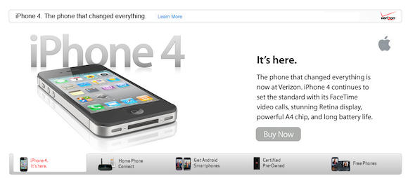
    The current Verizon homepage says it all, they lead with this iPhone 4 banner:

    They follow with this one about some silly looking device from 1995:

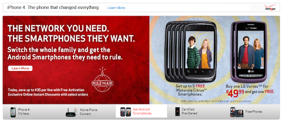
    Then they follow with this Android banner — that amazingly doesn’t promote the Droid line:

    Finally they get to the Droid phones, but only showing them as pre-owned devices:

    That is a telling tale: Droid’s are the 4th item on the rotating banner and are seen only under the basement title of “pre-owned”. It would seem that Droid has been sent to a beautiful farm land where it can run free…

    “Droid is dead” — is basically what I am saying here.

    I don’t mean that Verizon won’t ship or sell any more Droid phones, but they aren’t interested in wasting anymore money advertising the brand. I think this is done for a very good and logical reason:

    1. The iPhone is more desired and well known than the Droid brand — why waste money on a losing cause.
    2. It’s the iPhone versus the non-iPhones — consumers don’t care if it is an HTC Whatever or Droid, they just want to know if it is a smartphone or an iPhone.
    3. If you aren’t an iPhone then you better be cheap — that’s the message Verizon is sending in the above banners. You pay big bucks for the iPhone or you can buy lesser, iPhone clones, for a lower price.

    Those are not meant to be knocks against Android, but it is what I glean to be the thought process of non-geek consumers. The same consumers that walk into a Verizon store not knowing what they want already. Verizon knows that the only phone these customers are likely to know about is the iPhone and that matters. That explains why the Droid is basically dead as a heavily promoted brand.

    With that said, Droid, welcome to the category known as “not an iPhone”.

  • Sprint & T-Mobile’s Fate

    A quick visit to both Sprint and T-Mobile’s websites will show you two companies that are hocking cheap Android phones — no exclusive brands that are set to entice anybody born in the last 40 years. The last big “win” for T-Mobile was getting the first “Google” phone, the G1, way back when. The last win for Sprint was the EVO — and that was only because it was hilariously large, with a power hungry 4G antenna in it.

    Fast forward to right now and both companies provoke a contagious *YAWN* effect on me. Before they could team up with Verizon and berate AT&T for crappy coverage and push Android phones on to unsuspecting consumers, but now they are relegated to being two smaller carriers with no iPhone.

    Not a comfortable position to be in.

    Sprint has a ton of corporate customers that stem back to the days when they had the best mobile coverage in D.C. and when they merged with Nextel (you know the original push to talk guys). T-Mobile has a bunch of fans of Catherine Zeta-Jones and magenta lovers. ((Not really, please don’t email me about this.))

    I think T-Mobile will be fine in the long run, they have a small but loyal following and a network that is already compatible with the iPhone. It would be simple for Apple to get the iPhone on T-Mobile and my guess would be that the next version of the iPhone will be available on T-Mobile — it just makes sense at this point. ((Not to mention that once people started unlocking their iPhones they began using them on T-Mobile and, surprisingly, T-Mobile has always embraced this practice.))

    Sprint’s story is a different one though. They are making a hard push for 4G devices and they run on a CDMA network. While the Verizon version of the iPhone should be able to work on Sprint, it isn’t as simple of an argument for Sprint to get the iPhone. For one Sprint seems like a stodgy antiquated company ((Their CEO walks around in B&W on the commercials for crying out loud.)) and I am not sure that they see an immediate need to get the iPhone. Perhaps they wait until a 4G one comes out, perhaps not. While I am not saying that there won’t be a Sprint iPhone, I am saying that it doesn’t seem to match the feature set the company has been pushing for quite a while now. Sprint likes to tout 4G speed (they own part of Clear that provides a lot of that speed) and they like to tout rugged construction type phones and lastly at the opposite end they like to show smart business savvy phones. What they don’t ever show is fun — and fun is what the iPhone is all about.

    Carrying the iPhone would go against what both companies seem to be marketing right now: faster phones on faster networks. They aren’t marketing reliability or snazzy phones, but they are dinging AT&T and Verizon on network speeds. All of the major U.S. carriers are trying to roll out their version of “4G” networks as fast as they can, but it is T-Mobile that has now really gone on the offensive against AT&T about network speed.

    How can T-Mobile go back on this now if they were to offer the iPhone that only does 3G speeds? Their 3G network is, in use, slower than AT&T’s. It seems funny that a industry that used to be everyone versus AT&T and the iPhone has now become one that is the little guys versus AT&T and Verizon.

    The way I see it Sprint and T-Mobile have two options:

    1. Continue this silly fight the way it is right now, where you attack the slower competitors networks, to only fold eventually when Apple grants you access to the iPhone. Then hope that the iPhone keeps your customer base intact for the next five years.
    2. Accept that customers don’t care about anything you have to offer and figure out what to give them that they actually care about. I would start with pricing and customer service. From there I would call Microsoft and start to get some sweet Windows Phone 7 exclusives on my network. Then I would call HP and get some hot ass WebOS devices too. The iPhone only wins if everyone decides it’s not worth fighting against.

    Choose option 2 — please.

  • Responding to Richard Gaywood of TUAW

    Richard Gaywood called me and others out over at TUAW today and asks this of us about Apple’s policy change:

    To the bloggers above and to the many others passionately defending this change, I simply ask: why am I supposed to be happy about this? Or to put it another way: if all those apps disappear from my devices, what’s in it for millions of end users like me?

    The better question is: how has this negatively impacted you, the user, thus far? Sure Readability was rejected, but apps are rejected every day. You can’t be negatively impacted by that rejection unless you work for Readability — meaning you never had that app to begin with so you don’t know if you would have even liked it.

    The entire basis of Gaywood’s frustration (and others) is predicated on the idea of “what might happen” and not on a more clear “what is happening”. The App Store has never been black and white, so to call these new rules “clear” is to show a fundamental lack of comprehension of how the App Store has been run to date. The App Store has been built on a set of gray rules — granted and very dark gray, but gray nonetheless. To assume now that the rules are suddenly black and white is to make a rather bold assumption.

    Again, we all need to take two steps back, a deep breath, and wait to see how this plays out in June — when supposedly it is do or die time for current apps violating these rules.

  • Microsoft, It Is Time to Pull Your Heads out of Your Asses and Start Marketing Windows Phone 7

    Here’s what I think when I see advertising for Windows Phone 7: “lost opportunity”.

    Microsoft, it is high time that you pull your head out of your ass and start properly marketing Windows Phone 7, lest you become further irrelevant in the only technology space that matters right now — mobile. I for one couldn’t care less about seeing your commercials that mock me — you know the ones that portray someone who is constantly looking at their phone. Why are you alienating the very market that you need for the long term success of your platform?

    Here’s a thought: why not show me one compelling reason to use Windows Phone 7 — and you do have some compelling reasons.

    Here, I can help get you started:

    1. Market the fact that your Metro UI is completely different from anything else on the market. Apple built multi-million dollar campaigns around the idea of ‘different’ and it worked out pretty well for them. Certainly you can fire up the copy machines and give it a whirl — you have nothing left to lose.
    2. iTunes as a syncing platform is slow and crappy. Surely Windows Phone 7 being made by the same company that makes the worlds most common OS can better integrate their phone’s syncing than their competitor can? Meaning why not talk about how easy and seamless it is to sync Windows Phone 7 with, uh, Windows? I mean Apple and Google aren’t even advertising ease of sync.
    3. You have a great, well known, partner in Nokia — why not advertise that two fantastic companies are now going to make some fantastic phones. Build some hype here. Or even just show off some of the phones that you have so people know that they don’t look like the old crappy Windows Mobile phones…

    There are three ideas from a die-hard iPhone fan that could finally give Windows Phone 7 the recognition it deserves. Ball is in your court Ballmer.

  • Readability’s App Rejection

    Today we saw the first rejection of a SaaS app and that has lead to a flood of email to me — because I have defended Apple in the past.

    Even Readability agrees with me according to their open letter:

    To be clear, we believe you have every right to push forward such a policy. In our view, it’s your hardware and your channel and you can put forth any policy you like. But to impose this course on any web service or web application that delivers any value outside of iOS will only discourage smaller ventures like ours to invest in iOS apps for our services. As far as Readability is concerned, our response is fairly straight-forward: go the other way… towards the web.

    They are doing exactly what I argued for — either agreeing to Apple’s terms or moving on. They are choosing to move on, given Apple’s policies — who knows what that means for their business, but they made a choice. Everything I have seen posted about this so far is whiny — again — this is no different from a change in the law and as a company you need to figure out how to move past it, not complain about it. Readability is moving past it and kudos to them for that.

    MG Siegler writes:

    At 30 percent, most of these simply could not afford to stay in business. It’s ridiculous. And Apple needs to either wave the fee or cut it down to some low single digit percentage in circumstances beyond traditional media publishers.

    (in Siegler’s defense he does agree that Apple has every right to charge this fee.)

    This is the view that most people are taking and rightfully so, but don’t think for one second that I agree with it. Apple needs to do nothing for you. If you want Apple to start listening to users there is only one way to do it: speak with your wallet. If you want Apple to change its App Store policies tell it so by ceasing to buy anything from the App Store.

    But Apple isn’t the greediest are they — developers want 100% of this and 90% of that — yet they didn’t create the iPhone, the iPad, or iOS. They aren’t bringing 100 million credit cards to the table. That may seem mean and certainly not all developers feel this way — but if you are going to do business in the U.S. you need to pay Uncle Sam his cut — it sucks but that’s the way it is. If you want to do business in the App Store then you need to pay Apple its cut.

    Or:

    If you want to jump on Tommy’s trampoline then you are going to have to be friends with Tommy and that means going to his stupid birthday parties and playing by his rules — but its a freaking trampoline so its worth it.

  • Quick Takes on Five Apps

    Welcome to the first installment of quick takes where I look at five apps that I have been playing with, sharing quick raw thoughts on them.

    NBA Jam (iPhone)

    This is a classic game that I spent many hours as a kid playing — now it’s out for the iPhone. I was worried about how well this would stack up to the original, but after playing it for a few days I can say it doesn’t disappoint. The gameplay and overall fun factor is very high. It fits perfectly on the iPhone as another one of those games you can pick up and put down very quickly without having to spend time getting back into the game. Great stuff and highly recommended.

    Pennant (iPad)

    Baseball season is about to start up and I couldn’t be happier. Pennant is a neat little iPad app that tells you all sorts of stats from the 1950s to 2010 on a team by team basis. You can even watch a beautiful “replay” of the games. This app is for baseball geeks, information geeks and app design geeks. The animation is a bit rough on my iPad, but I don’t know if that is due to my running iOS beta versions or not. My only question: do we get stat updates as the season progresses? That would be amazing.

    Dayboard (iPad)

    A cross between Nightstand HD’s flip style clock (personal favorite) and an old school airport flight status board. Dayboard gives you the current time, date, weather and Twitter trending topics. It is an interesting app that I think presents the data beautifully, but I can’t see the value of it long term. The app doesn’t respect my 24-hour time format and only works in portrait orientation. I like the idea, but I need some more options. For example: does the date really need to take up the same amount of space as the weather and Twitter feeds? I think not.

    Pouch (iOS universal)

    Pouch is a great little Backpack (37signals) app that the developer was kind enough to send me a promo code for. My main complaints about the app are actually complaints about what 3rd party developers are allowed to access through the Backpack API. For starters you can’t see comments, because that is not available. You also can’t see files which may limit the value of the app to many. Whether this app is of value to you depends on how you use Backpack — if it is a reference manager this may be quite handy. This app is nice looking and works really well, it really is the best Backpack app for iOS right now — having said that I still prefer to interface with the website directly.

    Google Chrome 10 beta (Mac OS X)

    I still hate everything about the way Chrome looks and that it has Flash bundled with it — but the version 10 beta is stupidly fast. In fact it is so fast that I may have to switch over to it for a while. There are a lot of extensions that I will need to find to make Chrome on equal footing the Safari, but those tradeoffs are worth it for the speed I am seeing out of Chrome. This is an impressive build.

    Thanks for checking out the first installment of Quick Five, be sure to come back next week for another installment. If you have any apps you would like to see me write about be sure to get in touch.

  • A New Bag of Mine

    Early one morning I was going through OmniFocus to see what I needed to change into a project and what I needed to delete from my life. I was brain dumping a bunch of stuff for my upcoming adventure to SXSi and I realized that the kit I wanted to carry around with me, while in attendance, doesn’t fit in my current bag. Crap.

    At the very least I determined that I needed to carry my iPad, MiFi, and Canon G9 with me (iPhone in my pocket). I have two bags and even the biggest one is too small to carry the bulky Canon G9. I was stuck trying to decide if I should get a new camera or a new bag to carry this stuff. Common sense won out and I decided that if I get anything it should be a new bag…

    This thought killed me — just sold five bags, two of which would have worked. My desire to own less stuff came back to bite.

    It’s late for me, 9:00pm or so and my wife is intent on watching a TV show that I prefer not to watch — I am looking at bags. I decide that no matter what, I better pull the trigger — I need a bag that can hold extra stuff for all the travel I hope and plan to do this year. I buy a bag from a local Seattle company…

    It will be at my door soon.

    Arrival

    For whatever reason UPS in my neighborhood doesn’t deliver goods until 7:30pm or so — a major bone of contention I hold as an official stock holder in the company.

    A knock at the door, with some scuffle. The bag is here.

    Day One

    I decide that I should try out the bag so that I can write about it and return it if needed. The bag is both bigger than I expect and, yet, somehow smaller than I thought. I fret that it won’t hold what I need it to.

    I unpack my ‘old’ bag and surprise myself that there is only a few items that need to be stowed elsewhere. I carefully plan how I want to organize the new bag — it’s a zen moment for bag lovers.

    I carefully load the bag.

    I notice that unlike my old bag there is less compartments and it has more of an open feel. Things could fall out if not stored in a proper location — or if you decide to stupidly flip the bag upside down with the lid closed (it happens).

    I load the bag with the following:

    • 13” MacBook Air
    • iPad w/ Apple Case (get over the fact that I like the Apple case)
    • Micro USB to USB cable (6”)
    • Dock connector cable
    • Two credit cards
    • Office key
    • MiFi
    • Apple microfiber cloth for cleaning everything
    • 5 USB thumb drives (emergency back up and data off loading tools)
    • Business cards
    • Bose In-Ear headphones
    • One of those slim floppy Moleskins
    • Pilot G2, Blue
    • Monte Blanc rollerball
    • iPad camera connection kit
    • Glif

    Everything fits beautifully, but then I knew that it would.

    The real test is when I go to put in the last item: the Canon G9.

    I carefully take stock of where everything is and decide that I should put the G9 into the main compartment — seems like a good spot right with my iPad. It slides in, barely, and after looking at it I pull it back out.

    Hmm.

    I then slide it in the front compartment where my pens and MiFi is held in place. Ohh it fits right there rather nicely. The bag snaps shut and everything looks ready to rock and roll. (I am already late for work.)

    I go to put the bag on and notice a strap at the back of the bag. It has one of those straps that can go around your waist if you decide that petrol based transportation is not for you. ((You ride a bicycle.)) This helps to keep the bag securely on your body, but I doubt I will need it for walking up and down a few flights of stairs — it also won’t help when I bank onto the freeway at 70 MPH. Luckily, unlike with most bags, you can quickly remove this strap with what is a rather ingenious buckle system.

    I head down the five flights of stairs and notice immediately that this bag is far more comfortable on my shoulder than my current Booq Taipan Slim ((I have actually started using the Booq as a briefcase with no should strap.)) and I rather like the way it feels. The bag feels like it is rolled to conform with my body, but it is too early to tell.

    Unpacking

    Arriving at my office brought about the next crucial task for this new bag: unpacking. I have had bags where getting my goods back out of them becomes a real chore and that is never fun. This bag unpacked quite nicely and in fact I had no problems at all. Everything was in place where I put it, which honestly surprises me since nothing really fits snuggly in any of the compartments.

    When I pulled the MacBook Air out of the only padded sleeve on the device I noticed that unlike my other bags the compartment is actually only a soft material on one side (the side that would touching the top of the laptop if you stowed the laptop with the bottom of the laptop facing your body). I found this odd and slightly concerning — I don’t expect anything in the bag to give scratches to my Air, but a plush velvety compartment is always welcomed..

    With everything out of the bag I tossed it into the corner where it will sit until it’s time to head home — I noticed something else when I did this. Most of the bags I have used are fairly rigid in construction — when they are empty you would be hard pressed to see the difference between when they are full. That is not the case with this bag, it is only semi-rigid and will not fold in half when it is leaned against a wall, but it also looks empty when it is, in fact, empty.

    Re-Packing

    After a long day standing at my desk it is finally time to head home. Interestingly I have only pulled two things out of my bag all day, the MacBook Air and my iPad. In the past I would have to make sure that I put the iPad in the bag first, then the MacBook Air — otherwise it was too tight of a fit to easily get the iPad into my bag. I put the new bag on my desk and load in the Air, toss in the iPad and latch the flap.

    Then I notice that because I have a lot of extra room in the bag, the strap at the front can and should be tightened up a bit. I doubt this flap will ever be snug enough for me not to worry about a thumb drive that is kicking around not falling out, but it doesn’t hurt to tighten the strap.

    Home

    The last test of the day is the carry from my car, up five flights of stairs, and into my place. I typically move up the stairs as quickly as possible to get the blood pumping, today was no exception. In the past when I have worn a bag using a shoulder strap I would notice that it would bounce around and sway from side to side as I climb the stairs — not this time though.

    Given the vertical orientation of the bag (versus the horizontal orientation that most messenger bags take) I found that the bag actually seemed to hug my back and stay in pace more readily. There was still some movement, but not enough to be annoying by any degree. When I wore a bag over my shoulder there would usually be some part of the stair climb where my bag would inadvertently bump into the railing — not with this bag though and that is a huge relief.

    Final Thoughts

    I was a tad nervous ordering from Tom Bihn since I had never seen one of their products in person. To call their bags beautiful would be a stretch — these are utilitarian bags, beautiful to a select few and just another bag to everyone else. The materials, fit and finish of the bag is very good and I think these bags are a great value for the cost (this one was $120). There is very little metal on the bag, preferring plastic for the connectors and shoulder strap — there are drawbacks to both metal and plastic:

    • Plastic tends to break easily.
    • Metal tends to bend and at times squeak.

    I think the connectors on this bag will hold up just fine — they are made from incredibly thick chunks of plastic. After using the bag for a few days I think the only thing I wish the bag had was a fully padded bottom. As it is the only padded area is the compartment for your computer — the rest is just one layer of nylon. The benefit of doing it this way is a slim and light bag — the cost is that items like your iPad and Camera are susceptible to dropping the bag. Really, if you think about it, most of us are prone to setting our bags down to quickly on tables — an action that could damage your gear inside without a fully padded bag.

    I highly recommend this bag and I suspect I will get a lot of use out of it in the coming year, oh yeah — the bag I bought was a Tom Bihn Ristretto for 13” MacBook/Air.

  • A Really Good (Brain) Dump

    I don’t subscribe whole heartedly to the GTD method — I only do weekly reviews on a quarterly basis — but one part of GTD I love is the brain dump. Brain dumping is the second most satisfying thing that I can do in OmniFocus (the first is a tie between checking off tasks and deleting them). I have always had one single problem with brain dumps: I forget a lot of things that should be purged from my brain when I am faced with a blank OmniFocus inbox.

    A couple of months ago I was fiddling about in OmniFocus and while in Context view I started noticing that a ton of tasks were flowing into my head — things that I needed to do, but had yet to be captured anywhere. So I started brain dumping, going from context to context and getting down everything that came to mind.

    Except that I ran into another problem with this: context view doesn’t offer much help if you need to create a new project, nor is it very good for brain dumping — if they aren’t staring at me in my Inbox, I will never process them. The problem is assigning due dates, start dates, projects and the like when you add an action in context view is less than ideal.

    My solution for this: quick entry and double windows.

    I simply ‘review’ my contexts and add actions as I think of them using the quick entry pane. The advantage with this system for me is that when I get to location specific contexts (such as Costco) I can quickly pour out things that I need from Costco in the context window (I rarely add any more information to store list actions). I assign everything else straight to the inbox using quick entry.

    On occasion I will open a second OmniFocus window that just shows the Inbox and I will dump straight into that — it works better when I know that I will have a lot of stuff going on (i.e. I haven’t done a brain dump in a while).

    I have really found this to be helpful — more so than just viewing a blank inbox or going from project to project. For whatever reason looking at a context that says ‘office’ reminds me of a whole mess of stuff that I need to do…

    This isn’t GTD, but is about getting things done.

  • One Percent More

    A few items to follow-up on my ‘Thirty Percent’ post from yesterday — I am getting tired of answering the same emails over and over. Here goes…

    Justin Pennington gets it:

    @BenjaminBrooks I totally agree with you, I’m not sure why people are so against it. 70% of something is better than 100% of nothing.

    Wil Shipley (developer of Delicious Library) makes a valid point:

    Traditional book publishers, for instance, will give an author about $1 on a hardback sale. Solution: authors should dump publishers.

    I could cherry pick tweets all day long, but the bottom line is that this is nothing new in the business world — it is just something new in the App Store.

    Magazines

    A few people have written in to say this will kill any profit that a magazine would get. Except that remember you can have a paper magazine, printed and mailed to your home twelve times a year for the bank busting price of $10. Magazines and newspaper have never made money off of the price of subscriptions — they make money from the sales of ads inside the publications. Apple isn’t stopping that — serve them up for all readers care, nothing new.

    Amazon

    Even more people wrote in wondering how crazy I was for thinking that getting rid of all apps that act as ebook readers — except iBooks — is a good thing. I don’t and I doubt those apps are going away. Apple thinks this stuff through and I am confident that the complete picture has yet to be painted, be patient.

    At the very least offering just the reader for Kindle should be sufficient — I doubt many Kindle users struggle to remember Amazon’s URL to go buy a new book. Yes, it would be less convenient, but it isn’t a death blow by any means. Beyond that book distributers have a really screwy deal to begin with — it’s an industry ripe for change.

    Netflix

    Perhaps the most heated emails were from people that are upset about the consequences this may have on Netflix. Again we don’t know the entire story here, but my guess is that if Netflix is going to die because they now must give Apple a 30% cut of their monthly subscriptions — then, well, Netflix’s business was on the verge to begin with.

    Netflix costs $7.99 a month for streaming only and from that we can’t really derive what is profit, but we do know that they will send you a DVD and a return envelope for $9.99 a month plus streaming. Now that isn’t just one DVD a month, but only one DVD at a time. So for $2 more Netflix can afford to ship and house DVDs back and forth — to and from — people’s houses. I can assure you that sending someone one DVD a month and the return envelope (with associated warehouse costs) eats up more than just $2. If anything Netflix wants the Apple subscription model to work because it will mean more profit to them, not less.

    Music Subscription Services

    The same probably isn’t true for music subscription services, but honestly you are streaming so you need a net connection for it to work. Which is to say that a slick HTML5 app may be better suited for these services — it would be cross platform and incur them no fees from Apple.

    Again though, I really think that these services will reach an economy of scale where the 30% take isn’t worth arguing about when you are talking about a subscriber base in the millions. Bottom line: a 30% cut is far less destructive than Apple starting a streaming iTunes store — now isn’t it.

  • Thirty Percent

    People are really hung up on this 30% issue. I think it is dumb to get hung up on this — doesn’t matter if you are a developer or a consumer, let it go. I say this because there is only one way to get Apple to reverse this policy: make the App store fail, therefore Apple is forced to change its game. I don’t think any person wants to see the iOS App Store go away any time soon — it is a source of many peoples income and millions of peoples entertainment.

    Price of Admission

    The problem with the current mind set is that people are looking at this from the following perspective:

    “My app is worth $10 a month. If I sell 10 subscriptions I should get $100 a month, but Apple is taking a 30% cut of that and now I will only get $70 a month. Oh crap, I really need $100 a month, so now I need to raise my prices by 43%. ((Source, via Ian Hines on IM)) I can’t believe that Apple is taking this much money!”

    Here’s the thing about that logic: it’s wrong. Apple isn’t taking jack from you because without Apple you wouldn’t have a business developing iOS apps. Plain and simple. People really need to get this. If Apple did not create, maintain, pay for, hire people, construct, scheme, profit from the App Store — there would be no App Store to speak of. If there is no App Store then there is no revenue for any iOS developer. ((Sure Cydia is around, but that user base is minuscule and piracy laden.))

    So stop thinking about 30% being stolen from you and instead ask yourself if it is worth $3 for every $10 in subscriptions to have your product put in front of 100 million+ consumers which can subscribe with only a hand full of taps. I think it is.

    Value

    Next you need to ask yourself if your time is better spent supplying content to subscribers, or managing subscriptions. Apple is giving you an out from customer service. If someone needs to unsubscribe or has issues with their subscription — it is no longer your problem, Apple needs to fix that.

    Here’s what else you don’t have to do (if you don’t want to):

    • Process payments
    • Advertise
    • Worry about data breaches that give out SSN and Credit Card numbers

    I don’t know about you, but not having to deal with this stuff is well worth 30%.

    I’m Leaving

    Go for it, but remember: people on Android don’t pay for things, iOS users do. Would you rather serve ads, or sell apps/subscriptions?

    There is good reason for many people to leave the App Store over this. In fact 37signals’ David Heinemeier Hansson has already tweeted: “FYI, if Apple comes hunting for 30% of software subscription revenues through iOS, we’re dropping Campfire/Highrise apps in a Chicago second”. It makes sense for them to leave rather than pay 30% — most of their users are desktop/laptop based, not iOS based. So they already need those systems in place that I talked about before — on the flip side it doesn’t make sense for iOS only apps like ‘The Daily’ to leave over this, as they (theoretically) don’t have such systems in place to begin with.

    Books / Kindle

    This system also doesn’t make sense for book distributers to use — 30% is their entire profit. But I don’t think we have heard the end of how these book apps will work under the new iOS rules — personally I think we are all jumping the gun a bit on this one.

    Reacting

    Rules change when you play in someone else’s backyard — it sucks, but if you are smart you can still be wildly successful. The 30% cut isn’t great (though it does look great from a strict consumers view), but it isn’t the end of the App Store — I bet it only makes the App Store better by ridding it of more junk apps.

    “Smile, breathe and go slowly.” —Thich Nhat Hanh

  • Delegate a Task in OmniFocus With Email

    Don Southard posted an Applescript ((via MacStories)) on his site today that allows you to grab a task in OmniFocus and send it to someone using Sparrow. This is a great script, but since I don’t use Sparrow it has little utility to me.

    So I tweaked it, the result of which is a script that grabs the selected task in OmniFocus and creates a Mail.app message based off the data. I like it.

    Couple of notes:

    • I borrowed Southard’s code.
    • I borrowed Apple’s code for making a new Mail message
    • It probably is not perfect.
    • I removed the addition of contexts. The thinking is that we all have our own contexts so it is rather pointless to send that to someone.
    • In the script I changed the subject line to read: “Task Delegated from Ben Brooks” — in hopes that clarifies things a bit. However in the downloaded script it just reads “Delegated Task”.

    Set this script with a keyboard command using the excellent FastScripts (I am using ctrl+opt+d) and you are ready to roll. I don’t know just how useful this will be right now — but hey I’m adding it to the collection.

    Download my version for Mail.app here.

    [Updated: 2.15.11 at 1:58 PM]

    Reader David Messent sent in a modified version of this Applescript that embeds an OmniFocus link to the script that will allow another OmniFocus user to add it with just a click — very cool!

    Download his file here.

  • Name that file…

    Continuing with what I started yesterday with my post about Simplenote naming — and expanded on by Ian Hines, Dave Caolo, and Stephen Hackett — here is some more about how I name things on my Mac.

    When it comes down to how people ‘file’ stuff on their computers I see three main methods people use to file: ((Most mix and match two of these methods.))

    1. The Nesters: they create sub-folder upon sub-folder until they end up with stuff like this: Project A > Year > Month > Day > Hour > Minute > File. Ok not usually that extreme, but you know what I am getting at.
    2. The Desktoppers: Everything is filed on the desktop for fear that one may ‘lose’ that file forever if it is moved elsewhere. ((I can’t be friends with you if this is how yo file.))
    3. The Searchers: Just throw files in one massive folder and then use search methods to find the file later.

    I doubt that most of us fit into just one of these categories — in fact most of you are probably hybrids of two of these options. I am a hybrid of 1 and 3. That represents a sweet spot for me, but no matter what, you really need to make sure you are properly naming files and that you aren’t a full 2.

    I am a huge fan of Dropbox and instead of keeping a ton of files in just the main top level Dropbox folder I have a series of sub-folders. The main reason for these subfolders is so I can find what I need quickly in the iOS app for Dropbox. (This is doubly important when you have clients looking over your shoulder at your iPad when you are looking for the file. I like to pull up the relevant folder prior to the meeting.)

    So inside my Dropbox folder I have a series of subfolders. These subfolders are classified for the various parts of my life (Work, Home, Blog and so on). So I have my office, my back up, my reference, my Simplenote and so on. Most folders residing at the first sub-level of the Dropbox folder are items that are in place for syncing only or strictly for other programs to interface with.

    The real business happens inside the folder labeled: Inbox.

    My inbox folder is where I keep 90% of all files I am currently working — the only stuff not in the folder are large files that would throw me over my Dropbox limit. Initially I just kept a ton of files in the folder, but as time wore on I realized that to find things quickly in iOS I really needed a few subfolders — but not too many.

    I keep one subfolder in Inbox that is called ‘Projects’, inside of this folder I keep others that tie directly into OmniFocus projects that I currently have active. Thus the Inbox structure looks like this: Inbox > Projects > Project Name, where the ‘Project Name’ folder is linked into OmniFocus. I keep other files that are single action in nature in the Inbox folder itself (more specifically scans and the like).

    This is as far as I take my subfolder routine. From here all files are named with a rather cryptic looking description — much like how I talked about naming Simplenote files.

    TBR_P_2011_02_14_Name

    The above is a representation of the basic structure I use for naming a file. What the above name tells me is that the project is TBR (designated always between 2-3 letters). The second piece, the P, tells me that the file category is a ‘Post’. I use a single letter to help designate a general category (P for post, O for outline, D for design). This way I can have two files with the same name, but different types:

    1. TBR_P_2011_02_14_Pluto
    2. TBR_O_2011_02_14_Pluto

    Where the first would be a post with the name Pluto for the project TBR and the second would be an outline named Pluto for the project TBR. Basically I can run a search in Spotlight for: TBR + Pluto and get both files and know the difference between those files. Likewise I could also search TBR + O and see just outlines. This allows for very scannable file names, while keeping them easily searchable.

    I do the same for all projects — I even label my website files this way when they are on the Mac.

    To Each His Own

    I always create a TextExpander snippet for file naming, this way I don’t waste time wondering what day it is and where the underscore key is (both happen more than I like to admit). What I know without a doubt is that this file naming system will not work for you. You need to come up with your own — I am sharing mine with you to help you see how I do it and perhaps you can steal portions of this to help your filing.

    Underscores, Hyphens and Dates

    I want to mention why I do two things in the above naming scheme that I haven’t touched on. Specifically why I use underscores over hyphens and why I use dates in the file name.

    • I have found that underscores make the name much more readable to my eye than hyphens do. Both hyphens and underscores accomplish the needed separation between elements of the name, so there is no right or wrong. You can and should use whatever you like best. For me that is underscores to help me read the file names easier, for you it may be hyphens — just don’t use periods (you will regret that).
    • I know a lot of people that don’t put dates in the file names and will rely on the built in date metadata to see when a file was created — personally I found out the hard way that those dates are incredibly unreliable. If you have stored your files on a communal server at any point then you know what I am talking about. Egnyte, the server we use at my office, messes with these dates like you would not believe and there has been several instances where I couldn’t tell when the file was made because of this. It is easy to attach the date if you use TextExpander and if you don’t use it — then at the very least attach a year and month (you can thank me later).

    As Detailed as You Need

    We need to borrow from Patrick Rhone’s philosophy of ‘enough’ here. Your file naming and folder structure should be nothing more detailed and nothing less obscure than what works for you. A good place to start (and where I would start now) would be with moving everything into one single folder and then naming the files with a very detailed name. From there play with the naming of the files and add back folders only as needed.

    I recommend doing it this way because people tend to never remove folders if they start with many and will rarely add more information to file names if they start with abstract names. A big bucket forces good naming and good naming will reduce the amount of folders needed. Plain and simple.

    The Desktop

    Lastly, if you are a person that files everything on the desktop: stop and stop now. Again, you can thank me later on this one.

  • MG Siegler’s iPad Life

    I want to welcome one of my favorite writers, MG Siegler to my iPad Life interview series. He is probably best known for his great writing on TechCrunch.

    Tell me a little about yourself, what do you do, where do you live?

    I’m a writer for the site TechCrunch, focusing on a wide range of things, including yes, Apple. I’ve been with TechCrunch for about two years now. Before that, I was doing more or less the same thing at VentureBeat for a year and a half. I’m based in San Francisco and have been here for three years now.

    Before that, I was a web developer down in Southern California. I did front-end work: HTML, JavaScript, CSS. And before that, I worked in Hollywood for a few years. That was fun, but soulless.

    Originally, I’m from Ohio and went to school at the University of Michigan.

    What was your reaction when the iPad was launched?

    I was extremely excited. Of course, we had all been hearing the rumors for months (and really years) of Apple doing a tablet. But I had no doubt that when they finally did it, they would do it right.

    I laughed at the “big iPod touch” criticisms at the time, knowing that those people would all change their mind when they got their hands on the thing. Why? Because I really believe that touch is the future of everyday computing. We’ve all grown accustomed to desktops and laptops with mice and keyboards, but think about how ridiculous some of the learning curves are on that for a second. Then think about the iPad. As we’ve seen, babies can use it. It just makes sense.

    Which model did you order and why?

    64GB WiFi. The 64GB call was easy as I wanted to put a lot of media on it. The WiFi versus 3G debate was tougher, but I ultimately went with WiFi simply because of my hatred for AT&T. Living in San Francisco, it simply does not work. So I wasn’t about to pay them more money to prove their incompetence in another way.

    But now that Apple and Verizon have partnered up, I’ll definitely consider a 3G version of the next iPad (assuming there’s a Verizon option). On the other hand, the Hotspot feature on the Verizon iPhone sort of makes it pointless.

    How are you using the iPad on a daily basis?

    It has basically become the living room computer in our house. If I’m on the couch, chances are that I’m using it to surf, read, tweet, etc. I basically only need my laptop for when I’m going to write something — I still would not use the iPad for that.

    When I’m on my laptop or desktop, I usually use Instapaper to bookmark things to read later on my iPad. And that’s usually how I go to sleep at night.

    Can you give me a quick run down of the apps that you use the most?

    Twitter, Flipboard, Pulse, Instapaper, Reeder, ScoreCenterXL (ESPN app), Boxcar, iBooks, and, of course, Safari.

    I have dozens others installed, but those are the ones I use most frequently. Also, The Daily recent joined that group, but perhaps only because it interests me right now as it just launched. We’ll see if it stays in that group.

    Mg tmb

    Which app is your favorite?

    It’s a tough call between Twitter and Flipboard, but I’ll go with the latter. The reason is that I love that it has been thought of from the ground-up as a way to consume social content. It’s brilliant.

    Do you have any bag/stand/case recommendations for people?

    I definitely do not recommend the official Apple case. I hate that thing. I’m shocked Apple even approved it. I use a simple Incase puffy sleeve thing [Editors note: I think this is the case he is talking about]. It’s ugly (lime green), but it works well. And it keeps the iPad pretty clean.

    What features do you want to see in a future iPad?

    The main thing I’d love is for the iPad to weigh slightly less than it does. The battery life is amazing, but I’d even take slightly less if they could cut the weight a bit.

    I’d also love a retina-like display, but it doesn’t look like that will happen in iPad 2. But maybe later this year…

    The other big thing I’d love to see improved about the iPad is the screen glare. I understand it’s a hard problem to solve with glass, but the iPad really is pretty impossible to use outside at the moment, I’d love that to change.

    Oh, and more multi-touch gestures. But it looks like those will be coming as a part of future iOS updates too.

    If you had to choose between owning your Air or the iPad, which would you choose?

    That’s a very good question. For work purposes, I’d have to go with the Air. There is simply no better computer to travel with for work. And because so much of my life is work, I give it a slight edge over the iPad. Also because I know the iPad 2 is right around the corner. Very tough call though.

    I want to thank MG Siegler for taking the time out of his busy schedule to share his iPad life with me. You can keep tabs on MG by following him on Twitter where he is known as @parislemon.

    More iPad Life

    To see more people’s iPad Lives take a look here.

  • SimplyNoted

    It is no secret that I use and love Simplenote — you really should use it too — so I want to share with you a tip for getting the most out of Simplenote when you are using it on iOS. One great thing about Simplenote is that you can instantly search any note and you never need to name a note — except that you really should be naming your notes.

    The first line in your note is always displayed as the title of the note and I like to make use of this by naming my notes. This way they are easier to find later on — you know when you need that note now.

    Most of my notes have titles like this:

    Noted_2011_02_13_NAME

    It is a very simple naming convention — I start with what the document is (in this case a note) and follow with the date (Year_Month_Day), ending with a custom name that gives a brief description of the note.

    The problem with my naming convention is that it makes for a lot of typing and keyboard view switching to accomplish in iOS. That is until you realize that all I type is nnt and TextExpander fills everything but the descriptive name. The advantage to naming files like this is that I can really drill down in searches, I can use the date I am looking for to filter quickly and I can see if I am using a note or a different file type (for example I may start the note title with Ref in place of Noted so that I know the file is for reference).

    QQ Trick

    The above naming convention works really well for 90% of all my notes, but there are times when you make a note that you know you want to be able to access quickly (perhaps you want the note to be a bit more ‘sticky’). For that I use Merlin Mann’s ‘Q’ trick. ((I have heard him talk about this before, but I can’t find a written reference for you. [Update: A few readers point to this Podcast interview with Merlin.)) Basically the ‘Q’ trick is that you start your note name with the letter ‘Q’, this way when you need to search for an important note you can drill down the name with Qs. It is best to use two Qs and then add more from there.

    This is how an important ‘Q’ note looks in my setup:

    QQ_Note_2011_02_13_NAME

    From there I just add more Qs at the beginning as I see fit. The benefit of this is immediately realized when you start to search. I keep less that 10 of these ‘Q’ notes in Simplenote among the hundreds of other notes that I have. Even if one of these notes is months old I can quickly find it by typing ‘QQ’ in the search field and right now that only brings up three notes. It is very unlikely that you will ever type ‘QQ’ in a normal text note at any point.

    I personally use two thru four Qs at the beginning of important notes, with four Qs reserved for notes that are really important. The nice part is that you can quickly keep tapping Q on the keyboard t drill down fast. Of course I title the ‘Q’ notes using TextExpander too, that abbreviation is ‘Q2’.

    Tags

    I never use tags, in part because:

    1. They don’t work with Notational Velocity on the Mac.
    2. I have never been a fan of tags.

    You can use tags to accomplish a lot of the same things that I have written about above, but they offer no real speed improvement when you consider how fast this method is when it is coupled with TextExpander. As a bonus if you do use TextExpander on iOS and your Mac, be sure to sync the snippets between the two (you knew that right?).

  • A Not Quite Full Review, of a Not Quite Great Twitter App: Twitterrific

    As most Mac Twitter users are aware, Twitterrific 4 was released. I know a lot of people have been waiting for this app, but frankly it is just not a great app.

    The Problems

    • After you post a tweet your Twitter stream is not updated, so you see your new tweet at the top of the old tweets. Then when Twitterrific does update, the new tweets jump into position where they should be in the timeline. Your new tweet, that was at the top of where you had read, is now mixed in with a jumble of other tweets. You could get used to this, but you shouldn’t have to get used to non-sense like this.
    • The title bar with all the icons is very imposing and throws off the balance of the entire app. Even with all icons removed it is still just too thick. Twitter clients should always feel like small-apps and not like full-blown apps ((Who likes the way TweetDeck looks?)) — Twitterrific fails at this.
    • The sidebar is not attractive. You also can’t collapse saved searches or global trends (though you can remove the trends). Not to mention that you can only resize the window to a certain point before you are forced to collapse the sidebar to continue to make the app a useable size.
    • Light mode’s colors are not so good — particularly the mention color.
    • If you want two accounts you need to pay $9.99 — which is silly given that Twitter for Mac is free.
    • You can’t remove the menubar icon.
    • There is a badge on the dock icon with a new tweet count, I never have been a fan of badge counts (exception on Mail.app).
    • You can’t close image windows (Twitpic and the like) with the keyboard.
    • This is my biggest gripe: the direct messages show up as a random hodgepodge based on the time sent. So I can’t view the entire conversation thread, I just see messages in a confusing and un-helpful way.
    • No live streaming of the Twitter feed, which at this point is basic and mandatory. ((In the past I hated the live stream, but now it has really grown on me.))
    • No drag and drop support for posting pictures — I mean I guess sending the file path for the picture could be useful at times.

    The Good

    • Instapaper support. I have no clue why this isn’t standard on Mac Twitter apps, like it is iOS.
    • The dark mode colors look nice.
    • The conversation thread is nice. The pop-up window is much less confusing than sliding in a new ‘sheet’ like Twitter for Mac does.

    The Undecided

    • The compose window slides in from the top. I like that the window is hidden and not static in the app, but I typically prefer a new window that pops up. This way I can compose many tweets at the same time.
    • The icon: I don’t hate it, but I don’t love it.
    • The ads in the free version are from The Deck, so they look good, but they are still ads.

    Bottom Line

    The app is stable and works. It does what it says. I can’t help but feel a lot was left out to get the app out. Most of the problems can be easily fixed with updates, but for a version 4 product these issues should have never shipped. Making sure CMD+W closes picture previews and that dragging in pictures to a compose window attaches the image, is basic stuff for a 4th version product.

    The biggest problem with Twitterrific 4 is that there is no compelling reason to use it over Twitter for Mac when you factor in the $9.99 price tag for the non-ad, mutli-user version. ((I get that some people don’t like the look of the Twitter app and that is valid, but there are still better free options than this.)) I have been harsh on this app, more so than I normally would be, but I have been harsh because Iconfactory should be cranking out better apps than this. It doesn’t feel finished — it feels like a version 1.0 product. If this was a version 1.0 then I would be excited for its future, but given the version 4 nature I am hardly impressed.

  • (dv)’d

    I spent all night working to get this site migrated from a Grid Server (gs) to a Dedicated Virtual (dv) from Media Temple. I managed to do this so far without any support calls (particularly proud of this). If you are seeing this then the DNS changes have made it through and we are now on the (dv).

    I hope we all notice some improved load times!