This is a great trick when you use Safari in fullscreen mode (and it makes Safari in fullscreen mode a lot more useable). ((Note: this is the same trick that I told Shawn about on our latest [podcast](http://thebbpodcast.com/2011/08/episode-21-in-ear-monitors/).))
Top Posts
The Hype: Yoshida & Co’s Porter BagsAugust 26, 2025
G-SHOCK DW-H5600 After 7 MonthsJuly 31, 2025
Casio Duro MDV-106 Re-ReviewDecember 15, 2022
Recent Articles
-
Fullscreen Safari Trick [Lion]
This is a great trick when you use Safari in fullscreen mode (and it makes Safari in fullscreen mode a lot more useable). ((Note: this is the same trick that I told Shawn about on our latest [podcast](http://thebbpodcast.com/2011/08/episode-21-in-ear-monitors/).))
-
Drance FTW
Wonder why so many hated “that” post by Google? Matt Drance sums it up perfectly.
Wonder why so many hated “that” post by Google? Matt Drance sums it up perfectly.
-
Entitled
John Gruber: >Google seems to feel entitled to copy whatever it wants. Which is exactly why I am souring on Google as a company.
John Gruber:
>Google seems to feel entitled to copy whatever it wants.Which is exactly why I am souring on Google as a company.
-
PostCheck for Address Book
My thanks to Brian Toth for sponsoring the RSS feed this week to promote his excellent PostCheck. PostCheck is a killer plug-in for Address Book on your Mac. Its goal is to properly format the addresses in your Address Book for shipping things with USPS. The killer (for me) part is that it will autofill…
My thanks to Brian Toth for sponsoring the RSS feed this week to promote his excellent PostCheck.
PostCheck is a killer plug-in for Address Book on your Mac. Its goal is to properly format the addresses in your Address Book for shipping things with USPS. The killer (for me) part is that it will autofill in that pesky 4-digit addition that fancy people add to the zip codes.
I dig this plug-in, it’s not something I use all the time — but it *is* something that just seems so Apple-like every time I use it. Why this is not a built-in feature I don’t know.
At [$10](http://briantoth.com/postcheck/purchase) it is an instant buy in my book.
-
The B&B Podcast – Episode 21: In-Ear Monitors
Shawn brags about his headphones to me a little. I fail at explaining the Google patent stuff to Shawn. We both love Keyboard Maestro. We also discuss the merits of buying a desktop and I talk about why I think I might go back to a desktop machine. Brought to you buy these awesome sponsors:…
Shawn brags about his headphones to me a little. I fail at explaining the Google patent stuff to Shawn. We both love Keyboard Maestro. We also discuss the merits of buying a desktop and I talk about why I think I might go back to a desktop machine.
Brought to you buy these awesome sponsors: [Harvest](http://www.getharvest.com/) and [Campaign Monitor](http://www.campaignmonitor.com/)
-
Who Do You Side With on the Google/Microsoft Back and Forth on the Patent Issue?
An interesting poll by MG Siegler where Google is still favored by most people in this latest spat between the two. I am actually siding with Microsoft on this one (believe it or not) mainly because I do believe all Google has done is: “[whine like a bitch](http://brianshall.com/content/google-are-pussies)”.
An interesting poll by MG Siegler where Google is still favored by most people in this latest spat between the two. I am actually siding with Microsoft on this one (believe it or not) mainly because I do believe all Google has done is: “[whine like a bitch](http://brianshall.com/content/google-are-pussies)”.
-
Apple’s Favorite Make-Android-Awkward Patent
Florian Mueller with the easiest to understand of all the patent discussions about the cards that Apple is actually holding: >And with several such patents, it’s possible for Apple to create a very serious user experience gap between its own products and those of its competitors. >Death by a thousand cuts. Well, it won’t literally…
Florian Mueller with the easiest to understand of all the patent discussions about the cards that Apple is actually holding:
>And with several such patents, it’s possible for Apple to create a very serious user experience gap between its own products and those of its competitors.
>Death by a thousand cuts. Well, it won’t literally take a thousand patents. But the key thing is: one such patent has an effect, and several of them can collectively have major impact.
If you are at all curious as to why Google is so worried, this is the article to read.
-
The Google Patent Whiner
Last night things got pretty good on Twitter with Brad Smith, Microsoft General Counsel, [tweeting](https://twitter.com/#!/BradSmi/status/98902130412355585): >Google says we bought Novell patents to keep them from Google. Really? We asked them to bid jointly with us. They said no. Followed by a [Tweet](https://twitter.com/#!/fxshaw/status/98932077327691776) from Frank Shaw, Microsoft Head of Communications, that included a screenshot of an…
Last night things got pretty good on Twitter with Brad Smith, Microsoft General Counsel, [tweeting](https://twitter.com/#!/BradSmi/status/98902130412355585):
>Google says we bought Novell patents to keep them from Google. Really? We asked them to bid jointly with us. They said no.
Followed by a [Tweet](https://twitter.com/#!/fxshaw/status/98932077327691776) from Frank Shaw, Microsoft Head of Communications, that included a screenshot of an email exchange turning down the offer to partner up on buying the patents.
Kudos to Microsoft for having the balls to respond in this way — it may not be a savvy move in the end, but it is a great PR move in the short term.
I do however think that MG Siegler has the best explanation of what is happening with Google and patents right now (which is why I have this post linking to him):
>And it reinforces something that many observers think about Google’s position here: that they simply weren’t taking the patent situation too seriously until recently, and now they’re all up in arms about it.
-
HoMedics.com | Defender™ Anti-Theft Locking Drawer
This is a pretty neat drawer safe and what makes it particularly interesting to me is that it has holes for cords to slip through. The intended use is that you charge gadgets while keeping them secure — I wonder if it wouldn’t make a good backup drive safe. That is: run the backups with…
This is a pretty neat drawer safe and what makes it particularly interesting to me is that it has holes for cords to slip through. The intended use is that you charge gadgets while keeping them secure — I wonder if it wouldn’t make a good backup drive safe.
That is: run the backups with the drawer open for ventilation then lock it up when done. My only concern is what the “locking tether” is and how robust it really is for securing the safe.
[via Unplggd] -
Ultrabooks
Monica Chen and Joseph Tsai reporting on Intel’s new Ultrabook concept for PC manufacturers to compete with the MacBook Air: >The sources pointed out that the new MacBook Airs are priced at about US$999-1,599 with rather strong demand in the US; however, designing an ultrabook based on Intel’s technical suggestions will still be unable to…
Monica Chen and Joseph Tsai reporting on Intel’s new Ultrabook concept for PC manufacturers to compete with the MacBook Air:
>The sources pointed out that the new MacBook Airs are priced at about US$999-1,599 with rather strong demand in the US; however, designing an ultrabook based on Intel’s technical suggestions will still be unable to reduce the machine’s price level to lower than the MacBook Air’s unless Intel is willing to reduce its prices, which already account for one-third of the total cost.Two things to keep in mind here:
1. Apple (presumably) makes a profit off of MacBook Air sales.
2. Apple is considered to be *more* expensive than its PC counterparts. -
Patently Absurd
John Gruber responding to the hypocrisy that has become Google’s legal defense: >They’re effectively arguing against the idea of the patent system itself, simply because Android violates a bunch of patents held by Google’s competitors. I could have quoted every word he said in this post.
John Gruber responding to the hypocrisy that has become Google’s legal defense:
>They’re effectively arguing against the idea of the patent system itself, simply because Android violates a bunch of patents held by Google’s competitors.I could have quoted every word he said in this post.
-
Villainous Robber Baron
Writer W.W. for The Economist: >And then tell me that Nathan Myhrvold of Intellectual Ventures is not our age’s authentic villainous robber baron, making a fortune gaming America’s dysfunctional patent-law system to shake down would-be innovators.
Writer W.W. for The Economist:
>And then tell me that Nathan Myhrvold of Intellectual Ventures is not our age’s authentic villainous robber baron, making a fortune gaming America’s dysfunctional patent-law system to shake down would-be innovators. -
Car Analogies
In response to my earlier rant, about a certain journalist, David Hayes emailed me in a great comment that he also posted to his blog (which I am linking to here). I particularly love the last paragraph of the post as a way to look at the Mac price versus PC price debate. If you…
In response to my earlier rant, about a certain journalist, David Hayes emailed me in a great comment that he also posted to his blog (which I am linking to here). I particularly love the last paragraph of the post as a way to look at the Mac price versus PC price debate.
If you look at it the way Hayes frames the argument then it is clear that Macs simply require a higher standard of hardware and thus have a higher price point.
-
Hourly Wages and App Pricing
I whipped up a handy chart for reference. Before you complain about an app’s price consult this: [](https://f3a98a5aca88d28ed629-2f664c0697d743fb9a738111ab4002bd.ssl.cf1.rackcdn.com/salary.png) *(Click to enlarge.)* Here’s how to use this chart: pick the salary that most closely matches yours and the app price the see where the two intersect. This number you get is the amount of hours you…
I whipped up a handy chart for reference. Before you complain about an app’s price consult this:
[
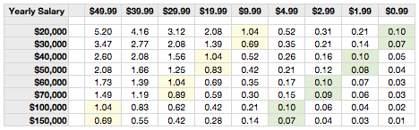 ](https://f3a98a5aca88d28ed629-2f664c0697d743fb9a738111ab4002bd.ssl.cf1.rackcdn.com/salary.png)
*(Click to enlarge.)*Here’s how to use this chart: pick the salary that most closely matches yours and the app price the see where the two intersect. This number you get is the amount of hours you need to work to obtain the dollars needed to purchase the app in question. Then ask these questions:
1. Do you gain more than X hours of value/time by owning this app over the course of the next year?
2. What about over the course of the next two years?Let’s pick on OmniFocus for the iPhone. It is priced at $19.99, so with on the lowest salary on this chart you will need to work for about 2 hours to make that money. The question then becomes: will OmniFocus give you back two hours of time, or make you two hours more productive if you buy the iPhone app?
I don’t know the answer to that question and I urge you just to look at what you get back over the next year of time — even though most apps will last you at least two years. ((At which time maybe you switch phones or there is a paid update you must, or want to, buy.)) I do know that most people scoff at the actual price of apps and not at the actual value of apps to them, given their financial situation. ((This is not to say that you buy apps when you don’t have the money to buy them. That would be silly.))
I have also highlighted (in light yellow) the price point for each salary level that most closely represents one hour worth of work (or less in some cases). This is the price point where anything below this threshold becomes a no-brainer in my book and I think best explains the pricing model in the App Store.
Most people are likely not to be inclined to pay for an app that will take them more than a one hour wage to earn, unless they are supremely confident that it will get them back that time. This is likely why most developers *know* that pricing over $9 is likely to result in low sales.
It’s the is–buying-this-app-worth-slaving-for-*extra*-hour-at-this-job-I-hate-worth-it factor.
Take a look on the store, most apps live under the $9.99 threshold which is also roughly an hour wage for a lower salary individual (lower salary on the above scale only).
In green I have highlighted (light green) the dollar amounts for each salary level that represents one-tenth of an hour. This is the level that I think makes the price point of an app an impulse buy for most people.
If you make ten times that amount in an hour, well then that amount of money starts to become very disposable.
### Conclusion
I have no real conclusion here and no big lesson that you are to gain. But it is something to keep in mind before you complain about *how much* that app is — considering that developers spend far more time making the app than you do making the money you are fretting about spending on the app. ((Well in most cases.))
-
It Gets More Idiotic
I guess I lied [yesterday](https://brooksreview.net/2011/08/buyers-remorse/) when I quipped this about Renee Oricchio: >Are you aware that anytime I see your name as the author I will now skip past the article? Because I went ahead and read her [follow-up piece](http://www.inc.com/tech-blog/comparing-pcs-to-cars.html) which is even more confusing than the original. Oricchio truly doesn’t get “it” let alone…
I guess I lied [yesterday](https://brooksreview.net/2011/08/buyers-remorse/) when I quipped this about Renee Oricchio:
>Are you aware that anytime I see your name as the author I will now skip past the article?
Because I went ahead and read her [follow-up piece](http://www.inc.com/tech-blog/comparing-pcs-to-cars.html) which is even more confusing than the original. Oricchio truly doesn’t get “it” let alone anything really.
She posts a bunch of cherry picked criticisms (none of which are mine much to the sadness of my ego) and then stated this in the start of her response:
>I think it’s a fair expectation that a new laptop, albeit cheap, should run seamlessly for more than a day.
That is an absolutely fair expectation — naive — but fair. From there though she seems to forget that first mission statement she laid out (I am quoting large chunks and skipping a few things, but I am trying to keep her original intentions intact):
>Who says you can’t compare apples to oranges? When you’re talking fruit, you absolutely can. It is fair to compare a $1000+ Mac to a $300 Windows machine. PC shoppers do it every day. They have to; both are on the spectrum of buying options. What would not be fair is having the same expectations for the bottom and top of that price range (just like comparing Honda to BMW).
Yes, but you are wrong here. You see it *is* fair to compare a Honda to a BMW if your stated reason for comparison is not performance, but as you suggested above is: reliability. Asking: is a Honda more reliable than a BMW? Is a completely fair question, which seems to me is the crux of your argument. You never said that your new $329 computer was slow, but that it was unreliable because it crashed twice on the first day — the equivalent of a car breaking down — so you absolutely *should* (by your own reasoning) be comparing your Toshiba to a Mac.
>I do expect both my Toshiba with Windows 7 and Toyota to perform consistently. I don’t think a cheap price is a reasonable excuse for a totally spotty performance. If you can’t sell something that works right at that price, then don’t go there.
Ok we are back on point now.
>I daresay that a $800 or even $1,800 PC with Windows 7 is just as likely to crash from time to time as my Kia—I mean Toshiba.
Wait, you just got done saying that… No I thought you were arguing that a cheap computer is *less* reliable than an expensive one? Now you are saying that price doesn’t matter — all Windows computers crash? If you *know* that then why did you complain in the first place? Why did you buy Windows? ((I know why, but I fear she doesn’t. She’s cheap/frugal.))
To use your own car analogies: this is more like you going to the junkyard and buying a car that someone wrote on the windshield “runs”, knowing full well that it likely will breakdown at some point, to only then get pissed when the inevitable happens: your car done stopped workin’.
Oricchio, you keep comparing your laptop to a new car, when it sounds more like you should be comparing it to a used car.
Oricchio ends with some odd quips about car analogies, but before that she states:
>Excusing Windows from crashing because I may have been installing non-MS software (everything was Windows-compatible, by the way) would be like excusing my hyptothetical Honda from dying at a stoplight on the way home from the dealership because some of the parts were not made by Honda (only Honda compatible).
I completely agree with this, BUT we *were* talking about the hardware not the software. The software is the same no matter the hardware when you are buying a Windows machine — you chose this!
Here’s the thing, and why I am harping on this. I am perfectly fine with criticizing shitty hardware. I am perfectly fine with criticizing Windows for crashing. I am fine with people stating that Mac users are crazies. What doesn’t make sense is the logic (or lack of) for this buying decision, here’s why:
1. Oricchio seems to be aware that Windows crashes no matter the hardware.
2. Oricchio seems to know that even though this shouldn’t be the case, shitty hardware is in fact, shitty hardware.
3. Oricchio bought shitty hardware (knowing it was shitty) with Windows on it (knowing it crashes).
4. Oricchio then decided that even though what she knew would happen, happened (multiple crashes on day one), that she is *not* the one at fault. Even though it was her decisions that took her to this place and that she had adequate knowledge to make informed decisions.To use her own car analogy: this is like buying a brand new Ferrari and driving it straight into a telephone pole and then getting pissed that the car is totaled and your neck is broken. ((That may be a bit of an exaggeration — point stands, both are stupid decisions and stupider reasons for complaining.))
-
Bonus Quote of the Day: Mayor Zuokas
“This tank is a good tool to solve the problem of parking in the wrong place” — Mayor Zuokas
“This tank is a good tool to solve the problem of parking in the wrong place” -
Amazon App Store: Rotten to the Core
Shifty Jelly: >Update: (and this one surprised us) you can’t remove apps from their store! You have to ask them for permission via an email. Every other store lets you remove apps from sale. The entire story is crazy, but this update they posted is nuts. [via DF]
Shifty Jelly:
>Update: (and this one surprised us) you can’t remove apps from their store! You have to ask them for permission via an email. Every other store lets you remove apps from sale.The entire story is crazy, but this update they posted is nuts.
[via DF] -
Bullying Anti-Piracy Lawyers Fined and Suspended
A pretty interesting story coming from the UK about actions being taken against a group of lawyers that sent out dunning letters hoping for payouts for alleged piracy. What came of it is fines and suspensions, but perhaps more importantly the news that not all those accused were guilty (shocking, I know). I hope we…
A pretty interesting story coming from the UK about actions being taken against a group of lawyers that sent out dunning letters hoping for payouts for alleged piracy. What came of it is fines and suspensions, but perhaps more importantly the news that not all those accused were guilty (shocking, I know).
I hope we start seeing some of this control of overzealous legal actions come to the US.
-
Measuring Broadband in the U.S.
A pretty interesting report that tells me three things: 1. Comcast isn’t as bad for everyone as it is for me. 2. Verizon fibre is the gold standard right now. 3. Cablevision, oh Cablevision, you suck.
A pretty interesting report that tells me three things:
1. Comcast isn’t as bad for everyone as it is for me.
2. Verizon fibre is the gold standard right now.
3. Cablevision, oh Cablevision, you suck.