Instacast just got a lot better with the 1.2 version update. If you have been holding off you should check it out now. You can now import and export OPML files (feed files for the podcast subscriptions) and you can do this via Dropbox. You can also send show notes to Instapaper — clever.
Month: April 2011
-
Could Tweetbot Change Twitter’s Stance on 3rd Party Devs?
MG Siegler:
>I also love the idea of adding some chaos into the mix. If Twitter doesn’t own the most popular mobile client, what does that mean? Would they have to buy Tweetbot? Do they make moves to shut it down or limit it?That’s and interesting question, but I am already willing to say that Tweetbot won’t over take Twitter (official app) as the most popular iOS client. The problem isn’t that Tweetbot isn’t good enough, the problem is that it isn’t $1.99 *better* than the free Twitter offering — it’s $0.99 better, but for most ((Whereby, “most” is not referring to us nerds, that only make up a small fraction of the base.)) they wouldn’t even cough that amount up.
[Updated: 4.14.11 at 1:35 PM]
I should also clarify to say that I think it is worth the price, but I don’t think that at any price they could surpass the market share that Twitter has with its official app.
-
TweetDeck to Make Their Own Fort?
Mark Millian reporting for CNN on plans that UberMedia (the people behind TweetDeck) may make a Twitter competitor, got this choice quote:
>”The audience for TweetDeck is very different” from the people who use Twitter’s official apps, Tony Haile[…]
No kidding, TweetDeck is a hot mess. Besides being ugly as sin it is nothing more than information overload presented in the most user hostile method possible.
Having said that, can you imagine just how “amazing” a Twitter competitor from UberMedia would be? It’d make MySpace look well designed.
-
Tweetbot Reviewed by Shawn Blanc
Shawn wrote a really nice review of Tapbots’ new Twitter client: Tweetbot. It just hit the U.S. app store last night and is overwhelmingly nerd popular. I have a mixed set of feelings about the app and haven’t used it enough to say for sure whether it is right for me or not. There is a lot of UI chrome going on and no real “must have” feature — I put it in my dock in place of the Twitter app and we will see if and how long it stays there.
-
Solarized OmniFocus Theme Updated
I updated the Solarized theme for OmniFocus to fix the color of the completed items. I also moved it to a permanent home. Please update your bookmarks to the page linked to as I won’t be mentioning future updates.
-
Topolsky’s PlayBook Review
Joshua Topolsky:
>There are five gestures which allow you to navigate the OS. A swipe up from the bottom bezel while in an application will take you to card view (and your homescreen), while the same gesture in the card view will bring up your app drawer and also close it. A swipe downward from the top of the bezel while in an app will reveal more chrome, allowing you to explore options or make other selections (in the browser, for instance, it brings up your tabs and option icon). If you perform the downward swipe on the homescreen […]I don’t normally quote this much of any one article, but I wanted to highlight just how complicated this gesture stuff is on the PlayBook. I just don’t see how grandparents would be fine with this. I know tons of grandparents who are in love and using iPads — do you think they could handle all those crazy gestures? I think we need a home button here.
Topolsky:
>And that’s what it really boils down to here; what is the compelling feature that will make buyers choose the PlayBook over something else?
There isn’t one.
-
MG Siegler’s BlackBerry PlayBook Review
MG Siegler:
>Is the PlayBook comparable to the iPad? No. Between the (lack of) app support and the wonky web browsing, there’s just no way around that fact. But RIM was smart to make the PlayBook a completely different form factor and give it BlackBerry Bridge to appeal to corporate users. So in that regard, there could be significant interest in this device.The review isn’t as bad as the above passage makes it seem — Siegler notes that there were a couple of updates pushed while he was reviewing the unit and that the software has a lot of nice touches. The problem seems to be that the iPad 2 and the apps behind it are much further along than where the PlayBook is as it jumps in to the ring.
-
Don’t Mimic Real-World Interfaces
There have always been those few apps that insist on looking like their physical, real world, equivalent. Calculator apps, date books, calendars, note taking apps, “stickies” — you know what I am talking about. Despite there being better options out there, better ways of displaying the data, designers stick with the known representation of the tool.
Now, though, Apple is taking it too far.
If you have seen any of the screenshots linked across the web about the new iCal interface you know what I am talking about. If you haven’t seen those, iCal is looking a lot like it does on the iPad right now in Lion’s developer preview. It’s ugly, and we should be way past this style by now.
I have [proposed a better calendaring solution](https://brooksreview.net/2010/09/sucky-calendars/) and [Marco Arment has talked about what he would like to see](http://www.marco.org/480805355) as well. The problem right now is that we have the graphics processing power and the design acumen to make realistic looking interfaces, and designers think they should make them look realistic.
Who wants that?
In theory, and perhaps in movies, this is a great look — in fact from an eye candy perspective it looks amazing. The problem is that these apps that mimic a real world interface make for pretty terrible computing interfaces. Real interfaces, those printed on paper for calendars, or molded out of plastic for calculators are static — computing interfaces are dynamic. The difference is that to make a sheet of paper show 7 days worth of appointments means that you have to print all seven days. Once it is past the first day it would be impossible to dynamically shift the content so that it keeps the seven forward looking days view. On the computer though this is easily done, yet no one does it — why?
I guess it is because that is not how paper calendars work, and that is just a silly convention to stick with.
In the early days of computing modeling interfaces, such as a calculator, after an actual calculator was very user friendly because users had a base understanding of how to work a calculator already. This lowered the bar for the prerequisite knowledge to use early applications. Ditto apps like calendars, datebooks and address books.
Now, I would guess that most “new” computer users actually don’t know that these things are mimicking their physical counterparts — well they know in the sense that it looks like a physical good, but I doubt they every think: “I used to have a calculator just like this one”.
How many teenagers today are likely to have ever owned or used a DayRunner? Mimicking these interfaces is not about creating a more usable interface, or about giving the consumer what they know — it is about creating eye candy, while the usability and productivity of the app suffers. Eye candy can aid a design and the usability — as it did with the first computer applications — more often though is forces the app to look and behave in a manner that is not very helpful to the user.
Ask any person who has used [Soulver](http://www.acqualia.com/soulver/) for Mac or iOS if they think Soulver was difficult to figure out — it is leaps and bounds better than any other calculator app, yet it doesn’t look like any other calculator app. It took me all of two minutes to figure out how to work the app and to realize just how much better it is. What Soulver did was not try to replicate the beloved HP 12c, instead they rethought what a calculator app was to be — and how it should be designed if it is only made for use on a computer, from day one.
It is what calculators would have been if they were invented at the same time computers were, instead of what we have with most calculator apps.
### Little Bits of Paper ###
Brent Simmons [calls it](http://inessential.com/2011/03/31/torn_paper_derangement_syndrome_tpds_) Torn Paper Derangement Syndrome (TPDS) and I most certainly have it:
>If this rumored new UI for iCal is real and not just a mockup by a misanthropic Photoshop sadist, then I’m going to be distracted forever by the bits of torn paper under the toolbar.
When I used paper notepads in school I would take an Exacto knife to remove those bits of paper weekly — can’t stand it. It is a sign of a flawed product — one that is designed to tear with ease and perfection at the top, but that never lives up to its expectation, much like checks (remember tearing those out). Why remind everyone of the imperfect days of yore by bring that bit of imperfection across. That is akin to Microsoft deciding that Excel should stop calculating *pi* after 3.14 — stupid and pointless given the tools at hand today.
Nobody misses those bits of paper. Nobody wants iCal to look like their Franklin Covey — people want it to work like that, but not look like that. That is: people love the feel of pen and paper and scratching stuff off, but that feeling is not best replicated through showing static, arbitrary, bits of torn paper. People love how organized they became with these old school paper tools, yet instead of taking that organization to the next level with computing we just get the same thing we had in paper form (less the paper cuts and waste).
The way to get people to love a calendar app is not to make it look like what they used 10 years ago, but to make it better than what they used 10 years ago. So far the only feature we have that consistently works is alarms that sound 15 minutes prior to meetings. Not even invites work on a regular, consistent basis across all devices.
### Feels Nice ###
The best part about how these interfaces work is how they feel — can’t you feel the texture of the paper grain as you move your mouse pointer over it? Wait, all I feel is the glass desk below my mouse and subtle twinge of annoyance as I pass by the intended resting spot for my mouse pointer. We can’t feel the textures drawn on the screen.
Real life interfaces are made to be pressed with the wide human finger, to be grasped in your hand and held in your briefcase. That’s why buttons can never be too small and why writing zones are large and the physical size is critically important. That’s also why a lot of these interfaces transfer nicely to touch based devices like the iPad or iPhone. That’s also why they suck so much on a ‘regular’ computer — a mouse pointer is tiny and doesn’t need huge click zones. Fonts are legible at small sizes and don’t need huge areas to fill. Screen sizes are anything but static and the interface needs to work well on all of them.
There is a separation between the needs of the real world and the needs of the computer world. Making direct porting of interfaces a poor decision.
### Looks Great, Sucks to Use ###
I can’t tell you how many apps there are that I could say the above about. Then there’s the small subset of apps that seem to really get how people actually want to, and do use, their apps — those are the apps that just leave you saying: wow.
These are the apps we need and crave.
It’s great that you spent 16 hours making that wood grain and stainless steel look exactly like the real thing — looks nice — but does your app work? Does your app make sense?
Calvetica isn’t good because it works like a DayRunner — it’s good because it works well with my fat fingers tapping at a slick, backlit, glass screen. It works because when I turn in to landscape the information changes, it works because they thought about how people use the product (yet, they have not solved Marco’s complaint, nor most of mine.) The subtle texture of the Reeder background doesn’t make me love the app more, the navigation and presentation of only what is important makes me love the app. I don’t think OmniFocus on the iPad is better than it is on the Mac because it looks more like a paper check list — I know it is better because it shows me only what I really *need* to see at any given time.
Some of the apps that are coming out for mixing boards and DJ scratching — they all look really cool, but they suck to use. You can’t physically turn a knob on the iPad screen — so why make knobs an essential part of your interface?
Why haven’t people figured this out yet?
-
OmniFocus Solarized Themes
I threw together the dark and light themes in OmniFocus, here’s what that looks like:
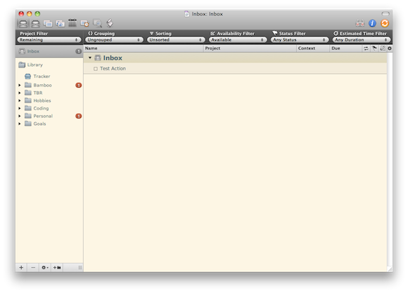
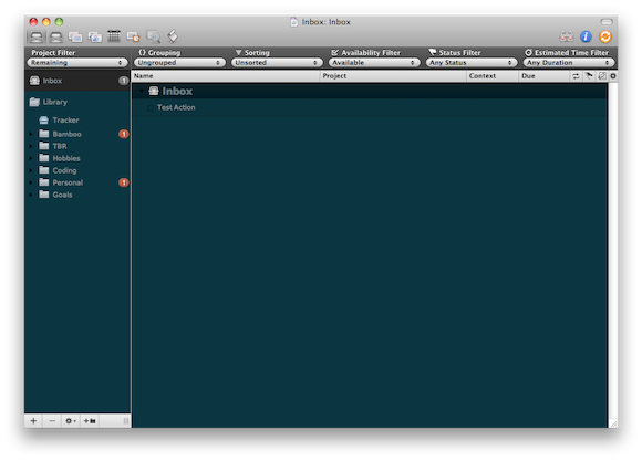I prefer the light and this is version 1.0 — if I make any changes or tweaks I will update this page.
[Download Here](https://f3a98a5aca88d28ed629-2f664c0697d743fb9a738111ab4002bd.ssl.cf1.rackcdn.com/OF-Solarized%20Themes.zip)*(The font shown is DejaVu Sans, you can [get it here](http://dejavu-fonts.org/wiki/Main_Page).)*
Updated versions:
Version 1.0.1 — fixes colors for completed items.
-
Solarized
I have always typed on a white background with dark gray text — it has a lot of contrast, but I just liked it. Justin linked to this and I check it out — what a fantastic color scheme (both light and dark) — I am using it now for everything and love it so far. If you are looking for a nice color scheme to use for your text editors or terminal — give this a go.
(Here’s the [TextMate theme](https://github.com/markstory/solarized).)
[via Justin Blanton] -
Developing for Android and All Those Screen Sizes
Christopher Mims on developing for Android devices:
>Developing for such a wide array of device screen sizes and aspect rations means that not only is it impossible to create pixel-perfect designs for Android interfaces, there isn’t even any guarantee that a given interface can be scaled to fit a particular screen.A nice read and a follow-up to this [piece](http://android-gripes.tumblr.com/post/4547554787/why-do-apps-look-worse-on-android-than-iphone-a).
[via @pobregizmo] -
Final Cut Pro X
The big story here isn’t that there is a new version of Final Cut Pro — it’s that the new version costs $299, not $999.
-
15 Slides, Three Writers, Three Ways
When I was down at SXSWi I almost missed this presentation from Jim Coudal, Michael Lopp, and John Gruber — they spoke early in the morning at a venue far away from my hotel — I am glad I didn’t miss it though. Turns out that this was the best presentation that I attended, they have great insight into how they write. If you have time to listen I recommend that you do (alas it is a Flash only audio player).
[Updated: 4.13.11 at 7:02 AM]
Gruber kindly posted a direct link to the MP3 so you aren’t stuck in Flash. Grab that here.
-
Acorn 3
>Acorn can create layered screenshots of every window you have open on your computer. It’s magic.
That’s a pretty amazing feature. With every update to Acorn I have less and less of a reason to have Photoshop installed — which is impressive for an app that is selling for $29.99 right now.
-
Tablets for Giants
Patrick Goss:
>Lenovo is working on a 23-inch tablet, with William Cai telling TechRadar that the company believes a home tablet could be arriving this year.Wow. I’ll let [Craig Grannell](http://reverttosaved.com/2011/04/12/is-the-ipad-too-small-for-you-if-so-check-out-lenovos-23-incher/) comment on this one:
>Someone at Lenovo presumably, then, was thinking about gaps in the tablet ecosystem and yelped “what if Godzilla wanted a tablet?”, because that’s the only explanation that makes any sense.
[via —Craig Grannell] -
Welcome to the staticDimension
There has been a lot of talk around the web lately about building ‘baked blogs’ — [Brent Simmons](http://inessential.com/2011/03/16/a_plea_for_baked_weblogs) (and he is not alone) is tired of not being able to read sites that John Gruber links to on [Daring Fireball](http://daringfireball.net/), because the sites tend to go down under heavy traffic influx. This is typically due to one of two things: cheap, crappy, hosting; or not properly “baking” one’s blog. The former is easy to fix, but costs a bit more money. The latter is also easy to fix, but can be quite complicated, costing you time.
Unfortunately most blogs that go down are WordPress blogs that aren’t being cached and thus, are dynamically being generated. The problem is that ‘baking’ a WordPress blog can be quite complicated and more than the average user wants to deal with (I will go into this more in a later post). In light of all this recent discussion I have been exploring all sorts of different blogging platforms — from Movable Type to things like Jekyll. I came across one true gem in all of this configuring, SSHing, and general time wasting — that gem goes by the excellent name: [staticDimension](http://subdimension.co.uk/pages/projects.html).
How great is that name?
This is a fully baked, static blogging platform. It is bare bones. It is free. And I think it just maybe perfect for new bloggers that are serious about the craft of writing on the web, and serious about not spending lots of money on hosting. Looking at the current blog software ecosystem I see two choices for bloggers that want to be able to provide ‘linked lists’ mixed with articles (like I do here, and [Shawn Blanc](http://shawnblanc.net/) does, and [Gruber](http://daringfireball.net/) and [Kottke](http://kottke.org/) probably started), the first choice is [Tumblr](http://www.tumblr.com), the second is [staticDimension](http://subdimension.co.uk/pages/projects.html). Sure, you can do this with WordPress and other platforms, but only if you are comfortable digging around some code — there is still no easy way to set this up on WordPress. Both Tumblr and staticDimension come with this feature built-in.
We know enough about Tumblr already and it’s hosted, but free, platform, that has been seeing growing pains of late. This newcomer though, staticDimension, is also free and is dead simple to install on just about any web server. All you have to do is upload the files to the servers public directory and then change the username and passwords — you are now done. There are no plugins, no database configuration, no nothing. Upload, set preferences, done.
Simple.
What does it look like? Head on over to benb.me for a look at a blog running on staticDimension. (The site is running on the same server as TBR.) It is pretty simple and out of the box allows you to make three types of ‘posts’: pages, articles, linked posts. I think that is pretty much all that any new blogger is going to need to get going. All articles are written in Markdown and saved as plain text files on the server, making it easy to both backup and get your data back out of the platform if you decide to move to a more robust platform later on.
The entire system is easy and simple.
### The Backend ###
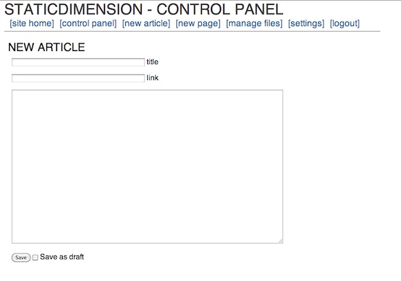
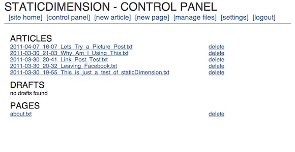
It drives me nuts when you can’t see what the backend of a blog really looks like, so here is the control panel of staticDimension:
[
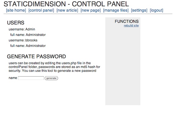 ](https://f3a98a5aca88d28ed629-2f664c0697d743fb9a738111ab4002bd.ssl.cf1.rackcdn.com/sd-cp.png)
[
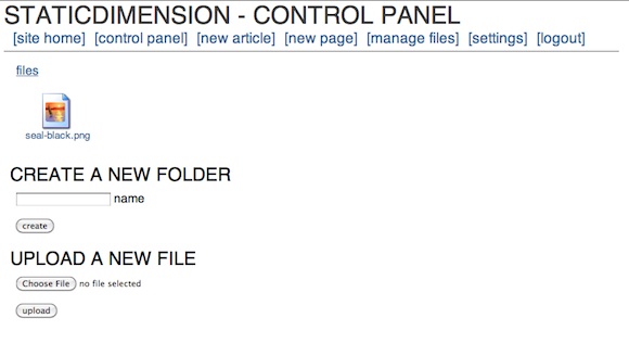 ](https://f3a98a5aca88d28ed629-2f664c0697d743fb9a738111ab4002bd.ssl.cf1.rackcdn.com/sd-f.png)
[
 ](https://f3a98a5aca88d28ed629-2f664c0697d743fb9a738111ab4002bd.ssl.cf1.rackcdn.com/sd-art.png)
[
 ](https://f3a98a5aca88d28ed629-2f664c0697d743fb9a738111ab4002bd.ssl.cf1.rackcdn.com/sd-artlist.png)
The whole thing is dead simple. My biggest complaint is that you can’t post from MarsEdit or TextMate (yet), but for a new blogger I doubt that matters as much as having an easy to setup system does. The backend is so fast and easy that it works fine on iOS — meaning you can write in your favorite program and copy and paste in the content with ease (not the case with WordPress). The options are far and few between, but the system has what you need — with one exception: auto-tweeting. It’s not the end of the world, but it does add a step that a service like Tumblr and WordPress don’t add.
### Design ###
The stock template leaves a lot to be desired and truthfully this is the biggest downfall of the system at the moment. There really is no other templates that you can install. I took about 30 minutes and modified the four template files that are needed for the system to run (easy to do if you know HTML markup) and I also edited the CSS file to change the look and add in Typekit (again standard CSS if you know how to write that). After doing that I found that I like the way the site looks, love the site speed and am pretty darn happy with it.
This is a flexible system for CSS writers, but I couldn’t find a way to edit the headline behavior on the site. For instance if I wanted to make the post headline of an article link through to the post page, I couldn’t find where that code lies. That’s a bit annoying, but again this is not for people who want full customization (not yet at least, it’s version 1.1 right now). I do think this is a good system if you know how to tweak a bit of CSS and you just want to get up and running. The stock theme is pretty, well, not attractive out of the box.
### Speed ###
This is fast, granted I only have a few posts on the site, but it rebuilds instantly. You don’t even need to rebuild unless you edit one of the template files (not including the CSS, that changes when you upload the new version). Browsing speed is lightening fast, even with Typekit installed.
### Archives ###
The archives are pretty basic and you have to drill down from year, to month, to day before you see a post. Then you see the post names as they appear in file names — a bit lame, but again not unusable. There are a few tricks to get the CSS working right past the main archives page, but emailing the developer will help you solve that problem.
Archives are really not good by default in any blogging system. WordPress’ are unuseable (mine work because there is a lot of extra code being used) and Tumblr’s are silly unless you add a photo to every post you write. So while the archives are not great, this is something that is simply not great on any platform. I would love to see the archive system grab the title instead of the file name — that would remove at least one level of ugly.
### Annoyances ###
I like the platform, but there are some things that need work:
1. Your page name is what appears in the navigation, and in the page heading when you go to it. Leaving no real room for customization of wanting the nav to say one thing and the page title to say something else.
2. As I mentioned before, no way to auto-tweet.
3. No way to post from blogging clients like MarsEdit.
4. Limited theme customization.
5. No other themes available.
6. Sidebar needs to be modified on each of the four template pages. To reflect the actual sidebar — there is no one sidebar template the system pulls from.
7. No search, though adding in a Google site search box wouldn’t be hard.Again, this is a version 1.1 system and I am sure lots of changes are being worked on.
### Final Thoughts ###
If you are just getting started with blogging and you want to run the web server yourself — give this a go first. I honestly think that you could run this off of a cheap $10/mo hosting plan and withstand a DF link — assuming you are not image heavy, or just don’t serve the images yourself (I don’t, S3 works great for that). The setup is stupidly simple. The backend is just what you need, nothing more. The files are stored as plain text so you can move them wherever, whenever.
It’s just easy and it really is pretty nice. If you hate databases and SQL (who doesn’t) and you wanted to have linked list posting — this is a system you really need to check out. I say give it a try first because it really is that easy to set up and, frankly, if you are wanting to put your writing on the web you should be the one that owns the content.
[Updated: 4.12.11 at 1:17 PM]
One thing I didn’t mention is that the developer is incredibly nice and very responsive. I emailed with him a bit when I was playing with the platform and trying to work out some kinks. Since posting this review the platform was updated to version 1.2 and then to version 1.2.1 shortly after he read my thoughts. The biggest change is in the archives and how they display the post names — great work!
-
The Price of Free
Eric F. Myers in the Google Reader support forums:
>If you’ve come here from the”Something is Broken” forum thinking that this problem has been Answered, I’m sorry to say that it has not been. It’s been six months since I’ve posted this question and there’s still no answer from Google. The post in question still has a star next to it.Another 283 people seem to echo his problem, that’s [what happens](https://brooksreview.net/2011/03/fragility-free/) when something is “free”.
[h/t to reader King Yip] -
Facebook Is Not as Truthful as Previously Thought — Shocking
Kevin Sablan:
>All tolled, the like buttons claimed that those pages were liked or recommended 4,622 times. In fact, they were liked or recommended only 1,790 times.Shocking, I’m sure. More information [here](http://almightylink.ksablan.com/statistics/facebook-button-count-is-wrong-use-realshare/).
[via Hacker News]