Month: July 2012

  • Google, Mayer, and the Future

    [Marco Arment brings up a really good point with regard to Marissa Mayer leaving Google to become the CEO of Yahoo!](http://www.marco.org/2012/07/17/the-real-reason-marissa-mayer-left-google):
    >Every time Apple loses one of its Senior VPs, we see stories questioning Apple’s leadership and future, suggesting that there may be significant inner turmoil.

    >Well, Google just lost one of its top people.

    Mayer was the 20th employee at Google and has been with the company for most of the company’s existence. So I think Arment’s statement is very interesting. What happens when Google loses top “talent” — is that bad for the company?

    Steven Levy seems to have had a lot of access to not only Mayer, but Google itself, [and in his post for Wired he notes](http://www.wired.com/business/2012/07/why-marissa-mayer-the-ultimate-googler-makes-sense-for-yahoo/):

    >And it must have been disappointing that she was not included in the “A” team of top product lieutenants that Larry Page chose when he became CEO last year.

    That surprised me, I always thought she was one of the top people at Google — certainly the only non-creepy Google execs. ((Looking at you Schmidty.)) So Levy is painting a picture of someone who seems to have hit their peak at a company — only natural then for an ambitious person to leave.

    More to Arment’s point though is this passage from Levy in the aforementioned Wired article:

    >I did an informal survey of the young managers and asked each to guess if he or she would be working for Google in five years. Not a single one answered in the affirmative. When I reported this to Mayer (we were in Israel by then), she was unruffled. Actually, she told me, it would be a positive thing, because Google DNA would be spread throughout Silicon Valley, to the benefit of all.

    I certainly wouldn’t want to run a company, and train new employees, if every one of those employees didn’t expect to be there in five years time. That line about spreading Google DNA just seems like a bunch of PR brush-off speak to me — this matters. Should be interesting to see how Google changes as they continually turn over managers.
  • Quote of the Day: Craig Grannell

    “This feels like an email client designed to appeal to people bereft of emotion.”
  • Scratch — Your Quick-Input Notepad

    I’ve only been using Scratch since yesterday, but I have to say it looks to have ousted Drafts as my go to note/scratch pad app. In my testing it launches faster than Drafts, and offers a lot of little clever features.

    For one, it supports Markdown with a special row of keys — but that’s almost trivial now in iOS apps. What’s really nice is that it has a special row of keys that give you other keys that would before cause you to tap and change the keyboard. In my case: the em dash is there. I use a lot — a lot — of em dashes, so for me this is a time saver.

    What’s odd is that the app doesn’t have a new note button, instead a delete this note button. Which at first was annoying, but really it’s more like taking the current page of paper you are writing on and tossing it aside, only to see a new — fresh — sheet of paper.

    Ok, before I wrap up this mini-review, let me point out two other features:

    – You can append what you just wrote to a text file in Dropbox. Append people. Very cool.
    – You can export just the text you select, again, nice touch.

    Did I also mention you can customize that custom row of buttons?

    The icon is blue-ish though, so that was a strike against it, but then I looked harder at it in my dock and the icon has grown on me. So note the time and date (July 17, 2012) because this is a blue icon that I like.

    The biggest rub I have with the app is that when I export to Dropbox I have to navigate my entire list of Dropbox folders. I would love to setup the app so that exports to Dropbox always go to folder X and that when I append they always go to file X. That’s a nitpick though. What’s more impressive is how much this app does without ever showing a settings screen.

    It’s [$2.99 in the App Store](http://itunes.apple.com/us/app/scratch-your-quick-input-notepad/id533320655?mt=8) and I applaud them for charging a premium price. It’s not for everyone, but — right now — it *is* for me.

  • Checkmark

    Checkmark made the rounds a couple of weeks ago when it was announced. I have been beta testing the app for a good while now and can say that it is a really solid app. I don’t personally use it, but that has more to do with my love affair with OmniFocus than Checkmark itself.

    [Shawn Blanc uses the app](http://shawnblanc.net/2012/07/review-checkmark-for-iphone/), and after talking with him, I agree that Checkmark is best thought of as a Reminders Pro — that is Apple’s own Reminders app taken to the next level.

    The best explanation I can give as to why you should use Checkmark: if you love location based reminders, but you don’t love having to enter them by hand in Reminders. Checkmark really excels at this and has an added nicety of delaying the reminder when you arrive or leave a place — that’s actually exceedingly helpful.

    It’s $0.99 in the App Store and really worth checking out.

  • Amazon Item of the Week: Ikea Poang Chair

    My wife and I just picked up two of these over the weekend and I have two main things to say about this chair:

    1. It is ridiculously inexpensive. This Amazon price is about what we paid at IKEA and it really is surprising that you can get this chair for that cheap.
    2. It is a really comfortable chair. I know you may not believe this, but it is very comfortable. Not only that but it has a nice bounce to it that our daughter loves.

    Every item like this that I post is an item that I have tried and really like — this is no exception. You may not like IKEA stuff, but if you need a comfortable armchair for any purpose — you could do a lot worse than this chair.

    (It comes in three different wood colors and many different fusion colors and fabrics — this is just a link to one option.)

  • ‘The Retina War Is Upon Us’

    Wells Riley on designing with retina screened computers:
    >Whether Photoshop scales a 1x image or not, I’m still not getting a real-world representation of a pixel-perfect 1x image on a 2x screen. It just can’t happen. The screen is too good to be backwards-compatible.

    The problem isn’t designing for the new retina MacBook Pro, the problem is designing *on* the new retina MacBook Pro *for* non-retina screens.

    Due to some unavoidable circumstances I scrambled to work up a new theme for this site before I launched the paywall — so the entire site was designed on my retina MacBook Pro. No problem, I whipped the site up using Coda 2, tested it on my iPhone and iPad — everything looked great. Then I got to my office and tested the new design on my MacBook Air, and — oh shit — things didn’t look right. So unless you view this site on a retina machine, you are *not* viewing it how I designed it. Luckily I don’t use any image files for the design, so I haven’t had to deal with that. Also it’s a pretty basic site, but still it was a bit of trouble.

    It would be difficult, if design was my job, to not have a retina MacBook Pro, but just as difficult to design with a retina MacBook Pro. Should be interesting to see how this plays out long term.

  • Our Future with Google

    Stephen Shankland writes about how people might be using Google in the future and brings up a lot of great questions. Questions about how all of this is funded in the future, the trust problem with Google, and most importantly — to me — the privacy implications of it all.

    One incredibly interesting quip that Shankland makes is about Google Glass and what ads a person sees. The Glass project doesn’t look like a cash cow product to me, but what if the intended benefit to Google is that now *they* see exactly what *you* see.

    Take the grocery store for example. The loyalty card programs were developed as a research tool — telling stores what items a person buys together in different locations. Things like: when people buy tortilla chips, they also buy salsa. The more data like this that stores get, the better they can optimize their shopping aisles so that what you need is grouped together — in such a way that you end up spending more than you normally would. What if instead of knowing buy looking at an individuals purchases, stores started knowing by virtually ‘seeing’ how customers browse a store. That is exactly the kind of data that most stores would kill to have.

    Same too with website owners looking to optimize content. I can see where you mouse is if I install the right software, but I cannot see where your eye is. Google Glass could change that, and as Shankland says — this both excites and terrorizes me.

  • Quote of the Day: Horace Dediu

    “It could even be said that today Samsung is the only Android profit engine.”
  • Interface Runes

    Rob Walker looking at the odd Graffiti language that Palm use on its Palm Pilot devices:
    >It seems unnatural to have invented symbolic stand-ins for the alphabet. Then again, the alphabet itself is a symbolic stand-in; the word “tree” doesn’t reflect the reality it refers to any more naturally, as it were, than its Graffiti Alphabet equivalent.

    Graffiti was an odd duck, but if you mastered it you could really fly with writing on a Palm device — I know this because I used to take notes on one during class. Walker interestingly started off talking about how silly he feels using gestures on an iPad, and then he found his Graffiti reference card and realized how silly that was, concluding something interesting:

    >Probably what matters more in judging post-language touch-screen navigation — and this can be a little unnerving — is watching a toddler, too young to speak, but evidently hard-wired to swipe and poke, navigate a touch-screen device. No reference card required.

    This is a really interesting difference between mid-90s tech and modern technology. More and more we are creating devices that we interact with in a seemingly natural way — except that none of it is really natural because we’ve never before had to do some of these things before.

    Sure moving content is natural, but why does pinching to zoom seem natural? I mean it’s not like I walk around my house and when I come across a photo I have printed, I then walk up to it and pinch it to make it smaller or bigger… Never before have we used that gesture in this way, yet the first time you do it everything clicks and it makes no sense to do zooming any other way.

  • The Misleading Use of Rumors in News Journalism

    Anybody who follows Apple with any sort of regularity knows that two things:

    1. The company is tight-lipped about plans and products.
    2. Bloggers will go crazy trying to report rumors about anything Apple may do.

    That’s two incredibly simple facts that most any Apple watcher/lover knows. Hell most avid web article readers probably even know that.

    The one website that doesn’t seem to know that? The New York Times.

    [Nick Wingfield and Nick Bilton wrote an article yesterday title](http://www.nytimes.com/2012/07/16/technology/apple-may-meet-tablet-competition-with-smaller-ipad.html?_r=1&pagewanted=all): “As Tablet Race Heats Up, Apple May Try Smaller Device”. The title isn’t misleading at all because they used the word “may”.

    As you start to read the article though, that ‘may’ seems like a distant memory.

    Case in point #1:

    >The company is developing a new tablet with a 7.85-inch screen that is likely to sell for significantly less than the latest $499 iPad, with its 9.7-inch display, according to several people with knowledge of the project who declined to be named discussing confidential plans. The product is expected to be announced this year.

    This is just a terribly misleading paragraph. “The company is developing” is an outright incorrect statement, they are reporting on a rumor that they have now stated as fact. They only hedge that statement at the end by sourcing this to “people with knowledge”. So now all the casual readers of The New York Times are certain that Apple is making this device — when the one thing we know about Apple is that they don’t share these details.

    If it was just this one statement I would leave well enough alone, but it gets worse.

    Case in point #2:

    >Apple’s plan for a tablet with a smaller screen is part of a textbook business strategy: to lure customers who want different sizes of tablets into the iPad product family, say analysts and technology industry executives.

    Again they state as fact that Apple is doing this as part of a textbook strategy that they seem to “know” about — again only hedging that statement at the end by saying this info is from “analysts”. You know, the analysts that are wrong about every prediction they make regarding Apple — yeah those guys.

    Case in point #3:

    >Either way, Apple has warmed to the idea of a seven-inch device.

    Really they have, you now have gone from saying that this “may” happen and hedging statements by stating your information is from anonymous (to us) sources, to what, all of sudden knowing that Apple has “warmed” to seven-inch devices? What changed from the title to this line?

    I think Bilton is one of the better tech journalists out there, but this article is perpetuating rumors as if they are fact — and that is just egregious reporting.

  • ‘A Future Full-time Job’

    Marco Arment responding to [this post from Stephen Hackett](http://512pixels.net/part-time-gig-full-time-frustration/):

    >I think I’d have a hard time ever working for someone else again. Not because everyone else sucks, but because I suspect I’ve lost the ability, if I ever had it, to be a very good employee for anyone else.

    Fun fact, once I graduated from college I never worked for another person. I’ve been my own boss since 2005 and even before that I only had worked for my Dad’s company — so my traditional office experience is non-existent. Since college I have had half a dozen companies.

    Working for yourself isn’t for everyone, in fact the most crucial part is being able to own your fuck ups. By that I mean walking up to a client/customer/reader and saying: “I screwed up, it was my fault.” The second most crucial part is having a solution.

    I don’t say that to sound like I know it all, but I’ve started and failed at my share of companies and yet I support my family, with my wife, off of a company I created (she also created her own company). I do this because literally the only thing I knew about how I was going to make money when I graduated from college was that I wasn’t going to make money working at someone else’s company.

    The hardest part is making the decision to do it, everything else is just doing the work.

  • Free App Idea: Open Road

    I have been thinking about this idea for quite a while now, approached a few developers I know to see if they wanted to take the idea and run with it, but now I just want the app. So here is my idea, you can have and I only ask for two things in return for you taking this idea:

    1. That you get me on the beta.
    2. That you charge for the app.

    Now that that is out of the way, my idea is essentially a [Dark Sky](http://darkskyapp.com/) like app for traffic. The idea is simple: when I am driving down the road and I see traffic coming up I always have two questions, ‘how bad’ and ‘how long’. Of course right now I grab my iPhone and pop open Google Maps and take a look at the traffic. That’s not ideal though for a couple of reasons:

    1. I often turn off the traffic data on Google Maps so that I can see the street names.
    2. Google Maps zooms in on the area where you are, but that’s often too close to see the traffic ahead since Google centers your location on the screen.

    Google Maps is just too cumbersome to try and use (safely or not) while you are driving a car. Enter “Open Road” (you are welcomed to choose your own name, I just need something to refer to).

    ### The Idea

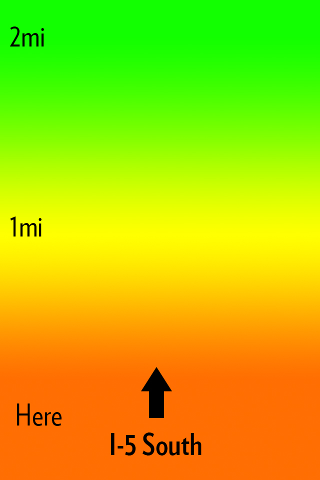
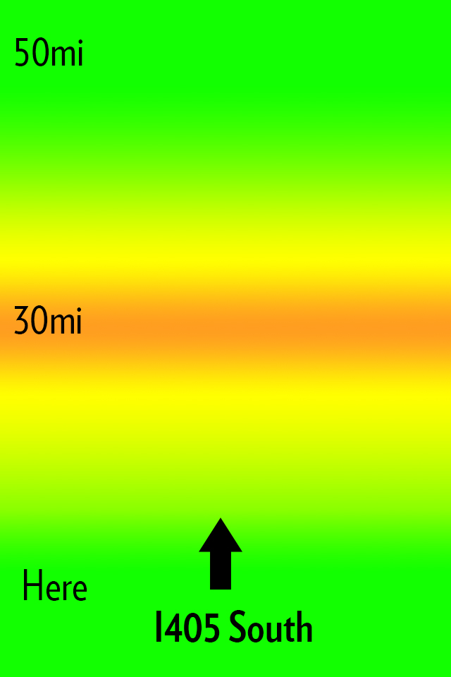
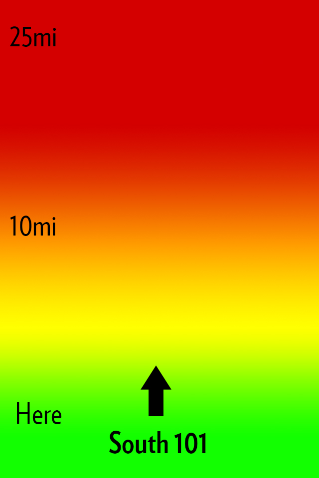
    My idea for Open Road is to create an app that does one thing: shows you the traffic ahead of you in a quick and glance-able format so that it can be used one handed without much thought or interaction while you drive. Here’s how I envision this looking:

    The main interface.

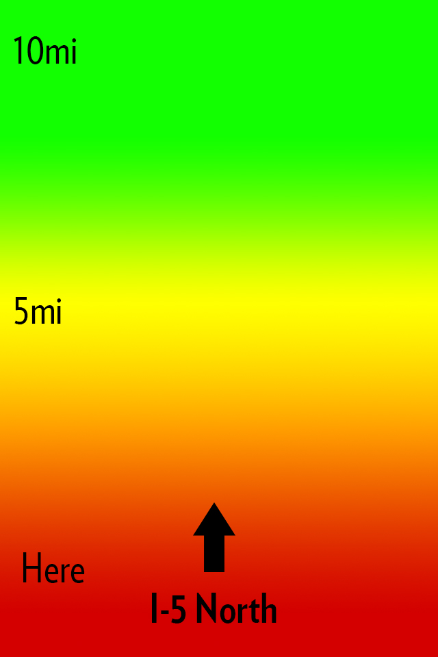
    All that you see is a screen with a heat map, the distances from you, and the road that the app thinks you are on. Green is open road, yellow is slower, orange sucks, red is the makings of a bad day. Pretty simple, here’s some more mockups:


    Now you might notice I changed the distances in the screenshots. The way I see the app working is that a driver can slide his finger up or down the screen to change the distance of the traffic from him. Perhaps I am only driving for another 5 miles on this road and I need to know if I can tough out the traffic — maybe I am on a long haul for 100 miles.

    This is the idea in a nutshell.

    ### The Warning

    iOS 6 is bringing a new map platform with crowd sourced traffic data. I have no clue how this looks or works, but there is potential it could compete with an app like this. I do not however see Apple making an app like this, but if they enabled push notifications of upcoming traffic then it’s game over.

    ### That’s All

    If you like the idea run with it. Good luck.

    *Let me just state again that I won’t pay for someone to develop this, and I certainly do not want any kind of equity or my name attached to any apps you may build. The idea is one I had, but the execution (the hard part) is all you.*

  • ‘Announcing an Audacious Proposal’

    Dalton Caldwell is fed up with being exploited by ads on social networks:
    >Why isn’t there an opportunity to pay money to get an ad-free feed from a company where the product is something you pay for, not, well, *you*. To be clear: I’m glad there are ad-supported options, but why does that seem like the *only* option? For example, I have the option of buying a Mac if I don’t want to buy a crapware-infested PC, right? I have no interest in completely opting-out of the social web. But please, I want a real alternative to advertising hell… *I would gladly pay for a service that treats me better*.

    He’s got a Kickstarter like campaign going where you can pledge $50 to get the project going. I’m in for $50. It’s for a Twitter like service, but one where they make the best product — not the most creative ways to inject ads. I like for pay services, so I am excited to see if this gets funded.\

    [More info about the project here](https://join.app.net).

  • Can Tumblr Embrace Ads Without Selling Out?

    The old adage is that a question in the title of an article can usually be answered with “no”, right?

    Here’s Rob Walker in an in-depth article for the New York Times on Tumblr’s founder and CEO, David Karp’s strategy to start making money:
    >This strategy means a brand must use Tumblr and use it well — which, actually, lots of brands already do, free. In fact, Tumblr helped many of them do so — again, free — during the years it was more concerned with boosting its audience than with making money. Karp argues that this is a strength: “A lot of these brands showed up on Tumblr, figured out how to use the tools, created value for our community and got a response.” Now they have the option to “elevate” what they’ve created within Tumblr, by way of a sponsorship.

    Everything about this idea seems to be akin to what Facebook is doing to business pages: charging business page owners a few bucks in order to show new updates to all of that pages fans. Guess what, that’s not going over so well with users.

    This is a tough issue, the same issue that I faced with changing the business model of this site. When you take away something that was previously free people get mad, and they get mad because you previously made them feel they were entitled to what you gave them for free.

    The difference between this site and Tumblr? I don’t have to answer to VCs that want to be repaid. Tumblr would be smart to just start charging for their service (at the very least to brands), but hey I don’t like ads so what do I know?

    Update: There is a [great post from Derek Powazek](http://powazek.com/posts/3024) about this very thing where he asks:

    >What if we designed a social network to be small, self-supporting, and independent from the outset?

    His entire post is worth a read, as he talks about what does and doesn’t work and what *has* worked for MetaFilter.

  • The Nifty MiniDrive

    Following my post I got [tipped off](http://twitter.com/vgoyle/status/223834365111705600) to this drive for MacBooks. Basically it is a converter for a microSD card, but specially designed to fit in the SD card slot of a MacBook without protruding. That alone is pretty neat, but why would you want this?

    Well they actually did a pretty good job of persuading me to get one: use it as an integrated backup drive. They note you can only get a 64GB microSD card right now, but that the Nifty MiniDrive supports up to 2TB — which would be slick.

    Anyways, I backed the project and look forward to putting my SD card slot to a lot more use. I plan on using the drive as my Aperture ‘vault’ location for backups.

    [via @vgoyle]
  • ‘Sneaker Net’

    Rob-ART Morgan analyzes USB3 thumb drives for new Mac owners and comes to this surprising conclusion:

    >If small size is the priority and you have a 2012 Apple laptop, you should consider using an SD card as your jump drive. That’s because the fastest SDHC card on the newest laptops is more than twice as fast as the same SD card in the SD slot of the 2011 and older Apple laptops.

    I didn’t see that coming. I griped on Twitter a week or so ago that I would really love to get my hands on a Thunderbolt powered thumb drive — something around 100GB — mainly because it would be a great medium to store my current working Aperture and LightRoom libraries on and would be fast as hell. I hadn’t even considered the SD card slot, but I like that solution (not, mind you, for my photo library just yet).

    I keep about 50GB worth of thumb drives in my backpack all the time and I cannot tell you the last time I used a single one. I am now to the point of giving them to people with data on them, and not caring if I get the drive back. SD cards would be even more disposable, and yet even more useful for other things — like my camera.

    Especially when you consider the Lexar 32GB thumb drive is $234 and 128GB Lexar Pro SDXC (they work in the Mac SD card slots on Retina machines) is only [$155 at Amazon](http://www.amazon.com/exec/obidos/ASIN/B007BZRXK2/ref=nosim&tag=brooksreview-20).

    Seems like a no brainer to go with an SD card — most Macs have a slot to read them now too. I would love that Thunderbolt thumb drive though if someone wants to build that for me.

    *Side note: I hadn’t heard the term sneaker net before, but I love it.*

  • Tap! Magazine

    [Craig Grannell writing about Tap! magazine](http://reverttosaved.com/2012/07/12/it-really-annoys-me-when-i-see-people-reviewing-ios-apps-badly/):
    >People still bang on about magazines being rubbish on the iPad (something I wrote about in March) and, more recently, argue the iPad’s corner in terms of content creation. Bizarrely, Tap! almost never gets a mention, despite being a magazine designed specifically for the iPad and that’s actually put together on an iPad and in the iPad simulator on a Mac.

    Grannell got me a free copy of Tap! back when they launched the app for the iPad (full disclosure and all) and he is right: Tap! is not like any other magazine you will find on the app store. I know I am among the lot that makes fun of iPad magazine apps. I make fun of them because for the most part they are a digital copy of what the magazine would normally print. Which is both boring and hostile towards the user (non-selectable text, huge files sizes, etc.). Tap! is different, but I have never been a huge fan of the kind of different that it is.

    It’s great that Tap! is specifically made for the iPad, that truly is great, but the UI is very odd. Print magazines have always been about three things that readers care about:

    1. The pictures.
    2. The ads (a lot of people used to buy magazines to see the ads, mostly women’s magazines I am told).
    3. The layouts.

    Magazines are visually interesting and compelling to look at, but when you get right down to it, they are usually pretty terrible to read. And on the iPad we *want* to read, because the iPad offers other *more compelling* things to just look at and drool over. So to **me** a good iPad magazine app is one that is highly readable.

    Does Tap! excel at this?

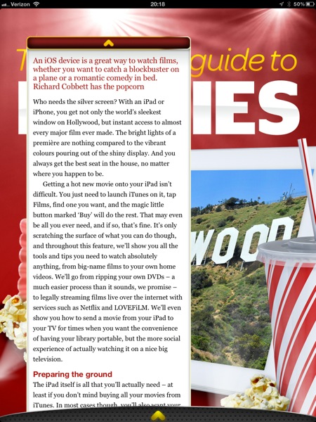
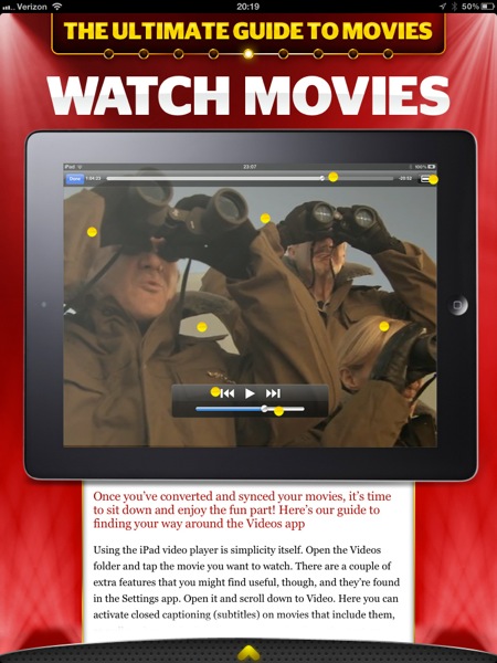
    To answer that I am going to let you see some screenshots taken from the March 2012 issue, but first you should know that Tap! is mostly short form articles about a bunch great little apps, tips, tricks, tools, and gadgets.

    The background “lights” blink and flash.
    Want that text box bigger? Too bad.
    Now this is the best reading experience on the app.

    I am really not trying to pick on Tap! here, because they did a great job to actually decide that PNGs is not an acceptable way to serve up text on the iPad. However, the bulk of the magazine looks more like the first two pictures than it does the latter two pictures. That’s where my problem with the magazine is: Tap! seems to be trying to sell based on the same merits that sold magazines and I am not sure that works on the iPad for me.

    I like the last picture of all the options, it shows the most text at once and fewest distractions, but again that’s not the majority of the magazine. With the short blurbs about apps I can understand the default to huge screenshots — they say more than what you would write — but even at that the text seems like an after thought. When the same trick is employed for howtos, I start to scratch my head.

    There’s both good and bad with Tap!, but ultimately I think it is probably the best general consumer grade magazine experience on the iPad. What that means is that this is the magazine I would tell my dad to buy, because I think he would appreciate it more than crafting his own magazine in Instapaper.

    This doesn’t make Tap! bad by any means, it just doesn’t make Tap! a magazine that is for me.

    *(I should also note that the download finished before my iPad screen went to sleep — which is a feat all by itself.)*

  • Sony RX100

    What happens when you try to make a pro level camera that fits in your jeans pocket without a bulge? Well if you are a normal camera company you make a decidedly non-pro camera, or you make a pro camera that decidedly does not fit in a pair of jeans pockets. But then there is Sony and the RX100. Which Luminous Landscape says packs:

    >Oh yes, did I mention that the RX100’s sensor is 20 Megapixels and that the lens, which fully retracts into the body, is a Carl Zeiss branded 28-100mm equivalent lens with a maximum aperture of f/1.8? Raw? Of course. Optical image stabilization? Ah huh. Video? Yup –1080P at 60P or 50P, depending on region.

    All in a camera that fits in your jeans pocket, all for $650 — not a bargain, but then again maybe it is, because again Luminous Landscape says:

    >The summary judgement for me is that the new Sony RX100 is hands-down the most appealing pocket-sized digital camera yet. Capable of producing DSLR grade images, it’s hard to find much to fault with this small pocket wonder.

    (Read the entire post if you are interested, it has some great detail.)

    So this is *the* pocket camera to have if you are serious, but it has one odd quirk that really caught my eye:

    >There is no charger supplied, because the batteries charge in-camera using either a USB connection to your computer or the supplied AC charger.

    Nothing revolutionary, except that this is pretty uncommon in the camera world. The thinking against this is that you don’t ever want to have to stop shooting to recharge, so it is easier if you just carry extra pre-charged batteries with you. However I really like the solution that Luminous Landscapes devised of using an iPhone battery pack to charge the camera — essentially extending your shooting battery for quite a while, and that is really handy.

  • The IRL Fetish

    Nathan Jurgenson writing an essay about the romanticized view that society now holds for “real life” and “offline”, culminating with a series of final paragraphs that are absolutely perfect. Jurgenson states near the end:

    >That is, we live in an augmented reality that exists at the intersection of materiality and information, physicality and digitality, bodies and technology, atoms and bits, the off and the online. It is wrong to say “IRL” to mean offline: *Facebook is real life.*

    This is a concept that I struggle with more and more now that I have a daughter. The idea of whether or not, and how to, introduce her to gadgets, computers, and digital life — these are the questions that I really struggle with. What compounds this, of course, is my love for always being connected and “online”.

    I have to think that this is just a phase in our societal norms. Was a horse carriage romanticized as the motor vehicle was taking over? Was the written letter romanticized as the telephone began to permeate society? Swords over guns? The shovel over tractor? The outhouse over indoor plumbing?

    My point is that — as Jurgenson writes — real, offline, life is so completely intertwined with technology that it borders on absurdity to think otherwise. That camping trip you took to get away from technology? Did you really take it to get away from technology, or did you actually take it to rid yourself of email access for a couple of days? Meaning: did you ditch GPS, flashlights, stoves, tents and the like? And if you really took it to “go offline”, were you truly ever offline, or was it a hiatus until you could post about these exploits on Facebook — wait your did take a picture while you were camping and select the perfect Instagram filter for it, didn’t you?

    I don’t buy the notion that we can ever fully unplug and I also think that is a very good thing that we never need to fully unplug.

    Of course, some people can be so nose down in their gadgets that they are maddening to be around, but you can always DM them if you need their attention…

    [via someone in the 5by5 chatroom]
  • The B&B Podcast #69: How Dead Was It?

    There were a lot of questions that people have about this transition to a paywall — Shawn does a good job scratching the surface with me on this week’s B&B Podcast. I think it is a really good episode where we talk a lot about the current state of blogging — and Mrs. Shawn Blanc’s lack of an iPad.

    Thanks to our sponsors: [Studio Neat](http://www.studioneat.com/) (and they may have a discount code if you listen to the show) and [Bartender](http://www.macbartender.com/). ((Yep, want to know why there are sponsors on the podcast and not my site? Listen to the podcast.))