Month: October 2012

  • Organizing an iPhone 5 Homescreen

    Ages ago (last year) I wrote a post about my methodology for organizing my iPhone and iPad homescreens. I still use that methodology for my iPad, but with the extra row of apps on the iPhone 5 I had to rethink my organization system.

    At first I simply added another row of apps to the bottom, like I suspect so many of you did, but after a week it was clear to me that this was the wrong way to go about utilizing an extra row of apps. I was stuck, not having a methodology bugged me because there had to be a good way to organize with this extra row — then during a 3am wake up call from my daughter it hit me.

    My flashlight app.

    With the added screen real estate I had finally added it to my homescreen, but it was in a random spot and in the dark I couldn’t find it without looking at the screen. Then I thought, if I had it in the top corner I could find it without looking — because it’s as far as my thumb can reach along the edge of the phone.

    That was the aha. So I have rethought my overly nerdy way of organizing my homescreen. Let’s take a look.

    I had actually modified my original method, and the modified version can be represented as such:

    Modified homescreen layout for iPhone 4S sized screens.

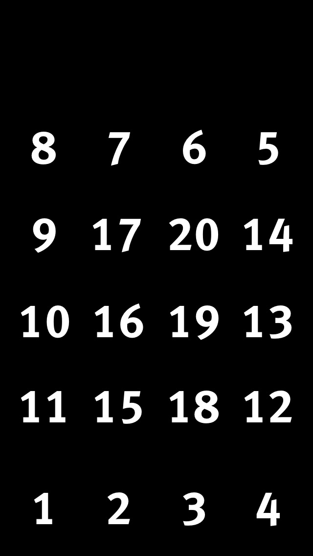
    The numbers roughly correlate with the priority of the apps in those spots.

    So for the iPhone 5 I finally realize that I need to treat the extra row, not as a row that slid into the bottom, but that attached to the top, like so:

    Now what apps go at the top?

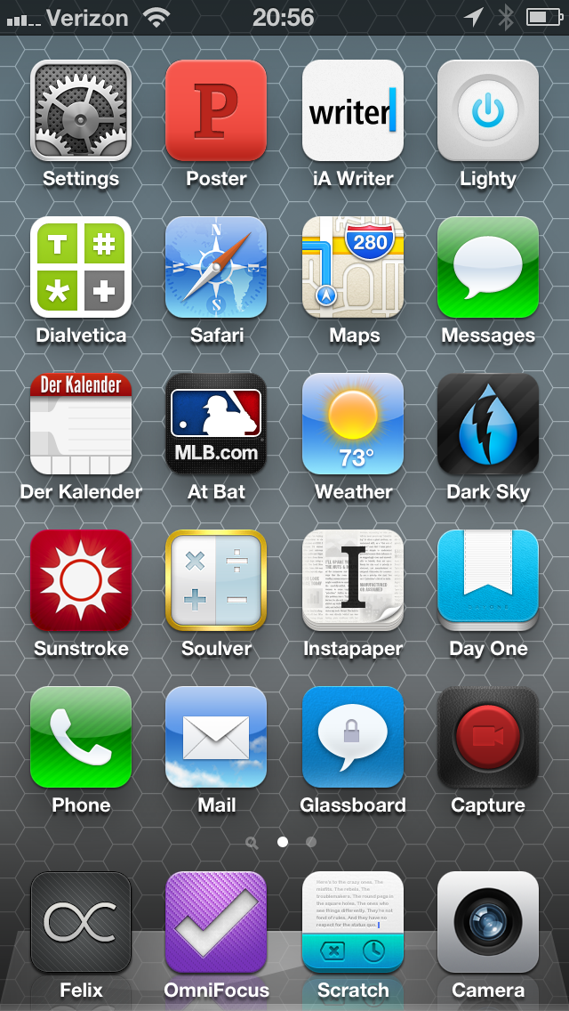
    From there all I had to decide was what should go at the top. As I said, top right is my flashlight app for the simple reason that I can find that spot on my iPhone every time without looking. This, however, is not something universal for people, it just so happens that with the grip I keep on the phone, my tendency to hold it with my right hand, and the size of my hand, the top left corner is an easy tap for me without looking. Great spot for a flashlight app in other words.

    Here’s my revised iPhone 5 homescreen layout methodology:

    iPhone 5 homescreen layout.

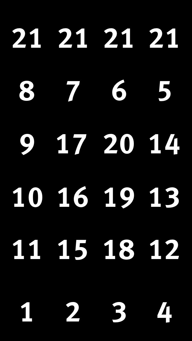
    I admit that this is a bit of a cop-out. I’ve numbered the top row all the same, but this is simply because the top row is not easy to access and therefore any app in that spot should be one that fits two criteria:

    1. Is useful to have on the homescreen, but not mission critical. (Flashlight app)
    2. Isn’t accessed all the time, but when needed is an app that you would get annoyed digging for. (Settings)

    I’ve obviously thought about this layout a bit, and tailored it for my thumb range: that is the apps I tap the most, I want in a zone that is easy for my thumb(s) to get at. It’s that simple, here’s what my homescreen looks like:

    My homescreen as of October 17, 2012.

    I only want to note a few things:

    1. I love having settings in the top row, like really love it.
    2. Der Kalendar likely isn’t permanent. I’ve become annoyed with calendar apps (again) and am cycling through a bunch right now.
    3. Wouldn’t it be great if you could tell iOS to allow an app to span multiple icon cell areas? I’d love for Scratch to be the size of both the OmniFocus and Scratch icon spots for really quick and easy taps.

    Overall, I am pleased with my new arrangement methodology now that I have better accounted for thumb reachability and decided that the extra row of apps is added to the top, not the bottom of the screen.

  • Only in ‘America’

    Emily Heffter reporting on the overturning of a Seattle, Washington law that allowed customers to opt-out of getting a shit-pile of yellow paper left on their door steps:
    >The court ruled the city’s law is unconstitutional, saying yellow pages are protected, like other publications, by the First Amendment.

    I say we start calling the cops when these are left at our doorsteps and filling out littering reports against Yellow-page providers. That’d be fun.

  • ‘Amazon, Watch Your Back: Target, Best Buy to Match Online Prices’

    Tiffany Hsu:
    >Tired of being used as showrooms by customers testing products in person before buying them cheaper online, Target and Best Buy have both pledged to offer the same prices in stores as major Internet shops.

    It’s about time, as it made no sense for them to be higher. Now, price is the only factor for why Amazon is so successful [as I have said before](https://brooksreview.net/2012/08/amazon-domination/), but there is one thing online never has: crowds.

    I don’t shop online because it is cheaper — I’d actually be willing to pay more to shop online — no I shop online because there is far less hassle. What would take me 15 minutes to walk into a store and purchase takes me less than 3 minutes to purchase online. No retail store, not even Apple, can beat that. Until they do, things like this won’t matter.

    *(Truth be told, what does matter is layaway programs — those are driving people into stores like mad.)*

  • Amazon Item of the Week: Incase EC20056 USB Cable Kit

    Very nice little kit of cables that comes with a nylon storage case. I bought it to use with my new [Flat Pack](http://www.hardgraft.com/products/flatpack-shore) as a smaller case to carry the cables and added to it just the [dock-to-lightning adapter](http://store.apple.com/us/product/MD823/lightning-to-30-pin-adapter) to complete it. These four items really are all the cables I ever find myself needing during a typical day.

    Nice find by Dan Frakes.

    [via Macworld]
  • Check the Weather

    David Smith has produced the first, to my knowledge, iOS weather app that uses the Dark Sky API to get short-term precipitation forecasts. ((Outside of Dark Sky itself.)) Smith gave me an advance copy last week to play with it before it launched.

    Here’s my take on the app: it’s good, solid, but it is not my favorite. Right now I use a combination of Apple’s weather app and Dark Sky — both do specific things very well and both I find to be gorgeous looking. Check the Weather is lovely looking and combines both of these apps. So if I was looking for one app to do it all, Check the Weather would be it, no question.

    In fact, check the weather is far superior to Apple’s weather app, [which I really like](https://brooksreview.net/2012/09/apple-weather/).

    I’ve, in fact, been torn between these two apps all week long. I personally think I will be switching to Check the Weather, but haven’t been able to bring myself to do it just yet. The sole reason: Apple’s Weather offering is just a bit sexier looking and thats drawing me in too much right now. ((This is not to imply that the design of Check the Weather is poor, it is very nice looking.))

    However, if you want one app to rule them all, [Check the Weather is it right now and it is only $2.99](https://itunes.apple.com/us/app/check-the-weather/id557872119?mt=8).

  • ‘Here Is a Downloadable Template for Opting Out of PayPal Arbitration Clause’

    In case you ever want the right to sue the shit out of PayPal, you have until December 1, 2012 to send this to them. Let’s flood their mailbox.

  • The Future Is Hypocrisy

    [Google’s Jonathan Rosenberg pens a post in Google’s *Think Quarterly* titled](http://thinkwithgoogle.com/quarterly/open/the-future-is-open.html): “The Future is Open”. And what a gem it is. Let’s dissect it a bit, shall we? We shall.

    >Three years ago this December, I sent an email to my fellow Googlers, attempting to pin a clear definition on a term being batted around quite a bit: Open. I was concerned that within our walls it meant different things to different people, and that too many Googlers didn’t understand the company’s fundamental commitment to the merits of being open.

    Your concern is well founded and still not resolved. Further, it is not a term being batted around by the world, it’s a term being batted around by Google — let’s keep that in mind because as far as I can tell “open” is really only important to Google. I’ve yet to meet someone who bought an Android device because it was “open”, typically it is because the sales rep pushed it on them.

    >No longer can a company so thoroughly control its customers’ environment.

    Except in the case of Apple’s ecosystem. Where, if the customer buys into the entire ecosystem (OS X, iOS, iCloud), their technology environment is very well controlled. Except in the case of Google’s ecosystem. Where, if the customer buys into the entire ecosystem (Chrome OS, Chrome, Android, Google Syncing), their technology environment is very well controlled. Ditto, Microsoft.

    >They know the primary motivation of an open system is product excellence; if the company tried to impose some other agenda on it, the developer audience would detect it immediately and revolt. In committing a product to openness, the company surrenders the ability to do anything but make it better for the user.

    I’m not going to rip into this too far, but the entire paragraph is highly hypocritical. The first half of the first sentence is pure bullshit. This may be Google’s primary motivation, but it is simply *not* the primary motivation of *all* or even *most* “open” systems. I’d further argue that Google *is* imposing another agenda on it, [as seen by the delay in “opening” Google releases up](http://www.businessweek.com/technology/content/mar2011/tc20110324_269784.htm) and their tight control over device certifications.

    >Today, we’ve shot up to 51 percent, and odds are good your smartphone was made by Samsung, HTC, Motorola or another Android partner.

    Or Apple and Nokia. Maybe that slipped his mind, or maybe he really believes that by not mentioning the competitors no one will know there are competitors? Nah…

    **…**

    Actually, I’m going to stop here, because I think you get the point. This is nothing but PR fluff with Fox News fact checking.

  • Quote of the Day: John “Very Nice” Moltz

    “Windows 8 may end up being a positive first step, but it’s going to be a hard one for a lot of people to take.”
  • The Microsoft Surface Mystery Machine

    Harry McCracken has a two page report on the Microsoft Surface, which I am sure has nothing to do with page views and everything to do with not enough bandwidth to put it all on one page, anyways he has a couple of non-boring sections that I want to point out. The first:

    >Surface’s 1366-by-768 resolution sounds skimpy compared to the iPad‘s 2048-by-1536 “Retina” screen. But a Microsoft researcher argued at length that Retina displays aren’t inherently superior. For one thing, he said, aging eyeballs can’t always tell the difference.

    Definition of “inherently”:

    >existing in something as a permanent, essential, or characteristic attribute: any form of mountaineering has its inherent dangers | the symbolism inherent in all folk tales.
    >Law vested in (someone) as a right or privilege: the president’s inherent foreign affairs power.

    Well, given that I’d say a Retina display *is* inherently superior, but hey no compromises right?

    I would guess that the “aging eyeballs” comment is an indication of the target market, so it only makes sense to poke fun at that market by saying: “old people can’t tell the difference anyways, suckers”.

    McCracken on the touch cover keyboard thing (skip to page two):

    >Overall, for a keyboard that barely increases the tablet’s thickness and weight, and which can be folded back like a magazine cover, it was remarkably good. But I understand why Microsoft will offer the Type Cover as well.

    Interesting, he adds:

    >Even Sinofsky thinks that plasticky little keys still have their place: He told the assembled journalists that he uses the Touch Cover most of the time, but sometimes swaps in the Type Cover for keyboard-intensive work.

    I don’t see the added benefit of the touch-cover over a touch screen if people still prefer the actual keyboard to either. Why not just have nothing — then again if it’s the same thickness as my smart cover it is kind of a no-brainer. This is the single most interesting aspect of the Surface to me and it’s sounding less and less great the more I read about it.

  • ‘Unveiling Intellectual Ventures’ Hidden Web of Patents’

    An Indiegogo crowd-funding project to find all the patents that Intellectual Ventures and their shell companies hold and put that information in a database. This sounds awesome, mark me down for $50.

  • Quote of the Day: Cyrus Farivar

    “Though they differed in their reasoning, the justices were unanimous in ruling that e-mail stored in the cloud (like Gmail or Yahoo Mail) does not meet the definition of electronic storage as written in the statute.”
  • Captchas

    Nicole Perlroth reporting on voter database vulnerabilities in Washington and Maryland has this gem of idiocy:
    >Washington officials also cite their use of “captchas,” which are meant to help weed out humans from computer programs.

    That seems like a valid response, until of course you take into account the rest of the story, like this bit:

    >It took The New York Times less than three minutes to track down the information online needed to update the registrations of several prominent executives in Washington State.

    That’s not a computer sniffing it out, just an untrained reporter, so in response to hearing that, Washington State, my home, said (basically) ‘But we have catpchas’. This actually is hurting my brain to think about.

    Think of how much data states hold on every citizen and then think about how horribly that data is protected by them. I worry about what Google does, but at least they give two shits about protecting my data from prying eyes (or at least from eyes that don’t pay them), Washington State just protects my data with a fucking captcha. Granted, modern captchas are nearly impossible to read, so maybe Washington is on to something.

    [via The Brief]
  • Quick Route: Bringing the Google Back

    Here’s the app for all of you that miss Google maps, and some of you that just like maps. Really nice take on Google maps, I’ve not played with it much, but it has a couple of great features:

    + Pull to re-route. This was always a huge limitation of Maps before and now if you need to re-route you just pull down. Great feature.
    + The map follows you as you drive/walk along the route so you don’t have to swipe to keep up. Not quite turn by turn, but very nice.

    Give it a try.

    **Update:** I was mistaken in what was powering the backend. Google Maps is not there, Google Places is.

  • We Can’t Get Rid of it, So We Fix It

    Michael Lopp on email:

    > For a new topic, my expectation is that the subject line gives me an inkling of what I’m about to read. “Question” is not a subject. “Question regarding the impending disaster in engineering” is a better subject. The best, “Calamity is a man’s true touchstone.”

    This seems really cool, but I hope that no one sends me a work email like this — I’d hate it. The reason: it doesn’t work well for recalling the email.

    Say a client wants to talk to me about strategies for getting a tenant to pay back rent, a poetic subject line, while fun to read, will end up making that email harder to find later. Yes I *can* find the email, but what if there are several threads talking about this issues, as there typically is in my job, then I’d have to go through each one to find the right thread. But with truly descriptive subjects lines I can usually find the email on first try.

    So for a roof leak email, “Roof leak in suite 159” works far better than, “The heavens hath opened”.

    I do like the rest of his thoughts especially this bit:

    > I’ve noticed that we’ve taken to blasting through our paragraphs and either using a default signature or no signature at all and I’m of the opinion that an unsigned email is a lost opportunity to say something small and important.

    I hate, hate default email signatures. If your email signature has an image of your company logo in it, I will be annoyed like you wouldn’t believe. That’s worse than a legal disclaimer, which are ridiculously idiotic to begin with. Here’s how I use email signatures: first email to you, you get my default signature filled with contact info; every other correspondence you get my name like this `-Ben`. I’ve never used things like ‘best’, occasionally, if warranted, it will say thanks, but mostly I just say: “Let me know if you need anything else” or “Let me know if you have any questions”. Both are TextExpander snippets.

    Now that I think about it, I need to get better about signing off.

  • Quote of the Day: Mary Beth Quirk

    “If you find yourself mildly freaking out when you’re not near your phone, you might have nomophobia, otherwise known as the fear of losing or being unable to use a cellphone.”
  • Selfstarter

    A neat project that allows you to self-host your own Kickstarter type of project. I like that it is built to use Amazon payments, but can be tweaked to use something better (maybe Stripe). When I first saw this I chuckled and thought: “No way I would trust some random guy to charge me for a project, where’s the safety of Kickstarter?”

    And then reality set in and I remembered that Kickstarter offers little to no protection for the backers of projects. Essentially: I don’t see how Selfstarter is any riskier for backers than Kickstarter.

    In fact, it would seem, Selfstarter is a better solution because the fees will be less and therefore the threshold for successful funding should be less. I like this idea, let me know if you use it for a project.