Year: 2014

  • App.net State of the Union

    Dalton Caldwell and Bryan Berg:

    The bad news is that the renewal rate was not high enough for us to have sufficient budget for full-time employees. After carefully considering a few different options, we are making the difficult decision to no longer employ any salaried employees, including founders. Dalton and Bryan will continue to be responsible for the operation of App.net, but no longer as employees. Additionally, as part of our efforts to ensure App.net is generating positive cash flow, we are winding down the Developer Incentive Program. We will be reaching out to developers currently enrolled in the program with more information.

    As you expected right? ((Everyone likes to say something is doomed, but only admit when they are right and not when they are wrong. You notice that?))

    I had hoped it would turn out different for App.net, but for me the writing was on the wall just six months after App.net was launched. At that point all the “popular” kids from Twitter were more or less fully back on Twitter and not engaging on App.net.

    Sure, it wasn’t their job to stay on App.net and you can argue it was App.net’s job to keep them there, but I think a lot of people ‘backed’ App.net on the assumption that it is where some, or all, of the people pushing it were going to go. When those people didn’t stay, the others had little reason to stay themselves.

    It’s a nasty cycle and it’s hard to break: giving big users reasons to stay so that you can keep the rest of the users.

    I greatly enjoy App.net, but what I’ve gotten the most from it is the knowledge that I really don’t care about these types of social networks — in that I really don’t get satisfaction out of using them — and so now I know I just really don’t need them. I won’t be leaving, but this certainly isn’t that shocking of news.

  • Hoefler & Co. Fonts on iOS

    This is huge for iOS users. You can now install Hoefler & Co. fonts directly for use on your iOS device. It’s as easy as tapping a link on their website, which installs a profile in settings and viola your fonts are there. I just added a few and it works smoothly and Pages/Numbers/etc recognize the change immediately.

    I say this is huge not because iOS fonts are shitty, but because I use Ideal Sans for all my documents and now I can finally edit them on my iPad without having to substitute the font — that’s what is huge.

  • The Questionable Link Between Saturated Fat and Heart Disease

    Nina Teicholz:

    The real surprise is that, according to the best science to date, people put themselves at higher risk for these conditions no matter what kind of carbohydrates they eat. Yes, even unrefined carbs. Too much whole-grain oatmeal for breakfast and whole-grain pasta for dinner, with fruit snacks in between, add up to a less healthy diet than one of eggs and bacon, followed by fish. The reality is that fat doesn't make you fat or diabetic. Scientific investigations going back to the 1950s suggest that actually, carbs do.

  • Additional Fujifilm X-M1 Images

    Shawn Blanc pointed out after I posted my review that I didn’t include enough images of the camera itself. I’m posting now to rectify that oversight.

    Back of camera, illustrating that dial I am not a fan of.

    With the 35mm f/1.4 lens attached.

    With the 27mm f/2.8 pancake (silver variant) attached.

    With the 35mm f/1.4 lens attached.

    With the 27mm f/2.8 pancake (silver variant) attached.

    With the 35mm f/1.4 lens attached.

  • Louis C.K. Against the Common Core

    My wife told me about this ‘new math’ bullshit a few weeks ago and it stumped me. I’m not great at math, or teaching for that matter, but none of this seems very logical.

  • Arbitrary scheduling in Keyboard Maestro

    Good tip, and I agree with Matt Henderson the biggest problem with Keyboard Maestro is that it needs about 10,000 more pages of documentation.

  • GR1 Straps

    Kyle Dreger on the GORUCK GR1:

    Although the straps took a week to break in, weight from the bag now feels evenly distributed across my chest and shoulders. I can pack the GR1 full with books, clothes, and my laptop, and it still feels comfortable to carry around.

    I can vouch for this. They straps are bulky compared to almost every other backpack I have tried, but after a week or so they feel damn comfortable. They feel like they mold to you, to your body, and I haven’t felt that with the other bags I test.

    That said there are scientific reasons why such large straps may not be ideal — personally I find most well made bags are comfortable no matter the strap design.

  • Review: Fujifilm X-M1

    Disclaimer: This is a review camera sent to me from Fujifilm America for the explicit purpose of a review. No money changed hands, nor was there any restriction on what I may or may not write.

    While older, and therefore far less exciting than some of the newer cameras coming out (e.g. X-E2, and X-T1) the X-M1 is a very interesting model. Some would look at it as an ‘entry’ level camera, but in this case that isn’t being very accurate.

    The X-M1 is smaller than the other X-series camera and lacks many of the manual controls that makes the line popular, but that doesn’t mean it is a dumbed down camera. What’s interesting about Fujifilm is that they don’t really hold back features for the sake of up-selling customers. So the X-M1 has the more traditional ‘Mode’ dial instead of the shutter speed, but otherwise it functions similarly to the X-E2, just in a smaller package.

    Most notably the camera still has the X-Trans sensor (though the older version 1 sensor, not the X-Trans II) and it still has WiFi and yet adds on a tillable LCD.

    Featureless this camera is not.

    I’ve been keen to try this camera ever since I realized two things:

    1. The X100s is about the same size as my X-E2 and thus seems silly to buy.
    2. I really want to leave a good digital camera with my wife, while still also having one for me to carry, but I don’t want more lenses.

    The latter is what pushed me to looking at the X-M1, so it was by happy coincidence that Fujifilm offered to send me one.
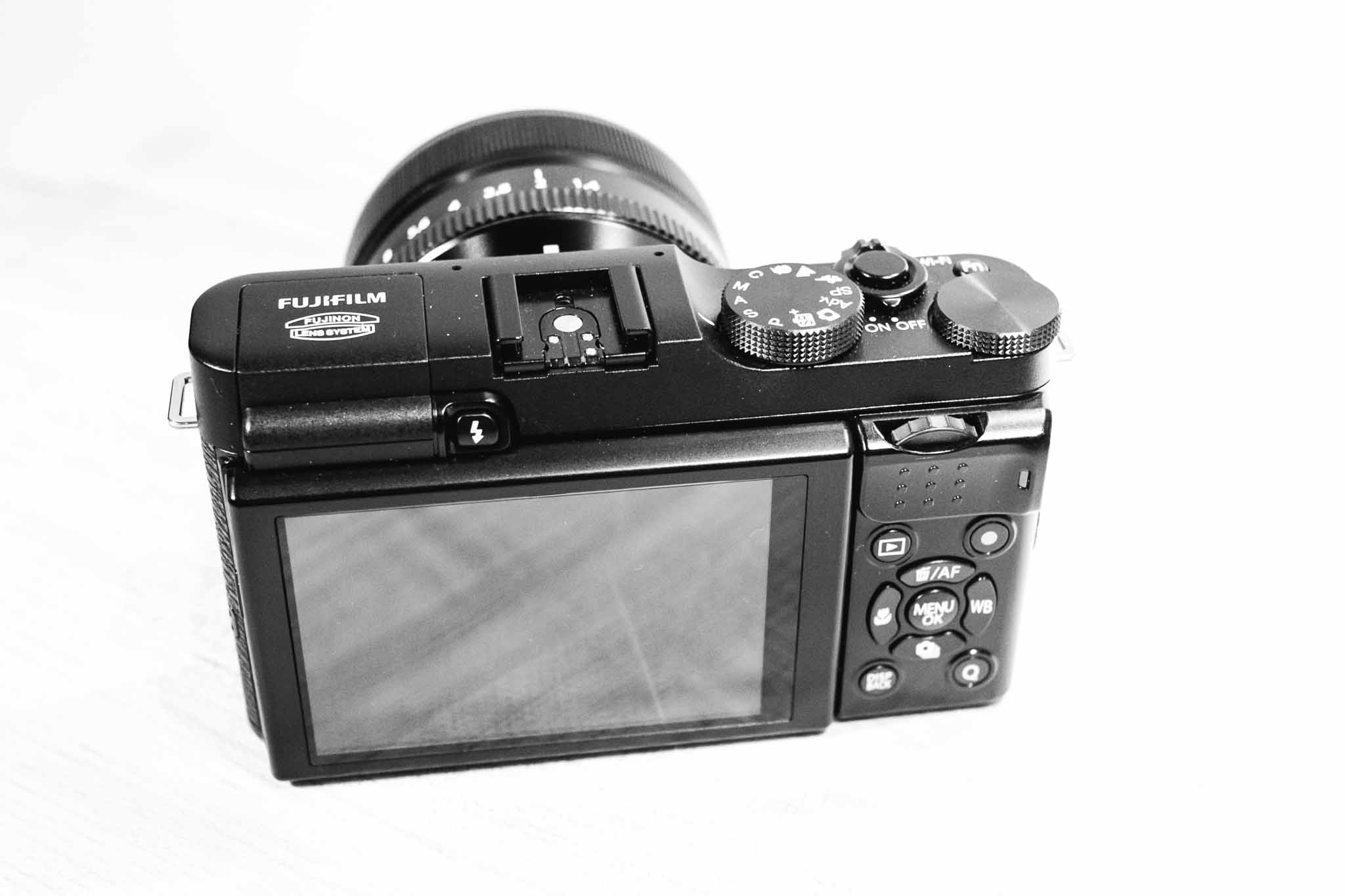
    Handling

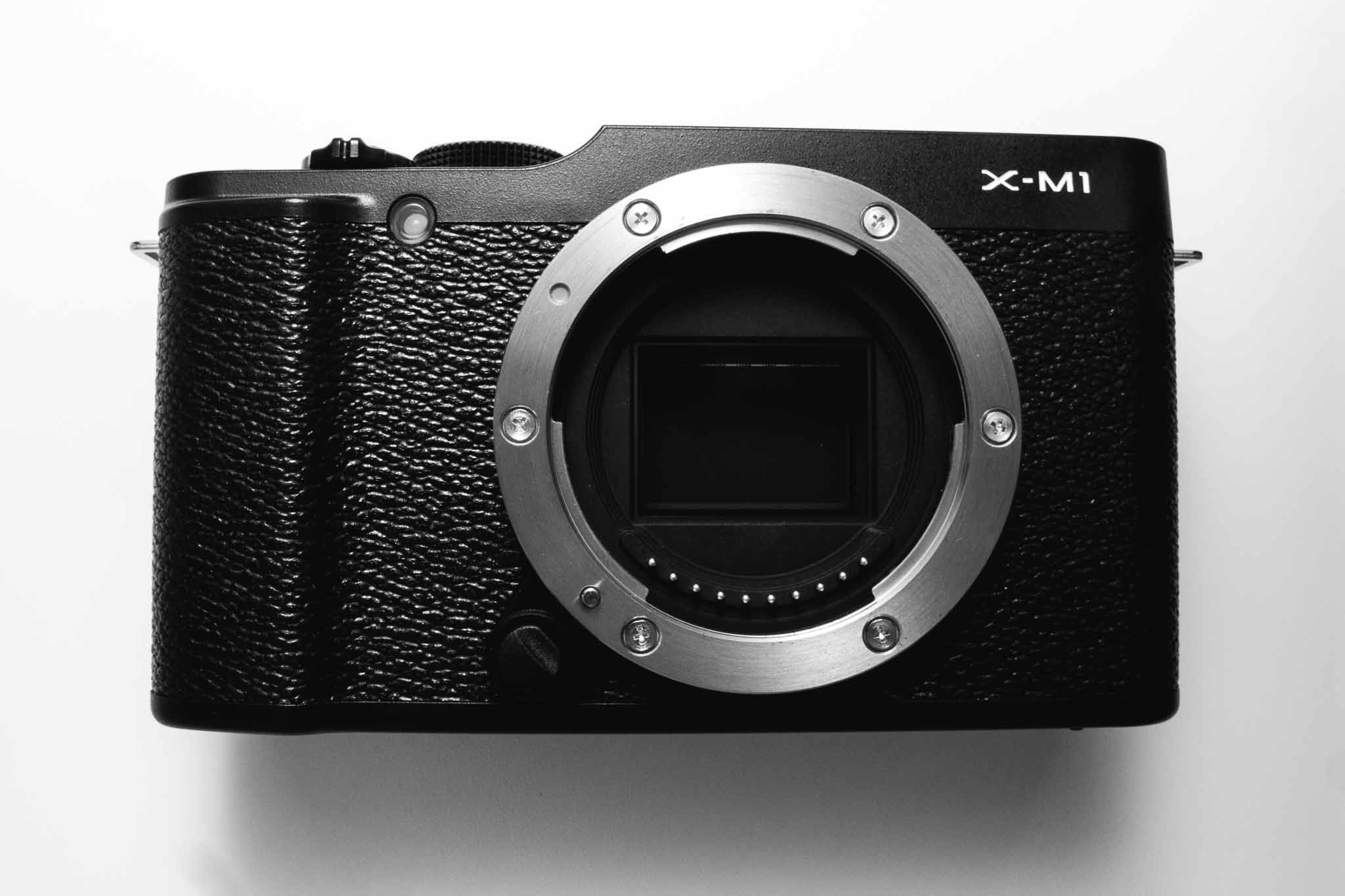
    The X-M1 is not only a more compact offering (with the same APS-C sized sensor), but it is also a less expensive offering. Due to that last fact, the build of the camera is much different from the other Fujifilm cameras I reviewed — it’s made of plastic. Still the camera feels solid to hold and use, but there are a few aspects that I have yet to get used to.

    The rear dial control is the first of those. On the X-E2 and X-T1 this is a horizontally placed dial. You can push in, or jog it left or right. It makes sense. On the X-M1 this is still horizontal, but positioned so that the dial spins on an axis parallel to the ground — or positioned vertically like it would be if it were on the top of the camera. It’s not bad, but it really is in an awkward spot for my thumb to reach.

    I think because of that, I found myself wishing the exposure compensation dial (which is unmarked, and has no stops at either end allowing it to spin all the way around) was a dial that you could reassign. This would be near perfect for the camera, however, you cannot reprogram that button — and I do find the X-M1 to have one less programmable button than what I really need.

    My complaints stop there though. As the body is very compact for the size of sensor, and quality of lenses, but still boasts niceties like a tilting LCD display.

    I’m not even sure I shot with that display flush to the camera the entire time I used it — the tilting display is really nice to have after you go without one for a while.

    Outside of the dial issue, I find little complain about on the X-M1’s handling. It doesn’t handle like the X-E2 and X-T1, instead opting for a more traditional configuration (like what you would find on most dSLRs, or micro four thirds offerings) and feels a lot like my old Panasonic GX1 to me.

    Image Quality

    I was surprised by just how good the older X-Trans sensor is, in fact the only noticeable difference I could detect is better noise handling in the X-Trans II sensor at ISO 6400. Beyond that it looks and feels like my ‘other’ Fuji X-Trans files.

    To me this is the best I could have hoped for and I am very impressed. This is a smaller and cheaper camera, but is only a slight notch under the newer camera in image quality.

    Overall Thoughts

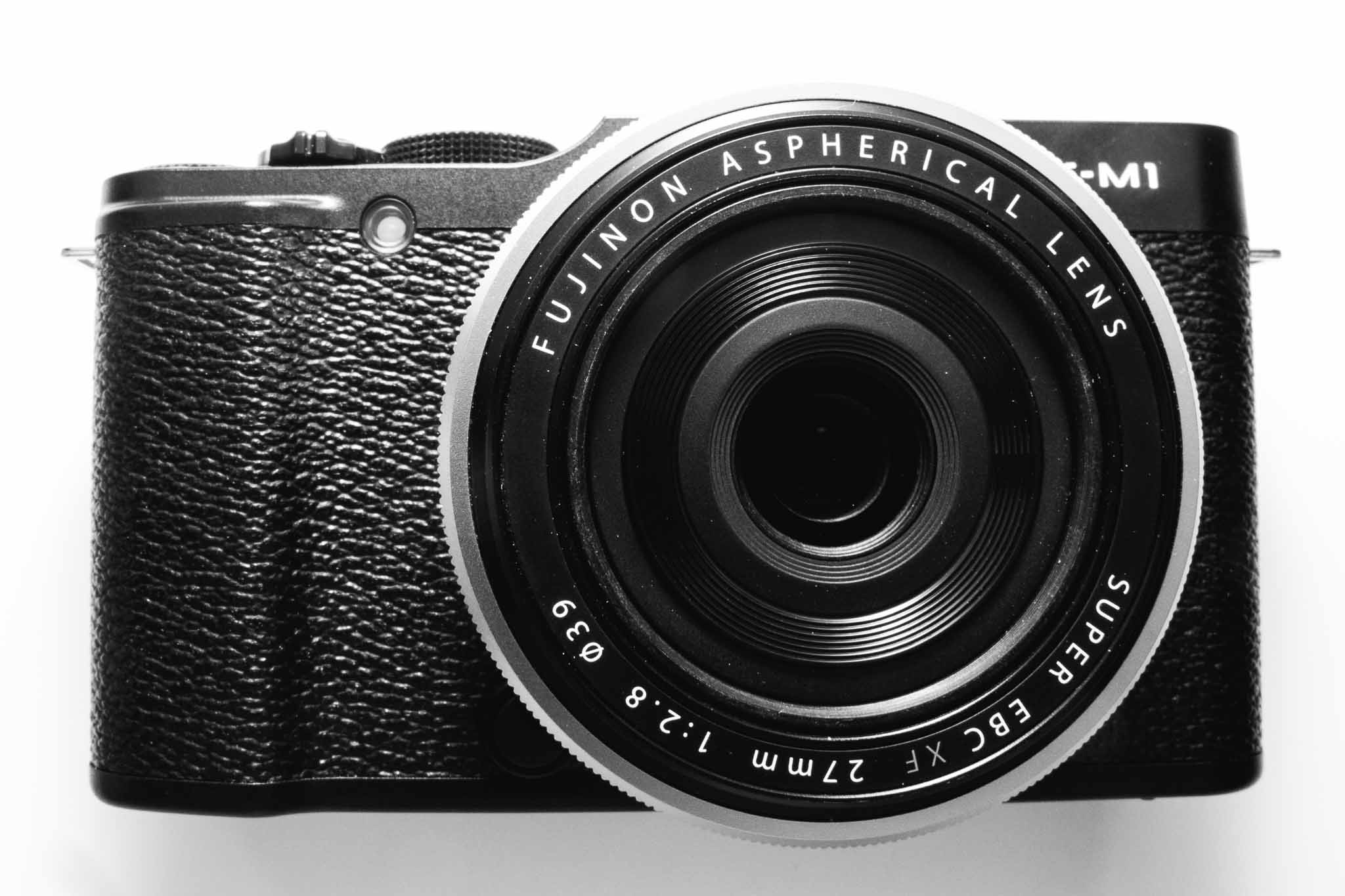
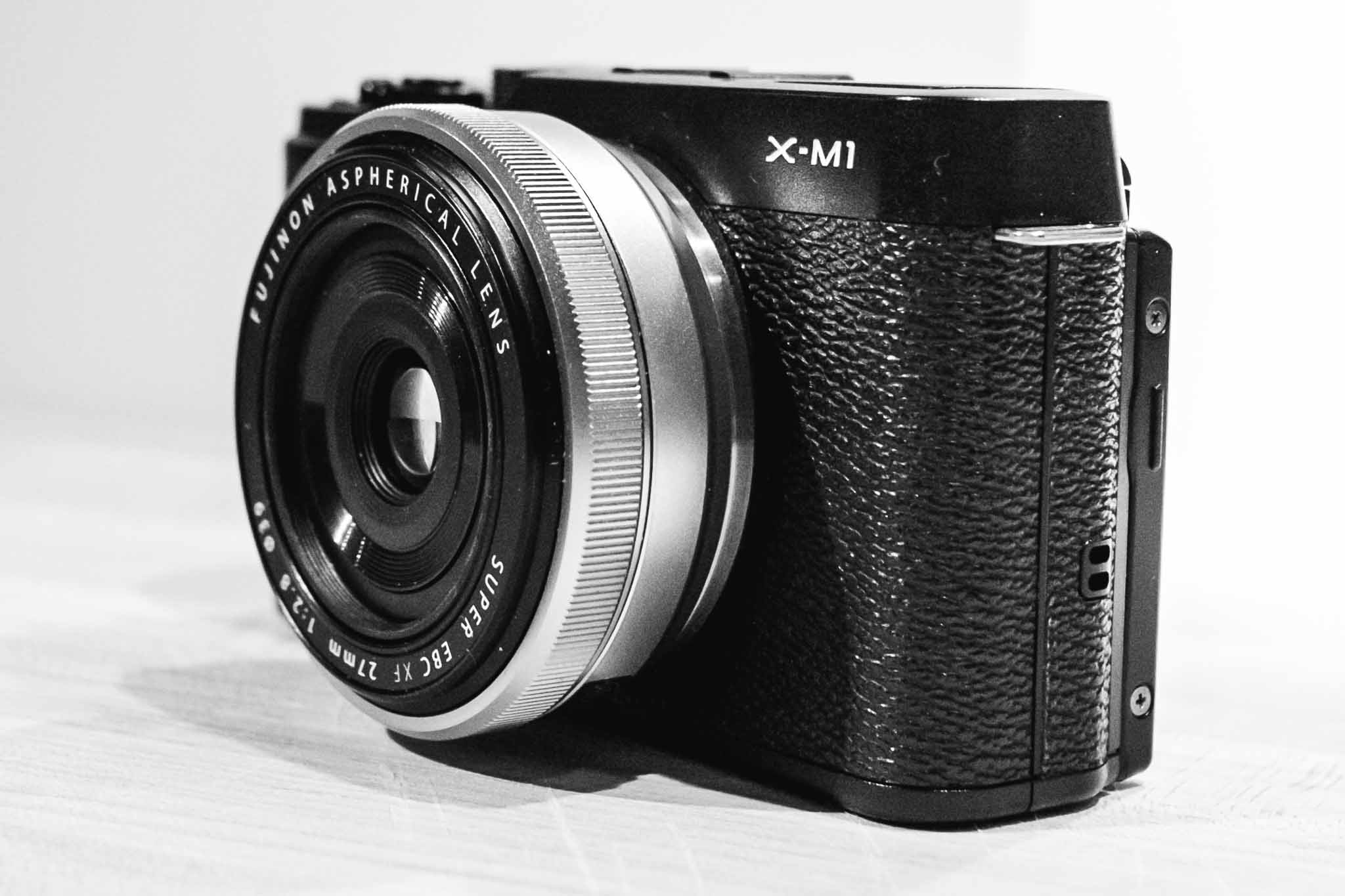
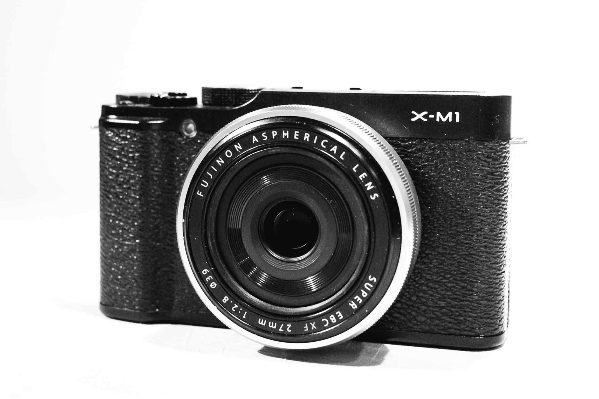
    The majority of my usage of the X-M1 was with the 27mm pancake lens attached. This combination is perfect, as it is sharp, fast-ish, and yet very compact with a useful focal length. I do wish that the pancake wasn’t only an f/2.8 lens — a stop faster would do wonders for indoor photography.

    In all I am torn about this little camera. I love that it is smaller, but I do miss the view finder. More than anything though is that I miss the shutter speed dial (instead the X-M1 has the more common ‘mode’ dial and isn’t nearly as fun to use).

    This is a solid family camera, and can be had for really great prices now. I’m thinking about adding one just so that I have a camera which can kick around the house, and car, but can still accept my other lenses if I need a backup camera for something. I can’t wait to see how the camera is updated, as I suspect it will become only more tempting.

    It’s not a replacement, or even competitor, to the X-E2 and above X-system cameras, but it is a very good and increasingly inexpensive camera. I’d be more than happy with it as my full-time camera and I think you would be mistaken to think this is an entry level camera.

    Buy It

    Photos

    Update: I’ve posted additional images of the camera, here.

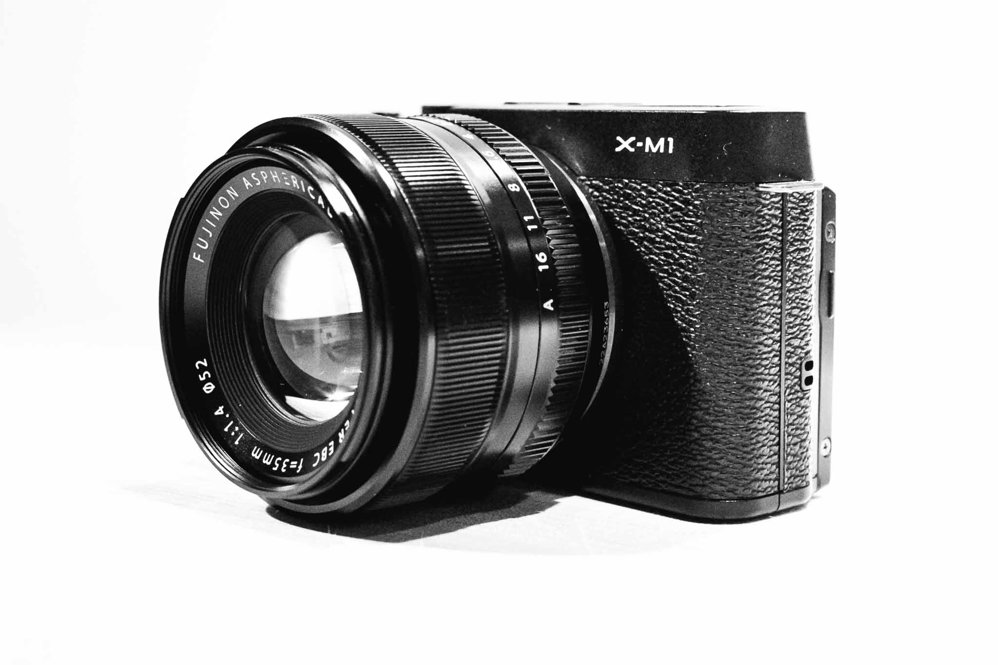
    Fujifilm X-M1, 1/4000s 35mm @ f1/.4 ISO 200

    Fujifilm X-M1, 1/550s 27mm @ f/4.5 ISO 400

    Fujifilm X-M1, 1/900s 27mm @ f/6.4 ISO 400

    Fujifilm X-M1, 1/2000s 27mm @ f/2.8 ISO 400

  • Firmware for X-E2 v2.0

    Continuing their tradition of awesome support for released cameras, Fujifilm has added two killer features to the X-E2 via a 2.0 firmware update. Now the X-E2 has selectable focus peaking colors — something I loved about the X-T1, and the ability to toggle face-detection on and off by assigning it to a function button.

    Both two big reasons I would upgrade, now taken away by Fujifilm themselves. Great support.

  • What iOS RSS Readers are Missing

    Since I took the time to dive into Unread and really consider the app, and the app category, I came up with a few things that I think are generally missing for some, if not all, RSS apps.

    Speed Mode

    Jared Sinclair, in my Unread review, talked about how most RSS apps seem to be made for what he called ‘triage’ — meaning just getting through the slog of items, but I think all RSS apps should have a triage mode. I should be able to leave my RSS feeds for a week and come back to thousands of items, and get through them all in 30 minutes.

    How? I’d propose that an ideal RSS client can perform some of the magic the same as Fever’s hot list does, by telling you what was popular while you were gone. So the app mode would work something like this:

    1. Enable popularity rankings. Let’s say that is on a simple five point scale, you then tell the app you want to see only articles 3 points or up — and to mark everything else as read.
    2. Now you have a significantly trimmed the list, but you still have to look through all the items. From there I would hope the app can craft a conversation view of posts centering around the same article. That way you can see the main, say, New York Times article, and a listing of the blogs/articles that commented on, and linked to, that main article. This way I can judge if it really was that important based on who is commenting on it.
    3. You should then quickly be able to toss articles to your read later service of choice.

    The overarching goal being to use social networks, and the RSS networks in your reader, to tell you what was popular — and to then take that one step further by only showing you the popular post, and effectively burying the commentary posts about that popular post.

    Two Reading Modes

    For times when you are not triaging you should be able to shift the app between a casual reading mode — something like what Unread is — to a more in-depth reading app. In other words allow me to toggle between something that works like Unread, and something that works more like a (good) digital magazine.

    The in-depth mode should show all the full content for the articles along with images and videos, ready to read as individual pages, so instead of looking at a list of articles you just get articles presented as pages that you flip through as you read them.

    It’s like your own curated magazine. Meant to be read from cover to cover.

    Auto Read Later

    I’d like to be able to mark certain feeds as auto-read-later feeds. I personally know that I like to read everything that Shawn Blanc publishes to his site, so I’d like to flag that feed as one that I never need to see because everything from it just is sent directly to Safari’s reading list.

    This would also weight that feed heavier in my above popularity rating scheme.

    Important?

    As I talked about in the triage section, I think RSS apps should give you indication if you are about to ignore a post that is generating any kind of a ‘buzz’. This could be aggregated from within your RSS feeds, to Twitter/Facebook and other sites.

    Sometimes I gloss over posts that a lot of other people are talking about just because it has a shitty title — such a feature would aim to make me give that post a second thought. Kind of like a: “woah, woah, that’s an article from John Gruber, not a link.”

    Link Blog

    Allow me to post a linked-list style blog post from within the app. Quote, author, snarky comment, title, posted.

    Yes, please.

    Reading Time

    I also mentioned this in my Unread review, but I think RSS apps should show you the reading time of each article right in the list view. And further I think you should be able to hide items over/under X reading time so that you can see all items that can be quickly read, and then check out the longer posts at another time when you want.

    To me that would be a killer feature for allowing me to check my RSS feeds in different ways, at different times and places, throughout the day.

    Handling Linked List Posts

    Last, but not least, RSS feeds should be smart about linked list style posts. If I send that to read later, I don’t always want to send the linked-to article to my read later service. Most of the time I want to send the RSS article — the commentary article — to my read later service.

    In fact, the ideal would be a setting to simultaneously send both the source and commentary articles to my read later service of choice. That way I can read the article and see the opinion of someone I care about.

    Wrap

    RSS readers are mostly differentiated by design at this point, which is good for casual users, but even the powerful Mr. Reader isn’t enough if you are a major RSS user (like me). This list is just the tip of the iceberg for creating an RSS reader that has a feature set which would take RSS from “email style inbox” to a tool for finding great things to read, and actually reading them.

  • Unnecessary Additional Work

    Marco Arment:

    iOS 7 only “set you back months or years” if you haven’t been paying attention to the iOS development cycle and decided to take on far too much unnecessary additional work with the migration to 7, both of which would cause problems in any year, on any app, with any new OS release.

  • Behind the Scenes of Touch Id

    iOSecure on Reddit:

    With iOS 7.1.1 Apple now takes multiple scans of each position you place finger at setup instead of a single one and uses algorithms to predict potential errors that could arise in the future. Touch ID was supposed to gradually improve accuracy with every scan but the problem was if you didn’t scan well on setup it would ruin your experience until you re-setup your finger. iOS 7.1.1 not only removes that problem and increases accuracy but also greatly reduces the calculations your iPhone 5S had to make while unlocking the device which means you should get a much faster unlock time.

    Fascinating. I have noticed that with every update Touch ID gets better and better.

  • Small Screen Productivity

    Matt Gemmell:

    For the vast bulk of stuff that most people will want to do on a computer, though, most of the time you don’t need a desktop monster. I don’t think you even need a 15” screen, which is essentially a portable desktop. You just have to use a small screen productively.

    I’ve never used an 11″ Air for work, or anything, but I did have a 13″ Air for quite some time and currently use a 15″ MacBook Pro. What Matt is saying is true for me 95% of the time. I got rid of my 24″ monster screen because I simply didn’t need all of that.

    There is, though, one specific instance where I am still cramped working on a 15″ display: working on a large spreadsheet while flipping back to reference information.

    Just today I was inputting data into a property tax analysis spreadsheet from Assessor websites and it was a pain. Would have been faster for those two tools to be side by side, but that creates its own problems on small screens.

    But, then, ask yourself how much you do that work — likely it’s less than you think. For just about everything else I have found the smaller screens to be better.

  • A Year Squandered

    Speaking of Jared Sinclair he has a blog post up today about the wasted year iOS 7 brought on developers:

    Fast-forwarding a year, the effect that iOS 7 has had on third party development is disheartening — which sounds like a fatuous thing to say, since there have been so many well-liked redesigns over the past year. But that’s the rub: the vast majority of third-party developers’ time has been spent redesigning and reimplementing apps to dress the part for iOS 7.

    The one thing iOS 7 seems to have done, though, is to bring easy money to many developers who hit a wall with improving their app(s). That is: redesign for iOS 7 and sell the app as new. That was a pretty common, if contentious, theme for this past year.

    That said, while I agree iOS 7 redesigns were a set back, I have less empathy for this complaint. iOS 6 looked old, iOS 7, or a redesign in general was needed if the platform was to continue to be successful. So on the one hand you can look at this as a setback, or a reboot. On the other you can look at it like the shift from PowerPC to Intel on Macs — annoying but necessary for long term health of the platform. (Or if you prefer the shift to the taller iPhone format. Or retina displays. Or…)

  • Thoughts on Unread for RSS Reading

    Unread was first released back in February, and while I wasn’t ‘in the office’ during that time, I couldn’t use the app given the lack of support for Fever. Recently the app updated to version 1.2 and I was able to give it a go as it added support for a lot more RSS services (including Fever, obviously). Without a doubt the design philosophy behind Unread, and the way that I use RSS, seem to be polar opposites.

    Unread is the type of app designed for people to spend a long time in the app. It’s not an app made for popping in and out of. It’s not an app made to get through RSS quickly.

    It’s an app made to read your RSS articles, in the RSS apps.

    While most RSS apps try to make it efficient for the user to send stuff to read later, Unread is designed for you to read the goods now and is very blunt about telling you that. (Though there is copious ‘read later’ support.)

    I was concerned about this philosophy since I subscribe to 748 RSS feeds. Hmm.

    What I found in Unread was not only a beautiful app, but a highly functional app — even when asked to do something it does not feel it is explicitly designed to do.

    I sent over a few questions to the developer of Unread, Jared Sinclair, to quiz him about some decisions made in his app. Specifically, I wanted to know more about this ‘philosophy’ he is pushing in the app. I wondered, that if Unread is designed to be enjoyed slowly with an iced cold Pepsi (or hot Coffee… I guess), then why truncate the posts in the main list view instead of just showing everything right there ready to read? ((Note: All of the responses from Sinclair are shown in their entirety and un-edited by me. I’ve re-phrased my questions to fit the flow of this article.))

    Sinclair: The word I use when describing how most other RSS apps are used is triage. I don’t mean this as a pejorative term. Some users have a lot of feeds and use RSS as a staging area for articles they’ll read later with something like Instapaper. I think this is a totally valid use for RSS, but it’s not the way I want to use it.

    Even though Unread is a destination and not a staging area, readers still need to be able to pick and choose what to read next. A good example is a blog that mixes linked-list posts with original articles. I may not have time to read an 8,000 word post on iOS 8 predictions, but I might have time to read a few short link commentaries.

    Finding the right balance between usability and aesthetics was a challenge. Unread’s article summaries are short enough to allow an overview of what articles are available to read, but long enough that they don’t look like email inbox items. Here’s a link to a visual history of my Photoshop sketches for the article summaries: http://jaredsinclair.com/unread/article-list-history.html

    I’ve never been one to read a blog directly on the web, always through RSS, but I can see the reasoning for allowing the user to decide if they have time for something right now. To that end, adding in reading time estimates would go a long way for helping with that decision.

    One thing that has really surprised me about Unread is that even though I subscribe to more than 400 active RSS feeds (748 total if you include those listed as “Sparks” in Fever), I am still perfectly able to use this app that seems very much not designed for a ‘triager’ like me.

    I asked Sinclair if this was intentional on his part.

    Sinclair: I have strong opinions about what I think is the most satisfying way to use Unread, but it would be foolish of me to think that my opinions are a good fit for everybody. Unread needs to strike a balance between novelty and utility, if only so that it can appeal to enough customers that I can stay in business. I’ve been pleasantly surprised how well-received Unread’s opinionated choices have been, things like the long article summaries or the lack of buttons and toolbars. Perhaps I had underestimated how many people felt like me and wanted a more relaxed reading experience.

    In other words, sage advice: don’t cut your customer base to a dozen people if simple choices mean you can have a customer base of hundreds of thousands of people.

    Since many have talked about Unread before, I thought I would just point out somethings which I noticed:

    • The app is what I call quasi-fullscreen as it does not forgo a status bar at the top, but otherwise acts like many apps that are fullscreen by not showing navigation buttons. I really wish that status bar was gone, and I am not sure the reasoning on keeping the status bar in the app. It adds very little value, and seems to keep you one set away from full immersion into the app.
    • Along the bottom of the screen is what I will call a section header. So when you tap on your RSS account it will display the account type (for a Fever account, the bottom is labeled ‘Fever’). What’s odd is that when you move into your unread items list, the title says ‘unread’. Which is logical, and helpful, but when your app is also called Unread, well, you can see where the confusion is. Is that a label for where I am in the app, or a reminder of the app I am using? This drives me nuts.
    • The main screen of the app is really odd. It looks like a promo/tutorial/setup type of screen, yet it is to be the top level screen for the entire app. I just don’t get it, nor do I like it. Sinclair said it is based off of table of contents.
    • That said, one really great touch is the inclusion of today’s date on the screen. I have no clue why I like that so much, but I really love it. I asked Sinclair about the decision to include the date on this screen.

    Sinclair: Thanks for mentioning that. It’s one of my favorite parts of Unread, too. Unread’s home screen is inspired by tables of contents from literary magazines like the New Yorker. Those kinds of magazines often place a big masthead and publication date above the table of contents. Putting the UNREAD word mark and today’s date on the home screen sets the tone for the rest of the app: this is for reading, not for rushing.

    • The app has some great themes, but does not automatically switch from light to dark based on the lighting conditions around you. This is a pet peeve of mine as I believe all apps should do this now, but to be fair, Unread is setup to allow a user to quickly and easily change the theme without losing their place in the stream. The actions for doing this (pulling the screen from right to left) is something I think more apps should employe as it is a lovely experience.
    • On the topic of themes, I feel the dark/night theme is very hard to read when there are a lot of links in a post as the links are red and underlined. Many things I’ve read lately talk about how highlighting links makes for a very distracted reading environment. So, once again, I asked Sinclair what his thoughts were on the link coloring and underlining in Unread.

    Sinclair: Good question. Early on I tried using just an underline, but it created problems. I stumbled upon an observation that now seems obvious: links are two things at once. They’re text but they’re also buttons. The usual typography guidelines don’t entirely apply. Links need to look tappable and be easy to spot. The best solution for Unread is a combination of a different color and an underline. Here’s my rationale:

    • If they were only underlined, then they wouldn’t be distinguishable from underlined text that isn’t a link. The same would be true of making them boldface. 
    • If they only differed from normal text by their color, then they wouldn’t be easy to spot by users with color blindness. 
    • If they didn’t use color, then they would be hard to spot in complex areas of text. Think of a bulleted list where each item contains a mix of typographic styles (boldface, monospace runs of code, italics). This kind of thing has a lot of visual activity and is not uncommon on technical blogs. Color helps cut through that noise.

    The combination of both color and an underline is usable by the greatest number of people, and for a wide variety of content, but without resorting to non-typographic elements like roundrect borders or a solid color background.

    • Even though it isn’t in-line with the philosophy behind the app, it drives me nuts that it requires so many taps and holds to send an article to a read later service. To me this is an action that should always be able to be performed quickly.
    • My last complaint is very minor, but seems like the most unfinished part of the app: the release notes. It is great that the release notes are in the app, but why just shoot out to a web view instead of loading in the release notes and styling them to fit the app? Again, seems like an oversight in an otherwise well polished app.

    At the end of the day, Unread has won me over, as it is just too pretty to not use. Watch your back Reeder.

    Unread is currently $4.99 on the App Store, and worth every damned penny.

  • Ulysses III, Version 1.2

    (Confusing version numbers, I know.)

    The best writing app for the Mac has been updated today and adds some very neat stuff. This isn’t a full review of the app, as I have one here, this is what’s new (and great) about the latest version — also what’s still missing.

    Goals

    A lot of writers set goals — where they want to write X words each day. Or perhaps you know you can only write something so long before you get in trouble. If that’s you, then you can rest easy as Ulysses will now easily track that in the sidebar of the app. Better still, it is out of view when you type, so as not to get annoying, but right there when you aren’t writing.

    It’s not something I’d ever use, but I can see the value for many people. I tested it out since I received an early copy of the app to test, and it’s implemented really well.

    Multiple Tags

    People love tags, now you can love them more. Again, another thing I don’t use right now, but something that is clearly becoming more and more popular with Mac users since the addition of file level tagging in Mavericks.

    Right now I organize with the groups in Ulysses, but I could really see this being handy as you can effective have the same sheet in multiple groups. I am still trying to plan out how to best utilize this, but I suspect that I will have it down in a few days.

    Theme Exchange

    It’s likely this will be excellent. ((Alas it was not open for me to check out.)) I love the stock themes in Ulysses.

    I always love seeing what designer types can pull off with themes of their own.

    The Soulmen also have a theme exchange for the export themes. Perhaps you don’t use these much, but they are an highly effective tool for getting your text properly formatted and off to someone else. I’ve taken to using them almost entirely for my personal document creation instead of Pages.

    Writing Themes

    They’ve also made it easier to create your own writing color themes, but as far as I know there is not an exchange for these yet.

    Missing

    • Per Group Themes: I wish I could set a display theme for each group, so that as I moved from group to group there was a visual change to the text. That distinction would be really nice.
    • It’s still not obvious how you make your own theme. You can edit certain things in the preference dialog, but to really tweak the background you are going to have to right click the theme and click ‘edit’. I am not sure why it is setup this way, it seems very backwards to me.
    • Publishing to WordPress: please?

    Huge update to one of my favorite Mac apps (and one of my most used Mac apps) and I would highly recommend this app to anyone who writes anything.

  • Too Good

    Ben Bajarin on the iPad:

    As I have reflected on this point, it has led me to think the iPad may be cursed. It may be too good of a general purpose device in that it lacks a preferred or specific use case. What I mean is the iPad lacks a function its owner prefers or can only do on the device. One that can not be done on any other device they own.

  • It’s Easy to Hack Hospital Equipment

    Kim Zetter:

    In a study spanning two years, Erven and his team found drug infusion pumps–for delivering morphine drips, chemotherapy and antibiotics–that can be remotely manipulated to change the dosage doled out to patients; Bluetooth-enabled defibrillators that can be manipulated to deliver random shocks to a patient’s heart or prevent a medically needed shock from occurring; X-rays that can be accessed by outsiders lurking on a hospital’s network; temperature settings on refrigerators storing blood and drugs that can be reset, causing spoilage; and digital medical records that can be altered to cause physicians to misdiagnose, prescribe the wrong drugs or administer unwarranted care.

    Comforting.

  • Ideology Behind Digital Tools

    Frank Chimero:

    What’s interesting about digital tools for information work is how frequently they are born from a specific ideology: someone thought work should be done in a certain manner, they found no tools to support that method, so they set off to build their own tool that presumes their ideology is true and best. Thus, we get another to-do app, Twitter client, or project management app.

  • It’s Broken

    Ben Thompson:

    Apple, though, does deserve some of the blame for the slower development of these new opportunities. Their reticence in enabling sustainable businesses on the app store makes building a business on apps, particularly new-to-the-world concepts, a risky proposition. This is unfortunate; after all, it was a 3rd party – Adobe – that truly drove desktop publishing. Unfortunately, the way Adobe treated Apple in the late 90s likely contributes to Apple’s current attitude towards developers, but it’s to Apple’s own long-term detriment.

    Thousands of words have been spilled this past week dooming the iPad, or holding it up. Of all those, the above passage strikes me as most imperative. I've talked to a lot of iOS developers and they seem to be struggling a lot. After all, when's the last time you heard some kid making millions on a new app? Only big studios are making that money now, because the App Store is simply broken. Search, charts, upgrades, trials, you name it — it's broken.

    The iPad will never reach its full potential if developers are not properly incentivized to develop for it, to look at it as a way to do what they love.