Category: Articles

  • A Desk of iPad

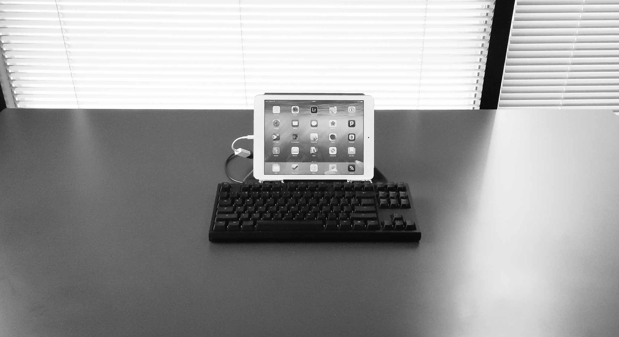
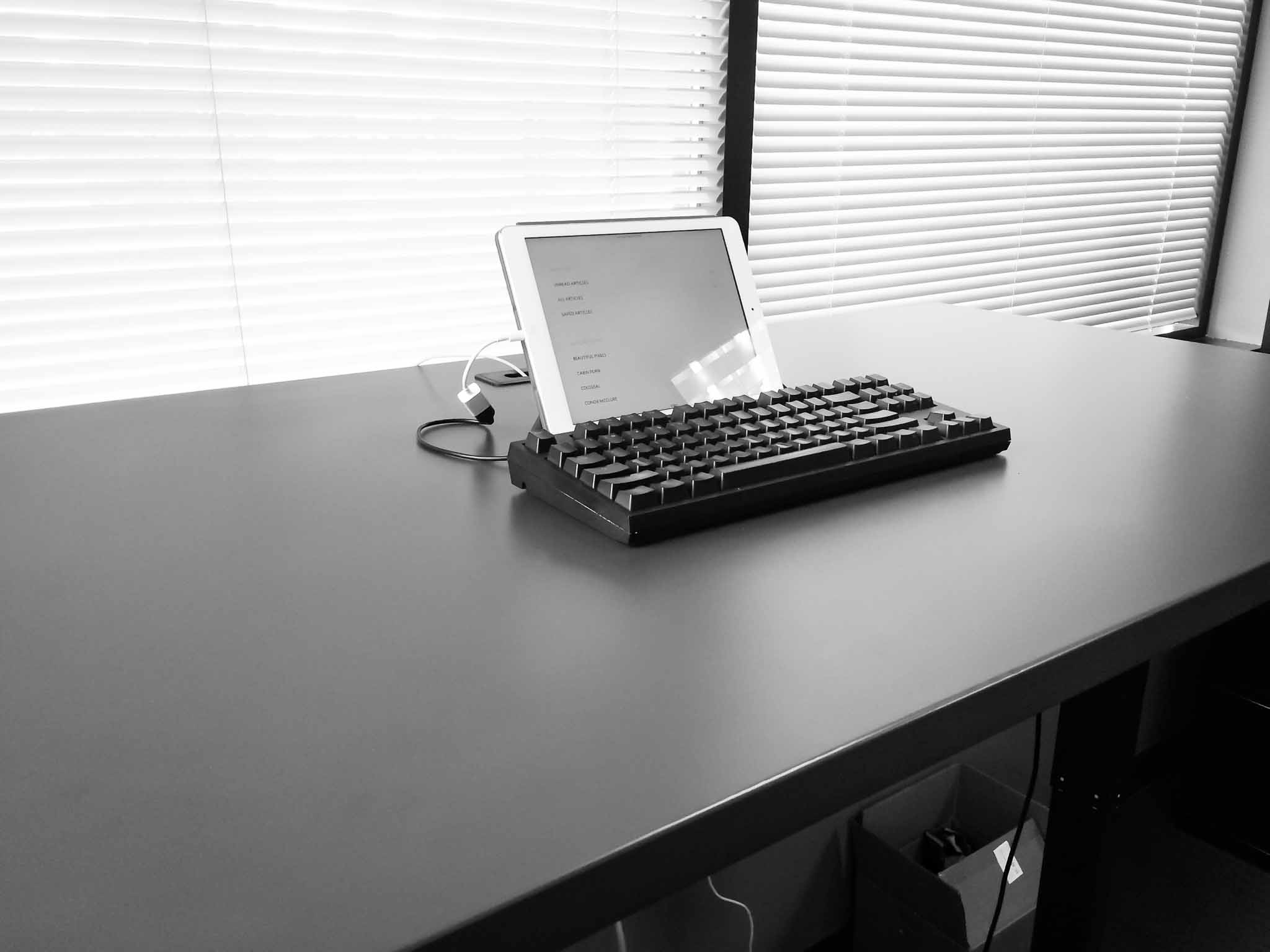
    I recently wrote about how I often dream of wiping everything off my desk and just placing the iPad in the middle of it. It would sit there alone, surrounded by my expansive desk as a symbol of both simplicity, and how far (technologically) we have come since the early days of computing.

    Well, I came up with a reason to do that — well kind of that. I was heading out of town for the long weekend, down to Oregon, and I was to ride the train out of town. Because of the train ride, I was going into work only until 2:00pm, and then having a coworker drop me at the train station. Naturally, I didn’t want to leave my laptop at the office over the long holiday, but I also didn’t want to take it with me.

    The solution was to leave it at home and spend the partial day working from just the iPad.

    First of all, the setup looks killer. Minimal, awkward, and awesome. Just how I hoped.

    As with most managers my days are spent writing things, usually in emails. I also make heavy use of OmniFocus, and web based services. All of this seemed ideal for this setup, and the addition of a long holiday meant that there wasn’t a whole lot of stuff to do anyways.

    I could have picked a smaller keyboard to go with the setup pictured (I have a few), but I enjoy typing on the CODE keyboard far too much, and I have the USB adapter to use it, so… It looks silly, but it feels amazing to type with.

    So how does this all work?

    Well, it actually works pretty well, and would likely work even better if I wasn’t running a beta version of iOS (as somethings don’t work in the beta). What I didn’t expect was that I would be more focused.

    When I have my Mac in front of me I am doing a lot of things, but not focusing on a lot of things. With the iPad only I felt that was reversed — I did a bit less, a bit slower, but what I did do was more focused and therefore carefully done.

    There’s both good and bad to this.


    Note about the CODE

    I ultimately had to switch to an Apple Wireless keyboard, in my Origami Workstation, because the CODE kept having too many problems. The iPad warned me it was not supported, but it worked (mostly). However, and I don’t know if this is an iOS 8 bug or not, but the keyboard kept locking up the iPad to the point where I had to hard restart the device.

    So I switched to the Apple Wireless as it works as expected. Oh well. I suspect there might be too great of a power draw on the CODE, not sure.


    The Work

    As I mentioned, I felt more focused, but I also felt like I was working slower. However, at the end of the day, I still got everything I needed to do done. Sure there were a couple of things that I couldn’t do throughout the day, but each of those were bugs in the beta of iOS and not underlying issues with iOS itself. Some things I just passed off to others as I didn’t want to take any time to figure out how to do them. (Benefit of being the boss, I suppose.))

    I shouldn’t be amazed by this, I’m a big believer in the iPad, after all it is my favorite device, but I’m still amazed at what I learned.

    I learned that I have no need for anything more than an iPad on an average day.

    That’s not to say that I won’t benefit from a laptop, or that an iPad is the best tool, but that the iPad did everything exceedingly well. I loved it. Not enough for everyday just yet, but when I know I have a busy day in meetings, I’m now going to leave the laptop behind.

    I still need more than an iPad, but that gap is going to close tightly once apps start taking advantage of the new features in iOS 8. And I can hardly wait for that.

    The only thing I do need is a bigger screen for the iPad. I’ve always wanted a larger iPad, but perhaps someone can figure out a way to make an iPad functional on a bigger screen (meaning the larger screen needs touch, or something of that ilk). Mostly I think a 12-13” iPad would make me drop a laptop completely, perhaps with just one family computer at home for those odd ball tasks.

    The long and the short of it is that I found the iPad better at:

    • Reading anything: when you stand it can be annoying to stand still and read, so I loved picking up my iPad and reading things leaning against a wall, only to set my iPad back down and act on that text with no need to switch devices. It was wonderful and freeing.
    • Twitter: It’s better in that I kept my eyes off of Twitter for most of the day, with more dedicated distractions into Twitter. So instead of looking at Twitter every 5 minutes, I looked every 60 minutes.
    • Tab-philia: I usually have tons of open tabs in Safari which denote things I want to read, and I see those tabs a lot during the day. On the iPad I have the same amount of tabs, but I don’t see them as often (because in Safari on iOS the view of tabs collapses so you don’t see them) and I found that less overwhelming as I worked.

    What the iPad was worse for:

    • Email was rough. The iPhone has lots of email clients, but the iPad is sorely lacking in third party email clients, help here please. I had no way to quickly turn an email into an OmniFocus task, and found it hard to quickly move emails to different folders — all automated on my Mac with Keyboard Maestro.
    • Image work. Still better on the mac, even with the great image editors that have been popping up on the iPad.
    • Fixing code in a website is still a bit of a chore.

    Overall

    As I said, this is a setup I am likely to use more and more. With iOS 8 extensions coming I think the gap between what most people need to do on a Mac each day, and what the iPad can do well, is closing faster than many suspect. At this point it’s not a person clamoring for better apps, that do more powerful things, it’s just a matter of fine tuning what we already have.

    I don’t see that taking very long. In fact, this time next year I may be splitting my time between the Mac and iPad evenly.
  • Facebook’s Explanation: We Wanted to Make Sure You Weren’t Turned Off By Facebook

    Adam D. I. Kramer, an author of the research, writes on an incredibly ugly Facebook page:

    The reason we did this research is because we care about the emotional impact of Facebook and the people that use our product.

    Ok, I can get behind that, you care about users. That’s nice.

    We felt that it was important to investigate the common worry that seeing friends post positive content leads to people feeling negative or left out. At the same time, we were concerned that exposure to friends’ negativity might lead people to avoid visiting Facebook.

    Oh, you were so close then you had to go and be all honest. So let’s boil down the ‘why Facebook did this’ to just this: we were worried people may stop visiting Facebook because of what they see in their feed. Or, alternatively: we need to know if we should show more or less positive feed postings to users so that they keep coming back more.

    Yeah, that sounds about right. Not really about the user, so much as about how much the user drives page views.

    Nobody’s posts were “hidden,” they just didn’t show up on some loads of Feed.

    Ummm… Let’s try that again:

    Nobody’s posts were “hidden,” they just didn’t show up on some loads of Feed.

    Hmm, pretty sure not showing up on some loads of the Feed is the definition of “hidden”, but I’m not an expert here.

    And at the end of the day, the actual impact on people in the experiment was the minimal amount to statistically detect it — the result was that people produced an average of one fewer emotional word, per thousand words, over the following week.

    Hold the fuck up now. You found a correlation between seeing negative posts and posting negative things. The research, if I understand it correctly, shows that the more negative stuff people see the more negative they become.

    Two parallel experiments were conducted for positive and negative emotion: One in which exposure to friends’ positive emotional content in their News Feed was reduced, and one in which exposure to negative emotional content in their News Feed was reduced.

    Meaning Facebook caused users to feel better or worse at random, but on purpose. So instead of allowing for natural balance (seeing both good and bad posts) this “experiment” limited some peoples feeds to showing more good, or more bad. That actually does have a fucking impact on people.

    The goal of all of our research at Facebook is to learn how to provide a better service.

    Wait, that contradicts what you opened with when you said:

    The reason we did this research is because we care about the emotional impact of Facebook and the people that use our product.

    I guess goal and reason are different at Facebook?

    The experiment in question was run in early 2012, and we have come a long way since then. Those review practices will also incorporate what we’ve learned from the reaction to this paper.

    Translation: We are still at it, but now we believe we are on moral high ground.

    Facebook, taking UX design to a whole new level of fuckery.

  • Seven Years of Magic

    When I watched the first iPhone keynote, I was in awe. I was pumped it was coming out on my carrier.

    I was getting one for sure.

    There wasn’t much information about how to get one. So I ordered online. Others lined up, but I ordered. And then I tried talking to Cingular reps I knew in the days leading up to launch to make sure I got one.

    I don’t concretely remember that day. But what I do know is I had only been dating my wife a couple of months, and she lived in Portland and would be driving up later that night to see me. I remember my car was in the shop (my car was always in the shop at that time). I remember the Apple website said August would be when I got my phone.

    I remember that ship date being completely unacceptable to me.

    I remember David Pogue’s review and how it made me lust for this bit of magic called iPhone.

    I needed to get to the store, and to get an iPhone.

    I called my wife (remember girlfriend then) and asked her a simple question: “hey, you close?”

    She was 20 minutes away.

    What happened next was one of the most awkward moments, I said: “so, how much do you l… uh, like me?”

    Her: “Huh?”

    “I mean when you get here would you mind driving me to the store so I could get an iPhone?”

    “Really? Ok, I guess, but would you drive?”

    I literally stood waiting for her at the end of the driveway. Recalling this now, it’s amazing my story with her goes on.


    We first went to the local Cingular store, they knew me there, but no luck. I was on a business plan and thus couldn’t buy one for some asinine reason I’ve yet to comprehend, furthermore they were asses about it.

    On a whim I drove to the Apple store, 35 minutes away on a Friday evening, while my girlfriend sat tired in the seat next to me after driving a long ways to see me for just a couple of days.

    At the Apple Store I bought two iPhones, then went back in a bought a third (one for me, one for my dad, and another for a friend — none for my girlfriend, not smooth Ben).

    Once home I quickly learned I couldn’t activate the iPhone (done through iTunes back then). I had a business account and Cingular wouldn’t allow it.

    Fuck. Me.

    I took a break to see my wife. (Smartest thing I did that night, but only after I slid the iPhone lock screen for emergency calls no less than 50 times.)

    The next morning I called Cingular. They were up to speed and quickly moved the three iPhones I purchased from a business plan to a family plan. Jackpot. Activated.

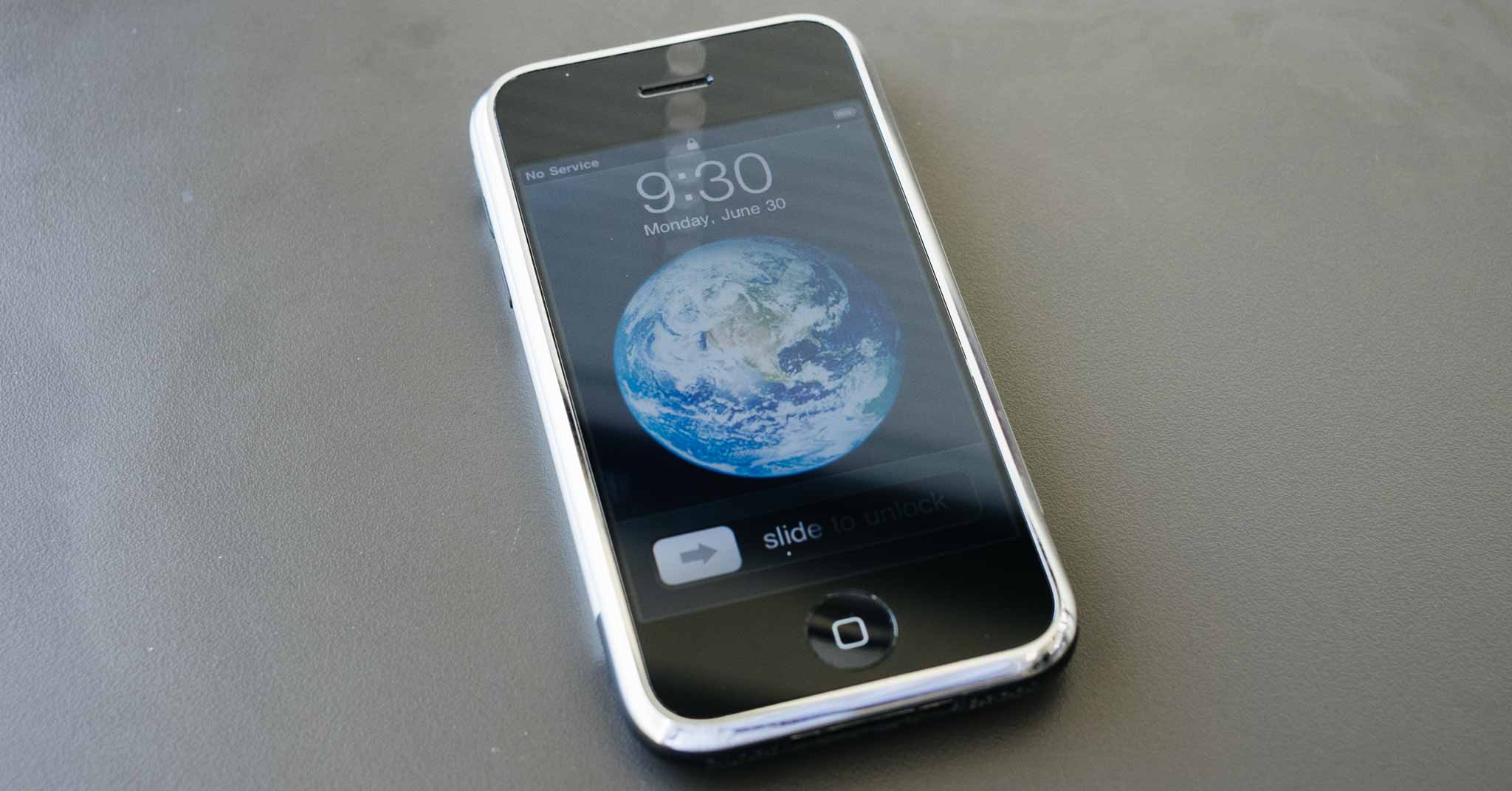
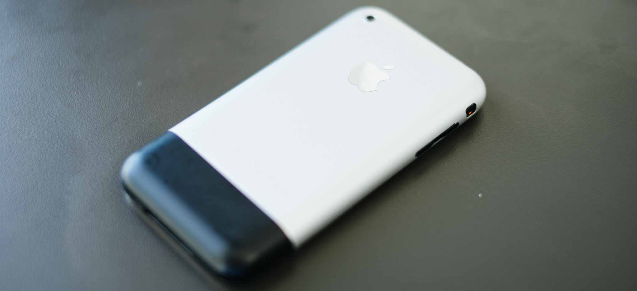
    I’ve owned every iPhone since then, and I still have them all. My original iPhone is gone, but we still have Erin’s original iPhone. All the iPhones still get used everyday except that old original phone. On a whim I pulled it out last night, charged it, and updated it.

    It still works fine, and even though it is quite a bit slower than my current iPhone, it doesn’t really feel that much slower.

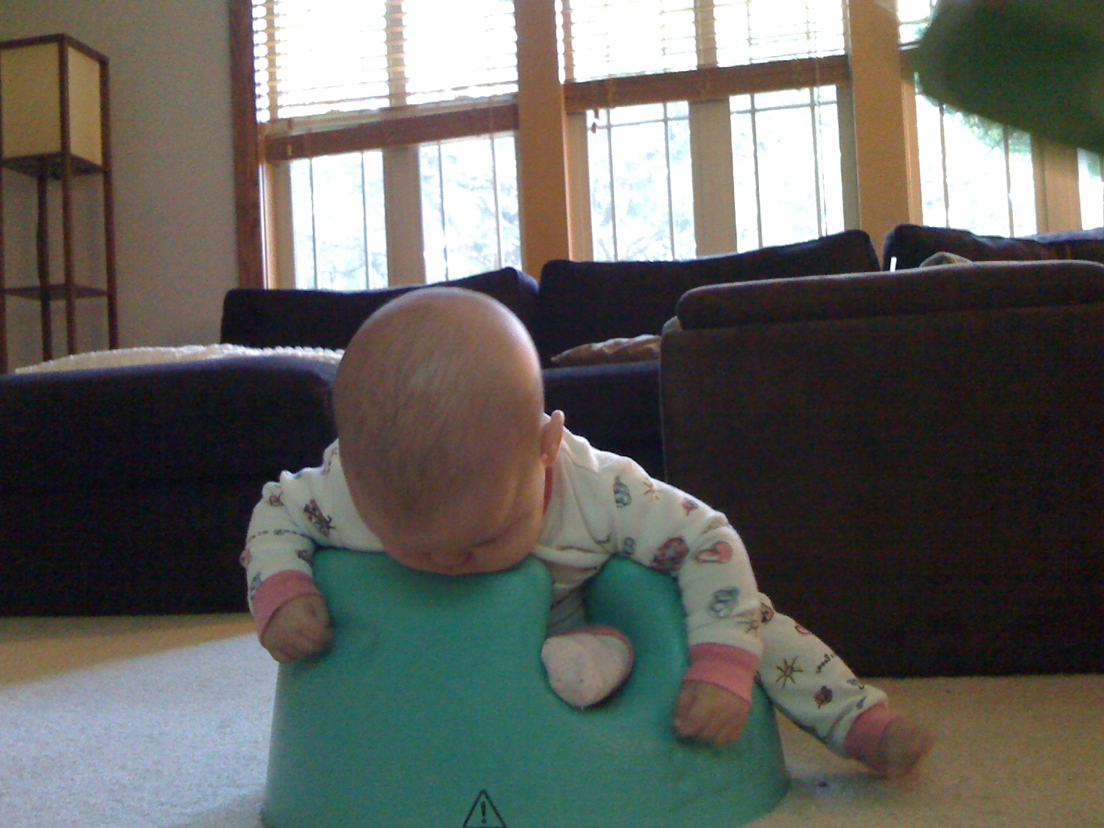
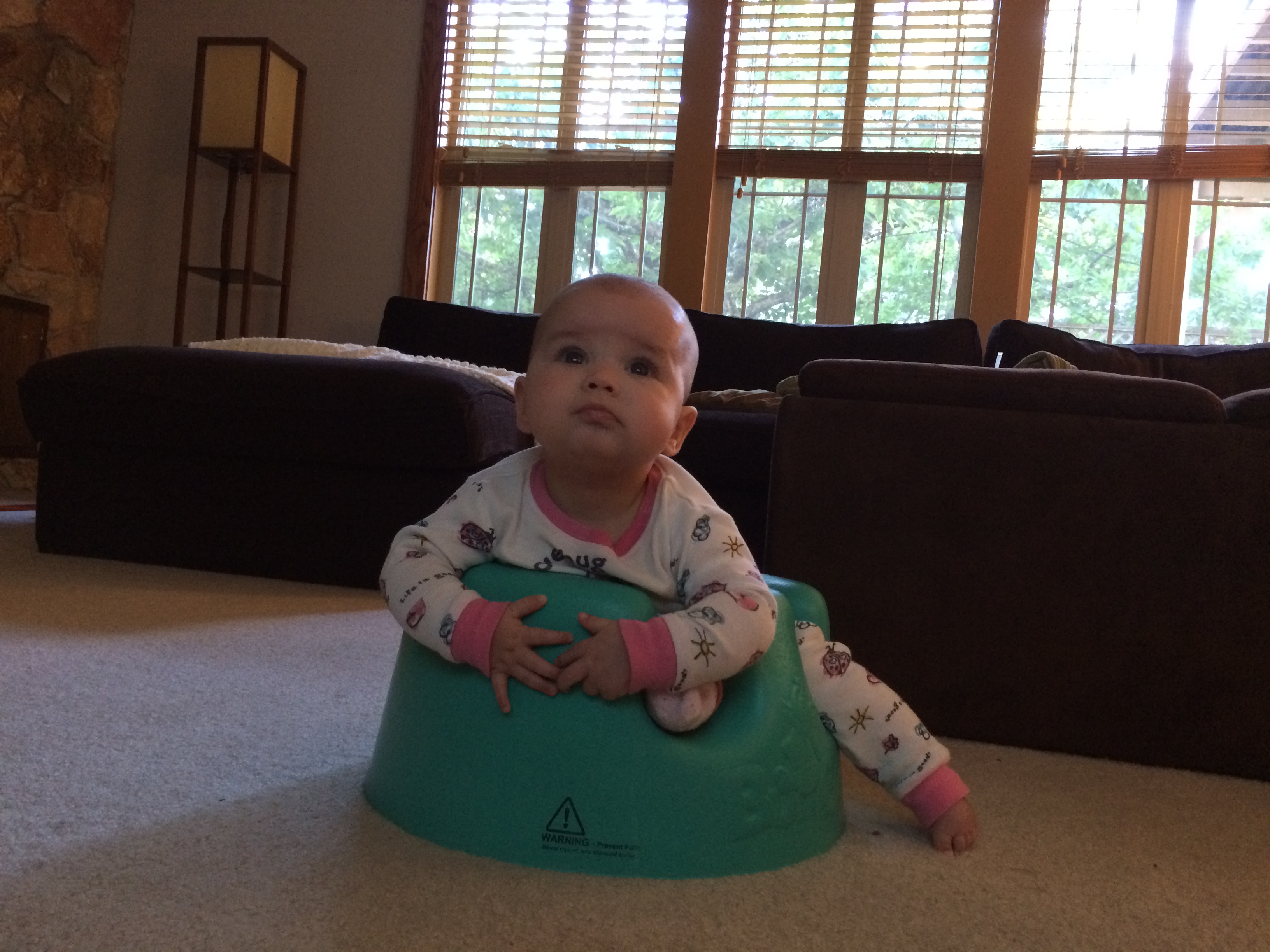
    The camera though, oh boy are we lucky we still don’t have that clunker.

    Original iPhone:

    iPhone 5s:

    Here’s to another seven years.

  • Google I/O 2014 in Tweets

    I didn’t watch the 14 hour Google Keynote today, nor have I read a single thing about it. Nope, just followed along with comments on Twitter. So, in chronological order, here is the Google I/O keynote recap:

    @justin: “We can’t hear Google, but they can see us. #io14”

    @moltz: “Look at this email interface. It doesn’t look like shit anymore. That’s the power we’re giving you.”

    @beerandpork: “Nice head placement pic.twitter.com/BS17GFlqdx”

    @panzer: “Google’s Problem: Even if its intentions are 100% pure, it’s impossible to talk wearables without thinking about data gathering for ads.”

    @gruber: “Eight on-stage speakers so far, by my count. Zero of them wearing Glass.”

    @danielpunkass: “The demo cockpit is a Kia. So is Kia the only company that agreed yet to integrate android auto?”

    @apike: “@danielpunkass No, they’re just the most prestigious one”

    @mattalexand:”Ah, I see it’s time for the Annual Google Television Attempt”

    @gruber: “So if you’re all in on the Google experience, are you supposed to buy an Android TV device or a Chromecast device or both?”

    @viticci: “I would say that Nike and Withings have produced more innovative and smarter wearable solutions than Google’s current crop of Android Wear.”

    @poritsky: “Inviting a creepy ad company into your television seems unwise.”

    @dhh: “Google’s new Material Design is pretty, but their language of justification is a ridiculous stew of gobbledygook. pic.twitter.com/z4EvWB9wQq”

    Sounds like a great keynote.

  • Amazon’s Terrible Marketing

    I wasn’t much excited about Amazon’s new ‘Fire Phone’, because I’ve actually used a Kindle Fire and I know the reality of the situation. What’s always far more interesting to me is the way Amazon markets new products, because overall Amazon does a pretty shitty job at marketing products.

    Yes, they have a great website which works well and does a good job at recommending things, but when it comes to the behemoth trying to sell new products (which they’ve made) — well desperation is the word that best sums up their marketing.

    Please, just buy this. Now. Please?

    In watching the marketing video Amazon prepared for the Fire Phone you will immediately notice one thing: it looks like a knock off of an Apple product video. One where Jony Ive is sitting there talking about design and Schiller is bouncing up and down talking about cool features.

    I’ll give Amazon that, they did copy the format. But they royally screwed up the execution.

    The people sitting there talking about the Fire Phone seem equal parts confused and exhausted, but the real issue is the real people (aka, not trained actors) that are talking about the phone as they use it.

    What you hear is a lot of ‘whoa’, ‘cool’, ‘neat-o Billy’ type of statements. Whether real or contrived, the people in the video clearly want you to know that they think the device is cool.

    What you don’t see, and don’t hear, is the usefulness of any of this. Because what Amazon is doing is marketing the features, specs, and wow factor of the device, instead of marketing the end results of the device.

    Their video is effectively the bullet points you find on the box.

    Amazon, then, is showing you why their device is cool in the phone landscape. Whereas what Apple tends to do is to show you the practical benefits that you, the user, will receive from having an iPhone.

    In a typical Apple marketing video what you see is:

    • People using, and enjoying using, the device being marketed.
    • People accomplishing something of merit with the device.

    Whether it is a Christmas ad of an introverted kid making a stellar family video, or a lone videographer shooting video of Niagara falls — what you see is stuff being done. Imagine those ads of Apple’s with the actors in them saying: “whoa look at this parallax.”

    With Apple’s ads I often don’t know how people are accomplishing what is shown, but I know that they are accomplishing specific tasks that I often don’t think about doing with my iPhone.

    With Amazon’s ads I know some of the things the device has, but am left knowing very little about what I can do with the device. Show me the practical, day-to-day applications of Firefly, not just the feature.

    So as a potential customer it becomes more of a challenge to want the Amazon device, based solely on the fact that I really don’t know what the fuck I can do with the device.

    Even Samsung does a much better job at this, or Microsoft with the Surface 3 commercials.

    Amazon’s marketing is just plain terrible.

  • Moving Back to OmniFocus

    When OmniFocus 2 came out, I switched back to it from Flow. I hadn’t been using any betas, or anything of that ilk. I had been using Flow, as I’ve documented here on this site.

    But, as it tends to happen in life, I had been getting increasingly busy. So busy that I was overwhelmed trying to manage everything in Flow. For all the happiness that Flow brought me for the many months I used it, the cracks began to show when I started to get swamped.

    And that’s bad, very bad. A task management tool should excel, not break, when the going gets busy. What I’ve come to realize is that if your task management system doesn’t seem like overkill when you are not overly busy, then you are going to break it when things get very busy.

    So I took the opportunity to move back to OmniFocus, and with it I found comfort.

    I found trust.

    The thing about OmniFocus, for me, is that it always feels safe. I know that it’s going to show me things, ping me, and ding at me. I know that it’s not going to lose anything. I know it is there, waiting, and ready for anything.

    I never got that feeling with Flow, and so now — even after I am over the hump of being incredibly busy — I am going to stay with OmniFocus. I’ll still use Flow and other tools, but OmniFocus with be the hub for everything.

    More on that later…

  • Idea for a WordPress Plugin: Blogger Honesty

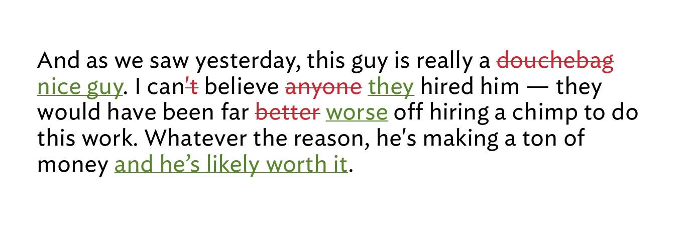
    Here’s a free idea for anyone who wants to whip this up: a new plugin for WordPress which shows readers the revisions made to a post. I’ve always wanted something like this, but the two plugins that currently exist aren’t up to snuff (and one is dead it looks like as it’s been two years since its last update).

    Here’s the gist of how the plugin I picture works:

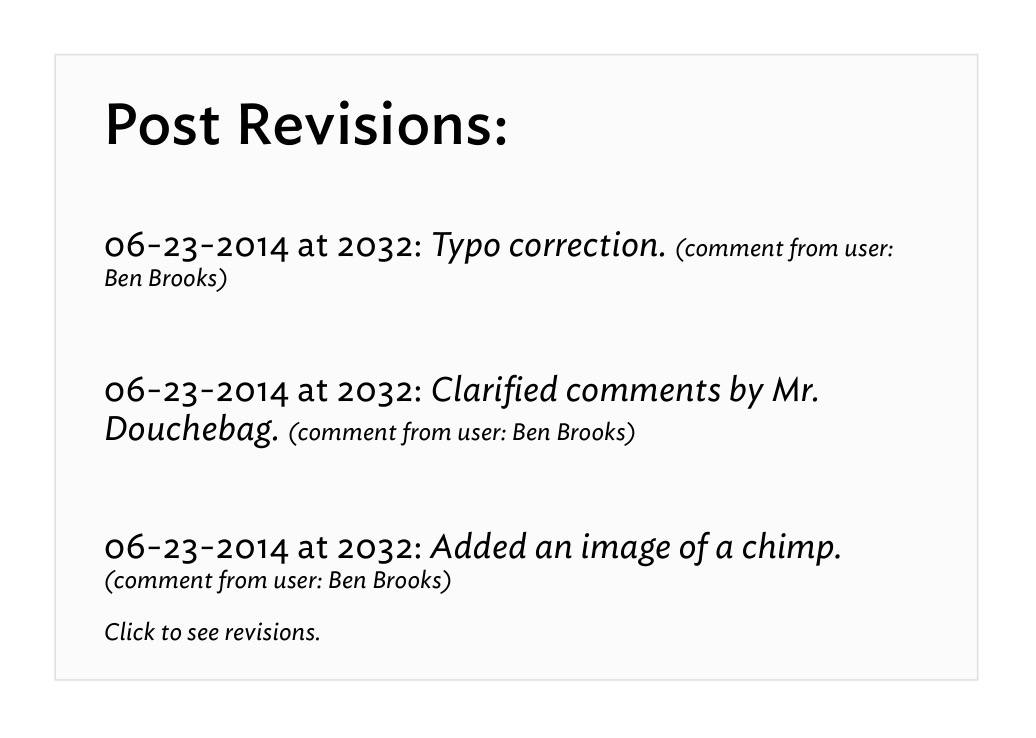
    • After a post is published any change made to it requires a comment be entered about what the change was. This is published on the site at the bottom of the entry after any footnotes. It can be short like I show in the below mockups, or verbose like The New York Times updates.
    • There’s a reader toggle that allows the reader to see the complete revision set of the document. This is shown inline for space and ease of viewing.
    • The site admin can set a threshold where X% of changes to overall text triggers a new post to be automatically published on the site letting readers know substantial changes have been made. The author of each post is warned that recent changes will trigger this post, and able to fill in text in a custom field to explain changes in the new post. Picture the posts that Kottke.org posts to let RSS readers know of updates. The author can also trigger this if needed. The update post would only publish once a day and contain a listing of all of these items.

    The goal is more transparency in publishing. I, or any blogger, could effectively wait for a ‘big name’ to endorse a post and then change all the text in my original post so it looks like that ‘big name’ just endorsed something awful.

    But more practically I just want to show the readers changes that have been made so that I can keep articles updated, in a more ‘living document’ manner.

    Here’s a mockup of what I’d like to see for the revision displays that the user could toggle on:

    And here’s what I would like to see shown at the bottom of the post listing revisions:

    You can have this idea, but if you build it let me know so that I can use it.

  • Podcasting, Networks, and Audience Building

    A month ago, Marco Arment made the ill-advised statement ((Ill-advised because it required more words to clarify.)) saying:

    Podcast networks are a lot like blog networks. (Remember them?) When the medium is young and everything’s difficult, it helps to band together with a large entity to pool resources on tools, hosting, ad sales, and staffing.

    He went on to talk about how these networks are not needed anymore. ((Not needed to be successful that is. Important distinction.)) Yesterday Arment sought to clarify his position since he was (likely) getting tired of people emailing him:

    Podcast networks are like record labels: they promise exposure, tools, distribution, and money. But as the medium and infrastructure mature, their services are often unnecessary, outdated, and a bad deal for publishers.

    I read that post, and I’ll be honest, it didn’t sit well with me. It seemed a bit too defensive and not expounded upon properly.

    Just this morning Arment followed up with a longer, and very excellent post. You should read the whole thing, but because I know a lot of you won’t, here are two relevant bits:

    Discoverability is overrated. The real way to get more listeners is to make a great, relevant show. The best content tends to be found, but it takes hard work and dedication.

    And:

    Neutral simply wasn’t as good as ATP and wasn’t as relevant to the audience. The Magazine under my leadership was subjectless, unfocused, and irrelevant to most of my audience. Bugshot was only useful to a few people, and I didn’t put much time into it. All of these had the benefits of a “built-in audience” to give them an initial spike, but none succeeded because they simply weren’t good enough.

    A lot of the criticism Arment has taken for his position on the rather pointless debate of whether podcast networks matter, surround this notion that Arment cannot apply his data to the overall dataset because he is so ‘famous’ to begin with.

    Bullshit.

    Read that last quoted text from Arment, that’s all you need to know. Your popularity and fame will only get what you do noticed, it will not sustain success. That’s why we have ‘one-hit wonders’, that’s why that stupid Color app didn’t go anywhere, and that’s why unknown people are found and loved. Discoverability is based on talent, or fame, but success is based solely on talent. ((Ok, for the most part. But certainly in podcasting unless your fame is Kanye West level of stupidity.))

    I’m coming at this from a different angle than Arment. I’ve never been popular or famous. I’ve never built anything really cool. All I’ve done is yell at people to get off my fucking lawn. ((Side note: there was an estate sale on my block this weekend and after the fifth car parked on my lawn I turned on my sprinkler system for the rest of the sale.)) When Shawn and I had B&B we struggled to gain more listeners each month. We didn’t really ever lose any, but we never gained a ton either.

    Ditto my paywall. ((Duh.))

    When B&B joined 5by5, nothing really changed for us, other than we got better and easier hosting, and got to chat with Dan a lot. But being a part of 5by5 — the best we could tell — didn’t significantly result in any difference to listenership. Other than helping us sell ads, because it lent legitimacy to our podcast, 5by5 didn’t change much for our podcast. And Shawn is famous.

    When I was on Fusion, a quasi blog network, nothing happened for my site directly because of Fusion. When I left, nothing happened either.

    When I was on the Syndicate, nothing again. (Other than still being listed as part of the network on Asymco — which gets me about 5 extra hits a month.)

    Sid O’Neill, whether he wanted to or not, sums up the side urging for podcast networks well:

    Getting your show on a podcast network associates you with a lot of other shows that people are already enjoying. It’s a mark of quality, and these days when everyone and their mother has a podcast, it makes it a lot more likely that someone will discover your show.

    And:

    Obviously ATP’s success is — in part — due to the loyal following that both John and Marco had accumulated over years of putting out fantastic podcasts.

    First off all, O’Neill’s first statement would imply that everyone who listens to one 5by5 podcast has listened to at least one episode of every other show. It also implies that the average podcast listener goes to the 5by5 website to see what shows are new.

    That’s a dubious argument, as I doubt most podcast listeners hear about a new show at 5by5, unless that new show is mentioned on the podcast they are listening too already. But I have no supporting evidence to back up that claim it’s just my overall sense.

    As for the idea that a loyal following played a role in the success of ATP: It did, and I don’t think Arment is arguing it didn’t. But what Arment is saying is that a loyal following only helps to get people to look at what you are doing, but to keep them coming back you have to actually be good.

    Better than good these days. You have to be great — even if you are Marco Arment. Actually, especially if you are Marco Arment.

    I’d argue a bit with Arment about how easy everything is, but that’s mostly because getting the podcast into iTunes is a bit opaque to most people. But generally speaking there are enough tutorials out there that it’s pretty simple.

    Shawn and I got going not knowing a thing about podcasting, and it took me about 3 days of playing to figure out everything (Shawn handled the iTunes end of things, I did the audio). ((For those that are about to email me. Yes, I am starting back up a podcast again. NO, Shawn is not a part of it as we feel we don’t want to revive B&B — we prefer to preserve the memory of it. When it launches you can find it here, right now there is just a badly coded website and a dummy podcast of the smallest file size B&B we recorded.))

    In short then, Arment is right that podcast networks don’t matter much. They won’t make a shitty podcast well listened to, and they won’t elevate a good podcast anymore than where it will naturally go. Your best bet is to put in a ton of time making your podcast not suck.

  • My Favorite Device

    Everyday I interact with, use, carry, and yell at an immense amount of devices. Most of these devices have either been directly purchased by me, selected by me, or something of that ilk — I’ve had a hand in them being in my hand. I don’t always make the best picks, but I usually know when I have made a great pick and I usually toss aside any crappy picks quickly.

    And as I was on my thinking throne the other day, I pondered which of all these devices is my favorite of the lot. I sure love my iPhone, or my Fuji X-E2, oh and my retina MacBook Pro is fantastic, can’t forget the iPad either.

    Which is my favorite, and perhaps not only just my favorite right now, but which device, which thing, would be my favorite of all time?

    That’s a really hard question because the human memory is pretty shoddy. We tend to weigh recent things as more important, and forget many of the other things along the way. We are biased towards what we have now, even if an older thing may have been, or still be, a more favorite thing.

    I started to make a list, and on that list:

    • 12” Powerbook G4
    • Original iPhone
    • Original Palm Pilot
    • iPod third gen, with those red touch buttons everyone but me hated.
    • Canon 5D

    I kept on going too, adding everything I had a fond memory of, I seemingly opened the flood gates of devices past — though most still within the last ten years.

    The Powerbook was a legend, it was the computer that made me start carrying a laptop everywhere. The iPhone changed how and what a phone should be — perhaps even how we should interact with most devices. The original Palm Pilot showed the power of having something small and always-on with you. The iPod broke my mind with how many songs I could carry on it. The Canon 5D was/is so perfect in so many ways that it compelled me to actually learn photography, instead of just take pictures.

    I could go on. Picking more devices and looking at what they changed for me, and that which makes them one of my favorites. But none of those, as close as they may come, is my favorite of all time.

    No, you see, to get to my favorite device of all time we need not look back into that annals of devices past, but only back less than a year.

    It’s got LTE, 64GB of storage, it’s break-your-mind-thin, retina, white. When I pick it up, when I hold in my hands, I dare not stop to think about the device because doing so makes me smile like a kid who just snuck extra dessert. I grin not because I love this thing, I grin because this thing is not only what I wanted when I was a kid, but it actually goes beyond what I imagined possible when I was a kid.

    I breaks my mind.

    And yet this device is only scratching the surface of possibility.

    The device, of course, is the iPad. In this particular case my iPad Air, but you can pick the retina iPad mini if you want, both are equally fantastic.

    Yes, the iPad over all those other things in the world.

    Why?

    I’ll let you in on a little secret about the iPad: it always feels like magic.

    I don’t mean Penn & Teller magic, I mean like the iPad is something that should not exist, and if it were to exist it certainly could not work well. And if it were to exist, and it did work well — it certainly could not be affordable. And yet, like magic, the iPad is all those things and more.

    Magic.

    The odd thing, that hard thing, to wrap your head around — at least for me — is that of my all devices I have around me, my iPad is the least used. Yet, it’s still very much my favorite.

    The meta (i.e. the blogger) thing to do would be to tell you all the amazing things I do with my iPad. To make it very clear that this very post was in fact written on my iPad. But it wasn’t written on my iPad. I do very little writing on anything but my Mac.

    No, the post was outlined on my iPad, but only after rough notes were taken on my iPhone.

    If I lost the ability to ever have an iPad again, I would miss it, but I wouldn’t miss a beat. I can’t say the same of my iPhone or Mac.

    And still, once again, I must state: the iPad is may favorite device ever. It’s not the best, but it is very much my favorite.

    As I said: the iPad is a bit of magic.

    Because the thing about the iPad is that while it does no one thing well — it can do just about every single thing I want or need to do on a daily basis. The same simply cannot be said about any other device I have ever owned. ((Though the iPhone is very close.))

    The iPad can not only edit photos and videos, but it could also be the only device I use to capture photos and videos. I don’t do that, of course, but plenty of people do use their iPad that way. Just open your eyes the next time you are in a photogenic crowd.

    iPad could replace your laptop, and sure somethings would be made more cumbersome, but you could still do them. Hell, there are many things which would be made even better if all you had were your iPad. While still many more that would be made far more cumbersome.

    I can even make and receive phone calls, text messages, and video calls. Sure, maybe only between iOS devices, but iOS devices are becoming as ubiquitous as Windows XP once was, so that limitation is really becoming less of a limitation.

    You see my iPad really is a digital sheet of paper, but it also — just so happens — to be a little super computer as well.

    And that’s really what makes it feel so magical.

    There’s quite literally very little that I ever need to worry about with my iPad. Charge it? Sure a few times a week. Want to do something on it? You likely can do that something, but it may require an app or two. Internet: always there, always fast.

    Like I said, there’s very little I cannot do on my iPad, but there’s also very little that I actually do on my iPad.

    And that’s not a factor of the device doing a lot of things, but doing those things poorly — it’s just a fact that I happen to have other devices always near me that: either do the task better/faster, or that the other device is more convenient (iPhone perhaps).

    Sure, that may not sound like a compelling reason for the iPad to be my favorite device, but take the cover off of your iPad (if you have one), it doesn’t matter the model.

    Don’t even bother turning the screen on.

    Just hold it a bit.

    Just think about everything it can do.

    Think about the fact that while it may not be best at doing those things, it’s rarely shitty at doing those things.

    I can’t let myself do that exercise too often, because I always find myself with the overwhelming urge to wipe everything from my desk and just put the iPad down in the middle of my desk. As if I have suddenly reached the plateau where my desk is on par with Picard’s.

    My, is the iPad a magical device.


    And I’ve been giving this a lot of thought. This idea that something can be so loved by me, so favored, and yet be used so little. It’s not a matter of the device needing better apps, or specs.

    It’s just a matter of the device being a little ahead of its time. I’m used to carrying a large phone around with me everywhere because the first smart phones that I carried for so long were huge in comparison.

    So carrying my iPhone is no problem at all.

    I’m used to toting my laptop to and from work and on short vacations because the laptops I toted around before were so large and cumbersome.

    I’m just not used to toting around an iPad. First because it is a device that’s only existed for four years. I have no device to compare against. I can’t say it is lighter, or thinner, or better than what we used pre-iPad.

    Because the truth is, we still don’t know what the hell we are doing with the iPad.

    Yes, there are a great many apps that push the envelope of what you can do with the iPad, but those apps are still only scratching the surface.

    Because perhaps that magic I feel when I hold the iPad is a feeling of potential. If you allow yourself to stop and openly think about the iPad what you realize is that in almost all cases it should be the better way to do a great many things.

    The list of what the iPad is and should be better at is boring because individually these tasks themselves are boring. But taken together the list is compelling.

    The iPad is not my favorite device because it is the best right now, but it is my favorite device — I think — because it feels as though it is on the cusp of being the best at a great many things.

    It’s so very close, and the magic is palpable.

  • On Interruptions

    UPDATED (on Jul 14, 2014): Richard Koopmann has significantly reworked his data, and while it doesn’t change the outcome, it is worth looking at if you are a data nerd. I’ve preserved this post as original and the new data can be found here.

    I had this theory, while reading something completely unrelated, and the theory goes like this: I wonder if people tend to leave people alone more if they deem the device (or thing) they are using (or doing) to be of a “work” related type of task. That is, are we more or less inclined to bug people if we think they are doing something more than just screwing off? Common sense answers this: of course we are less inclined to bug people we perceive to be busy with something of importance.

    The unanswered question that nagged at me: if I am writing a novel on an iPhone, am I more or less likely to get interrupted, than I would be if I was writing the same novel, same place, but by hand with a pen on paper? I’m doing the same task, just using a different device — how would that matter to the perception others had of me?

    I thought the answer would be: never bug someone physically writing — they are clearly busy. I admit, that’s a rather stupid way to think as there are plenty of ways to waste time with a pen and paper, but I still had to know if I thought the same way as others.

    So imagine you walked into an open office, and you can see what each person is doing the device(s) they are using and as you walk in you know you want to kill some time talking to someone — anyone. You know all the people in the room, and have no preference who you talk to, you just don’t want to write that TPS report so you want to shoot the shit.

    Someone is on an iPhone, another on an iPad, another on their laptop, another still on a desktop, and then someone writing on actual paper with an actual pen — which of those people are you most likely to interrupt?

    Naturally, I took a poll to help get to the bottom of this.

    I asked two questions, while both are essentially asking the same thing, I rephrased the question to try and get a more accurate set of data.

    The Results

    I’m not a statistician and it’s been almost a decade since I had a class on it (I aced the course though). Because of that I decided to ask for some help and Letterpress ace @rkoopmann got in touch. He, apparently is a wiz with poll data.

    So he worked up this report for me and I want to present it to you in its entirety.


    Here we go, thanks rkoopmann:

    Methodology

    The poll was presented as a post with an embedded iframe on The Brooks Review website. The post was titled Interruption Survey and contained the following introduction and note:

    I’d appreciate you taking a moment to fill this out (note this is an iframe, you need to scroll the frame to get to the “finish” button):

    Note: I’m assuming you want to interrupt someone and they are using the device.

    Instrument

    The poll consisted of two questions:

    1. I am more likely to interrupt someone using:
      • a pad of paper to write.
      • an iPad.
      • a Desktop.
      • a Laptop.
      • an iPhone.
    2. I am least likely to interrupt someone using:
      • a pad of paper to write.
      • an iPhone.
      • a Desktop.
      • an iPad.
      • a Laptop.

    Each of these items was required and only one choice was allowed per item.

    Results

    Respondents

    There were 499 submissions received between 2014-06-11 18:44:51 and 2014-06-14 14:34:49 (GMT?).

    Note that some percentages may not sum to 100% due to rounding.

    Geography

    The majority of respondents (58%) were from the United States; the next-largest group of respondents (9%) was from Great Britain. The remaining 33% of respondents came from 49 other countries with each country contributing less than 5% of respondents.

    Operating System

    The overwhelming majority of respondents (82%) were running an iOS (49%) or OS X (33%) device. Windows (4%) and Linux (2%) were the remaining identified operating systems; the tool was unable to identify platform for the remaining 12% of respondents.

    iOS 7.1 (46%) and Mac OS X 10.9 Mavericks (29%) were the largest group of respondents; 9 respondents (2%) were bleeding-edge dev-types running iOS 8; 14 respondents were old-school OS X 10.1 Puma (released Sep 2001).

    Q1. I am more likely to interrupt someone using

    • a pad of paper to write. 12%
    • an iPad. 16%
    • a Desktop. 15%
    • a Laptop. 6%
    • an iPhone. 51%

    We can see that an iPhone was selected at a significantly higher rate and a Laptop was selected at a significantly lower rate (chisq = 317.7635; df = 4; p \< 0.001) than expected (if we assume all options would be selected at the same rate of 20%).

    There was no significant differences with how frequently a pad of paper to write, a Desktop, and an iPad were selected.

    By Operating System
    • iOS users (49% of respondents) responded with an iPhone at a significantly (chisq = 184.9796; df = 4; p \< 0.001) higher rate than expected.
      • iPhone users (34% of respondents) responded with an iPhone at a significantly higher rate and a Laptop and a pad of paper to write at a significantly lower rate (chisq = 151.5882; df = 4; p \< 0.001) than expected.
      • iPad users (15% of respondents) responded with an iPhone at a significantly higher rate and a Laptop at a significantly lower rate (chisq = 36.5205; df = 4; p \< 0.001) than expected.
    • OS X users (33% of respondents) responded with an iPhone at a significantly (chisq = 82.9102; df = 4; p \< 0.001) higher rate than expected.

    Q2. I am least likely to interrupt someone using

    • a pad of paper to write. 45%
    • an iPhone. 21%
    • a Desktop. 22%
    • an iPad. 2%
    • a Laptop. 9%

    We can see that a pad of paper to write was selected at a significantly higher rate and that a Laptop and an iPad were selected at significantly lower rate (chisq = 264.4569; df = 4; p \< 0.001) than expected.

    There was no significant differences with how frequently an iPhone or a Desktop were selected.

    By Operating System
    • iOS users (49% of respondents) responded with a pad of paper to write at a significantly higher rate and a Laptop and an iPad at a significantly lower rate (chisq = 151.7143; df = 4; p \< 0.001) than expected.
      • iPhone users (34% of respondents) responded with a pad of paper to write at a significantly higher rate and an iPad and a Laptop at a significantly lower rate (chisq = 105.5882; df = 4; p \< 0.001) than expected.
      • iPad users (15% of respondents) responded with a pad of paper to write at a significantly higher rate and an iPad and a Laptop at a significantly lower rate (chisq = 46.3836; df = 4; p \< 0.001) than expected.
    • OS X users (33% of respondents) responded with a pad of paper to write at a significantly higher rate and an iPad and a Laptop at a significantly lower rate (chisq = 78.4790; df = 4; p \< 0.001) than expected.

    Holy cow, that’s so close to legitimate journalism that it makes bloggers everywhere shudder.

    What Does This Mean?

    What it means is that if you want to get work done, uninterrupted, you better not be doing it on an iPhone.

    And if you really want to be left alone, write on paper.

    But there are bigger implications to all of this than just the above. The audience that completed this survey is pretty tech centric. Therefore the respondents (one would assume) inherently know that you can likely do more work on your iPhone than a pad of paper these days. ((Exception to crazies like Mr. Rhone and Mr. Marks.)) And yet, the perception of someone likely to be dicking off on an iPhone, and therefore interruptible, is still there.

    Look at the data, it suggests that the hierarchy of what is seen as a “real” tool goes from: is essentially paper in a league of its own. The iPhone is seen as something you are clearly not using concentration for, given the willingness to bug people using them.

    That’s crazy.


    A few people wondered why I didn’t just use generics for iPad and iPhone — like tablet and smartphone — my reasoning was twofold:

    1. I don’t care about the other devices.
    2. I suspect that people would answer differently between iPhone and BlackBerry, but not between HP and Apple for laptops. So I reasoned that the best way to keep that consistent was to name some devices.

    The data can’t explain why we perceive paper as being more serious — more uninterruptible — but it does let us know that there is a different perception when you are using paper. And as an employer that’s a perception which I think employees should be aware of.

    Maybe you love responding to emails from your iPhone, but perhaps, if you want your boss to think you are working, responding on a piece of paper is a better strategy.

    Did I really just recommend that?

    Either way my curiosity is only more peaked now.

    UPDATED (on Jul 14, 2014): Richard Koopmann has significantly reworked his data, and while it doesn’t change the outcome, it is worth looking at if you are a data nerd. I’ve preserved this post as original and the new data can be found here.

  • Testing Your Internet Speed with Keyboard Maestro

    A long time ago I saw this post on Justin Blanton’s site. In it he found a command line tool to use Speedtest.net to test his internet speed. Sounded great, I couldn’t get it to work.

    Here’s what I did, I followed these instructions, but downloaded the file manually.

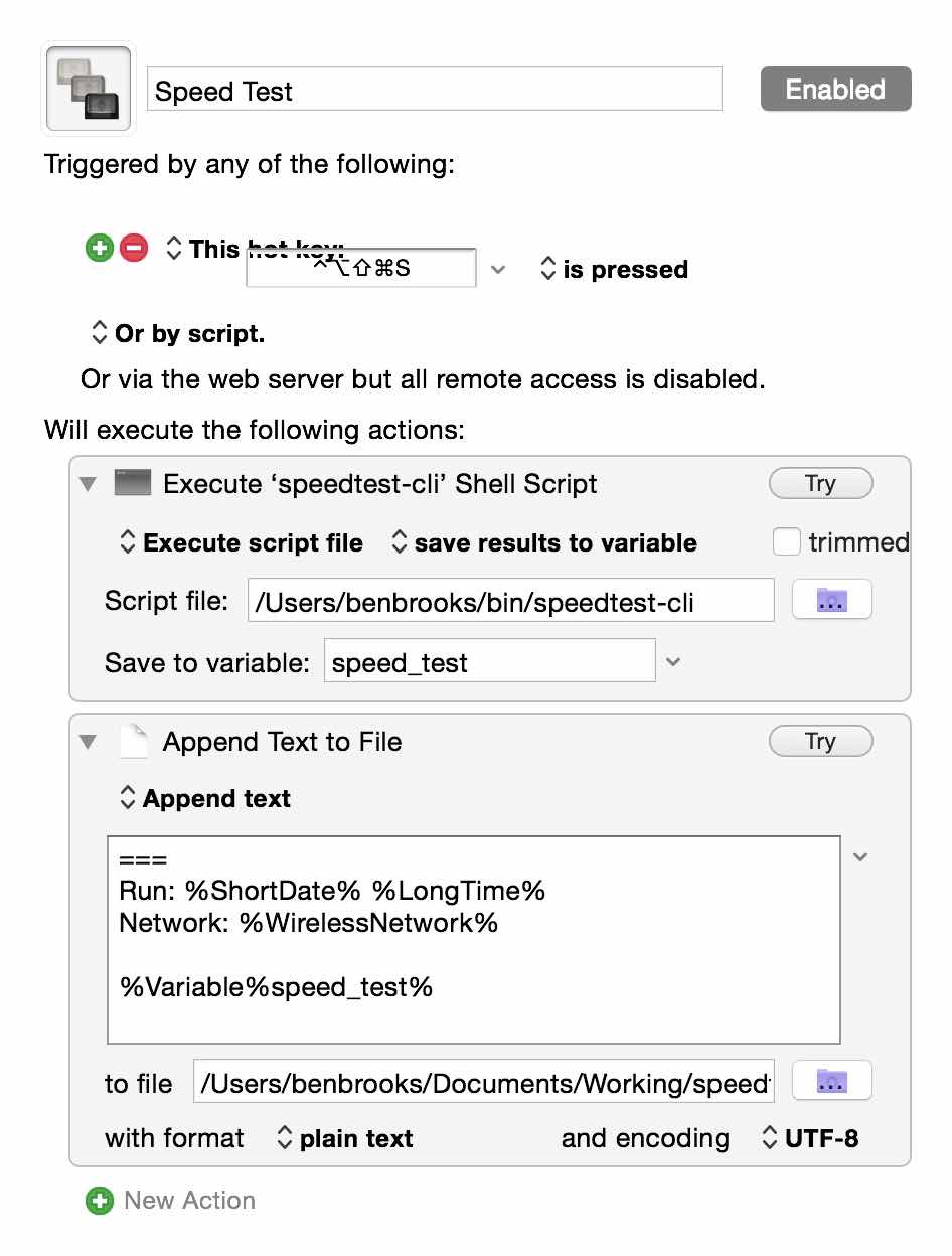
    Ok, that’s neat, it works in the command line. But, I’m not typing that crap out. So I flipped over to Keyboard Maestro where I can execute that command line script and write out the results to a text file for logging.

    Here’s what that looks like:

    All I do is run the script, write the output to a variable and then append that variable to a text file.

    In the text I append to the variable I also add in a separator, the time and date, and the network name I am on. Seems like over a long enough period I should be able to collect some interesting data.

    Oh, and remember, as all those links say: don’t abuse this tool. It’s not for testing your bandwidth every 5 minutes.

  • Interruption Survey

    I’d appreciate you taking a moment to fill this out (note this is an iframe, you need to scroll the frame to get to the “finish” button):

    Note: I’m assuming you want to interrupt someone and they are using the device.

  • App.net Versus Twitter: The Real Deal

    This would have probably been far more timely a year ago, but oh well. The one thing that users of App.net (myself included) like to point to is that you have better, deeper, conversations on App.net then what you find on Twitter and therefore App.net is better. It’s as if theory gives far more meaning, or intellectualism to the service, and therefore (should) justify using it to anyone.

    The idea is that because the service is smaller, used by people that are paying for it (mostly), and offers larger character limits — the conversations themselves are far deeper and done at a not-petty level (read: trolls).

    So the real question is: is Twitter more shallow than App.net?

    I don’t think so. I’ve used both extensively and App.net exclusively for the last year — so I have a good basis from where I speak. What I’ve come to realize, especially after coming back to Twitter, is that Twitter suffers from a popularity problem.

    There’s too many great people and accounts to follow, and they turn out an amazingly high volume of, well, shit ((I don’t use shit to mean everything is bad stuff, just there’s a lot of shit being tweeted, some good, some inconsequential.)) everyday, hour, and minute. I’d guess that for everyone one post on App.net, I’d have 30 tweets waiting for me on Twitter, but it feels more like 50 to 1.

    That’s astounding.

    The real difference is that with Twitter you have a problem of overload, and on App.net it never gets that way. Even on busy days on App.net, I could go all day without checking App.net, spend 15 minutes at the end of the day, and be caught up. It just took me 15 minutes to get caught up on Twitter after not checking for three hours.

    There’s no way I can decipher everything I see coming at me on Twitter, and because of that there is no way I can think about everything I see. On App.net you can read a post, think about it, and move on — without taking too much of your time. That will naturally lead you to formulating thoughts, thinking, and responding in a more considered manner.

    It’s not that App.net is better for discussions because of the platform — it’s that it is better for discussions because fewer people use the service than use Twitter. Is that good or bad? That’s for you to decide, I missed the chaos of Twitter after a year away, but I do admit to needing to follow some old advice of mine:

    We are not friends because we both pushed a button confirming so — we just are interested in what other people say. Think of Twitter more like RSS feed subscriptions and less like a network of friends and you won’t get so worked up over all this follower nonsense.

    App.net as a platform kicks Twitter’s ass, but the people are simply not on App.net. You can live in the best city in the world, but if you feel alone in that city then what is the point of living there?

    It’s not paid versus ‘free’, or 140 versus 256, that matters — what matters is what and how you use the service. You want more quality in discussions, slow down and read carefully and consider. Maybe unfollow a few hundred people on Twitter.

  • LaunchBar 6

    Today LaunchBar 6 was launched (sorry) and it is a tool I have been relying on for years — switching to it after the death of Quicksilver. It’s a fantastic launcher, but it can and should be used for so much more.


    LaunchBar is now put in an interesting position with the expansion of the feature set of Spotlight in the coming OS X Yosemite — and though I’ve been testing this, Spotlight is hardly feature complete so a comparison at this point is pre-mature. Suffice to say, I doubt there is need for worry from the LaunchBar camp.

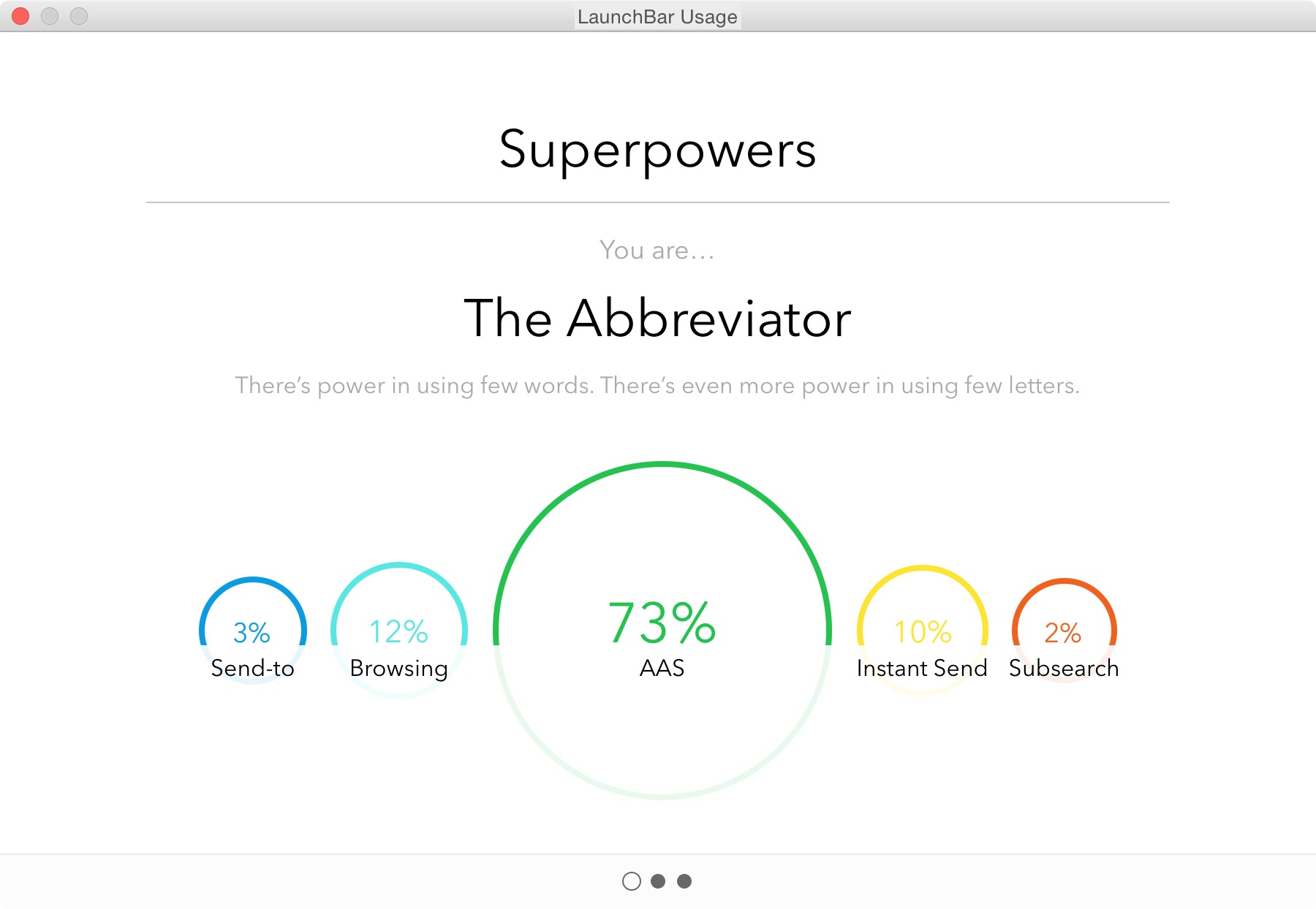
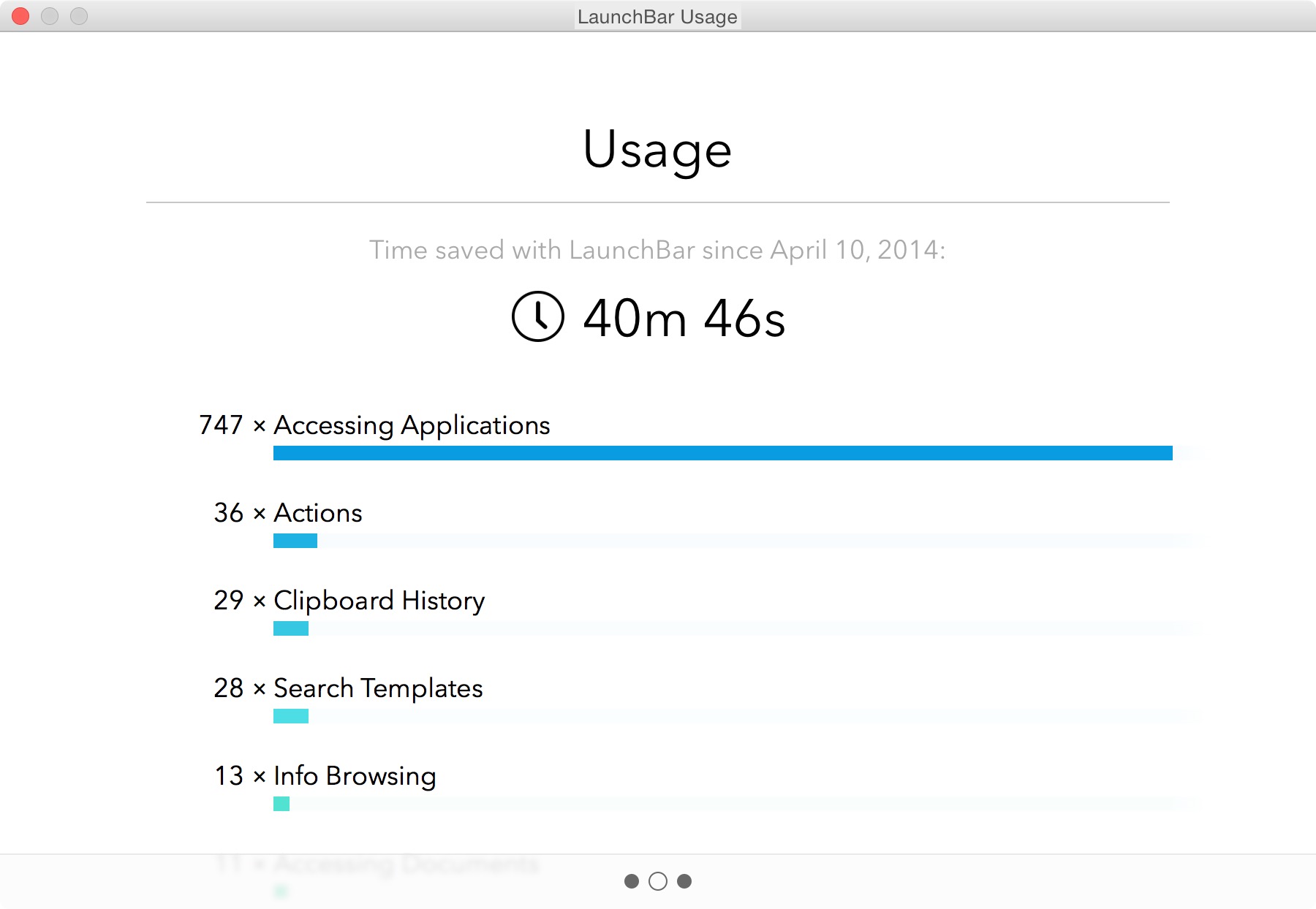
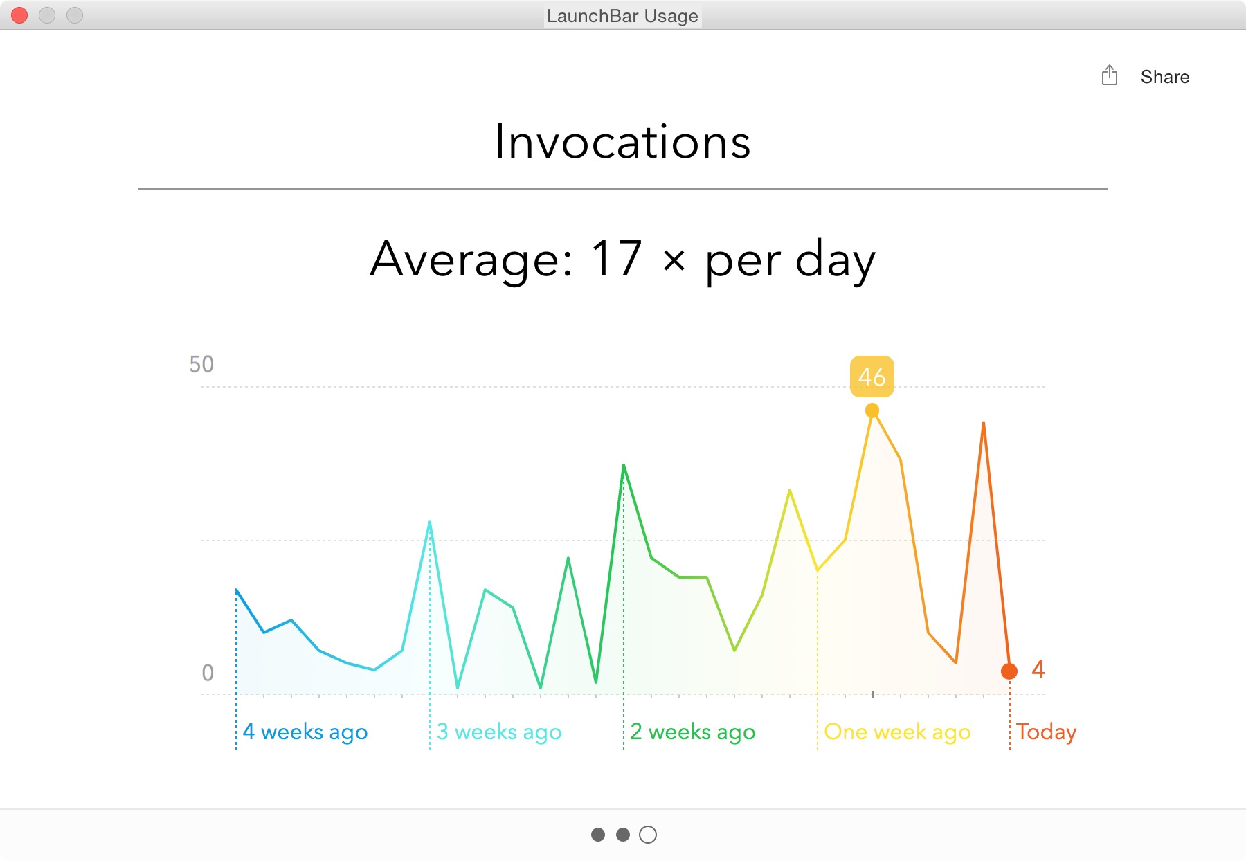
    As you can see above, I use the piss out of LaunchBar — it’s one of the most used apps on my Mac. I mostly use LaunchBar for:

    • Launching Apps
    • Finding Contacts
    • Searching this site
    • Clipboard History

    That may seem like an incredibly short list to most people, but the tool itself is invaluable.

    I polled people on twitter and here are some of the responses I received about what people love about LaunchBar:

    • Instant Send
    • Clipboard History

    Something like Instant Send is invaluable if you start thinking about it right. What I love to do is put images I am going to use in a post on my desktop. I then invoke LaunchBar, hit CMD+G, tab, and type imo+return. I’ve just sent all those images to ImageOptim for compression. Boom. Never touched the mouse. So great.

    LaunchBar 6

    Now, we aren’t just talking about LaunchBar for no reason, because today we get a new version of LaunchBar. Among the biggest changes to the app is the new look. It looks stellar. With a larger focus on typography, and a bigger overall UI.

    Overall I love the new UI, it brings a welcomed update to and old favorite of mine. But the UI isn’t the most important part of LaunchBar, the most important part is taking the time to learn how to do cool shit in LaunchBar.

    To that end, I want to focus on some of the new additions in LaunchBar 6 — you can see many more examples of what LaunchBar can do here.

    New to LaunchBar 6 is the ability to invoke Transmit Favorites. I’ve longed used Transmit to work on all of my web servers, and this is a great addition. The favorites are easily called up in LaunchBar, and invoking the action opens that favorite in transmit. I used to have a special Keyboard Maestro macro to open favorites in Transmit, but this is an even better way. Handy little addition.

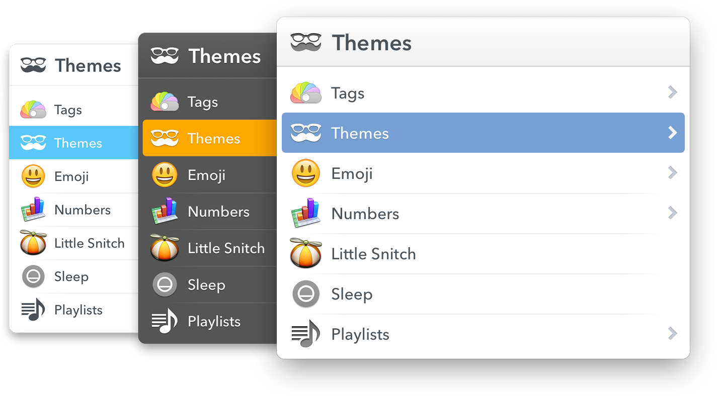
    I mentioned earlier that you can select from a set of themes, well of course you can select from those within LaunchBar 6 itself. It makes for a very quick change of feel — something that will come in handy when you are working late into the night.

    A few other great additions:

    • Support for tags, both viewing and assigning tags to files.
    • Now has Emojis, which is just fun.
    • You can extend LaunchBar with custom actions written in a large range of scripting languages. This isn’t something I am likely to directly use, but I could see this becoming a very powerful way of launching scripts (like the ones Dr. Drang is keen to talk about).
    • File data. I love being able to get all this info in a much better format than the Get Info dialog affords.

    Overall

    LaunchBar isn’t just a good app, it truly is one of the great apps you can have on your computer. The way I use it, isn’t the way that other people use it — and that is kind of the point. There is so much that LaunchBar can do, and do easily, that you really have to get it and spend time playing with it to wrangle its true power for you.

    LaunchBar 6 is out now, go buy it.

  • Syndication and Theft

    Matt Gemmell has a truly fantastic article about dealing with republication requests — something that is a must read for anyone who makes and sells things on the web (even if that is just a blog) because if you get a popular post two things will happen:

    1. You will get those annoying emails Matt references.
    2. Someone will outright steal your content and post it on their site.

    I’ve had both happen a lot. The best way to deal with number one is to have fun, the best way to deal with number two is to be forceful.

    On the first I typically respond: Yes, the fee is $5,000 payable to me in advance. Let me know if you need me to fill out a W9. That ends the conversation right there, even if I put $5 as the price the conversation would be over. The thing is, people don’t see monetary value so they think you are greedy no matter what. And if they don’t think you are greedy, at least they know your price.

    For the second, once I find out about it (usually because they have an ‘attribution’ link back to my site hidden somewhere) I send off a terse email. Usually saying: “Whether intentional or not, you’ve stolen my work. You need to remove it immediately, and if you do not remove it I will pursue full legal action, starting with a cease and desist from my attorney. This matter is urgent.”

    That scares off most people, and (surprisingly) slimy sites like Business Insider will quickly comply, but work to secure rights to your post. Just be firm and tell them to fuck off. Here’s the thing, you need an attorney that you can call. Not on retainer, but you need to know one so you can toss out a Google-able name. And it takes a bit because attorney’s need to do “conflict” checks first. (You are looking for a copyright attorney, by the way.)

    More Fun

    Even more fun is the most common email I get: link share requests.

    Here’s an actual email:

    Hello,
    My name is [redacted] and I represent a number of leading online companies that function in various fields: gaming, sports, international flower delivery and finance.
    I had visited your site https://brooksreview.net recently and was impressed by its content. I believe that it could be suitable for a number of my clients.
    I would like to offer that we purchase textual or banner advertisements from you to host your site.
    If this would be of interest to you please contact me by return email, and we can begin discussing details.
    Hope to hear from you soon.

    I get these about once a week, more when I am heavily linked to. Here’s how I respond, in almost every case:

    For flower ads the price is $100,000 a month, all other ad types are a $150,000 a month.

    I respond like this, because — honestly — if they paid me those rates I’d do it in a heartbeat. ((I used to, as people on Twitter way back know, respond with a “It’s $15million for a lifetime ad.” But times are tough, I get that.)) But the thing is, I set a price, now this person can either meet it or fuck off. Either way, I don’t care. Is it spam? Yeah, mostly, but who cares. Because sometimes you get this response:

    These price are for banner, I assume?
    I would like to know your prices for a sponsored post.

    That’s really the response from my above response and it’s awesome. Just for shits and giggles I responded:

    Sponsored post is $25,000.

    Because, after all, why not? (No response to that last one unfortunately.)

  • What Task Management Apps Are Missing

    As I’ve been struggling to find the perfect task management app for me, I’ve come across some things that I don’t think many task management app designers think long and hard enough about.

    (Note: Begin ignores almost everything on this list by design, it’s meant to be overly simple. What I am referring to is the apps that are for “power users” — whatever that means.)

    For me, then, the perfect task management app hits on all of these points in addition to what you would normally find in an app like OmniFocus.

    Collaboration

    I’ve said it before, but it bears repeating: if your app is not built for collaborating with a disparate group ((Not only ‘teams’ or companies, but groups of freelancers, or groups consisting of one or more people not at the same company.)) of users, then you are skating to where the puck was. ((I am beginning to hate that turn of phrase.))

    At the most basic level I believe that collaboration in a task management app should be implemented to include the following:

    • Assignment of tasks.
    • Assignment of a project, with ability for tasks within that project to be assigned to others.
    • Commenting on tasks.
    • Partial, or progressive, completion indicators. This would be like sub-tasks, but would not need to be implemented from the creation of a task. Meaning, if someone assigns you to ‘create budget’, and you are waiting on items. Then you can link your waiting task to this budget task, and show when that waiting action was completed, thus showing the state of progress on the budget task itself. This idea also allows for marking the task as ‘drafted’, or ‘reviewing’ and thus moving a progress indicator along. Doing this partial progress report removes the need of a manager to bug you about where you are as they can see progress — and removes your need to type explanations as you can show progress through completing the supporting tasks. Hell, even allowing someone to arbitrarily mark a task as XX% complete would go along way towards making life easier.
    • Sharing of files within a task/project. Even if that is just a linked Dropbox folder, it would be better than nothing. Not a day goes by where I don’t look at my tasks, then jump into a folder to open the file(s) I need to complete the task.
    • Built-in ability to decline an assigned task. Most collaborative task management apps assume you will accept a task without complaint — give us the ability to say “hold the fuck up, whatchyou talkin about”.
    • Ability to collaboratively assign time estimates. Going along with the last, if I assign a task I can tell the person I am trying to assign it to two things: how long as a manager I think the task should take, and what the time commitment is. That way the person being assigned not only knows my expectations, but knows the demand which is going to be put on them.

    Just the basics here — we don’t need the most massive collaboration features, but we do need a better way of tracking work others are doing, and accepting work from other people.

    Project management, or task management

    Almost more important than collaboration is to define if your app is for project management, or for task management. Even still, a good app needs to do both well. Project management apps like Basecamp are all about collaborating, but you should also be able to use such an app on a personal basis. In other words I shouldn’t have to copy tasks between systems and check them off both places.

    I shouldn’t need two apps: one for my manager to create schedules and assign tasks; and another for me to drill down the task and mini-projects into actionable tasks. This should be done within one app in order, not only for people to work better, but for managers to more easily manage their staff.

    Send Reminders For Me

    There should be a special class of tasks that is a reminder task, where you want to remind, or follow-up, with another person. You should be able to compose and send that email/text/notification within app, right there in the app. See the task, perform the action, task is marked complete and you get asked if you want to have it pop back up in X days.

    Managers, or team leaders, spend an inordinate amount of time checking to see if things were/are done. We need a better way for everyone to manage this. I shouldn’t have to make a call, and you shouldn’t have to answer a call (or email) to let me know that you did go to the store and buy that thing.

    Defer / Snooze

    I’ve taken to calling the Defer date (formerly Start dates) in OmniFocus as one of the best, yet most under promoted, features of the app (but why doesn’t Forecast view show me every ‘deferred’ task instead of just those coming available today, this drives me nuts). David Sparks will fill you in on why they are so powerful, but it’s like a can of magic when you start using them.

    The best way to think about these dates is to think of them as snooze buttons for your tasks. If you can’t, or don’t, want to do a task today then you shouldn’t see it just because you are looking at all tasks due this week. Moreover it shouldn’t be hard to push the defer date off (or the due date for that matter) on any task.

    Even the mighty OmniFocus fails when it comes to quickly being able to change the dates on your tasks. ((AppleScripts can solve this, but that’s a hack.)) With Begin that was one key thing we focused on (albeit easier given the two-day-only nature of the app): making it just as easy to push a task off until tomorrow, as it is to complete the task.

    Every task management app excels at quickly allowing you to complete a task, but I have to re-assign dates just as often as I have to complete tasks — yet for some reason little thought seems to be given to the workflow of putting off tasks. ((You can argue that this is “for productivity”, but I call bullshit. Sometimes stuff comes up and you need to put things off, it’s highly unproductive to make me jump through hoops to do that. And yes, I use Applescripts to speed this up, but I shouldn’t have to.)) There is immense power as a person, if a task is easy to shove off your plate. Having something on your todo list for today, when you know you won’t do it today, is more distracting.

    In a nut shell: help people hide what they can’t act on, and quickly snooze what they can’t get to today.

    Work modes

    In an interview with the OmniGroup Shawn Blanc got this nugget about how Derek Reiff uses OmniFocus:

    I separate my tasks at the very top level by using two folders: Work and Home. When I’m at the Omni Group office, I enable Focus on the Work folder and every view or perspective I switch to from that point on will only show Work actions and projects.

    I think that pretty clearly shows the trouble people have with task management apps: they are personal apps that are used for both work and personal things. One thing I love about Flow is that I can have a Personal and a Work ‘workspace’ — and yes you can do that to a degree in OmniFocus, but these ‘spaces’ should be taken to the next level.

    I’d propose a more time-sensitive set of views (not the only views, but perhaps on the level and display ability of what OmniFocus’s forecast view provides):

    • Overview: Allow me to see a general overview of my day, week, month. I get to set the time/date range and can easily see what is starting, what is due, etc. This would be the planning mode. You can use it each day, or just at the beginning of the week. OmniFocus’ forecast view does some of this, but it’s only part of the way there.
    • In the task: I’d like there to be a view for when I am working on the task. I wouldn’t use that with everything, but for larger tasks this would be great. It could show me the comments, how many times I snoozed the task, supporting documents, etc. In other words: a dashboard for getting that task done. Ideally this would also work with Projects too. This is your organizer for things you need for that task.
    • Mid day: I’d like there to be another overview that I step into after lunch. Here I see just the tasks from a subset of projects that I want to see (added by drag and drop and keyboard shortcuts for speed, removed easily from a list somewhere else). I can check in and see what wasn’t done, and what must be done for the rest of today. It’s a view that shows you just the most important stuff — perhaps just flagged items, or some other means. The goal of this view is simply to make sure you plan time for the really important stuff (now that the day is half wasted at least).
    • End of day: Here only the important tasks from the last view are shown if they were due and not completed and now I also see my personal tasks that I want to do this evening. This would also be time/location based so once it is past say 8p, or I am at home, I don’t see the work tasks anymore.
    • Weekend: No work tasks, just my personal tasks. This view hides anything not personal so completely that I don’t even know I have work tasks and thus I can just focus on my honeydew list.

    This all sounds complex, but it should be fairly automated using some AI to figure out where things go for you.

    Integration

    A task management app should integrate with other apps to show me activities, discussions, and emails that I may need to add into my task management system. (Flagging keywords which sound like I need to act on them.) I’d like to see a task management app that plays nice with tools like:

    • Slack
    • Basecamp
    • Trello
    • Asana
    • IMAP
    • CALDAV

    I don’t always want to jump into those tools, but I might be ‘forced’ to use them at the office, so make that easy on me. Make it so that I don’t really have to use those tools — just your app.

    Keep Me From Forgetting

    Hit me in the face with important tasks. Really.

    I should be able to assign things as “must do this today” and have the app remind me constantly so that there is no way to forget. ((Whereby constantly is user configurable — duh.)) This isn’t a feature you use everyday, but you use it when that really important thing needs to be done yesterday. This is great for something like “Today is your anniversary”, or “Taxes Due”.

    For the things you are very likely to forget, but are imperative they get done.

    Easier Creation

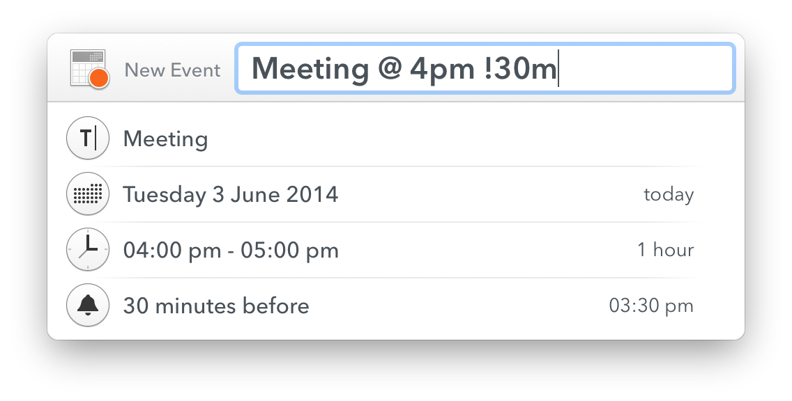
    Calendar apps have gotten really great at natural language input, and I’d like the same in my task management apps. I should be able to tell a quick entry screen: “Work, Write proposal, start tomorrow, due in two weeks”. That entire string should parse correctly into my app.

    Additionally, there should always be two entry modes: hit me with tasks as fast as you can; and the detail “quick” entry you see in apps like Flow and OmniFocus. Allowing me to brain dump if needed, while also being able to add a considered task when I want.

    Further the app should be guessing at things like projects and contexts based on my previous usage of the app. So if I say Email as a start, the context is quickly assigned as ‘email’.

    Auto Lists and Categories

    Or another way to think about it: smart groups. A lot of times I will have tasks to email or call people, but instead of using ‘email’, or ‘phone’ as the context, I will simply do something like ‘office’ because I know I don’t want to make that call unless I am at my office. But I’d still like to be able to see all tasks which have a phone number attached, or ‘call’ in the title together.

    There’s a lot of things you can do with such smart groupings that I am only scratching the surface with the above. This should be there already, but I’ve yet to see it anywhere.

    It’s Hard

    It is easy for me to type all these rather obvious things out, but building even a basic to-do app like Begin was really challenging. Just finding what would work isn’t easy — I get that — but at the same time there’s a lot of mature apps that seem to be focusing on the wrong parts of their apps. Making tasks more granular instead of helpful.

    The above is simply meant to help some of these apps get back on path — because we, no, I need this app.

  • Unread for iPad

    I’ve been beta testing the app, and it is wonderful. Most of what I said about Unread for the iPhone apply — well the good things. I don’t really like checking RSS on my iPhone anymore — it’s too good on the iPad.

    Here’s what Stephen Hackett had to say:

    Like most apps that exist on both the iPhone and iPad, the new tablet version of the app is great to read with. Unread’s lack of Chrome makes the app just about indistinguishable from something like Instapaper or Pocket.

    Agreed, which makes it a lovely way to read your articles.

    Federico Viticci:

    Thanks to the larger screen, Unread works better for two core aspects: focus on text and comfort.

    I think Mikhail Madnani hits the nail on the head for me:

    Mr Reader is great for triaging and working on your list quickly if you subscribe to loads of feeds and Unread now provides the best reading experience.

    I am a big fan of Mr Reader, and the change between the two is jarring — but I think a change well worth making. Go buy it, and be happy with your RSS zen.

  • Update on A6000 Post

    Some odd glitch on my end lead to the photos on the A6000 post not being viewable, apologies. Now fixed. (Thanks to all who let me know.)

  • More Thoughts on Apple Search

    A little bit ago I published a link to a post about the latest Apple acquisition, which was related to mapping and search. In the post I declared that I think Google should be very afraid of Apple when it comes to search. Unfortunately I barely scratched the surface.

    I’d like to double back to that thought now and dive into the topic a little bit more.

    In a nutshell I see Apple attempting to create a search tool which shows the answer, instead of the search tool that Google has which shows a list of answers. The distinction is linguistically simple, but vastly different in implementation.

    Of course we already know that Google sees the value in showing answers, as they will for some questions already, and we know Apple is building this as we have all used Siri.

    What makes Apple so dangerous is not simple:

    1. Apple has the ability to not be beholden to any one tool. Apple owns very little in the way of search, but because of that they can switch to anything that is better at any time. Apple’s users will never notice, or never need to adapt to a new backend service — because they never saw that service to begin with, all they saw was Siri, or Spotlight. So if you ask Siri what the capital of Kazakhstan is, you’ll never notice or care how Apple gets that answer. If you ask that of Google, and all of a sudden Google just shows the name: ‘Astana’. Well that’s a little jarring. Both provided the same (correct) answer, but because you only expected Astana from Apple, and a list of links from Google, you were off put by Google’s change. That’s a huge problem for Google.
    2. Apple isn’t showing ads. No really. Apple doesn’t need to, and Google must show ads.
    3. Google’s play seems to be to predict what you need, whereas Apple just wants to have the answer you need to you as fast as it can. One is creepy, the other is logical. I don’t remember Captain Picard walking around the Enterprise and upon asking another crew member “where did Earl Grey come from?” having the fucking ship’s computer chime in and say “Charlton & Co. of Jermyn Street in London… Maybe, it’s not clear”. No instead Picard would have had to ask the computer. Why ask the computer? Because having a computer chime in as a know-it-all would be exceedingly annoying.

    In the end Apple is interested in telling you what a research paper concluded, but Google is more interested in showing you the research paper, and the bibliography for it while occasionally, and seemingly randomly, offering a summary as well. And how to you get a user to look at search results long enough to monetize that user if all you show is the one answer?

  • Two Days with the Sony A6000

    I had a couple quick days to play with the new Sony A6000, which is replacing the NEX lineup of APS-C sized Sony mirrorless cameras. I’ve used a few NEX cameras in the past and have really not been impressed, so I was a bit biased to not like this camera going into my testing.

    For the duration of my testing I used the Sony 35 f/1.8 OSS lens (OSS is Sony’s version of image stabilization). What I found with the A6000 surprised me quite a bit, it’s actually quite an excellent camera.

    Handling

    Handling, or how a camera feels in your hand, can make or break a camera experience — this is also highly subjective, as everyones hands are different.

    To my hand the A6000 feels very comfortable with the large grip making the camera easy to hold with one hand, while never feeling like you might drop it.

    With the exception of the shutter button, all the buttons on the camera feel good. Not excellent, but good. The thing to remember is that this is a plastic camera body, with plastic buttons — everything feels like plastic. Nice plastic, but still plastic.

    That’s about where my compliments on the handling end.

    The shutter button is too easily pressed, and there were many times when I intended to half-press the shutter to lock focus, and instead snapped a photo. With longer use, this probably becomes less of an issue, but the feel between half-press to exposing the image is so subtle that I have a feeling I would always end up with a few accidental photos. This is the first time I have ever felt this way about a shutter release.

    The two main dials, one for the mode setting, and the other to adjust controls are backwards. With the mode being in a very convenient spot for your thumb, and the dial where you would actually adjust something like EV, Aperture, or Shutter, being in a very awkward spot for my thumb. Essentially requiring me to hold the camera slightly less securely to use it. This drove me nuts as I felt like I was doing thumb contortions to get at the dial.

    But that’s not the worst handling issue — the dedicated movie recording button is. I’ve been told that this button location used to be worse on the NEX lineup, and so it was moved out of the way. It is now in such an awkward spot that I would not recommend anyone press it while holding the camera with just one hand. Now, for recording movies it makes sense to hold the camera with two hands (for stability), but even so this is a dumb place for such a button.

    Beyond those comments I didn’t get to use the camera long enough to find any other handling issues I feel comfortable making an assessment on.

    Image Quality

    It is top notch, and a whopping 24.3 megapixels. I’m not the right person to ask for someone to dive into the quality, but that’s not what most people want to know. Instead let me answer what I feel are the most common questions:

    • Can this take lovely pictures? Yes. But I do find the pictures to be a soft, and in need of sharpening in post processing. I found this in just about every image I took.
    • How is the noise control? Not as good as Fujifilm, but not too shabby. I wouldn’t take it over 3200 if I wanted a clean image (after noise reduction), but 6400 is fine.
    • How are the colors? Neutral, that’s the best way I can describe them. This camera lacks personality in the image tone, and some people will love that, while others (like me) will feel it looks a bit generic.

    Overall then: images need sharpening and noise reduction above 1600 ISO, and the colors lack personality. That’s not too shabby, and lets not forget you get a very large image from this camera, in a very small package.

    Auto Focus

    The fastest and quietest I’ve used, hands down. Just about every camera I have used I have been able to hear the AF motor (even Canon USM), but I really can’t hear it on the Sony. Even with my ear next to the lens, I have a tough time hearing the motor. It’s a bit unreal — like somehow the camera magically focuses without doing anything at all.

    Add to that the fact that the AF is nearly instantaneous, and always spot on. Then add to that the fact that the tracking can actually track my kid — and wow, just wow.

    This is a truly impressive AF, and I drool over how good it is. I want this in every camera.

    All of this means: AF-C is a no brainer on this camera. After a couple hundred shots I set the camera to continuous autofocus with tracking, I mean why not? I don’t hear thew noise, the camera doesn’t hunt for focus, and it always hits it’s mark. It’s astounding.

    The only complaint I have is that the stock multi-AF point mode didn’t always find what I wanted the focus to be on, and for those times it was far faster to switch to manual focus than to change modes and select the focus point. Now, that is only the case in still life photography, once you introduce people the camera tracks the people exceedingly well.

    This is a people camera first and foremost.

    Miscellaneous

    • Shutter Sound: this is actually a pretty loud camera. So even though the autofocus is silent, the shutter is really loud and higher in pitch. It’s not annoying, but no where near stealth. Everyone in the room will probably hear it. It sounds to me a bit how Hollywood makes ‘silencers’ and pistol sound.
    • There is shit all over camera. One of the worst things about the camera is the excessive labeling and writing. Do I really need the megapixel count etched on the camera? No. Just look at this mess. Way too much going on.
    • The SD card slot, is the worst SD card slot in the history of SD card slots. Look at an SD card, see that indent for your finger nail? That helps get SD cards out of slots, and it is quite nice. That indent, on the A6000, goes up against the battery door, so that one must try hard to pinch the edges of the SD card to remove it. No joke, I had to use two index fingers to get my card out as it does not pop up high enough, nor offer access to the finger nail indent. I hate this so much that it is almost a deal breaker right there.
    • Eye cup: it’s huge. Like really huge. Probably great for bright light, but really kills the ability to compactly stow the camera. It can be removed, but then the glare is terrible on the EVF. For how small the camera is, the eye cup is comically large.
    • Manual Focus isn’t great, it’s not bad, but I had trouble with it unlike I have had with other cameras. This just is not a camera meant to manual focus, and why would you with how great the autofocus is.

    Overall

    This is a camera that is very easy to use and a camera that you can trust. ((WiFi could not be tested because this reviewer was running a beta of iOS.)) What I mean is that you can set this camera to P mode, and hand it to anyone and trust that the camera will do a pretty epic job of making sure you get a decent photo — especially if that photo is of people.

    In other words, close to the opposite of a Fujifilm camera as you can get.

    Because of that, I found myself getting a little frustrated with the camera at times. I felt like I had little control over the exposure even in Aperture Priority mode (my preferred mode of shooting). That has nothing to do with a flaw in the camera, as much as it has to do with a flaw in the photographer. The camera never let me make a mistake, and so I never really felt like the images were ones I was making — as much as images the camera was making.

    So who then is this camera for? Well I can think of two people:

    1. Someone who wants really good images, without having to ‘learn photography’. And I truly do not mean that as a back handed compliment to the A6000 — it’s actually kind of impressive if you think about it. I tried to find something where the camera would screw up, but I couldn’t.
    2. Anyone with kids who want images that are in focus of their kids. Seriously, if you want a small camera that can track sports, and active kids — this is the camera to buy. No joke, I wish I could have one of these just for the times when I know the kids are going to be active (waking hours). This is a beast of a camera for focus tracking.

    Those two categories, unsurprisingly, encompass a large swath of people. Where a person is likely not to enjoy this camera is if they like a bit more manual control. Everything is done with odd buttons and very few dials on this camera. This is a tough camera not to like, and surprisingly (to me) I really do like it.

    This is a people camera and, luckily for Sony, people tend to mostly take pictures of other people. I won’t replace my Fuji for this, but this is a very tempting and very good camera. Perhaps the best people/family/kids camera I have ever used.

    Buy It

    Buy it at Amazon.

    Or buy it from B&H Photo.

    Photos