Category: Articles

  • ‘Easily Obtained Subpoenas Turn Your Personal Information Against You’

    [CIRONLINE.ORG has a fantastic report on how easy it is to get personal data on people][1]. This is all the reason anyone should need for getting out of Google and other big email providers:

    > Even if an investigator faces some hurdles with your inbox, such as Google insisting on a warrant, email is not entirely protected. With a court order that doesn’t reach probable cause, Google will give up your name, IP address, the dates and times you’re signing in and out, and with whom you’re exchanging emails.

    Well worth the read of the entire report, but none of the report is good news for privacy advocates.

    [1]: http://cironline.org/reports/easily-obtained-subpoenas-turn-your-personal-information-against-you-5104

  • ‘Battle: Los Angeles’

    [Fraser Speirs on LA students “hacking” their iPads][1]:

    > Imagine you’re 14 and, one summer, you hear on the news that you’re getting iPads when you go back to school. You go back, are handed an iPad, and then they tell you that you can’t browse the web, can’t use it for personal projects and all you can do with it is look at Pearson apps.
    > Total heartbreak.

    Speirs makes some fantastic points backed up by his experiences in the deployment at his school. I still wonder how anybody thought a fully locked down iPad was worth, well, buying an iPad for?

    [1]: http://speirs.org/blog/2013/10/1/battle-los-angeles.html

  • ‘Why It’s Time for Apple to Open FaceTime’

    [Mike Elgan making a fantastic point about FaceTime][1]:

    > From the user’s perspective, FaceTime should work like iMessage. If Apple did it right, you’d be able to simply use it to make all your calls — video and audio. If the person you’re calling has FaceTime, great! If they don’t, that should be when the phone fails over to either the regular carrier’s phone system or another VoIP alternative. Or, it would connect to the other user’s FaceTime-compatible app.

    If you haven’t had a chance to make a FaceTime audio call, do it now. It is actually amazingly better than a “normal” phone call. The depth and clarity of the audio is astounding. However FaceTime audio is buggy as shit. There’s been several occasions where one or more of these things have happened:

    – Call unable to connect after reading connecting for a minute.
    – Call dropped because I got another call.
    – Call dropped because I got an iMessage.
    – Repeatedly calling and not getting an answer, then cell call works.

    It’s about a 49% success rate for me. I have my wife setup on my Favorites to default to FaceTime audio, we both love it, but it is more of a hassle. I wonder why FaceTime wasn’t built like iMessage whereby everything defaults to FaceTime and falls back to cell calls if FaceTime cannot work, I’d love that.

    *(I also wonder if the dropped call problem is a Verizon issue, or AT&T suffers this as well.)*

    [1]: http://www.cultofmac.com/247673/why-its-time-for-apple-to-open-facetime/

  • ‘NSA Storing Internet Data, Social Networking Data, on Pretty Much Everybody’

    [Bruce Schneier summing up the latest bullshit from the NSA](https://www.schneier.com/blog/archives/2013/10/nsa_storing_int.html):

    > This is getting silly. General Alexander just lied about this to Congress last week. The old NSA tactic of hiding behind a shell game of different code names is failing. It used to be they could get away with saying “Project X doesn’t do that,” knowing full well that Projects Y and Z did and that no one would call them on it. Now they’re just looking shiftier and shiftier.

    If you haven’t read the key tag lines for the latest news about the NSA, I can sum it up as such:

    – They are preparing to take in 20 *billion* records a day and having those records ready for analysis in 60 minutes.
    – They collect all travel records.
    – There was some scary stuff about their social network mapping also.

    The bottom line is that the more we learn, the more it is realized that the collection is almost total. The safest assumption is that the NSA can collect everything, with an also safe assumption being that the NSA will eventually be able to crack just about any encryption you put in place. And yet the bickering in congress is over funding health care when this level of spying hurts everyone and most certainly should be debated vigorously.

    Hey, Congress, I know where to find you billions of dollars in extra cash…

  • Ignore the Fact that it Looks French

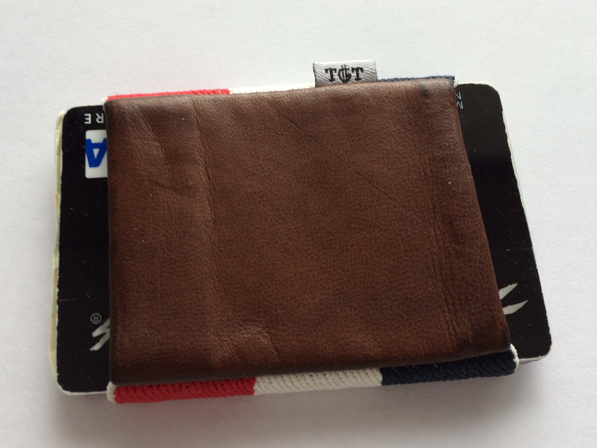
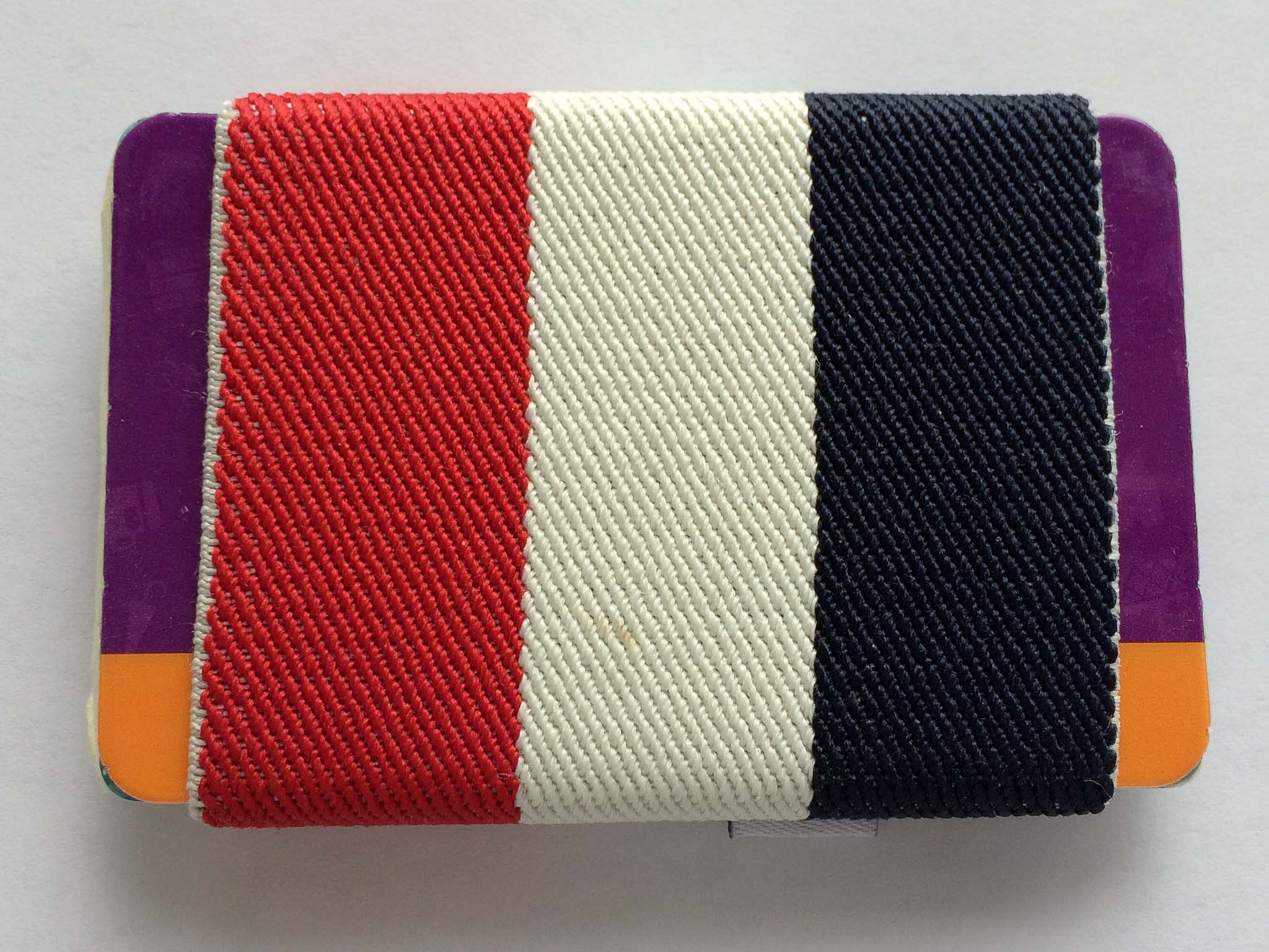
    A while back, one of my favorite little curated deal sites,[Huckberry][1] ((Sign up with that link and you get $5 and I get $10 when/if you buy something.)) , was selling the [TGT Americana 2.0 wallet][2]. I don’t remember what I paid, but the wallet is sold through TGT for `$34.00`.

    TGT Wallet

    Until I got this wallet I had been using the [ill-fated Supr Slim][3] wallet — not a huge fan of that wallet. The TGT is another elastic band type of wallet, but it offers two differences that intrigued me:

    1. Instead of the cards sliding into a pouch, they are free on the ends, more like how a band holds something. For some dumb reason this sounded like a huge improvement to me. (Spoiler: *meh*.)
    2. What I liked more was that the wallet added a little pouch in which you can store a couple of bills (e.g. cash money). I don’t often have cash, but it is nice to be able to carry a bill or two when I need to carry it.

    This wallet is substantially better than the Slim, it works easier and holds things in a secure, but yet more useable manner. I like it — I don’t love it, but I like it. Of course, before I get into why we need to address the shortcomings:

    – The wallet looks more [French flag][4] than “Americana” — which would be fine, except that (for no good reason at all) I loathe French things.
    – The leather pouch for holding your cash has a bad habit of sticking to your iPhone and thus causing the wallet to fly out of your pocket when you grab your phone. This is by far the biggest issue with the wallet.
    – Like any elasticky wallet, it’s near impossible to elegantly get at the cards stuck in the middle of the stack in and out of the wallet.

    I carry about six cards in the wallet, one being a business card, and it feels comfortable with that much stuff. I could carry less, but that’s what is in the wallet right now. I have carried up to eight cards with no issues.

    French Flag

    I’ve come to really like the cash pouch on the wallet and now consider such a compartment to be a must have for any of my future wallets. If that pouch was nylon on this wallet, it would be much better.

    If you like elastic band type wallets, this is the best I have used. For me it is acceptable, and leaps better than the Supr Slim, but I am still looking.

    [1]: https://secure.huckberry.com/referral/86b0679362
    [2]: http://www.tightstore.com/collections/all-products/products/americana-2-0
    [3]: http://hypertext.net/2012/12/supr-slim-wallet/
    [4]: https://en.wikipedia.org/wiki/Flag_of_France

  • To-Do Lists Don’t Work

    [Daniel Markovitz arguing for less todo lists and more calendaring][1]:

    > Putting your work in the calendar enables you to better determine whether or not you can (or should) say yes to a new project. And if you do say yes, you can better determine when you realistically might be able to get it done.

    On the flip side, super productive guy, [Justin Blanton][2]:

    > These days I throw *everything* into OmniFocus: projects/tasks (obviously), birthdays, anniversaries, meetings, etc. Why split any of this stuff across two different apps (*if* you can get away with using just one)?

    I think both are getting at the same point: everything needs to be in one view so you get a better idea of what you actually have to do. This is one of the reasons why the OmniFocus Forecast view (showing your tasks and calendars) is so powerful. Getting to see both at once is extremely helpful, but to date no app has done a very good job at this (even OmniFocus’ attempt is limited).

    I have tried both methods mentioned above, the timeboxing-ish method that Markovitz is arguing for is stifling from a creative standpoint for me. Whereas Blanton’s method worked a little bit better for me, I still found it feeling a bit like the wild-wild-west. (Though I will say I love keeping birthdays and anniversaries in OmniFocus, that’s an excellent use.)

    The problem that both are trying to solve is finding an intelligent and workable way to tell you one thing: how busy am I, and can I do this too? I wish I could say there was a software solution, or a workflow solution to this, but as far as I have found there isn’t. Instead I just consistently say I am too busy, and hope for the best.

    Every solution I have come up with adds a massive amount of “upfront” burden on the workflow. Meaning you need contexts, projects, start dates, due dates, reminders, and time estimates in order to get a good sense for how busy you are. And it hinges on your time estimates being accurate. I suck at being accurate on most time estimates.

    [1]: http://blogs.hbr.org/2012/01/to-do-lists-dont-work/
    [2]: http://hypertext.net/2011/05/fantastical/

  • ‘Underscore Price Dynamics’

    [Marco Arment on the paid iOS market][1]:

    > The market has shown that free apps will be downloaded at least an order of magnitude more than paid-up-front apps, and smart use of in-app purchase in a free app is likely to make more money. Over time, this trend has only become stronger and more clear.

    The real question is how to integrate in-app purchases in a way that is compelling to users, but not nagging of users. The more subtle, the less money you make. The more aggressive the nag, the shitty the app you make.

    [1]: http://www.marco.org/2013/09/28/underscore-price-dynamics

  • ‘Keeping Your Laptop Plugged in All the Time Will Kill Its Battery Faster’

    [Roberto Baldwin][1]:

    > Cadex Electronics CEO Isidor Buchmann told WIRED that ideally everyone would charge their batteries to 80 percent then let them drain to about 40 percent. This will prolong the life of your battery — in some cases by as much as four times.

    I bet he’s right, but why bother? As Buchmann mentions near the end of the article, it would be extremely cumbersome to do this. I actually poked around Keyboard Maestro a bit to see if I could whip up a warning system, but after about 10 minutes I gave up.

    I looked up what it would likely cost to replace the battery on my retina MacBook Pro, the best data I could find was a year old, but listed the price as `$199` plus taxes. That’s about `$220` at the end of the day here. My battery life isn’t noticeably bad right now, but let’s assume that a MacBook Pro battery will only last the average person 2.5 years. That equates to an `$88` per year expense, or `$7.34` a month expense for battery life.

    The point is this: would you rather agonize over when to start and stop charging your battery — having to remember to top it off when you know you might need a full battery — or would you rather just *use* your computer?

    For `$7.33`, I’d rather just use the damned computer and take my chances on having to replace my battery sooner than I *might* have to replace it if I were being anal-retentive about monitoring the battery usage and charge percentages.

    [1]: http://www.wired.com/gadgetlab/2013/09/laptop-battery/

  • Bags… Again

    Lately I’ve been thinking about the three bags I own. The revered Tom Bihn Smart Alec, the rugged GORUCK GR1, and the sexy Hard Graft Flat Pack. I love each in their own right, but I began to wonder which I’d choose if I could only have one. Which is the best?

    I’m talking about the choice I’d make if my wife decided that I have to get rid of one before I buy another: ((Ok, that may be pretty close to reality in my house.)) We’re not talking about doomsday decisions, or Sophie’s Choice.

    I suspect this choice is of interest to my fellow bag lovers, because not all of you want to spend a grand on bags to only use one at a time.

    I initially figured that the Tom Bihn was the correct call, because it truly is a fantastic bag, but the more I thought about it the less sure I became. Each of these bags have clear strengths and subjective weaknesses.

    While the GR1 is an outwardly tough bag, I wouldn’t hesitate to take the Smart Alec hiking. But then what of the Flat Pack? In so many situations I prefer the Flat Pack over the other backpacks.

    My goal today is to recommend a bag based on the assumption that you can only own one of the three contenders, and you’re going to use that bag for everything. (I will exclude extreme use-cases, like carrying bricks through mud, and hiking).

    So, which bag should you buy?

    The two backpacks are both bulky but travel well. You can put a lot of stuff in the backpacks, whereas the Flat Pack won’t hold much more than an iPad, pen, and laptop. In fact in all the months of owning all three bags the Flat Pack is the least used, by a huge margin.

    The only reason I use the Flat Pack less is that I worry about the consequences of carrying a smaller bag. What if I need that adapter? How about that extra pen? That backup battery? Shouldn’t I bring both iPads just in case? With the Flat Pack, I don’t pack any of these extra items because they simply don’t fit in the bag. In a single-bag world the Flat Pack is far too limited and I can’t recommend it.

    That leaves us with a question I’m frequently asked: Which bag is better, Ben? The Smart Alec or the GR1?

    While both are (or can be) black backpacks, they are actually very different bags (as long as you aren’t my Wife, who… never mind). The GR1 has military inspired styling and opens completely with a dedicated laptop compartment. The Smart Alec is more subtle in its styling, opens and loads only from the top and comes with a comprehensive selection of modular padding and pouches.

    Having traveled with both bags and used them day-to-day I can say with complete confidence that I use the Smart Alec more often. It really feels like the Smart Alec should be the winner here, but let’s discuss my reservations with the GR1 and see if they remain valid in a more general (not-specific-to-me) sense.

    My GR1 reservations:

    1. Styling. I love the look of the bag, but the military inspired design certainly has its “out of place” moments. I live next to a very large military base and still feel that way. I’d have a hard time wearing this bag in countries that aren’t very US friendly (are there any US-friendlies left? Well Canada, I guess…) and likewise it would feel out of place at a formal business meeting.
    2. I wish there was a way to cinch the bag a bit smaller when it’s empty. I love that the Smart Alec can do it, but this is a minor complaint as the GR1 seems to “wear” smaller than the Smart Alec. ((Meaning that when the bag is on your back it feels like a smaller bag than the Smart Alec, even though it isn’t.))

    If the GR1 had a little less military style (like say the SK26, which was released after I bought my GR1) then it would be my choice hands-down.

    If I had to pick only one of the bags that I currently own it would be the Smart Alec, which is a fantastic bag all around. The Smart Alec’s modular pockets make it exceedingly versatile and less likely to become obsolete when your tech-gear changes.

    Given the choice of any bag on the market I would choose the GORUCK SK26 (I might even choose the sand color). ((If a noble reader wants to get me one, or loan me one, I’d be happy to fully weigh in on this. But as far as I know it is identical to the GR1 just lacking the MOLLE.))

    Why choose the SK26? Here are a few reasons (in no particular order):

    • It’s exceedingly tough and I have no doubt this bag could be handed down to younger generations. GORUCK bags feel like they were made to be around for generations.
    • Its design is very well suited for utilizing space — top loaders make that a bit harder.
    • When I travel, my GR1 is the bag I prefer to use, and the SK26 is essentially the same bag.
    • I love the GORUCK zippers.
    • The shoulder straps are wider and more padded, making them much more comfortable.
    • The bag feels “broken in”, whereas the Smart Alec always feels kind of new. That’s not always a bad thing, mind you.

    You can’t go wrong with any of these bags, truly (even the Flat Pack), but if forced, now you know where I stand: GORUCK SK26 is the bag you should be looking at.

    Inevitable Caveats

    I don’t know how you use bags typically, so this is based on my typical usage which is:

    • 90% home to office travel, via a car that I drive.
    • 6% Travel where I won’t be staying at my home that night.
    • 1% Day hiking.
    • 3% Other shit.

    If I only ever went to and from the office the Flat Pack would be a much better contender. I just wish it could also hold a bottle of water and my GX1 camera — that’s the deal killer for me.

    The Smart Alec offers phenomenal protection for your laptop, but without additional padded compartments it offers no protection for iPads. The GR1/SK26 has a decent suspended pouch to hold your iPad, which I prefer.
  • ‘The Lawsuit Against Google for Email Scanning Will Go Forward’

    [Ben Richmond reporting on Judge Lucy Koh’s decision to let the case move forward][1]:

    > She wrote in her decision that, “a reasonable Gmail user who read the Privacy Policies would not have necessarily understood that her emails were being intercepted to create user profiles or to provide targeted advertisements.”

    And:

    > “Google has cited no case that stands for the proposition that users who send emails impliedly consent to interceptions and use of their communications by third parties other than the intended recipient of the email,” Koh wrote.

    In other words Google is going to have to defend against federal and state wiretap laws, as Koh sees it, because: a) it’s not easily understandable by any layperson reading the privacy policy that this email scanning happens; and b) that it certainly is not reasonable to expect people emailing Gmail users to expect their emails are being scanned.

    This is going to be a huge decision and will have huge ramifications to all online service providers. We all know I loathe Google (to put it mildly), but I hope this works out badly for Google for no other reason than the good it would likely bring to the openness of privacy policies. Of course, it could just be bad all the way around.

    [1]: http://motherboard.vice.com/blog/federal-court-allows-lawsuit-against-googles-email-scanning-to-proceed

  • Regarding My ‘Ridiculous’ Assertion that RF is Not Wireless

    I had a long post penned defending this stance, but after some really great conversations on App.net and in my inbox, I am changing my stance a bit. While I still feel it is disingenuous to call something wireless when it needs a dongle, I do concede that perhaps a better overall approach is to simply label whether or not things include a dongle.

    [David Krauser on App.net][1]:

    > @benbrooks @dlehman that’s one thing I’d like to see on packaging: whether or not a dongle is required/included. As it stands now, if you buy something dubbed ‘wireless’, you have no idea what you’re getting.

    [Dave Lehman][2]:

    > @palimondo @benbrooks @dtk I definitely agree that a “dongle-free” designation would be a selling point.

    > “Wireless” is like saying “calorie-reduced”– it’s not nearly telling the whole story.

    This pretty well encapsulates what I failed to clearly convey yesterday.

    [1]: https://alpha.app.net/dtk/post/11652285
    [2]: https://alpha.app.net/dlehman/post/11653153

  • Editorially, Writing, And Being Boring

    I posted recently about the launch of Editorially, but I didn’t expand very much on my thoughts (the launch caught me by surprise). I have been using Editorially from almost the moment that they opened for beta testing. It’s a tool that I use daily, and in fact Editorially has its own icon on my iOS home screens. Kyle and I used it a ton in collaborating on Begin. James Martin and I use it to edit most long form articles on this site before I hit publish.

    It’s a fantastic tool, so let me tell you why.

    To understand why writers like Editorially so much you have to understand what, or how, “we” were getting work edited before. Pre-Editorially James and I were exchanging text files via email. I would send him the `.txt` file and he would send me the edited file back. I would then open TextMate or Kaleidoscope and diff the two files so I could see the changes.

    There was no way, then, for me to post a blog article that had been edited from anything but my Mac, unless I wanted to fully accept all James’ changes. That was unsettling. Even though I accept all of his changes 90% of the time.

    The only other alternative was Pages/Word with track changes, and I would rather shoot myself in the toe — it seems like that would hurt a lot.

    Editorially eliminates the need for a lot of crappy tools. ((Kaledioscope is not crappy.)) I don’t usually write directly in Editorially, but once I have something ready to be seen by others, the rest of the work is done on the Editorially site.

    ### To the Future

    I don’t know much about the future plans of Editorially, but I think it has massive potential. I would love to see some of these features added:

    – Ability to have predefined teams. This way I can add a group of people to a document all at once instead of just one person at a time.
    – The ability to publish from Editorially to different platforms. To export to Word documents and Pages files, or WordPress.
    – The ability to archive old writings so that I don’t have to see them without deleting them.
    – But most of all I want it to act more like a service — for example, the way Github does. Wouldn’t it be great if writing apps could integrate Editorially support like they do with Dropbox? You pull down the latest version and it is checked out until you are done editing — then it is pushed back up for others to edit and review changes. You could write in your favorite app, but have the full power of collaboration. In my mind that is where these tools need to be heading and I’d post with exclamation points upon this vision being realized.

    ### Concluding Characters

    I like Editorially as it stands today, but it’s my optimism about Editorially’s future potential that keeps me coming back to the app.

  • Marco’s Keyboard

    At the end of August, [Marco posted his review][1] of Microsoft’s Sculpt Ergonomic Keyboard. It actually looked like a good keyboard — so I went ahead and picked one up to try out.

    I have had the keyboard for only a short time, but I am returning it. It’s not so much an issue with the split layout, but a philosophical issue with how keyboards should work.

    Before I get into that I see two major issues with the Sculpt:

    1. As Marco noted the F1-F12 keys are the biggest piles of shit I have seen on a keyboard before. I’d like to meet the guy who made that decision so that I can tell him I’d rather typeset my website in Comic Sans than touch one of those keys. And, as it turns out, I actually use those keys quite often — something you don’t likely notice until you so loathe touching those keys.
    2. The keyboard is wireless, but still requires one of those stupid RF things to be plugged into your USB port. Honestly, if that is the route you have taken, I don’t think it is fair to call the keyboard wireless. Wireless means Bluetooth — to say otherwise is to be a liar.

    Ok, so back to my philosophical problem with the keyboard.

    My biggest issue with this keyboard isn’t technically the fault of the keyboard — it’s the natural layout. I’ve never used such a layout before this keyboard, but was excited to try. It doesn’t take long to get used to the layout, but — and this is the philosophical issue I have — why should I have to get used to it?

    I get that every keyboard takes a bit of an adjustment to get used to, but the natural layout eschews everything I have spent the last 20 years learning so that I may type faster. Why should I have to conform to the “way you should type”, if hitting `B` with my right hand, or `Y` with my left hand is simply faster for me?

    More so than any other keyboard I have ever used, the Microsoft Sculpt is constantly telling me: “You’re doing it wrong.”

    That bugs me more than anything else.

    Yes, I could have predicted this had I thought longer about it, and yes I just should stay away from natural keyboards. All of that is true, but what’s also true is that I despise this keyboard because it seems preachy about how I should type — I don’t think keyboards should ever be preachy — just let me type the way I type. I also hate those damned F keys.

    [1]: http://www.marco.org/2013/08/30/sculpt-ergonomic-keyboard-review

  • ‘Google to Encrypt ALL Keyword Searches: Say Goodbye to Keyword Data’

    Google is trying to encrypt all search traffic, which is fantastic news for users. [Pamela Vaughan is outraged][1]:

    > This means marketers won’t even be able to get keyword data for searches conducted by users who aren’t even signed in. (Cue marketers everywhere raising their fists in fits of rage.) 

    Her entire post is a whine-fest over losing access to search keywords — WHAT’S A MARKETER TO DO! How can this world be so unfair that Google is seeking to protect its users in a way that hurts marketing activities? I guess all those SEO-experts have a job again.

    [1]: http://blog.hubspot.com/google-encrypting-all-searches-nj

  • ‘On the New Simplenote’

    [Matt Mullenweg has a great post up with a little Q&A about the revised Simplenote.][1] [Shawn Blanc also loves it][2] — as do countless others. I used Simplenote for a very long time before switching to Notesy, but as [most of you][3] know now I have [deleted][4] my Dropbox account. I did so without even considering note taking and how that would be affected.

    Obviously, not using Dropbox means that I can’t use 99% ((I did no math to arrive at that number.)) of the nerdy note taking apps in the App Store. I had been trying just the iOS clients for ownCloud and BitTorrent Sync, as I figured I didn’t actually use notes as much as I thought.

    *Wrong*.

    As it turns out I still use note apps quite a lot, at least enough that both of those file manager apps tuned out to be shitty solutions.

    When I saw the new Simplenote I thought two things:

    1. Man that looks great.
    2. Oh yeah, they are owned by Automattic now.

    That meant one big thing to me: I had reason to trust the syncing engine that Simplenote uses, because I trust Automattic ((I likely trust them more than I should out of respect for Mullenweg himself. Based on nothing more than what I know about the man from reading about him, and using his products.))

    I can’t say that I am 100% sold on Simplenote just yet, as I am not 100% sold on the idea of not “owning” or controlling the syncing engine. That said these apps are simply fantastic. There’s a few things wrong with each, but with each day that passes the Simplenote suite is steadily winning me over.

    And this quote from Mullenweg might have just tipped me fully into the Simplenote camp:

    > You will start to see the Simperium engine make its way into almost everything we do.

    I can’t wait.

    [1]: http://ma.tt/2013/09/on-the-new-simplenote/
    [2]: http://shawnblanc.net/2013/09/the-new-simplenote-apps/
    [3]: https://brooksreview.net/2013/09/goodbye-dropbox/
    [4]: https://brooksreview.net/2013/09/dropbox-opens-your-files/

  • ‘Chaos Computer Club Breaks Apple TouchID’

    [Frank from the Chaos Computer Club on their workaround for Apple’s TouchID system][1]:

    > The method follows the steps outlined in this how-to with materials that can be found in almost every household: First, the fingerprint of the enroled user is photographed with 2400 dpi resolution. The resulting image is then cleaned up, inverted and laser printed with 1200 dpi onto transparent sheet with a thick toner setting. Finally, pink latex milk or white woodglue is smeared into the pattern created by the toner onto the transparent sheet. After it cures, the thin latex sheet is lifted from the sheet, breathed on to make it a tiny bit moist and then placed onto the sensor to unlock the phone. This process has been used with minor refinements and variations against the vast majority of fingerprint sensors on the market.

    As I said that other day, [who cares][2]. The CCC is making this out like there is *no* security with TouchID, which is a falsehood. In fact there’s a lot *more* security even with this vulnerability.

    Let’s walk through a few facts:

    – The CCC hack requires a near perfect, smudge free, finger print to be photographed at a very high resolution, cleaned up digitally and printed at a very high resolution. Once all of that is accomplished then you can unlock a phone. Yeah, not exactly something that can be done quickly.
    – $10 says I could remote wipe my iPhone before you could replicate my fingerprint and unlock it.
    – With TouchID a user has very little reason *not* to create strong and complex passcodes and Apple ID passwords for their information. Meaning you are increasing the non-you aspects of your security. And because iOS 7 requires your passcode upon restarting the iPhone, I could easily accomplish wiping my phone before you could accomplish your task of beating TouchID. ((Assuming you don’t carry a portable faraday cage. There does exist the possibility that you have my fingerprint already replicated when you swipe my device, I’ll take my chances on you being able to do that.))

    So yes, TouchID isn’t perfect, but we had a reasonable expectation to assume this may be the case. However, the other items that Apple has implemented makes TouchID a pretty secure system. Because while you could beat my fingerprint under ideal conditions, I could likely wipe my iPhone under shitty conditions before you beat my fingerprint.

    [1]: http://www.ccc.de/en/updates/2013/ccc-breaks-apple-touchid
    [2]: https://brooksreview.net/2013/09/touchy-id/

  • Touch ID is the Future

    I personally believe that Touch ID, and future systems like it, are going to prove just as important to smartphones as multi-touch has proven. It’s something that seems so logical, so magical that when you use it, as [Jony Ive says][1]:

    > True simplicity is, well, you just keep on going and going until you get to the point where you go, ‘Yeah, well, of course.’ Where there’s no rational alternative.

    Touch ID is one of those “Yeah, well, of course” things. So naturally I have been wondering about the future of Touch ID. Right now Touch ID can only bypass your device passcode (which you can now make complex without hating your life) and it can unlock your Apple ID password for iTunes and App Store purchases (which should also be a complex password). These are very useful scenarios, but I’d really like to be able to do things like unlock 1Password (again, a complex password).

    I think it is a safe assumption to assume that Apple has thought about how nice this would be too, but they aren’t yet allowing third-party access to whatever system Touch ID works off of, so why? I have to believe that Apple could allow access in a very secure manner, so why not?

    My guess is that Apple knows that Touch ID is a system that makes a lot of people, to say the least, *uncomfortable*. And until such time that Touch ID becomes comfortable, Apple won’t run the risk of letting any third-party developers do anything to potentially delay, or dissuade, the comfort and trust that Apple is asking from its users.

    Assuming then that Apple can securely allow developers access to Touch ID, I have to believe that they want to, and eventually will, allow developers usage of Touch ID. The timing will just come down to waiting for the point to come when users not only want and trust Touch ID, but refuse to go back to the pre-Touch ID days.

    I can’t wait for that day.

    [1]: http://www.usatoday.com/story/tech/2013/09/19/apple-jony-ive-craig-federighi/2834575/

  • LinkedIn Scumbags

    [A nice report from Bloomberg’s Linda Sandler on LinkedIn’s incredibly shady practices](http://www.bloomberg.com/news/2013-09-20/linkedin-customers-say-company-hacked-their-e-mail-address-books.html). The report stems from a lawsuit filed against LinkedIn alleging (very generally) two things:

    + That LinkedIn sent emails asking people to connect with users without user permission.
    + More seriously, that LinkedIn hacked (in someway) into external email addresses of their users and scraped all email addresses to send the above reference emails to people.

    Of course, they are trying to make this more of a class action lawsuit than anything else. While the hacking aspect would certainly be damaging, its the first claim that is — I feel — potentially far more interesting. If you read the Bloomberg report you can see LinkedIn’s defense: that they don’t do anything without the permission of the user.

    The issue in the case I think will come down to what “permission from the user” really is.

    The argument LinkedIn would make is that the user didn’t uncheck this, or agreed to that, in the terms of service, or any other obscure place. The user would argue they had a reasonable expectation to not have to dig for that information to turn off privacy violating features and that they didn’t know, or couldn’t be reasonably expected to, find these settings — probably showing how often the locations change and items mysteriously turn back on as supporting evidence.

    The decision by a potential jury on this could be far reaching in the tech industry. The best outcome for users would be for LinkedIn to get hit with huge punitive damages which sends a clear message to other companies that these settings must be clear, easy to access, and explicit. I don’t generally like lawsuits, but this is something I can get behind.

  • Identically Sized Circles

    [Dustin Curtis remarking on the space grey iPhone 5s][1]:

    > The outer part of the new home button is exactly the same size as the Phone and passcode keypad number circles in iOS 7, which are in turn also identical in size to the holes in the back of the new iPhone 5c rubber case.

    He noticed a lot more things too, which to me speaks worlds to having “one” man in charge of all design. Consistency of design is very important, and though few would notice this sizing, we all unconsciously notice these things. It makes a difference, just not a directly quantifiable one.

    Curtis, again:

    > “Slide to unlock” on the lock screen no longer makes sense when you’re using a fingerprint to unlock.

    I do find that odd. Obviously you can still unlock your iPhone with a passcode ((Make it a complex one though now that you have Touch ID.)) when you have Touch ID turned on, but it seems odd to see “slide to unlock”.

    If you are using Touch ID and you do attempt to slide to unlock you are only slowing down the process of unlocking your iPhone. I assume the reasoning behind this staying in place is to maintain a sense of familiarity for users, but I fully expect this to change at some future point.

    [1]: http://dcurt.is/5s

  • OmniFocus 2 for iPhone

    [In his review of OmniFocus 2 for iPhone, Don Southard concludes][1]:

    > I think the Omni Group did an excellent job improving on an already great product while keeping it relevant on an entirely new operating system. OmniFocus 2 is being released as new app for all customers but is still highly recommended.

    While I fully realize I am now biased on the matter of todo list apps, I do want to weigh in on OmniFocus 2 because it is a tool I still use daily.

    I don’t like OmniFocus 2 for iPhone very much right now, but I do like it better than the version it replaces. Don’t get me wrong, if you are Ben Brooks, I highly recommend OmniFocus to you.

    Allow me to explain.

    OmniFocus for iPhone has never been (well OmniFocus in general) a world class app when it comes to design. The functionality is amazing, but the aesthetics leave a lot to be desired. It looks as though this was the complaint the OmniGroup looked to address in this update (and I am very glad they did). So to judge OmniFocus 2 for iPhone we need to not look at the features, but we need to look at the design.

    There are some really odd design choices in this app.

    For one: why display the days of the week under the forecast heading on the main screen, if tapping those days doesn’t jump you into the forecast view for those days? This seems like a wasted power-user opportunity to me.

    Also, why wouldn’t you show the individual perspectives as tappable items under the perspectives heading — instead leaving an awkward spacing before the bottom of the screen is reached? UPDATE: Turns out you can do this, apologies. Still, not very discoverable.

    All this brings me to my last complaint. In the forecast view, the plus button at the top right-ish area of the screen: was this an afterthought? I hope so because it could not look more out of place. The alignment looks off, it cramps the top bar and it looks out of place. I get the function of the button, but I think this is an instance where removing that “feature” and saying you add all tasks with the inbox add button at the bottom, would be a better move.

    I am glad I bought the update, and recommend you pick it up if you use OmniFocus, but the design feels a bit rushed and not fully fleshed out. That’s just not something I expected from an app of this caliber. Perhaps that expectation is too high, but as an everyday OmniFocus user I hoped for something that felt (for lack of a better term) more well thought out.

    That said, this is certainly a step in the right direction, perhaps I was just hoping for a leap.

    [1]: http://www.macstories.net/reviews/omnifocus-2-for-iphone-background-sync-and-a-bold-redesign/