Category: Articles

  • iPad + Keyboard or MacBook Air?

    I have had an iPad since day one and up and until last week I had never once attached a keyboard to either of my iPads. I simply never saw the point and wasn’t the least bit curious.

    Then [two](http://technologizer.com/2011/12/05/how-the-ipad-2-became-my-favorite-computer/) [writers](http://www.zdnet.com/blog/mobile-news/ipad-2-as-a-serious-writing-machine-how-to/5964) came out and started talking about using an iPad 2 as their writing machine — [attaching various keyboard contraptions to them](http://www.macworld.com/article/164210/2011/12/macworld_buying_guide_ipad_keyboards.html). This had me intrigued, as I previously just used the on screen keyboard — which I know I am slower on, but it doesn’t require any more space.

    Then Dan Frakes had to go and post [that mega-guide for Macworld](http://www.macworld.com/article/164210/2011/12/macworld_buying_guide_ipad_keyboards.html) of all the different iPad keyboard options out there. That’s when I saw it: the Origami Workstation. I really wanted it when I saw it.

    After all I have several Apple Wireless Keyboards, it’s my favorite keyboard, and the Origami didn’t add extra bulk to the iPad since it didn’t actually connect to the iPad.

    I bought one to check it out.

    In short I am very happy with this little keyboard case, but I am not sure if it is better than just taking my MacBook Air (more on this later).

    The Origami Workstation is a solidly built case. It is more than rigid enough to place in your lap and type away on. The iPad isn’t locked in, but also never felt as though it was about to tip out of the stand when on my lap.

    This case does add bulk to the Apple Wireless keyboard, but not an awful lot. In fact, I actually never realized how much bigger the Wireless keyboard is than the iPad 2 until I wrapped it in the Origami and packed them in my bag — and that’s certainly not the fault of the Origami.

    There’s only one complaint I can lodge about the Origami case: velcro. Essentially you snap the battery compartment of the Wireless keyboard into a bit of plastic and friction holds it in place (and does so really well). The case covers the entire bottom and top of the keyboard — not the sides.

    To secure the top flap over the keyboard you have two velcro tabs that further wrap around the front of the keyboard. These tabs are also used to transform the case into a stand for your iPad. While the velcro holds fantastically well — I despise velcro.

    To me velcro is just a more civilized version of duct tape.

    It’s noisy and bulky — fully inelegant. I loathe velcro.

    Yet I don’t have a better solution that would hold as well as velcro, so I give this a passing grade — just barely.

    The Origami Workstation does just what it says it will and I have no real qualms with the product (outside of velcro) — what’s more interesting to me is the usage of the iPad + keyboard setup.

    ### Keyboard + iPad

    I tried to pair my Apple Wireless keyboard and it failed the first time. Worked on the second, but now I was afraid that using the keyboard with the iPad would prove extremely disappointing.

    I had 30 minutes to spare, a chair without a desk or table, a review to write and a case to test. I opened iA Writer on the iPad and got to the task at hand.

    Forty-five minutes later I realized I was running late and had written a ton.

    The ideas were flowing.

    Later I cleared my email inbox writing typo-free replies. I worked some more on that review and lost track of time because I stayed on task.

    That may be the best summation of the iPad + keyboard combination that I can give — but it has nothing to do with the case and everything to do with one missing shortcut: `CMD + Tab`. I couldn’t figure why I was more focused on the iPad, then I realized it is actually quite a pain to switch apps on the iPad.

    I am a huge user of `CMD + Tab` on my MacBook Air — it might just be the most used shortcut on my Mac. It is also the most distracting shortcut, taking me away from writing to Twitter and Reeder.

    The disconnect of having to reach up to the iPad to switch apps, instead of doing it on the keyboard, is what makes it such a fantastically focused writing device for me. It certainly is just as good with the on screen keyboard, but by adding in the external keyboard both my accuracy and speed increased significantly — as did my confidence.

    It’s truly a fantastic experience, but not to the point where I am about to go all iPad all the time.

    ### iPad + Keyboard or MacBook Air

    This is the real conundrum for me. Carrying my iPad 2 with Origami case is no different than carrying my MacBook Air — from weight and room in my bag perspectives. The only difference is that I have the option of *just* carrying the iPad 2, sans keyboard, if I so choose.

    The question then becomes: do I take the iPad 2 and keyboard on trips, or the MacBook Air and iPad 2 (since I can’t seem to leave the iPad behind)?

    I really don’t have a good answer to this. My mind tells me that, logically, I can do most everything I will want to do with just the iPad. My heart though can’t stand the notion of leaving behind the MacBook Air.

    Truth be told I could probably go on vacation and only bring my iPhone and remain perfectly happy and productive, but that doesn’t help me solve this *other* problem.

    No matter what I do I seem to have my mind made up that my iPad 2 must travel with me — nothing can beat it when you are on a plane, or in otherwise cramped areas.

    That means the decision is really between bringing my iPad 2 and Origami, or my iPad 2 and MacBook Air.

    I have put off writing this post because I don’t have a good answer to this question — and I couldn’t suss out why I didn’t have a good answer. Today, though, I finally figured it out: Amazon S3.

    There’s three critical things I need to be able to do when away:

    1. Remote login to my property management server.
    2. SSH into the TBR server.
    3. Post new content here.

    One and two are no problem for the iPad 2 — but surprisingly it was number three that I have trouble accomplishing. I can certainly post links and text, but it is when I want/need to add in an image to a post that things really start to become troublesome if all I have is an iPad — and that is because I choose to host all images on Amazon S3. ((This makes server load times faster and keeps the site up under extreme traffic.))

    There simply is no good way to upload an image to Amazon S3 and then set it public and grab the direct URL to that image. I have tried just about every Amazon S3 client I could get my hands on: all of them suck.

    I can do it, but it means using two apps — both of which are incredibly horrible to use. I have to use one app to upload the images — one at a time — then a second to set each file (individually) to public. Then generate a time sensitive URL to email for each image, but copy out just the normal bit of the URL.

    All in all: it’s a horrible experience.

    Until that experience changes I will be toting the MacBook Air.

    While it is not as lightweight, I can do pretty much everything on it much faster and with far less friction than I can with the iPad 2 and a keyboard.

    I do hope that changes, but for now it is a major stumbling block.

  • ‘It’s Time to Give GoDaddy a Break’

    [Meet Todd Wasserman](http://mashable.com/2011/12/30/its-time-to-give-godaddy-a-break/), an idiot. ((Via [Stephen Hackett](http://512pixels.net/mashable-its-time-to-cut-go-daddy-a-break/).)) He starts off just dandy:

    >First, the obvious: Go Daddy runs horrible, sexist Super Bowl ads.

    Yep.

    >In addition, those who believe, as I do, that Go Daddy was on the wrong side of the SOPA issue, should also have no qualms if they cut their ties with the company before it changed course.

    For sure.

    >What’s troubling, however, is the anger against the company for not fully internalizing the opposition to SOPA. It seems as if nothing short of a North Korean-style show of emotion will convince Go Daddy haters at this point and that’s just weird. People even got ticked off that it took Go Daddy a full four days — and this was over the Christmas weekend mind you — to get off the House’s list of SOPA supporters.

    Wrong. What’s troubling is that GoDaddy thinks that SOPA was OK and that they weren’t against it from the outset. It doesn’t matter how long it took them to respond, or over which weekend this erupted, nor does it matter if they now publicly denounce SOPA. What matters is that they still likely think SOPA is ok.

    That’s not that hard to understand and the fact that Wasserman can’t understand that shows why is opinion isn’t really that interesting. He then devolves to talking about Kelly Clarkson and Ron Paul… yay?

    Let’s recap the GoDaddy problems as I see them:

    1. Horriblely sexist ads that shove a scantly clad Joan Rivers in my face.
    2. A crappy website that makes it nearly impossible to properly manage domains — thier primary business.
    3. No respect for customers (see point 2).
    4. Elephant hunting.
    5. Supporting SOPA and thinking nothing of that support.
    6. Did I mention the Joan Rivers thing?

    >Now that Go Daddy has unequivocally opposed SOPA, haters are still up in arms because the company seems to have only done it because its business was at risk. Wasn’t this the point?

    I mean shouldn’t we all do business with unethical copmanies so long as they cave to the will of the loudest complainer — afterall it makes good business sense for them…

    *Idiot.*

    **Update:** [They also helped write SOPA](http://donttreadonmike.com/2011/12/24/godaddy-not-only-helped-write-sopa-they-are-also-exempt-from-it-scumbags/?queenelizabeth), but you know they now claim not to support it so who cares. Right? RIGHT? ((Via [
    Dan Gribbin](https://twitter.com/dangribbin/status/152813768571756545)))

  • Smart Alec Review: Part II

    In part one I talked about my day-to-day usage of the Tom Binh Smart Alec and how it felt to switch from a messenger bag to a backpack. In part II I am going to talk about using the Smart Alec as my only bag for a short weekend away.

    But first some follow-up on part one:

    • I still very much like using a backpack over a messenger/should bag.
    • My only remaining frustration is the friction that is involved in putting on the second strap. Whether the bag gets caught by literal friction of the strap against my clothing, or is hung up on my watch face — I have yet to find it easy to don both straps. I don’t know if this is my inexperience here or if I am just doing it wrong, but it is annoying the crap out of me.
    • I have started advocating to people I know that carry heavy shoulder bags that they should switch to backpacks. I didn’t see that coming.
    • I am really loving the modular-ness of having smaller bags inside my Smart Alec to quickly add and remove a mass of things.
    • I have also posted some photos of the bag on my back, since many of you have asked for that.

    Background on Travel

    Before I dive into using this bag as a weekender I think it is important to give you an idea of the type of weekend I am talking about and my general travel style (as we all travel differently). For starters the trip I am basing this one on is one that I do 6-10 times a year.

    It is a trip down to Portland, OR to visit with my wife’s family. We stay with in-laws and not in a hotel. I have done this trip well over 60 times in the last 4 years. ((No I am not bad at math, I do the trip 6-10 times a year now. In previous years I was doing this trip every other week.)) That’s to say this is a trip I am very familiar with and thus know exactly what I will need every time.

    With each passing year I also pare down what I need to bring with me as I travel. I don’t need a ton of clothes — I know what I can wear a couple of times and what I will need for different activities. I travel light — not as light as others — but I travel lighter than most.

    Lastly, and perhaps most importantly, I travel light because I don’t care if I have to go buy something I have at home to better enjoy my trip — I just care about traveling light. That is if I didn’t pack clothes to go do activity X, I would just go buy the clothes to do activity X while away and not worry about having failed to pack something.

    I also stopped packing in rolling suitcases quite a while ago. I much prefer the MLC from Patagonia. It holds more, holds it better, and stows away in overhead bins much easier than other bags.

    The Trip

    I was bound and determined to pack everything for a three day and two night trip away in just the Smart Alec. I honestly had no idea if everything I needed/wanted to bring would fit in the bag, but I laid it all out without concern for what would and wouldn’t fit. It all fit with room to spare, here’s what I packed (in full):

    • One button down oxford shirt.
    • One thin sweater.
    • Four pairs of socks.
    • Two pairs of boxers.
    • Two undershirts.
    • One pair of jeans.
    • Toothpaste (full size tube).
    • Toothbrush.
    • Hair goop.
    • Deodorant (full size).
    • Allergy medicine.
    • Nasal spray (prescription).
    • Electric razor.
    • Finger nail clippers.
    • Comb.
    • Origami keyboard case and stand (with keyboard).
    • iPad 2.
    • Surefire 6PX Pro (why not?).
    • Glif+.
    • Joby Gorillapod Zoom.
    • iPad VGA adapter.
    • HDMI Cable.
    • Belkin 3-Port Surge.
    • iPad Charger.
    • iPhone Charger.
    • iPad HDMI Adapter.
    • 4 AA Batteries.
    • USB to Micro USB 6”.
    • Flask w/ Chivas Regal 12yo.
    • All the goodies listed in part 1.
    • ESEE 4 Knife ((I actually didn’t realize this was at the bottom of the bag until I started writing this list. It has been at the bottom for a while I gather since I tossed it in there for a potential review after getting it.))

    All of that fit in the Smart Alec with room to spare. I did remove the Brain Cell since my MacBook Air wasn’t accompanying me on this trip to gain some extra space. (The clothing was strategically placed to pad my iPad 2.) That is pretty surprising to me, but it was only the beginning of my surprises.

    What surprised me the most was just how much I loved the modular nature of my packing with the Smart Alec. Two small bags for my toiletries (one is TSA approved for liquids, too small for everything) one Snake Charmer for all my electronic goodies and my small pouch for the often used accessories. It was truly great to just pull out a little bag of items when I needed to get something instead of digging through large pockets filled with these items.

    With all this in the bag it carried surprisingly well and allowed me to keep both hands free to carry gifts and my wife’s rolling luggage when we arrived places.

    Smart Alec vs. MLC

    As I mentioned above my go to bag for weekend to week long trips is the Patagonia MLC. It’s large, comes with a shoulder strap and backpack straps. I always thought it was a pretty nice and compact bag to carry, but I usually also carried a messenger bag in addition to it.

    Do you know how difficult it is to carry a messenger bag and a suitcase type bag when each just have one strap to go across your body?

    It’s very difficult and certainly not comfortable.

    The most striking difference between these two bags though is how I had to fold my clothes. In order to maximize space I had to fold my clothes into much smaller bits in order to pack them in the Smart Alec well. This isn’t a problem for underwear, jeans, t-shirts and the like — but it is a problem if you have something you want to keep wrinkle free.

    In the winter this is less of a problem since most of my shirts go under sweaters, but I can imagine this becoming quite frustrating in the summer months when button down shirts aren’t hidden under the warmth of a sweater. I am not sure of what the solution here is, perhaps some type of packing cube thing.

    Beyond that I can see this bag being a far better bag for weekend trips than the MLC — it is just far more compact and controllable.

    I felt quite nimble.

    Weekender Bag Verdict

    As you can tell by now I am smitten with this bag. I think it makes for a great weekend bag just given the surprising amount of stuff that it can hold. The bonus to using this bag as your day to day bag and as a weekend getaway bag is that you need not transfer around a bunch of little times as you would if you were using two different bags.

    That in itself makes this a great choice.

    I had enough room left over that I felt as though I could have packed tighter and squeezed in the Brain Cell with my MacBook Air, or just tossed my Canon 5D on top of everything else that I packed — that’s a nice option to have.

    I never once was uncomfortable carrying all the weight in the bag and was glad on 4-5 occasions to have both hands totally free. I highly recommend this bag for day to day usage and weekend getaway usage.

    Next Up:

    In part three of this series I will be looking at using this bag as part of a larger kit for traveling to a conference. Look for that after Macworld.

  • Microsoft’s iOS Apps

    I haven’t been posting links to all the apps for iOS that Microsoft has been releasing lately. I am sure these are decent apps and from what I hear there isn’t much complaining about their quality.

    This alone is incredibly interesting to me — it should be to you too — but what’s more interesting is Microsoft iOS Apps in general.

    So interesting that I wonder how someone got Microsoft CEO Steve Ballmer to approve of the move — especially at the level of commitment they seem to have towards churning out iOS apps.

    It really is dumbfounding if you think about it.

    Remember [Ballmer is the man that famously said in 2007](http://www.electronista.com/articles/07/04/30/ballmer.on.iphone/):

    >There’s no chance that the iPhone is going to get any significant market share. No chance. It’s a $500 subsidized item. They may make a lot of money.

    It would seem Microsoft would avoid such a platform, but the next sentence from Ballmer is even more interesting in retrospect:

    >But if you actually take a look at the 1.3 billion phones that get sold, I’d prefer to have our software in 60% or 70% or 80% of them, than I would to have 2% or 3%, which is what Apple might get.

    And here in 2011 his company is putting a real effort into creating quality apps for this platform that he thought would only have 2% or 3%. Perhaps having their software in 60-80% of smartphones really means not having Windows in those phones, but Microsoft apps?

    That’s likely not what Ballmer was thinking when he made the statement, but it may well turn out to be the reality of Microsoft’s future.

    All Microsoft needs is some better Android offerings.

    If we go by a favorite saying of the tech web, that Office is far more important to Microsoft than Windows, would it not make sense then that 10 years from now Microsoft is just a really good “app” company?

    That is, instead of making platforms (like Windows) they are just producing applications that run on the best platforms out there — regardless of who controls these platforms?

    With Ballmer this won’t happen, but with fresh eyes this seems to be a pretty interesting strategy for a company that is struggling to get a foothold in the ever important mobile industry.

    Of course this minimizes the sheer size of Windows itself, but then again I have to wonder just how important the traditional PC will be to the average consumer in a decade’s time.

  • The Failed Promise of ‘The Verge’

    When Engadget was purchased by `Aol.` I was concerned ((Updated at the bottom.)) — then all the best writers at Engadget jumped ship (which may or may not be related to inner workings at Engadget — either way it doesn’t matter for these purposes) and started doing their own thing over at *This is my Next*. It was a noble effort and a ballsy move — it’s everything that so many of us nerds love to see — fight the man.

    Then Topolsky and crew launched their next big thing: *The Verge*. It’s what they envisioned tech reporting to be when they left Engadget, but unfortunately for them it sucks.

    The design — though I am not a fan — is a notch above just about every other large tech site on the web. The writers for the site are good and seem smart. ((More on this in a bit.))

    The ads are present and at times over-run the site, but I have yet to be offended or sufficiently annoyed by them.

    The photography and videography puts to shame even larger sites like *The New York Times* and *The Wall Street Journal*.

    The amount of posts is astonishing. The scoops, breaking news, features, interviews, product reviews are there.

    What’s missing is compelling content.

    There’s a lack of opinion and a lack of wow. I have yet to read something on *The Verge* that left me thinking:

    – Oh wow, great point.
    – I hadn’t thought of that.
    – Woah.
    – I must quote this.
    – That’s so far off base, but person X made a great argument.

    There is just a lot of vanilla tech reporting going on — the kind that I expect to see on CNET. Which is a shame because by all accounts the writers for the site *are* smart — the type that should get it, but refuse to spell it out for readers.

    In fact the most compelling and interesting writing in *The Verge* are [the posts that its senior editors](http://www.theverge.com/2011/12/15/2638611/horseshit) post in the “forum” in response to criticism. That shouldn’t be the case, yet they are the only posts I look forward to reading on the site.

    Further proof: here are two of the latest reviews on the site that illustrate a general lack of opinion:

    ### David Pierce’s Sphero Review

    David Pierce’s [Sphero review](http://www.theverge.com/2011/12/19/2645681/sphero-review) might be the epitome of what I am talking about. He makes statements about how it’s “simple” to recalibrate the device every time you go to use it — to only later half-criticize the fact that you must recalibrate the device every time.

    >You have to calibrate the Sphero every time you turn it on. It’s a simple process […]

    Then later:

    >[…]but it means you spend a lot of time picking the ball up and shaking it back on and re-calibrating.

    So it’s a simple process, just one that you spend a lot of time doing and the you have to do often. I would guess this is a much bigger annoyance that Pierce is making it out to be — but I will never know because he barely covered it in his review.

    He gives the gadget a 5/10 rating — could you be any less opinionated than that?

    Maybe so, because here are his closing two sentences:

    >However, it needs a much broader swath of uses before I can recommend spending $129.99 on it.

    *Sounds like he doesn’t recommend it.*

    >Though honestly, can you really put a price on messing with your cat without even getting off the couch?

    *Wait so it is worth it?*

    So which is it: not worth it, or totally worth it? I’m confused.

    ### Joshua Topolsky’s Verizon Galaxy Nexus Review

    Joshua Topolsky’s [Verizon Galaxy Nexus review](http://www.theverge.com/2011/12/16/2638466/galaxy-nexus-review-verizon-lte) — a follow-up review on the device to talk about a 4G LTE version — is right with the rest of the site.

    The first mistake that Topolsky makes is with battery life. He states:

    >Even though the battery life takes a clear hit, I don’t think it’s necessarily a dealbreaker on this phone. Obviously it can’t hold a candle to non-4G devices, but a swappable battery (or extended options) and an option to switch off 4G can help ease the pain.

    That’s just stupid, I’m sorry, but it really is a stupid statement. It’s like saying: “This car is really fast, but it only gets 2MPG when in fast mode. That’s not a problem at all, but best to just turn off fast mode.” Or break it down like this, Topolsky first states: Battery life suffers. One would think that would be a black mark, but Topolsky quickly states that it is not. Then he talks about how it isn’t nearly as good in the battery life department as other non-4G device. Then offers two ways (both at a detriment to usability of the device) that a user can take to avoid this battery ‘issue’.

    Topolsky states that he is specifically reviewing the 4G LTE version of the phone and he glosses over the fact that you take a “clear hit” to battery life when using this feature — the very feature he is reviewing.

    I can’t be the only one that sees the stupidity here.

    He then goes on to tout the speed of the device over 4G — yeah the same 4G he just said you may want to turn off to mitigate battery drain.

    I fully understand what he is saying: the 4G is fast, but it drains your battery fast. So best to turn it off if/when you don’t need it, but I can’t be the only one that thinks that makes for a device that is a bit more of a pain in the ass to use than this review would lead one to believe. Yet that is never stated when it should be stated explicitly.

    Ok, let’s just get down to Topolsky’s verdict:

    >Ultimately, you have to make the decision of what you want out of a phone, and there are excellent choices on the market right now. Personally? Verizon just got themselves a new customer.

    I take that and the 8.7/10 rating as a recommendation of this device — so I have to ask why not come flat out and say that you recommend people buy this device? Why make it a gray area of interpretation: “I like it, but who knows if you will.”

    I hate that.

    Further, what are the other “excellent choices” that I should consider instead of this phone? How is this phone better than those in your opinion? Topolsky answers the who, what, when, where — just not the how and why and those are the only two I can’t read on the manufactures website.

    One last thing: there are three bullet points listed as “good” and three “bad” for this review, which is fine, but there is no weight given to them.

    Is having a “Fantastic 720p display” really of equal weight to “Camera quality can be spotty”? I would guess that most people are going to be happier with a great camera than with a “fantastic” display — a display mind you that most say is not as nice as the iPhone 4/4S. ((See update about this at the bottom of the post.)) Is battery life (also list as “bad”) really the same weight as well? I can’t believe that most consumers would think these things are equal — so why are they listed as equal?

    ### Lackluster

    As I said above I was pretty excited about *The Verge* and what the crew behind it was trying to do. I think they created a great independent site that gets excellent access to companies they cover. I think that they created a great brand and image.

    But I think the site’s content is pretty lackluster.

    Push aside the press release re-writes that contain little to no commentary — this is par for the course (unfortunately) — and you are left with tech specs.

    When the most interesting thing you write on your site — from a reader’s perspective that reads 300+ tech sites in his RSS reader — is a rebuttal to another site, well I think you have big problems.

    [MG Siegler summed up *The Verge*](http://parislemon.com/post/14286785030/horseshit) (and most tech sites for that matter) pretty well — whether he intended to or not I don’t know — when he said:

    >I don’t know about you, but when I read my favorite technology writers, I want an opinion. Is the iPhone 4S the best smartphone, or is it the Galaxy Nexus? I need to buy one, I can’t buy both. Topolsky never gives us that. Instead, he pussyfoots around it. One is great at some things, the other is great at others. Barf.

    The problem is endemic of the industry as a whole. You can say all you want about my opinions — whether I am right or wrong — what you can’t say is that I don’t have one. I will take you disagreeing with me all day long over being a bland yes man.

    This is a rather long winded way of saying exactly what MG Siegler said above: take a stance.

    ##### Bonus

    For the record, here are some hard and fast recommendations.

    – Buy the iPhone 4S and nothing else.
    – Unless you are a nerd buy a 13” MacBook Air.
    – The only tablet to get is an iPad, but you probably don’t need one.
    – Apple makes the best displays and anything else you buy will look like crap in comparison.
    – Pepsi is better than Coke.
    – Glenlivet 18yr is the best Scotch.
    – Tom Bihn makes exceptional bags.
    – Don’t bother reading *The Verge*.

    **UPDATED** (on Dec 20, 2011): I incorrectly stated that it was the Aol. buyout that spurred this, when in fact I believe it was the Huffington merger and her subsequent elevation to be in charge of Engadget that did so. I regret this error.. It appears I was still wrong, as [Joseph Caiati on Twitter](https://twitter.com/joecaiati/status/149186816103297024) pointed out it was likely the [AOL Way memo](http://www.businessinsider.com/the-aol-way) that did it. I really regret being wrong twice. Hey guess what? I am still wrong about the reason according to Nilay Patel:

    I’ve asked him to share the real reason, no response yet. I, yet again, regret this error. At this point it really doesn’t matter why they left Engadget, or even if they did. Doesn’t change my main complaints about *The Verge* itself.

    Secondly I stated that most think the iPhone 4/4S screen is better than the Galaxy Nexus. [Here is the article I should have linked that too](http://www.flatpanelshd.com/news.php?subaction=showfull&id=1319022037).

    Additionally people have told me that The Glenlivet 21yr is much better, however I cannot speak to this as I have yet to try it.

  • Backpacks and Messenger Bags

    I need another bag like a need a hole in the head — at least according to my wife. I have (off the top of my head) over 20 different bags at my house: from huge duffle bags to an iPad man-purse. My wife, well, isn’t too happy whenever I get a new bag.

    For the most part I am an over one shoulder bag type of guy. Since my freshman year in high school I have been using a messenger style bag of some sort — that was 1998.

    I have tried just about every messenger bag out there:

    • Leather
    • Flapped
    • Zippered
    • Nylon
    • Waterproof
    • Vertical
    • Large
    • Small
    • Huge
    • No strap
    • Sling strap with odd strap that comes back around the other way.
    • Lots of pockets
    • One pocket

    Yeah I’ve been there, done that. Since ’98 there has probably only been a handful of times I can remember switching back to a backpack for everyday carrying — usually precipitated by some self-imposed need to carry more stuff — all switches were short lived.

    For me the messenger style bag is the pinnacle of style. Backpacks are for kids and hiking — neither of which fit my daily routine. The other problem is that I am six feet, three inches tall so any normal sized backpack is either going to:

    1. Not fit me.
    2. Look ridiculously small on my back.

    So I need a slightly larger bag than most and that’s not really a good thing. When Micheal Lopp recently wrote about his switch to a backpack I was immediately sold and purchased his exact setup:

    What sold me was not his get through lines fast sell, but the practicality of a backpack and the ability to remain mobile with one. The entire post just struck a chord with me.

    Could I have one bag that suddenly works for just about every situation that I am likely to encounter?

    If I can, then that is what I want. ((God knows it would make my wife happy.))

    This is part one and this is going to be a long series and most of you are not a big enough bag nerds to care — but those that are should get something out of this. ((I hope.))

    In part one we are dealing with using a backpack from day to day (home to work to home) type situations and how it stacks up against messenger bags that I have used.

    The Idea

    Before I go any further I want to talk about my reasoning for why I am ready to go back to a backpack, or why I think I am.

    1. I am married and generally don’t give a shit anymore what people think of the way I look. The only exceptions are my Wife’s opinion and my opinion (not necessarily in that order). So the idea that only kids wear backpacks is quickly fading on me.
    2. I love hiking and wouldn’t dream of carrying anything other than a backpack while hiking. They stay put and distribute weight well ((Not so of any messenger bag I have tried.)) and I think it would be nice to bring that comfort to my daily routine.
    3. I have had stuff fall out of my Ristretto while on a plane and in my car — that is starting to get really annoying.
    4. I want to get rid of most of my bags and just have one bag. ((Ideally one, realistically I know that isn’t likely to happen for me.)) The idea of not having the mental clutter of extra bags stored somewhere in my home is incredibly appealing to me.
    5. Lopp is right about never really having your body totally free when you are using a messenger bag — you are always striving for balance on the strap. I want very much to feel that freedom again.

    So there you have it.

    So why the Tom Bihn and not something awesome like the Goruck GR1? Some reasons:

    1. The Bihn is cheaper.
    2. Tom Bihn is local.
    3. I have not had a bag as well designed (ergonomically) as the Ristretto and that’s just a small vertical messenger with a handful of pockets — imagine what they can do with a backpack.
    4. I have a really good daypack for hiking — I just need a city bag and the Bihn seems more tailored for that use.
    5. The Smart Alec seems more versatile in the ways that you can arrange it — including having no laptop pouch at all.
    6. I went with the Tom Bihn because Tom Bihn has proven to me that their bags are great.

    Gearing Up

    The first thing I had to decide was the layout for the bag. This would serve as the layout for the bag across all types of uses so I spent time thinking about this. The right side pocket of the bag (my right when I am wearing the bag) contains:

    • Keys
    • Notebooks
    • Business Cards
    • Pens

    Because of my profession I have to deal with a lot of keys on a regular basis (our key cabinet at the office holds 160 keys and on any given day my already large (20+ keys) key ring needs to be supplemented with these keys, so I needed an area that I could toss loose keys in. This works perfectly. I did notice that the strap Tom Bihn provides is not long enough to reach from its location to a door if needed (this is how I stow my home and office keys). Luckily, Tom Bihn makes a double length strap that I picked up.

    The pocket on the opposite side carries a little accessory bag from Tom Bihn that holds my daily essentials, which include:

    • Mophie Juicepack Reserve
    • Dock connector cable
    • Mini USB cable
    • Micro USB cable
    • Camera Connection Kit
    • Square Card Reader
    • SD Card
    • Thumb Drives
    • Two Credit Cards

    The pocket also holds a pack of playing cards ((A great idea I stole from Micheal Lopp. I have a deck of the Helviticards that I keep in there.) and my current favorite hard candy. ((Lifesavers right now, I bought a mass amount from Amazon a while back and — well — I still have a few cases.))

    I like keeping all those little bits inside an internal bag because I never have to wonder if I lost a thumb drive or if it just went in another pocket. I also carry a few more things than I did with a messenger bag because:

    1. I have the room.
    2. I do not notice the weight.

    Internally there is a lower center pocket that I haven’t found a use for just yet. It’s an odd pocket in an odd location.

    In the top internal pocket I stow:

    • Headphones
    • Micro fiber cleaning cloth

    I like Lopp’s idea of leaving half of this pocket open (it’s divided) for stashing a wallet/passport/watch and things of that nature while you are traveling — especially when going through security checks.

    The Brain Cell locks (rather cleverly) into the backpack and secures shut with velcro on the top. I really don’t like the use of velcro here, but the security it offers is almost worth the tradeoff of the noise it produces. I have been thinking about this quite a bit since getting the bag and while I am getting more and more used to the velcro I am beginning to think about stitching in a button and clasp to shut the Brain Cell with — but I will give it a bit more time before making that move.

    The Brain Cell offers a mesh pocket that is rather small and flat on the front of it. In there I stash small bits of paper like receipts and permits (usually elevator permits that I always forget to change out). I particularly like this pocket because it holds paper things flat and keeps them from getting “lost”.

    Aside from what was mentioned the only items that I add before leaving the house are my MacBook Air and my iPad 2. ((Typically I do not carry a charger with me for my devices unless it is an overnight trip because I have one at my office and one at home — if you don’t have two like this I feel bad for you.))

    In the morning when I gear up to leave I only need to toss in my MacBook Air, iPad 2, and headphones. That’s not much different from the messenger bag life style. What I have noticed is that I am still not used to zipping up a bag.

    Overall there isn’t much of a difference here when I get ready to leave. My bigger fear initially was that I would end up throwing too many things in the bag that just sat in there loosely or out of place. This has actually not been as problematic as it was with the messenger bag because everything secures in its place — allowing you to immediately see what doesn’t belong.

    Car Toss

    The car toss is my morning ritual where I put my bag in the backseat of the car (fancy, I know). With all messenger bags I typically slide the bag in the footwell behind the driver’s seat. The Smart Alec doesn’t fit there (remember I am a tall guy so my seat is all the way back). Instead I toss the bag on top of the seat behind the driver’s seat.

    I really mean toss here too. The protection afforded by the Brain Cell gives me no worries about the gear inside of it (I can fit my Air and iPad in the Brain Cell).

    This is a huge difference from my messenger bag, becausee:

    1. The padding was a lot thinner in the Ristretto, so I took greater care when placing it down somewhere. I was always aware with other bags that my gear could still be damaged if not properly handled.
    2. The Ristretto was prone to having things fall out or move about the bag if not carefully rested — this is not so with the Smart Alec as everything just stays put.

    I would much prefer this bag to slide behind my seat to conceal it a bit more, but I haven’t had a problem with the Smart Alec sliding about the rear seats.

    Heading Home

    About 40% of the time I loose track of the time near the end of my work day. Because of that I will often glance up at the clock and realize it is past time to go home ((If I leave too late I am in for a traffic headache)) and I tend to rush my packing to get out of the office.

    My messenger bags were perfect for speed packing and so far the backpack has proven it is even better — much to my surprise.

    One thing that I never even realized was a problem for me was the tucking of the padded flap on the Ristretto to secure my MacBook Air. The Smart Alec with Brain Cell requires you to close a velcro flap and zip the bag and it would seem like that backpack is causing more work while adding time, but in my usage the backpack is actually much easier and faster to pack up.

    I think the reason behind this is that the motion for tucking is much more cumbersome than pressing down on a velcro flap. I also always made sure the tuck was all the way in and smoothly done.

    I also tend to have things I need to bring home from work — a chore to do when your bag is nearly full already as with the Ristretto — are easily swallowed up in the depths of the Smart Alec.

    The best part for me though: being able to check on apps while walking to my car. Before it wasn’t possible because I would be using one hand for the door and balancing the bag with the other hand/arm — yet I never noticed that I was doing this. Freeing up that arm has allowed me to sync up Twitter and the like with where they were on my MacBook Air before I left my desk.

    One day I left my office with the side pocket unzipped that had pens and notebooks in it. To my surprise everything was still in its place when I got to the car. This alone made me feel a lot more secure with the backpack than my messenger bags.

    Thoughts and Observations

    • I’ve only had the bag for about a week now and have been very self conscious about the fact that I am carrying a backpack, yet no one else seems to notice or care. I’ve asked my wife a few times if it looks too dorky — let’s just say she doesn’t think it looks any worse than any other bag I use.
    • The backpack is much larger than I am used to. Even when mostly empty I find that it doesn’t tuck away as discretely as my messenger bags have in the past.
    • I have never had a bag that I felt so confident in the security and protection of the things inside of the bag.
    • The zippers still feel a bit stiff to me. This is exaggerated by the waterproof coating on them and I tend to find that these types of coatings ease up over time. I am hoping that zipping the bag doesn’t require me to also hold the bag after a bit more use.
    • The Snake Charmer bag is much larger than expected, but should be perfect for longer trips.
    • Initially I bought a medium sized push for my daily essentials, but quickly realized that was much too large — I scaled back to the small.
    • While the elastic cord across the front may look like a silly bit of design it is actually functional. More than just being able to strap a jacket in it ((Which works really well.)) — tightening the strap will cinch up the backpack to shrink the size a bit when it is empty. This is a great little touch.
    • When wearing a rain jacket or synthetic down jacket the straps tend to slip around much more than I would like. However when wearing a softer texture like a sweater or shirt the straps have just the right amount of friction to them — not too “grabby”. It’s an interesting trade-off that non-rain-all-the-time folks will likely not notice.
    • The backpack is much lighter than I would have guessed. Many of the highly padded backpacks that I have used are too structure and heavy to be great — not the case at all with the Smart Alec as it has a nice lightweight to it.

    Consensus on Daily Use

    This backpack is probably the largest bag that I have carried on a regular basis in my life, yet it doesn’t feel like the biggest bag I have ever carried. The second strap (as opposed to the one strap on messenger bags) adds a lot of psychological weight to the bag and a makes the bag a bit more cumbersome to put on — something that I feel is offset by the usefulness of that second strap.

    Once on this is the best bag I have ever carried on a regular basis.

    Everything about the bag seems to have been designed by someone who uses backpacks. It doesn’t look professional, yet after using it I can’t help but feel bad for those hapless businessmen lugging around briefcases and messengers at the expense of their backs and balance.

    On an average work week I bring my lunch two days. Those two days always necessitated an additional lunch bag with my Ristretto. With the Smart Alec I don’t even notice the extra items that I carry into the office. Same goes for those odd days that I need to bring more than one small thing home.

    The size of the Smart Alec is quite obviously overkill for my day to day routine — yet I don’t notice that it is.

    It’s a bag in waiting.

    Deceptively bigger than you would expect — while feeling smaller than it truly is.

    I’d feel uncomfortable carrying my Ristretto through Pike Place Market when I am showing guests around Seattle: it was too small to be helpful and far too open to ever feel secure in such a crowd. With the Smart Alec though it’s a no brainer: throw it on my back and go. What could be simpler?

    I really like this bag. So much so that I have put up for sale almost every other bag that I own — the Ristretto is next (and I love that bag).

    Thus far the Smart Alec has done the one thing that I truly hoped it would do: eliminate my need for any other bag.

    Next Up:

    In part two I will be covering using the bag for a weekend getaway and just how much you can stuff in it. Look for that some time after Christmas.

  • Time’s Non-Award-Award

    *Time* magazine is not what it used to be. This is only further proven by today’s [announcement](http://www.time.com/time/specials/packages/article/0,28804,2101745_2102132_2102373-1,00.html) that the “Person of the Year” award was going to: The Protester. Could *Time* being any less decisive?

    Not to squash the importance of the protesting that is happening around the world, but even with all these important protests happening *Time* still failed to pick which protest is *the* protest.

    [Matt Alexander](http://www.one37.net/blog/2011/12/14/times-person-of-the-year-the-protestor.html) is spot on:

    >The inclusion of the Occupy movements across the United States in the same article as the bloody overthrow of Gaddafi? Seems a bit much.

    That’s certainly a bit arrogant on *Time’s* part, but what bugs me more is awarding something titled “Person of the Year” ((Formerly Man of the Year)) to something that is decidedly *not* a person.

    This of course is not [unprecedented](http://en.wikipedia.org/wiki/Time_Person_of_the_Year) for *Time*. The first instance of this was in 1950 when “The American fighting man” was awarded the Person of the Year title — specifically honoring troops in the Korean War.

    In total (including this year) *Time* has awarded the “Person of the Year” title to 13 things that are not a singular person as the title of the award would have you believe.

    More interestingly the spread of these non-person awards is pretty wide between 1950 and 1993 — only occurring 9 times in that 43 year span. Since 2002 *Time* has honored a non-person 4 times with the award, in only a span of 9 years. Back to back in 2002 and 2003 even.

    I don’t particularly care about the award and who gets it, but I do think that *Time* has a history of fucking up the award. All the proof you need is the 1938 award to Adolf Hitler. I don’t care what the context was. Because it was followed in 1939 by Stalin. If you still want to argue President George W. Bush was awarded it twice.

    Most importantly shouldn’t this award be awarded to something that fits the title — you know — an actual person?

  • What Twitter for iPhone 4.0 and Twitter’s New-New Design Tells Current Users

    “We care more about new users and you finding more people to follow rather than about how everyone has been using Twitter in the past.”

    Don’t read that as a bad thing. Don’t read that as a good thing. It is simply just a thing.

    The fact is that the web version of Twitter doesn’t matter to me. I rarely use it and try to stay logged out of it. I don’t care about the web version.

    The iPhone app though — it is the most used app on my iPhone. My iPhone is Twitter.

    The design changes are just design changes and I mostly think they look nice. These changes are a nice new look at Twitter and I have no qualms with them — even though the top blue bar is a bit bright.

    I really like the new ‘Connect’ tab because of the ‘Interactions’ menu that shows not just @replies, but also shows new followers, retweets, and favorites. That’s a welcomed change and I think pretty helpful for all users.

    What is absolutely crazy — what drives me nuts — is the ditching of the swipe-to-act gesture. In previous versions you could swipe left or right on a tweet to slide open an action menu. From there you could quickly favorite, retweet, Instapaper, or reply to the tweet.

    That was the single most fantastic thing about the app.

    Now it’s gone.

    I think the reason this was removed is explained by the direction Twitter is moving: gone are the days when Twitter was a tool because now Twitter is an environment.

    The latest updates to Twitter seem to be saying: “stick around, don’t leave.”

    I don’t think that’s a bad thing, but it’s certainly not how I am used to using Twitter.

  • Personal Activity Monitors

    After my [Fitbit review](https://brooksreview.net/2011/12/fitbit/) was published I was sent some varied and interesting feedback. I can split most of it into two camps of people saying:

    1. You are wrong.
    2. That’s what I thought all along / You are right.

    That’s pretty typical of anything that I write. What made this go around a bit different is why people felt that I was wrong. Specifically why people think I am wrong compared to why I think I am spot on.

    A significant amount of the “you are wrong” emails I received had anecdotes about how devices like the Fitbit have helped them. “I lost X pounds in X weeks.” “I am way more active.” “I actively make different decisions to my benefit because of this.”

    I don’t want to discredit these people as there certainly is a psychological effect to wearing such a device. That effect though isn’t enough to convince me that this *is* a good device. I am sure it *can* be a good device, but there are to many conditions to make that true.

    Given these emails I can see now that I wasn’t clear enough about why I discount the legitimacy of the Fitbit. Instead of appending an update to the post that a great many people won’t see I wanted to expand on my thoughts about these types of “personal activity monitors”.

    More specifically I want to elaborate on two things:

    1. What these devices are *currently* good for.
    2. How these devices would be useful to everyone that strapped one on.

    These two things are actually very different. These devices are like accounting statements. Where a general ledger, income statement, and balance sheet are useful tools — but only useful if you fully understand all of the data, where it comes from, and how to use it. As a pure source of data accumulation and reporting I find that these tools excel.

    Where they fall flat though is in their ability to help a user come to a decision about what should be done next when it comes to their health.

    ### Current Use

    I think the best case usage scenario for these types of devices (as they currently exist) is for people who have a clear goal in mind and know how to reach it (and what their goals should be). That could be a few different types of people.

    – It could be someone who simply knows that they want to walk/run X miles per day. Thus they want a way to track such data. For that the Fitbit would be an excellent choice.
    – It could be someone who just wants to increase their activity by a factor of X over the next few months. Again, a great option. That’s a goal that is easily quantifiable.

    Really these devices seem to be more tailored to people that are currently “in the know”. These are the knowledgeable set that want to learn, analyze, and conclude on their own. For this subset I have no doubt that the Fitbit will work astoundingly well.

    *(Don’t forget about the psychological effect that I mentioned above.)*

    What happens though when you are someone that just says: “I want to be more healthy.” That’s not something that can be quantified in steps taken per day, miles walked, stairs climbed, hours slept — yet this is exactly the type of goal the target market for these devices are seeking help with.

    ### Moving Forward / What I Want

    What people really need (and what I think Fitbit and UP fail to deliver) is not personal statistics about activity levels, but a personal assistant that can translate those statistics into digestible and understandable information.

    It’s the difference between data, useable data, and actionable data. Right now these solutions only succeed in the first two and fail in the latter. Yet the actionable data is the most important data — without action we just have a plastic piece of junk weighing us down for nothing (both physically weighing is down and psychologically).

    We need an intelligent means of translating this data into actionable information. A way where we as the lazy beings that we are don’t have to lift a finger to learn the what we *should* be doing.

    #### What This Looks Like

    I completely understand that most won’t “see” what I mean in the above. Let me try to better explain my vision by providing an example of what I think would be neat — regardless if things exist to be able to achieve such results.

    First and foremost the device would tell me in a matter of fact way whether I gained, lost, or maintained my weight that day. The value in that alone is helpful — don’t skirt this because you want to spare feelings. Just state it. Time to get real.

    Certainly the Fitbit can do this with the calorie burn tracker and the food consumption deal, but it fails to do this because the food consumption piece is too cumbersome for an average user to ever use.

    If I drink a Pepsi and want to enter that, here is what the current screen looks like:

    That is a UX nightmare. That makes me want to avoid this entry screen at all costs.

    I entered what I ate everyday for a week and I regret wasting that time. It was an effort in futility and frustration.

    There are three current shortcomings of the system:

    1. Too many duplicates.
    2. Too much user knowledge required about portions and calories.
    3. **Too few assumptions**.

    Why not just simplify the screen and instead respond to me wanting to enter “Pepsi” as an item by saying the following:

    How big?

    – Small Cup
    – Medium Cup
    – Large Cup
    – XL Cup
    – Can
    – Standard Bottle

    Pepsi’s calories are a knowable quantity. You can estimate the rest of the sizes and be close enough — we don’t need everything broken down by: Taco Time Medium Cup, 8fl oz, 2 cups, Large KFC Cup, Mexican sub-full-sized-Cancun-special bottle. That’s just confusing for the user and will encourage them to not use this functionality.

    Adding what you ate should be fun in the best case scenario and fluid in the worst case.

    Strip out the shit and take some guesses. A bad guess is infinitely more useable than no input. We must embrace the inaccuracy of such a system.

    Further, what if I eat a home cooked bowl of chili?

    How do I input that? I need to guess the serving size and calories? I don’t even know where to start with such a guess. The Fitbit app lists a slew of “chili” options, which only confuses me more. None of these were my wife’s chili recipe — nor would I expect that they would be. ((I am pretty sure she makes it up every time. Still delicious.))

    Just let me enter “chili w/ cheese, 1 bowl”. From there you guess at the rest — I can assure you that your guess will be far more accurate than mine.

    That’s step one and it is a necessary one.

    Step two is eliminating a stupid little sensor that I must carry with me while adding in more useful sensors.

    Imagine this: you place a small film sensor under the lining of your shoes (these sensors would ideally be cheap enough that you get a few so as to keep them in more than one pair of shoes).

    More sensing activity is gained from your phone/ watch. (In other words: things you already have on your person.)

    There is an additional sleep sensor and it’s all built in to your pillow or a pad underneath your sheet.

    All of this syncs with your phone constantly — with no user input and no need to every worry about carrying additional items.

    That’s how you make a useful system.

    The pad in your shoes detects two things:

    1. Weight
    2. Weight distribution

    Using the weight sensor everything knows how much you actually weigh and if you are carrying additional weight with you (in other words is has a baseline for your weight). This will give a more accurate sense of calorie burn when you are carrying a computer bag and other items and a recommended activity level.

    These weight sensors could also be a better way of counting a step, as a step would theoretically reduce the weight on that foot. Coupled with the GPS sensor talked about later this could give very precise measures of distance walked with a low false-positive rate. Likewise it would stand to reason that when running the pressure hitting each foot would be different in such a way that he software could determine you are running and adjust calorie burn accordingly.

    The second shoe sensor would be able to help with posture problems that likely plague many people. This is done much in the same way that the Wii Fit module detects these things. For instance I stand all day and it would be really nice to know if I have good posture, or if I should work on something. Perhaps I stand on the balls of my feet too much — a weight sensor would know this.

    The phone/watch sensors would track:

    1. Pedometer
    2. Altitude
    3. Distance
    4. GPS ((Yeah, battery life. This is make believesy.))

    What we want to know is just how active we are and what we *should* change. I want to add in the GPS portion so that we can disregard data gained while traveling on major highways (it is not likely we are walking down them). It would also be coupled with the movement tracking to see if a person is actually moving about, as opposed to shaking a leg. This would give a better idea of actual calories burned.

    Now that we have most of what we need to track down, I want to look at how we use that data. As I see it a good device needs to do a few things:

    1. Encourage me to be more healthy.
    2. Show me how **and** where to be more healthy.
    3. Explain what I am doing right.
    4. Explain what I am doing wrong.

    This is where the Fitbit falls on its face.

    Please do not confuse my saying the data needs to be useable as my saying that the data should be infographic in nature — that’s not what I want. Instead the data must be understandable without prerequisite knowledge and instantly understandable to every user. Such a device shouldn’t be scaring off users because they can’t understand what the device is telling them.

    Telling me that I burned 2400, of 2560 calories consumed is nice — but what should I do with that? Is that good? Is that bad?

    What would be better is saying something more like: You maintained your weight today, loosing weight at today’s activity level would have been as simple as not drinking that Coke at lunch.

    This may sound offensive to some, over stepping to others, but it is hard to deny the helpfulness of such a response. More importantly that information is incredibly actionable. It encourages the user with the knowledge that they are on the right track and gives them something tangible that they can act on: drinking one less Coke.

    That seems pretty simple to implement. Further such a device should be willing to recommend things when a users asks. If I get home from work and want to know if I was active enough during the day and the software says I wasn’t — why not then say:

    – “You still have some energy to burn, may I suggest a 20 minute walk around your block?”
    – “Maybe walk the dog to walk off today’s stresses.”

    That is helpful.

    Perhaps the user can even ask what they should eat:

    – “Given your consumption today snacking on a Clif Bar would be great about now.”
    – “You had a light day today, perhaps just a salad for dinner?”

    Those in the proper mindset would thrive with such an intimate and personal tool — likely you are in this mindset if you are willing to buy such a system. This is something that is locked away in a computer that you control instead of in the, perhaps, judgmental eyes of a trainer or nutritionist.

    Most importantly the information is clear and actionable. A chart that says you have walked 2,467 steps out of your 5,000 step goal doesn’t tell you much. But telling a user that they should go walk around for 30 minutes *is* actionable — and something that is far less daunting because we know what 30 minutes of walking is like.

    Is a user more likely to try and hit a goal of 5,000 steps if they see that are only halfway there, or are they more likely to accept that they need to walk for 30 minutes? How long does it take to walk 2,500 steps? I don’t know and I doubt most people know.

    ### The Goal

    As you can see I think that a device that is truly useable is one that helps the user make decisions driven from data by recommending actions. Not one that helps provide the user with data.

    Data is nice and fun to look at, but many users can’t quantify and translate that data into actionable information. A consumer device needs to be designed to be used and understood by any user.

  • The Arctic Butterfly

    About a month and a half ago I noticed that there was visible dust on most the images that I was shooting with my aging Canon 5D. ((I saying aging because the camera is circa 2003. I do not saying aging because the camera is not up to today’s standards. I still very much love this camera.)) As days past I noticed that the problem was actually very pronounced.

    I removed the lens and flipped the mirror up. Using a [Rocket Blower](http://www.amazon.com/gp/product/B0013J0502/ref=as_li_qf_sp_asin_tl?ie=UTF8&tag=brooksreview-20&linkCode=as2&camp=1789&creative=9325&creativeASIN=B0013J0502) I blew the sensor as clean as I could and tried again. Now the problem was noticeably worse. I tried several more times to blow it clean, but nothing worked.

    I really didn’t want to clean the sensor myself. I knew that it was a fragile piece of the camera — I just wanted someone else to clean it.

    A few people on Twitter suggested that I give [Sensor Swabs](http://www.photosol.com/store/pc/viewCategories.asp?idCategory=4) a go. I was told they were easy to use. I promptly wen to Amazon to order, but couldn’t get the cleaning solution component before the weekend (no Prime) and I wanted to work on the cleaning before the weekend.

    I called a local photo store ([Glazer’s](http://www.glazerscamera.com/) they rock) to see if they would clean the sensor. The sales rep said no, but they sold stuff to clean it — and again — it was easy.

    Ok I thought let’s clean it myself. I never make it home in time to get to Glazer’s so I stopped by a local camera store near my office: [Robi’s](http://www.rainierphoto.com/index.html).

    After talking with the two sales associates they did their job and sold me a much more expensive cleaning solution: [The Arctic Butterfly](http://www.visibledust.com/products3.php?pid=707).

    What actually sold me was that the Butterfly is a statically charged brush instead of a swab and solution that you wipe across the sensor. This seemed like less risky solution — so I bought one.

    The two sales associates said that if it didn’t do the trick I should send the camera somewhere to be cleaned — likely whatever would not come off would be really stuck. My fear was that I would have to do just that: send in the camera.

    I used the Arctic Butterfly twice on the camera sensor and then reassembled the camera. Boom it was perfectly clean.

    I’m not saying the sensor was better. I am saying the sensor was dust free — like new.

    The best part is that the Butterfly is completely reusable — unlike the Sensor Swabs. It is also one size fits all and is something you can easily stash in your camera bag.

    I don’t know how the Sensor Swabs work, but I do know that this method worked fantastically for me. I highly recommend that you get one of these for your camera kit if you are a dSLR shooter.

    At some point your sensor will get a speck of dust on it that will annoy the crap out of you.

    #### Buy It Here

    [Buy it from Amazon and I get a small kick back](http://www.amazon.com/gp/product/B004OPWQEA/ref=as_li_qf_sp_asin_tl?ie=UTF8&tag=brooksreview-20&linkCode=as2&camp=1789&creative=9325&creativeASIN=B004OPWQEA).

    ### Note ###

    I also used this to clean out the viewfinder — which is a bit tricky to get apart. After cleaning that my camera now looks completely dust free.

  • Finally, Finally, Finally

    [Paul Thurrott pens a post](http://www.winsupersite.com/article/paul-thurrotts-wininfo/finally-apple-antitrust-probe-141507) this morning titled: “Finally, An Apple Antitrust Probe”. Always the source of fair and balanced reporting Thurrott takes this post one step further by not providing any links to back up his citations — except of course to other stories he has penned.

    Thurrott starts by stating:

    >Before Apple’s entry, publishers set the wholesale price of books, but retailers could determine the final selling price. But Apple changed that, allowing publishers for the first time to determine the final price at which eBooks were sold to consumers. As a result, the average selling price of new eBooks jumped from $9.99 to $14.99.

    Those bastards at Apple didn’t want to set the prices themselves! How dare they!

    In the very next sentence he states:

    >The EC will try to determine if the firms colluded to fix prices and restrict competition. Both charges should be easily proven.

    Oh now Thurrott is a European legal expert and knows all of the facts of the case. It’s a crying shame he writes a Windows site and not an Apple site — imagine all the insider knowledge he must possess to make such a claim. Further didn’t he just say it was the publishers that set the prices because Apple decided they didn’t want to?

    Next Thurrott talks about how Amazon gave in to the publishers wanting to raise prices to match Apple — funny thing is he never says it was Apple that colluded with Amazon to raise the prices. Nope, just the publisher wanting higher pricing.

    He cites further evidence from a class action suit filing in the U.S., quick note to my readers: unlike Thurrott you should be aware that filing a suit against someone in the U.S. does not — in fact — mean you are right by default.

    >And now, finally, a major regulatory body is investigating this issue.

    *Finally*. Hasn’t iBooks been out for like almost 1.5 years now, absurd!

    Don’t take this as me saying that Apple is in the clear here. But what sounds more like Apple: what Thurrott is claiming and what he quotes EC spokesperson Amelia Torres as saying “had the objective or effect of restricting competition and fixing the price of e-books at a high level in Europe”; or does it make more sense that, perhaps, Apple just agreed to let the publishers set the price of their own goods in the store (as Thurrott claimed in his own post).

    There is likely to be somethings that went wrong here, but I think it is idiotic of Thurrott to make the blanket claim that this will be “easily proven”.

  • Personal Information Tracking via The Fitbit

    When the Jawbone UP was announced my buddy Shawn Blanc was pretty excited about it and subsequently he got me pretty excited as well. Shawn ordered one and found that he liked it and so I set out to get one. After not finding one and being skeptical about keeping something on my wrist — additionally being concerned about its accuracy — I decided to skip the UP and order a Fitbit instead.

    [](https://f3a98a5aca88d28ed629-2f664c0697d743fb9a738111ab4002bd.ssl.cf1.rackcdn.com/fitbit-1.jpg)

    The Fitbit looks like an oversized paperclip and is far less useful to clip onto things than a paperclip. The Fitbit is easy to clip onto the included wristband, or a thin shirt. A belt or pants pocket will require the use of the included belt clip. The stupidity of this entire situation does not elude me.

    [](https://f3a98a5aca88d28ed629-2f664c0697d743fb9a738111ab4002bd.ssl.cf1.rackcdn.com/fitbit-3.jpg)

    Fitbit is a product that has a built in clip, but also includes a belt clip holster due to the failings of the built in clip. This makes my head hurt.

    [](https://f3a98a5aca88d28ed629-2f664c0697d743fb9a738111ab4002bd.ssl.cf1.rackcdn.com/fitbit-4.jpg)

    ### Tracking

    The Fitbit tracks a slew of things, but here’s what I track with it:

    – Steps taken each day.
    – Sleep “efficiency”.

    It’s a glorified pedometer that has been hacked and programmed to tell you all sorts of data.

    [](https://f3a98a5aca88d28ed629-2f664c0697d743fb9a738111ab4002bd.ssl.cf1.rackcdn.com/fitbit-2.jpg)

    In my unscientific tests I found the Fitbit to track my steps fairly accurately when kept in my front pocket. It records just a few extra steps for every 100 steps in my testing. That’s not too shabby given that I likely am the cause of the mis-counts (arm hitting my pocket or grabbing something out of my pocket).

    The sleep tracking is what I was very excited for. Then I found out that you must purchase that at a $49 a year price tag. I did. Now I know how many times I was “awoken”, how fast I fell asleep, and how long I slept for. Yay?

    ### The Idea

    The overall Fitbit product is well done (with the exception of the clip fiasco), but the execution for this type of product is significantly flawed.

    The UP comes closer to moving the execution forward by providing the user with active feedback through the use of vibration alerts, but still (I believe) largely fails to push change of any sort. People just don’t want to wear the UP on their wrists all the time, which is the fatal flaw of that product.

    The Fitbit is a completely passive device. It syncs with your computer only through a special cable. It doesn’t show you and give you very useful feedback on the device. The software leaves it to the user to decide what they want to get out of the data.

    When I started using the Fitbit I was sleeping for six and a half hours on an average night — far too little sleep. Yet the Fitbit never said: “hey it is recommend that you get at least 30 minutes additional sleep”.

    That is a simple thing to say and has been beaten into our heads for most of our lives, yet the Fitbit couldn’t care less. I changed my sleeping habit to 7 hours a night, but not because the Fitbit told me to — I just didn’t realize how little I was sleeping. That’s the difference between a useful device and a passive tool. The Fitbit is certainly in the latter category.

    In fact that sleep change of 30 minutes is the only thing the Fitbit has changed about my life.

    In no way is my life better because I have a Fitbit. In no way am I more active. In no way am I in better shape or likewise more healthy. At no point did the Fitbit actively try to help me with any of those above listed items.

    The failure of the Fitbit is not in the product, but the idea that a little piece of plastic can actually help you — because it can’t. At least it can’t help you until you make it aware of the goal.

    Giving the Fitbit a goal of 5,000 steps a day is useless. It’s useless because it does’t count that I walk up and down 12 flights of stairs everyday. Useless because it doesn’t know when I am carrying additional weight while walking (unloading groceries, carrying a computer bag, etc.). The amount of steps I take each day in no way correlates with how active I was.

    In the end these types of devices are utterly useless because they are tracking the wrong things. We don’t need our steps tracked, or for a device to guess at our ‘activity’ level, or looks at our sleeping habits. We need to be told what we are doing wrong and how we can change it.

    That’s going to help.

    And that’s not what the Fitbit, UP, et al does. Save your money, because these activity tracking devices are about as good as the Palm Treo was when all we were looking for is an iPhone.

    **UPDATE** (on Dec 6, 2011): This post doesn’t make it clear that you can track your sleep without the add on purchase, but you don’t get the full benefit of the system unless you pay. Sorry for the confusion.

    **UPDATE** (on Dec 7, 2011): I have added my expanded thoughts on this type of device. [You can find that post here](https://brooksreview.net/2011/12/pam/).

  • Some Knife Follow-Up

    After posting the [review](https://brooksreview.net/2011/11/fielder/) of the SOG Fielder I have gotten a few questions that all seem to be the same. So I wanted to take a quick moment to answer these.

    ### Why don’t you have a cooler knife?

    A lot of you have shared your favorite knives with me and I love that — thank you. I do have a lot of knives already, but I chose to review the Fielder because it was my latest addition.

    Some have asked about spring assisted knives. I have never had one of these (at least the type I assume most are talking about), but I do have some knives that have the [SOG assisted technology](http://sogknives.com/store/assisted.html) on them. That assisted technology is fantastic without being dangerous and I really recommend it.

    ### What is your every day carry knife?

    I carry an [SOG Flash I partially serrated](http://sogknives.com/store/FSA-97.html) knife everyday. It has the assisted technology that I love and is very lightweight while being cheap enough to replace if I lose/break it.

    One thing that I want to point out is the partially serrated blade. I normally would’t choose this, but did so because a lot of the time I cut twine and zip ties during the day. The serration really helps slice through those with ease.

    For most people I would go with a standard, non-serrated, blade.

    ### What do you carry camping?

    Unfortunately I don’t have a very straightforward answer for you on this one. So instead here’s how I decide:

    – **Day Hikes**: For simple day hikes I will typically carry just a large folding pocket knife. The [SOG Trident](http://sogknives.com/store/TF-3.html) to be specific. This is true unless I know the particular area I will be hiking in is very remote. If I know the hike with be very remote (as in I can’t walk back to civilization in a few hours time) then I will add in a light weight fixed blade knife. Typically that will be the [SOG Field Pup](http://sogknives.com/store/FP3.html).
    – **Camping**: If I am just going car camping, or camping not too far from civilization, then it will be the same kit as above with the Field Pup. Typically if my wife is with me she will take my everyday carry knife as her knife. This is more for my peace of mind than for her to use.
    – **Backpacking**: When I go backpacking (i.e. I strap a heavy backpack on my back and really get away) I will take the Trident and the [SOG NW Ranger](http://sogknives.com/store/S240.html) with me. ((I have an older model that has a partially serrated blade, but I much prefer the new model.)) This is my go to survival knife right now, but I am getting a new knife that may replace it.

    The one knife I have that I really never use or take with me is the [SOG Fixation Bowie](http://sogknives.com/store/FX-01.html). It’s just too damned big and heavy.

    I hope this answered your question.

    #### Buy the Knives ####

    Buying the knives mentioned in this post from any of these links will help to support TBR:

    – [SOG Trident](http://www.amazon.com/gp/product/B00020BNW2/ref=as_li_qf_sp_asin_tl?ie=UTF8&tag=brooksreview-20&linkCode=as2&camp=1789&creative=9325&creativeASIN=B00020BNW2)
    – [SOG NW Ranger](http://www.amazon.com/gp/product/B00468FBAG/ref=as_li_qf_sp_asin_tl?ie=UTF8&tag=brooksreview-20&linkCode=as2&camp=1789&creative=9325&creativeASIN=B00468FBAG)
    – [SOG Field Pup](http://www.amazon.com/gp/product/B00007E1LZ/ref=as_li_qf_sp_asin_tl?ie=UTF8&tag=brooksreview-20&linkCode=as2&camp=1789&creative=9325&creativeASIN=B00007E1LZ)
    – [SOG Fixation Bowie](http://www.amazon.com/gp/product/B0017212JS/ref=as_li_qf_sp_asin_tl?ie=UTF8&tag=brooksreview-20&linkCode=as2&camp=1789&creative=9325&creativeASIN=B0017212JS)
    – [SOG Flash I](http://www.amazon.com/gp/product/B000AQABOY/ref=as_li_qf_sp_asin_tl?ie=UTF8&tag=brooksreview-20&linkCode=as2&camp=1789&creative=9325&creativeASIN=B000AQABOY)

  • The SOG Fielder

    I am a huge fan of carrying a pocket knife with you wherever you go and because of that I am constantly buying a trying new knives in the search of the “perfect” knife (you know the one that doesn’t actually exist). I have been a huge fan of [SOG knives](http://sogknives.com/) for the last 5 years or so and own several of them.

    I typically find that SOG knives are well made, handle nicely, and are priced well when compared to most other knives. SOG typically prices on the high-end of what you would see at a retailer like REI and the low-end of what you would see at knife shops (around $100-150 a knife on average).

    Recently SOG announced a new knife: the “Fielder” series. These look like the knife your grandpa may carry and not like the techno-wonder knives that SOG typically sells. They also are pretty basic: straight edge, thumb screw open, liner-lock — no fancy assisted opens or v-cutters here.

    [](https://f3a98a5aca88d28ed629-2f664c0697d743fb9a738111ab4002bd.ssl.cf1.rackcdn.com/fielder-1.jpg)

    *(Quick note: The pictures shown for this knife are after I used the knife for quite a while without cleaning it up. Typically I would clean and polish items before photographing, but I felt that the high polish on the knife needed to be shown after use.)*

    These knives are also aggressively priced starting at $25 and going up to $35. I was about to order one when I saw the price and was turned off by how low it is. Typically knives this cheap aren’t worth the time or trouble. Then over Vetran’s day they held a sale, [$20 for the knife that is the mid-size $30 offering](http://sogknives.com/store/FF-30.html). I took the plunge to try it out.

    So how does it fare?

    ### The Look

    [](https://f3a98a5aca88d28ed629-2f664c0697d743fb9a738111ab4002bd.ssl.cf1.rackcdn.com/fielder-2.jpg)

    This is a knife that after a years patina will be passable as a knife that your grandfather handed down to you. The styling is classic with polished metal and wood meeting at the perfect intersection of badass and classic (classic badass?).

    The blade is your standard no-nonsense straight edge with an upward curve to the point. The back of the blade is tappers from thick to thin leading away from the handle. This is for blade control by giving your thumb a more substantial area to rest on — while also strengthening everything.

    The look of this knife is what initially drew my to it because it rids itself of the high-tech plastic that is becoming very common and just takes me back to another time — when knives were accepted as something you just always carried.

    (You may notice that my knife does not have the pocket clip on it as shown on the manufacturers website. I took that clip off immediately as such clips hinder the handling of the knife and I never clip my knife inside my pants pocket. I find these clips very annoying.)

    ### Handling

    I am going to look at two components to the handling of a knife: gripping it and open/closing the knife.

    #### Gripping

    The knife is very chunky and the result of that is a rather comfortable fit in your hand. When you apply serious pressure and grip on the knife there is only one part of the handle that starts to dig in your hand: the lock mechanism. This is a necessary evil to make the knife close easier with one hand.

    When carving with the knife I find the control very good, with the indented back of the blade a good spot for controlling the blade movement. The length of this knife is perfect for my hand, and should continue to be comfortable for smaller hands. Larger hands will begin to hit the curled back edge of the knife, which may cause a point of discomfort if the knife is used for extended carving sessions.

    The back of the blade is not comfortable when pressing your thumb against it and it will leave a mark after extended carving. It is not however to the point where I would shy away from controlling the blade with my thumb.

    #### Opening and Closing

    This is where the knife fails for me, I can’t open it with one hand because I am left handed. The knife is only set up to be opened with one hand: your right hand.

    I am not as practiced with opening on my right hand, but in my attempts I found that my right hand could easily open the knife one handed and get to lock every time. After each open though my hand was not position for use, requiring a shift so that I could use the knife for anything. That’s a minor point given that this seems to be the case with every knife that I have used.

    Closing the knife is also a right handed task. The liner lock is easily pushed clear and the blade closes up nicely. I never once felt as though the knife would chop my thumb off if I didn’t clear my thumb quickly. There is no spring mechanism in the handle of this knife, unlike you may find in other locking knife mechanisms.

    Most importantly opening and closing could be performed without looking at the knife with ease. This is the most important part of a good pocket knife to me and the Fielder passes this test — albeit only right handed.

    ### Sharpness

    There are three things that I use to evaluate how good a blade is: how sharp it is from the factory, how easy it is to get the blade back to sharp, and how long the blade stays sharp. These are all pretty subjective tests so it is just a matter of my opinion.

    [](https://f3a98a5aca88d28ed629-2f664c0697d743fb9a738111ab4002bd.ssl.cf1.rackcdn.com/fielder-5.jpg)

    I started the week with a freshly sharpened blade (by me) and at the end of the testing I ran two tests to see how sharp the blade still is comparing those results to the ones obtained just after sharpening. Those two tests are:

    1. The arm hair test: how easily does the blade shave the hair from my forearm. I test to see how even the sharpness is based on the evenness of the hair across the blade. (Needless to say I can’t run this test over and over.) I also test to see how smoothly the hair was shaved off.
    2. The paper slice in the air: hold a sheet of paper in front of you parallel to the ground. Slightly curve the paper so it stays up. Slice the blade from the end inward. If it cuts, how clean is the cut? A sharp blade should produce a clean cut without flopping the paper over.

    Those are my tests and you may have others you like better, but I have been testing this way for years so I stuck with what I am comfortable with. As for the use and abuse of the knife I cut everything I could this week, lots of cardboard, tape, wood, plastic and so on. Cardboard actually will dull a blade pretty fast so I find it is a good way to test knives.

    #### Quality of the sharp blade

    The Fielder is made with 7Cr13 stainless steel and I have no clue what that means.

    Google doesn’t even really have a clue what that means.

    From what I have read in online forums filled with knife lovers the 7Cr13 stainless is a Chinese import steel that is relatively cheap and not what is considered “high-end”. Most compared it as slightly lesser to the AUS 8 steel (Japanese) that SOG uses in their other knives, which is not as good (apparently) as the VG-10 (still with me?) that is used in the more expensive SOG knives.

    Practically speaking what does this mean? From what I gather the steel is softer than high end knives and thus likely will not hold a sharp edge for as long or be good for prying. Ok, that seems like a fair trade off for a knife that is $30.

    I read a lot of other forums that basically said you need to ignore all the marketing hype around the steel used in blades. What it comes down to is this: expensive knives are expensive typically because of the steel used. So if you want a cheap knife then you get cheaper steel.

    This is like grading diamonds, some people are fanatics and only want the whitest, clearest diamonds — while others are just happy to have a diamond.

    I actually have five SOG knives. Two are using the 7Cr13 stainless, two the AUS 8 stainless, and one 8Cr13MoV (who the hell knows what that is). Here is what I have found: the AUS 8 knives generally hold their edge better (meaning less sharpening), but not to the point where I would shy away from the other steel grades.

    I am sure you are tempted to email me about this, but the fact is that a well sharpened knife *is* sharp. We are not talking about a knife for survival so the most important thing is not how it will hold up if you need to use it as your main tool for a year, but how it will hold up from day to day: and it holds up fine in the latter case.

    #### Ease of sharpening

    The type of steel this blade is made out of allows for very easy sharpening. I have had no trouble whatsoever getting a good sharp edge on the knife. I have used a simple v-sharpener that I carry when I backpack and more sophisticated sharpeners like a diamond system and Japanese sharpening stones. All worked just fine and I found that a respectable edge could be had off of just the v-sharpener and a rather fine edge off of better sharpening methods.

    #### Duration of Sharpness

    This is a tricky one. After substantial box slicing and wood carving the blade was still able to shave hairs off my arm — just not as smoothly as before. Where things really were evident was on the paper slicing test. Here the blade was noticeably less sharp — not to the point of being dull and unusable, but certainly not something that I would be happy with.

    Again this knife is $30. This isn’t a knife I would take camping, but it is a knife I would be fine keeping on my desk or around the house. In practice I would guess that if you used the knife everyday to open your Amazon deliveries you would need to hone the edge back once a week. The AUS 8 steel knives I have seem to hold an edge for at least a couple of weeks.

    ### Quality

    The overall quality of the knife is much higher than I expected given the pricing. It very much feels like a mass produced good, but it also feels very substantial. That said I don’t think the knife is perfect and I don’t think it needs to be.

    One nice “feature” is the knife is assembled with screws instead of rivets. What’s nice about that is that you can, theoretically, tighten back up the knife if things start to get wiggly. Overall the blade has a little lateral play in it when locked, but not enough to worry me when using the knife under normal conditions. You probably want to steer clear of prying anything though as the handle has some flex in it where the wood inserts are.

    #### Handle

    The polished finish is average. The grooves routed into the handle look like crap, there was no attempt made to polish in these grooves or even sand the metal to a smoother finish.

    [](https://f3a98a5aca88d28ed629-2f664c0697d743fb9a738111ab4002bd.ssl.cf1.rackcdn.com/fielder-3.jpg)

    While the wood insets look very nice, they are also going to be your first point of failure. This is not the knife that you would want to take out in the woods for survival, the weather would likely take a toll on the wood handle inserts.

    #### Blade

    The blade is of average quality. Better than a cheap knives that you find at the checkout stands of auto parts stores. I haven’t found the blade itself to be weak, but it’s not the best at retaining a sharp edge as mentioned above.

    #### Mechanism

    The pivot and lock for the blade all seem fine. This is a tried and true system for locking pocket knives, not something I suspect will fail — probably the last thing to fail on this knife come to think of it.

    ### Miscellany

    I asked on Twitter what readers would like to see me talk about and the questions they may have for a knife review. I received a good amount of responses, so let’s go through them now (just the ones I don’t think I already covered):

    **[Davy Buntinx asks](https://twitter.com/#!/dbuntinx/status/141237066792058880)**: “If it messes up the coloring of your pants where the edges of the knife are. They need to be well-rounded, I think.”

    Yes, in my experience anything in your pocket will eventually cause the marks that you are referring too. This likely will too as it is thicker than my iPhone 4S.

    **[Matt Griepentrog asks](https://twitter.com/#!/mattgriepentrog/status/141237114523238401)**: “What’s the toughest material it can cut through?”

    Something between tin and steel.

    **[Oliver Hood asks](https://twitter.com/#!/oliverhood/status/141237143354875904)**: “speed of putting away vs. slicing fingers off.”

    Its speed is OK. I would say the assisted open is far better for speed, but much more dangerous to your fingers. This knife is OK with speed and poses little risk to your fingers.

    **[Maxim Harper asks](https://twitter.com/#!/maximharper/status/141237581345067008)**: “What situations you genuinely need it. Many people insist on carrying a knife in their EDC and only use it to eat Apples.”

    Good question. I am a proponent of carrying a knife every day (EDC means: “everyday carry”). Typically I use it for opening packages and trimming strings off of clothing and bags. I am also a property manager by day and find a lot of uses cutting free zip ties and taped on items. You mileage will vary, but I typically have a use for a knife once a day — never to the point of not being able to walk to a drawer if needed.

    Also: I never eat Apples with a knife. I never understood that.

    **[Wes Koopmans asks](https://twitter.com/#!/weskoop/status/141238556424278016)**:“Good for food? Easy to clean? Deadly to open? Does it play well with an iphone in the same pocket?”

    Sure. Yep. Nope. Hell no.

    **[Michael Anderson asks](https://twitter.com/#!/bobrudge/status/141238832979906560)**: “Can it cut through a shoe? That’s the litmus test as defined by the knife infomercials.”

    I’d be happy to try it on your shoe and barring any steel toes I am sure it could if you applied the right pressure. I value my toes too much to try this one.

    **[Nick Charlton asks](https://twitter.com/#!/nickcharlton/status/141239941987434496)**: “How does it feel in the hand? What is the workmanship like? Do you enjoy using it?”

    Good questions, I like the way it feels in my hand and I find the workmanship decent but not great. I do however enjoy using it and that is mostly because it looks fantastic.

    **[Ricardo Melo asks](https://twitter.com/#!/ricardomelo/status/141245784329961472)**: “does it inspire fear on your foes while their widows wail for mercy?”

    Good question. No, I think you may want to try [this](http://sogknives.com/store/FS-01.html).

    **[Ryan asks](https://twitter.com/#!/tnps47/status/141250242891874304)**: “this might sound weird but addrs use/utility vs perception by others, ie, utility (nerdiness), blade length (threatening).”

    Yeah that’s a great question. Overall I think this knife is too large to be an everyday carry option with the blade length of 3.5 inches. My ideal everyday carry blade length is closer to 2.5 inches — allowing a good length of blade and handle, but not an intimidating amount of blade. This knife is better suited to toss in your pocket when you are doing manly tasks, not when you are running to get a Frappuccino refill.

    I think that people will very much perceive this as a knife that could hurt them — a weapon more than a tool.

    **[b737officeview asks](https://twitter.com/#!/b737officeview/status/141263591184666624)**: “writing a review about a pocket knife is unusual. so, the review should be about what drives you to write the review of it”

    I wanted to review it because I think that too many people want to want to carry a pocket knife (huh?) but decide not to because all the “cool” looking knifes cost too much money.

    Let’s try that again. I wrote this because I think you should be carrying a pocket knife and I wanted to show that there are options that won’t cost you an arm and a leg (while still being able to actually take them if you want).

    I think the smaller [Fielder mini](http://sogknives.com/store/FF-33.html) is a great knife to start with because of the size and price. At $25 it is cheaper than those blog themed t-shirts you buy.

    **Lastly, [Dean Mayers asks](https://twitter.com/#!/deandmx/status/141266008731160577)**: “How many redneck points does it give you.”

    I’d say 42, or there about.

    ### Overall

    Ok, so here we are. We have a knife that is too big to really be an everyday carry and too cheap to really be great. So what’s the verdict?

    [](https://f3a98a5aca88d28ed629-2f664c0697d743fb9a738111ab4002bd.ssl.cf1.rackcdn.com/fielder-4.jpg)

    I don’t regret buying this knife at all, but I don’t think I would buy it again. This is a fine knife for leaving about in your home to handle the odd chore. Anything more than menial tasks and I would opt for a better knife because I have much better knives.

    Having said that there is a large class of people that just want a knife that looks cool and cuts on the rare occasion that they need it to cut. For such a purpose this knife is exceptionally well suited.

    However based solely on this knife I would certainly by the smaller version as a starter everyday carry knife. It looks like a great size at an amazing price.

    [](https://f3a98a5aca88d28ed629-2f664c0697d743fb9a738111ab4002bd.ssl.cf1.rackcdn.com/fielder-6.jpg)

    #### Buy These

    If you want to save money (and help TBR out) you can buy these knives from Amazon where the Fielder is still $19.99.

    – [The Fielder](http://www.amazon.com/gp/product/B0038A706Q/ref=as_li_qf_sp_asin_tl?ie=UTF8&tag=produchacks-20&linkCode=as2&camp=217145&creative=399369&creativeASIN=B0038A706Q)
    – [The Fielder mini](http://www.amazon.com/gp/product/B0056NO2Z0/ref=as_li_qf_sp_asin_tl?ie=UTF8&tag=produchacks-20&linkCode=as2&camp=217145&creative=399373&creativeASIN=B0056NO2Z0)
    – [The Fielder XL](http://www.amazon.com/gp/product/B005BY30I4/ref=as_li_qf_sp_asin_tl?ie=UTF8&tag=produchacks-20&linkCode=as2&camp=217145&creative=399373&creativeASIN=B005BY30I4)

  • The Flying with Electronics Survey Says…

    Yesterday I asked you to fill out a quick survey about how you use electronics when you fly. Given all the hubbub out there I wanted to know how my very tech centric audience dealt with the rules. For take off and landing I asked what you did with your electronics in multiple choice. After 696 responses (as of this writing, here is the [live link to the results](https://docs.google.com/spreadsheet/ccc?key=0AvxECnheEuzKdEo2ZThJTnhpZXZTRGcxWFBPdF9HN1E)) here is what you said:

    – **63%** said that they “Turn on Airplane mode or otherwise make sure all radios are off before sleeping the device.“
    – **16%** said that they “Turn the device power completely off.” (The current rule.)
    – **13%** said that they “Just sleep the device.”
    – **8%** are rebels saying they “Willfully ignore all instructions.”
    – And one dubious fellow said: “I don’t fly with electronics.”

    Say this data is someone representative of all tech fliers. That means that 8% off all nerds flying are leaving everything on. Let’s say that 10% of people flying are nerds. So out of 1,000,000 fliers that would be 100,000 nerds. So 8,000 people out of a 1,000,000 ignore all instructions leaving their devices fully on during take off and landing.

    Hmm, where’s the fireball crashes?

    More interesting is how people handle the devices while in flight:

    – **74%** say that they “Make sure the device is in airplane mode.”
    – **15%** say that they “Keep WiFi on so that I can hope that there is a free WiFi.”
    – **11%** say that they “Leave everything on.”
    – And one guy is still in the stone age.

    Look at those numbers again. During the flight more people break the rules than they do during take off and landing. Still, flying has only been getting safer…

    If anything I just wanted this survey to show that there certainly are people who break the rules without the horrific outcomes the FAA would have you believe.

    What outcomes? I asked what people have heard would happen if they don’t power down devices and here are some of *my* favorite responses:

    – “death”
    – “The nice lady says so”
    – “Because our advanced electronics systems aren’t capable of filtering out a little radio noise. I’m fairly sure this hasn’t a problem since the late 90s but, whatever.”
    – “Theyd rather be safe than sorry. “
    – “I am British and therefor used to stupid rules that make no sense.”
    – “It may explode the plane.”
    – “Otherwise the plane could crash into a mountain because of interference.”
    – “Not quite on topic, but on one flight, the pilot came on just as we were pushing back from the gate and stated that there was a cell phone still on in the plane and they couldn’t take off until it was turned off. I watched at least 10 people dig into their bags to turn off a phone. Mine stayed on. We took off just fine.”
    – “Spontaneous human combustion”

    There are a lot of good answers, mostly people have heard that cell phones cause interference with the airplane communications. A couple of pilots wrote in, and I reached out to a commercial pilot I know about the issue. The consensus from these pilots is that only older, non-3G, devices cause interference — the same way they might cause a buzzing sound to come through your car speakers. This however is gone by 10,000 feet.

    However I have been told by a couple of the people that I spoke with that not only do *they* leave their cell phones on while flying, many pilots don’t turn off their phones.

    It seems this is largely a B.S. rule, then again I doubt the FAA would want to gamble 120+ lives when they *know* that asking all phones to be turned off *is* safe.

  • The Computer-less Scanner: Doxie Go

    A while back a long time sponsor reached out to me and asked if they could book a couple of weeks for the planned launch of their new product. That new product is Doxie Go: a fully mobile scanner.

    [](https://f3a98a5aca88d28ed629-2f664c0697d743fb9a738111ab4002bd.ssl.cf1.rackcdn.com/doxie-go-1.jpg)

    I have always been intrigued by the products that Doxie makes because they always look great and are priced right — I just hadn’t purchased one. Doxie is all about scanners, but I have a trusty [Scansnap](http://www.amazon.com/gp/product/B003990GMQ/ref=as_li_qf_sp_asin_tl?ie=UTF8&tag=produchacks-20&linkCode=as2&camp=217145&creative=399369&creativeASIN=B003990GMQ) at my office that works well. I kept threatening my wife that I was going to buy a scanner for our house, but laziness gets the better of me (that and not knowing what to get that is cheaper than a Scansnap).

    When I found out what Doxie Go was I asked Doxie if I could buy a unit and get it earlier — before they started shipping.

    [](https://f3a98a5aca88d28ed629-2f664c0697d743fb9a738111ab4002bd.ssl.cf1.rackcdn.com/doxie-go-5.jpg)

    They did me one better and gave me a Doxie Go. ((Full disclosure, they are both a sponsor of this blog and have given me a free unit.)) This is a very interesting product so I thought that in addition to the normal sponsor links I would take the time to do a full review of the product.

    ### Go

    One of the most important things to understand when you are looking at the Doxie Go is that it is a computer-less, sheet fed, single page scanner. That’s kind of confusing.

    Here’s the low-down:

    1. You don’t need a computer or power source attached to the scanner in order to scan something.
    2. It scans one page at a time, and each page is its own file (more on this in a bit).

    What this means is that the Go is a completely stand alone device and I think that is pretty cool. More importantly it means that you have a scanner that is small enough to be tucked away, yet dead simple to pull out and start scanning with. I for one don’t want to keep a scanner on my desk all the time — especially not one the size of a Scansnap.

    This almost feels like the magical moment you set your printer up for wireless printing — finally no more USB and *finally* you can tuck that hideous printer out of sight. The Go is kind of like that except that it is pretty nice looking.

    ### File Transfers

    [](https://f3a98a5aca88d28ed629-2f664c0697d743fb9a738111ab4002bd.ssl.cf1.rackcdn.com/doxie-go-6.jpg)

    There are four ways that you can get your scans off of the Go and onto your Mac:

    1. There is an SD card slot in the back of the scanner and when an SD card is present all scans go on to that card — no need to reconfigure the device at all. Pop out the SD card and place it in your Mac and pull the scans off of it. This plays nicely with the camera connection kit for getting the scans directly onto your iPad too since they are scanned and stored as JPG files.
    2. There is a USB port on the back of the scanner that accepts a USB flash drive. Like the SD card, once a flash drive is present all scans go to that drive (drive must be formatted FAT-32). In practice this works really well and if you have a really small flash drive ([like this one](http://www.amazon.com/gp/product/B004BLIMOU/ref=as_li_qf_sp_asin_tl?ie=UTF8&tag=produchacks-20&linkCode=as2&camp=217145&creative=399369&creativeASIN=B004BLIMOU)) you can hardly tell that something is plugged into the back of the scanner. Alas the flash drive I mentioned above doesn’t work with the camera connection kit (you get a too much power needed warning).
    3. You can also plug the scanner into your Mac with a mini-USB cable. There is some internal storage on the scanner and you can pull the scans off the internal storage (the Go’s internal memory will store 600 pages). It is important to note that you cannot scan directly to a computer when the Go is plugged into the computer, so there is a need to always know which storage you want to use. Though, as I said, the Go requires no setting changes to switch between the storage methods.
    4. The most interesting option involves the WiFi enabled SD cards like the Eye-Fi. I don’t have one of these cards to play with, but my understanding is that you use a WiFi network to shoot the scans straight to your Mac or iOS device (using the Eye-Fi app). I think this is a pretty neat option, but without testing it I don’t know how well it would work.

    That in a nutshell is how the Go works. Whereas most scanners scan directly to a device the Go scans directly to a storage device allowing you to later transfer those scans where ever you would like.

    If you think of the Go as a digital camera for your documents then you pretty much get a good sense of what the device is and how it works.

    ### Scanning

    I am approaching how well the Doxie Go scans from the standpoint of someone who has spent far too many days using flatbed scanners to digitize old photos and someone who has used a Fujitsu Scansnap every work day for the past 5 years.

    The Go leaves a bit to be desired when compared with the Scansnap and is magical feeling compared to a flatbed scanner. For most people I think the flatbed scanner is a waste of money, too cumbersome to use and often over priced. Likewise a Scansnap is usually overkill because it is meant for scanning a lot of pages at once directly to a PDF. The Go (and most of Doxie’s products) fits right in the middle — something for the average person.

    When scanning with the Go I have run into two things that I haven’t seen with my Scansnap:

    1. Because the feeding deck is shallow it is not uncommon to send a sheet of paper through at an angle. I haven’t run into a situation where it makes the scan look unreadable, or jams the scanner, but being a bit more careful when feeding paper is required to get perfectly straight scans (you can rotate scans with the software on your Mac). Even the “calibration” sheet that it came with went through crooked — though it was my first try using the scanner.
    2. If the paper is at all ripped, or badly bent along the edge, it will make for a very challenging time feeding the paper. Simply turning the paper around usually solves this and I imagine getting more familiar with the device will help too. I should say that this is a problem I have never encountered with a scanner before so whether it is just a tradeoff of this scanner, or user error I don’t know.

    The Go has two settings, by default it scans at 300dpi and with a simple tap of a button you can flip that to 600dpi. I would say the latter is over kill for anything that’s not a photograph and 300dpi is a great default setting — maybe even too high.

    Speaking of photographs, the Go comes with a sleeve that you can slide a photograph into for better, easier, scanning. That’s a nice touch, but this isn’t the scanner you will ever want to use to digitize your photo album with — it’s just not fast enough, but it would be faster than most flatbed scanners.

    For a “normal” black and white text page that I scan, the speed feels much slower than my Scansnap, but then again the device is about 1/5th of the size… (When in 300dpi mode the scanner takes 8 seconds per page.)

    ### Hardware

    The device itself is really well made and I am a huge fan of it. It has ample rubber feet on the bottom so that it sticks well to the desk — never feeling like something that would slide off. The scanner is all plastic so it is lightweight, but not so much so that it would easily be carried about in your daily bag — though not too heavy to carry if needed.

    There is just one button on the device. A press and hold will turn the Go on and off, and a quick tap will switch between 300dpi and 600dpi modes (denoted by the change of the LED light from green to amber). All in all: dead simple operation.

    The Go charges off of a mini USB cable making it easy to add in with your normal allotment of USB chargers — or charging off your computer. Doxie says that you will get 100 scans off of the battery and it will only take 2 hours to fully recharge. That sounds like a pretty good balance, I can’t imagine a typical user will find 100 pages too limiting.

    There are two really interesting things about the hardware I want to note and one massively annoying thing:

    1. Both the logo and the power button are coated with a rubbery coating. So the logo itself feels rubberized like the back of a Kindle Fire, just a touch rougher. The power button has the same coating in the center, but is white instead of black. I am not sure of the goal here, but it does give a nice flat look to the logo that I like. Though I don’t think it gives the same nice look to the power button as the white rubber does’t match the white of the plastic on the device.
    2. The white plastic seems to be a magnet for black specks of dust from the cover that the Go comes with — a little black, velvety, carrying case. I highly recommend that you just toss that case to the side, don’t put your Go in it, because it seems to just make your device more dusty.
    3. The most annoying thing about unpacking the Go was all the protective film on it. Unlike with an Apple device where you can easily remove the plastic, I had to scratch at corners all over the device to get the very tightly adhered film off of the Go. It’s not a deal breaker, and this is more of an OCD complaint, but I find the harder it is to remove such film the more people tend to just leave it on their devices until they are forced to remove it for one reason or another.

    [](https://f3a98a5aca88d28ed629-2f664c0697d743fb9a738111ab4002bd.ssl.cf1.rackcdn.com/doxie-go-4.jpg)

    [](https://f3a98a5aca88d28ed629-2f664c0697d743fb9a738111ab4002bd.ssl.cf1.rackcdn.com/doxie-go-3.jpg)

    All in all I think the Go is a handsomely made device that will travel well on infrequent trips, but will likely need to be protected while traveling with it (to keep it scratch free and dust out of it).

    ### Software

    As with any device the Doxie comes with its own [scanning software](http://www.getdoxie.com/product/doxie-go/software.html) for the Mac. The basic features of which are:

    – Import scans from the three media types accepted.
    – “Staple” pages together. The Go scans each page as it’s own file, the software makes it easy to combine these pages into one file (select the pages and click one button, it’s actually pretty nice). ((The usage of the term “staple” I think is also a much better way to present the task of combining pages — much more user friendly. Kudos there.))
    – Save the file. By default everything is scanned as a JPG (this is why it plays well with iOS), but you can save out the scans as either a JPG, PDF, or PNG.
    – You can directly send the file to one of many other pieces of software you have installed. (For me that list is: Acrobat Pro, Illustrator, Photoshop, Evernote, Preview, iPhoto, and Yojimbo.) This is a nice little touch if you mainly are scanning to immediately archive into something like Yojimbo.
    – You can make various contrast, crop, and rotation adjustments.
    – There is also a free Doxie Cloud service that you can upload your scans to and share the files with a URL. I think this is a mildly useful tool, but an iOS app counterpart could make this really killer. However if you have a really large file this could be a great way to share it.
    – The Doxie documentation says that OCR support will be a free update that is due out in December 2011. The addition of which would be very welcomed and a greatly useful.

    Overall I find the Doxie software simple and powerful.

    Something I have noticed with the software is that double clicking the file will open the adjustments panel — not the expected outcome of such an action. In order to preview the file you use Quick Look by hitting the spacebar, but each time I tried this I noticed quite a bit of lag — enough that it really bugged me. Other than this quibble the software works as expected for a bit of software to pull in scans. Any more than that and you will want to work with something else.

    (I am bothered by the pink heart icon though. But it is the Doxie corporate identity.)

    ### iPhone / iPad

    Doxie says there will be an iPhone/iPad connection kit for $39 that syncs scans directly to your camera roll. I know nothing about this right now but really would love to see how this works.

    This could be the magical component to this setup.

    ### Examples

    So let’s test out this scanner and see what it looks like. [Here is the file we will be working with](https://f3a98a5aca88d28ed629-2f664c0697d743fb9a738111ab4002bd.ssl.cf1.rackcdn.com/doxie-test.pdf) as printed directly to a PDF from Pages. The pages was then printed with a laser printer.

    [Here’s the first scan](https://f3a98a5aca88d28ed629-2f664c0697d743fb9a738111ab4002bd.ssl.cf1.rackcdn.com/doxie-300dpi.jpg) as it comes out of the scanner in JPG format.

    Here is the [same scan converted to PDF](https://f3a98a5aca88d28ed629-2f664c0697d743fb9a738111ab4002bd.ssl.cf1.rackcdn.com/doxie-300dpi.pdf).

    [Here is a scan](https://f3a98a5aca88d28ed629-2f664c0697d743fb9a738111ab4002bd.ssl.cf1.rackcdn.com/doxie-600dpi.jpg) as it comes out of the scanner at 600dpi.

    Obviously these are not has high-quality as the natively made PDF, but they are readable and with the future addition of OCR should be pretty great.

    ### Where The Go Fits In, Or Why You May Want One

    [](https://f3a98a5aca88d28ed629-2f664c0697d743fb9a738111ab4002bd.ssl.cf1.rackcdn.com/doxie-go-2.jpg)

    The Go isn’t as high quality as a flat bed and it’s not as fast and robust as a Scansnap. So I am guessing people may be wondering why they would want one.

    I wouldn’t recommend the Go for anyone that thinks they will be scanning from the same computer, at the same desk, every day — or maybe even every few days — you will probably like a Scansnap a lot more. But if you are anything like me you don’t scan very often and most (if not all) or your computers are portable.

    I like a clean desk and I only need to scan things at home a handful of times each month (at the most) and the same goes with my wife. That pretty much makes the Doxie the perfect scanner for us.

    It can just sit neatly tucked in a drawer and we can scan things when we need to without fussing about with wires. The Go is $199 and I don’t think that is too high of a price to pay for something that does its job very well.

    What is especially nice is if you really just want to take scans directly from a scanner to your iOS device — that’s not something I could do with a Scansnap without the aid of a computer.

    Overall I think this is a great scanner for a mostly paperless family. I love this little thing.

  • Instacast HD, Your Podcast Dashboard

    I am a huge fan of Instacast, it is one of those apps that at first blush you think: “yeah but I can just do that with the built in iOS tools.” Then you use the app and you think: “pretty nice, well done.”

    Then a month later you are still using it.

    Then you go to another device (your iPad) that doesn’t have Instacast and you immediately think: “well this sucks.”

    Today that last bit stops, today we get [Instacast HD a $4.99](http://vemedio.com/products/instacast-hd/buy) version of Instacast for your iPad. And it looks fantastic.

    If you already use Instacast on your iPhone/iPod then you know what this app is. What you may not know is that on the iPad it is about ten times better. Instacast now has iCloud sync — meaning it’s seamless to run and use Instacast on two devices an important addition now that you will likely want it on both your iPad and iPhone.

    Instacast HD is more than just a pretty iPad version of Instacast — it actually feels like what Instacast should have been all along: your podcast dashboard.

    I love the iPhone, but when the iPad came out and I got a hold of it my consensus was: “oh, this is what iOS was really made for.” The iPad didn’t feel like a scaled up iPhone as much as the iPhone felt like a scaled down iPad.

    The same is true with Instacast HD.

    I never look at show notes for podcasts, it’s a step I never take. But with the way that Instacast HD presents them, it seems silly not to look at them. Making the podcasts I listen to that much more rich.

    There’s one other thing about Instacast HD that makes is so very good: the developer clearly uses the app. I was a bit annoyed with the order of the podcasts on the scrolling list of icons, and I thought: “can I change this?” The most natural way would be to tap and hold, then drag them around. Sure enough, that works. These are the details that people implement when they make an app that they themselves use — these are the details that make apps go from good to great.

    I don’t have much else to say, so instead let’s look at the beauty.

    [](https://f3a98a5aca88d28ed629-2f664c0697d743fb9a738111ab4002bd.ssl.cf1.rackcdn.com/instacasthd-1.jpg)

    You can also send show notes right to services like Instapaper:

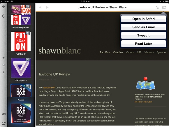
    [](https://f3a98a5aca88d28ed629-2f664c0697d743fb9a738111ab4002bd.ssl.cf1.rackcdn.com/instacasthd-2.jpg)

    Instacast HD brings over its own ranking system, a nice way to find great shows:

    [](https://f3a98a5aca88d28ed629-2f664c0697d743fb9a738111ab4002bd.ssl.cf1.rackcdn.com/instacasthd-3.jpg)

    This little volume slider is one of my favorite parts of the app, it just looks perfect:

    [](https://f3a98a5aca88d28ed629-2f664c0697d743fb9a738111ab4002bd.ssl.cf1.rackcdn.com/instacasthd-4.jpg)

    Once you select a podcast you can switch between episodes by swiping or with this nice drop down:

    [](https://f3a98a5aca88d28ed629-2f664c0697d743fb9a738111ab4002bd.ssl.cf1.rackcdn.com/instacasthd-5.jpg)

    This is a must have for any podcast listener with an iPad. It may even be the reason you need to buy an iPad if you love podcasts and still don’t have an iPad.

  • Apps are Critical

    I really was disappointed with the design and usability of all the Android apps that I tried on my Fire — at least the ones that weren’t a popular iOS game already. I actually didn’t think a well designed Android app existed, so much so that I started to write a post about how stupid it is that one doesn’t exist.

    I thought: surely it is possible and at least worth someones time.

    As part of the research for that post (yeah I occasionally research) I Googled: “Best Kindle Fire Apps”. After looking through stupid slideshow after stupid slideshow ((Seriously, this is not a good way to display anything. Even *The Big Picture*, a photo blog, knows this.)) I finally found one app that looked like it might actually be decent: Evernote.

    Now, I am not an Evernote user, nor am I someone who understands the allure of the app. It was however free and looked promising so I downloaded it — I used Evernote back in 2009 so I had an account and a bunch of notes in it already to play with.

    I have to say, Evernote is a really great looking Android app and it works well to boot. Evernote gives you a good idea of just how good an Android app can be — that means that most Android developers either don’t care, or don’t *need* to care about the design of their Android app.

    I am so happy to have found the Evernote app that I wanted to make sure it wasn’t just a clone of another UI Evernote has used on iOS or the Mac — it isn’t. In fact the iPad, iPhone, Mac and Android (Fire) all have their own UIs that make sense for each of the devices, imagine that.

    This isn’t a review of the Evernote app — that app just serves as proof that you can make great looking and highly useable Android apps.

    This post is about why Android developers don’t make great looking apps — generally speaking. (Though Evernote is literally the only app, games aside, that I have found to look really nice.)

    ### Apps Matter

    One thing that has become abundantly clear after reading through all the Kindle Fire reviews is that apps matter. No matter the platform or device, what makes or breaks a tablet is the overall depth and quality of the apps that the tablet has at its disposal.

    On the [episode 35](http://thebbpodcast.com/2011/11/episode-35-lunchbox-locker/) of the the B&B podcast Shawn said (roughly): “If I had to choose between only getting the built in iOS apps, or only 3rd Party apps, I would choose 3rd party.”

    I agree.

    That’s a pretty powerful statement too, because it says that what makes the device so valuable is not what it comes with, but what can be added to it. Apple wouldn’t ever include an app that uses a camera to deliver your heart rate, but for $0.99 I can [buy one](https://brooksreview.net/2011/11/ipad-vitals/) (it works too).

    This is where most other devices get it wrong. The absolute best looking and feeling app that I downloaded for my Fire before outwardly searching for a fantastic app was: Angry Birds. Ask me the same question about my iPad and I couldn’t choose between the plethora of great apps that I have currently sitting on my home screen, not to mention the 100s of others I have yet to try that many others say are excellent.

    Why? Why are these apps missing from Android?

    It’s not the user base, because that is supposedly pretty high. I can’t believe it is because “[Android users don’t buy apps](http://www.appleinsider.com/articles/11/11/21/googles_android_market_estimated_to_earn_just_7_of_what_apples_app_store_makes.html)” because I think that is largely due to the fact that there aren’t apps worth buying.

    Why?

    I can think of a few reasons:

    – Pirating is supposedly rampant. So developers are naturally wary about the platform.
    – Copyright infringement from what I hear is not only common, but not dealt with very quickly.
    – Fragmentation between screen sizes and specific Android OS builds is high. This makes it harder to make one app that is great on all the Android devices.
    – More than one store on a device so picking which app store it be in is a bit of a pain.

    Even with all those reasons, I just can’t believe that there is still only one Android app that I can look at and say: “yes, that’s what I am talking about.”

    Even if all the above reasons for not developing for Android are true, it would still seems highly unusual that I was only able to find one good app.

    The best guess I have has to be that the “market share” is just not that high, thus not making it “worth” it for developers to make amazing apps for the platform. If that is the case, then that is a shame — I think a large part of the reason Android doesn’t appeal to me is because of the lack of apps. ((There are other reasons, but the lack of apps keeps me unwilling to even consider the platform.))

  • Readability and Collection of Money for Others

    I was chatting with a friend the other day about Readability’s model. The question that he asked was (paraphrasing): “So after 12 months, what happens to the money that is unclaimed?” You see “premium” members pay a monthly fee (that they choose, mostly) and 70% of that fee is evenly distributed out amongst the sites that the person reads.

    This is an incredibly noble cause, and I believe that Readability only has the best intentions, but there does lie a significant flaw in the model. In order for a site to get the money, the site actually has to sign up, as a publisher, with Readability and then they get a check every 6 months.

    So after 12 months, what happens to all the money that would, *should*, have gone to a publisher that did not opt-in, or actively chose to not participate?

    The obvious answer is that Readability keeps that money and its just a bonus to them for pursuing this business model.

    Hmm.

    I was a huge fan of Readability when it came out because of the fact that I may make more money. I’m not going to lie, I like things that impact my bottom line in a positive way. I never once had a problem collecting, and continuing to collect, a check from them every six months.

    But I think they are going about this wrong. If my assumption that Readability pockets unclaimed money after 12 months, I think as both a publisher and formerly a paying member, we should be upset.

    If a site doesn’t claim money after 12 months, I think the left over funds should be dispersed equally amongst the sites that actually are setup to collect the money — on a user by user basis. That is if Tom paid out $5 to 5 sites ($1 for each site) and 1 of those sites didn’t collect their money, after 12 months the 4 sites that Tom already paid each now get $0.25 more — this seems far more “noble” that taking the money and sticking it in your pocket.

    This would be better, but it’s still not great. The next part, I don’t have a good solution for.

    ### Last Night on Twitter

    You see last night on Twitter [David Chartier](https://twitter.com/#!/chartier/status/137316873887956992) tweeted:

    >Readability makes it drop-dead simple for readers to thank publishers, publishers to get paid. I love it [http://tmblr.co/ZelxbyC3Y5rH](http://tmblr.co/ZelxbyC3Y5rH)

    That tweet set in motion one of the most interesting discussions I have ever followed on Twitter, because Kontra (@counternotions) [responded](https://twitter.com/#!/counternotions/status/137330248252530689):

    >@chartier How do you know publishers get the money?

    I am going to skip ahead here, but first a short recap of the conversation. Kontra doesn’t sound like he is a Readability fan, and eventually Anil Dash (Readability advisor) and Marco Arment (Instapaper founder) chime in to the conversation. Everything is very cordial and there is some nice discussion and debate. Then Kontra sent four tweets that really blew my mind and completely changed how I think about Readability.

    [Tweet 1](https://twitter.com/#!/counternotions/status/137351777023565824):

    >@chartier Is it OK for a 3rd party to collect money in the name a publisher w/out its knowledge or content? (See, books, Google, courts.)

    [Tweet 2](https://twitter.com/#!/counternotions/status/137370881625296897):

    >@chartier For avg user, Readability is collecting money in the name of the publisher. There’s no way of getting around that.

    [Tweet 3](https://twitter.com/#!/counternotions/status/137374513666080768):

    >@anildash When somebody collects money in your name w/out your consent (with a cut), it’s called something else in many boroughs of NYC.

    [Tweet 4](https://twitter.com/#!/counternotions/status/137377133193478144):

    >@anildash Any act is not always better than no solution. Readability has no right to claim agency for publishers w/out consent.

    After reading those four tweets I really started to have a problem with Readability’s business model. Because the mysterious Kontra is right — Readability has no right collecting money in my name without my consent.

    Now, realistically, I have given Readability consent by signing up — but what about other publishers that have not only not signed up, but have actively chosen to *not* sign up? Is it still OK for Readability to be collecting money in their name?

    I think not.

    But how do you solve this problem? I don’t know, but it is a very real problem.

    *(Note: I just want to reiterate that I don’t think Readability has any malicious intent. The model is complex and inherently flawed.)*

  • A Review of “the First Serious iPad Competitor”, aka the Kindle Fire

    Amazon marks their entry into the crowded tablet space with a 7” custom Android OS device — a tablet that is at the bottom of the price for a tablet from any company most people are likely to recognize.

    The long and short of the Fire is that it does quite a few things, but doesn’t do any of them very well. It does many of these things really poorly.

    It was about a year ago that I reviewed the original Samsung Galaxy Tab — one of the first Android tablets, also seven inches. The main problems with that tablet were: hardware, lack of software, the OS and the price. Amazon only fixes the price and the hardware (mostly) on the Fire, otherwise the device feels very similar — though more closed — than the Tab did a year ago.

    That’s probably not something you want someone to ever say about a new tablet: “feels like one I used a year ago.” Tablets aren’t cars, they don’t get better with age, they just get sad with age.

    ### First Run Experience

    Right from the get go the Fire’s first run experience is pretty poor. I am a big believer that I should never have to be shown how to use a device, good devices should be intuitive, and if it isn’t good I don’t want to use it. The Fire walks you through every little tap — a clear sign that the OS is just not that intuitive — before you get going and even with that tutorial I was a bit lost once I was let loose in the OS.

    Right away you are presented with a dialog that you need to update the Fire software, something that took about 5-8 minutes on my very fast Internet connection. Normally I would be fine with this, but I couldn’t even use the device until it updated — there was no option to wait until later, and I really think that is needed before you block a user for running the device.

    Once you finally get into the OS you see a carousel view that isn’t exactly clear on telling you what it is showing. In fact nothing about the UI on the Fire is very straightforward. It seems like I am constantly scanning the interface to see what I want to do and where I need to tap.

    Your recent items are most prominent and then you have some favorite apps along the bottom. Music, movies, web browsing are shown in a small line of text along the top. Seriously I had to stop and pause to figure out where the web browser was at first.

    I did get over these issues with use, but it still struck me as uncomfortable.

    ### Context Unaware

    What’s most interesting to me about the Fire is that, unlike iOS, it is very context unaware. With the iPad there is very clear modes delineated by the fact that each app is different and maintains it’s place in the grid. The main grid simply cannot show you the last file you worked on, only the last app. That is central to iOS.

    On the Fire the main carousel is your most recently opened items, but not by context or app, instead by individual items like videos, web pages or books. That is a very different concept.

    So maybe you see the email app icon, and a few other app icons — that is all familiar and logical. Then you see the cover of a book, the screenshot of the last webpage you looked at, the artwork for the movie you last watched. These are things that on iOS would be represented by their app icons, instead of the media itself.

    So on iOS where I would see the ‘Safari’ app icon, on the Fire I see the screenshot of the actual webpage.

    I don’t point this out because it is better or worse, but because it is very different. It like storing all the papers on your desk by project in folders and no other way — the Fire then would ditch the folders and just keep stacks of papers by project, with the last viewed paper on top of each stack.

    I like the way the Fire handles this because it makes it easy to jump right back into the movie or webpage that I want — that’s great. I don’t like how prominent this carousel is on the “home” screen of the device, I’d much rather it be treated as secondary in the same way that the “favorite” apps on the home screen currently are. It seems too over powering, but I think with use this is something that you would get very used to.

    ### Closed or Protected?

    The Fire maybe built on top of Android, but it isn’t open to customization the same way that Android is. I can’t change the look of the OS at all. I can’t change the image that is used for the lock screen (it actually rotates through some, which makes it potentially very easy to get your Fire mixed up with another) and I can’t change how long before the device requires a passcode.

    There’s quite a few stupid little things that I have come to expect to be able to do on a tablet, that I simply cannot do on the Fire. I would say this is a sign of a closed system, much as Apple has created with iOS, but perhaps it is better to use the word ‘Protected’ so that we don’t get mixed up with the open source debate.

    Here are some things I expect to be able to do, but currently cannot — or don’t know how to — do:

    – Change the lock screen wallpaper.
    – Change the passcode timeout.
    – Change the time to display in 24-hour format, or even put up the AM/PM symbols.
    – Change the device name that is displayed in the top left corner.
    – Delete apps completely from the device that came with it (like the web icon link to Facebook, WTF).

    There’s more, but I think you get the point, little things are missing.

    ### The Hardware

    The Fire is surprisingly nice feeling in your hand. The device feels thick, but it is hard to make such a smaller footprint feel thin. It is heavy, and feels just as dense as my iPhone. ((I don’t mean that it is the same weight, just that if my iPhone were blown up to the same size as the Fire, I would assume it would be the same weight.)) The weight actually gets in the way of making the device as comfortable to hold for long periods as my Kindle 2 is — thus reducing the reading-in-bed experience.

    The screen feels like any iOS screen. The back has a rubberized coating that isn’t grippy enough to keep it “stuck” on fabric, but does have a nice tactile feel. However, the tradeoff is that the back is prone to many greasy finger prints — ones that don’t wipe off as they do on the screen.

    [](https://f3a98a5aca88d28ed629-2f664c0697d743fb9a738111ab4002bd.ssl.cf1.rackcdn.com/fire-2.jpg)

    The digitizer is actually visible under bright lighting and reveals that it is spaced wider than on the iPad. Thus, I would assume, explaining most of the poor touch interaction on the device.

    The power button is small, but easily pressed, at the bottom of the device. Of note the power button actually lights up which is quite off putting for iOS users.

    Overall the Fire is a well built, sleek looking, little tablet. However for $199 you can’t expect perfection as these bumps in the rubber between the chassis and screen show:

    [](https://f3a98a5aca88d28ed629-2f664c0697d743fb9a738111ab4002bd.ssl.cf1.rackcdn.com/fire-3.jpg)

    [](https://f3a98a5aca88d28ed629-2f664c0697d743fb9a738111ab4002bd.ssl.cf1.rackcdn.com/fire-4.jpg)

    I talked to a few other Fire owners and this seems to be hit and miss whether these ripples are on the device.

    ### Apps

    As was the case with the Samsung Galaxy Tab the apps available for the Fire are both limited and universally subpar. I don’t say that to deride Android and hold iOS up on some pedestal, but the App selection and quality truly is worse than on iOS. This is actually a really big deal for me, and I suspect most users, because Apps are what make these devices so useful.

    Apps that are missing, or lack any useable version:

    – Instapaper (by the developers choice). I did try out Read It Later Pro, but found that the experience was not up to the level of Instapaper — though it is a passable alternative if I was forced into it.
    – An RSS reader that syncs with Google Reader. I liked EasyRSS (an pure Reeder clone) the best, but it crashed every time I tried to scroll a list view. Every time. I didn’t find any other RSS readers that worked with Google Reader that are worth even mentioning.
    – A Twitter client (Seesmic is slightly better than the web portal).
    – Notes app. Again here I didn’t find a Dropbox syncing note app, leading me to Evernote as the best solution — though it doesn’t come close to fitting in my “normal” workflow.
    – Dropbox, I am told I could side load one. That’s a lame solution, side loading is something a very small percentage of Fire users will ever do, let alone know what it means.
    – Weather (there are many, many crap ones). The best I found was AccuWeather.

    And then you get to the worst part about the Apps on the Fire: they all have different icon sizes. So when you do see your apps listed in a grid, very few icons are the same size. I don’t even understand the logic on this one and quite frankly don’t think it is possible to logically explain this choice. Even scaling the icons to the same size, at risk of pixelation, would be better than the jumble of sizes.

    Overall I was left very disappointed about the variety of apps and the quality of the apps. (For the record the best app I found was Angry Birds. It actually managed to play smoothly on the device — it may be the only smooth thing on the Fire.)

    ### Video

    A lot has been said about the Fire by other reviewers, but one thing that I kept seeing is that it makes for a good device for viewing video. I don’t get that, it sounds like something reviewers decided that they would like so their entire review wasn’t negative — because in the world of tablets the Fire is just average, at best, when it comes to video.

    Selection wise, it’s pretty great. Playback wise? Not so much.

    Every video I played (Netflix and Prime streaming) played back smoothly, but the layout of the hardware got in the way of my enjoyment of the video. The light sensor for the dimming on the screen is in the top left corner of the device when held in portrait. That’s fine, but when you switch to landscape view it is in the bottom right corner, a spot likely to be covered by your hand — dumb.

    Now it is true that I could spin the device around so that the sensor was back at the top, however that introduces another problem: the UI rotates but not the video. So in order to play back a video in another orientation you need to stop the video, exit the playback, and then enter back in, but you must make sure you are holding the tablet the way you want the video oriented.

    This seems like a bug that should be fixed, but until then it is pretty crappy. (I do want to note that the Netflix app works as expected, just not Amazon’s built-in player.)

    What can’t be solved by a software update is the lack of hardware volume buttons. In order to adjust the volume (something that I apparently do frequently when I watch videos) I have to go back into the software to change the volume. This is just bad design.

    What’s more is that the power button is smack in the middle of the bottom (when held in portrait) and so when you watch a movie it is smack in the middle of the side. I can’t tell you how many times I hit that button while I was holding the device — in any orientation. This is a problem that I have only had on very rare occasions with the iPad.

    ### Silk

    One of the biggest features of the Fire is the web browser: Silk. This browser is the primary reason that I wanted a Fire. Amazon designed Silk to work with its servers in order to help “instantly” load web pages — or at the very least make them much quicker.

    At home I have a 60mbps internet connection on the download and 12-20mbps on the upload. I have an ample connection speed.

    Having said that Silk is not nearly as fast as I would expect for a browser being “assisted” by faster servers. In fact in my very unscientific testing web pages actually load faster when this “acceleration” is **not** enabled. Go figure. ((I tested the speed by clearing the cache, loading the page with acceleration on. Then clearing the cache and loading the same page with acceleration off. I did this with a sampling of 5 site, ranging from complex to simple.))

    Silk also doesn’t work very well when you double tap a column of text so that it will zoom in. The text often reflows when you zoom in on it, something that I find very odd and doesn’t usually zoom in accurately as one would see in Mobile Safari.

    Any Typekit site renders very slowly. The text looks less than stellar on it.

    Overall, the browser is better than the standard Android browser, but no where near as good as Mobile Safari on iOS — not even close.

    ### Reading

    So the Fire is branded under the Kindle name and Kindles are some of the best reading devices on the market (excluding paper). Unfortunately the Fire fails the Kindle brand in the reading segment.

    Oh the text looks fine, comparable to the iPad screen, but the experience of actually reading a book is pretty terrible. I’d take the iBooks design any day over this, because with iBooks at least everything works smoothly.

    #### Books

    My preferred book reading app on my iPad is the Kindle app and so I was excited to give ebooks a go on Amazon’s own device. The design and layout is much the same, with one big caveat.

    There is an odd animation displayed when you change pages — wait no, actually it is just a jittery animation of the pages sliding from one to the next. Page turning is incredibly jittery and given that turning a page is something you frequently do when you read — well this is pretty important.

    Other than that, standard Kindle app fare.

    #### Newspapers

    I purchased two Newspapers (single issues) the local *Seattle Times* and *The New York Times* on the Fire to give each a go. Both are laid out very similar, you are presented with a list of articles with the first couple of lines of text for that article. You can also jump to specific sections of the paper. Tapping a headline brings you into article view where you can actually read the paper from front to back if you wanted by just sliding to the next page. There is no hard stop once you finish an article, you just move on to the next in the list.

    There are still jittery page turns here and over all a pretty uninspiring layout and UI. I don’t hate the newspapers on the Fire, but I find them less appealing than their iPad counterparts — more like you’re reading an ebook than reading a newspaper.

    #### Magazines

    So here’s the deal: I hate magazines on the Fire with such a passion that I very much regret every penny and moment I spent buying and testing *Forbes* — I even hate the fact that this sentence about it has run so long.

    Until a major overhaul is done you are far better served downloading the 500mb magazine issues that are common to the iPad.

    ### Miscellany

    – The keyboard works in much the same way as on every other Android device and like on iOS the keys “pop up” when pressed. What’s odd is that the spacebar also pops up when pressed, this seems a bit unnecessary.
    – The packaging is dead simple. Charger, device, getting started card. No knife was needed to open any part of the packaging from the time I picked it up off my stoop, till the time I started using the device. This is Amazon at its best.
    – I don’t think the screen has the olephobic coating that Apple uses, because it is slightly more resistant than my iPad and iPhone. However it still wipes clean with relative ease.
    – To indicate when you have reached the top or bottom of a list the OS put a white glow emanating from the top or bottom. It took me about an hour to realize why that was there. The elastic bounce that iOS uses is just a far better indicator, but I believe this is a patent issue for Android devices.
    – Amazon sends you an email every time you buy or download something, for each item, every time. Whereas iTunes waits a bit and sends multiple transactions in one email — every transaction is emailed from Amazon. Again, every one — even for free apps.
    – The time it takes to “rotate” the screen is far too long. Overall I don’t find the device to be very responsive when switching orientations.
    – This device was really made to be used in portrait and with a 16:9 resolution it feels very silly to do anything but watch videos in landscape.
    – The ability for Apps to integrate with the browser is incredibly useful. For example once you install Read It Later you can send articles directly to the app from the browser in just a couple of taps. No need to figure out how to install a bookmarklet, that’s actually really nice.
    – When entering a passcode you must tap a small OK button after you have entered your passcode. I see no point to this.

    [](https://f3a98a5aca88d28ed629-2f664c0697d743fb9a738111ab4002bd.ssl.cf1.rackcdn.com/fire-1.jpg)

    ### The Helping Sell Things Argument

    I have seen many people talk about how great the Fire is for selling Amazon items. I largely agree with that statement because the Fire does have a very nice Amazon store on it. Here’s the “but”: a device that you never want to use, isn’t a device that is likely to compel you to buy anything for, or with, it.

    So while the buying experience is very good, I doubt it is going to help pad Amazon’s bottom line, because I doubt people will be clamoring to use the Fire.

    ### Bottom Lining It

    Here’s the thing about the Fire, as it currently exists I pretty much find the device useless. Not one person would be better served buying the Fire over an iPad, OR an iPod touch. There’s no reason for it.

    Since getting the Fire I have left my iPad as far from me as possible and taken the Fire every where I have gone. Time and time again I found myself walking to where ever my iPad was so that I could use it, because I simply couldn’t, or didn’t want to, do what I needed to do on the Fire.

    But that is as the Fire *currently* exists. If you give it a touch more horsepower, rework the Magazines, add in a few “normal” customization features — then I think you have a pretty slick little device. Oh, and make some nifty way for a cover to attach like the Smart Cover does on the iPad.

    I don’t know how much Amazon can fix with software updates, but I am more curious to see if they even try to fix things with it. I strongly suspect they will just release a newer model, with better software.

    At the end of the day I would have loved to have taken more time with the Fire before reviewing it, but I honestly didn’t want to have to use the device anymore.

    And that pretty much sums it up.

    **UPDATED**: You can rename the device by going into your Amazon account online and navigating to the ‘Manage My Kindle’ page. Thanks to those that wrote in on that one.