Category: Articles

  • WWDC Around the Web

    Federico Viticci:

    All developers I’ve talked to over the past few days share a common thought: this year’s announcements are creating new possibilities. New technologies can empower users in new and better ways. We can’t wait to start coding.

    I’ve heard this same thing too. Developers are really excited.

    Craig Hockenberry:

    Apple has a newfound confidence in itself. It’s at the top of its game, and it knows it.

    I wouldn’t say ‘newfound’, I think a better word is: recharged. I don’t think Apple ever lost confidence, but I think they questioned their confidence a bit.

    Stephen Hackett:

    Apple feels good about itself, and that trickles down to the community. You can feel it in the air.

    It’s palpable.

    Shawn Blanc:

    We are seeing what the post Steve Jobs Apple is like, and my friends, it is awesome.

    If I summed up the direction Apple has decided to take, it would simply be: bold. They aren’t resting on their laurels the way Microsoft did when Ballmer took over. They are banging shit out and getting it done as fearless as they can be. But they are tempering that enthusiasm with patience and thought. They are doing a lot, but are being careful to do it right the first time.

    A lot of people have told me I am too excited about iCloud Drive, but the thing is I think Apple will finally get the cloud stuff right. Their stream for WWDC was perfect, and their iCloud offerings really have been nearly flawless recently.

    Jason Snell:

    Over the next year, there will be innovations that surprise and delight users, and they won’t be trapped inside a single app interface—they will be able to spread themselves across many more parts of the iOS interface.

    All of a sudden things that used to be very tedious to do on iOS will become so simple that it will feel magical. There’s no need to talk about customer lock-in with iCloud — that’s all the lock-in most people need.

  • Blixt for iPhone

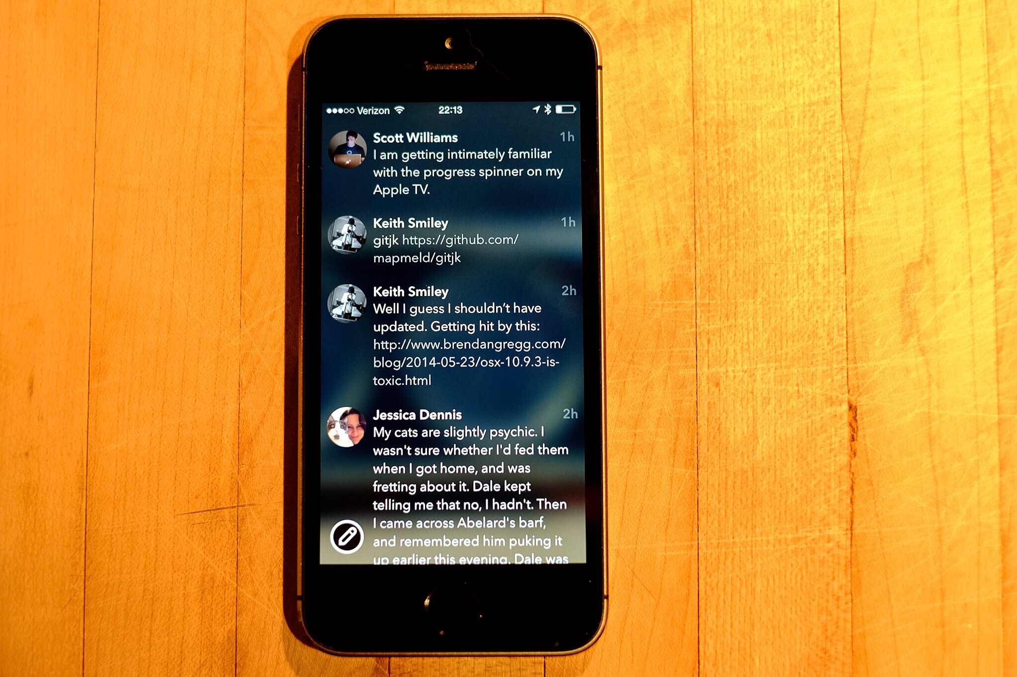
    A few nights ago I got an email from Bryan Clark, and he explained that he and Jesse Herlitz teamed up to make a new App.net client, and they are still excited about it even if App.net seems to be in a bit of limbo. I’ll be honest, I wasn’t too excited to test the app, but I checked out the other app these two worked on and was impressed with the app. Then, I accepted to promo code so I could see the app before launch ((If you don’t know, developers can have an app approved, but hold it so you cannot download it. Then they can share promo codes and people can download the app from the App Store that way.))

    Boy am I glad I checked out the app. It’s called Blixt and it is an App.net client, though it doesn’t do private messaging.

    It is gorgeous.

    It is damned smooth.

    I love so many things about this app that I wish people posted more on App.net so that I might use it more.

    The Highlights

    The scrolling in this app is possibly the smoothest scrolling I’ve seen, it’s like a plastic disc on an air hockey table. Simply fantastic, you just want to scroll around. I don’t know what gives it that feeling, but man is it silky smooth.

    There are no delineating lines between posts, but somehow nothing looks cluttered and nothing is confusing. It’s really clean feeling and super flat, but yet it feels like slick glass. It feels made for the iPhone.

    The animations are great. From the little bounce a post does when interacted with, to the loading indicator when using the browser. All these small touches make for an app that visually doesn’t get in the way, but never leaves you feeling lost.

    I was confused at first as to what the image is that is blurred out behind your timeline, as it turns out it is your cover image. However, when you browse to another user, or simply view the post view for a post that is not yours, the image switches to that user’s cover image. Very nice touch, and amazingly not distracting at all, it simply gives a little depth and character to the app. In fact it is a great way to skin the app a bit if you want.

    Another nice touch is how large the few buttons are. This is best seen when composing a new post, as the buttons are a bit in your face, but thankfully easy to tap, which isn’t something I can say about most of iOS 7. Even though the buttons are larger they feel right, but not something you tend to see in iOS anymore.

    The Misses

    There’s a bug that I’ve run into when I tap on a post with a link the app seems to freeze (the developers are looking into it), all you have to do is go back to the home screen and back into the app (no force quitting needed) and all is fine. It’s odd and annoying, but a testament to just how good this app is that I am more than fine with putting up with that bug.

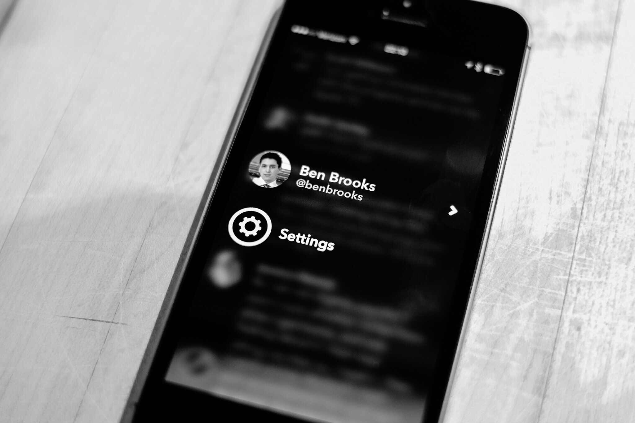
    The swiping is a bit un-iOS, in that going back, say from mentions to timeline, requires a swipe starting near the middle of the screen to the edge. If you swipe from the left edge to the right, you pull up the account switcher and settings screen — I pull that screen up a lot. This isn’t consistent with the rest of iOS so it is likely to always be a challenge for me.

    The Icon

    I wanted to give the icon it’s own section, just because it is stellar. Of all the icons on my main home screen, this is the only one worthy of being there.

    More like this please.

    Go Buy It

    Who gives a damn about what’s going on with App.net, this app is one of those apps you will appreciate the hell out of no matter what you think of App.net. Rarely do I like apps this much, but this app is very impressive in such a very simple and smooth way.

  • Changing Your Mind

    The other day I was talking with a client of mine. It was after hours and I was out running personal errands. This client likes to talk, as in I spend hours on the phone with people at one time, and he was going on about a meeting. How the guy at the meeting said he couldn’t ‘read’ my client.

    So my client, let’s call him Bud ((Because, great name.)) , asked me: “Am I hard to read?”

    Now I replied that I think to so he was, to which Bud chuckled and asked: “Do you know why?”

    Me: “Yes, because you never stop talking.” ((Bud’s a good client, and takes a ribbing well.))

    Bud laughed again and told me: “No, well maybe, but it’s because I never know what I am thinking — and sometimes I just change my mind every time someone talks to me.”

    And I can attest, Bud does change his mind often.

    But so do I. In fact, and I relayed this to him, I see the ability to change your mind as one of the most intellectually honest things you can do. But I think I need to clarify that statement a bit.

    It’s not intellectual in any sense to arbitrarily change your mind — simply for the sake of changing your mind. What is intellectual is if you know why you are changing your mind.

    And in most cases the “why” is usually easily cited as ‘new evidence’. But that’s why I appreciate people who change their mind so much: I know they are listening, processing, and thinking constantly about new inputs they receive. They aren’t just hearing me for the sake of trying to figure out how to punch back at my argument, they are actively listening to my point.

    To me, there is nothing more you can ask from a person than for them to keep the cliched “open mind” and hear you out. I’m wrong — a lot — but what keeps me alive (so to speak) is the fact that I recognize where I have wronged, why, and then try to change it (whether that be an action, decision, or thought).

    Don’t be afraid to change your mind as long as you know why you are changing your mind. I cannot imagine a world where people were not willing to change your mind — all to often we are asked to make a decision on incomplete data. Imagine if you had to stick to that decision even after you get better data? That would be horrid.


    Two hours after I talked to Bud on the phone I decided to join back up on Twitter. I waited a day just to make sure that I wasn’t missing anything, but I changed my mind.

    In the post about rejoining Twitter I could have defended my action without ever admitting I was wrong. I could have. But that would have been wrong in itself.

    So it’s good to change you mind, but don’t do so for the wrong reasons. And certainly don’t act like you didn’t change your mind — then you just look like a fool.

  • Changing the Game

    I don’t typically do WWDC keynote wrap ups, but this wasn’t a typical WWDC keynote. You can find all the details of what was and wasn’t elsewhere, what I want to talk about is the things they announced which appear to be immediate game changers.

    Continuity

    The ability to start working on something on your iPhone, and pick up at that exact spot on your Mac, or iPad. Whether it be an email, or web browsing. To be able to accept, and place, phone calls and SMS messages from any of your devices.

    This is going to be huge. This is about experience, and this is the intangible part of Apple that competitors and non-customers just cannot understand. Syncing files with Dropbox will be cute, in the way that syncing files with floppy disks once was, when this is fully realized — this kind of a shift towards device agnostic computing cannot be understated. The normal user won’t understand why everything doesn’t work this way.

    Touch ID

    This is another ‘experience’ aspect, but opening up Touch ID to third-party developers is massive. Touch ID was OK when it launched, but now it is truly stellar. It is so fast I cannot understand how it is possible.

    What Apple is trying to do is to eliminate passwords on iOS. Think about the magnitude of that for a moment.

    Why do people choose shitty passwords, because they hate remembering and typing them. Touch ID obviates all of that.

    It’s something no other platform can do, and Apple just did it.

    App Previews

    To me it looks like these will be simple videos in the normal screenshot preview window, but it’s going to be huge. Apple needed to clean up the App Store, but instead of getting more picky about who they let in, they are giving users the ability to actually see how smooth, how pretty, and how well an app works.

    I suspect this helps bring the good stuff to the top much quicker.

    Extensibility

    This is a developer arena addition, but the ramifications of this one thing are truly a game changer for iOS. Apps can now talk and interact with each other. The examples shown (translating text, share sheet integration, notification center widgets, and custom keyboards) just scratch the surface. This is effectively the x-URL callback scheme taken to the next level.

    As I talked about the other day, you don’t need side-by-side apps when you can talk to other apps this way. I need to read more into this, but right now: wow.

    Spotlight

    A lot of app launchers are going to talk about how they are still a good choice, but for most people the new Spotlight will be all they need. In fact, clipboard history may be the only main feature missing.

    That alone is neat, but not game changing. What is game changing is that this seems to remove the need for Google to a large extent. If Apple can get the average user using Spotlight it could mean a big hit to Google. Spotlight can get you what you want, and do it quicker.

    Everyone uses Google to find information on places like restaurants, now Spotlight can do that for you — and show you contacts appointments, etc — send it to iOS. It’s not only faster than Google, it’s more rich of an experience than Google could ever have on the Apple platform.

    iCloud Drive

    This is effectively Dropbox, with far better integration in Apple products. You can’t beat this — you won’t beat it. And it’s on Windows. People like to dog on iCloud, but I’ve been using it seriously since it came out and I’ve yet to encounter any major issue — or even minor issues.

    If Apple can scale iCloud Drive there will be no stopping it — and I really believe that.

    Storage Limits

    An aside to that are the storage limits. Apple allowing up to 1TB, and as cheap as 20GB for $0.99/mo — companies simply cannot compete with that pricing. It’s insane.

    Wild Cards

    There are two other things that Apple introduced which seem huge on the surface, but which I also have my doubts about.

    HomeKit

    This is Apple’s ‘secure pairing’ to home automation devices. Nest was curiously absent ((Joking, we know why.)) but there were many other companies. The hardest part about HomeKit being a game changer is that it relies on third party hardware manufactures. One shitty product and people will be turned off of the service for a long while.

    Apple will need to closely monitor what device is allowed on HomeKit in order to make this a big deal. With Nest out of the picture I am highly skeptical about the future of this. It’s going to come down to great hardware.

    HealthKit

    Like the above, this too relies on sharing health data with third-parties. Not only that, but it also relies on third-party hardware to collect the data. Effectively being a middle man for data.

    It has the potential of Passbook — but as we have seen Passbook has yet to take off at all.

    Lastly: Swift

    Apple’s new programming language has gotten every developer all hot and bothered. I don’t program, so I can’t comment, but a lot of people see this as taking the development ecosystem and advancing it far out into the future.

    Keynote Overall

    There was a lot in the keynote — a lot — and the biggest thing to remember is that unlike other keynotes and product announcements: all this stuff is real. You may not get it today, but developers are already hard at work on it so that when you get it, everything works. Amazing.
  • My 15,000 Words on Coming Back to Twitter

    Or, actually, I can say it in a lot less words than that.

    After careful thought since the announcement of the beginning of the end of App.net ((Or so they say.)) , I’ve decided to start actively using Twitter as my main social network once again. I could write 15,000 words on it, or I could sum it up in three statements:

    1. I was wrong. I thought the people I cared about would all whole-heartedly move over to App.net, but they didn’t. (Well, most of them didn’t.)
    2. I miss my buddies, I have buddies on App.net, but I miss the specific people who only hang around Twitter.
    3. At this point I felt like I was the whiny kid sitting martyr-style in his room while everyone partied carefree in the other room. The only thing this accomplished was my own self satisfaction of knowing that I was doing something I thought was right.

    Bottom line: I just want to come back into the room with the party.

    So, hey, come follow me on Twitter.

  • The Future of the Office Space

    I tend to read a lot of posts about the future of the office — be it about office design, or working from home. I read these posts because not only will it eventually effect me, it likely will effect my business (being in real estate) much faster.

    When you read these articles the facts you tend to understand after a while come down to:

    • We all ignore that ‘open office’ designs are not the most productive environments because: they look pretty, they are trendy, and most importantly they cost less.
    • Remote working, some people have it, some don’t, but everyone seems to want it.
    • Did I mention open office designs? Those are really big.
    • And then there are the posts about standing at your desk, which I love to do — though I am sitting as I type this.

    There seems to be the consensus that open office layouts are here to stay, and that eventually at some point, working remotely will be the norm.

    Ok, I guess.

    But I have a little different vision of the ‘future’ office, and it’s certainly not working from home. While it is very nice to work from home, in general, working from home is a pretty bad idea. Forget all the ‘distractions’ ((I worked from home quite a bit for a few years, it was not ideal.)) that most people will point to and instead focus on just one aspect: space.

    How much space do you have in your home to create an office? Ok, so you have enough for you, but what about your spouse, or your kids when they start working (but are still in school), is there room for all of you to have home offices? I think not.

    Are we suddenly going to start remodeling our homes, and designing them, to accommodate the fact that we work from home? Are dining rooms, living rooms, eat-in kitchens, and garages all going to become ‘offices’? How long, if we will all work from home one day, until our home is nothing but and office?

    Is the future really one where my commute is a hallway, and I never leave the house, let alone stand up? Where the work never ends because it is just two steps away and everyone, including your boss and clients, knows that? Is it one where we just work all the time because we feel pressured into it, or where we constantly fight all the distractions at home as we try to do some work that we are loathe to do?

    I think not — at least I hope not.


    The question that has been nagging at me is this: what happens to the millions of square feet of existing office space if, indeed, there are no corporate offices anymore?

    That space won’t simply vanish — trust me, I manage far too much vacant space and no matter how hard you try it doesn’t go away.

    I try to look at this problem of remote working and current office space from the perspective of what I would do to fill the space. Open office space layouts has proven that companies love saving money, even if it is at the expense of less productivity. ((As contentious a statement as it is to say that open plans are less productive, but just put your headphones back on and enjoy that collaborative open office while rocking out and trying your best to ignore the people around you.)) It comes down to what’s cheaper for corporations: offices, or no offices?

    To that end I think corporations will actually be keen on having people work from home, rather than having to pay for an office — and the admin staff that is required of you having an office. ((Janitors, office managers, maintenance.))

    So if I were running a property with a bunch of vacant office space, I’d start leasing out the individual offices in the space to people who “work from home”. That thought got me a little excited about how the future of office work could really play out.

    Maybe corporations don’t have offices anymore, but maybe individuals do have offices. Sometimes that is a desk in the corner of a room full of desks, sometimes that’s an office in a building full of offices. But I see it working like so:

    • I have my own office, setup the way I want it.
    • That office is paid for by whomever I work for as part of my salary.
    • If I leave the company, I simply go to another company, and that company doesn’t have to pay for a new workspace, as I already have it. I can move jobs without having to move offices.
    • Or, I can move offices, cities, countries at will, and never have to change my job.

    Offices become “Ben’s office”, instead of “X Company’s office”. That could be cool, and it makes far more sense than everyone working from home. Each employee having their own dedicated office space would allow for:

    • Personalization
    • The correct environment for that employee. Be it ‘open’, or private — or somewhere in-between.
    • Cheaper costs, as a company now has 100% flexibility with lease rates (they aren’t locked into a 10 year lease for a 1,000 people even if they just laid off half the people). Instead their employees assume the risk of a lease, or work from home.
    • Employees get to choose their location, and move whenever they might want to.
    • Employees get to choose the people they spend their day with. Don’t like the other people in your office? Get a new office. Don’t like your city? Get a new city.

    There are more, but you get the idea.

    To me this is a powerful idea. The idea that we reverse roles to a degree. We don’t have to live with our future office being in our homes — because there is going to be abundant space available for us to rent out. Want a nicer office? Pay for it.

    I still have doubt about how much remote work will play into the future of business, but there is no doubt that it already is a substantial amount of people. Therefore, I can only assume that number is going to increase with every technological jump we make.

    The biggest hurdle now is simply paper. If we can find a way to reduce paper transaction between business (checks and invoices) then we can expedite this change in workspace.

    This should be exciting.

  • After Google Bought Nest, It Removed One of the Company’s Biggest Competitors From Search Results – Kind Of

    James Robinson has a post of questionable truth up about Google removing search results for Vivint (a Nest competitor) from Google search. Now, Matt Cutts clears up that this was part of a SPAM thing and says it has nothing to do with the Nest acquisition.

    This though will always be a problem. When search results are as important to finding good information as they have become, then there will always be questions around integrity for companies that run anything other than just a pure search engine. This is one of the reasons I like sites that are member supported, and why I like DuckDuckGo so very much.

    Who knows what the truth here is, but that in itself is the real problem. We, as users, should never have to question if the search results are being refactored to better support the companies other products. With Google ((And probably Bing too if we look hard enough.)) there has been a lot of smoke (and some clear instances) of the company gaming search results to better support their products. ((See: Google Plus))

    That simply shouldn’t be the case, search accuracy is far too important.

  • The Split Screen iPad

    For a while now rumors have been swirling that Apple is gearing up to introduce multi-tasking on the iPad — the kind where two apps run side-by-side. The thing about it, the solution seems rather unApple to me.

    Perhaps you disagree, but how in the world do you run two apps side by side in portrait mode? What, you disable portrait mode? Unlikely.

    There’s little elegance about it, and far too much complexity. Perhaps they have something amazing I am not thinking of ((Not a big reach there.)) , but I am more inclined to believe that if Apple want’s to improve what ‘business’ users call ‘multi-tasking’ that they would approach it in a different way.

    More specifically, I think Apple would approach it in a similar manner with how apps can access the Photo Library, Twitter compose, Facebook compose, or new Email compose screens. I’d imagine something like being able install a blogging app, and having that register with Safari. Then, via the Share sheet, I can call that app from within Safari to create a new blog post as if I was emailing the page to someone.

    That seems more elegant, and honestly, more useful than two apps running along side each other. In fact adding such a system seems like it would really work well as it wouldn’t be just an iPad feature — the iPhone could use that system just as elegantly.

  • Reuters’ Bullshit Commuting Post

    I saw a post titled: “Your commute is costing you more than you realize” on Reuters and saved it away to read this morning. I was keen to read as I drive a bit for my job, and previously commuted about 90 minutes a day (round trip) to get to work. I just wanted to see what they found out.

    Here’s their opening shocker:

    Specifically, the four years when Phillips was driving 2.5 hours each way to her job and back, every single workday.
    […]
    The total tab, she figures: $43,000. And that is just in gasoline – not oil changes or repairs, not the value of her time.

    WOAH!

    Oh, wait, that’s $43,000 over four years, not just like one year. Though it only accounts for fuel. But let’s also remember that is a 2.5 hour commute, when the article lets us know that on average an American commutes just 25.5 minutes. ((Though they don’t say if that is round trip or not, seems like it is only one leg of the commute.))

    So really that $43,000 number is better stated as $895.83 per month — as humans are inherently bad when numbers and time spans get too long. Now, that’s still a pretty large number, but Reuters isn’t done shocking you yet — because they have an even bigger number to throw at you:

    “So if you have a 20-mile commute to work, multiply it out: 40 miles each workday times 50 cents a mile. And there are 2,500 of those workdays in every decade, so that ‘not too bad’ commute is burning at least $50,000 every ten years.”

    $50,000! That’s bigger than $43,000. Oh, over ten years, so like $416.67 per month then. You know: half of the other number? Yeah… ((In case you are wondering the $0.50 per mile figure is something the government sets the bar at for employee reimbursement for travel in a personal vehicle. You can also use that figure as a tax deduction if you track miles — consult your tax person about that though.))

    So what we have in this article is a bunch of useless bullshit, and I’ll tell you why: it’s useless because Reuters offers no baseline of what they average cost of commuting is and without that baseline you cannot know what the numbers they show you really mean.

    Is $416.67 per month a lot of money for commuting? I don’t know because I don’t know what the average cost of commuting is, so that I may compare the figure with the average. Instead let me do some math that Reuters should have done:

    • $416.67 per month is actually better expressed as $19.23 per day (assuming 52 work weeks a year, and five work days per week from that original $50,000 per ten year figure).

    Ok, so it costs about $20 a day for that 40 mile (total daily) commute. Is that a lot?

    I honestly don’t know, but I am inclined to say it’s probably only a little higher than average. If I assume that the average American must take powered transportation of some ilk to work, then we can assume they are at least going to pay about $4 per day in bus fares. ((Maybe less, maybe more in your city. Best I recall it’s $2 base in Seattle.))

    But that’s on the bus, and we know Americans love cars. So let’s talk about Tacoma, WA — considerably cheaper than Seattle — and assume you drive for 25.5 minutes to work, park, and then drive back home 25.5 minutes.

    I plotted a 25 minute drive from the lovely University Place, to downtown Tacoma. That drive is 9 miles one way, or 18 round trip. Using that $0.50 figure that comes out to $9 per day. But wait, then you have to pay for parking, so you’ll buy a parking pass. In Tacoma you can get one for $40/mo, but let’s say you get one for $30/mo. That means your daily cost is now $10.38 per day for parking and vehicle expenses.

    Now we have a really good baseline to go off of, and we can now compare the data like so:

    • The average American spends between $11 per day on their commute to work. (If they drive.)
    • A 20 mile (each way) commute to work will cost you almost $20 per day on average if you drive.
    • A stupidly absurd 2.5 hour commute (each way) to work will cost you an mind numbing $42 per day.

    None of this accounts for your time wasted commuting, so be sure the commute is worth the salary and do the math.

    UPDATE: Reader Luke writes in with a poignant comment on this:

    For those that can’t or don’t want to telecommute, I do think there’s value in looking at monthly cost rather than daily cost because rent/mortgage is generally considered monthly. Taking your $11/day number, that’s $238/mo. That means that if I currently have an average commute but can find somewhere within walking distance of my work, I can spend an extra $200/mo on my house and still come out ahead.

    That’s a really great way of looking at this. I struggled with day/month views of the numbers as I think the month view is equally as hard to look at as the day breakdown. But equating it to rent/mortgage is a fantastic way to look at it.

  • Creating New OmniFocus Tasks with a Linked Email Message

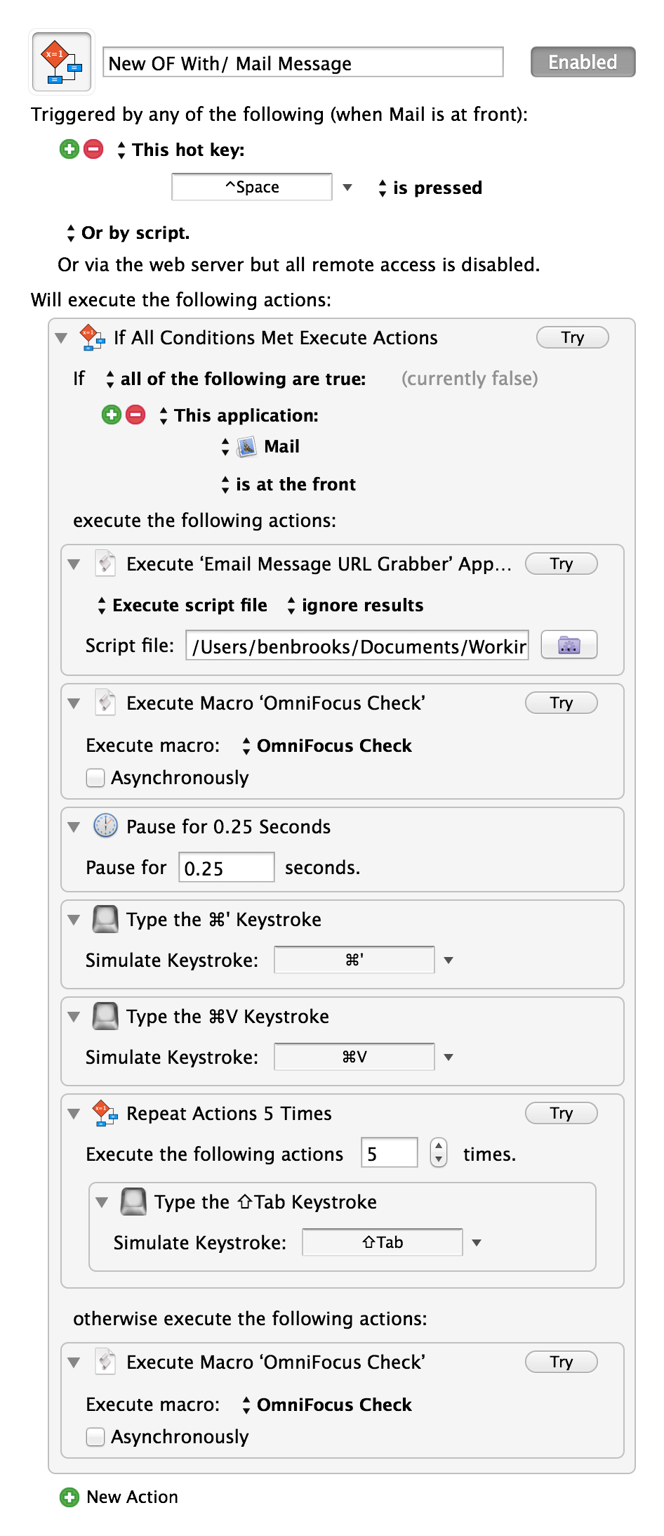
    The other day I posted a link to Matt Henderson where he created a system of adding mail message links in OmniFocus — it was neat — but used the OmniSync Server, so I didn’t want to use it. Today, Matt posted a follow-up creating a system whereby the entire process happens on your Mac.

    Be sure to take a look as he really has a clever system. I went ahead and did two tweaks to his macro:

    1. I moved his script to get the message URL into a script file as I couldn’t get it to work without that (and I prefer this flow anyways, for later editing of the script).
    2. I added in using Shawn Blanc’s excellent OopsieFocus script to make sure OmniFocus is running.

    The result is this:

    The ‘OmniFocus Check’ is simply a macro I have that runs Shawn’s above mentioned script. I’ve tested it, and it is fantastic — though I am not sure I want to keep it my normal shortcut, but for now I will. Thanks Matt.

  • Design Changes

    Earlier this week I pushed an update to the design of this site. Visually not a lot has change, but I reworked a bunch of little things. Notably I changed how the site displays the post metadata.

    I was never happy with this part of the design before so I’ve been rethinking it. Now you see the post type (e.g. Quote of the Day, Linked, Article) at the top followed by the author (if necessary), reading time (for articles), and date. I really like how this looks — though some tweaks to the space between the metadata and the post title is needed.

    Also, if you are wondering, the date serves as the permalink if you need it for quotes and linked items.

    In the footer I added a popular post widget and some links to other stuff I am up to. The goal there is just to consolidate my presence and hopefully show some trending stuff — no matter how old the post is. (That home screen organization post is always a top post for some reason, I love it and it may be the geekiest thing I do. I also have an update coming in that front.)

    The biggest design change happened on the single post view. Here I added a bunch of, well, crap. This site has been suffering from declining visitors, and declining revenue, and say what you want about it being about the “content” — sometimes you also need to get the word out. That’s my goal. I’m not married to having social buttons, and related post links, BUT thus far these items have tripled incoming social referrers.

    So, yeah.

    Oh, and I quite like the related posts deal from Jetpack ((A real bitch to style.)) , it’s fun for me to see other posts on a topic. Really fun actually. So whether it helps with traffic or not, I’m keeping it for my own enjoyment.

    Let me know what you think of these minor changes and remember this site’s design is always a work in progress. This latest update takes me to my sixth version — or sixth version that I feel wants a version number increase.

  • The Surface and Windows 8 Problem

    Ben Thompson has a piece up today with his reasoning for killing off the Surface, and even though I disagree with him — I also largely don’t give a shit what Microsoft does with the Surface — far more interesting to me is why Windows 8 failed so miserably.

    Windows 8 seemed like everything users wanted, but yet, nope. I’ve been thinking on this for a few days now and I have a theory: Windows 8 failed because of the Windows third party developers. And while I hate to pin the blame there, I do think a large part of the blame should be heaped on them.

    When you look at a Mac, or iOS app, you can usually tell that it is a Mac or iOS app. You may not know for sure, but there are telltale signs — and while many of these apps look completely different, you can still tell.

    That’s because users of Apple platforms have no tolerance for shitty design.

    Windows, on the other hand, has always been chockfull of shitty design. Some of the software that companies rely on the most still looks like they did twenty years ago. And therein lies a major problem.

    Windows cannot advance its design and feature set unless it also pushes it developers to do so too.

    Imagine a world where Windows 8 launched the same as it is today, but that the top 100(0) Windows apps also launched with fully redesigned UIs to match windows 8 and a touch interface to boot.

    Imagine where the Surface and Windows 8 would be today had that happened. It would have been a gold rush if you ask me. Forget the failings of Windows 8, or why you might not use it, and look strictly at what most people use: shitty Windows.

    Windows 8 is less shitty looking ((I have a theory that many employees don’t want better software, because then they have less excuses as to why work is done.)) , but imagine if the software that only ran on Windows 8 was substantially less shitty looking. Man would employees be clamoring to get to use that.

    In other words, to put this in terms you can relate to, Windows pre-8 was like the iPhone pre retina display, Windows 8 is like iPhone with retina display, larger screen, and iOS 7 all at once. Now imagine barely any apps updated for all three of those issues — you’d hate the iPhone if that were the case because it would be unusable garbage.

    The iPhone only made those leaps because developers invested the time to make those leaps. So far, it doesn’t look like the same is happening with Windows developers, and that is a major issue.

  • Print Sale

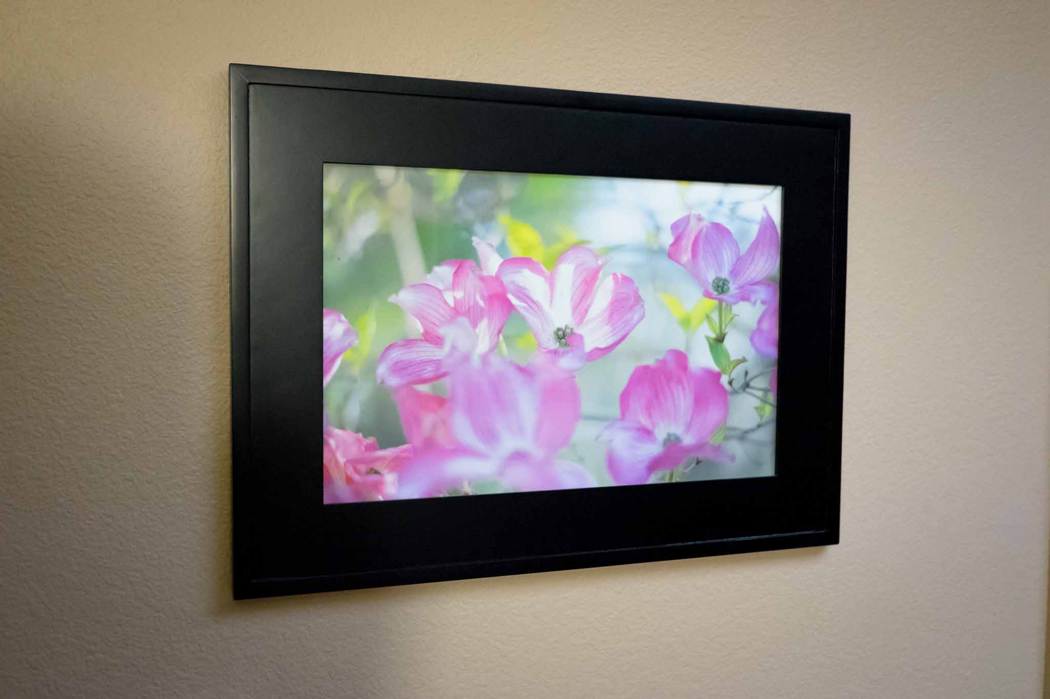
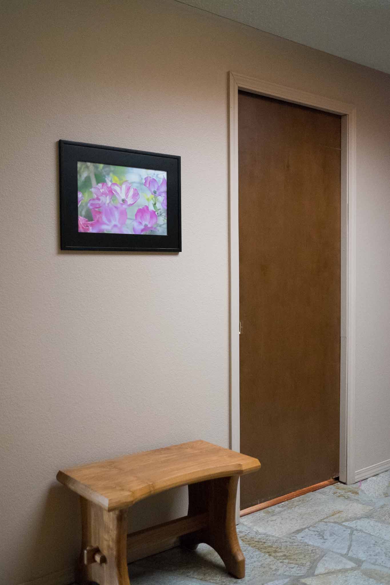
    Recently I was printing out a bunch of photos to update pictures around our home. One of them I printed out to replace a photo we had been using in the same frame for the past five years — that pictures resides in our entry. The new picture seemed brighter, it looked better, and I liked it, so I thought it would be a nice change of pace form the black and white image that hung by our entry.

    I made a snap decision to print the photo on water color paper, and when it was done I was blown away by how great it looks. The photo is now hanging in our entry way, and I stop and look at it every time I pass. I don’t really like this type of gloating, but this image — when printed — makes me exceedingly happy when I look at it. In fact quite a few visitors to our home have remarked on it, which bring us to this post.

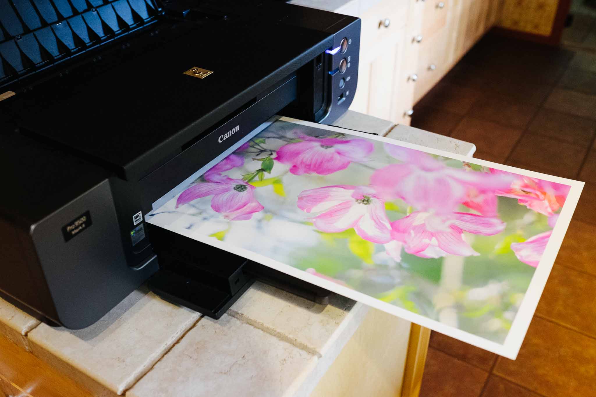
    I’d like to offer this image for sale as a limited edition print. I am offering two sizes printed and signed by me on water color paper (this paper) on my Canon PIXMA PRO 9500 mkII. The pricing and sizing is as follows:

    • 12” x 18” image printed on a 13” x 19” piece of water color paper for $150, signed (on the back).
    • 8” x 10” image printed on a 8.5” x 11” piece of water color paper for $50, signed (on the back). Note: because this size format does not fit the natural image aspect ratio, some cropping will occur.

    The limited edition factor is not quantity based — though I will write the print number on each image with my signature — it’s limited edition because I will guarantee this will be the only time I offer this image for sale on water color paper. The water color paper gives this image a very lovely feel to it, less ‘printed photo’ and more art.

    This site is directly supported by you the readers and members, and right now it just breaks even. The goal of this print sale is to raise money for the purchase of items to review. What items, you might ask? I have a long list and once I figure out how much money all of this raises I will be putting those items to a vote. You tell me what you want to see reviewed.

    Shipping is hard. Shipping costs $10 for US, and $20 outside of the US. All prints will be handled with cotton gloves and will be packaged with extreme care.

    To order, head here. Sale ends June 6th, 2014.

    Note about shipping times: I will be shipping on a continual basis. I hope to have prints shipped within 14 days of ordering.

  • Why I Moved Back to Ulysses III

    When iA’s Writer Pro came out I promptly switched over to it (having previously being a huge Writer fan) and I was largely happy using it over Ulysses III. The difference is splitting hairs in the simplicity realm of writing, but I’ve come to find out that single hair makes a very large difference to me.

    Both Ulysses III and Writer Pro are exceptionally simple. Writer Pro is a no-nonsense ‘here is what I am, and that is all there is’, type of app. Ulysses III is more of a ‘this is your writing space and it is as simple as you want it to be’, type of app.

    Both are simple, just in very different ways.

    To me the complexity inherent in Writer Pro is evident in two areas:

    • The modes are the first stage. Where you actively have to think about what part of the writing process you are in. That’s a great tool overall, but one cannot argue that on some level it adds psychological overhead to the process of writing. “Wait, I want to write, but I am in edit mode.”
    • The file storage is the biggest area of concern for me in Writer. Writer Pro relies on simple text files, yes, but those files can be stored anywhere, or in varying folders within iCloud. Each must then be opened by themselves in new windows and thus managing your files becomes more complex than in an app that manages files for you. In other words you have to think about organizing those files.

    Ulysses suffers from different levels of complexity:

    • It is meant to house all of your writings. Which is great because they are all there, but also they are all there. You see everything when you have more than just the editor window open — and that’s just distracting. Though to be fair, CMD+1 removes all that visual clutter.
    • Unlike Writer Pro, Ulysses has options — and those options can lead to a more complex tool. The way they are presented keeps things on the simpler side, but options adds complexity.

    In my opinion, Writer Pro is actually the more complicated app to use.

    Everything you do in Writer Pro, outside of writing and editing, must be done somewhere else — not in the app. So while Writer Pro is more simple, it adds more complexity to my overall workflow as I need more and more tools to do something — anything — with that text I just labored over.

    In a nutshell that’s the top reason I am back with Ulysses after a stint with Writer Pro: Ulysses affords me the ability to interact with my texts after I am done writing them and keeps them all in one depository. I can do more with one app in Ulysses than I can in Writer Pro.

    Of course there are a few other reasons why I came back, and in no particular order here those are:

    • I think the overall design of Ulysses is better than Writer. And if I don’t like the design, I can just change the colors and fonts. The flexibility is there, but not a distraction as can be in so many other apps.
    • Variable typewriter scrolling is amazing. I like the line I am writing on to be static in position, but I don’t like that position to be the middle of my screen, or maybe I do. With variable typewriter scrolling I can decide on the fly where I want that line to be. It’s fantastic.
    • It’s nice to use, nice to work with, and constantly being improved.
    • Feels like a notebook with endless pages and a notebook always feels like endless possibilities for new ideas and thoughts. Writer feels like an endless stack of sheets of paper, where they will get lost and are limiting in usefulness. You don’t go into the most important meeting you’ll have this year with a stack of loose paper — you choose a fine notebook.
    • I like the document states in Writer Pro, but I’ve been able to replicate them (and more) with tagging in Ulysses.
    • Color and fonts: I can choose them. I can tweak them, and Ulysses remembers that I like my light theme in window mode and my dark theme in fullscreen mode.
    • Daedalus is better on iPhone than Writer Pro. But, you likely disagree with me. It’s an odd duck, but I really like it. (And you can install your own fonts to it to match your Mac!)

    Of course there are somethings that are still not so great:

    • I really don’t like the process for adding links. If you paste a markdown formatted link, then the app doesn’t recognize it properly. So you have to start the process and paste in the link when the popup appears. If I hadn’t figured out how to automate this with Keyboard Maestro this would have been a deal breaker.
    • Markdown is not copied by default. Instead you have to use a different keyboard shortcut — maybe. Actually the secondary copy shortcut can be one of many formats and which one is based off of the format you used last. Which is not only annoying, it’s inconsistent with logic of any kind. Just let me set what type of text ‘copy’ copies.
    • Lack of publishing support to weblogs. It’s been promised, but it’s not here yet. This is something that any writing app should have at this point in time.

    Overall though, still one of the best writing apps I have ever used, and the best I have found for OS X.

  • Updates From the Past

    When I first started computing, updates were a rare thing. Sure they happened, but not often and not always for free. The updates had to be shipped to you, on some sort of physical media which was not only annoying, but slow as well.

    Then the internet and software downloads came along and changed all that. Programs could be rapidly updated to take into account other changes to operating systems and time in general. Things became easier and faster. Good all around.

    Then Apple’s App Stores came along. With the App Store updates and downloads and buying is easier and better than ever. Well, except that the App Store has thrown us back in time with app updates. Unless a developer requests the limited emergency update protocol, the nuclear option, it can take a week (or more, or less) to get an update to users.

    Which really isn’t acceptable to anyone. Not developers, not users. Well, except maybe Apple, they seem happy to leave things as they are.

    If something breaks in an app you rely on because Apple updated OS X, and you purchased that app from the App Store, well now you get to wait.

    And wait.

    Work?

    What work?

    Oh, there’s the update. Thanks Apple.

  • Roles of iPad

    A lot of keyboards have been strained over the furious typing surrounding the future of the iPad recently. All of these posts seem to be all over the place. Some calling for doom, some (most?) confused, and others saying ‘pshaw, all is good’. I think it would be helpful to look at what the iPad is actually good at doing — but do note that by using the word ‘good’ I don’t necessarily mean ‘better’ — what’s it’s not so good at, and then see if we can suss out this confusion.

    Best Uses

    Here’s what I find to be the best use cases for the iPad, as it currently functions:

    • Web browsing. Sorry, even with limited access to some sites you just won’t find a better way to browse the web.
    • Gaming. Yes console games are great, PC games are epic, and iPhone games are handy. To me the iPad strikes a great balance and I always find myself fully immersed in a game when I play it on my iPad.
    • Hand written notes. Paper is better, but Paper is pretty sweet. That, and apps like Notability make things a lot easier than taking notes on any other device.
    • Short bursts of computing. If I have to watch my kids I’m not bringing in my laptop out while they are playing. It’s too many interruptions for my laptop to hold up well, but the iPad lives for this type of usage. Grab it for 5 minutes, or 10 seconds, or 10 hours — doesn’t matter — you can easily pick it up and put it down and do what you need, or want, to do.
    • Reading. Your Kindle is great and all, and you can read on the Mac or iPhone, but the iPad is very good for reading too. It’s certainly better than your laptop, possibly your phone depending on where you are.
    • Outlining. I find outlining on a computer to feel silly, after all it doesn’t take much more to write it out since I am already on the computer. But the iPad is well suited for outlining as it’s onscreen keyboard helps to keep outlines short and to the point.
    • Media. You may think the iPad is too heavy to hold to watch a movie, but have you tried holding a laptop or TV to watch a movie? And your iPhone is super light, but also tiny.

    With the exception of maybe two of the above ((Outlining and web browsing.)) , people have historically bought specially made tools to do just one of the things on the lists above. The iPad packages them all up, and cumulatively at a cheaper price. It’s no slouch.

    I’m reminded of this from Ricardo Mori:

    That what the iPad does better is exactly the fact that it can do many things well. The iPad, for me, shines exactly because of the staggering amount of things it does well — there is no other tablet capable of doing something like this. You may say that this or that other tablet are better than the iPad at performing certain tasks, but they lack the iPad’s overall versatility.

    Worst Uses

    Now, it’s not all good. There are a great many things that iPad does not (yet) do very well:

    • Spreadsheets. I don’t even bother. It’s fine to view them, but shit to make a high quality spreadsheet on the iPad.
    • Writing is unless you attach a real keyboard. I love the onscreen keyboard, but even I don’t love to write long form on it.
    • Page layout. lol
    • Coding. LOL
    • Sharing files. I loathe having to send something to someone from my iPad. “Send me that PDF.” Trying 5 apps later I found it and sent it, what a pain.
    • Working with reference material is too big a chore on a single app display device.

    There are a lot more options you can add to either list, but those are the rudimentary things which people like to note about the iPad.

    So is it a failure?

    The truth is no one knows yet, but moreover you must define failure. Failure to make money for Apple? Surely not. Failure to rid the world of PCs? Absolutely. Failure to cure world hunger? Miserable failure.

    I counter such notions of the iPad being a failure with a series of questions:

    • Does a Camry fail because it is not a Ferrari?
    • Does a Ferrari fail because it is not a Jeep?
    • Does a MacBook Air fail because it is not a Mac Pro?

    Of course not.

    The only people truly disappointed with the iPad right now is Wall Street, because Wall Street is stupid. Wall Street lives and breathes on bullet points and future potential. How well is the iPad fighting the bullet point war? Not well, but only because Apple doesn’t care to fight that war.

    And because the iPad doesn’t fair well when compared on bullet points alone — and doesn’t care to fair well — Wall Street just doesn’t get iPads. And when you think you are the smartest people in the room (the room being Wall Street and the people being ‘analysts’) and you come across something you don’t understand, you naturally believe it is because there is nothing to understand — and therefore it will soon die. ((Also there’s the very plausible argument that iPad upgrade cycles are far longer than that of iPhones. Which, come to think of it, is all I should have written for this post.))

  • The Best Camera

    I’ve always felt that my best images come from my best camera(s). Yet as it turns out, the images that are my favorite are always shitty ((Shitty is to mean, blurry, poorly composed, poorly exposed, etc.)) snapshots that tell the story of my daily life and are captured with whatever is on hand — sometimes that is my best camera, but mostly these days it is my iPhone.

    But it doesn’t really matter, well the camera that is, as 51% of photographers will tell you: “the best camera is the one you have with you”. I’m constantly reminded of this as I dig through my archives of images. Like this shot snapped on a rainy, misty, and relatively boring hike that my buddy and I took quite a while back now.

    Literally everything we saw that day was some shade of green with flat light from the rain/mist. It was an average hike with wasted energy mostly spent on carrying camera gear we didn’t want to use for fear of it getting too wet. But that image turned out really well and I didn’t even realize it was there until just recently. And it was shot not with my best camera just a camera. Slightly off center, probably shot full auto, eye level, on a wet miserable hike and I love it.

    The camera doesn’t matter to me in hindsight , and I doubt I would have grabbed a much better image with a better camera. Just a different image, ever so slightly different, taken in more or less the same sloppy fashion.

    I hate the mantra that the best camera is the one with you, but in hindsight it does seem to hold true — well, kind of. You see in hindsight, and even now, we don’t really know what images we are missing, or missed. I don’t know what other images I could have had on that hike if I had tripods, lenses, dSLRs, ND filters, and patience. I don’t know, and I don’t care to try and think back on it.

    What I do know, is that I don’t give a shit what camera I took and image with after I’ve taken the image. I only care about the camera when I am taking the picture, and more often then not I can’t stand not having my ‘best’ camera to take the image.

    ‘The best camera’ doesn’t mean anything to me anymore, instead I sit back and greatly enjoy the simple images like this, instead of admiring the ‘better’ images like this.

    I will always find it more enjoyable to take a picture with my best camera, but I find that no matter what camera I use to make the picture, my enjoyment of the picture is never diminished by which camera I used at the time.

    It is, then, only in the process of making the image that I care about the camera. Once the image is there, I tend to only care about the image itself.

  • Working with Flow

    Back in December I wrote about how I had switched from OmniFocus to Flow (getflow.com) as my task management system. I don’t think one can really get a sense as to how good a task management tool like this is until they’ve use it for a year, but I wanted to update you on a few things I have been finding now that I have close to six months of usage under my belt.

    These are random thoughts in no particular order.

    Lists, Workspaces, And Sub-Lists

    The organization of Flow is much different than many other task management apps I have used. For starters Flow allows you to have many different sections where you can have different collaborators — Flow calls these ‘workspaces’ and they make a lot of sense. Flow is giving a nod to today’s work environment where people are often working with others who are not necessarily a part of their company, but an important piece of the overall project.

    Workspaces in that sense work really well, and I have four setup:
    – Personal
    – Day Job
    – Project 1
    – Project 2

    What’s odd is that Flow won’t allow you to set one workspace as your personal workspace. Instead Flow is always showing you your personal workspace as if it was a 15 person team’s workspace. That’s a bit annoying because there could be simple changes made to a fully private space to make it more useful. Things like changing ‘comments’ to ‘notes’, and turning off the rather useless dashboard (useless that is only if you are the only person in the workspace).

    Lists

    Flow further breaks down your task storage with lists, residing inside workspaces. Each list can have sub-lists, and all of that gives you a very GTD/OmniFocus ‘project’ based planning tool. I’ve been playing around with these lists and have come to realize a few things:

    • Lists should absolutely be project based when in a workspace with more people than just you. Having just one master ‘to-do’ list simply doesn’t work once you start working in a team setting.
    • In your personal workspace lists work really well for categorizing your tasks. (e.g. Costco, Office, Home, Bills, etc)
    • Sub-lists are great for showing small projects inside of categories in both team and personal settings. So you can have a master list of ‘Design’ and then break that down into the different designs you need (e.g. Tutorial, Icon, etc).

    It’d be fine if Flow stopped there, but it also allows adding sub-tasks to a main task. So if my task is “buy groceries for party” then I can add sub tasks within that task that is my actual shopping list, which is useful if said task doesn’t just fit into my ‘Costco’ list, or if I want to take a trip to Costco just for that set of items.

    At first I thought sub-tasks solely added another layer of obfuscation to my task management, but I have come to find that it is actually very handy. While I don’t use it for my shopping lists (as I cited in the above example) — I have found it to be killer when a task suddenly becomes so much more than just another task. These are like mini-projects in a way. Not always useful, but indispensable when you come across the need for sub-tasks.

    One issue with sub-tasks is that the main task is only ever shown and complete or incomplete, no matter how many sub tasks have been completed. Therefore you could have a task with 19 of 20 sub tasks done, but it still looks just as incomplete as it did when it was originally created. I’d love for there to be more indication of status in Flow (for sub-tasks and in general).

    iOS is buggy

    I’ve found that the iOS apps are rather buggy (which is odd since they mostly feel like web views). By this I mean that often I have to quit the app out of the tray, or log back in, to get the app working. Recent updates have improved this, but it is very annoying.

    The iPad app is really annoying because it is portrait only, I just don’t get this move.

    Overall I am downgrading my initial ratings of the iOS apps to average at best.

    Fluid is great

    Since there is no full-fledged Mac app I run Flow in a Fluid instance. That’s not always ideal, but for this app it actually works really well. The biggest annoyance is the lack of native keyboard shortcuts, but I haven’t been bothered by this enough to consider it a deal breaker.

    Menubar is perfect

    The official menubar app for Mac works perfectly for quick entry, but it is annoying that a workspace is pre-defined instead of easily being typed in. To change workspaces requires touching the mouse, and I really try to avoid that if I want to do anything “quick”. Also the lack of repeating options in the entry panel is limiting if you regularly create repeating tasks. You actually have to jump into another Flow app to make a task repeating.

    Random Annoyances

    Right now here are some of the main annoyances I am facing:

    • Repeating tasks need some work. You have to create a task before you can repeat it, as I stated above, and that’s rather annoying. I’d also like to be able to set repeat dates like ‘first monday each month’ and ‘the 5th, or the closest day to it not on the weekend, each month’, but so far I don’t know of any app that does such “sophisticated” of repeat patterns.
    • Lack of start dates is killing me. I think OmniFocus spoiled me here as I constantly am deferring tasks as a way to have a defacto start date mechanism. This is the only thing making me want to go back to OmniFocus.
    • Need real iOS apps, not just web views and not a portrait only iPad app. It’s just crazy. I reiterate this because of how imperative it is.
    • Quicker way to defer tasks is needed badly. Often something comes up and I know I won’t get to any of today’s tasks until tomorrow. In OmniFocus I could use a script to defer everything, or key through the due fields to enter new times, in Flow I have several clicks on each task to defer them. This is as close to a deal breaker as I have come with Flow.

    Overall

    I am still sticking with Flow, but only for now, as it is only better than OmniFocus in some ways and not all. The real question is whether the areas that Flow is better in are worth some of the reduced functionality and only more time will tell on that front.

  • Additional Fujifilm X-M1 Images

    Shawn Blanc pointed out after I posted my review that I didn’t include enough images of the camera itself. I’m posting now to rectify that oversight.

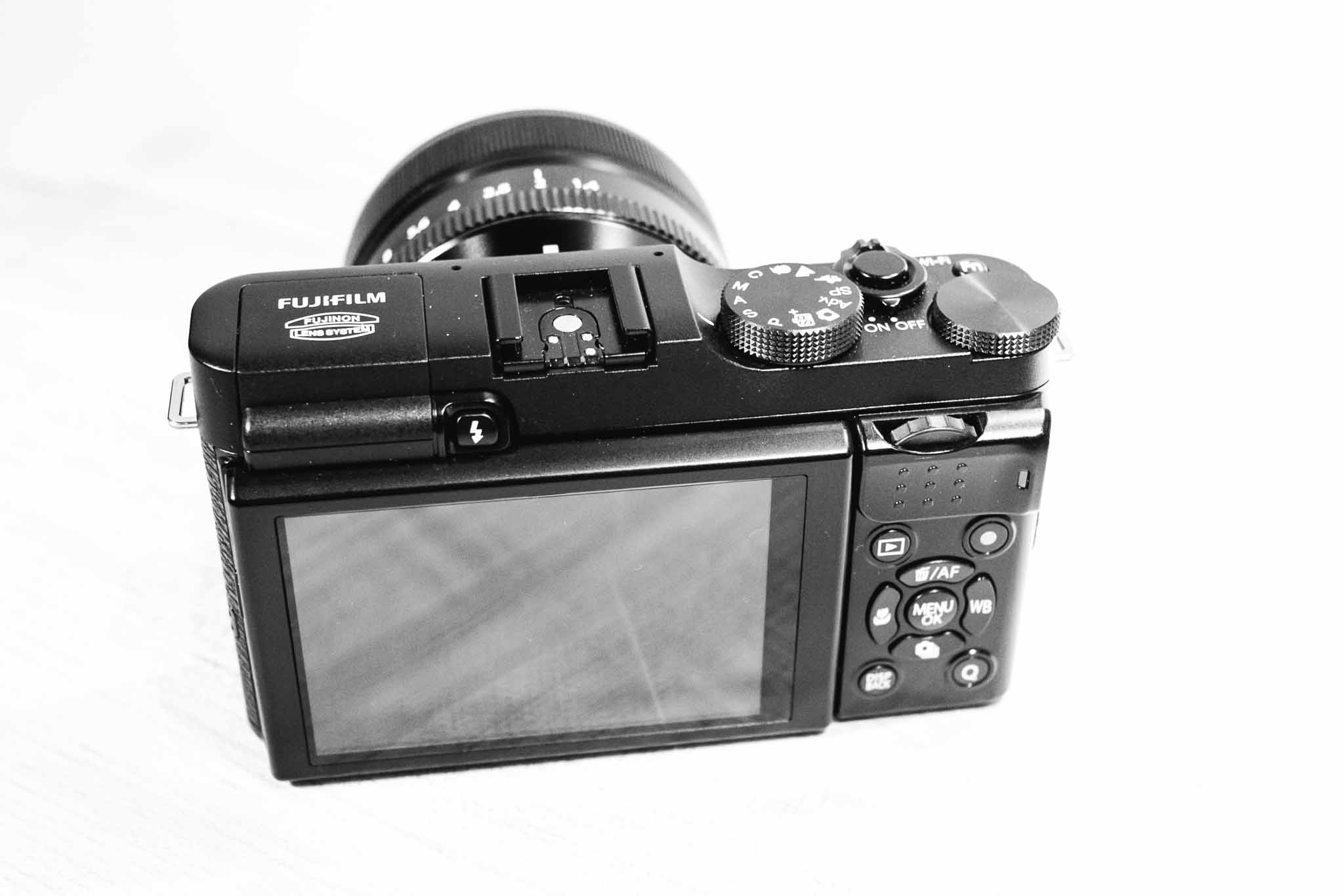
    Back of camera, illustrating that dial I am not a fan of.

    With the 35mm f/1.4 lens attached.

    With the 27mm f/2.8 pancake (silver variant) attached.

    With the 35mm f/1.4 lens attached.

    With the 27mm f/2.8 pancake (silver variant) attached.

    With the 35mm f/1.4 lens attached.

  • Review: Fujifilm X-M1

    Disclaimer: This is a review camera sent to me from Fujifilm America for the explicit purpose of a review. No money changed hands, nor was there any restriction on what I may or may not write.

    While older, and therefore far less exciting than some of the newer cameras coming out (e.g. X-E2, and X-T1) the X-M1 is a very interesting model. Some would look at it as an ‘entry’ level camera, but in this case that isn’t being very accurate.

    The X-M1 is smaller than the other X-series camera and lacks many of the manual controls that makes the line popular, but that doesn’t mean it is a dumbed down camera. What’s interesting about Fujifilm is that they don’t really hold back features for the sake of up-selling customers. So the X-M1 has the more traditional ‘Mode’ dial instead of the shutter speed, but otherwise it functions similarly to the X-E2, just in a smaller package.

    Most notably the camera still has the X-Trans sensor (though the older version 1 sensor, not the X-Trans II) and it still has WiFi and yet adds on a tillable LCD.

    Featureless this camera is not.

    I’ve been keen to try this camera ever since I realized two things:

    1. The X100s is about the same size as my X-E2 and thus seems silly to buy.
    2. I really want to leave a good digital camera with my wife, while still also having one for me to carry, but I don’t want more lenses.

    The latter is what pushed me to looking at the X-M1, so it was by happy coincidence that Fujifilm offered to send me one.

    Handling

    The X-M1 is not only a more compact offering (with the same APS-C sized sensor), but it is also a less expensive offering. Due to that last fact, the build of the camera is much different from the other Fujifilm cameras I reviewed — it’s made of plastic. Still the camera feels solid to hold and use, but there are a few aspects that I have yet to get used to.

    The rear dial control is the first of those. On the X-E2 and X-T1 this is a horizontally placed dial. You can push in, or jog it left or right. It makes sense. On the X-M1 this is still horizontal, but positioned so that the dial spins on an axis parallel to the ground — or positioned vertically like it would be if it were on the top of the camera. It’s not bad, but it really is in an awkward spot for my thumb to reach.

    I think because of that, I found myself wishing the exposure compensation dial (which is unmarked, and has no stops at either end allowing it to spin all the way around) was a dial that you could reassign. This would be near perfect for the camera, however, you cannot reprogram that button — and I do find the X-M1 to have one less programmable button than what I really need.

    My complaints stop there though. As the body is very compact for the size of sensor, and quality of lenses, but still boasts niceties like a tilting LCD display.

    I’m not even sure I shot with that display flush to the camera the entire time I used it — the tilting display is really nice to have after you go without one for a while.

    Outside of the dial issue, I find little complain about on the X-M1’s handling. It doesn’t handle like the X-E2 and X-T1, instead opting for a more traditional configuration (like what you would find on most dSLRs, or micro four thirds offerings) and feels a lot like my old Panasonic GX1 to me.

    Image Quality

    I was surprised by just how good the older X-Trans sensor is, in fact the only noticeable difference I could detect is better noise handling in the X-Trans II sensor at ISO 6400. Beyond that it looks and feels like my ‘other’ Fuji X-Trans files.

    To me this is the best I could have hoped for and I am very impressed. This is a smaller and cheaper camera, but is only a slight notch under the newer camera in image quality.

    Overall Thoughts

    The majority of my usage of the X-M1 was with the 27mm pancake lens attached. This combination is perfect, as it is sharp, fast-ish, and yet very compact with a useful focal length. I do wish that the pancake wasn’t only an f/2.8 lens — a stop faster would do wonders for indoor photography.

    In all I am torn about this little camera. I love that it is smaller, but I do miss the view finder. More than anything though is that I miss the shutter speed dial (instead the X-M1 has the more common ‘mode’ dial and isn’t nearly as fun to use).

    This is a solid family camera, and can be had for really great prices now. I’m thinking about adding one just so that I have a camera which can kick around the house, and car, but can still accept my other lenses if I need a backup camera for something. I can’t wait to see how the camera is updated, as I suspect it will become only more tempting.

    It’s not a replacement, or even competitor, to the X-E2 and above X-system cameras, but it is a very good and increasingly inexpensive camera. I’d be more than happy with it as my full-time camera and I think you would be mistaken to think this is an entry level camera.

    Buy It

    Photos

    Update: I’ve posted additional images of the camera, here.

    Fujifilm X-M1, 1/4000s 35mm @ f1/.4 ISO 200

    Fujifilm X-M1, 1/550s 27mm @ f/4.5 ISO 400

    Fujifilm X-M1, 1/900s 27mm @ f/6.4 ISO 400

    Fujifilm X-M1, 1/2000s 27mm @ f/2.8 ISO 400