Category: Articles

  • Camera Filters

    With the bettering of smart phone cameras and a growing general interest in digital photography one thing that gets left out of geeky talk is the use of on-lens filters. Not the filters that you apply after you take an image (ala Instagram), but filters you stick on the front of your lens prior to taking the photo.

    I’m not a trained photographer, but I have had experience with many of these filters and I wanted to share a few thoughts for those of you moving towards more pricey digital cameras. (I wish they made some filters for the iPhone — then again that’d be silly.)

    A Note About Filters and Prices

    There’s two really important things to remember when purchasing any filter:

    1. You are putting another piece of glass between your scene and the image sensor. With every piece of glass your image quality can degrade. Don’t put a $20 filter on the front of a $1,000 lens. Buy high-quality filters or your really sharp lens may not be so sharp anymore.
    2. Adding more glass can increase lens flare and other “undesirable” things. (Though this could be good if you aspire to be JJ Abrams, but bad if you want clean and crisp photos.)

    There are things that help reduce these factors, but keep those two important points in mind before you click ‘buy’ on anything or read any further.

    UV Filter

    This may be the most common of camera filters. The UV filter is essentially a clear filter that goes on your camera lens (some people call them “protective” filters too). These filters serve two purposes:

    1. To help block UV rays from the actual film inside the camera.
    2. To protect the front lens element from damage.

    With digital cameras, for the most part, my understanding is that these filters are only useful for protecting the front lens.

    In other words, I personally skip these filters, but if you are prone to bashing your camera around then maybe you need one — but buy a high-quality filter in that case. Remember $150 for a filter is far less than your lens cost.

    For the most part you can skip these filters and just smirk when people tell you that you need one.

    CP Filter

    The Circular Polarizing filter is the one filter I would encourage you to get. Like polarized sunglasses it can cut down on glare. The circular part means that the filter (once attached) can rotate independently of the lens so that you can shift the polarization.

    Update: I was mistaken here as the circular part refers to the type of polarization. My apologies.

    This comes in handy for photographing reflective surfaces as you can truly cut down the reflections, or capture better (subjective) color when shooting landscapes.

    Wikipedia actually has a good article on the usage of CP filters with some great example shots. I highly, highly, recommend you have one of these and the Wikipedia article is a good place to start understanding why (just look at the photo comparisons if nothing else).

    It is important to note that depending on the filter you select, you will lose some light coming into the lens, so they aren’t made for shooting in low-light. If you shoot products ((Bloggers, that’s you.)), landscapes, or real estate this is a must have.

    Specialty

    There’s also three specialty filters that I want to mention, as you may bump into them as you look around.

    Close Up Filter

    To take a really close up picture of an item you need to buy a true macro lens. Short of that are specialty filters called “close up” that allow you to get the lens closer to the item while maintaing focus — creating a poor-mans macro lens.

    I really do not recommend these. They are just magnifying glasses (more or less). I’ve only ever owned one and I was really underwhelmed by it. Better to save up for a macro lens and fake it until then. ((By faking it I mean you just take the photo from farther away at f/8+ and then crop in tighter on the item.))

    Neutral Density Filter

    Have you ever seen those shots of ocean waves, or waterfalls, and the water looks like a fine smooth blurry mist? Those are long exposure shots — slower shutter speed — and a neutral density filter was most likely (but not always) used to get the them.

    Essentially an ND filter is sunglasses for your lens, making a bright afternoon much darker. The neutral part denotes the fact that they do not change the coloring of the photo, but you really need to spend good money if you want a truly neutral filter.

    They are sold in “stops” meaning how much light they block out. Again, if you shoot water this is a great tool and dead simple to use. (Though you will need a tripod when using one.)

    Graduated Neutral Density Filter

    Like the ND filter, the GND filter seeks to stop down the light in the image. Unlike the ND filter it doesn’t do it over the entire front of the lens. This is what landscape photographers love to use, as typically half of the filter is an ND and the other half is clear. The graduation comes into play because there is no hard line between the two halves, instead they gradually blend into each other.

    This allows you to stop down the sky, but not the terrain, creating a (hopefully) better exposed image. ((That’s a highly subjective statement, as I mean technically well exposed. Lest we forget that photography is art and there is no right or wrong.))

    I would not recommend buying a GND filter that screws on to the front of your lens. Buy a square filter, where you can just hold it in front of your lens, allowing you to adjust the angle and position of the graduation depending on the scene.

    Do note that you can fake this a bit digitally (Lightroom has a tool for this), but the results just aren’t quite the same as you would get with a filter.

    Coatings, Brands & Prices (etc)

    Coatings

    You will notice some filters saying things like MRC — this is a type of coating applied to the glass on the filter. The better the coating, the better the glare/lens flare control is, I am told. Overall it’s best to look for filters with the MRC moniker and buy those.

    I’ve used a ton of MRC and Kaesemann MRC filters and have been very happy with them.

    Brands

    I’ve bought all sorts of brands, but the ones I trust are:

    • B+W (pro-sumer type grade, and mostly what I own/buy)
    • Heliopan (more expensive)
    • Lee (pro-level gear)
    • Rodenstock (very expensive)

    Prices

    As far as prices go you can spend a lot or very little. I personally don’t think it’s worth wasting money on cheap filters, but I don’t make money from my photography either, so I try not to waste all my money on expensive filters.

    Here are the filters I recommend:

    Etc.

    Some things to note as you look through filters:

    1. They come in different sizes. I linked to 46mm versions as that is common in micro-4/3, but your lens should be marked with its size. Be sure to check that before you buy anything. (Larger sized filters cost more, sorry.)
    2. You may run across “slim” filters but be warned that they often prevent you from attaching a lens cap. They are slimmer, so they have nothing to attach a standard lens cap to. Non-slim filters should work with your lens cap.
    3. The Lee filters that I linked to above are square/rectangles. They make holders for them but don’t bother. You can just hold them in front of your camera and shoot — you are going to want a tripod anyways.

    Wrap

    Right now, for my micro-4/3 setup I only have a CP filter, and I will likely get a GND next and an ND last. You don’t need a filter to get good photos but it can help you get the photos you envision and they are a lot of fun to play with.

  • Selling My Canon Gear [Updated Pricing]

    I have posted up all of my Canon dSLR lenses in a Canon Forum (you need to register to view them, didn’t know that when I originally posted this. I’ve added pictures here and can send you photos if you are interested.) — they are all for sale and include:

    – [Canon 50mm f/1.4](http://photography-on-the.net/forum/showthread.php?t=1353358) `$250`
    – [Canon 17-40mm f/4 L](http://photography-on-the.net/forum/showthread.php?t=1353356) `$530`
    – [Canon 80-200mm f/2.8 L](http://photography-on-the.net/forum/showthread.php?t=1353354) (old-school lens) `$575`
    – [Canon 100mm f/2](http://photography-on-the.net/forum/showthread.php?t=1353353) `$330`

    *All prices include shipping within the US.*

    The prices, details, and pictures can be found there. If I sell off all those lenses, then my Canon 5D classic will also be for sale. You need not join that forum, just get in touch with me if you are interested in picking any of them up. As an added bonus, any reader of this site that buys one gets a free membership (just let me know you want that).

    *Note: I am selling off all of this gear to go micro four-thirds only, it’s just about the quality of my Canon and far more likely to be with me. I haven’t used most of my Canon gear regularly for a year and half.*

    All sold. Thanks

  • Zappos Says Goodbye to Bosses

    [Jena McGregor writing on holacracy at Zappos](http://www.washingtonpost.com/blogs/on-leadership/wp/2014/01/03/zappos-gets-rid-of-all-managers/):

    > In addition, there are no managers in the classically defined sense. Instead, there are people known as “lead links” who have the ability to assign employees to roles or remove them from them, but who are not in a position to actually tell people what to do. Decisions about what each role entails and how various teams should function are instead made by a governing process of people from each circle. Bunch does note, however, that at Zappos the broadest circles can to some extent tell sub-groups what they’re accountable for doing.

    I had a hard time reading this post as it is so chocked full of
    ‘business consultant’ buzzwords that I couldn’t stop simultaneously giggling and rolling my eyes.

    I don’t know much about the holacracy business structure, and [Wikipedia has a rather vague look at it](https://en.wikipedia.org/wiki/Holacracy) so I am guessing a bit here and trusting the article — but what it sounds like to me is a way of ‘rebranding’ managers. Let’s not call them managers, let’s call them “leads”, or what have you.

    It’ll be interesting to see if this works out, but I just don’t see it scaling well. I bet it will work, but I bet it won’t fit the model set out. ((Meaning I bet there will still be managers, they just won’t be called managers.))

    What strikes me as most interesting though: why would anyone want to work at a company like this?

    If you worked at Zappos and wanted to apply for a job somewhere else — but you didn’t have a job title or management position — how in the world do you market yourself? “I was the circle lead for in-house development?”

    What the fuck does that mean? ((Not that any job title anywhere makes any sense. “Senior Project Manager III”, huh?

  • ‘App Store ratings are broken, let’s get rid of them’

    [Peter Cohen](http://www.imore.com/its-time-admit-app-store-ratings-are-broken-and-get-rid-them):

    > My preference is to get rid of the rating system all together. It’s too easy to abuse and provides no useful context to inform App Store customers. I’d love to see it abolished all together, because I don’t see a way to make it work.

    [Marco Arment commenting on Cohen’s post](http://www.marco.org/2014/01/03/app-store-ratings-are-broken):

    > Eliminating the star ratings but leaving the written reviews would eliminate a lot of developer headaches and much of the motivation behind the annoying “Rate This App” epidemic that’s interrupting and annoying iOS customers and infecting, embarrassing, and devaluing almost all modern iOS apps.

    Yeah, it sounds great, but would make for a horrible experience for the users. The App Store is so chocked full of shit apps that there are usually only four ways to find the good apps:

    1. Reviewers
    2. Top Paid/Free/Grossing
    3. Main App Store screen
    4. Searching and looking at star ratings

    Your typical user will do all of those except `#1`. And`#4` is something that I would guess *everyone* does. I do that every time I do app round ups. Removing ratings leaves only two ways for users to discover apps — and developers are already having a tough time with discoverability.

    Getting rid of star ratings would only make discoverability harder in the App Store as *no one* wants to read a bunch reviews and try to parse for themselves if the app is good or not.

    There *must* be some kind of glance-able method for users to quickly determine if the app is good.

    Here’s a few alternatives that *might* work, but that I haven’t fully thought out:

    1. Replace star ratings with a favorite/reccomend button. Have no mechanism other than a written review for not liking an app. Thus users can get a sense of how many people think the app is worth a favorite. This takes away the ambiguity of 1-5 and instead makes it: do you like it or not?
    2. No ratings, only written reviews. BUT each app gets a little badge showing how many users *currently* have the app installed. Therefore you can judge the popularity of an app by installed base. And thus deleting the app from your phone is voting for the app in dislike.
    3. Allow all ratings, but force users to show their real names as shown on their credit card which is linked to the account. Therefore you cannot rate as “angrymofo10”, you instead see your name next to your shitty review. This is obviously highly unlikely.
    4. [Do this](http://blog.jaredsinclair.com/post/70498658794/solving-the-app-store-discovery-problem-with-app).

    I vote for `#4`.

    Star ratings *can* work and I would use Amazon as the prime example. I don’t take star ratings as gospel, but you cannot ignore a product with 500+ ratings that has a 4.5 star average.

    There’s a problem in the App Store ratings and there always has been, but I don’t think getting rid of star ratings solves the problem.

  • When Anonymous Isn’t Really Anonymous

    Over the past couple of weeks there has been a little website making the rounds. [On the site the user is asked just 25 questions](http://www.nytimes.com/interactive/2013/12/20/sunday-review/dialect-quiz-map.html?_r=0) — each question about word choice. It’s a multiple choice quiz for U.S. residents that seeks to identify where your language most likely comes from — and the questions are innocuous enough: “What do you call that strip of grass between the street and the sidewalk?”

    Nothing about the quiz makes you think they are actually going to be accurate. And yet, the site is stunningly accurate. It reminds me of yet another quiz — a [little electronic toy that plays the 20 questions game with you](http://www.20q.net). All you need to do is to think about something — hell tell the crowd in the room what you are thinking of, the toy can’t hear — and then truthfully answer its questions. I’ve only seen it fail to get the answer once, and that’s because the word was an esoteric Japanese tradition.

    Both of these tools are a bit of engineering amazement, but they also both foretell how powerful computational power can be. If you have a large enough database to query, you only need so many search parameters before you get *the* answer you were looking for — it seems logical, but in practice feels a bit magical.

    So, if a website can narrow down where you likely live, or grew up, by only asking 25 questions about your word choices — then I think you have to seriously wonder how close someone can get to actually identifying you if they are given the “anonymized” data that Google holds on users.

    The question: can we truly anonymize data?

    It seems like it would be a trivial task for Google/NSA to go from an anonymous user ID to ‘Ben Brooks’ if they properly mined my data — and if we can accept that as a given (I think it is hard not to believe that is possible), then the question really becomes: is assigning a user ID truly a means of making something anonymous?

    I’m not sure it is.

    Let’s just take what Google knows about you and strip it down to the bare minimum data that *I* (not having any targeted advertising knowledge) would guess a marketer might want to know to better target their ads at me:

    – Interests
    – Keywords from email
    – Keywords from Social Posting
    – Keywords from Searches
    – Location
    – Age
    – Sex
    – Sexual Orientation (gleaned from correspondence and searches)
    – Occupation
    – Marital Status

    That’s a fairly intrusive list, but I highly doubt exhaustive of all the data points Google is tracking for every user they have — and seemingly innocuous when looked at point by point. I’d wager that given that data set you could match my data with my name and I don’t think it would take long, or be hard to do — even if the data is only shown to belong to user #110923849108234098.

    Again a $20 toy can “read your mind” asking only 20 questions. A website can effectively know where you developed your language patterns from asking just 25 questions.

    How hard do you really think it would be for the computing power of any large company to reverse all the thousands (millions?) of data points they have and find *you*?

    That’s part of the problem with data collection: that no matter what it’s not a truly anonymous data set — it’s just a slightly less _identifiable_ data set. You are effectively throwing a blanket over and object you want to hide instead of actually hiding the object. You can still see the size and shape, so educated guesses are fairly easy.

  • Long Live the Camera

    Craig Mod, [in an article he wrote for *The New Yorker*](http://www.newyorker.com/online/blogs/elements/2013/12/goodbye-cameras.html):

    > But I returned with the unshakeable feeling that I’m done with cameras, and that most of us are, if we aren’t already.

    I was getting all worked up at this point — I am passionate about cameras, photography, and well camera gear — but Mod went on:

    > But it seems clear that in a couple of years, with an iPhone 6S in our pockets, it will be nearly impossible to justify taking a dedicated camera on trips like the Kumano Kodo pilgrimage.

    And:

    > In the same way that the transition from film to digital is now taken for granted, the shift from cameras to networked devices with lenses should be obvious.

    It’s hard to read this article and disagree with it at the same time. It’s a smart article, which isn’t talking about the demise of the camera, but the resurgence and rejuvenation of the camera. As a kid I remember hearing: “Did you remember the camera?” But more and more as an adult I am hearing: “Did you post that to Facebook/Instagram *yet*?”

    It’s that distinction — of worrying not about having a camera, but about sharing — that I think really drives home Mod’s point. I can’t agree with Mod’s notion that he doesn’t notice differences in the quality of the photos, or that he finds shooting on the iPhone better, but I do agree that I will pull out my iPhone and snap a few shots so I can share them right away even if I was shooting with a camera already. And I agree that editing photos on a touch screen is far superior and _immersive_ than with a mouse/keyboard.

    Near the end Mod summarizes:

    > It’s clear now that the Nikon D70 and its ilk were a stopgap between that old Leica M3 that I coveted over a decade ago and the smartphones we photograph with today.

    In order to agree with Mod you have to forget the ‘pro’ argument — there will always be pros that need pro level gear — what Mod is getting at is that the average person will be increasingly happy with their smartphone cameras. That’s something I wholeheartedly agree with.

    If I was a camera manufacturer right now I would be looking at creating a platform that works *with* smartphones. Something like:

    1. Snap a photo on the camera.
    2. It is automagically sent to the app on your smartphone/tablet.
    3. Edit and post from the app on the smartphone.
    4. Both original and edited image are sent off to your archive location of choice.

    There’s a few things such a system would accomplish for photography enthusiasts:

    – You would get to take images with a *better* camera, but still get all the benefits of having taken that image with a phone.
    – You wouldn’t ever have to download images to a computer. They are already shared, and archived. If one needed/wanted an image on a Mac then you could grab the archive from a web service and do what you need to do.

    There are some systems that attempt this, but they are shitty. They are shitty because they don’t understand the two aspects that make such system *better*: why the user wants it, and how the service needs to act.

    The user wants this to make their life easier — in other words it should be no more complicated than remembering to shoot with your “good” camera instead of your phone. And of course in order to achieve that level of ease, the service *must* be flawless in its implementation.

    Apple’s Photo Stream works exceedingly well, and effectively what I am talking about is cameras being able to pipe *directly* into a system like Photo Stream. This is where the real challenge comes (getting a web-connection on a camera, getting a universal like system, etc.) and where I doubt this is done without a partnership between a phone maker and a camera company. But, one can dream.

  • Review: The Olympus OM-D E-M5


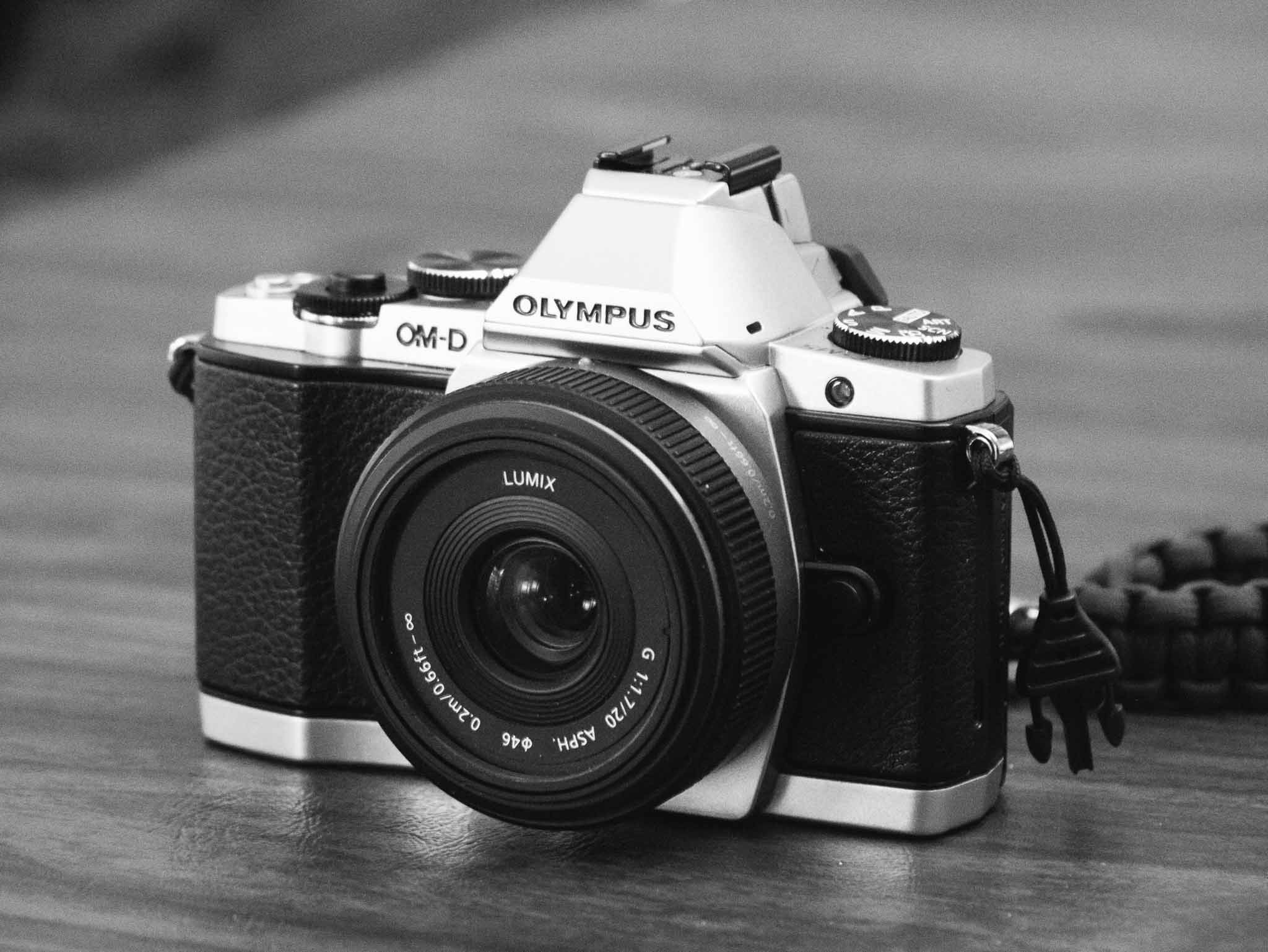
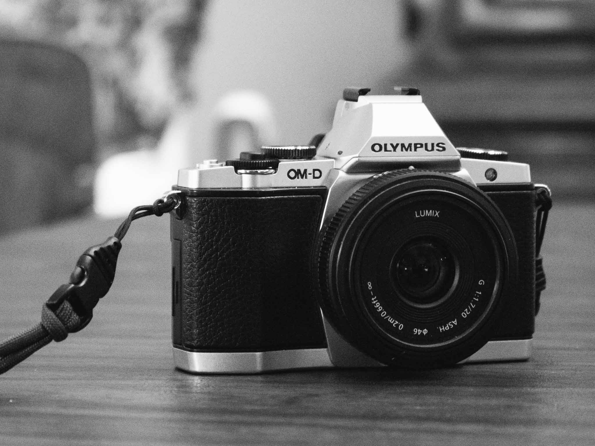
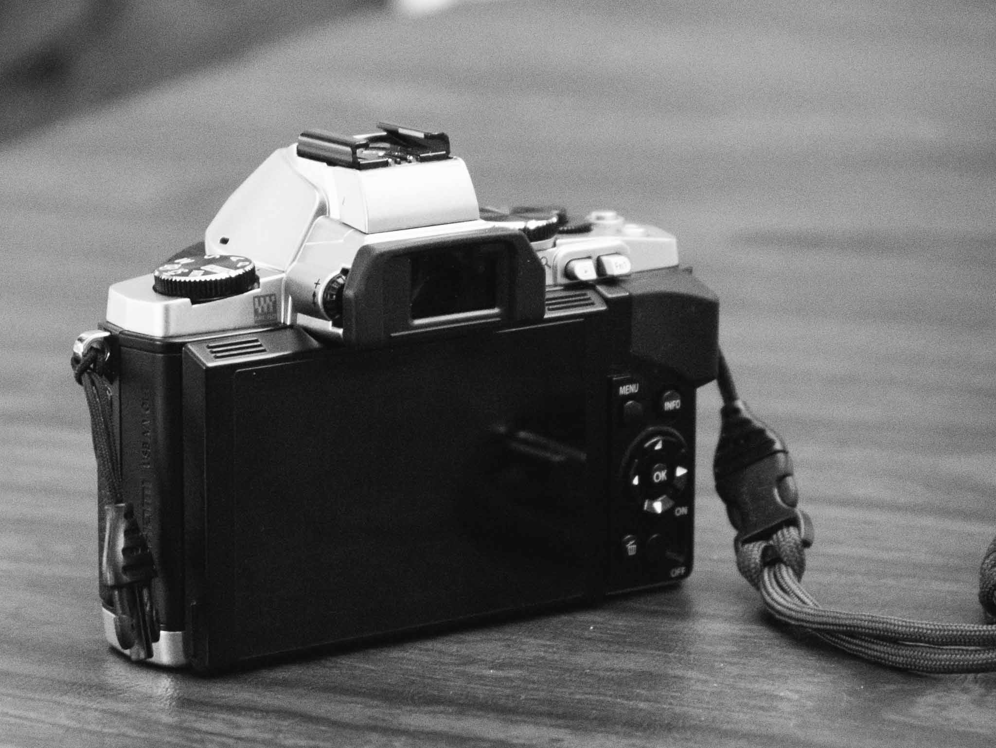
    The Olympus OM-D E-M5 was released a year and a half ago and is coming up on its second anniversary rather quickly, even so it is the camera I chose to replace my beloved Panasonic GX1. (You can read a great review of the E-M5 from Steve Huff.) ((Also, here’s my GX1 review.))

    Shawn Blanc and I often chat about cameras, well, actually we send links to each other and drool over new gear — that’s part of the “fun” of photography. A few months ago (maybe?) I told Shawn: “I am beginning to think the best/smartest/cheapest way to buy a new camera is to wait until it’s a year old.”

    At the time I was looking to update the GX1, but it was a half-hearted endeavor as the GX1 works phenomenally well for me and I don’t really need a new camera. But I wanted one, so I kept my eyes out for deals and kept lusting over different options.

    As luck would have it I landed the OM-D E-M5 for a great price, but before I bought the E-M5 I was seriously considering these four cameras:

    Panasonic GX7: This was the natural evolution for me as it is effectively the new model of my current GX1. I won’t lie: this was my first choice. The reviews of the GX7 are only solid and it seems a waste of money to ignore the fact that there are other, more passionately reviewed, cameras to be had. There seemed to be something intangible missing from the GX7 and that seemed reason enough to keep looking.

    Panasonic GM1: This looks like a beast of a small camera. Lots of people like it, and have great passion for it. What turned me off the camera is that this seems like a new venture: insanely small and still fully-functional. In other words it sounds like the original MacBook Air to me — which tells me to wait for the next revision of the camera. Also by the time I researched this camera I was pretty well decided on wanting to get an electronic view finder this time — instead of just an LCD display — and that’s something the GM1 doesn’t have. The one thing I really miss from a full sized DSLR is the viewfinder for composing my images. ((Though I must say, now that I have a viewfinder again I find that I am using it far less than I would have assumed.))

    Fujifilm X-pro 1: I cannot tell you how much I want this camera. By all accounts this is a fantastic camera that boasts an APS-C sized sensor — much larger than the micro four-thirds sensors — which is a huge benefit when it comes to image feel on shallow depth of field photos. While micro four-thirds cameras are getting better, nothing beats a full frame sensor, but APS-C is closer to full frame (most entry level DSLRs use APS-C sensor sizes to put that into perspective) than a micro four-thirds camera and thus the X-Pro-1 is very appealing in this size class. But the X-Pro 1, as great as it maybe, is not great looking (this matters to me) and would set me back almost $1,700, since it uses its own lens mount, requiring me to buy a new lens) and not just a camera body. The price alone was enough to eliminate this camera from the running for now.

    Fujifilm e-x2: Another great camera, but this one newer and better looking than the X-pro 1, and again with a similar large sensor. Still, though, the overall price of buying a new lens made this unrealistic this time around for me — though I still very much would love to get this camera, I had to pick buying this and not having a lens, or finding a cheaper body.

    Side note: One line of cameras I did not consider is the Sony cameras. While many people like them, and they seem to be well regarded, I have never liked them whenever I held/shot them. My father has the NEX-7 and I just don’t like the controls or feel of the camera overall. I can’t explain this better, but it’s just not a camera system that I really enjoy and therefore is not interesting to me.

    As you can see the OM-D wasn’t even something I considered while shopping. The main reason I glossed over the camera was because I thought it was too big, looked to DSLR-ish, and so forth. I thought these other offerings would be better and I came within a click of buying the GX7 — but then I stopped.

    I read reviews, I looked around, and came to the OM-D E-M5 — even with its ridiculous name — and began to see it as a great buy. It packed a bunch of features that I wanted and was missing from the GX1, would be a true upgrade, wouldn’t be too much bigger, and would fit all the gear I currently have. It sounded like a win on paper.

    Why the E-M5

    The first question you may be asking yourself is why the E-M5 and not the newer E-M1? There are three reasons:

    1. The image quality isn’t substantially better between the two as far as I can discern from reading a ton of reviews. The E-M1 is better, but I don’t think the gap in performance is enough to justify the price premium of the E-M1.
    2. The body on the E-M1 is much bigger, and that’s something I’m trying to avoid with this class of camera and the E-M5 is quite a bit smaller in use. If I was to consider the E-M1, I would also be looking at the Canon 5D/7D series as I have many excellent lenses that fit Canons — and once a camera is at a certain size getting a bigger camera isn’t that much of a difference.
    3. Price. The E-M1 is hot and new, and is priced accordingly. This time around I was trying to get the best bang for my buck, while staying as inexpensive as I could.

    The latter two reasons are why I stayed away from the E-M1. It is the better camera, but it likely isn’t the better camera for me. It costs a lot more and is purposefully built larger, and I really didn’t want something substantially larger.

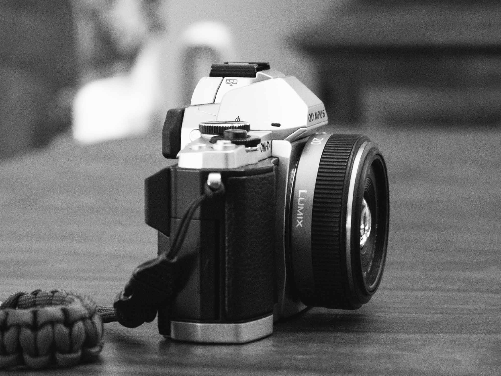
    I have owned a DSLR for years and have found that I tend not to use cameras that are bulky to carry around. I love using them, but I never take them with me so they never get used. One of the reasons I love the GX1 is because it is small enough to stash in a jacket when going out — and I use the camera more because of that. Small is important to me, and it seemed that the E-M5 is in the elite ranks of quality but still small enough to carry around — though not as easy to carry around as the GX1. ((The biggest size difference is in the height, as the E-M5’s viewfinder makes it stick up quite a bit more.))

    Steve Huff, in his review of the OM-D EM-1, lists out the advantages of the EM-1 over the EM-5. There isn’t much said about the image sensor, and a lot said about the physical aspects of the camera and a lot of nice-to-haves. Huff even points this out:

    This [E-M1] is an amazing camera because the E-M5 is amazing the way it is. Add these improvements and you have something special that usually only comes around every 2-3 years.

    Seems like the EM-5 is a fantastic, top-tier camera, but smaller than the EM-1. To me that’s like choosing a slightly smaller computer with slightly lower specs than the bigger version because you know the smaller computer will fit you better.

    Love It

    The E-M5 blew me away on the first day I used it. Not only does the design look great, ((I am a sucker for the old-school looking silver and black cameras that are popular (again) today.)) but the image stabilization on this camera is phenomenal (more on that in a bit). Overall I have found two things to be true about this camera:

    1. It is an absolute joy to shoot with.
    2. It produces surprisingly great images. And I don’t mean that in the way that a person who just bought their first ‘real’ camera means it: “Gee, this DSLR takes way better pictures than my Nokia.” I mean it in the sense that the images feel like they should be coming from a much larger, much more expensive, camera body. They feel like they should be coming from my 5D — except there are many shots I have been taking with the E-M5 that even the 5D couldn’t capture given the relatively low ISO range of my much older 5D.

    The E-M5 is still small, but it is bigger and weighs more than the GX1 so it’s not as pocketable, but what you get in return is absolute top-notch quality. There’s a reason Steve Huff chose the EM-1 as the camera of the year (2013), and not a Lieca, or Sony A7 — there’s a lot to love about the OM-D lineup of cameras. (In case you are wondering the Sony RX1 was his 2012 pick while the EM-5 was in second place, or his “second pick” as he puts it.)

    I’ve found the E-M5 produces excellent images and is a joy to shoot with.

    Image Stabilization

    The one tech-spec that sets the E-M5 leaps ahead of all my other cameras is the image stabilization (IS). I have Canon IS lenses, but my GX1 and most of the primes I shoot with on the 5D lack IS of any kind. The IS on the E-M5 is outstanding, but keep in mind I have nothing to compare it to other than my few IS Canon lenses.

    So instead, something that speaks for itself:

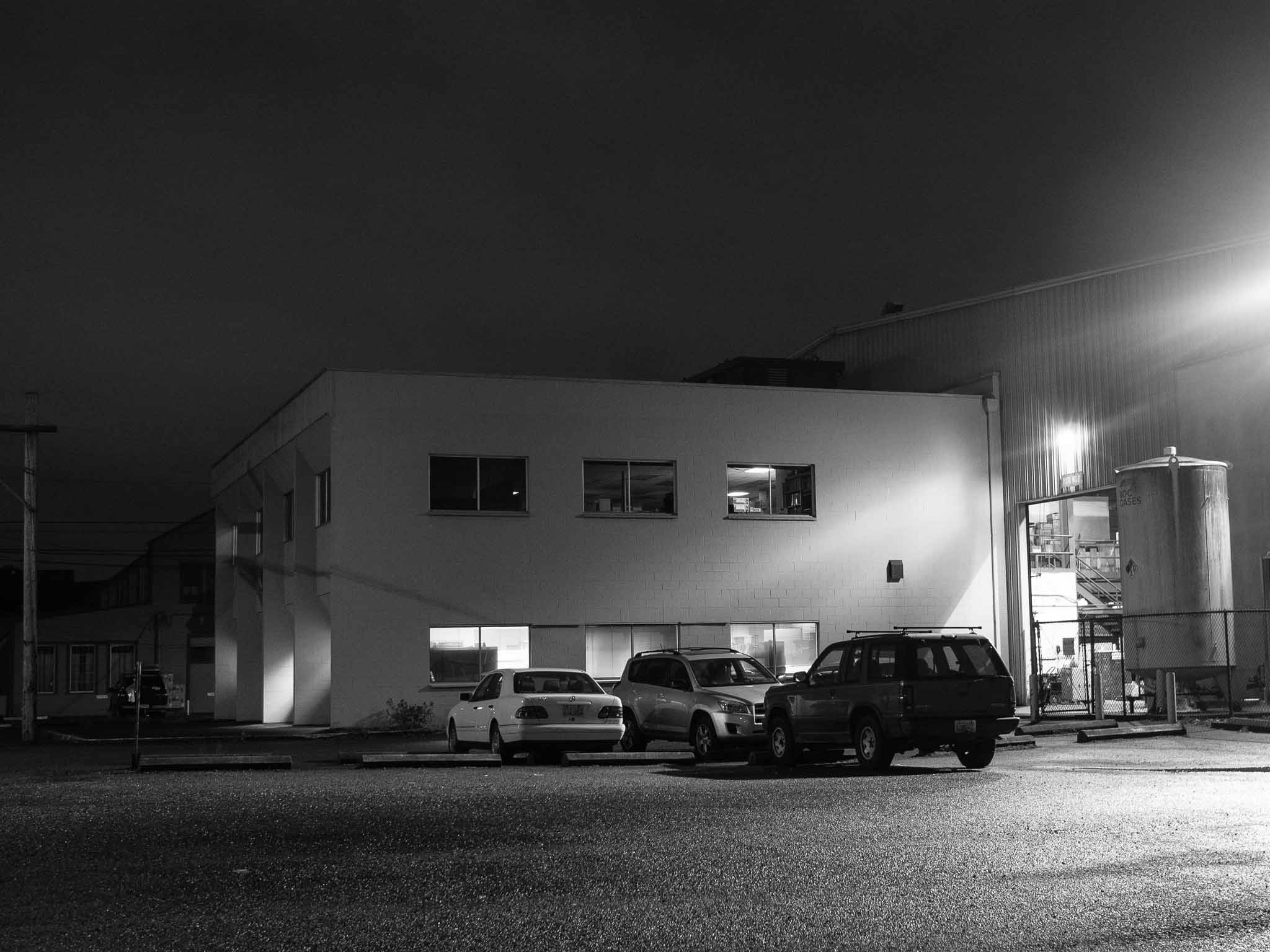
    The above image was shot, handheld, with a shutter speed of 0.4 seconds (by comparison typical logic says I shouldn’t even get a crisp picture with a slower shutter than 1/30th a second). Now, my arms were supported. Basically I had my elbows propped on the arms of the chair, but no other support. The image is just as sharp as an image I shot seconds later at 1/100th of a second.

    That just blows my mind. It’s not a practical application in that most of the time I won’t be able to support my arms in that way — but I truly didn’t think that image possible before I took it.

    Practically speaking you shouldn’t expect to be able to hand hold any camera at that speed, but it’s an extreme example, that helps to show how good the 5-axis IS in the E-M5 really is. For the most part I have yet to find a situation where I got a blurry image because of a slow shutter — this takes yet another “worry” out of photography for me. ((This is not limited to the E-M5, but I am not out to compare it against all the models out there — I value my sanity too much.))

    More serious photographers may balk at this, but let’s face facts: most images that people take are going to be snapshots. Things like phenomenal IS and high-ISO are important for snapshots. The image stabilization alone has made the E-M5 worth the upgrade for me.

    Feel

    I’ve held hundreds of cameras and shot regularly with dozens of DSLRs and 35mm SLRs, I’ve held and tried dozens of small interchangeable lens cameras, and I’ve owned countless point and shoots over the years.

    I speak with experience when I say: the feel of a good camera in your hand is unmistakeable.

    To me, the Canon 5D series (I’ve shot with both my MKI and a MKII) feel absolutely perfect in my hands. Whereas most point and shoots, and cell phones are cumbersome to hold for framing a perfect shot with a steady hand. With micro four-thirds it’s been hit and miss with how these cameras feel in my hand, typically feeling too light or too small.

    The GX1 was very light, but was just about as small as I could hold stable with my hands. The GX1 always lacked good grip spots, and that too has been a complaint on the E-M5 for some. (Note: you can buy an overpriced grip to fix that issue, or just get the larger EM-1 that addresses that directly.) This is one tradeoff with smaller cameras: smaller area for large hands to grip.

    The E-M5 however feels very nice in my hand. While the front grip is shallow, the thumb grip on the rear gives you a strong leverage point over the camera — which is needed as I wouldn’t describe the E-M5 has lightweight.

    The real winner of the EM-5 is that weight. This is a camera that feels solid, well built — it feels like a tank and I love it. The GX1 doesn’t feel bad in general, but it doesn’t feel nearly as great as the E-M5 in comparison.

    Issues

    You’ll find lots of people talking about different issues with any camera. I am going to skip past the tech-spec comparison issues, like battery life (it’s not bad, but not great) and instead focus on three things: an info display issue, button and dial placement/usage, and some high ISO banding issues.

    Shutter Speed Display

    No matter how you compose your image, the camera will show you the shutter speed and aperture. That’s common on any camera, but the way the E-M5 handles this display drives me nuts. No matter the display I look at, it is often not possible to tell if the shutter is 1/4 second, or 0.4 seconds. In either of those two cases the display will simply read: 4.

    Sometimes, SOMETIMES, the display will put something like 2” to denote that the camera is speaking in seconds — otherwise you are left to guess. In time I hope to be able to figure this one out, but for right now it is the single most annoying and frustrating thing about this camera.

    Buttons & Dials

    Every camera — especially every camera manufacturer — has a different philosophy about how and where buttons should be placed. The GX1 had a power button in a very convenient spot, so convenient that I accidentally turned the camera on/off more than once.

    The E-M5 has a similarly annoyingly placed power switch — though it is placed in a bit more DSLR standard location. It’s on the bottom right corner of the back of the camera.

    Here’s the thing: if you use the E-M5 one-handed (which is kind of the de facto way to use it) then you pick it up right handed — making it nearly impossible to turn the camera on with that same hand. It’s a finger contortionist move of olympic-level difficulty.

    If you can’t tell, the power switch is the biggest annoyance I have with the camera. It’s just in a bad spot, with bad switch style, and annoying.

    The dials though, they confuse(d) me a lot. There are two dials on the top of the EM-5. By default the one attached to the shutter sets the exposure compensation, and the larger dial changes settings for the camera mode you are in (e.g. Aperture in Aperture Priority mode).

    The entire dial setup is changeable, but completely backwards out of the box (at least for me). I switched the dials around, and also switched the direction you turn the dials to increase/decrease the settings.

    It’s my opinion that the E-M5 would be incredibly frustrating to use/learn if you couldn’t change around these dials. So if the dials bug you (and this may be due to my Canon background) be sure to change them before you pull your hair out trying to use the camera. It’s nice that I could change these, but a very odd default setting if you ask me.

    High ISO and Banding Issues

    UPDATE: I’ve gotten word this only happens when paired with the Panasonic 20mm f1.7 lens (which was my test lens). I am testing now with other lenses to confirm. Apologies. This is great news though.

    One of the first things I noticed when I started trying the camera is under very high ISO modes (3200+) there is visible banding in the images. You can see it in this photo below:

    (Here’s the same photo edited — you can hardly see the banding once edited.)

    Now, before I talk about this anymore I want to tell you my thinking on high ISO usage/importance.

    I am a photographer that will force my camera to shoot at the lowest possible ISO for as long as possible. I hate auto-ISO. I want control over my ISO. Not too long ago ISO 1600 was considered the upper limit of a useable image, but that above example? ISO 10,000. Yeah, it’s pretty useable.

    So here’s my high-ISO theory/advice: don’t worry about the image quality, because it’s likely an image that you could only get using a really high-ISO on a camera (any camera). It’s great if the image looks like an ISO 200 image, but it’s not necessary because almost every image shot at high-ISO is a snapshot. In other words a picture for documenting/remembering a moment and not a photo for a contest. ((This is my rule, get your own.))

    In a nutshell my feelings about banding on the EM-5 are twofold:

    1. The nerd in me hates that the banding is this obvious, because without the banding the noise is well controlled even at ISO 10,000. The banding is what makes this image less useable.
    2. The practical photographer in me realizes that getting a sharp image, even with banding, is better than getting a blur of unfocused people. Getting the image versus only having the mental picture makes the banding acceptable.

    In short: I am fine with the banding because it allows me to capture an image that I would otherwise likely not be able to get.

    Some will find this banding unacceptable though, so they should get an EM-1 where the issue is fixed from what I have read.

    The Photos

    I have been enjoying the heck out of this camera and I find the image quality to exceed my expectations for the E-M5. Here’s a bunch of photos I have snapped, in no particular order. (Fair warning: I tested over Christmas so there’s many photos of my daughter doing Christmas like stuff.)


    Buy It

    I love this camera.

    If you buy the OM-D EM-5 from this link, you help support the site — and I personally think this camera is worth every penny.

  • So You Thought DigitalOcean Was Great?

    I’ve never used DigitalOcean (and I’m glad about that), but I’ve been hearing about many people loving their service. There was an issue [posted on GitHub](https://github.com/fog/fog/issues/2525) detailing a flaw in the way user data was deleted from DigitalOcean servers. This flaw lead to data being “leaked” between user accounts. The discussion was then moved over to DigitalOcean [here](http://digitalocean.uservoice.com/forums/136585-digitalocean/suggestions/5280685-scrub-vms-on-delete-by-default).

    Essentially all data could be wiped, but it required the user to check a specific box, or call a poorly documented part of the API — in other words it was a bad design decision from DigitalOcean. This isn’t good at all, as Apache logs were being pulled from other user accounts.

    However, [DigitalOcean’s response was horrible](https://digitalocean.com/blog_posts/transparency-regarding-data-security). Instead of owning the issue and making a change, they offered a qualified excuse, committed to changing, and then (if the comments are any indication) lied about data being leaked.

    Here’s what DigitalOcean said in their post:

    > At no time was customer data “leaked” between accounts.

    Jeffrey Paul’s comment on that same post:

    > For fuck’s sake, now you’re just lying.

    > Not scrubbing has been the default – a user doesn’t have to “explicitly not scrub”.

    > If no customer data leaked between accounts, how was I able to read someone else’s stack traces[1], web logs[2], and customer tokens[3] on a freshly provisioned VM? (I am the person who got bitten by this dark pattern, investigated further, verified your error, filed the bug in fog, and then spent half my Monday auditing credentials because you LEAK DATA BETWEEN CUSTOMERS.)

    > What follows is evidence to directly support the claim that you’re lying through your teeth to save face after having been caught being grossly irresponsible with your customers’ data.

    > Please start acting like professionals.

    > [1] http://i.imgur.com/TMp2kdf.png

    > [2] http://i.imgur.com/WLv2qSE.png

    > [3] http://i.imgur.com/fJOxRN9.png

    There’s a few other comments supporting his claim too.

    I’d run away from DigitalOcean if I was using them.

  • Today in Misleading App Store Screenshots: FoxyLocks

    I regularly browse through the top apps just to see what kind of crap people are downloading, but today I came across a real gem in [FoxyLocks](https://itunes.apple.com/us/app/foxylocks/id773956272?mt=8).

    Don’t bother clicking that, it’s an app that claims to change the appearance of the iOS lock screen. Now, when you stop chuckling, take a look at the screenshots they provide:

    It’s pretty easy to guess what the app is doing: you pick your wallpaper photo and it overlays some crap to make it look like you are framing the content on the lock screen (though I bet this doesn’t work well with parallax, but who cares).

    What’s really great is that you will notice the image they want downloaders to assume is the “before” image is, in fact, from iOS 6 and the “after” is iOS 7. They say it right at the bottom in fine print, but no one reads that.

    This is the exact kind of bullshit misleading marketing that I would *expect* Apple to be weeding out of the App Store. It’s just trash marketing that should get developers banned.

  • ‘Do You Want to Write?’

    [Michael Lopp, writing about Writer Pro](http://randsinrepose.com/archives/do-you-want-to-write/):
    > Preferences are a sign of design laziness; they are an indication the people responsible for building the application don’t have enough empathy or desire to do the work they intend to be paid for: design the application so I that I can work, not think about how I might work.

    He listed Word, Excel, and Photoshop as examples of “kitchen sink” apps which are packed full of features. I’d add to that list OmniFocus. I think the above quote encapsulates my issues with a lot of apps these days in general.

    I’d recommend ignoring all the ridiculous stuff going around about patents surrounding Writer Pro (they’ve wisely decided to drop the whole thing) and just check out the app, especially if you make software. Writer Pro is an exercise in stripping an app down to what is needed, not what is asked for.

    There’s an old adage about how we got cars with tail fins in the mid-1950s. It goes something like this: “instead of asking people what they wanted in a new car, they started asking people what their neighbor would buy.” And then we got cars with fins.

    I can’t find a reference for this, but the adage seems to encapsulate the design decisions of a lot of software. Designing what *you* think the user wants instead of pairing things down to only what the user actually *needs*. It feels nearly impossible to do at times, especially if you dislike people emailing you screaming for features. But I think it is the direction that good, nay *great*, software is headed.

  • Chill

    [Jonathan Poritsky, in his well linked to take on Writer Pro](http://www.candlerblog.com/2013/12/23/no-thanks-ia/):

    > When I hand my money over to a developer, I want to at least feel like I’m the reason their product exists, that it otherwise wouldn’t but for my interest, support and cash. Goading other developers into forking over licensing fees undercuts that feeling for me. While the full patent application isn’t available yet, Reichenstein tweeted an image that has “Method of editing text in a text editor” listed as the “Title of Invention.” That sounds precisely like the sort of broad software patent that discourages innovation.

    I think the tactics iA is allegedly going to take is lame. But there’s a few small thoughts that I want to point out because I think we may be a bit premature here:

    1. Getting a patent isn’t bad. It’s likely the smartest move to protect yourself from other patent trolls. You fight nukes with nukes. iA didn’t start it, they likely just want to survive.
    2. Upon introducing the iPhone Steve Jobs made a snarky comment about all the patents in it. I don’t remember anyone doing anything but applauding him. Or doing anything but applauding their victory over Samsung. The size of the players shouldn’t change your “moral” stance.
    3. I don’t believe anyone has been sued over this yet.
    4. What if the licensing fee is *actually* reasonable and the US affirms the patent? Nothing much to complain about.

    As far as I can see, the worst iA has done is a shitty PR campaign. Maybe they can add PR tools into the next Writer update.

    We aren’t patent experts, we are bloggers. ((I’ll amend this to say some bloggers are patent experts. But I haven’t seen them chime in on this.)) Until something actually happens I say we simmer down a bit.

  • ‘”Patent Pending?” iA’s Militant Stance on Syntax Control in Writer Pro’

    [Weswanders in *The Verge* forums](http://www.theverge.com/2013/12/21/5234580/patent-pending-ias-militant-stance-on-syntax-control) (worth reading):

    >So, does iA actually have the exclusive right to the idea of Syntax Control, putting unsuspecting future developers on a collision course with iA? It appears the answer is no. What’s more, iA’s claims of beating everyone to the punch appear to be disingenuous at best.

    This is an absurd stance for iA to be taking with Writer Pro, because as it turns out the Syntax Control stuff is more or less baked into OS X and iOS. I can’t wait to see other developers add in Syntax Control.

    I am all for *every* writing app getting better. However, the hard part is always mixing and matching writing apps as more and more they want to play in their own sandboxes only.

    Writer Pro is the best writing app on iOS, but I think Ulysses III is likely still the best on OS X (I need more time with Writer Pro on OS X to make the a firm statement). But even if I wanted to use UIII and Writer Pro together — it would be easier to make my own writing app.

    The way I see it, right now:

    – Writer Pro is easily the prettiest of the lot.
    – Ulysses III has a fantastic organization and workflow system — the best of the lot.
    – Byword has the very wise ability to publish your writing to your blog.
    – Editorial makes my life easier with workflow automation.
    – Editorially makes shared editing a snap.

    I want the best of all this writing tools, but even if I wanted to use them all — I would be stuck copying and pasting all day long. Lame.

  • Switching to GetFlow.com (So Long OmniFocus)

    I’m a huge productivity nerd, wait, make that recovering productivity nerd — which means I am actually productive. (Doing work instead of fiddling with things heralded to make you more productive.)

    I got sidetracked there, sorry.

    I’ve used OmniFocus since it came out and kGTD before that. I also used Things for quite a while and I’ve had flings with other to-do systems in the meantime. I helped Kyle craft Begin into the simple to-do app it is today. New to-do list apps are familiar to me, I just tend to actively ignore them.

    Then Michael Lopp posted this:

    Over the course of the weekend, I moved everything I’m tracking into Asana. I’ve been using Asana on and off for a year. It’s added a little more friction and a little more religion to my task tracking process, but it’s also done something Things hasn’t done in years – it’s new bevy of functionality has me asking one of my favorite engineering questions, “How can I do this better?”

    There were some back and forth debates around Lopp’s post. I chimed in, saying I was going to look at other to-do options:

    My goal isn’t to try and leave OmniFocus, but to make sure OF still is the best solution for me. OF has gotten so ugly on the Mac and iPad I almost refuse to use it in those places. Which means I am essentially using the iPhone app, and even the new iPhone app isn’t the best looking app.

    I started with Asana and then tried almost every other multi-platform, modern, to-do list out there. Something full featured, something that can replace most of the functionality of OmniFocus, while also adding to it. In short: I was looking for an OmniFocus-like app that could also work with teams.

    I didn’t find one.

    What I found is Flow, a tool I hadn’t used in since it launched. Flow is primarily focused on team task management but I have been testing it as a standalone, single person, tool. While parts of the app are silly for a single user, it’s still useable as a personal tool, which means it passed my first test.

    Flow costs real money: An annual subscription instead of an upfront purchase, which I think is the main reason it has survived. Flow’s revenue depends on the company’s ability to keep the product moving forwards.

    The good news about Flow is that their most important app — the iPhone app — is the best of the lot. The iPad app is pretty good, but doesn’t support landscape orientation (odd). The Mac app is just a menubar quick entry app, which is quite nice because I can map it to a keyboard shortcut (like OmniFocus), but annoying that I have to run the Flow web app in a Fluid instance if I want a persistent view of my tasks. Overall the apps are solid.

    Flow is now mature and, with its team tools, feels like it’s trying hard to be anything but OmniFocus…

    On OmniFocus

    In testing, using, and helping to develop Begin I realized the shortcomings of OmniFocus. It’s a fantastic tool, but it’s long in the tooth. It needs more than a UI overhaul and I’m not confident that there is enough value in waiting for that. If OmniFocus is overhauled it will be top-notch once again.

    But why should I wait?

    The value I get using a better product while I wait for OmniFocus to be updated will far exceed the cost of shifting between tools if OmniFocus is ever improved. Not to mention that OmniFocus will seemingly never be multi-platform — it will always be within the realm of Apple.

    I love Apple but I loathe the idea of my important to-do lists being tied only to Apple products. Especially when it comes to teamwork — you just can’t force everyone to use Apple products (as much as I would love that) so multi-platform becomes a must have. ((Fair to say that Flow is a Mac tool with a web component, but that web component is all you really need these days to make something multi-platform.))

    The Flow

    I’m looking forward to rolling out Flow to all the people I work with as I think that will be the moment when it leap frogs OmniFocus in a big way.

    Flow has more structure than OmniFocus and, more importantly, a lot fewer GTD-styled features. While I’ve never been a strict GTD follower, I do appreciate many aspects of the system. It took quite a while to get comfortable in Flow given the change from a GTD focused system to a task/list focused system. Gone are contexts, projects, start dates, time estimates, etc. You have to make peace with the idea that you get your task, assign it to a list and set a due date. Basic to-do stuff, but it can feel shocking when you come from OmniFocus.

    Quick Reasons That I Really Like Flow

    Topping the list are features for teams. The lack of team functionality in full-featured to-do list apps is akin to the lack of cloud synchronization in to-do list apps just a couple of years ago.

    Team management is a must have feature for almost everyone working today.

    Beyond team functionality, here are two little things I love:

    • While OmniFocus supports notes on each task, I much prefer the comments field in Flow. I can use it as a running note log for myself on each non-team task. Say I have a task to call a person, but they don’t answer. The task is still important, so I reschedule it for tomorrow, but I still leave a note showing that I left a message. It becomes a quick activity log to tell me when I called, and how many times I called before I reached the person. Flow also shows a little log of who changed the due date, giving you a good idea of how badly you are delaying doing something.
    • Lists and Workspaces. OmniFocus uses Contexts, Projects, Groups, and Single Action Buckets. Ugh. Flow simplifies that to Workspaces and Lists. Changing workspaces changes everything, it’s like switching databases, and is a really great way to separate personal and professional to-do management within one app. Within each workspace you can have tons of separate lists for further to-do breakdowns. (You can view your tasks from different workspaces in one place too.) I’ve long abandoned using projects and contexts in OmniFocus, so lists are really all I need as a way to track things and I’m finding the simplicity of moving away from OmniFocus freeing.

    Overall I like Flow. My one complaint is that I truly do miss start dates. Due dates are great, but start dates are the way I love to work.

    For now, Flow is making me happier.

    Note

    I’m not prepared to do a full review of Flow just yet, I’ve only been using it for a few weeks. I am prepared to switch completely and start rolling it out to my office. I’ll report back after using it full-time for a while.

  • Why Tech Podcasts Bother Me

    Right now, the most requested feature of this site (from both members, and non-members) is for a podcast. I started preparing one; creating live streaming, live chat, its own site, found a person to partner with, etc. All I needed was a little design, some sponsors, and to start recording.

    Except that was months ago and I have very little motivation to do a podcast. My reasoning — excuse — is that I don’t have time. That, though, is mostly a lie. I have plenty of time to do a weekly podcast if I want.

    No, the real reason that I am not podcasting is because I’ve come to loathe the medium.

    Every time I think “OK, time to do that podcast", I start listening to some podcasts, and then I quickly fall 20, 30, 40 episodes behind, because really podcasts are largely a pile of shit and they bore the crap out of me. ((I sometimes feel like they are only recorded so hosts can complement each other while they jerk-off.))

    I’ve been thinking about why I feel this way and I think it’s largely focused around the goal of most (but not all) podcasters. Whether explicitly stated, or implied, most tech podcasters seek to create "a podcast that allows you to listen in on two good friends chatting about topics you’re interested in". That sounds great on the surface but in reality I don’t want to listen in on two people I barely know talking about things.

    The reason I don’t want to listen in is because two friends talking are never on point. Subjects jump, there are insider jokes/back stories that I don’t get — but most of all I’d rather be a part of that conversation than a party eavesdropping on that conversation.

    If you’ve never listened to the This American Life podcast, then I apologize because the rest of this post will make little sense. TAL is the best podcast out there — the scripting, pacing, research, and editing is top notch. The show feels casual, but has enough format, flow, and scripting that it becomes comfortable to listen to, instead of wanting to join in on. I think this is what most people desire to create, but don’t understand why having a casual chat doesn’t create this. ((I am among those people.))

    The goal of a podcast should not be that the podcasters enjoy the show, but that the listeners enjoy the show. I think that’s lost on most podcast hosts.

    Who is talking should be less important than what’s being said — just like writing a blog — and yet that’s not the case.

    The who has become more important than the content.

    Most popular tech podcasts are between 60-120 minutes each, recorded weekly — which is just absurd if you think about how little content is actually being shared. If these podcasters took time to plan out their shows with their podcasting partners, I wouldn’t be surprised if the shows were on average 30-60 minutes — or half their current length. ((But then where would you fit all six sponsors? OUTRAGE!)) If any one of these hosts sat down and wrote about the topics they wanted to cover on the podcast, their blog posts would be about 500 words (or less) for each topic. But yeah, go ahead and ramble on for two hours.

    So here’s my proposal for making podcasts better: if you want me to spend 1-2 hours a week listening to your show, then you better spend at least that much time preparing for each show. Reading your RSS/Twitter feeds doesn’t count as preparation. ((You don’t actually have to do this, of course, because I don’t listen to a single podcast anymore.))

    And, to bring this back around to a podcast here, there’s no way I am doing that amount of preparation for a medium that is positively futile trying to turn a profit in — so I won’t waste your time. ((Or mine, for that matter.))

  • So This is Writer Pro

    So [this is Writer Pro](http://writer.pro). It looks nice enough, but not nearly as stunning as the original Writer (a tool I used exclusively when writing for quite a while). Still, $40 for a new writing application — one that has no Dropbox support — is bound to draw criticism from many, so is it worth it?

    There’s of course new features, the hallmark feature being the syntax highlighting mode. (Something I’ve never even thought about wanting, but was immediately intrigued by.) But otherwise it looks the same…

    Shawn Blanc, [in his first look at the app](http://shawnblanc.net/2013/12/first-thoughts-writer-pro-ios/), says that he is not likely to switch over to Writer Pro. This doesn’t surprise me as he never was a Writer fan to begin with, but what about me?

    Not only was I a Writer fan, but I was a heavy Writer user (and tweaked everything on my Mac workflow to accommodate that). So far I’ve only had Writer Pro for a very short while, but I’m not sure how I will use it long-term. I’m not immediately enamored or blown away by it like I was with the first Writer.

    I’m in love with Ulysses III on the Mac, but the integration that it has with iOS is horrid. I hate the way I have to manage sandboxes with it, and Daedalus Touch (even with the recent, *very nice*, update) isn’t a preferred writing environment for me. Neither though is anything else I have been using on iOS, which is split between writing in Poster, Daedalus Touch, Editorial, Editorially — all of those suck for one reason or another. I’ve missed the consistency of platforms that I had with Writer.

    Everything that made Writer great is, mostly, still there in Writer Pro. The coloring is a touch different, but to my eye I think it is much better. The typography is still tops of any writing app I have used — even Ulysses III.

    The real difference between Writer and Writer Pro is in the syntax highlighting. This is an odd feature to say the least. In Writer you could enter a focus mode where all text except the sentence you are currently working on is faded back a bit. This is now part of the new syntax mode and is labeled as “sentence” (shocker). However Writer Pro brings some additions (as you have likely seen), adding: adjectives, nouns, adverbs, verbs, prepositions, and conjunctions to the mix. Toggling between them effectively does the same trick as with sentence mode, but highlights *all* words in the selected categories.

    Clearly I am not a trained writer or journalist. I couldn’t tell you the last english class I took. ((Makes sense now, right?)) But honestly I am not sure if there is some underlying logic I am missing with these highlight modes, or if it is all marketing. I have been flicking them on and off to see what I can discern and I am still not sure of the value.

    I *assume* the benefit is to help show how stuffed and repetitive you may be, but again this is lost on me. So if syntax highlighting is the premier feature of Writer Pro, then I see no reason to be enamored — certainly I will use it to see if it makes my writing better, but I still don’t get it (and I won’t pretend to get it either).

    ## The Greatest Feature

    For me the best feature of Writer Pro is the four states of working that it offers: note, write, edit, read. From the videos I thought this was a way to keep versions of the same document, and then in someway move between them, but that’s not the case. When switching between these modes you are actually just toggling a view/style change in the app.

    Each mode has a different font (though I think Edit and Read are the same fonts) and a varying cursor color. And if that was all these modes did it would be another underwhelming feature, but it does a bit more that I find pretty neat.

    A lot of people have been, and will be, complaining that Writer Pro lacks Dropbox sync. In fact, Writer Pro lives in iCloud — I am a big fan of iCloud over Dropbox — so for me this wasn’t an issue. The documents are nicely presented in iOS with the four workflow states acting as lists of sorts, which allow you to view all documents in note mode together, while stashing away those you may have in edit mode. It’s a nice way to keep your app from overflowing with documents — something that I have always had trouble with. It seemed like Writer Pro was just attaching some metadata to detect which file was in which state, but that’s actually not the case.

    It wasn’t until I installed the Mac app that I saw the power of this tool — and saw how this is a great feature. When you open Writer Pro on the Mac you get the standard OS X iCloud file picker — except you will see four “folders” in your iCloud account labeled: Note, Write, Edit, Read.

    Ah ha.

    Managing files in folders, and using tags, has always been cumbersome for any user, but what Writer Pro has done is exceedingly clever: they have created a slider for each document that moves the document location for you. While the user moves a documents from note workflow to write workflow — the app moves the document to the corresponding folder in iCloud. To me, that’s a bit of magic — and the outside the box thinking that I expect from iA.

    These moves are seamless and unseen to the user so effectively iA has recreated the hidden folder system that they use on iOS, on OS X. It’s a very slick setup.

    ## Until I Use It More

    Until I use Writer Pro more I won’t have more to say. I’ll be switching to it full-time and putting it through the paces. Expect to hear back from me after Christmas.

    ### Notes on ‘Missing’ Features

    – I’d guess that Dropbox support is forthcoming, if I recall correctly they did the same thing with the original Writer app. This is purely a guess.
    – There’s no internal versions within the app, so that’s a major bummer if you were hoping for track changes.
    – Likewise there is no collaboration feature, so Editorially is still your best bet by far.
    – There is no publish feature, which I find silly to omit at this point. What’s the point of a writing app if you can’t do anything with those words once you are done?

  • NSA » Some Show With A Stop Watch » And, Well, Ben

    On Sunday night the NSA scored a major PR win in the form on a highly-favorable `60 Minutes` interview with NSA Director Keith Alexander. I did not watch the segment for the same reasons I avoid reality TV centering around people yelling at people for the sake of people yelling at people.

    Predictably, this `60 Minutes` interview was a waste of time.

    [Dylan Byers at Politco opened his criticism][1] with a look at the failings of the news program:

    > CBS’s “60 Minutes” has had a terrible year: Lara Logan’s now-retracted Benghazi report was the sort of black mark that will take the news-magazine years to live down. Charlie Rose’s interview with Amazon founder Jeff Bezos, about his drone delivery plans, was panned as fawning and promotional.

    He went on to state how laughable John Miller’s interview with the NSA Director came off.

    [Derek Mead at Motherboard was a bit more on point][2], ending his article with:

    > It’s no surprise that a guy who was once the FBI’s PR man would be sympathetic towards the national security world, but by presenting such a soft and one-sided report—literally one-sided, as there wasn’t a single outside source, which is appallingly shoddy journalism for such a contentious story—60 Minutes did its viewers a disservice.

    Mead’s post also can serve as a good overview of the things you *will not* learn from the `60 Minutes` interview.

    [Simon Sharwood at The Register notes][3] how the NSA tried to scare Americans during the program by mentioning a BIOS attack the agency thwarted:

    > A foreign country developed BIOS malware “disguised as a request for a software update” that would have turned PCs into “a brick.” Plunkett said “The NSA working with computer manufacturers was able to close this vulnerability”. 60 Minutes names China as the culprit

    But the [winning take is from Greg Mitchell][4] at The Nation:

    > Here’s the complete transcript of tonight’s show. It’s got something to offend everyone. All that’s missing is an Amazon drone delivering a package of listening devices to an NSA agent in the field.

    Likely to be lost with the coverage of `60 Minutes of Shit` is some more interesting NSA news. Specifically [this report from The New York Times’ Mark Mazzetti and Michael S. Schmidt][5]:

    > In recent days, a senior N.S.A. official has told reporters that he believed Mr. Snowden still had access to documents not yet disclosed. The official, Rick Ledgett, who is heading the security agency’s task force examining Mr. Snowden’s leak, said he would consider recommending amnesty for Mr. Snowden in exchange for those documents.
    > “So, my personal view is, yes, it’s worth having a conversation about,” Mr. Ledgett told CBS News. “I would need assurances that the remainder of the data could be secured, and my bar for those assurances would be very high. It would be more than just an assertion on his part.”

    The basic problem for the NSA is that they have no clue, *no clue*, what Snowden took from them. All that why they maintain the company line that *we* should feel safe trusting them to monitor everything. The intentions of the NSA and most of its employees are no doubt noble, but do you really feel safe knowing that not only is the NSA able to spy on you, but that they would have little to no idea if another person was spying on them (thus someone else is siphoning off documents about you)?

    That’s an issue.

    [Offering another pro-NSA point over the weekend][6] is Loren Sands-Ramshaw a former NSA employee (worked in the elite TAO group it sounds like). Sands-Ramshaw’s post seeks to allay concerns over NSA employees being evil, but as I said above that’s not the real issue here. Still, a good read.

    Here’s the problem: even with all the shit being slung from each side, nothing is fucking happening. There’s no real open debates from our lawmakers. There’s rhetoric flying, but no change. There’s decreasing public outrage, and increasing government officials burying their heads in the sand hoping we all forget it over the holidays.

    Don’t forget it.

    Any agency that actively works to subvert privacy is focusing on the wrong mission. We as a nation are letting it stand that institutions like [Yale can decide not to expel rapists][7] and just let them go about their schooling.

    We as a nation have decided that, well, torture is fine if it yields results, but if you fail to get results then we will have your ass. Which, of course, only leads to harsher torture and more hate lobbed at Americans.

    We’ve failed a lot.

    Let’s try not to fail on the one thing that has risen up to give the oppressed the voice that they so often disparately need. Let’s protect online privacy by telling agencies like the NSA we will not stand for them subverting encryption and spying on *everyone*.

    Too often, change for the betterment of society starts off looking like terrorism. [Imagine where we would be as a country today if Paul Revere had been silenced][8].

    [1]: http://www.politico.com/blogs/media/2013/12/whats-wrong-with-minutes-179692.html
    [2]: http://motherboard.vice.com/blog/seven-crucial-questions-that-60-minutes-failed-to-ask-the-nsa
    [3]: http://www.theregister.co.uk/2013/12/16/nsa_alleges_bios_plot_to_destroy_pcs/
    [4]: http://www.thenation.com/blog/177598/sad-decline-60-minutes-continues-weeks-nsa-whitewash
    [5]: http://www.nytimes.com/2013/12/15/us/officials-say-us-may-never-know-extent-of-snowdens-leaks.html?pagewanted=all&_r=1&
    [6]: http://lorensr.me/nsa-an-inside-view.html
    [7]: http://www.huffingtonpost.com/2013/08/01/yale-sexual-assault-punishment_n_3690100.html
    [8]: http://www.kottke.org/13/06/prism-in-the-18th-century

  • Why ‘Positive’ Reviews Are More Prevalent than Negative Reviews (Hint: $$$)

    If you look at almost any ‘popular’ review blog you will likely notice a lack of outwardly negative product reviews.

    “EVERYTHING IS GREAT!”

    The reason should be obvious: readers want to learn about great products, not bad products. But there’s more to the story because you’ll notice a lot of side-stepping around anything negative about major products. Phrases like "not the best", "not for me", "could be better", "not great" — are used to side-step the truth which, if stated honestly, would be a negative statement along the lines of "piss-poor" “shitty", "terrible" "who the fuck thought of this?" "this is a joke, right?".

    How can any site, when reviewing a new gadget, wax on about its greatness, mention a few highly-downplayed flaws in passing, and then give the device only a 7/10 rating? When the reviewer fails to note anything warranting a 3 point penalty and that’s what the device is rated there should be more outrage — three points shy of perfection with no explanation.

    What’s going on here?

    The best that I can surmise is the following:

    • The conclusions and ratings are done haphazardly.
    • The reviewer fears losing access to "free" review units if the review is too harsh.
    • The product’s parent company advertises on the site.
    • No one wants the truth.

    With the exception of the last item, all of the above are likely in play.

    You simply cannot get review units from companies if you constantly say bad things about that company’s product.

    Trust me on this. ((I once got a Samsung Galaxy Tab review unit from Verizon. Remember that thing? I slammed it and the Verizon guy never again returned emails or phone calls.))

    If you are big enough, maybe you can slam one or two things a year, but any more and you will be blackballed faster than Gizmodo.

    Since most website revenue is driven by traffic (page views / ad-clicks), and traffic is driven by constantly reviewing and talking about the latest new things, you need a constant stream of new things. Very few sites can afford to buy all the products they review so most live off review unit handouts. Thus, it is paramount to maintain relationships with companies, lest your revenue dry up from lack of content (or from buying review units).

    You can see this happening everywhere if you look around (not just here). The Verge doesn’t seem to get any Apple review units — likely because of their preachy Android reviewing tendencies. Gizmodo doesn’t get Apple review units either since they bought property Apple believed to be stolen. The next time a major product comes out look around to see who isn’t reviewing it.

    As a blogger you need good relationships, so maybe you massage your language a bit. You still point out a flaw but you bend the truth of the impact of that flaw so as to not piss off the people loaning you the device.

    A hypothetical example massaged message: The battery life is only 90 minutes on this latest Samsung device, BUT it is a glorious 90 minutes. Just buy a few extra batteries and you are set.

    The hypothetical truth: This Samsung device would actually be pretty great if the battery life weren’t a piss-poor 90 minutes. You could buy extra batteries, but having to carry extra batteries around defeats the purpose of life — not to mention the batteries are $40 each and you would need half a dozen to get through a day.

    Watch how writers phrase negatives in reviews and you can start to see the fear of losing their monetary lifeline looming over their words.

    For example, from The Verge’s review of the Toq smart watch (since I am picking on them already):

    In fact, the battery is located in the clasp, which explains why the mechanism is so big and uncomfortable; I invariably took the Toq off when typing.

    What percentage of The Verge readers would you guess use a computer as part of their jobs? Has to be over 90%. Yet, that statement above isn’t a deal breaker — I mean doesn’t everyone want to take their watch on and off all fucking day long? I sure do.

    That should have been the end of the review, but of course it wasn’t, as the Toq went on to score 6 out of 10.

    The web needs more brutal honesty in product reviews. People deserve honesty. Less fluff, fewer videos. Just an honest take on the product. As a reviewer, if you think a product defect is likely to only effect you, then say so and explain why you think it’s not a problem for others.

    This isn’t just a scolding of other sites, but of this site too. I need to be cognizant of whether I am being negative in a helpful manner, or massaging language for effect. I often fall on the side of actively pointing out the flaws while downplaying strengths (the reverse of what most people do). That in itself is erring on the side of caution for readers (as you are less likely to spend money on such a product), but the reverse is erring on the side of caution for advertisers, which I think is far worse.

    A Note About Strictly Negative Reviews

    This post may seem a bit self-serving. In the process of writing what I feel are very candid reviews I have garnered a reputation for negativity in my reviews. I think negative reviews are valuable (where deserved) and play a very important role in the buying decision.

    Obviously a negative review can stop people from wasting their hard earned money, but it can also help to make better products in the end. Often after publishing a negative review I get a response from a company telling me of a future update that they think will address issues with their product. My review is usually not the first time they hear a complaint, but the first time it’s made public. So while I’m certainly not the cause for changes to a product — often a negative review about a known issue can shift company priorities to fixing problems instead of adding shit.

    Aside from financial pressure there are a number of reasons that negative reviews are rarer.

    First: few reviewers seek out bad products to review. Reviewers tend to buy or select things they believe will be good. Even sites like The Wirecutter or The Sweet Setup don’t seek out crappy products to add to their "best of" picks. I would have loved to have checked out every weather app, but there isn’t enough time in my life so I pick the ones I think stand a chance of being good.

    So does everyone else.

    Reviewers also tend to get better at selecting good products from the outset as they gain more experience evaluating, thinking critically and writing reviews. They develop an “eye” for it. That said, experienced reviewers are unlikely to bother writing a negative review for a bad product because they don’t care to use the product enough to form a strong argument and write a review.

    Which can be frustrating.

    I completely understand this mindset and fall into this trap myself. I try dozens of apps, and many are so bad I don’t use them for more than a few seconds, so I don’t review them. To use these apps enough to write a review would turn out to be a colossal waste of everyone’s time. Let’s not waste time on that kind of review

    There is one type of negative review I advocate: negative reviews of popular, well-liked, products that you don’t like. You don’t review it because you "must be missing something".

    Peer pressure is powerful.

    You bought it because it had 4.5 stars on Amazon with 400 reviews, but you think it’s a crappy product. Either you don’t bother writing a review or you massage your review into something that could swing either way in case you did miss something.

    Negative product reviews of popular products are important because they can help money-strapped potential buyers avoid the product.

    If you wonder why I slam some products in my reviews, know that it’s less about controversial writing, or complaining and more about trying to make sure we don’t collectively fall over ourselves, wasting money on things that probably aren’t as great as people say.

    The next time you don’t like a product, try writing something — however short — about why you don’t like it. Maybe we can all benefit.

  • Logitech Ultrathin Keyboard Cover for iPad Air

    Over at Macworld, [Dan Frakes just updated his comprehensive post on using keyboards with iPads][1] to reflect some of the new options. I picked up the [Ultrathin for my iPad Air][2] when I bought it to help with my ambitions to use the iPad more and my Mac less.

    I’ve been a staunch advocate for the Origami setup, but now not using the Apple Wireless Keyboard full-time, the consistency of using that same keyboard between my Mac and iPad is less important to me so it was time to try something new.

    I wanted something that was of a smaller profile to travel with.

    ## The Usage

    When the keyboard arrived I set it up and used it for the full work day and evening. That was my “get used to this small thing” primer. From that point forward I took the keyboard with me everywhere my iPad went, but never attached to the iPad Air (it looks stupid attached). I’ve schlepped this thing in my bag for quite a while now.

    And I barely use it. I could, it only takes a few seconds, but I barely do.

    I think the most telling situation was just a few days ago, sitting in Starbucks to write on my iPad — I left the keyboard in my bag for the hour long writing session, opting instead to use just my onscreen keyboard.

    ## The Flaws

    For me, there are three major flaws with this keyboard, flaws that keep me from wanting to use it:

    1. It is not better than the onscreen keyboard to type with. I make the same amount of mistakes typing on either. With time, and with practice it will likely be better, but so too is the onscreen keyboard.
    2. Which brings us to: it is not nice to type on. The keys don’t have much travel (as expected), but the travel also feels like utter crap. It’s mushy, I hate mushy. The MacBook Pro keyboards have a certainly crispness to their action, whereas this keyboard feels like, well, cheap.
    3. It is not that convenient. I thought having something smaller, something that *could* be a case would make me use it more. I truly don’t feel the weight carrying it, but when it comes right down to it, it is barely more convenient than the Origami setup — and at least in that case the keyboard feels decent.

    I’d take this keyboard with less battery life if the width was lopped off behind where the iPad rests and the thickness was significantly reduced (even at the cost of battery life).

    ## The Good

    The nice things about this keyboard are plentiful:

    1. Looks good, I’ve had people ask me about when I used it because they simply like the looks.
    2. The angle is spot on for me. I really was worried about this, but love the angle it holds the iPad at.
    3. It weighs nothing.
    4. They key spacing and sizing is mostly fine, it’s only the delete key that I take issue with.
    5. It stays clean and scratch free. Mine has just been kicking around in the bag, but not a mark on it.
    6. Great battery life.

    ## Overall, Then?

    It’s a solid keyboard. Personally I don’t think it is worth $100, I doubt there are many iPad specific keyboards that are worth that, but it is a better option than an Origami if you don’t already have the Origami and Apple Wireless Keyboard.

    I just can’t see any scenario where I would want to use this over the onscreen keyboard. It could be better, if it were substantially smaller, but even then the only real advantage to someone that has no problem using the onscreen keyboard is that you can see more text.

    [1]: http://www.macworld.com/article/1164210/macworld-buying-guide-iPad-keyboards.html
    [2]: http://www.amazon.com/exec/obidos/ASIN/B00EZ9XG62/ref=nosim&tag=brooksreview-20

  • Punishment vs. Rewards: App Store Reviews

    [John Gruber, voicing a frustration about the “rate this app” nag screens that are the scourge of iOS users][1]:

    > I’ve long considered a public campaign against this particular practice, wherein I’d encourage Daring Fireball readers, whenever they encounter these “Please rate this app” prompts, to go ahead and take the time to do it — but to rate the app with just one star and to leave a review along the lines of, “One star for annoying me with a prompt to review the app.”

    It’s actually hard to be an iOS user and *not* agree with Gruber here. Those screens are shitty and annoying.

    I hate them with a passion.

    If you have been following any iOS developers on App.net/Twitter that do these nag screens, you will have also noticed that Gruber’s post seems to have started to affect the app ratings overall for apps with nag screens. (Which was the point, as we hope it would inspire change.)

    We hope we will eliminate these nags by giving bad reviews.

    Except that’s only looking at the problem from *one* side of things.

    ### User Side

    From the user perspective: you took time to download this app and therefore should be able to use it without being nagged to death to rate the app.

    This is only logical.

    As a user you also expect a stable app that is given regular updates and improvements. Again, not wholly unreasonable.

    Mostly, you just want to use the app when and how you want to and then get on with your life.

    ### Developer Side

    Developers *need* to get their apps into the hands of as many users as possible to fund the future development of apps.

    Developers also know that people are unlikely to buy poorly rated apps, and that not everyone reads blogs about apps to stay abreast of what is best. Therefore developers need good ratings to fulfill the first obligation of sales/downloads and thus the nag screen.

    There’s no more evil to it than that, with developers feeling like it is a small ask of their users. Again, not wholly unreasonable.

    ## Opposing Forces

    This is where the problem exists. The developers have every incentive in the world to cause a user a *minor* annoyance and ask users to rate the app via nag screen. The developer figures this minor annoyance is worth it for the user because it indirectly helps the developer continue to work on the app.

    More ratings = more installs = more money = more time spent developing the app = benefits to users. Everyone wins…

    It’s rather simple. And in that vein it is in the best interest of the user in the long-term.

    Except the user’s priorities don’t align with this thinking. The user faces a few problems with nag dialogs that aren’t typically expressed in the developer perspective:

    1. *Your* app isn’t the only one nagging them to review. In fact, if it was just one app every once and a while nagging the users, then users would likely never care — but it’s not just one app every once and a while. Actually *most* apps, most of the time, are nagging thus creating a feeling of *constantly being nagged*. It’s like driving a school bus: what’s the harm in *one* student asking “are we there yet?” There’s no harm in that, but the fact is that once one student asks they all ask, and then you just pull the bus over and walkaway from those little brats.
    2. The user has to stop their day. Think about that, especially if your app is designed to help the user accomplish something faster/better/easier. You, the developer, are asking your user to forgo the potential “productivity” benefits of your app, stop, head over to the App Store, write a few words, sign in, agree to new terms, sign in again, pick a star rating, and submit. It’s not a minor annoyance, it’s typically a big pain in the ass that takes real time.

    The simple fix is for Apple to allow submitting reviews from inside an app. That’d be great and simple.

    But that’s not reality today, and we need to deal with reality.

    It’s not fair for users to review apps one star based on the fact there was a nag screen from rating the app. We should *all* agree on this.

    But it’s also not fair for developers to nag users to review their app based on the fact that “it’s vital to development and doesn’t take any time”. Again, we should *all* agree on this.

    I think a better strategy is this: If you don’t like nag screens and an app nags you, don’t rate that app, but pencil in some time once a week to rate one app you like that never nags you.

    It’s a matter of punishment versus reward. I think, in this case, rewarding those that don’t nag is better than punishing those that do nag.

    ### Side Note About Push Notifications

    But, with all that said, fuck those people that abuse push notifications. Slaughter them in reviews.

    [1]: http://daringfireball.net/linked/2013/12/05/eff-your-review

  • A Note About Old Pictures

    In March of 2012 I switched cloud providers for hosting images on TBR. I moved from the ubiquitous Amazon S3 to [Rackspace Cloud Files][1]. I made the move for two reasons:

    1. I couldn’t easily upload an image to S3, set it public, and grab the URL from my iPad. I could do that from Rackspace though.
    2. In my rudimentary testing Rackspace was just a touch faster than S3.

    With the cost being a negligible factor, I made the move. Instead of doing the wise thing an porting over all my old images to Rackspace and updating the linking at that time, I just left it be. So every image pre-March-2012 was still on S3.

    I never foresaw an issue with this and on my left went. ((I should have. Fuck.))

    About two months ago I got a fraud call from my credit card company telling me that there was a pending charge from Amazon for $30,000+ — and was I ok with that? WHAT!

    This lead to an afternoon of my life that is rather blurry. I got in contact with Amazon support and we tracked it down to someone hacking into my AWS account in the middle of the night and spinning up a lot of EC2 instances (I had EC2 on for VPN usage, but never used it). So while my S3 bill was still only $4, there was more than thirty thousand dollars being billed with EC2.

    I was frantic, but confident that I could prove in court it wasn’t me and it was a hack, but still didn’t want to have to go that far as it would likely cost my a lot of time *and* money.

    Still it took hours that day, and weeks of waiting, to fully resolve the issue.

    It is resolved now. To Amazon’s credit their support staff was smart, well trained, helpful, and felt on “my side” the entire time. In fact, from almost the outset of the call, the support rep told me “we will work to get these charges removed for me”. She said that often and I’d be lying to say that wasn’t what I needed to hear at that time.

    During that fiasco (while on the phone with Amazon) I downloaded a backup of my S3 data (not much) with the intention of porting over the data to Rackspace because Amazon told me on the phone I had (maybe they strongly urged me, I can’t recall) to delete my AWS account and the S3 data would be nuked.

    I never got around to uploading that backup S3 data, but now many of you are pinging me to let me know that old image links are broken (I know, believe me, I know).

    Today I set out to repair those images, but I can’t find the backup file. ((Fuck!)) At this point I fear it was overwritten on a USB drive, so as it stands old images are just going to be broken. If I find the backup file I will update the images as quickly as I can — but it is truly not looking hopeful.

    I apologize for this and am a bit red in the face over the matter.

    [1]: http://www.rackspace.com/cloud/files/