Holy amazing. Prime shipping here I come. ((The wife and I are moving right now.))
Year: 2012
-
At the Speed of OmniFocus
Shawn Blanc perfectly sums up, in his review of Clear, [why I am using both Clear and OmniFocus on my iPhone](https://brooksreview.net/2012/02/clear/):
>But the biggest caveat with OmniFocus is its speed. It takes more than a few seconds to launch the iPhone app and enter something in. New OmniFocus items beg to be given contexts, projects, start dates, and due dates. While this is OmniFocus’s greatest strength, but there are moments when this is also OmniFocus’s greatest weakness.I love OmniFocus and if forced to pick between Clear and OmniFocus, the latter will win every time — no hesitation. Luckily I don’t have to choose one or the other.
-
Clear
[Clear is a new task management app from Realmac Software](http://www.realmacsoftware.com/clear/) and it had quite the attention while I was down at Macworld. I was shown a demo from Nik Fletcher and was blown away by how nice it looked and how fun the interactions are.
The folks over at Realmac sent me a promo code, and an early look at the app, so let’s take a peek.
[
 ](http://c276381.r81.cf1.rackcdn.com/clear-1.jpg)
There is literally no UI chrome in Clear. No status bar, tabs — hell there aren’t even any buttons in the app. The entire app is driven by gestures, movements, and taps.
[
 ](http://c276381.r81.cf1.rackcdn.com/clear-2.jpg)
The idea of no buttons may sound confusing, but it is surprisingly intuitive to use Clear once you get going with it.
The biggest advantages to Clear over just about any other app I have used: it is concise and fast. You can’t get buried in the details with the app because there are no details to get lost in. You can actually only enter in a task that is under 30 characters long. Clear forces you to be *clear*.
Clear is the fastest way to enter in new tasks on my iPhone: swipe down/pinch open/tap to create a new item, start typing, pull down to create another, type, pulldown… and so on. It’s fast — faster than OmniFocus.
But Clear doesn’t sync, there are no backups of your data (beyond iCloud/iTunes backups). There is no Mac/PC client. So your data, your tasks, are only on your iPhone. This is what ultimately will keep a lot of people from trying Clear, but I think I have found a pretty neat use for it.
### Where it Fits
The biggest question for me is: where do I use Clear if I am already using OmniFocus for everything? Within 5 minutes I found my answer: location specific lists. I am pretty tired of location reminders from OmniFocus and Reminders.app popping up at times when I can’t, or don’t want to, act on them — so I turned that feature off.
I still want those lists though, I just want and need those lists to be passive — and easy to dump lots of things into quickly.
Here’s the system I came up with:
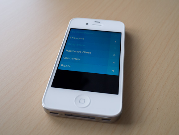
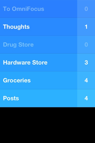
[
 ](http://c276381.r81.cf1.rackcdn.com/clear-ss-3.jpg)
That’s five lists in Clear that I don’t use/need in OmniFocus.
– To OmniFocus: this is pretty simple, but why not just input into OmniFocus? Clear is faster, so if I am in a meeting and want to input a lot of things fast, Clear is going to be a better option. I also can’t get distracted by adding due dates and contexts and creating projects. I can do that later on my iPad, for now let’s just get the tasks down.
– Thoughts: random things I think of that I may want to remember? Check. The length limitation is also helpful in paring down the thought to the lowest denominator. Keeping these non-actionable thoughts out of OmniFocus, but somewhere more handy that Notesy is great.
– Drug Store: Next time I go, I need to buy…
– Hardware Store: Next time I go, I need to buy…
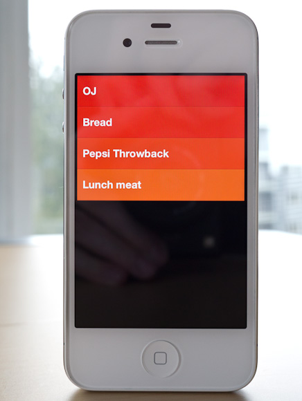
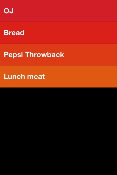
– Groceries: I will be hungry if I don’t buy…
– Posts: I want to write about…All of this could be done in OmniFocus. All of it used to be done in OmniFocus. With Clear I hope to not get tangled up in the planning of these tasks. I just jot them down and walk away. Nothing I put in Clear is time sensitive, but all are things I want to remember.
[
 ](http://c276381.r81.cf1.rackcdn.com/clear-ss-1.jpg)
The icon is actually pretty great. It pops more than any other icon on my home screen — and there are a lot of great icons on my home screen. The design of Clear alone is worth the download — I suspect Clear just started a new trend in iPhone app design.
Ultimately, for me, Clear has earned a seat on my home screen. I love the no interface-interface. I love how clever and fast it is. I just have to remember to not think of Clear as a task manager — instead looking at Clear as a list making app.
And it’s fantastic at making lists.
Here’s the App Store link: Clear
-
Apple CEO Tim Cook Speaks at Goldman Sachs Technology Conference
Apple CEO Tim Cook on the iPad market:
>We started using it [the iPad] at Apple well before it was launched. We had our shades pulled so no one could see us, but it quickly became that 80-90% of my consumption and work was done on the iPad. From the first day it shipped, we thought that the tablet market would become larger than the PC market and it was just a matter of the time it took for that to occur. I feel that stronger today than I did then. As I look out and I see all of these incredible usages for it, I see the incredible rate and pace of innovation, and the developers — If we had a meeting at this hotel, and we invited everyone doing cool stuff on PC, we wouldn’t have anyone here.If he did 80-90% of his work/consumption on the iPad *before* it launched — do “we” think he even uses a Mac anymore?
-
The Lack of Consistency in Twittelator Neue
An astute observation from Will Simons.
-
Quote of the Day: Alex Payne
“The factors that appear to make a business successful change from week to week, article to article, tweet to tweet, blog post to blog post.” -
‘You Can Buy Motorola, but We Still Don’t Trust You’
Jon Brodkin reporting on the Google acquisition of Motorola:
>But regulators on both sides of the pond went out of their way to warn Google not to abuse the patents, with the Justice Department comparing Google’s patent statements unfavorably with what Justice views as more responsible statements made by Apple and Microsoft.Read that again: “more responsible statements made by Apple and Microsoft”. In 2003 I would have bet money that such a statement would never have been said — let alone be true.
-
‘Two Contradictory Thoughts About Apple and Path’
Watts Martin on Apple’s responsibility to users of iOS (with the Path address book hubbub as the central issue):
>Apple has explicitly made the case that a platform advantage of iOS is that Apple does verify that developers aren’t being shady dipshits.
[…]
>Once you’re pitching that as an essential platform differentiator—and I think it’d be hard to argue Apple doesn’t make that pitch—then “is it Apple’s job to keep developers from being shady dipshits” is not the right question. “Why do apps only have to inform of you of some potential privacy issues, not all” is the right question.That’s a really good question. Also see his comments on those dialog boxes that people are suggesting (like the ones used for location services) because he brings up a damned good point there.
-
Samsung’s Super-sized Galaxy Note
Abdel Ibrahim and Jon Dick:
>The Galaxy Note’s tagline asks if the device is a tablet or a smartphone, but like a girl in Spanx, it’s so much more.That maybe the best line I have ever seen on a blog.
-
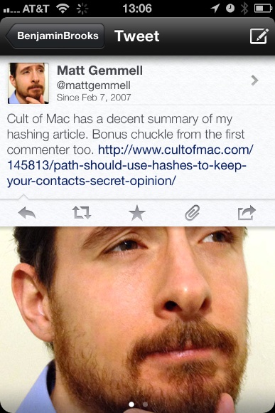
Sleazy Promotions
Matt Gemmell on those annoying “I entered to win” tweets:
>It’s bad enough trying to artificially turn a prospective customer into a delivery mechanism for your marketing, but requiring that they advertise to their chosen social circle is nothing less than appalling. The customer’s credibility, impartiality, judgement, taste and sense of personal ethics are all assaulted if they choose to take part in such a promotion, and the existence of the promotion invites such an assault. -
China’s Proview Seeks iPad Trade Ban in Apple Trademark Row
Artemisia Ng in Hong Kong and Melanie Lee in Shanghai:
>A Chinese tech firm claiming to own the “iPad” trademark plans to seek a ban on shipments of Apple Inc’s computer tablets into and out of China, a lawyer for the company, Proview Technology (Shenzhen), said on Tuesday.It’s a boring legal dispute, but imagine the repercussions of Proview winning this.
1. No one would be getting iPads — the import **and** export will be blocked.
2. Foxconn workers would be laid off.Basically this is more than just not being able to buy an iPad, or seeing iPad delays — it would have a huge impact on the Chinese work force and one of the largest employers: Foxconn.
Should be interesting to watch.
(Apple, of course, says they already own the trademark from Proview.)
-
Verizon, AT&T to Sell 4G iPad
Spencer E. Ante and Jessica E.Vascellaro:
>Verizon Wireless and AT&T Inc. will sell a version of the coming iPad that runs on their newest fourth-generation wireless networks, according to people familiar with the matter, as the battle to cash in on big investments in mobile broadband heats up.If true, and the iPad also gets a retina display, then I want to know one thing: where is all this battery life coming from? (My assumption being that Apple wouldn’t sell a new iPad with less battery life than the device it is replacing.)
-
InVision Prototyping Tool [Sponsor]
The UI prototyping phase of the design process is crucial to get right. It’s about figuring out how your product will work, and ensuring everyone is aligned before moving into building.
[InVision](http://invisionapp.com/) is a web-based [prototyping tool](http://invisionapp.com/) that lets you paint an accurate and realistic picture that anyone can understand.
InVision lets you design in your tool of choice. It simply requires .jpg, .png or .gif files. Create them however you want. Take your static files and drop them right into InVision all at once. The bulk uploader makes adding files a snap. Then use the web GUI to draw Hotspots and link them up.
As a special offer for our readers, [InVision is offering](http://www.invisionapp.com/february/) a 30 day free trial along with a special discount for the first six months.
Design anywhere. Bring it to life with [InVision](http://www.invisionapp.com/).

-
Twittelator Neue for iPhone
I am, without a doubt, a diehard Twitter for iPhone user because I really like that app. I do however admit that the latest updates to the official Twitter app, on the iPhone, made the app less — for the lack of a better word — powerful. To many this was the burying DMs, but for me what hurt was having to open a link in the browser before I can send it to Instapaper.
That, I felt, was a crap move. It put me in my own personal hell.
Still I stuck with the official app for one reason: I strongly feel that, in the not to distant future, the only app that will truly work with Twitter is their official app(s). I have no inside knowledge of this, it is just the feeling I get given their public moves with the company.
I apologize for not remembering, but one of my Twitter followers pointed me to [Twittelator Neue](http://stone.com/neue/) a while back. I played with it out of curiosity and dismissed it because it wasn’t quite ‘polished’ enough for me. [Last week though, John Gruber reminded us all of the app](http://daringfireball.net/linked/2012/02/09/twittelator-neue), so I decided to give it another go.
Since then I have been using it everyday as my main Twitter app on my iPhone.
So far I have found it to be one of the more interesting Twitter apps that I have tried and because of that I don’t really know what to make of it. So here’s my somewhat random thoughts on the app.
### Design
[
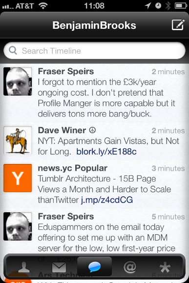 ](http://c276381.r81.cf1.rackcdn.com/twittelator-neue-5.jpg)
Let’s just get this out of the way right now: the icon is hideous. It’s ugly to the point where I almost don’t want to use the app because of its icon.
Ok, now that I have said my piece on that issue we can get into the rest of the design.
I think the best way to describe the UI design is with the word: light. Both in the sense of the visual color/brightness and in the overall feel of the UI. The app feels like a bundle of plastic to me, from the gloss stylings to the way it “feels” when you move about in the app and that gives it a very light feeling.
I also think that Twittelator Neue spent some time paying attention to the look of text in the app because I find the text clean and easy to read.
[
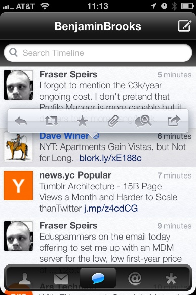 ](http://c276381.r81.cf1.rackcdn.com/twittelator-neue-2.jpg)
But the app is also pretty low contrast. The pop-over for adding links to Instapaper is very low contrast — in fact when you really look at the app most of the design is rather low contrast. That’s not a deal breaker, but it can be difficult if you are trying to fly through the app.
For an app that is just about the most opposite of skeuomorphic that you can get, it has this little detail:
[
 ](http://c276381.r81.cf1.rackcdn.com/twittelator-neue-8.jpg)
Wow, really? I don’t so much object on the grounds of skeuomorphism, but on the grounds that this detail just doesn’t fit with the rest of the app.
As I said above, I can’t really decide if I like this app or not — the design doesn’t *do anything* for me. I could take it or leave it.
There are areas where it is better than the Twitter app and areas where it is worse, overall I don’t think the design of Twittelator Neue alone will sell you the app.
### Navigation
The navigation for Twittelator Neue will certainly set it apart from any other Twitter app. While it has the standard navigation tabs at the bottom, well truthfully, those tabs aren’t even standard.
The navigation tabs at the bottom actually are confusing because they can be hidden away with a downward swipe — and pulled back up from the little tab that is left behind. This is, at the same time, very clever and very confusing. I never think: “oh I lost the navigation tabs”, but when scrolling through my timeline I tend to think: “woah there, almost hid the navigation tabs”.
The difference is that I don’t care if the tabs get hidden, but when scrolling I notice them start to hide away and my reaction is always to jerk them back up in place. It’s like knocking `X` over (that doesn’t matter if you knock it over or not), but that you still actively try to prevent `X` from getting knocked over.
Now here’s a real annoyance that I have: the top navigation bar moves. When new tweets arrive the top navigation bar drops down to show you the count of new tweets, same too when you add something to Instapaper. So the navigation bar completely bucks the iOS standard behavior of always staying put and that is off-putting.
I find this movement to be one of the more annoying aspects of the app. It is just something that does not and should not move.
I do, however, like that you can swipe left and right pretty much anywhere to move about the different tab views — I think that is really great as a small time saving touch. But for as much time as this action saves you, you lose it all once you try to switch from one account to another.
Account switching is just buried too deep for me, not to mention slower to get at then on the official app. I also find it annoying that you always start back at your profile when you switch between accounts.
The navigation is something that will take more time to get used to than what I have spent with the app and even still I am not sure if it will be worth getting used to in the end.
### Instapaper
Truthfully I can, and do, ignore all of those problems with the app because it does one thing really, really, well for me: it sends links to Instapaper much faster than the Twitter app does. More than that it adds the link back to the tweet in the Instapaper description so that I can properly attribute the item.
I need not load up a webpage first before sending to Instapaper.
One odd thing is that when you have a Tweet in the main timeline with more than one link in it — there is no prompt for which link you want to send to Instapaper, you just get all the links. I don’t mind this, but I do wish I was given the option to choose.
### Avatar Power
There’s one last thing about this app that I find kind of odd: its obsession with Twitter Avatars.
This is an awful lot of Matt:
[
 ](http://c276381.r81.cf1.rackcdn.com/twittelator-neue-prof-.jpg)
This isn’t that big of a deal to me, but I find it odd how obsessed the app is with showing you huge avatars, take the profile page for example (that is *your* profile page when you install the app):
[
](http://c276381.r81.cf1.rackcdn.com/twittelator-neue-1.jpg)Why is my avatar shown twice, and how creepy is it just seeing my eyes? So odd, I feel like I am constantly being spied on with all this avatar love in Twittelator Neue.
### Concluding, Something
So is Twittelator Neue better than the official Twitter app? It only is in the implementation of Instapaper and for me that is enough to keep on using the app. In almost every other aspect I prefer the official Twitter app.
-
Washington Signs Gay Marriage Into Law
Well done.
-
Quote of the Day: Jake Levine
“Congratulations Facebook, you’ve built THE KILLER BIRTHDAY APP.” -
Meet Roger Martin a RIM Board Member and RIMdiot
This article so perfectly encapsulates everything that is wrong with RIM — it actually astounds me that people listen to Mr. Martin. Gordon Pitts writing:
>In a rare outpouring of candour by a RIM director, he heaps scorn on the notion that the board should have hired a star outsider to re-energize RIM – a strategy that, he points out, failed abysmally at other stumbling tech giants, including Dell, Hewlett-Packard and, in its troubled 1980s, the now seemingly flawless Apple.
>”So we’re supposed to hand it over to children, or morons, from the outside, who will destroy the company?” he [Martin] says. “Or should we try to build our way to having succession?”
Nah, just stick with internal morons, which is clearly the better option.
>Mr. Martin agrees the two ex-CEOs made mistakes, particularly in the U.S. market for smartphones, where Apple and Google-based products have stolen the BlackBerry’s thunder. And he concedes the board failed to push for more marketing muscle in anticipation of serious competition.
Yeah, because everything would have been fine with better/more marketing.
Ok one last quote:
>But today, he is distracted by two pressing issues – the Super Bowl loss by his beloved New England Patriots and the fate of RIM, a company perceived to have lost its way in the smartphone market, causing its stock price to plunge.
“Perceived” — really?
[via Lessien] -
Human Wormholes
Robert Krulwich building off something that [Jason Kottke calls ‘Human Wormholes’](http://kottke.org/12/01/human-wormholes-and-the-great-span):
>There are people who live long enough to create a link — a one-generation link — to figures from what feels like a distant past, and their presence among us shrinks history. When “Long Ago” suddenly becomes “So I said to him …,” long ago jumps closer.There are some fantastic stories in here, a must read.
-
‘The Super Sweet 1Password Trick You’re Almost Certainly Not Using’
Brett Kelly:
>You just created a bookmark for a website that you commonly use, but now it will automatically fire up 1Password and fill in the login for you and—if you have it configured to automatically submit login forms—just log you right in.This is fantastic.
-
‘Valve Offers More Details About Steam Break-In’
Peter Cohen:
>Newell added that “it is probable that the intruders obtained a copy of a backup file with information about Steam transactions between 2004 and 2008. This backup file contained user names, email addresses, encrypted billing addresses and encrypted credit card information. It did not include Steam passwords.”I mean, no biggie.