Category: Articles

  • The Updated Ristretto from Tom Bihn

    *(Disclaimer: Tom Bihn sent me the Ristretto to test out, this is the only bag they have sent me — the others I gladly paid for.)*

    [A while back I purchased my first Tom Bihn bag, the Ristretto for 13” MacBooks](https://brooksreview.net/2011/02/new-bag/). I really liked that bag, but I had one huge complaint about it: stuff was prone to sliding out of the front compartment — especially when on a plane.

    This wasn’t a deal breaker, but it was annoying — requiring an extra level of attention needing to be paid while you are deplaning, or de-anything-ing. The only reason I moved away from the Ristretto is because [Michael Lopp opened my eyes to the world of freedom that a backpack offers](http://www.randsinrepose.com/archives/2011/12/04/a_bag_of_holding.html).

    Now, I love my Smart Alec from Tom Bihn, but I couldn’t help but smile when Tom Bihn responded to feedback and offered a new, modified version, of [the Ristretto](http://www.tombihn.com/page/001/PROD/200/TB0223).

    The front pocket now fully zips shut.

    [ ](http://c276381.r81.cf1.rackcdn.com/ristretto-2.jpg)

    That alone makes the bag near perfect because your goods are far more secure, but Tom Bihn didn’t stop there.

    Tom Bihn has changed two other things that may seem minor to most, but adds quite a bit to the bag.

    [They changed the nylon used to make the bag](http://www.tombihn.com/blog/?p=2400):

    >The Ristretto is now made with an exterior U.S. 1050d high tenacity ballistic nylon and an interior lining of our ultralight Dyneema/nylon rip-stop fabric from Japan. Both fabrics are made specifically for us. Previous, the Ristretto was made with an exterior of 1000d Cordura® and an interior of 500d Cordura®. For the time being, we will continue to offer one Cordura® color combination — Olive/Cayenne — in all three sizes of Ristretto. Why the switch in fabrics? Our 1050d ballistic nylon has a stiffer hand and a rich weave and we like the way it reflects light. We work with our fabric mills to get this fabric just the way we want it. Our Japanese ultralight Dyneema/nylon fabric saves weight and is as tough as nails. And it’s quite handsome to boot.

    This new nylon is much stiffer and while that may seem less appealing — it actually makes the bag quite a bit better. For one the bag is a lot more rigid when you set it down, instead of flopping over like the old version, it sits up.

    [](http://c276381.r81.cf1.rackcdn.com/ristretto-1.jpg)

    Overall this new nylon adds a bit of structure to the bag and I like that a lot. The old version was just a floppy bag in comparison.

    The second change was to add a new lining to the bag — this lining is the typical Tom Bihn grid. While it is not my favorite look, it does greatly aid you when you are digging about the bottom of the bag looking for something — particularly something small. It’s a very nice finishing touch.

    This isn’t an extensive review because it doesn’t need to be — everything I liked about the original bag is still here. Tom Bihn made the changes that the bag needed to go from very good to great.

    The new zippered front pocket is a godsend.

    ### The Catch

    There is one other thing that was added that I dislike, but it’s pretty minor. It’s this:

    [](http://c276381.r81.cf1.rackcdn.com/ristretto-3.jpg)

    A QR code, really? Ugh.

    ### Wrap Up

    Quite a few people asked me if these changes are enough for me to switch back to the Ristretto from my Smart Alec. That’s a tough question to answer. I never *wanted* to get rid of my original Ristretto, but I did so to partly fund the purchase of the Smart Alec — and because I just don’t switch bags that often.

    Having both the Ristretto and Smart Alec at the same time offers an interesting conundrum for me. I love having a backpack and all the room and mobility a backpack affords, but I also like how small a light the Ristretto is — I feel more mobile with the Ristretto.

    If I had to choose I would still stick with the Smart Alec, but only because I have seen *the light* when it comes to backpacks versus shoulder bags. If I had both? Well, the Ristretto would get used regularly, very regularly.

    It’s a great bag, [go get yours here](http://www.tombihn.com/page/001/PROD/200/TB0223).

  • Dictating to Your Mac

    Here’s a neat trick that I am sure many of you have figured out, but that I just discovered Friday night. If you have [TouchPad](http://itunes.apple.com/us/app/touchpad/id297623931?mt=8) on your iOS device (probably other apps allow this as well) you can use the `dictation` key in iOS to dictate text into your Mac.

    If that sounds really easy, that’s because it is. I use this now when I am trying to type things out on our “media center” Mac mini that is hooked up to a TV without a keyboard — works surprisingly well. I for one am pretty happy with this little trick.

  • Shit, Meet Fan

    This Mike Daisey stuff is only getting started, but it’s important enough that I feel it warrants more than just more linked list posts. It’s important not because it paints Apple in a better light, but it’s important because of the trust we (myself included) thought we could place in publications like NPR Chicago Public Radio (syndicated to PRI, apologies) and The New York Times.

    John Gruber is doing a great job digging into this:

    – [The New York Times reporting on the incident, and retraction](http://daringfireball.net/linked/2012/03/16/nyt-daisey).
    – [CBS News](http://daringfireball.net/linked/2012/03/16/the-dark-side)
    – [MSNBC and Daisey’s Blog](http://daringfireball.net/linked/2012/03/16/dramatic-license)
    – [The fire starter: This American Life](http://daringfireball.net/linked/2012/03/16/this-american-life-mike-daisey) Who, credit where credit is due, is doing a full retraction show.

    Update: [Dave Caolo has a great quote too.](http://52tiger.net/i-wouldnt-express-it-that-way/)

  • An iPad Bar

    A large part of my job these days is going into vacant spaces and, well, waiting. Waiting for someone to do something or to show up somewhere. Lots of a waiting. Typically I soak up that time rather uncomfortably perched somewhere with my iPad.

    Yesterday was different though, yesterday I went to a vacant coffee shop. The tables and chairs were gone, but left in the space was this bar that was standing height. I set my bag down and my iPad, then I noticed this:

    [](http://c276381.r81.cf1.rackcdn.com/iPad-bar-3.jpg)

    The iPad fit perfectly on the bar. Held in by a large lip, but one that comfortably sat my wrists while I typed. Oh it was nice, then I turned it to portrait. Here’s what happened:

    [](http://c276381.r81.cf1.rackcdn.com/iPad-bar-2.jpg)

    [](http://c276381.r81.cf1.rackcdn.com/iPad-bar-1.jpg)

    That’s pretty sweet. So in landscape the iPad fit perfectly as a writing spot and in portrait it was held perfectly (for my height) as a reading device. So very sweet.

    The perfect iPad bar.

    In all the years I managed that space I never knew this existed and they never marketed it. If I was a coffee shop owner I would make something like this and then show people it — I would frequent such a place.

  • That Clicking Sound

    My buddy, [Shawn Blanc](http://shawnblanc.net/) is a fan of [Byword](http://bywordapp.com/) — has been for a while now. It was because of him that I tried Byword to begin with.

    But when [iA Writer](http://www.iawriter.com/#Mac) came out [I wrote this about the two apps](https://brooksreview.net/2011/05/ia-writer/):

    >The difference between Writer and Byword is very, very significant. Writer has zero preferences and while Byword has limited preferences, it has far too many options. Allowing you to pick what you see in “focus mode” is nice on a bullet point feature list, but in practice it is far too much choice. On and Off is all you really need.

    I screwed up in making that statement, not because I was wrong, but because I didn’t dig deep enough into the differences between the two apps.

    Truthfully, the difference between Byword (or [WriteRoom](http://www.hogbaysoftware.com/products/writeroom)) and iA Writer is the difference between my home office and a coffee shop. It’s the difference between entering a writing environment that you can’t change, or manufacturing your own writing environment.

    Byword is your home office, and while it is very nice, it is also very distracting — because you can and *will* tinker with it. If the desk isn’t clean, I can’t work. Why is that picture crooked? Maybe I should get different color light bulbs — ugh what is that CLICKING!?!

    I think that is my general home office experience, there is always something to be tinkered with instead of writing, and because I can tinker with it, I typically will tinker with it.

    iA Writer on the other hand is the coffee shop, or perhaps more accurately the Starbucks near your house/office. It’s the place you go to “focus” because it is the one place that two things happen:

    1. You know what to expect. At the coffee shop that means: The WiFi works, but isn’t particularly quick. The atmosphere is soft with occasionally loud waves. The smells are warm and inviting. Everyone else there is minding their laptop screens, so you mind yours. It’s always the same, never more and never less.
    2. The Coffee Shop (like Writer) also just *is*. You can’t change it, or tinker with it. At the coffee shop that means: The chair is a bit uncomfortable? Too bad. The light too low? Too bad. Your only option is to finish what you came there to do so that you can leave, eventually — right after the wave of productivity subsides.

    Some people can’t work at coffee shops, some can’t work at their office.

    This analogy isn’t perfect for either app ((For one Byword isn’t as tweak-able as my office and iA Writer is far better looking than any Starbucks.)) , but I hope you understand what I am saying. I don’t dislike Byword for any one reason — I dislike it because it doesn’t work for me because of the fact that I am a tinkerer and using an app that I can tinker with, when I want to focus, is a truly bad idea.

    After using iA Writer everyday since it came out for the iPad I can say this for sure: I no longer have a want to tweak it, to tinker.

    I downloaded the new Byword for iOS this morning — I spent the first 15 minutes trying to decide between the two custom fonts. 15 minutes. 2 fonts. Just imagine if I could change the background color? I used to spend hours a week tweaking colors in WriteRoom.

    Now? Now I just write.

  • Blogging About Blogging

    Earlier today [I linked to the Curator’s Code](http://www.curatorscode.org/) crap — actually I linked [to *The Loop’s* take on it because I agree with Dalrymple](http://www.loopinsight.com/2012/03/12/code-of-conduct-proposed-for-content-aggregators/):

    >How about just stop stealing other people’s shit.

    I have never been excited that someone gave me a `via` link. Often people ask if I want one when I share something with them via DM or iChat — I usually say “I don’t care.”

    Because I don’t care.

    I think the curator’s code deal is pretty stupid and inconsequential, [but Marco Arment brings up an interesting point](http://www.marco.org/2012/03/12/not-a-curator):

    >The real problem is that these posts replace the need for the source link.

    >Sites that do this can call this practice whatever they want. Often, it’s called aggregation, or simply reporting. There’s a continuum between 100% original reporting and zero value being added to the source content, but I don’t think I’m being unnecessarily inflammatory by labeling the posts on the far end of the continuum as rewriting.

    I absolutely hate the way *The Verge* cites posts — so much so I can’t read the site. Rewriting is the true problem — not adding in more `via` attribution. The problem I face is when I write a post like this that is somewhere between a linked list post and an article post — on these types of posts I try to make source links really long, more than a few words. That seems decent enough to me.

    I tend to find the people who whine about `via` attribution to fall under two categories (in general, as always, there are exceptions):

    1. News breakers. These are the guys that break news and are truly *the* source of the news.
    2. Small sites that linked to something and believe that a larger site *got* that link from them.

    I totally agree with the first and the second — well I have been there, but let me share a secret: `via` attribution links don’t give you very much traffic and certainly not lasting readership.

    I try to stay away from these debates, because blogging about blogging isn’t really interesting to anyone but bloggers. But I decided to write about this to state why/when I use such attribution.

    I use `via` attribution when it feels right.

    There’s no set rule and often I don’t remember where I found the link to begin with so I can’t put attribution on links that I sometimes wish to. Oh well: do what feels right.

  • You Can Sign-up, But You Can Never Leave

    [On March 6th I wrote](https://brooksreview.net/2012/03/explanations/):

    >Right now — I don’t want anything to do with Readability. I am, however, going to let things cool down before making a final decision.

    [Later that same day John Gruber linked to that post and said](http://daringfireball.net/linked/2012/03/06/brooks-readability):

    >Like Brooks, I’ve never been comfortable with the way they collect money on behalf of publishers. And their app is nowhere near as good as Instapaper.

    Once Gruber posted that I started to get a flood of comments from friends. The common theme was: “I agree with you.”

    I didn’t want to make a decision that day, but as I read more and more about Readability it made me sick.

    Rich Ziade of Readability reached out on Twitter asking me to ask him any questions. I took him up on it and sent this email to him:

    As of this writing I still haven’t heard back, but I also used the contact link in the help section to request that https://brooksreview.net be blocked from Readability and that my publisher account be deleted — you see unlike a user account there is no `cancel account` link.

    Again, as of this writing, I still have not heard back and https://brooksreview.net is still not blocked, my publisher account is also still active.

    [Readability states](http://help.readability.com/customer/portal/articles/267462-how-can-i-opt-out-of-readability-view-):

    >If you don’t want your website content to be available in Readability view, you can exclude your content from being processed by contacting us directly. We’re always happy to help.

    Except I asked them to do this five days ago and not only has it not happened, but they seem to just be ignoring the request.

    That seems awfully shady.

    Update: Chris Dary of Arc90 responded to me on Twitter and got me opted-out. Thanks to him for that.

  • Marketing Bullshit

    Congratulations. By updating to iOS 5.1 your iPhone 4S suddenly got 4G! Except it didn’t really, because as [Brad McCarty explains](http://thenextweb.com/apple/2012/03/08/att-apple-hspa-lie/):

    >The iPhone didn’t suddenly become an LTE-capable capable device by simply upgrading the version of iOS that it’s running. AT&T is defining its HSPA+ network as 4G, but by the very definition of HSPA+, theoretical speeds aside, it doesn’t qualify as 4G.

    So what the hell, Apple? McCarty sees this as Apple caving to AT&T — and that may well be — but more worrisome is that this move is pretty hypocritical and deceitful. [Here’s Phil Schiller at the iPhone 4S launch as quoted by GDGT](http://live.gdgt.com/live-apple-iphone-4s-event-coverage/):

    >“Where have I heard these numbers before? This is what our competitors call 4G… the iPhone 4S is just as fast as all of these phones, even faster in real-world use.”

    Yet, Apple refused to call the speed `4G` and many people (myself included) applauded them for that decision.

    Now though? Now we have the *same* iPhone 4S and suddenly also get the bullshit `4G` moniker — that would be bad enough, but it gets even worse for users that don’t know about the difference.

    AT&T is pretty horrible about this because if you viewed their coverage map when deciding between your shiny new 4G iPad on Verizon or AT&T — you immediately saw that AT&T appears to have a pretty robust 4G network. [Everything in the darkest blue is 4G according to AT&T](http://www.att.com/network/?wtSlotClick=1-006S2O-0-1) (also note that this is *not* the coverage map that Apple links to on the iPad buying page):

    So the average person is likely going to see that AT&T has `4G` in just about every major city on the two coasts. That’s fantastic — I was almost fooled by this.

    Then you read the map and see that `4G LTE` is by cities, denoted by the large orange blob. Fantastic: no LTE in the Pacific Northwest. So when you look at this map to determine 4G coverage, you really just need to be looking for giant, inaccurate, orange blobs.

    Now, compare that to how [Verizon markets `4G` service](http://www.verizonwireless.com/b2c/CoverageLocatorController?requesttype=NEWREQUEST&zip=94531&city=Antioch&state=CA):

    Everything in dark, dark, red is 4G LTE — every other red area is simply 3G. Now it is true that Verizon doesn’t have the faux-4G that AT&T does, so they might not be as good as they seem. One thing I can tell you for sure: Verizon has more 4G LTE areas (and a zoomable map).

    Long story short: `4G` and `4G LTE` are not equals, and shame on Apple for misleading iPhone users with the `4G` tag that AT&T so clearly loves to toss about.

  • The Panasonic GX1

    I don’t remember a time in my life when I didn’t love taking pictures — back in the day those pictures were mostly of pets, ok truth be told they still are — but I love photography. Over the years I have amassed a lot of gear, sold some off, and bought more expensive gear — safe to say I have used a lot of different kinds of cameras and camera systems.

    For the past five years I have been been a Canon shooter and have grown to love the platform, but the iPhone changed this with the introduction of the 3GS the majority of all the photos I take are with my iPhone. Yet, I find the iPhone 4S camera lacking in a lot of circumstances, even though it is truly a fantastic camera for how small it is, you just can’t expect it to replace a dSLR. So I often find that I snap a picture with my iPhone because I end up getting too frustrated trying to compose an image with my iPhone.

    When the micro four thirds camera movement came about I was really intrigued by these little beasts. I was mostly skeptical about how good these cameras would be and why they are/were better, but then these cameras started getting really good, while at the same time my values started to change: I no longer wanted to lug around a camera that so distinctively screamed “LOOK AT ME — I TAKE TEH PICTURES”. That means the 5D is left collecting more dust, and though I like my Canon G9 ((Do you see the price on this thing! Holy cow!)) , it is a joke to shoot with above ISO 400. So, I have been impatiently waiting to get a micro four thirds camera for quite a while, and not too long ago I pulled the trigger on one.

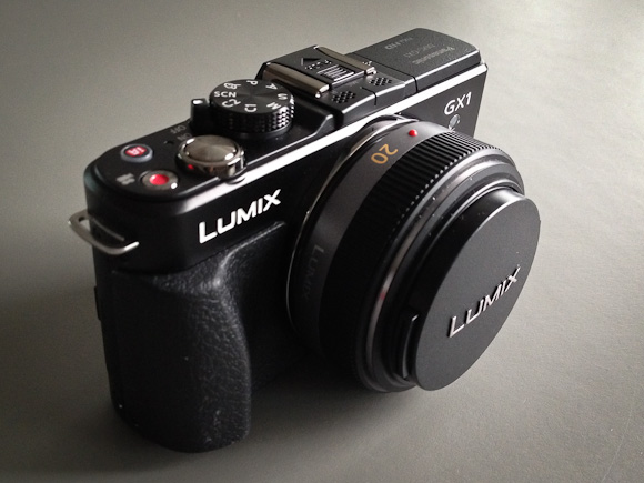
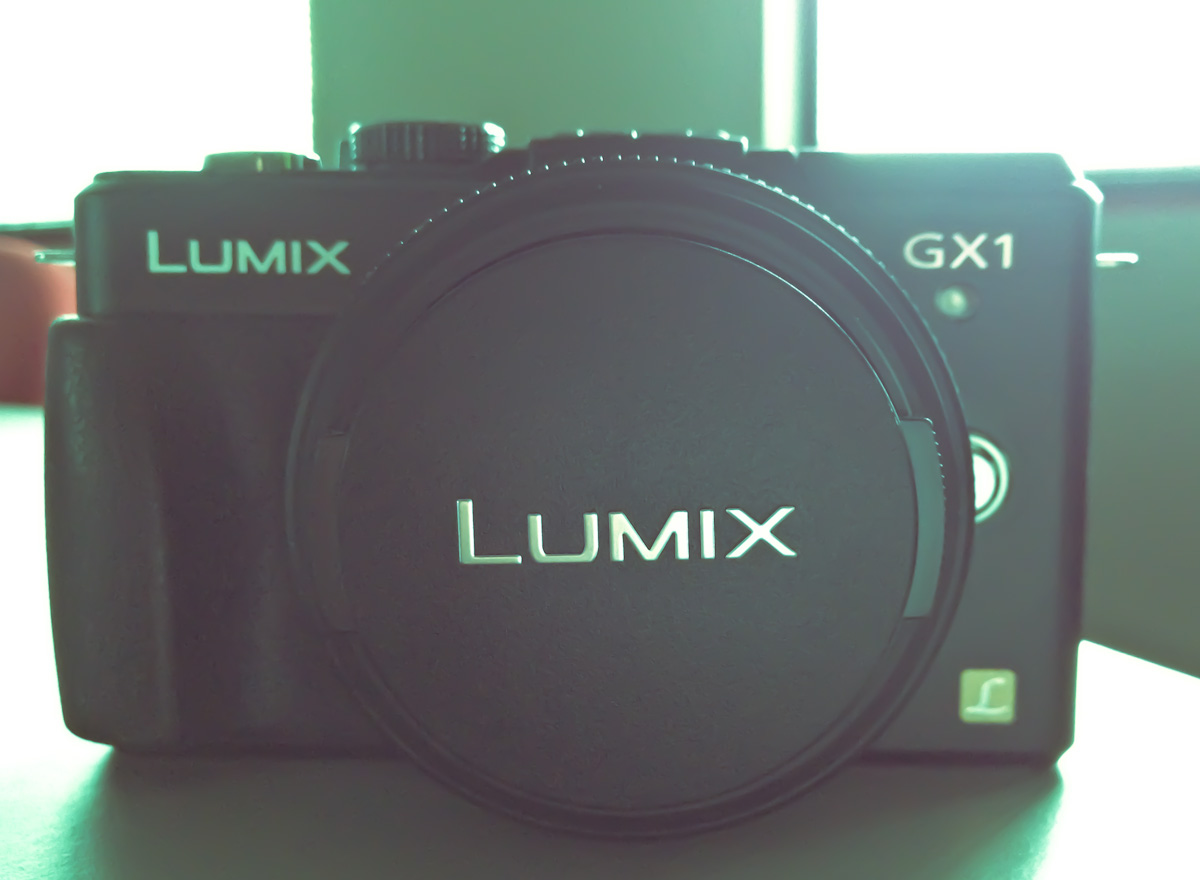
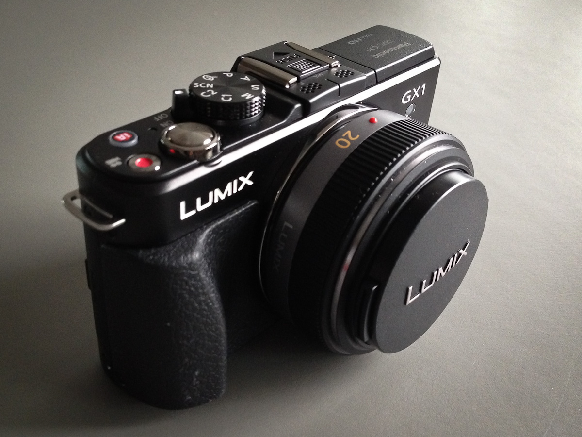
    I went with the Panasonic GX1, with the 20mm f/1.7 Panasonic lens — that comes out to about a 40mm lens on a standard, full frame, camera (note: all links to products in this post are affiliate links). Which works out nicely since the most used lens on my 5D is my 50mm f/1.4 — that lens practically lives on my 5D.

    The Idea or Why This Instead of That

    The idea of the GX1 (for my usage) is that it should fit between my 5D and my iPhone — mostly it should be what the G9 should have always been: an awesome daily carry, compact, camera. ((Dimensions: 4.58” x 2.67” x 1.55”.)) Some might think the GX1 isn’t that small, and truthfully it isn’t fitting in your pants pocket unless you wear cargo pants, but — actually — never mind. The camera does however disappear amongst the space in my Smart Alec and carries fairly comfortably in my jacket pockets. I will say that unless your jacket is zipped the weight of the camera will pull down one side of your jacket in a very awkward manner.

    In comparison to carrying around a camera bag for my 5D, well the GX1 practically isn’t there. I just want a camera that is fast and easy to shoot, but gives immensely great control than my iPhone and that performs really well in low light.

    (Personally I don’t see the point in going any smaller thent he GX1, as the GX1 is just about as small as can comfortably be held in my hand. For those times I really need a super-compact camera I will go with my iPhone. Which is why most point and shoots are not in the discussion.)

    My goal: take more pictures with less frustration. Remove the friction, have fun.

    The Build

    Prior to buying the GX1 I had never touched one. I read the reviews and knew the general size of it, but I had no idea what to expect when I put my hands on it. I am pleased to say that this is a solid camera — it feels more like a solid object than something with hollow spaces inside for chips and sensors. ((It clocks in at 11.22 oz.))

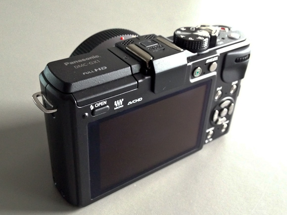
    Most of the entire back panel is taken up with a 3” LCD screen that is also a touch display, with just enough room on the right edge for my thumb to rest without blocking any of the display. The oddest part for me about this camera is that it feels and works so much more akin to my 5D than my iPhone, that the lack of a viewfinder is very unsettling at first — something that quickly went away after a few days of use. ((You can in fact buy the electric viewfinder for the camera that attaches to the hotshoe on top, but it is around $250 and adds more size to the camera.))

    There is both a molded grip on the front side for your fingers and a molded thumb area on the back that helps to get a firm hold on the camera. It’s not as comfortable as the 5D, but leaps and bounds better than trying to hold an iPhone — to Panasonic’s credit, never once did the camera feel like it was going to slip from my hand — a daily occurrence with my iPhone.

    Remember that right edge that I said my thumb covers, thats where you will find some function controls for the camera. I never accidentally press these on accident, but have found that it is easy to drop your thumb down to them to change settings while holding the camera.

    One dial that isn’t great is the dial that sits in the thumb grip.

    This dial scrolls from side to side and can be pushed in. With soft hands it is easy to operate, but after moving into a new house and painting my hands became firm and callused, once that happened I had quite a bit of trouble easily operating this dial. The biggest problem I have had is accidentally pressing in the dial while trying to turn it (which toggles what you are, um, toggling). Now, until my hands heal, I have to use my finger nails to spin this dial. Needless to say, this is a big pain in the ass to do.

    The top of the camera has the mode dial, on/off switch, shutter release, video mode toggle, and an iA button for a special mode Panasonic created. With the exception of the iA button these all feel very heavy duty and well made — the iA button just feels like a cheap plastic button, luckily I have only ever pressed it twice.

    So the camera feels good, is built pretty well, but how does it look? It looks like a camera. It’s black (you can get gray, but shouldn’t) and it isn’t anything fancy.

    I will say that I could do with a lot less labeling and badging. There’s only one side of the camera without a written word on it — that’s kinda sad. With the lens cap on you read the words Lumix twice, right next to each other and then get the L Lumix logo on the front as well — it’s a bit much. This kind of over branding isn’t unique to this camera — it’s an industry wide problem.

    Other than the massive amount of text on it, the design is simple and straight forward — just what I like in a camera.

    The Images

    This is what you want to know right: how do the images look? Short version: awesome. The GX1 shoots at 16MP and that’s plenty big enough for anything I am going to do. What I can say is that there is a different quality to the images than that of my 5D, the images seem less smooth — which is both good and bad. The bokeh isn’t as silky looking and the noise (when there is noise) is far more, shall we say, colorful. All things to be expected with a smaller sensor camera.

    Since I mentioned noise I should note that the GX1 has an ISO range of 160 to 12,800 — which boggles my mind a bit. If you shoot between 160-800 you are going to have to view the images at 80-100% to see the noise and even then Lightroom can vanquish most of it. I find the noise to be acceptable up to 3200 and useable at 6400 — beyond that godspeed.

    The best thing I can say about the image quality and over all functionality of the camera is that it never once held me back. Whereas with the iPhone I always feel like I could make a better picture if I just had a different camera.

    Software / Controls

    My favorite and most used mode is A, which is Aperture priority. Basically you, the user, sets the aperture that you want to shoot at and the camera automatically sets the shutter speed (you can use Auto ISO, but I never do that, preferring to set that manually as well). The GX1 has a few other modes: shutter priority, program, full manual, custom 1 and 2, and a few ‘scene’ modes — this in addition to the full 1080p video mode.

    The modes are pretty standard, but a neat surprise in the camera is that it has a gyroscopic sensor of some kind that can give you an indication of how close to level you are holding the camera (if you want). This isn’t just to tell you if the camera is level on a plain, but if you are also tilting it downwards or upwards — this is one of the best features of the camera, any camera really.

    I wish it was a bit more sensitive and there is some lag between adjusting the camera and the indicator moving, but it is acceptably good if you have no point of reference for leveling your shots.

    The menus are lacking in design, but functional. Most of the menu items seem comically large, but then you have to remember that you can also tap to select many of the menu items. Most users will stay out of the menus once they setup the camera, but I find constant use in the quick menu and so I wish it was a bit better looking.

    Lens

    There are three lenses that you will see being sold with the GX1: the 14-42mm, the PZ 14-42mm, and the 20mm f/1.7 that I purchased. I have no experience with the other lens options, but in researching them I learned a couple of things that I want to pass along.

    The 14-42mm f/3.5-5.6

    This is the most common lens that you will find in ‘kits’ (when the lens and body are sold together). It is a dead simple lens, but it is slow (meaning the fastest aperture is 3.5) and it is big. The pictures alone show you how big it is, but it works like a ‘normal’ SLR lens when you zoom with it. The best review of the lens I found, was here. It’s not a bad lens, but it is far too bulky for my needs.

    The PZ 14-42mm f/3.5-5.6

    The PZ makes a huge difference and it stands for ‘power zoom’. What does that mean you ask? Basically it is a super compact lens that zooms out with the help of an electric motor. Think of it like how the zooms on a point-and-shoot works, you move an electric jog and the lens zooms in and out. This is the same principle.

    Again I never used this lens, but the compact nature of it appeals greatly to me. Again though, it is just too slow for me to consider. Ultimately the fact that I couldn’t find a solid review for it turned me off, but it is impressively compact — just look at this preview for the lens.

    The 20mm f/1.7

    This lens is what many call a ‘pancake’ style lens. It is about as compact as you can affordably get and the lens I ultimately chose. Again Photozone.de has an excellent review of the lens and notes the distortion and vignetting problems with the lens — both can be fairly easily corrected on your computer (and is done automatically in many cases).

    I have nothing but good things to say about the lens. It is exactly what I wanted: small, tough, sharp, and fast.

    The GX1 also will accept the standard micro four thirds mounts, so that opens you up to a lot of lenses — many much more expensive. For starting out though I think I found a nice sweet spot with the 20mm f/1.7. I do want to note that f/1.7 on a micro four thirds camera is not the same as f/1.7 on a full frame camera, as my comparisons will show in the depth of field achieved by each lens.

    Speed

    Enough with the aperture speed, let’s talk about the speed of using the camera, which has a few factors: focus, start-up, frame-to-frame, saving/writing to card. In most every one of those cases this camera is sufficiently quick. (I am using this memory card for the record, a faster card would give you faster write speed.)

    In most cases the GX1 is ready to take a picture before I am which is on par with what I am used to with the 5D. However the autofocus would be much improved if it was a bit quicker — it’s more like the speed of the iPhone 4S autofocus than it is of a 5D USM autofocus speed. The AF doesn’t do much hunting to find focus, but it does give you pause to lock the focus. If you are shooting at the same distance (or just on the far end or the close end of the focus scale) then the focus is fast and solid — moving between the two distances is when you start to notice the lag in movement. Like I said: if you are coming from USM focusing on a dSLR then this is going to be slow, but if you are coming from a point and shoot or iPhone — this is going to be on par or much faster (depending on the camera and lens and lighting).

    The frame-to-frame shooting can be ridiculously fast. I am guessing this has to do with a lack of a mirror to flip up and down, but even with the shooting set to show the live-view image (which slows it down a bit) it feels like your shutter speed is all that is holding you up, but in reality Panasonic says it shoots at 4.2 frames per second. ((Though by reducing the images size you can push that to 20 FPS.)) Which actually isn’t that fast, but just sounds really quick.

    The only speed complaint I really have is the shut down time: it takes longer than I would think. You actually notice how long it takes from the time you flip the power switch to off, to the time it actually turns off.

    Comparisons

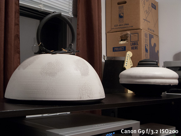
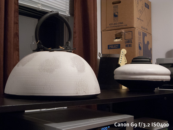
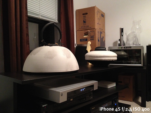
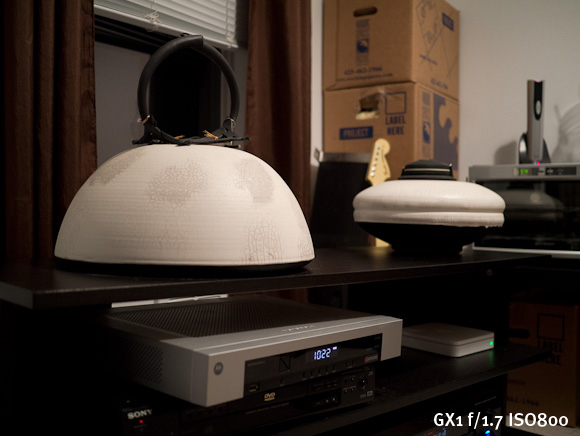
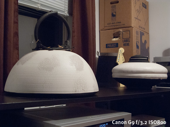
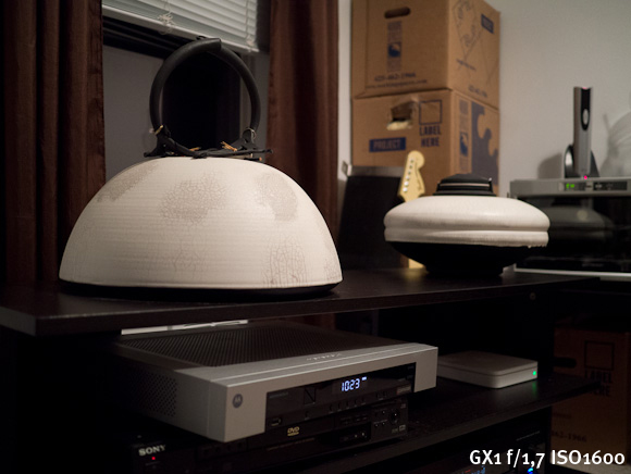
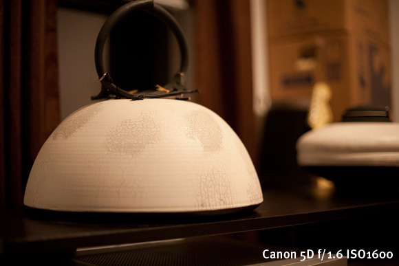
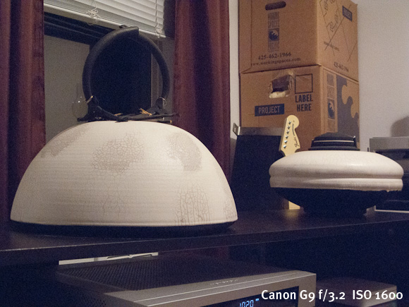
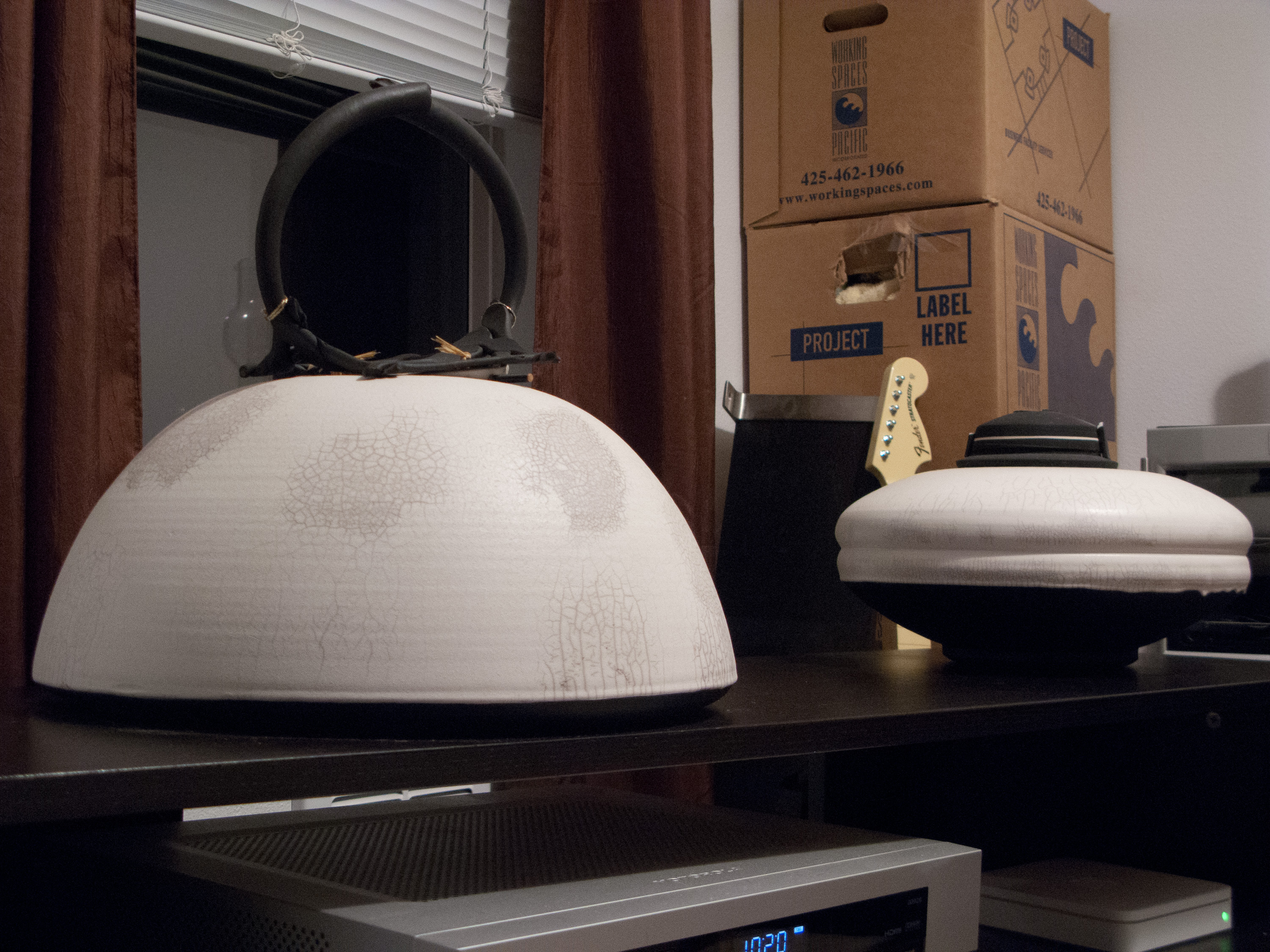
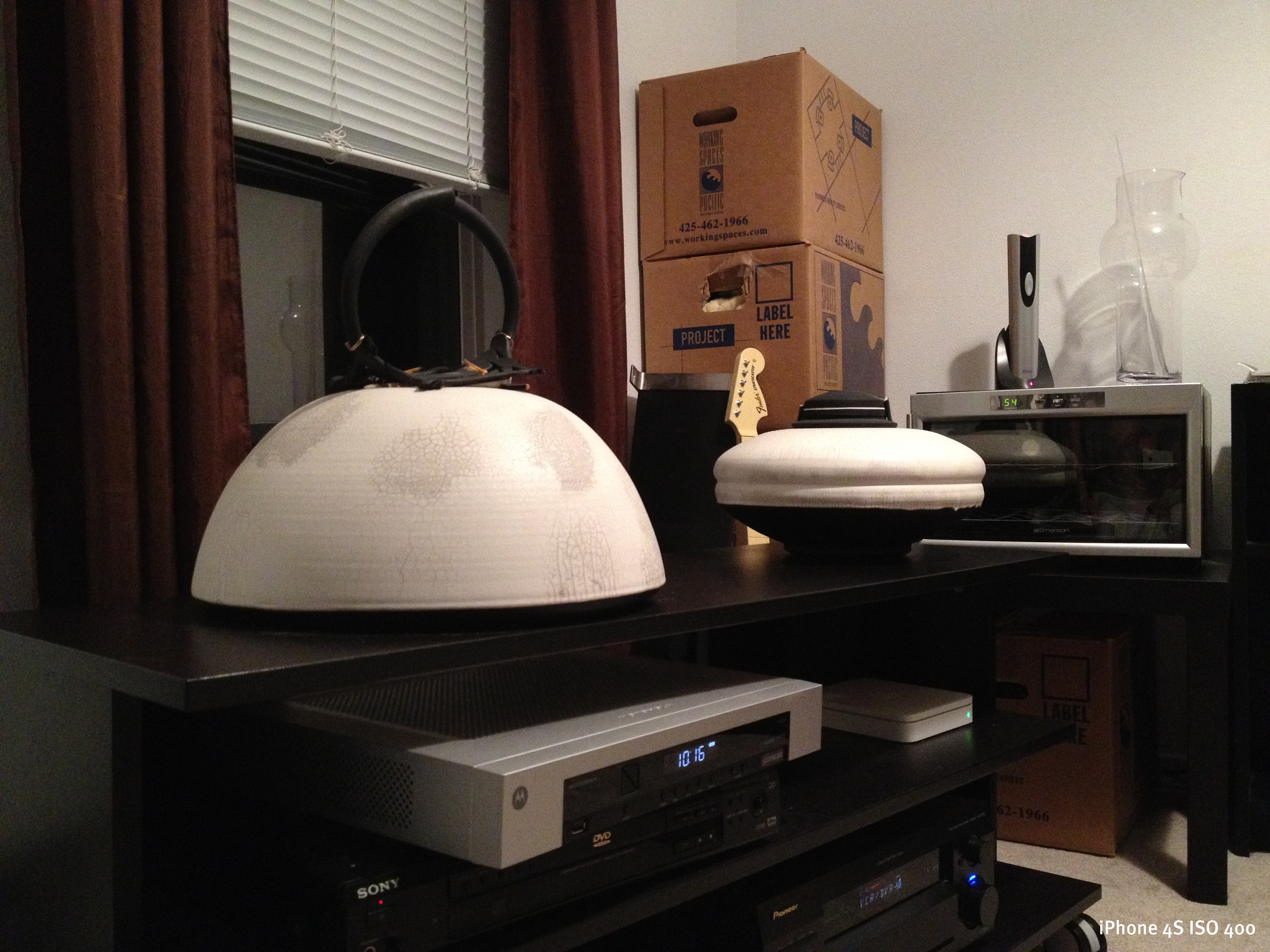
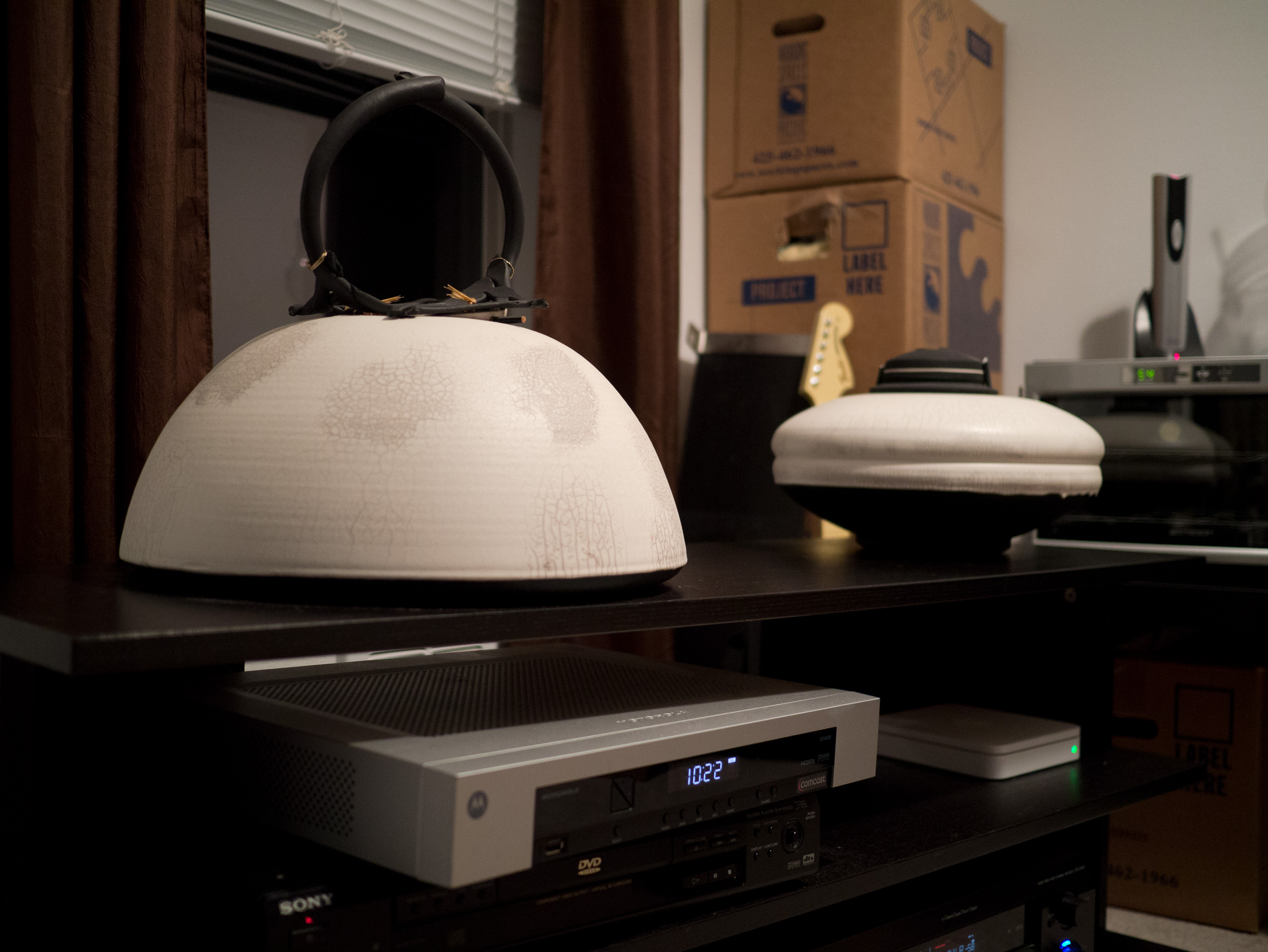
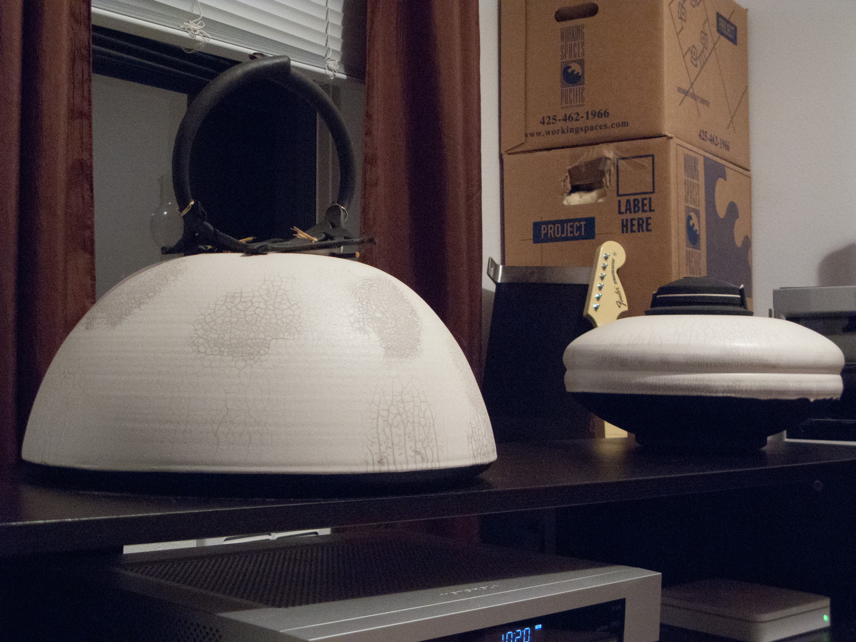
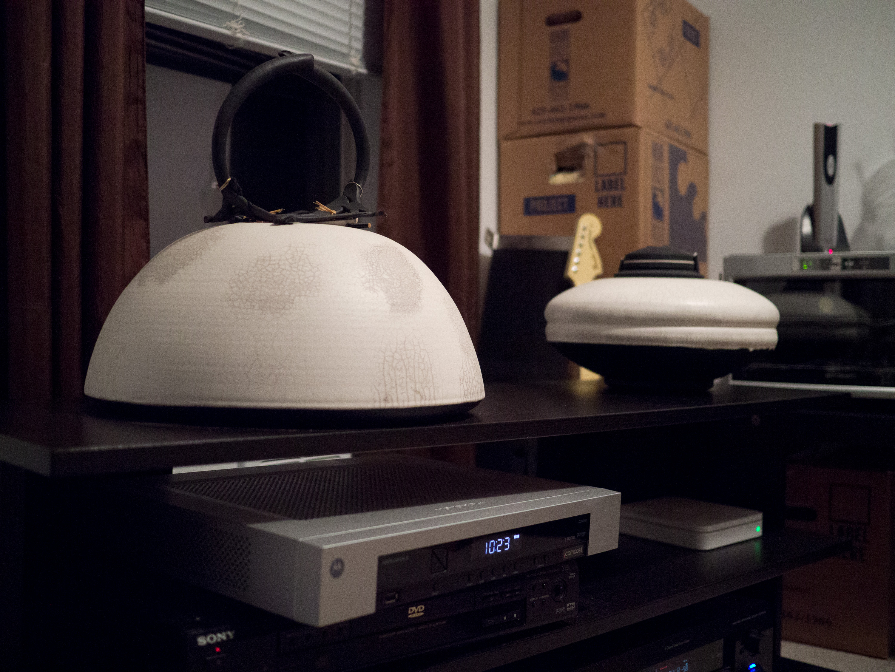
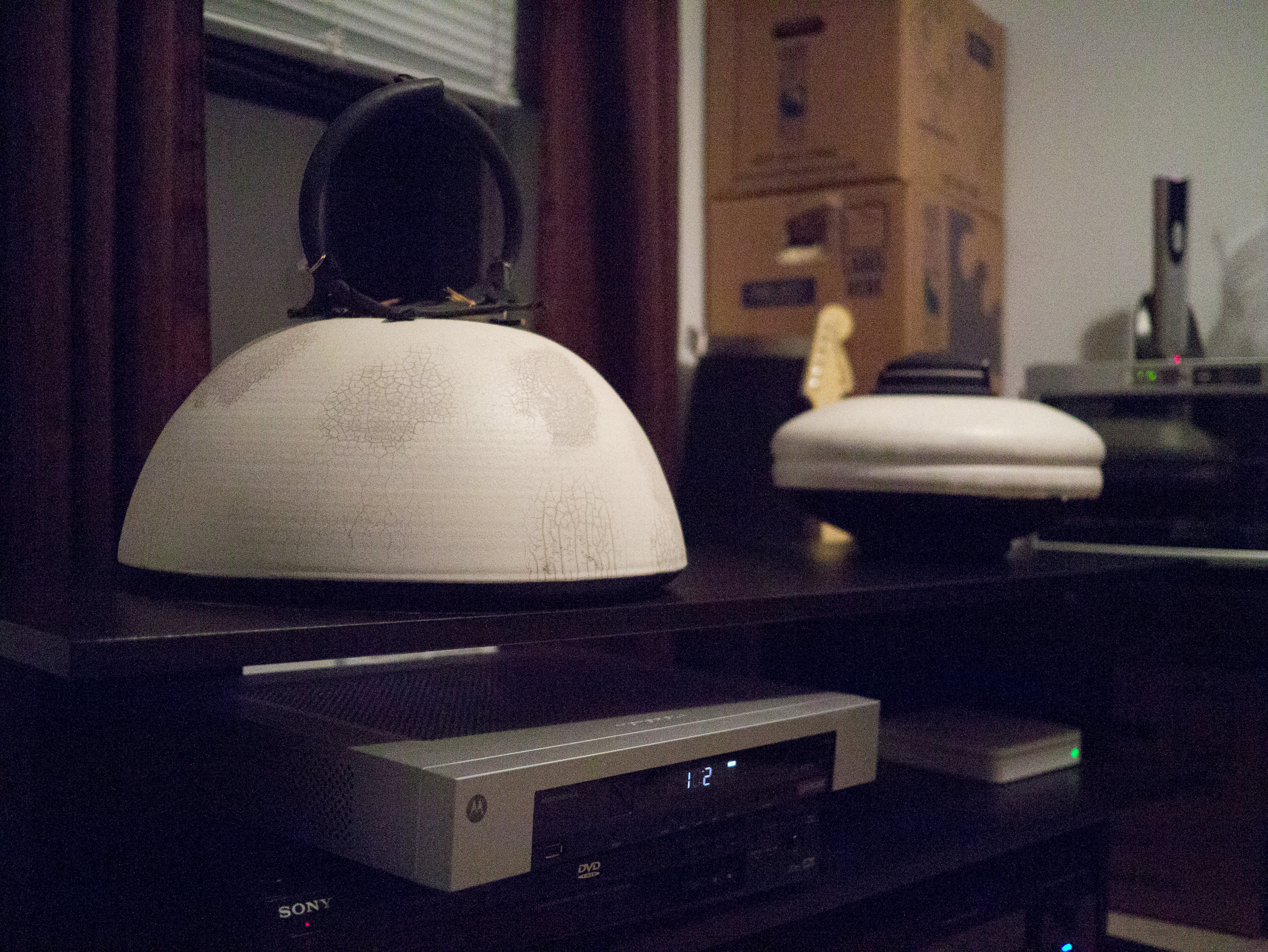
    It’s hard to know just how good a camera is unless you start to analyze it at 100% on a high quality display — what is called ‘pixel peeping’. I don’t care to do that, but I do think it is important to know what the quality and feel of the image is with the same composition between the cameras you are used to. For this, I setup a tripod and shot with my iPhone 4S, Canon G9, Canon 5D, and Panasonic GX1 from the same spot one after the other. (The 5D was with the Canon 50 f/1.4 and the Panasonic with the 20mm f/1.7.) I shot all images inside to control the lighting (I also was packing so I found the least box filled area — I wanted some light and dark to show noise — It’s a boring scene and I know that). Here are those images — camera aperture and ISO is listed in the bottom right, lastly no corrections were applied — these were shot in RAW and opened in Lightroom (LR does apply some basic adjustments, but I did not tweak them beyond that). Please note that clicking the images will produce a larger size — a much larger size — so be aware of that if you are on a slow connection.

    Here’s a couple more shot at ISO 3200, ISO 6400, and ISO 12,800 on the GX1 of the same scene.

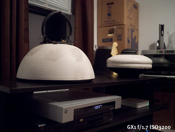
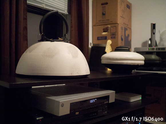
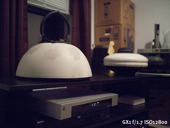
    Overall I am pretty pleased with the GX1 — it is leaps and bounds better than the iPhone and the G9 to my eye. The 5D has a warmer white balance overall, but this can be adjusted later. The GX1 seemed to hold down the noise on par with the aging 5D — which is pretty impressive. Amusingly ISO12,800 on the GX1 seems pretty comparable — if not better — than the noise you would see on the G9 at ISO1600.

    Annoyances

    The biggest annoyance I have with the GX1 is that I will occasionally pull it out of my backpack and the power switch had been flipped on. I don’t know if this happens when I am putting it away or pulling it out — or somehow while it is just sitting in the bag, but it annoys me. I do have to say though that the battery life is fantastic because: 1) I have yet to recharge it and 2) if it is getting left on in my bag see point 1.

    That gets me on to a nitpicking annoyance: the lens color. I chose the all black GX1 body, but the 20mm pancake lens is silver. I hate the fact that it doesn’t blend nicely with the body of the camera.

    Odds and Ends

    The touch screen. Oh boy, that touch screen. It’s really bad. Not that it is unusable, but that it’s just not very good. It’s fine for selecting the odd menu item, but for using the tap to focus/shoot — it’s pretty poor. The problem is two fold:

    1. The taps must be somewhat firm, therefore you get a lot of camera movement when you tap the screen to focus. This is bad because by default when you tap to focus the camera snaps the picture, meaning you are going to likely end up with blurry photos.
    2. Secondly when the touch to focus is turned on, I have found that it is fairly easy to tap the screen and take a picture while you are holding the camera, or trying to frame a photo. Ooops. Luckily it is fast, and easy, to turn on and off the touch screen and the tap to focus modes.

    There is one part that the touch screen comes in handy for: reviewing your photos. The onscreen buttons and scroll that is meant to be tapped is great for this action and you can quickly jump to the picture you are looking for. I actually like the touch here, I just wish the touch screen was bit more accurate, because coming from an iPhone it takes some adjustment.

    I am not really into video, but the GX1 does record at 1080p. I have found that the video quality is great, but the AF falls on its face a bit in video mode. If you are shooting video to edit later then I think this is fine, but you will need to edit as it takes time to refocus when you are shooting. Where I think this video won’t work very well is if you are trying to capture a lot of moving objects like a sporting event — I just don’t think the AF can keep up with that — but is probably fine if you are shooting a ‘scene’.

    Wrap-up

    The GX1 is basically the 11” MacBook Air to the 15” MacBook Pro of my Canon 5D. It’s fantastic at most everything, but there are still times you will be wishing you had your full-frame dSLR. That said it is leaps and bounds better than the G9 and a lot more fun to shoot with than any other camera I have owned. ((In case you are wondering, the iPhone 4S would be the iPhone 4S in this analogy.))

    Where to Get It

    Buy it from Amazon here, and the lens here and I will get a cut. B&H is also very good, as is Adorama (which is where I ordered it because it was on backorder everywhere else).

  • Readability, Instapaper, My Hypocrisy, and Trust

    Regular readers should know by now that I am scared of Facebook, and don’t trust Google one bit. While I don’t use Facebook, I still use some Google services — I can see the hypocrisy in still using Google services while actively voicing my privacy concerns about them. I get that, but such hypocrisy is impossible to avoid without actively making my short-term life a mess — so I am forced into it by my own choosing.

    So that brings me to Readability and Instapaper.

    I have been, over the past few months, expressing some concern about the business model, and the agency model, that Readability has with their service.

    Here are my concerns:

    1. Readability can, and does, collect money in the name of others without their permission. If you pay for the service any article you save will get a percentage of the money you pay for your subscription, but what if that website isn’t signed up to get the payments? Well essentially Readability keeps that money after a year, but tells you it will go to that publisher *if* they sign up within the year. To me that is a lot like a bum on the street saying that they are taking donations on my behalf (without my knowledge) and then claiming they kept the money because I never came asking for the money. This may not bug you, but it bugs the hell out of me — even though I have (as of this writing) given them permission to do so on my behalf. This actually would bug me more if I was a user than a publisher on the service.
    2. I loved the idea that you had to pay to use Readability, but that clearly put me in the minority as they (apparently) couldn’t make that work. So now they are giving the app away for free and have VCs funding it? So long term, how do they make money? [Readability doesn’t even know](http://www.candlerblog.com/2012/03/06/richard-ziade-interview/).
    3. Lastly I just think they are largely a copycat business ((Not just of Instapaper.)) with a free model and a heavy focus on UI design over UX design.

    So that has made me somewhat publicly debate whether or not to ask Readability to block my site from being “saved for later” with the service. Many have asked: “why do that for Readability and not Instapaper?”

    Easy: I don’t have any of the above problems with Instapaper.

    In fact I know exactly who Instapaper’s customers are: the app users. Knowing that allows me to know Instapaper’s motives: make the app users happy. In that respect Instapaper and The Brooks Review have the same customers. ((Because the people paying for the Instapaper app are paying *extra* just to read this site and other sites — that’s a dedicated reader.))

    With Readability, who is the customer? Is the free user the customer? The VC helping fund it? Or is Readability itself the customer and the Publishers the ones paying Readability to do something they never asked Readability to do? (After all they take 30% before paying out to publishers.)

    The fact that I don’t know this about Readability makes me leery of the service. The same is simply not true of Instapaper — in fact I optimize this site to work even better with Instapaper.

    I think that [Tory Briggs makes another good point](http://torybriggs.com/2012/03/06/instapaper-and-readability-why-good-is-better-than-free/) about an aspect of Readability that also bugs me:

    >Don’t get me wrong, the app [Readability] is gorgeous and it works great, but apparently their conviction that “good, quality content is worth paying for” isn’t so strong after all, especially since their app and service are now free.

    I think that’s what VCs affectionately call a “[pivot](https://brooksreview.net/2012/01/oh-come-on-nyt/)” — something I see as desperation. ((We couldn’t make idea A work, so let’s just start tossing shit at the wall and seeing what sticks.))

    Is it fair to slam Readability while openly embracing Instapaper? Probably not. I can even see the argument of it being hypocritical, but again I can’t avoid such things so instead I try to acknowledge my own hypocrisy to allow you, the reader, to draw your own opinions.

    Others have commented that there’s no way to avoid such content scraping — and I agree — but that doesn’t mean that I have to like it. In this case though, I can stop it.

    Ultimately it comes down to whether or not I want to support a service such as Readability. That goes beyond whether or not I want to pay them to use the service, but also whether I want to have them pay *me* for others using their service.

    Right now — I don’t want anything to do with Readability. I am, however, going to let things cool down before making a final decision.

    In the mean time, if you truly want to support me, or any other writers on the web, just tell your friends to read our sites — that’s ultimately going to help me more than your monthly $0.13 from Readability.

  • The Readability Fallacy

    [Danny Silverman with a noble reason for switching from Instapaper to Readability](http://agblog.com/entry/3932):
    >You see, the ability to strip out all of the ads, pagination, navigation, and other chrome from an article and just get the pure text is a wonderful thing for the end-user, but it is not at all good for the publisher. Those ad impressions are what pay for that content. As long as I have used Instapaper I have always felt a little bit dirty.

    (**Update:** One other thing about his statement is that my site has been carefully designed so that you don’t see any menus or ads once you start reading a post. This is because I too hate seeing those distracting things when I read.)

    That reason is really nice — honestly. But there is a problem with that statement. The problem is that (at least with Instapaper) you must first visit the page before you can save the page for later — thus you have already given the publisher the needed ad impressions. ((The notable exception is when saving directly from Twitter clients. Even in the Instapaper browser you need to first visit the page before saving it for later, a friction creating step that I commend Instapaper for keeping in the app. Update: Also RSS readers completely forgot about that one. ))

    As a reader your job is done in (most) publisher’s eyes once you give them a page view. Clearly Silverman wants to further support people that he reads, but as a publisher myself I can say that Readability isn’t the savior many thought it would be (myself included).

    [As I noted this week](https://brooksreview.net/2012/03/readability-ios/) the amount of money I get from Readability has gone from $30 to $1 — the new iOS apps may spur those numbers back up, but I doubt that many people are paying for the subscriptions given what I have seen and heard.

    I have also [documented the problems with Readability’s business model and the problem I have with them collecting money in other peoples names without (at least some of the time) their consent](https://brooksreview.net/2011/11/readability-agency/). So what if I didn’t want Readability to collect money on my behalf, say I didn’t even want to be associated with them — well that’s easy I just delete my publisher account, right? Ah, but there’s another problem: no users of Readability will know that I have am not and do not want to participate, so therefore people like Silverman may be mistakenly thinking they are supporting my site when actually they are just sending a few cents a month into a black hole. ((Large publishers, to my knowledge, still can’t or won’t sign up so kiss that money you are sending the NYT goodbye.))

    I like what Readability has tried to do with the service, and the apps are gorgeous, but I have a big problem with the approaches being taken by them. For one I can’t figure out if they want to be a great place to save articles for reading later, or do they want to be a middleman that helps make money for independent publishers and large publishers alike, or… I don’t know. The motives matter to me and I can’t figure out Readability’s.

    That’s the problem I really have with Readability.

    I completely understand the need and want to switch from Instapaper to Readability, but please do it for reasons we know exist and not the notion that you may, possibly, maybe, perhaps, be helping publishers pay bills.

    *Note: I will not be switching — in part because Readability seems a lot like Things to me whereas Instapaper feels more like OmniFocus. We all know where I stand in that debate.*

  • Readability for iOS

    [Federico Viticci in his review of Readability for iOS](http://www.macstories.net/reviews/readability-for-ios-review/):
    >Second, to differentiate its product from the plethora of available read-later browser companions and mobile apps, Readability spiced up its offering with a unique “support the publishers” spin that, as we detailed, allows users to pay for Readability and give 70% of their subscriptions back to the websites they read.

    Their new app is certainly gorgeous, but this second point really rubs me the wrong way — and it’s not Viticci’s fault. The thing is that when Readability launched I loved this idea of paying writers and it panned out for me to the tune of $20-25 a month. Not great, but heck it bought me a few burgers.

    So let’s lay our cards on the table, here’s my Readability stats:

    As you can see in June of 2011 the service basically died for me. Maybe it’s because I have been [outspoken about their business model/practices](https://brooksreview.net/2011/11/readability-agency/), maybe not. I have talked to a few others and they too have seen the same decline, so I don’t think it is just me.

    I included my Feedburner stats in the table so that you can see this is not due to a decline in my readership — the page views show growth as well. This decline has strictly been (from what I see) do to a decline in the usage of the Readability paid service itself. Perhaps these new iOS apps will change that, but I wouldn’t count on it.

    Once you give users a free option, they have little reason to upgrade. So while the “pay your favorite writers” mantra is awesome and easy to get behind, so far it hasn’t panned out from what I have seen and I hold little hope that this will change. ((A few have noted that since Instapaper stopped their integration with Readability they stopped paying Readability. If that is the case then I think it says a lot more about Readability and the lack of passion users have for it, than it says about anything else.))

  • Promoted Tweets in Twitter for iPhone

    Word from the [Twitter blog](http://blog.twitter.com/2012/02/promoted-products-now-more-mobile.html):
    >With our most recent app updates, Promoted Accounts are now in Twitter for iPhone and Twitter for Android. And in the coming weeks, we’ll begin introducing Promoted Tweets in the timeline on these mobile apps.

    Many would think this is precisely the reason to *not* use the official Twitter apps, but I think it is precisely the reason *to* use the official mobile apps. I have long been telling people that I think it is only a matter of time before you can’t use third-party Twitter apps — at least not without them being crippled — and I see this move as further evidence of that.

    Think about it another way: what if RSS feed reading clients started to block my ‘sponsored posts’ that I send out weekly? I would want to stop them from being able to do that because by not stopping them I would be directly harming my ability to make money off of this site. Advertisers would be getting less eyeballs and therefore less return for their money and would be less inclined to advertise on this site. It’s really that simple.

    The same is true with Twitter.

    By injecting ads (I mean promoted tweets) into the timelines of their mobile apps, the company is (presumably) making money. When other third-party apps do not show those ads in the timeline, those apps are effectively reducing the eyeballs that see the ads, which in turn is devaluing the ad. Therefore, in order for Twitter to maximize revenue from the ads (oh, promoted tweets) that it interjects, all Twitter clients must show them.

    So either every third-party app will need to interject Twitter’s own ads, or those/some third-party apps need to no longer work with the service. That’s the way forward — that’s how Twitter survives as a business — and make no mistake Twitter needs more than VC money to survive.

    *(On a separate note, don’t confuse this post with me being happy that ads are going to be put in my timeline.)*

  • My Thoughts About Different Tech Companies Over the Years

    Like the title says:

    ### Microsoft

    **1990-1999:** Apple can’t touch them. They are *the* platform going forwards — no need to worry about your OS — just buy damned fast hardware.
    **2000-2002:** Meh.
    **2002-2004:** Why is nothing new? I am tired of blue and green or silver and green start bars.
    **2004:** See ya.
    **2005-2007:** Microsoft now stands for everything that I see wrong with computing in general. I loathe the fact that they are so prevalent in my home state.
    **2007-2008:** They are going to go bankrupt, lol.
    **2009:** I forgot about them for a bit.
    **2010:** They have something in Metro, I want to see more.
    **2011-Writing of this post:** They are now the underdog I want to see having a come from behind upset with Windows Phone and Metro. Man, would I love to see that.

    ### Apple

    **1990-1999:** Who would use a Mac? The floppy disks don’t even work on the PCs I have at home without converting stuff each time. These things are junk.
    **2000:** My sister has a Mac, oh man is it slow.
    **2001:** The university has some iBooks running OS X, I have to say it looks interesting.
    **2002-2003:** If nothing else I want the PowerBook because its hardware looks sweet.
    **2004:** Hello, 12” G4 PowerBook. I now see that we have something in Macs — why did it take me so long?
    **2005-2007:** If you are not using a Mac I have to seriously question why I know you — clearly our differences are too great to reconcile.
    **2008-2010:** I remember when it was unique to see people using a Mac. I remember when people thought my having an iPhone was unique.
    **2011-Writing of this post:** Congrats on buying your Apple product, yes I know how much you were missing this whole time, yes you were a fool. I don’t want to talk about it anymore, because I don’t want to teach you why clicking the `X` is not the same as `quitting` an app. Yeah, everyone has the same iPhone as you — now take the case off.

    ### Google

    **~2000:** Goo…what?
    **2001-2008:** This is the company that is going to change everything — the world will be better and more awesome with them. See ya, Microsoft.
    **2009:** It’s just Schmidt, once they oust him things will be OK.
    **2010:** Maybe they are a two-hit-wonder: Search and Gmail. They are making tons of money anyways, nothing to see here, everything will get better once the Uncle Creepy leaves.
    **2011:** Nope, didn’t get better.
    **2012-Writing this post:** Were they ever capable of not being *evil*?

    ### Facebook

    **Late 2004:** Poke.
    **2005-2006:** What girl do I know who took a vacation to a bikini climate?
    **2007:** This is not the same thing it used to be. I miss the days of “poke”. Wait, since when was person A not with person D????
    **2008-2009:** `Person X hid a fucking easter egg on your wall.`
    **2010:** *Delete.*
    **2011-2012:** I can’t believe I ever used Facebook, let alone that people *still* use Facebook.

  • ‘Mountain Lion Is Not More Like iOS’

    [Jim Dalrymple doesn’t like](http://www.loopinsight.com/2012/02/17/mountain-lion-is-not-more-like-ios/) the idea that Apple is trying to make the Mac more iOS like, saying:

    >Mountain Lion is about familiarity and integration. The new features and apps in Mountain Lion make sense for a desktop operating system.

    >These claims of Mountain Lion being more like iOS are just shit.

    Are they? I don’t disagree with what Dalrymple is saying up and until the last line. Apple is indeed trying to bring some familiarity and integration between the two platforms, but there’s more to it than that.

    The way I see it, Apple is trying to simplify OS X and bring to it some of the features from iOS that make sense. To that end Apple is very much making Mountain Lion more iOS like. Take for example these screenshots from [Jason Snell’s preview of the OS](http://www.macworld.com/article/165407/2012/02/hands_on_with_apples_new_os_x_mountain_lion.html):

    It’s hard to look at those two images and not be reminded of iOS because not only do they look similar to their iOS counterparts, but the ideas showed up in iOS first. Now, you can certainly argue that this is the ‘familiarity’ angle at play — but how does that differ from iOSification arguments? Both are saying the same things: stuff is being brought from one OS to the other OS in order to make both more uniform and familiar.

    I believe Apple is trying to make all their OSes more simple and it just so happens that the most simple OS available right now *is* iOS. Therefore it only makes sense that Apple would want to make OS X more like iOS — in that iOS is far more popular and far more simple than OS X.

    Here’s [John Gruber on what Mountain Lion is doing](http://daringfireball.net/2012/02/mountain_lion):

    >The recurring theme: Apple is fighting against cruft — inconsistencies and oddities that have accumulated over the years, which made sense at one point but no longer — like managing to-dos in iCal (because CalDAV was being used to sync them to a server) or notes in Mail (because IMAP was the syncing back-end). The changes and additions in Mountain Lion are in a consistent vein: making things simpler and more obvious, closer to how things *should* be rather than simply how they always have been.

    Exactly. Dalrymple is right that Mountain Lion “is about familiarity and integration”, but Apple is making those changes by bringing more iOS features *to* OS X. That’s how they are gaining the familiarity.

    [Michael Schechter correctly points out how Mountain Lion is moving us towards the future of apps for iOS *and* OS X](http://bettermess.com/responsive-app-design/):
    >The expectation would be one unified application that has been seamlessly thought through at all levels, making the distinction between mobile and desktop that much more irrelevant. This could inevitably lead to a unified App Store with truly universal apps that span both OS X and iOS.

    This is what I see happening with OS X and iOS: bringing both to the point where the average user doesn’t *have* to see a difference between the two OSes, but where there very much *are* differences between the two.

    Making OS X more like iOS is not a bad thing — iOS is fantastic — just so long as OS X is made more iOS like in only the areas that it clearly needs to be more iOS like. Thus far, this is exactly what Apple has done.

  • Friday Gripe: Redirections

    Here’s a common scenario for me: I find an interesting article on my iPhone in Reeder/Twitter/Fever and open it in Safari, then decide I don’t have time to read it, so I send it to Instapaper.

    The next time I am at my computer reading articles in Instapaper I come across that article I saved from my phone. Ah, but the web admins were clever and had redirected my iPhone to a mobile version of the article. So now when I load it up on my Mac I have to either: a) find the “full site” button, or b) try removing the m/mobile portion of the URL.

    Here’s my gripe: if you are so clever that you can redirect my iPhone to a severely crippled ‘mobile’ version of your article, then why the fuck can’t you redirect Safari, on my Mac, back the — oh I don’t know — full site version of the article?

    *Pathetic.*

  • Clear

    [Clear is a new task management app from Realmac Software](http://www.realmacsoftware.com/clear/) and it had quite the attention while I was down at Macworld. I was shown a demo from Nik Fletcher and was blown away by how nice it looked and how fun the interactions are.

    The folks over at Realmac sent me a promo code, and an early look at the app, so let’s take a peek.

    [](http://c276381.r81.cf1.rackcdn.com/clear-1.jpg)

    There is literally no UI chrome in Clear. No status bar, tabs — hell there aren’t even any buttons in the app. The entire app is driven by gestures, movements, and taps.

    [](http://c276381.r81.cf1.rackcdn.com/clear-2.jpg)

    The idea of no buttons may sound confusing, but it is surprisingly intuitive to use Clear once you get going with it.

    The biggest advantages to Clear over just about any other app I have used: it is concise and fast. You can’t get buried in the details with the app because there are no details to get lost in. You can actually only enter in a task that is under 30 characters long. Clear forces you to be *clear*.

    Clear is the fastest way to enter in new tasks on my iPhone: swipe down/pinch open/tap to create a new item, start typing, pull down to create another, type, pulldown… and so on. It’s fast — faster than OmniFocus.

    But Clear doesn’t sync, there are no backups of your data (beyond iCloud/iTunes backups). There is no Mac/PC client. So your data, your tasks, are only on your iPhone. This is what ultimately will keep a lot of people from trying Clear, but I think I have found a pretty neat use for it.

    ### Where it Fits

    The biggest question for me is: where do I use Clear if I am already using OmniFocus for everything? Within 5 minutes I found my answer: location specific lists. I am pretty tired of location reminders from OmniFocus and Reminders.app popping up at times when I can’t, or don’t want to, act on them — so I turned that feature off.

    I still want those lists though, I just want and need those lists to be passive — and easy to dump lots of things into quickly.

    Here’s the system I came up with:

    [](http://c276381.r81.cf1.rackcdn.com/clear-ss-3.jpg)

    That’s five lists in Clear that I don’t use/need in OmniFocus.

    – To OmniFocus: this is pretty simple, but why not just input into OmniFocus? Clear is faster, so if I am in a meeting and want to input a lot of things fast, Clear is going to be a better option. I also can’t get distracted by adding due dates and contexts and creating projects. I can do that later on my iPad, for now let’s just get the tasks down.
    – Thoughts: random things I think of that I may want to remember? Check. The length limitation is also helpful in paring down the thought to the lowest denominator. Keeping these non-actionable thoughts out of OmniFocus, but somewhere more handy that Notesy is great.
    – Drug Store: Next time I go, I need to buy…
    – Hardware Store: Next time I go, I need to buy…
    – Groceries: I will be hungry if I don’t buy…
    – Posts: I want to write about…

    All of this could be done in OmniFocus. All of it used to be done in OmniFocus. With Clear I hope to not get tangled up in the planning of these tasks. I just jot them down and walk away. Nothing I put in Clear is time sensitive, but all are things I want to remember.

    [](http://c276381.r81.cf1.rackcdn.com/clear-ss-1.jpg)

    The icon is actually pretty great. It pops more than any other icon on my home screen — and there are a lot of great icons on my home screen. The design of Clear alone is worth the download — I suspect Clear just started a new trend in iPhone app design.

    Ultimately, for me, Clear has earned a seat on my home screen. I love the no interface-interface. I love how clever and fast it is. I just have to remember to not think of Clear as a task manager — instead looking at Clear as a list making app.

    And it’s fantastic at making lists.

    Here’s the App Store link: Clear

  • Twittelator Neue for iPhone

    I am, without a doubt, a diehard Twitter for iPhone user because I really like that app. I do however admit that the latest updates to the official Twitter app, on the iPhone, made the app less — for the lack of a better word — powerful. To many this was the burying DMs, but for me what hurt was having to open a link in the browser before I can send it to Instapaper.

    That, I felt, was a crap move. It put me in my own personal hell.

    Still I stuck with the official app for one reason: I strongly feel that, in the not to distant future, the only app that will truly work with Twitter is their official app(s). I have no inside knowledge of this, it is just the feeling I get given their public moves with the company.

    I apologize for not remembering, but one of my Twitter followers pointed me to [Twittelator Neue](http://stone.com/neue/) a while back. I played with it out of curiosity and dismissed it because it wasn’t quite ‘polished’ enough for me. [Last week though, John Gruber reminded us all of the app](http://daringfireball.net/linked/2012/02/09/twittelator-neue), so I decided to give it another go.

    Since then I have been using it everyday as my main Twitter app on my iPhone.

    So far I have found it to be one of the more interesting Twitter apps that I have tried and because of that I don’t really know what to make of it. So here’s my somewhat random thoughts on the app.

    ### Design

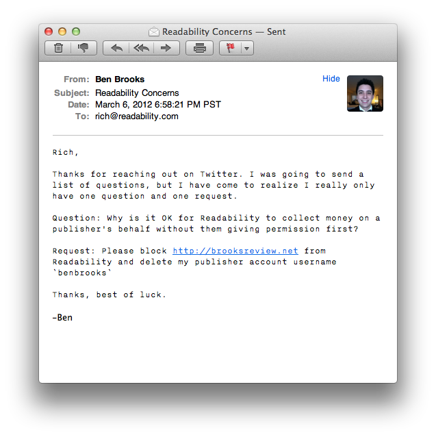
    [](http://c276381.r81.cf1.rackcdn.com/twittelator-neue-5.jpg)

    Let’s just get this out of the way right now: the icon is hideous. It’s ugly to the point where I almost don’t want to use the app because of its icon.

    Ok, now that I have said my piece on that issue we can get into the rest of the design.

    I think the best way to describe the UI design is with the word: light. Both in the sense of the visual color/brightness and in the overall feel of the UI. The app feels like a bundle of plastic to me, from the gloss stylings to the way it “feels” when you move about in the app and that gives it a very light feeling.

    I also think that Twittelator Neue spent some time paying attention to the look of text in the app because I find the text clean and easy to read.

    [](http://c276381.r81.cf1.rackcdn.com/twittelator-neue-2.jpg)

    But the app is also pretty low contrast. The pop-over for adding links to Instapaper is very low contrast — in fact when you really look at the app most of the design is rather low contrast. That’s not a deal breaker, but it can be difficult if you are trying to fly through the app.

    For an app that is just about the most opposite of skeuomorphic that you can get, it has this little detail:

    [](http://c276381.r81.cf1.rackcdn.com/twittelator-neue-8.jpg)

    Wow, really? I don’t so much object on the grounds of skeuomorphism, but on the grounds that this detail just doesn’t fit with the rest of the app.

    As I said above, I can’t really decide if I like this app or not — the design doesn’t *do anything* for me. I could take it or leave it.

    There are areas where it is better than the Twitter app and areas where it is worse, overall I don’t think the design of Twittelator Neue alone will sell you the app.

    ### Navigation

    The navigation for Twittelator Neue will certainly set it apart from any other Twitter app. While it has the standard navigation tabs at the bottom, well truthfully, those tabs aren’t even standard.

    The navigation tabs at the bottom actually are confusing because they can be hidden away with a downward swipe — and pulled back up from the little tab that is left behind. This is, at the same time, very clever and very confusing. I never think: “oh I lost the navigation tabs”, but when scrolling through my timeline I tend to think: “woah there, almost hid the navigation tabs”.

    The difference is that I don’t care if the tabs get hidden, but when scrolling I notice them start to hide away and my reaction is always to jerk them back up in place. It’s like knocking `X` over (that doesn’t matter if you knock it over or not), but that you still actively try to prevent `X` from getting knocked over.

    Now here’s a real annoyance that I have: the top navigation bar moves. When new tweets arrive the top navigation bar drops down to show you the count of new tweets, same too when you add something to Instapaper. So the navigation bar completely bucks the iOS standard behavior of always staying put and that is off-putting.

    I find this movement to be one of the more annoying aspects of the app. It is just something that does not and should not move.

    I do, however, like that you can swipe left and right pretty much anywhere to move about the different tab views — I think that is really great as a small time saving touch. But for as much time as this action saves you, you lose it all once you try to switch from one account to another.

    Account switching is just buried too deep for me, not to mention slower to get at then on the official app. I also find it annoying that you always start back at your profile when you switch between accounts.

    The navigation is something that will take more time to get used to than what I have spent with the app and even still I am not sure if it will be worth getting used to in the end.

    ### Instapaper

    Truthfully I can, and do, ignore all of those problems with the app because it does one thing really, really, well for me: it sends links to Instapaper much faster than the Twitter app does. More than that it adds the link back to the tweet in the Instapaper description so that I can properly attribute the item.

    I need not load up a webpage first before sending to Instapaper.

    One odd thing is that when you have a Tweet in the main timeline with more than one link in it — there is no prompt for which link you want to send to Instapaper, you just get all the links. I don’t mind this, but I do wish I was given the option to choose.

    ### Avatar Power

    There’s one last thing about this app that I find kind of odd: its obsession with Twitter Avatars.

    This is an awful lot of Matt:

    [](http://c276381.r81.cf1.rackcdn.com/twittelator-neue-prof-.jpg)

    This isn’t that big of a deal to me, but I find it odd how obsessed the app is with showing you huge avatars, take the profile page for example (that is *your* profile page when you install the app):

    [
    ](http://c276381.r81.cf1.rackcdn.com/twittelator-neue-1.jpg)

    Why is my avatar shown twice, and how creepy is it just seeing my eyes? So odd, I feel like I am constantly being spied on with all this avatar love in Twittelator Neue.

    ### Concluding, Something

    So is Twittelator Neue better than the official Twitter app? It only is in the implementation of Instapaper and for me that is enough to keep on using the app. In almost every other aspect I prefer the official Twitter app.

  • Some Thoughts on the Jawbone Era

    A while back I needed a new bluetooth headset, so I decided to purchase the [Jawbone Era](http://www.amazon.com/exec/obidos/ASIN/B004K1EDG2/ref=nosim&tag=brooksreview-20) (affiliate link). In fact I ended up purchasing two of these headsets after my first one took a ride through the laundry.

    [](http://c276381.r81.cf1.rackcdn.com/era-1.jpg)

    While I like this headset quite a bit, there are four issues with it that I find quite annoying and that I only really became annoyed by recently.

    ### 1. Comfort

    Jawbone gives you a plethora of options for wearing the headset, including an over the ear loop. Here’s the problem though, with exception to the over the ear loop, the headset becomes very uncomfortable after about 30 minutes of wear.

    If I wear a smaller ear piece it is comfortable, but the headset doesn’t stay in my ear. If I wear the correct size it stays in my ear, but my ear ends up aching 30 minutes later.

    The over the ear band is simply not an option because:

    – It conflicts with my sunglasses. Yes I live in Seattle, but clouds can be quite bright.
    – It is more difficult to put on — meaning I need to keep the headset on my ear while in my car or fumble about every time I want to make or receive a phone call. This is not something I ever want to do.

    The SoundID headset that this Jawbone replaced was perfectly comfortable, so I know it is possible to have a headset that fits my ear comfortable — it’s just not the Era.

    ### 2. Bluetooth Connectivity

    I keep my iPhone 4S in the car door pocket, which is low and left of my body. There is actually a special little felt lined area for it there — this is the best place to keep my phone. I wear my bluetooth headset on my right ear, as these types of things tend not to stay in my left ear.

    The distance from my ear to the iPhone is about three feet.

    At that distance the audio gets a bit crackly. However if I move the phone three feet away on my right side, perfect audio. Even at 6 feet.

    I have found that the Jawbone doesn’t like to have to maneuver around your body and instead it just sounds like crap. This is really annoying for me, but people on the other end of the call rarely get the crackling sounds — so it’s not a total waste.

    I think, though, we should be past this bit of annoyance by now.

    ### 3. Motion Sensing Buttons

    The Era has this feature that you can turn on (when you mess about with it on your computer) that can set the headset to answer a call if you shake it twice. It sounded neat in the beginning, but it has turned out to be the worst feature I have ever seen.

    Here’s the common scenario:

    – My phone rings.
    – I grab the Era from the center console where it was sitting.
    – I lift it to my ear, and secure it in place.
    – I press the answer button.
    – I hear the other person.
    – Then the phone hangs up on the call.

    What actually happened is that somewhere along the line I shook the Era twice and it initiated the call answering. What the hell? Then when I pressed the button on the Era to answer the call — well — I actually was ending the call.

    Lame.

    You can turn this non-sense off, but you need your computer to do it. This is the single worst feature, but not the worst problem with the Era.

    ### 4. The Worst Button in the World

    The absolute worst part of the Era is the call/end button on the back of the device. It feels like complete crap. The stroke of the button is so shallow that you can hardly tell if you pressed it and forget about a firm and even “click” because most of the time you won’t even notice one.

    Therefore: I never know if I have actually pressed the button or not.

    [](http://c276381.r81.cf1.rackcdn.com/era-2.jpg)

    Just really horrible design and lack of care and attention to the one part of the device that all users are going to be interacting with. I find this button inexcusable.

    ### Wrap-Up

    I didn’t really state any of the good on this headset, so let me state it now: the noise canceling is phenomenal and the audio quality is very good (provided your phone is one the same side of your body as the headset). The battery life is OK (about 3-4 days on one charge left on in my car 24/7 and used about 30 minutes a day).

    Even with all the bad, and the very little good, this is the best bluetooth headset I have tried — which says more about the industry as a whole.

    For a device that many states require a driver to use, if they want to talk on the phone while driving, it is pretty amazing how crappy most of the bluetooth headset offerings are.

  • It’s About Trust and Apple Broke It

    [Craig Grannell responding to the idea/ragae that Apple should have prevented Path from uploading a users address book](http://reverttosaved.com/2012/02/10/blame-apple-part-3463-it-shouldnt-allow-devs-to-be-naughty/):
    >But more to the point, why should Apple become a watchdog for the less-than-moral behaviour of some developers? Just because you can do something, that doesn’t mean you should.

    What I think we all have to keep in mind here is the concept of trust and more specifically who is asking for our trust. Apple isn’t saying that we should trust developers, quite the contrary, because of the review process Apple is saying that we actually *shouldn’t* trust developers.

    What Apple is telling iOS (and now with the Mac App Store, OS X) users is that they can and *should* trust Apple. And therefore they can trust everything in the App Stores because those apps have been vetted by Apple.

    And we are supposed to trust Apple.

    There is no doubt in my mind that developers should go out of their way to gain user trust and there are some developers that are absolutely trustworthy. While there are certainly developers that can be trusted, and developers that can not be trusted, it doesn’t matter at the end of the day.

    If you live and play in the Apple world, you need only trust Apple. This is what Apple tells us — it’s a ‘feature’ of the Apple ecosystem.

    The fact is, that in this instance, Apple broke that trust.