Category: Articles

  • What iOS RSS Readers are Missing

    Since I took the time to dive into Unread and really consider the app, and the app category, I came up with a few things that I think are generally missing for some, if not all, RSS apps.

    Speed Mode

    Jared Sinclair, in my Unread review, talked about how most RSS apps seem to be made for what he called ‘triage’ — meaning just getting through the slog of items, but I think all RSS apps should have a triage mode. I should be able to leave my RSS feeds for a week and come back to thousands of items, and get through them all in 30 minutes.

    How? I’d propose that an ideal RSS client can perform some of the magic the same as Fever’s hot list does, by telling you what was popular while you were gone. So the app mode would work something like this:

    1. Enable popularity rankings. Let’s say that is on a simple five point scale, you then tell the app you want to see only articles 3 points or up — and to mark everything else as read.
    2. Now you have a significantly trimmed the list, but you still have to look through all the items. From there I would hope the app can craft a conversation view of posts centering around the same article. That way you can see the main, say, New York Times article, and a listing of the blogs/articles that commented on, and linked to, that main article. This way I can judge if it really was that important based on who is commenting on it.
    3. You should then quickly be able to toss articles to your read later service of choice.

    The overarching goal being to use social networks, and the RSS networks in your reader, to tell you what was popular — and to then take that one step further by only showing you the popular post, and effectively burying the commentary posts about that popular post.

    Two Reading Modes

    For times when you are not triaging you should be able to shift the app between a casual reading mode — something like what Unread is — to a more in-depth reading app. In other words allow me to toggle between something that works like Unread, and something that works more like a (good) digital magazine.

    The in-depth mode should show all the full content for the articles along with images and videos, ready to read as individual pages, so instead of looking at a list of articles you just get articles presented as pages that you flip through as you read them.

    It’s like your own curated magazine. Meant to be read from cover to cover.

    Auto Read Later

    I’d like to be able to mark certain feeds as auto-read-later feeds. I personally know that I like to read everything that Shawn Blanc publishes to his site, so I’d like to flag that feed as one that I never need to see because everything from it just is sent directly to Safari’s reading list.

    This would also weight that feed heavier in my above popularity rating scheme.

    Important?

    As I talked about in the triage section, I think RSS apps should give you indication if you are about to ignore a post that is generating any kind of a ‘buzz’. This could be aggregated from within your RSS feeds, to Twitter/Facebook and other sites.

    Sometimes I gloss over posts that a lot of other people are talking about just because it has a shitty title — such a feature would aim to make me give that post a second thought. Kind of like a: “woah, woah, that’s an article from John Gruber, not a link.”

    Link Blog

    Allow me to post a linked-list style blog post from within the app. Quote, author, snarky comment, title, posted.

    Yes, please.

    Reading Time

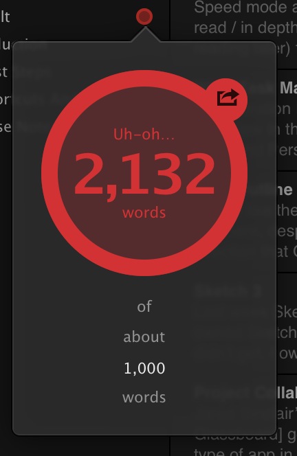
    I also mentioned this in my Unread review, but I think RSS apps should show you the reading time of each article right in the list view. And further I think you should be able to hide items over/under X reading time so that you can see all items that can be quickly read, and then check out the longer posts at another time when you want.

    To me that would be a killer feature for allowing me to check my RSS feeds in different ways, at different times and places, throughout the day.

    Handling Linked List Posts

    Last, but not least, RSS feeds should be smart about linked list style posts. If I send that to read later, I don’t always want to send the linked-to article to my read later service. Most of the time I want to send the RSS article — the commentary article — to my read later service.

    In fact, the ideal would be a setting to simultaneously send both the source and commentary articles to my read later service of choice. That way I can read the article and see the opinion of someone I care about.

    Wrap

    RSS readers are mostly differentiated by design at this point, which is good for casual users, but even the powerful Mr. Reader isn’t enough if you are a major RSS user (like me). This list is just the tip of the iceberg for creating an RSS reader that has a feature set which would take RSS from “email style inbox” to a tool for finding great things to read, and actually reading them.

  • Thoughts on Unread for RSS Reading

    Unread was first released back in February, and while I wasn’t ‘in the office’ during that time, I couldn’t use the app given the lack of support for Fever. Recently the app updated to version 1.2 and I was able to give it a go as it added support for a lot more RSS services (including Fever, obviously). Without a doubt the design philosophy behind Unread, and the way that I use RSS, seem to be polar opposites.

    Unread is the type of app designed for people to spend a long time in the app. It’s not an app made for popping in and out of. It’s not an app made to get through RSS quickly.

    It’s an app made to read your RSS articles, in the RSS apps.

    While most RSS apps try to make it efficient for the user to send stuff to read later, Unread is designed for you to read the goods now and is very blunt about telling you that. (Though there is copious ‘read later’ support.)

    I was concerned about this philosophy since I subscribe to 748 RSS feeds. Hmm.

    What I found in Unread was not only a beautiful app, but a highly functional app — even when asked to do something it does not feel it is explicitly designed to do.

    I sent over a few questions to the developer of Unread, Jared Sinclair, to quiz him about some decisions made in his app. Specifically, I wanted to know more about this ‘philosophy’ he is pushing in the app. I wondered, that if Unread is designed to be enjoyed slowly with an iced cold Pepsi (or hot Coffee… I guess), then why truncate the posts in the main list view instead of just showing everything right there ready to read? ((Note: All of the responses from Sinclair are shown in their entirety and un-edited by me. I’ve re-phrased my questions to fit the flow of this article.))

    Sinclair: The word I use when describing how most other RSS apps are used is triage. I don’t mean this as a pejorative term. Some users have a lot of feeds and use RSS as a staging area for articles they’ll read later with something like Instapaper. I think this is a totally valid use for RSS, but it’s not the way I want to use it.

    Even though Unread is a destination and not a staging area, readers still need to be able to pick and choose what to read next. A good example is a blog that mixes linked-list posts with original articles. I may not have time to read an 8,000 word post on iOS 8 predictions, but I might have time to read a few short link commentaries.

    Finding the right balance between usability and aesthetics was a challenge. Unread’s article summaries are short enough to allow an overview of what articles are available to read, but long enough that they don’t look like email inbox items. Here’s a link to a visual history of my Photoshop sketches for the article summaries: http://jaredsinclair.com/unread/article-list-history.html

    I’ve never been one to read a blog directly on the web, always through RSS, but I can see the reasoning for allowing the user to decide if they have time for something right now. To that end, adding in reading time estimates would go a long way for helping with that decision.

    One thing that has really surprised me about Unread is that even though I subscribe to more than 400 active RSS feeds (748 total if you include those listed as “Sparks” in Fever), I am still perfectly able to use this app that seems very much not designed for a ‘triager’ like me.

    I asked Sinclair if this was intentional on his part.

    Sinclair: I have strong opinions about what I think is the most satisfying way to use Unread, but it would be foolish of me to think that my opinions are a good fit for everybody. Unread needs to strike a balance between novelty and utility, if only so that it can appeal to enough customers that I can stay in business. I’ve been pleasantly surprised how well-received Unread’s opinionated choices have been, things like the long article summaries or the lack of buttons and toolbars. Perhaps I had underestimated how many people felt like me and wanted a more relaxed reading experience.

    In other words, sage advice: don’t cut your customer base to a dozen people if simple choices mean you can have a customer base of hundreds of thousands of people.

    Since many have talked about Unread before, I thought I would just point out somethings which I noticed:

    • The app is what I call quasi-fullscreen as it does not forgo a status bar at the top, but otherwise acts like many apps that are fullscreen by not showing navigation buttons. I really wish that status bar was gone, and I am not sure the reasoning on keeping the status bar in the app. It adds very little value, and seems to keep you one set away from full immersion into the app.
    • Along the bottom of the screen is what I will call a section header. So when you tap on your RSS account it will display the account type (for a Fever account, the bottom is labeled ‘Fever’). What’s odd is that when you move into your unread items list, the title says ‘unread’. Which is logical, and helpful, but when your app is also called Unread, well, you can see where the confusion is. Is that a label for where I am in the app, or a reminder of the app I am using? This drives me nuts.
    • The main screen of the app is really odd. It looks like a promo/tutorial/setup type of screen, yet it is to be the top level screen for the entire app. I just don’t get it, nor do I like it. Sinclair said it is based off of table of contents.
    • That said, one really great touch is the inclusion of today’s date on the screen. I have no clue why I like that so much, but I really love it. I asked Sinclair about the decision to include the date on this screen.

    Sinclair: Thanks for mentioning that. It’s one of my favorite parts of Unread, too. Unread’s home screen is inspired by tables of contents from literary magazines like the New Yorker. Those kinds of magazines often place a big masthead and publication date above the table of contents. Putting the UNREAD word mark and today’s date on the home screen sets the tone for the rest of the app: this is for reading, not for rushing.

    • The app has some great themes, but does not automatically switch from light to dark based on the lighting conditions around you. This is a pet peeve of mine as I believe all apps should do this now, but to be fair, Unread is setup to allow a user to quickly and easily change the theme without losing their place in the stream. The actions for doing this (pulling the screen from right to left) is something I think more apps should employe as it is a lovely experience.
    • On the topic of themes, I feel the dark/night theme is very hard to read when there are a lot of links in a post as the links are red and underlined. Many things I’ve read lately talk about how highlighting links makes for a very distracted reading environment. So, once again, I asked Sinclair what his thoughts were on the link coloring and underlining in Unread.

    Sinclair: Good question. Early on I tried using just an underline, but it created problems. I stumbled upon an observation that now seems obvious: links are two things at once. They’re text but they’re also buttons. The usual typography guidelines don’t entirely apply. Links need to look tappable and be easy to spot. The best solution for Unread is a combination of a different color and an underline. Here’s my rationale:

    • If they were only underlined, then they wouldn’t be distinguishable from underlined text that isn’t a link. The same would be true of making them boldface. 
    • If they only differed from normal text by their color, then they wouldn’t be easy to spot by users with color blindness. 
    • If they didn’t use color, then they would be hard to spot in complex areas of text. Think of a bulleted list where each item contains a mix of typographic styles (boldface, monospace runs of code, italics). This kind of thing has a lot of visual activity and is not uncommon on technical blogs. Color helps cut through that noise.

    The combination of both color and an underline is usable by the greatest number of people, and for a wide variety of content, but without resorting to non-typographic elements like roundrect borders or a solid color background.

    • Even though it isn’t in-line with the philosophy behind the app, it drives me nuts that it requires so many taps and holds to send an article to a read later service. To me this is an action that should always be able to be performed quickly.
    • My last complaint is very minor, but seems like the most unfinished part of the app: the release notes. It is great that the release notes are in the app, but why just shoot out to a web view instead of loading in the release notes and styling them to fit the app? Again, seems like an oversight in an otherwise well polished app.

    At the end of the day, Unread has won me over, as it is just too pretty to not use. Watch your back Reeder.

    Unread is currently $4.99 on the App Store, and worth every damned penny.

  • Ulysses III, Version 1.2

    (Confusing version numbers, I know.)

    The best writing app for the Mac has been updated today and adds some very neat stuff. This isn’t a full review of the app, as I have one here, this is what’s new (and great) about the latest version — also what’s still missing.

    Goals

    A lot of writers set goals — where they want to write X words each day. Or perhaps you know you can only write something so long before you get in trouble. If that’s you, then you can rest easy as Ulysses will now easily track that in the sidebar of the app. Better still, it is out of view when you type, so as not to get annoying, but right there when you aren’t writing.

    It’s not something I’d ever use, but I can see the value for many people. I tested it out since I received an early copy of the app to test, and it’s implemented really well.

    Multiple Tags

    People love tags, now you can love them more. Again, another thing I don’t use right now, but something that is clearly becoming more and more popular with Mac users since the addition of file level tagging in Mavericks.

    Right now I organize with the groups in Ulysses, but I could really see this being handy as you can effective have the same sheet in multiple groups. I am still trying to plan out how to best utilize this, but I suspect that I will have it down in a few days.

    Theme Exchange

    It’s likely this will be excellent. ((Alas it was not open for me to check out.)) I love the stock themes in Ulysses.

    I always love seeing what designer types can pull off with themes of their own.

    The Soulmen also have a theme exchange for the export themes. Perhaps you don’t use these much, but they are an highly effective tool for getting your text properly formatted and off to someone else. I’ve taken to using them almost entirely for my personal document creation instead of Pages.

    Writing Themes

    They’ve also made it easier to create your own writing color themes, but as far as I know there is not an exchange for these yet.

    Missing

    • Per Group Themes: I wish I could set a display theme for each group, so that as I moved from group to group there was a visual change to the text. That distinction would be really nice.
    • It’s still not obvious how you make your own theme. You can edit certain things in the preference dialog, but to really tweak the background you are going to have to right click the theme and click ‘edit’. I am not sure why it is setup this way, it seems very backwards to me.
    • Publishing to WordPress: please?

    Huge update to one of my favorite Mac apps (and one of my most used Mac apps) and I would highly recommend this app to anyone who writes anything.

  • OmniOutliner 4

    I really like the apps that the OmniGroup puts out there, despite my sketpicism about the direction that OmniFocus is taking, the work is some of the best work on OS X.

    I’ve long been an OmniOutliner fan, having used version 3 extensively, and keeping the iPad version on my iPad home screen. When version 4 came out, I hesititated and ended up not upgrading.

    Because of that OmniOutliner began to collect dust in my app folder. Just last week I picked version 4 up, as I really needed a strong tool to get caught up on a bunch of work, and man am I impressed.

    OmniOutliner 4 is a heck of a tool, and really ‘modern’ when compared to version 3. I’m excited to learn the app more.

  • Sketch 3

    Last week Sketch 3 was released. I’ve long owned Sketch, but never really used it — I didn’t get. I own Acorn, Photoshop CC, Pixelmator, and Sketch — and I have to say while most of these apps seem to be the same thing, Sketch is different.

    I’ve been consulting on more apps lately and that often necessitates me ‘sketching’ out an idea of how the app should look. It’s just hard to describe things in words, when a mockup can state everything more clearly. This used to take me a lot of time to do in Acorn/Pixelmator/Photoshop, but with Sketch I am have been firing them out like it’s nothing.

    I am loving Sketch.

    One thing I will note, is that like all the apps listed (save Photoshop), Sketch offers very limited control of typography. I really wish that weren’t the case, but sadly it is.

    Sketch is $79 on the Mac App Store.

  • Thoughts on Project Collaboration Apps

    Jared Sinclair’s post today about Glassboard got me to thinking about this type of app in general. I call them project collaboration apps because they deal more with discussions than planning. (Whereas project management apps deal more with planning than discussion.)

    The best project collaboration apps I have found are:

    • Glassboard
    • Quip
    • Slack
    • Basecamp

    The problem is that I simply cannot tell you which of these is the best because they all have issues and strengths. In short, here’s how I see these apps stacking up:

    • Glassboard: Designed around the one idea at a time approach. A users posts a new message and there is a thread of other users responding to that message. It’s best thought of as a thread on a message board. The obvious benefit being that threads are usually very on topic and to the point. The down side being that there is less room for a conversation around a general topic, as messages are designed to be more specific than that. Should you want to be more general you will quickly get lost in all the comments on messages.
    • Quip: Designed around files. Think of it like Editorially for Word documents. Quip is all about collaborating on documents, so if you are only sharing Word-like files, you cannot get anything better than Quip. It’s far better than track changes if you ask me.
    • Slack: Designed around conversation topics. The newest kid on the block is very well received (I use it multiple times a day). You create #channels that have set topics. Everything flows like a more natural conversation in those rooms — like in chat rooms. Files can also be uploaded into a room, where files then get a specific comments thread for each file. Overall Slack excels at water cooler talk, and general discussion. Where it lacks is focus. If you wanted to talk specifically about one design element of an app (like a button, instead of the app design in general), it is quick and easy for that to be derailed, and then hard to track the conversation about just one specific element.
    • Basecamp: The OG of this type of app is designed with a more traditional project management focus. Though, in recent updates, the app is slowly shifting to project collaboration. I’m of the opinion that Basecamp combines Quip and Glassboard, but doesn’t do either function better than those apps. Basecamp for the most part still lacks a freeform chat, which was previously built into the product with the help of Campfire. Basecamp excels at structure, but lacks in allowing structureless conversation.

    In a nut shell, each app has strong reasons to use it, but none of them are there yet — to me this is evidenced by the fact that I use all four of them weekly (if not everyday). I’ve been trying to think about what is missing from these apps, or what the perfect app would be, and I’ve come up with some core ideas that I think are missing (in some form) from some, or all, of these apps:

    1. Give me a way to have conversations around one central theme. Something somewhat general like ‘design’. Slack excels at this, and though you could do that with multiple boards in Glassboard, it’s not setup for free form conversation. Again, Slack is the perfect example of this. This type of loose conversation is ideal for brainstorming, and also perfect for roughing out where a project is. It’s the tool you want to keep to get the project off the ground, and then gives you a place to vent as the prject gets closer to completion.
    2. Allow me to define a specific topic within a conversation. This is where Glassboard and Basecamp excel, and Slack suffers. Going back to my earlier example, if I want to talk about button design within a ‘design’ conversation I should be able to track just that discussion without being sidetracked by side discussions. For that the Topic > Comment framework is ideal. While you could create more #channels in Slack, that’s a hack of a solution. I’d like these specific topics to be visible within a main conversation, but then to later be able to just view the specific conversation on a topic. This is critical once a project is under way, and all the way through completion.
    3. Commenting on files and images is crucial. Each of these apps handle this in some way, all different, but I think Basecamp handles this the best. I like that I can have a conversation on a topic in Basecamp and attach any file. In Slack you can do that, but then that file can have specific comments on just a file — which is confusing. If you are swapping mockups for one design element, it all needs to be maintained in the same thread — as Basecamp does. I should be able to upload a mockup, and each person responding should be able to comment on that, and upload iterations of that mockup all on the same ‘thread’. Again, crucial for most projects that are underway.
    4. I need to collaborate on text. Basecamp has a really poor implementation of collaborating on text, and it’s so bad I don’t want to talk about it any more. Quip, clearly, does the best job here, but the app is so niche it is hard to assimilate into a workflow. Every project invovles writing something at somepoint — it should be natural part of such an app.
    5. Private messages are a must, and Slack really does a good job at that. It’s nice to be able to talk directly to a team member in a private setting, but not be beeping their phone with each message. I want to be able to leave work when I leave work. I want to be able to use my comptuer without getting bugged by work. To that end, I want the private messages within the app, instead of IM or Text messages.
    6. Notifications need to be smart. The app should be able to tell me when things are directed at me, and what I have and have not read. Again, Slack does a very good job at this. I talked above about how Glassboard doesn’t handle this well, and I personally think the dashboard view of Basecamp doesn’t handle this well either. Slack needs to centralize these notifications, but does the best job of the lot. I also need to have quiet hours, to turn off the notifications, but get a summary when I get back to work.
    7. Bookmarks. Most of the apps have a way of bookmarking a topic, or message, but I always wish it went further. I’d love to be able to send different things within each topic/discussion to a reference folder of sorts. To be able to quickly cull together excellent ideas, tasks, and important notes in one place that is only visible to me. Something like a montage of important pits from all the things going on within the app.
    8. Allow me to get old stuff out of my face: a.k.a. give me an archive buttons that works. I still want to be able to see it if I need it, but I don’t want to see something that just isn’t active anymore. Once we design that button, I only need that conversation for posterity and not for active discussion. Remove the mental overhead of seeing that discussion when I login.
    9. Allow me to take any one message, or thread of messages (or files, etc) and turn it into a task for a team member. Most task systems ask you to create the task first, and then discuss it. I think that is backwards. I say, lets talk about the button design and then when we get it all figured out, assign the implementation to one person.

    That’s my quick and dirty list of things that need to be addressed in project collaboration tools. Perhaps you don’t think this is all that important — these are niche tools — but to think that seems to be sticking yourself with the idea that going into the office will always mean: going into a physical office where all your coworkers are. That’s changing, and changing fast, and these tools are becoming vital to that change.

    I hope they get better and get better faster than they are right now, because using four apps at once is tiring.

  • Improving My Workflow: Desk

    Most of the year I spend reacting to things going on at work, news on the web, and opportunities as they present themselves. So while I used to be a big GTD nerd, of late I tend to just be a reactionary fool. About once a year I stop working, dump everything rattling in my brain on something, and then reevaluate it all.

    My goal is instead of forcing myself to work in a rigid way which may actually not work for me, I try to set habits once a year and let those habits slowly change throughout the year as I need. Then at some point I stop and reevaluate it all.

    It just so happens that this once a year period is right now for me.

    The first up for my changes in habits are in how I work at my desk, and on my desktop. As you can see in the picture I keep my desk very tidy, so here’s a quick rundown of what’s going on.

    Left Side

    On the left side of my desk I keep my camera, my iPad, my stylus, and a pen. I’m left handed so it only feels natural to keep those items on my left.

    iPad & Stylus

    When I get to work I layout my iPad and Bamboo Stylus as you see in the picture. I also open up the Notability app, with a “scratch” document open and ready (but the iPad off). I’ve long tried different ways of entering quick notes into my Mac (notes you might take while on a phone call), but in practice it doesn’t work to use a keyboard. Typing with one hand just is annoying.

    Pen and paper are fastest, but I can’t stand a pen and paper. Instead I use Notability as the paper, and the stylus as my pen.

    I keep one running file of notes in Notability, which archive once a month. This allows me to scribble phone numbers much easier than typing with one hand while on a phone call, like I would on paper, but with the added flexibility that a digital system offers.

    So far this works well.

    An additional note: I keep the smart cover as you see in the picture. This allows my left hand/wrist to anchor the iPad in position while I write — and keeps the iPad feeling much thinner (hand is held higher because of the cover and iPad is lower than if the cover was folded behind it) than if I were to fold the cover back behind the iPad. So while it looks a bit silly, it works much better this way and feels more comfortable.

    As for the stylus: a necessary evil. I like the Cosmonaut, but the rubber makes my hand smell funny so I don’t ever use it. The Bamboo stylus is small, looks nice, and writes well.

    So there you are, I guess I am an iPad stylus guy after all.

    Pen

    I’m currently using 1.0mm Uniball Jetstream pens with blue ink. Original documents are best signed in blue ink and that’s pretty much the only reason I have the pen: signing contracts and checks. I don’t care to hear about other pen choices, I literally just use it to sign things.

    Camera

    While my camera isn’t always on my desk, it usually is 60% of the time which is why I included it in the picture. There’s no reason for the camera to be on my desk, other than to serve as a reminder of what I would rather be doing.

    Center

    Central to my desk is my retina MacBook Pro, CODE Keyboard, trackpad, and DJ stand for my Mac. The stand is to get the computer high enough, the Mac always has Flow open and ready to go. That CODE keyboard, she’s a thing of beauty. (Also trackpad, because I don’t like the scratching sounds of a mouse sliding on my desk.)

    Right Side

    Off to the right I keep my iPhone. This reason is two fold: I tend to answer my phone with my right hand, and it is easiest to move when someone wants to come set papers down for me to review. That and the left side is really crowded as is.

    Boring

    On the face of it this is all rather boring to talk about, but the biggest revelation for me was using Notability. I’ve long used the app in meetings, but making a place for my iPad & stylus on my desk has really helped me keep working without trying to type one handed, remember things, or search for paper.

    For me adding in the iPad in this way wasn’t obvious, but felt natural once I did it. It takes a lot of space on the desk, but just works brilliantly. I’ve tried many other apps, but I like the way Notability works, and so it stuck.

    Most people like to keep a scratch piece of paper handy, and I truly do too, but I don’t like dealing with that paper afterwards. Using my iPad I get 85% of the way to that paper, with the added benefit of not having to deal with the paper after I am done with it.

    I also find leaving the cover open, feels like it is an open notepad awaiting my scribbles. And yes, sometimes I just use it to doodle while on the phone — but I typically switch to Paper for that.

  • Standing Desks: How to Get Going

    Mikael Cho recently moved to a standing desk, but found the experience short lived. Cho:

    After two weeks, I was able to stand for about four hours a day, but I still needed to take multiple breaks. This was fine with me because I often need breaks throughout the day to refresh and maintain a good flow.
    And:
    If a standing desk works for you that’s great. But if it doesn’t, don’t force it — especially if it negatively impacts your work. Standing while working might not be for you. It wasn’t for me. And that’s okay. Standing for long periods of time isn’t much better than sitting anyway.

    Cho gets really in-depth into the standing desk ideology, and what he has done in hopes of making his sitting desk situation better. Even though I don’t agree with Cho, this is an article that I think everyone who works at a desk should read.

    That said, it is my opinion that he went about standing to work all wrong. At the beginning of 2011 I started standing full-time. I wrote my reasoning in that linked post, but you all know why already: standing is healthier.

    But standing hurts right? Cho was driven nuts, my buddy Shawn Blanc couldn’t bear to stand all day (Shawn corrected me) much preferred to sit while writing, than he did standing. It’s a pain in the foot to stand all day. But only for a little while.

    Like anything in life you have to ease into standing to work, and then even after that it will take a while to build up the strength to stand all day — trust me. It is three years later and I still stand to work, but even at that I get tired.

    My journey to standing all day looked like this:

    • Day One: stood for two hours, and didn’t get much work done. Finally sat down and just wanted to cry.
    • Day Two: basically the same thing as day one for the next week.
    • Week Two: Things were better.
    • Month Two: I can now stand for about 6 hours a day, but more importantly I have finally broken the urge to sit down when I need to concentrate on something.
    • Month Four: I stand all day, and can work effectively now while I stand. I still go home with sore feet and legs.
    • Month Eight: The soreness is mostly gone and I can stand fine.
    • Year Two: I can’t focus as well when I sit, and my legs/feet rarely feel sore. I’ve also ditched the anti-fatigue matt.
    • Year Three: It feels weird, and too loungey, to sit and work.

    In other words, it takes more than a year to fully adapt the standing habit. Think about how much you hated sitting a desks when you were a kid to work, but then you got used to it — now you are trying to undo all of that training.

    The biggest issues you will face when trying to move to a standing desk are:

    • Sore feet, knees, legs, and lower back. This is common, and is due to you not being used to working those muscles all day like this.
    • Trouble focusing on detailed tasks while standing. You just aren’t used to standing and so standing itself is taking some of your concentration.
    • People won’t get why you are doing it and will constantly remind you how comfortable sitting is.
    • Your chair is right there — calling to you.

    Standing all day isn’t easy, but I firmly believe that it is a lifestyle choice that will pay off in spades long-term. So, here are my top tips for getting started with a standing desk:

    • Wait at least six months before you build/buy any sort of a permanent standing desk. There are tons of ways to build a makeshift standing desk for pennies. Just search around. After that you can get something nice, but I waited until just recently to buy and actual standing desk.
    • Wear comfortable shoes, like athletic shoes, for at least the first month. Even if you can’t wear those for you job, bring a pair to switch into while working. Don’t try to go bare foot.
    • Don’t be afraid to take your shoes on and off as you feel you need to do.
    • Anti-fatigue mats are nice, especially if the floor in your office isn’t carpet.
    • Your feet will swell, so be sure to wear shoes with laces so that you can loosen them.
    • Don’t try to stand for more than an hour for the first week.
    • Then, if I were to do it again, I would add 90 minutes to my standing time each week until I got to eight hours.
    • BUT, break up that time in halves. Stand when you first get to work, and right after lunch. Sit the rest of the time.
    • If you need to sit, sit. Don’t force standing, but also try to have enough discipline to hit your standing time goal each day.
    • Marvel at how much shorter “meetings at your desk” are now that others are forced to stand too.
    • Don’t eat while standing.

    Most important: give it time. Six months in, you should have a good sense if standing is going to work for you, but it won’t be until about a year in that you are fully comfortable with standing.

    These days I stand for about 85% of my working day and sit for the rest. If I am tired from the kids keeping me up, I just sit. There’s no reason to have my work suffer just so I can stand, but I still try very hard to stand as much as possible.

    Even an hour a day of standing is better than no standing. Keep that in mind and go easy.

    The biggest downside to standing is how much faster you wear our your shoes and socks. I go through socks like crazy now.

  • Updates to Writer Pro

    I’ve been using Writer Pro a lot since it came out, but recently found myself back in Ulysses III (a topic for another post). Recently though Writer Pro got a very important update, this update adds the first ever ‘night mode’ theme to Writer Pro.

    It’s very well done, and very welcomed. I prefer to write fullscreen with a dark background, and so Ulysses always fit the bill there better. But this new night mode for Writer Pro has much better colors — it’s very well done.

    (Luckily Ulyesses allows you to edit the themes it uses, so this should be a no-brainer.)

    Either way, if you bought Writer Pro already you are really going to dig the new night mode.

  • Replacing Flickr with 500px

    About a two years ago Ryan Cash wrote this, in response to my post on the matter:

    But after Ben posted the intimate photos of his super-cute new daughter, they ended up populating an entire page or two of the feed of the people I follow.
    I mean this in the most respectful way possible – but that’s not what > I wanted to see when I went to check the feed of the extremely talented photographers I’ve chosen to follow.
    On Flickr or even Facebook, I’ve come to expect this sort of thing in the “recent activity” section of my contacts – but not on 500px.
    I don’t want to unfollow Ben as I am interested in his other types of photography, but at the same time I don’t really want to see his personal photos all the time. 

    His thoughts came at a time when everyone thought Flickr was soon to die. Since then it has been reignited, but still kind of a dead community. Ryan is/was right, my photos were overboard.

    It was actually an issue with the 500px plugin whereby new photos added to any collection was also added to my profile, and therefore in “feeds”. Now the Lightroom plugin doesn’t do that (which is great), but Ryan is still right.

    500px was always a stop gap while Flickr tried to do anything but that hasn’t really changed. I am faced with two photo sharing sites, one that is great in 500px, and one that is something in Flickr.

    The fact is, neither works for the primary purpose of sharing family photos with friends, Facebook probably does, but not these sites made specifically for photos.

    I’ve kept sharing photos in collections on 500px for my family, but we need something better. I’ve not seen anything better, even the Kidpost project seems to miss the point.

    All I want, all any parents wants, is an easy way to share great photos with family and only family. The best I have found is shared Photo Streams, but those are impossible to add photos to from my good cameras.

    Apps like Sunlit get close, but they still aren’t ‘there’. It’d be great for there to be a section of 500px that still looks great, but only designated family members can access. I don’t need passwords, just a hidden, yet accessible, area for grandparents and the like.

  • Lightroom mobile

    Adobe launched Lightroom mobile today, which syncs using the Adobe Creative Cloud with the Mac/Windows version of Lightroom. You need that Creative Cloud subscription for the sync, but not to use the app as far as I can tell.

    The syncing is on a Collection by Collection basis, and is dog slow even on my very fast internet connection (30mbps up). That said it does appear to sync the ‘master’ (read: RAW) files.

    On the iPad the download sync speed is pretty fast, and you can edit the images and sync back changes swiftly. It all works well, just the initial upload is annoyingly slow. You can also import images on the iPad into Lightroom, thus creating an almost very cool mobile editing tool.

    I say almost because the presets are missing. I love my custom presets in Lightroom, but they aren’t there on the iPad version. That bums me out and really seems shortsighted. Instead, Adobe has just their basic set of presets, which is OK, but not great.

    Also missing is any noise reduction tools, which is just lame.

    Having said all that this is easily the best photo editing tool I have used on the iPad. It works fast, looks really great (which is amazing for an Adobe tool) and overall is very well rounded.

  • Deckset

    My review:

    You’ll want to go pick up a copy.

    Here’s the plain text of that, as needed to create the above presentation. I did nothing else. Awesome stuff.

  • Choosing the Right Camera For The Job: Travel & Hiking

    Reader Patrick wrote in to ask:

    While I am currently 90% lean towards the X-E2, I have only one concern: if take travel/hiking into consideration, how would the weight/size of X-E2 be a issue compared to the E-M5? Furthermore, what do you think of the newly released E-M10?
    I am also interested in how you carry your camera on most of days (i.e. designated bag, pouch, etc.), since I can’t find any camera case satisfies me and I don’t intend to invest in another bag.

    Although I answered him with a quick answer already, I wanted to expand on my thoughts a bit more. This is not as easy of a question for anyone to answer as it would seem. I am going to break things apart a bit and include all mirrorless cameras in my advice, but ultimately give you an answer that fits within the bounds of his question. Here we go.

    Travel

    Personally I think the best travel camera you can buy is the Fujifilm X100s. Here’s what Ken Rockwell has to say on that camera:

    No camera captures life like the Fuji X100S, and it’s so easy to carry everywhere around your neck.

    But the X100s is also fixed lens camera and therefore not everyone’s cup of tea. Even though I’ve spent limited time with the camera, I do think Rockwell is right — it’s one of the very best cameras out there. So the ultimate travel camera to me is the X100s, but that doesn’t fit the bounds of the question asked.

    Between the X-E2, E-M5, and E-M10 — which one do you choose? That’s not an easy answer, because the next question is: what lens do you want to use?

    If your answer is simply a small pancake then I think the E-M10 wins out easily. It is very capable, very small, and all around pretty fantastic. But if you want to answer “a fast 50mm lens”, like the 35mm f/1.4 on Fuji, or the Panasonic 25mm f/1.4 on the OM-Ds, well then my answer shifts back to the X-E2.

    The reason being: once you add the 25mm on to the OM-D, the camera size advantage becomes a moot point — all three cameras now become something too large for a pocket. Thus, the X-E2 is my pick as it will give you a higher quality (better and bigger sensor) overall and I think better optics.

    So if you want a really great small camera among those three for traveling, the E-M10 is the pick, but only if you pair it with the Panasonic 20mm f/1.7 lens. Otherwise the X-E2 with the 35mm f/1.4 is the winning combination for interchangeable lenses.

    Hiking

    Hiking isn’t the same beast as travel. For me the best hiking camera would be the Fujifilm X-T1 as it is weather sealed, no anti-aliasing filter for a higher resolution image, and much more. The X-T1 seems built for hiking: SLR like, but really small and really light. No brainer if you ask me.

    However, once again, that answer doesn’t fit the bounds of the question as asked to me. But ‘hiking’ means different things to different people. To me hiking means getting out in the Cascade, or Olympic, mountain ranges and strapping on a backpack for a 5-12 mile journey. To me it means there is a better than 50% chance you are going to get wet.

    Naturally then I would have to say the E-M5 as it is the only weather sealed camera of the lot. And in reality, among those three choices, I truly think the E-M5 is the best bet. The E-M5 feels made to be out on a trail, like the X-T1’s baby brother. My only reservation is that most lenses that are really great for the E-M5 are not weather sealed. ((Personally, I wouldn’t let that stop me, just wipe it down and you should be fine. At least I was always fine.))

    So for hiking then: E-M5 and I would go with a 17mm lens.

    For Hiking & Travel Then

    This is a bit tricky because I think you have to choose which of the two activities you are doing more of, and optimize for that activity. Obviously, I would choose the X-E2, or ideally the X-T1, as I think the qualities of the Fujifilm X-system far out weigh that of the Micro Four-Thirds system (but that’s highly subjective).

    Lets say though that you travel equally as much as you hike. In that case it’s the OM-D E-M5 in my book that takes the winning seat. It’s a bit easier to stash with the 20mm on it, it is tough, it has 5-axis image stabilization, and weather sealing.

    So, for both activities, it’s the E-M5 because you have to optimize for the harsher conditions and in this case the harsher condition would be hiking (typically).

    On the E-M10

    My thoughts on this little beauty are pretty much going off of only the specs and what others say as I have not handled it, but it generally looks great. The lack of weather sealing really won’t be a big deal for 90% of the people out there. I’ve traveled and hiked with tons of non-weather sealed cameras and have never seen an issue, but don’t assume that means you won’t run into one.

    For me the biggest drawback to the E-M10, and the reason I would think long and hard about the E-M5 over it, is the lack of 5-axis image stabilization. The 3-axis system by all accounts is still killer, but I’ve used the 5-axis system and it is almost all the reason one needs to buy the E-M5/1.

    How I Carry My Stuff

    Some days you just feel like you want to take some great pictures — you are in the mood — while other days you just want to drag along the camera “just in case”. So for the former I take my kit in the Ona Bowery bag which I wrote about.

    Actually that Bowery bag will fit in my Goruck GR1 nicely if I need to carry both bags at the same time.

    Outside of that, for the days when I just want to have the camera with me, I carry the X-E2 with the 27mm f/2.8 pancake lens and a spare battery in the Goruck GR1 Field Pocket (inside of my GR1 backpack). It doesn’t offer a ton of padding, but it offers enough and it keeps the camera free of scratches.

    Questions?

    If this just made you want to know more, get in touch.

  • The Email Scheduling

    MG Seigler on his new email game plan:

    From now on (or at least, for an indeterminate set amount of time), I’m going to try to only respond to email at a set time during each day. I’m going to put an hour (or perhaps two) in my calendar for this at the end of the day. And in that hour (or two), I’m not going to do anything besides email.

    I know people get more email than me, but I just don’t get how people think solutions like the above will work. All that does is makes you not as responsive, more overwhelmed because your inbox is always huge, and always behind.

    With email I have come to the realization that you either need to check (and respond to) it regularly or dump it entirely.

    I don’t see how limiting email usage to an hour or so a day is any better than just not using it at all. Perhaps because some people get responses from you instead of no one getting responses, but that just seems like you are setting yourself up for disaster. People know you use email, but you rarely respond, whereas just letting people know you don’t use email seems like you are setting a more reasonable expectation.

  • Review: Fujifilm 56mm f/1.2 R

    Any time a new lens comes out and it has a max aperture at, or below, f/1.2 I get excited. When Fujifilm announced the XF 56mm f/1.2 R I was pretty excited to see it, it was fast and a great sounding focal length. At 56mm it gives the classic portrait length sitting at 84mm (where 85mm is pretty standard portrait length). That’s a pretty tight zoom to use for regular shooting, so I was concerned that it wasn’t all that useful to the average shooter — as my 100mm f/2 Canon lens went mostly unused.

    While I waited for Lens Rentals to get their copies in stock, I read a lot about the new 56mm lens. Mostly the reviews are in love with the lens, all for various reasons ranging from unexplained orgasmic like sensations, to very creamy bokeh.

    I knew about the debate between the 85mm and 100/105mm focal lengths for portraits, but what I didn’t know about was why a nice fast lens is important. TOP says:

    Yes, you can “soften” sharp shots in post, but, like “soft filters” in the old days, it seldom looks right—at least not until you achieve a certain level of Photoshop expertise—and it’s a headache to do. In pictures of faces, you don’t want to see how a model’s makeup was applied, and you don’t need a topographical record of your subject’s skin pores like a map of the moon, or a centimeter-by-centimeter report of how oily their skin is. But of course no one will buy less sharp lenses on purpose, because what if you want to use it for something you want a sharp picture of?

    His answer, and camera makers in general, are fast lenses due to the nice falloff.

    That was interesting, and so I rented the 56mm for just four days to test out. I didn’t expect to want the lens at all, as I typically shoot wider, but I can tell you right now I wish I could buy this lens right now. I loved it.

    Operationally there’s not much to say. The lens works fine, and better than fine in some ways. It is well built and extremely sharp. I found the bokeh to be very pleasing, etc, etc.

    Optically, and operationally I have no complaints.

    Actually, I honestly, have no complaints about the lens whatsoever.

    There are two things I think worth talking about in regards to this lens: an f/1.2 aperture, and the focal length for an everyday lens.

    The Danger of f/1.2

    I’ve only ever shot an f/1.4 lens before (well as far as fast lenses go) so I was keen to try an f/1.2. What I found was 0.24". That’s what my depth of field calculator tells me is the depth of field at f/1.2 on my camera at the minimum focusing distance for the lens.

    That is insane. As you can see, you can get some amazing isolation.

    What you don’t see, and what photographers don’t tell you, is that for every one they got tack sharp, there’s 15 just slightly out of focus, because let me tell you a little secret: shit moves.

    I had to fire my camera in 8 frame bursts when I was trying to take a picture of my daughter, because it turns out she is not capable of remaining still for a portrait just yet. So professionally, with a model, this lens is a no brainer. For photos of moving kids/animals you are going to need to stop the lens down to something with a bit more depth of field, like f/2.

    But, on the flip side, a really shallow depth of field can be good fun for other photos.

    The Focal Length

    The two least used lenses in my Canon setup was the 80-200 and the 100mm. I never used them, not unless I had something specific going on. Instead I just used the wider lenses.

    So the 56mm worried me that, while it may be great, I wouldn’t get much use of it outside of portraits. Instead what I found was a good amount of fun. Yes, you can walk close to something to use a wider lens, but there was simply a different perspective to be had with this focal length and I truthfully really enjoyed it.

    It wouldn’t be my first pick for a family lens, but I am considering swapping my 23mm out for the 56mm — and I really love that 23mm. It seems to me that having a short telephoto like the 56mm and a ‘normal’ lens like the 23 or 35 is a very complimentary lens combination.

    Overall

    I have not a complaint about the lens. I think it is more than a portrait lens and something to be seriously considered for most Fuji shooters.

    Buy It

    You can buy it here from B&H Photo and help support the site.

    Images

  • Using Keyboard Maestro To Tag Files in Mavericks

    Current tagging macros.

    When I posted about how I thought adding tagging tools to Keyboard Maestro was going to be a big deal, I hadn’t even used it yet — so here’s my first macro to use them. For me the biggest part is the fact that I can now start to use tags because I can quickly add them, whereas before it was far too much clicking of the mouse to tag files.

    Here’s the setup:

    And here is the one to remove all tags:

    There are currently four options for working with tags:

    • tags : This sets the tags to a specific set, hence leaving it blank removes all tags.
    • tags (add) : Think of this like append, as you aren’t changing the existing tags, but appending one or more new tags to the list.
    • tags (toggle) : As the name suggest this will toggle on and off one or more tags. I am actually thinking of changing my macros to use this method, but for now I am not. I want to see if my way has conflicts or not and I am not sure I want tags turned off if I blindly apply a tag to a list of files.
    • tags (remvoe) {That typo is in the app, not mine.} : This removes a specific tag.

    All in all Keyboard Maestro has fixed the biggest drawback to using tagging instead of folders: mouse management of tags. I think this will getting me using tags a lot more.

    UPDATED (on Apr 2, 2014): The macros were updated after the developer told me I was doing it the long way.

  • Fast Mail and Loose Privacy

    Marco Arment recommends moving to FastMail to ease our email privacy woes:

    I continue to recommend buying your own domain and pointing it at either your own IMAP server or a dedicated, paid, standard IMAP host. (I’ve used Fastmail for 7 years and have no complaints.)

    Eighteen months ago I moved all my email hosting from Google Apps to FastMail. It was becoming clear that Google sometimes kills free services that people rely on. It seemed safer to pay a company that focuses on hosting Email, a company that isn’t distracted by building self-driving refrigerators or deep-sea Internet balloons.

    I hate maintaining infrastructure, which ruled out running my own mail server. At the time, the only paid hosts with kudos seemed to be Rackspace and FastMail. Marco Arment recommended FastMail. Nobody recommended Rackspace. I chose FastMail.

    Switching from Gmail to FastMail was simple, just a few DNS records to change. ((The only complication was having two domains in one FastMail account, which meant using “personality aliases”. Receiving email from several domains into a single FastMail account is easy but sending from a different personality requires some slightly obscure setup.))

    Since switching there’s been no noticeable down-time. Email seems to be delivered promptly and spam filtering seems as good as Gmail.

    Is switching from a free email host worth the effort? Does switching for privacy reasons make sense?

    There are two big problems with Email privacy, one is identity; how do you know that only the intended people are reading your message? How do you know that the sender of an Email is who they claim to be?

    The second problem is that almost all Email is sent over the open Internet in plain-text, which can be read by anybody with access to a server on the path from sender to recipient. Do you trust all of them?

    Unless we start building personal trust networks (exchanging and verifying public/private keys) and encrypting our email, then we should probably give up on email privacy. When communicating in plain text over the public Internet we should assume that our messages are being read by third parties.

    It doesn’t matter if we self host, pay a dedicated Email host with a simple privacy policy or use a giant advertising-supported technology company’s Email service for free. Email privacy without encryption and trusted, verified identity is an illusion.

    Google and Microsoft are big companies with shareholder mouths to feed, and they make money by doing amazing things with data and selling those data to advertisers. I don’t begrudge these business models, but they complicate our provider-consumer relationship because now we’re sandwiched between the advertisers and the email host. Suddenly it’s a love triangle.

    We know that advertisers pay handsomely to put their products in front of us. The free-to-use, ad-supported email host knows that the content of Emails allow them to show more relevant ads. That’s a more valuable service to both consumers and advertisers.

    But complicated relationships become tiring. What used to be a simple exchange of personal data for services begins to feel creepy.

    My relationship with Google reminds me of the sequence in the film Groundhog Day where Phil (Bill Murray) spends many Groundhog days learning everything he possibly can about Rita (Andy MacDowell) in an attempt to get her into bed. By the end of the sequence Phil is trying so hard to impress Rita by using what he’s learnt about her that he comes off as a phony. Instead of making him more effective at selling himself to Rita, Phil’s targeted advertising just makes their interactions feel forced and he seems increasingly desperate and creepy.

    FastMail’s business model and privacy policy is simpler. My relationship with them is simpler. FastMail provide email hosting. I pay them money. They only read my email in order to prevent spam and provide a good service, so they say.

    To force the Groundhog Day metaphor, my relationship with FastMail feels more like Phil and Rita at the end of the movie, when Phil gives up his incessant data collection and starts using all his time to make other people’s day as great as possible. Rita falls for him because he’s turned into this genuine, cool (freakishly talented) guy.

    Can I trust FastMail with my privacy? It’s an Australian legal entity, which is harder for U.S. and U.K. intelligence services to bully. FastMail’s privacy policy says it will turn over my data to law enforcement if ordered by a federal warrant issued by an Australian judge, which is comforting, but in 2013 Telstra proved that at least one Australian company is willing to assist foreign intelligence services without a warrant.

    When I emailed FastMail to ask about its history with warrants and whether it discloses requests to customers, director Richard Lovejoy replied:

    We receive a very small volume of warrants, and currently I deal with them all personally. They are virtually all connected to ongoing criminal investigations, and often we are prohibited from notifying the user. In the cases that we are allowed to, I would normally send an email to the user concerned.

    I can only take FastMail at its word. I’m still sending Email in plain-text and hoping that nothing I write incriminates me or lands me on some government blacklist. The main difference between FastMail and free email services is that FastMail’s entire financial success rests on people trusting it enough to continue paying for email hosting. No company that sends and receives plain-text messages on your behalf can guarantee your privacy but you have a choice. You can date the sincere nice-guy or the creepy, polyamorous show-off.

  • Bag Cleansing

    One of Michael Lopp’s travel tips:

    My travel tip is this: every three months, sit down on the floor of your office, take whatever bags accompany you around the planet, open them, and pour the contents on your floor. From there, you are making two piles: shit you need and shit you think you need. My advice: obvious need is easy, and if there is any question in your mind regarding need, put it in the other pile.

    I apply this tip to my bag I carry everyday, and do this about every month. I dump it all out and figure out what is unnecessary crap accumulated in my bag from a one time need. I lose a lot of junk every month, junk which would have otherwise kept accumulating. In fact, one thing that is nice about testing new bags is that I clean things up more often.

    It takes me about 10 minutes to dump it all out and put it back together, and I’d still do it if it took me thirty minutes.

  • The Misguided Don’t Host Your Own Email Argument

    Richard J. Anderson takes a contrary stance about my post the other day, saying:

    I’m really not happy about the idea of my government poking through my email either, but I’m not going to blame Google for that. We can address these issues, and educate people about what they’re giving up when they sign up for free email services, without the intolerable air of technological privilege. I suggest people like Ben Brooks try that, before being smug about how secure his ivory tower is.

    Anderson is upset with the fact that I have “an intolerable air of arrogance around their idea of self-hosted email”. That’s fun.

    For reference, the entirety of my arrogance was:

    So, unless you are totally fine with your email being accessible to the government, and the company hosting it, I suggest you go host it yourself.

    In fact I would argue the most arrogant part of my post was:

    I personally don’t even like emailing people who use Gmail.

    That’s an arrogant statement for sure. But I don’t see how I am arrogant because I pointed out the flaws with not self-hosting your email. Even Anderson concedes:

    We can address these issues, and educate people about what they’re giving up when they sign up for free email services, without the intolerable air of technological privilege.

    Pretty sure all I did was point out the issue. Now, on to his real beef: that it is somehow hard to setup email hosting for yourself. If you can edit HTML, you can setup your own email, and keeping the server patched is dead simple.

    Actually the worst part of hosting your own email is the cost of it all.

    Don’t take me to task over the idea of technical difficulties, because hosting a Mac mini at macminicolo.net and setting up email is almost trivial work (with millions of easy to follow guides and ready help) — no — take me to task over suggesting everyone buy a Mac mini to host their email on.

    I haven’t set up Fastmail ((I’ve asked a buddy to write something about it for me.)) , but I am guessing setting up your own email server and setting up Fastmail is just about the same level of technical skills. That is: DNS changes and clicking things while following instructions.

    Using OS X Server to host your emails was the easiest part of setting up the Mac mini server — truly. I don’t know how to do it on linux/unix, but I am sure there are a few guides out there.

    Two more things before I let this go:

    1. I don’t expect everyone to do this, as I said, I only expect those that care about their privacy to do this. If you don’t have the money, encrypt your email — again that’s not nearly as hard as people think it is. ((GPG for Mac Mail is dead simple to use. In Linux the setup is only a touch harder. The real hard part is just learning the terminology for the setup. Again, guides.))
    2. Anderson says that if you don’t keep your server in your possession it isn’t secure. Actually, if it was in your home it’s not that secure, as your home is likely easier to break into than the secure data center my server is in. And yes, that means the Government could get to it, but I keep the email database encrypted for just that reason. It’s not perfect, but it is just about as good as it gets.

    There is no fool proof email hosting setup, as you are always at the mercy of the person receiving your emails and how they store their end of the chain. There is a real, true, and active risk with hosting with Hotmail and Gmail right now — both companies can turn over your data without telling you, and actively mine your data for their own gain — that’s dangerous if you ask me. The only way around that, the only solution I like, is to host email yourself.

  • The Multi-Screen Debate

    Farhad Manjoo on using one screen instead of two:

    With a single screen that couldn’t accommodate too many simultaneous stimuli, a screen just large enough for a single word processor or browser window, I found something increasingly elusive in our multiscreen world: focus.

    We’ve seen this debate a lot over the past five years. I’ve gone from two screens to one (although that was mostly driven by a lack of retina external displays than anything else) and back and back. This debate, and Manjoo’s post, also mirrors the iPad versus Windows/Android argument too. Where the iPad forces one app at a time and other tablets allow you to see two apps (or more) at once.

    In May of 2010 I wrote about moving back to one display:

    A couple of hours into it and I feel liberated.

    Just a few months later I wrote this about distracting apps on my Mac:

    A few weeks ago I thought this was all a waste and that there had to be a better way of dealing with these distractions. Keeping them on their own space was not good enough – I had to remove them from my Mac. The answer was of course the loyal iPad sitting in its lovely stand next to my computer.

    What I had done was to take Twitter apps and only use them on the iPad — thus the iPad was a second display, but one that shut off after a bit and wasn’t controllable by my keyboard or mouse. I was also using Things ((Gasp!)) at the time and used my iPad to view/review the tasks on it.

    That setup worked pretty well actually — maybe I should do that again — but now I just have my 15″ MacBook Pro display. It’s not bad, and most of the time it doesn’t feel cramped. I use fullscreen apps almost all day, and I love the focused nature this presents.

    But there are times when I need that second display. When I need to be able to look at a reference item and my current document. I need a second display for that, but I really just want a portable second display so that I can put it away once the task is completed.

    For that, I use my iPad.

    There are two ways I accomplish this. The first is just by opening that reference material on my iPad. Sometimes that actually works pretty well (especially with Safari tabs, and PDF Expert on the iPad), but there are other times when that’s a pretty crappy solution.

    For those rare times when I really just need a true second display I utilize Air Display — an app that can turn your iOS device into a second display (on Macs it support multiple iOS devices, which I guess is neat?). Air Display is a neat tool, but very limited in its ability to make a true second display out of an iPad. That said, for being able to look over and glance at data in a spreadsheet/webpage while maintaining the ability to also copy and paste — it works ok for that.


    So this debate of two screens, or one. Of one app, or two/three apps. This debate is a bit pointless. Each shine in their own light and own ways — but both also have clear downsides. Most people will need both setups at different times, some more often than others.

    It’s just pointless to argue about which is better.